First understanding
Before learning flexible layout, we must first understand its concept
flex is the abbreviation of flexible box, which means flexible layout. It is used to provide maximum flexibility for boxed models
Any container can be specified as a flex layout
.box{
  display: flex;
}
Inline elements can also use flex layouts, of course
.box{
  display: inline-flex;
}
The browser of webkit kernel must be prefixed with - webkit.
.box{
  display: -webkit-flex; /* Safari */
  display: flex;
}
Note: after setting to Flex layout, the float, clear and vertical align attributes of child elements will be invalidated.
Basic concepts
Elements with Flex layout are called Flex containers, or "containers" for short. All its child elements automatically become container members, which are called Flex items, or "items" for short.
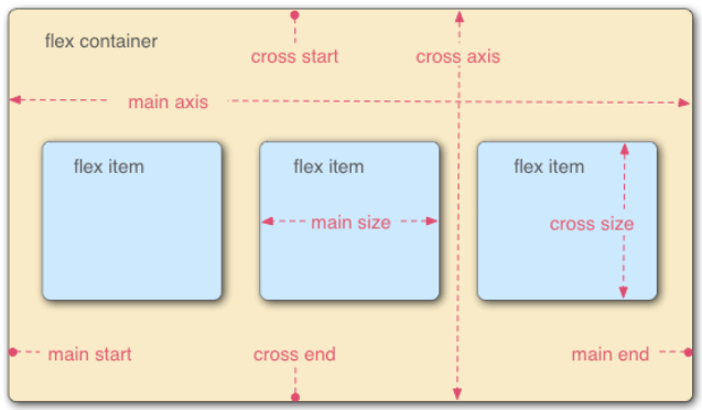
The container has two axes by default: the horizontal main axis and the vertical cross axis. The starting position of the spindle (the intersection with the border) is called main start, and the ending position is called main end; The start position of the cross axis is called cross start and the end position is called cross end.
Items are arranged along the main axis by default. The spindle space occupied by a single item is called main size, and the cross axis space occupied is called cross size.
Please keep these basic concepts in mind. When we talk about attributes below, we won't repeat the description!
attribute
Container properties (container)
- flex-direction
- justify-content
- align-items
- flex-wrap
- align-content
- flex-flow
1.flex-direction
	flex items The default is along main axis(Spindle) from main start Start going main end Directional arrangement
	flex-direction decided main axis There are four values for the direction of row(Default value) row-reverse,column,column-reverse


.box {
  flex-direction: row | row-reverse | column | column-reverse;
}
row (default): the main axis is horizontal and the starting point is at the left end.
Row reverse: the main axis is horizontal and the starting point is at the right end.
column: the main axis is vertical and the starting point is on the top edge.
Column reverse: the main axis is vertical, and the starting point is at the lower edge.
2.justify-content
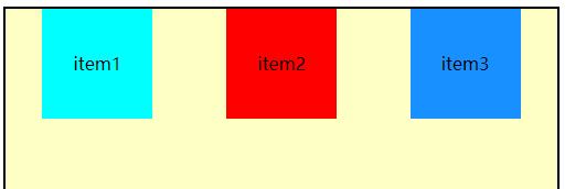
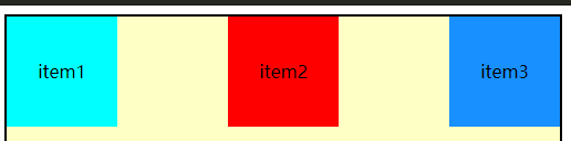
	justify-content decided flex item stay main axis Alignment on

	flex-start(Default value):And main start alignment
	flex-end: And main end alignment
	center: Center
	space-between: flex items Equal distance between, and main start,main end Align both ends
	space-evenly: flex items The distance between them is equal,flex items And main start ,main end The distance between is equal to flex items Distance between
	space-around :flex items The distance between them is equal,flex items And main start ,main end The distance between is equal to flex items Half the distance between
The purpose of this attribute is to arrange the item positions of the main axis
Of course, you can try these attributes by yourself, and you won't try them one by one here, but note that these are container attributes, which should be written in the css of the container!
3.align-items
    decision flex items stay cross axis Alignment on

	normal: In elastic layout, effect and stretch equally
	stretch: Premise is items Do not set height when flex items stay cross axis Directional size by auto Automatically stretches to fill when flex container(Or in other words: if the project is not set to height or set to auto,Will occupy the height of the entire container.)
	flex-satrt:And cross start alignment
	flex-end:And cross end alignment
	center:Center alignment
	baseline:Align with baseline
4.flex-wrap
   decided flex container Is it a single line or multiple lines
	nowrap(default): Single line
	wrap: Multiline
	//This is less used
	wrap-reverse:Multiline (contrast) wrap,cross start And cross end (opposite)
By default, items are arranged on a single line, also known as a grid line. The flex wrap attribute defines how to wrap lines if an axis cannot be arranged.
5 align-content
 Decided on multiple lines flex items stay cross axis Alignment and usage of justify-content One is the horizontal axis. One control vertical axis
	stretch(Default value): And align-items of stretch Similar, when items When there is height, there is no effect
	flex-start:And cross start alignment
	flex-end :And cross end alignment
	center: Center alignment
	space-between:flex items Equal distance between, and cross start,cross end Align both ends
	space-evently: flex items The distance between them is equal,flex items And cross start ,cross end The distance between is equal to flex items Distance between
	space-around :flex items The distance between them is equal,flex items And cross start ,cross end The distance between is equal to flex items Half the distance between
6 flex flow is short for flex direction and flex wrap
In other words, when you use this attribute, you can use the above two attribute values, for example: Flex flow: row wrap; (horizontal arrangement, multi line display)
flex item attribute (item attribute)
- order
- flex-grow
- flex-shrink
- flex-basis
- align-self
- flex
1 order
    order decision flex items Arrangement order of  (Not much)
	It can be set to any integer (positive integer, negative integer, 0). The smaller the value, the higher the ranking
	The default value is 0
This attribute can be understood. To be honest, it hasn't been used much
2 align-self
    Can pass align-self cover flex container Set align-items
	auto(Default value):follow flex container of align-items set up
	stretch,flex-start,flex-end,center,baseline Effect and align-items agreement
It is equivalent to inheriting the align items attribute of the parent element. If there is no parent element, it is equivalent to stretch.
3 flex-grow
    decided flex items How to expand
	It can be set to any non parent number (decimal, integer 0), and the default is 0
	When flex container stay main axis Remaining in direction size When, flex-grow Property is valid

	If all flex items of flex-grow comprehensive sum Not more than 1, which is directly multiplied by the remainder size Is the extended size
	Expand if more than 1 size=surplus size*flex-grow/sum
The flex growth attribute defines the magnification of the item. The default is 0, that is, if there is any remaining space, it will not be enlarged.
4 flex-shrink
flex-shrink (shrink Shrink, shrink)And flex-grow Similar, one extension, one expansion
	It can be set to any non parent number (decimal, integer 0), and the default is 1
	When flex items stay main axis Over in direction flex container of size flex-shrink Attribute will take effect
	If all flex items of flex-shrink the sum sum More than 1, each flex item Contractile size For:
		flex item go beyond flex container of size*Shrinkage ratio/each flex items Sum of shrinkage ratio
	If sum Not more than 1 per flex item Contractile size For:
		size = Beyond size * flex-shrink value
	flex items Final after shrinkage size Cannot be less than min-widthmin-height
If there is an expansion, there will be a reduction. The flex shrink attribute defines the reduction ratio of the item, which is 1 by default, that is, if there is insufficient space, the item will be reduced.
If the flex shrink attribute of all items is 1, they will be scaled down equally when there is insufficient space. If the flex shrink attribute of one item is 0 and all other items are 1, the former will not shrink when there is insufficient space. You can try it yourself. Finally, a case of dice layout will be given!
5 flex-basis
Used to set flex items stay main axis Directional base size
	Default to auto,You can set specific width values

	decision flex items final base size Factors, priority from high to low
		max-widthmax-heightmin-widthmin-height
		flex-basis
		widthheight
		Content itself size
The flex basis attribute defines the main size occupied by the project before allocating extra space. Based on this attribute, the browser calculates whether the spindle has excess space. Its default value is auto, which is the original size of the item. You can also set the same width and height as width and height, indicating that the item will occupy a fixed space!
6 flex
flex yes flex-grow || flex-shink||flex-basis Abbreviation of
 You can specify 1, 2 and 3 values in the above order! The default value is 0 1 auto


.item {
  flex: none | [ <'flex-grow'> <'flex-shrink'>? || <'flex-basis'> ]
}
be careful:
- The default value of this attribute is 0 1 auto (note the order), and the last two attributes are optional
- This attribute has two quick values: auto (1 1 auto) and none (0 0 auto).
- If these three attributes are needed, it is recommended to use flex instead of three separate attributes, because the browser will calculate the relevant values
Dice layout practice
It's really Kung Fu to say without practicing the fake handle style and tear the code by hand!
The following uses flex to write several dice layouts, which can be used for reference!
<!DOCTYPE html>
<html>
	<head>
		<meta charset="utf-8">
		<title></title>
		<style type="text/css">
			#container{
				background-color: #CCCCCC;
				height: 600px;
				width: 500px;
				/* flex */
				display: flex;
				justify-content: space-evenly;
				align-items: center;
			}
			.item{
				background-color: yellow;
				width: 100px;
				height: 100px;

			}
			/* Single point */
			.one{
				/* Use flex layout for points */
				display: flex;
				justify-content: center;
				align-items: center;
			}
			/* spot */
			.item-one{
				display: block;
				height: 20px;
				width: 20px;
				background-color: #1890FF;
				border-radius: 50%;
			}
			/* Three points */
			.two{

				display: flex;
				justify-content: space-between;
			}
			.two span{
				margin: 2px;
				display: block;
				height: 20px;
				width: 20px;
				border-radius: 50%;
				background-color: #1890FF;
			}
			.two2{
				align-self: center;
			}
			.two3{
				align-self: flex-end;
			}
			/* Five o'clock */
			.three{
				display: flex;
				justify-content: space-around;
			}
			.three span{
				display: block;
				height: 20px;
				width: 20px;
				border-radius: 50%;
				background-color: #1890FF;
			}
			#three_one, #three_three{
				padding: 2px;
				display: flex;
				flex-direction: column;
				justify-content: space-between;
			}
			#three_two{
				display: flex;
				flex-direction: column;
				justify-content: center;
			}
			/* 6'o clock */
			.four{
				display: flex;
				justify-content: space-around;
			}
			.four span{
				display: block;
				height: 20px;
				width: 20px;
				border-radius: 50%;
				background-color: #1890FF;
			}
			#four1,#four2{
				padding: 2px;
				display: flex;
				flex-direction: column;
				justify-content: space-between;
			}
		</style>
	</head>
	<body>
		<div id="container">
			<!-- Center one point -->
			<div class="item one">
				<span class="item-one"></span>
			</div>
			<!-- Three points -->
			<div class="item two">
				<span class="two1"></span>
				<span class="two2"></span>
				<span class="two3"></span>
			</div>
			<!-- Five o'clock -->
			<div class="item three">
				<div id="three_one">
					<span></span>
					<span></span>
				</div>
				<div id="three_two">
					<span></span>
				</div>
				<div id="three_three">
					<span></span>
					<span></span>
				</div>
			</div>
			<!-- 6'o clock -->
			<div class="item four">
				<div id="four1">
					<span></span>
					<span></span>
					<span></span>
				</div>
				<div id="four2">
					<span></span>
					<span></span>
					<span></span>
				</div>
			</div>

		</div>
	</body>
</html>
test result
That's all for this article. It's not easy to summarize. If it's helpful to you, please move your little hand and give me a praise!