
Data analysis is inseparable from data visualization. The most commonly used ones are pandas, matplotlib, pyecarts and, of course, Tableau. After seeing an article introducing plotly mapping, I was also eager to try. I checked the relevant materials and began to try to map with it.
1. Plotly
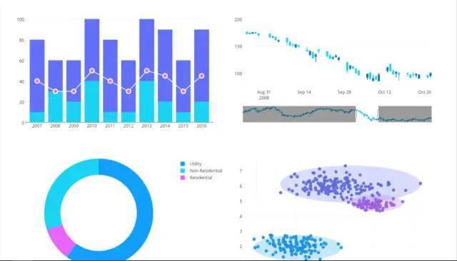
Plotly is an online platform for data analysis and visualization. It has very powerful functions and can draw many graphics online, such as bar chart, scatter chart, pie chart, histogram and so on. It also supports online editing and many API s such as python, javascript, matlab and R. It is also very simple to use in Python. You can directly use PIP install plot. It is recommended to use it in jupyter notebook. pycharm is not very convenient. Many high-quality maps comparable to Tableau can be drawn with plotly:
Plot mapping I tried to make line chart, scatter chart and histogram. First, import the Library:
from plotly.graph_objs import Scatter,Layout
import plotly
import plotly.offline as py
import numpy as np
import plotly.graph_objs as go
#Setting offline mode
plotly.offline.init_notebook_mode(connected=True)
The above lines of code mainly refer to some libraries. Plot has two modes: online and offline. The online mode requires an account to be edited in the cloud. For the offline mode I selected, if plot is set to offline mode, it can be displayed directly in the notebook.
2. Make line chart
N = 100
random_x = np.linspace(0,1,N)
random_y0 = np.random.randn(N)+5
random_y1 = np.random.randn(N)
random_y2 = np.random.randn(N)-5

#Create traces
trace0 = go.Scatter(
    x = random_x,
    y = random_y0,
    mode = 'markers',
    name = 'markers')
trace1 = go.Scatter(
    x = random_x,
    y = random_y1,
    mode = 'lines+markers',
      name = 'lines+markers'
)
trace2 = go.Scatter(
    x = random_x,
    y = random_y2,
    mode = 'lines',
    name = 'lines'
)
data = [trace0,trace1,trace2]
py.iplot(data)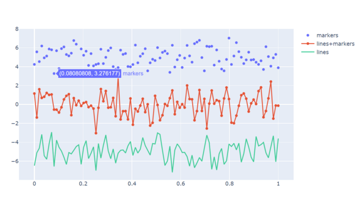
Set four parameters randomly, one x-axis number and three y-axis random data, and make three different types of graphs. trace0 is markers, trace1 is lines and markers, and trace3 is lines. Then put the three graphs in the data list and call py IPlot (data).
The default color of the drawing system is also very good-looking~
3. Make scatter diagram
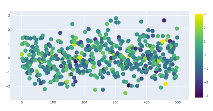
trace1 = go.Scatter(
     y = np.random.randn(500),
    mode = 'markers',
    marker = dict(
        size = 16,
        color = np.random.randn(500),
        colorscale = 'Viridis',
        showscale = True
    )
)
data = [trace1]
py.iplot(data)
Set the mode to markers, which is the scatter diagram, and then set a set of parameters in the marker, such as the random range of colors, the size of scatter points, legend and so on.
4. Histogram
trace0 = go.Bar(
    x = ['Jan','Feb','Mar','Apr', 'May','Jun',
         'Jul','Aug','Sep','Oct','Nov','Dec'],
    y = [20,14,25,16,18,22,19,15,12,16,14,17],
    name = 'Primary Product',
    marker=dict(
        color = 'rgb(49,130,189)'
    )
)
trace1 = go.Bar(
    x = ['Jan','Feb','Mar','Apr', 'May','Jun',
        'Jul','Aug','Sep','Oct','Nov','Dec'],
    y = [19,14,22,14,16,19,15,14,10,12,12,16],
    name = 'Secondary Product',
    marker=dict(
        color = 'rgb(204,204,204)'
    )
)
data = [trace0,trace1]
py.iplot(data)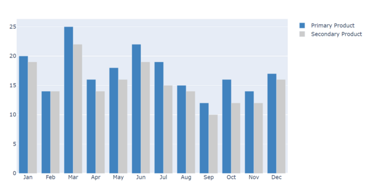
Histogram is a commonly used graph. The way of plotting histogram is a little similar to what we set in pandas. They intuitively reflect the difference between two productivity in different months. The above drawing is just the tip of the iceberg of plot. It is some of the most basic usage. It also has many cool usage and graphics, especially the drawing combined with pandas is very beautiful. For example, the K-line chart of some stocks can be studied if you are interested ~ link here: https://plot.ly/python/
Original link: https://www.jianshu.com/p/e5f...
end of document
Your favorite collection is my greatest encouragement!
Welcome to follow me, share Python dry goods and exchange Python technology.
If you have any opinions on the article or any technical problems, please leave a message in the comment area for discussion!