By Liana Mehrabyan

Data can help us describe the world, explain our ideas and show our achievements, but if there are only monotonous texts and figures, it is often difficult for us to catch the attention of the audience. Many times, a beautiful visual chart is enough to surpass thousands of words. This paper will introduce five visualization methods based on plot. You will find that the original visualization can not only use histogram and box diagram, but also be so dynamic, good-looking and even interactive.
Storytelling is a vital skill for data scientists. In order to express our thoughts and persuade others, we need effective communication. And bright visualization is a great tool to complete this task. This article will introduce five non-traditional visualization technologies that can make your data story more beautiful and effective. Python's Plotly graphics library (also available through R) will be used here, so that you can easily generate animation charts and interactive charts.
So what are the benefits of plotly? Plotly has strong integration capabilities: it can be used with Jupiter notebook, can be embedded into the website, and fully integrates Dash, an excellent tool for building dashboards and analytical applications.
start-up
If you haven't installed Plotly, just run the following command on your terminal to complete the installation:
pip install plotly
After installation, start using it!
animation
When studying the evolution of this or that indicator, we often involve time data. Plotly animation tool only needs one line of code to let people watch the changes of data over time, as shown in the following figure:
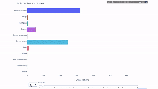
The code is as follows:
import plotly.express as px
from vega_datasets import data
df = data.disasters()
df = df[df.Year > 1990]
fig = px.bar(df,
             y="Entity",
             x="Deaths",
             animation_frame="Year",
             orientation= h ,
             range_x=[0, df.Deaths.max()],
             color="Entity")
# improve aesthetics (size, grids etc.)
fig.update_layout(width=1000,
                  height=800,
                  xaxis_showgrid=False,
                  yaxis_showgrid=False,
                  paper_bgcolor= rgba(0,0,0,0) ,
                  plot_bgcolor= rgba(0,0,0,0) ,
                  title_text= Evolution of Natural Disasters ,
                  showlegend=False)
fig.update_xaxes(title_text= Number of Deaths )
fig.update_yaxes(title_text=)
fig.show()
As long as you have a time variable to filter, almost any chart can be animated. The following is an example of animating a scatter chart:
import plotly.express as px
df = px.data.gapminder()
fig = px.scatter(
    df,
    x="gdpPercap",
    y="lifeExp",
    animation_frame="year",
    size="pop",
    color="continent",
    hover_name="country",
    log_x=True,
    size_max=55,
    range_x=[100, 100000],
    range_y=[25, 90],

    #   color_continuous_scale=px.colors.sequential.Emrld
)
fig.update_layout(width=1000,
                  height=800,
                  xaxis_showgrid=False,
                  yaxis_showgrid=False,
                  paper_bgcolor= rgba(0,0,0,0) ,
                  plot_bgcolor= rgba(0,0,0,0) )
Solar chart
The sun chart is a good way to visualize group by statements. If you want to decompose a given quantity through one or more category variables, use the sun chart.
Assuming that we want to break down the average tip data according to gender and time per day, this dual group by statement can be displayed more effectively through visualization than a table.
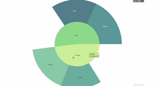
This chart is interactive, allowing you to click and explore each category yourself. You only need to define all your categories, declare the hierarchy between them (see the parents parameter in the following code) and assign corresponding values. This is the output of the group by statement in our case.
import plotly.graph_objects as go
import plotly.express as px
import numpy as np
import pandas as pd
df = px.data.tips()
fig = go.Figure(go.Sunburst(
    labels=["Female", "Male", "Dinner", "Lunch",  Dinner  ,  Lunch  ],
    parents=["", "", "Female", "Female",  Male ,  Male ],
    values=np.append(
        df.groupby( sex ).tip.mean().values,
        df.groupby([ sex ,  time ]).tip.mean().values),
    marker=dict(colors=px.colors.sequential.Emrld)),
                layout=go.Layout(paper_bgcolor= rgba(0,0,0,0) ,
                                 plot_bgcolor= rgba(0,0,0,0) ))

fig.update_layout(margin=dict(t=0, l=0, r=0, b=0),
                  title_text= Tipping Habbits Per Gender, Time and Day )
fig.show()
Now let's add another layer to this hierarchy:
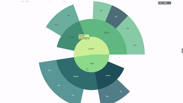
To this end, we add another value of the group by statement involving three category variables.
import plotly.graph_objects as go
import plotly.express as px
import pandas as pd
import numpy as np
df = px.data.tips()
fig = go.Figure(go.Sunburst(labels=[
    "Female", "Male", "Dinner", "Lunch",  Dinner  ,  Lunch  ,  Fri ,  Sat ,
     Sun ,  Thu ,  Fri  ,  Thu  ,  Fri   ,  Sat   ,  Sun   ,  Fri    ,  Thu
],
                            parents=[
                                "", "", "Female", "Female",  Male ,  Male ,
                                 Dinner ,  Dinner ,  Dinner ,  Dinner ,
                                 Lunch ,  Lunch ,  Dinner  ,  Dinner  ,
                                 Dinner  ,  Lunch  ,  Lunch
                            ],
                            values=np.append(
                                np.append(
                                    df.groupby( sex ).tip.mean().values,
                                    df.groupby([ sex ,
                                                 time ]).tip.mean().values,
                                ),
                                df.groupby([ sex ,  time ,
                                             day ]).tip.mean().values),
                            marker=dict(colors=px.colors.sequential.Emrld)),
                layout=go.Layout(paper_bgcolor= rgba(0,0,0,0) ,
                                 plot_bgcolor= rgba(0,0,0,0) ))
fig.update_layout(margin=dict(t=0, l=0, r=0, b=0),
                  title_text= Tipping Habbits Per Gender, Time and Day )

fig.show()
Parallel category
Another way to explore the relationship between category variables is the following flow chart. You can drag and drop, highlight and browse values at any time, which is very suitable for demonstration.
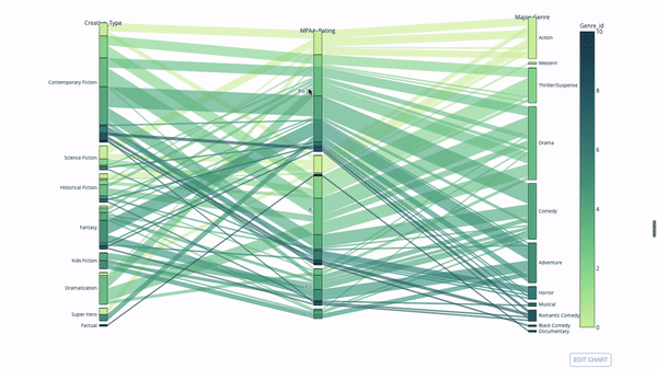
The code is as follows:
import plotly.express as px
from vega_datasets import data
import pandas as pd
df = data.movies()
df = df.dropna()
df[ Genre_id ] = df.Major_Genre.factorize()[0]
fig = px.parallel_categories(
    df,
    dimensions=[ MPAA_Rating ,  Creative_Type ,  Major_Genre ],
    color="Genre_id",
    color_continuous_scale=px.colors.sequential.Emrld,
)
fig.show()
Parallel coordinate map
The parallel coordinate chart is a continuous version of the chart above. Here, each string represents a single observation. This is a useful tool for identifying outliers (a single line away from other data), clustering, trends, and redundant variables (for example, if the values of two variables are similar on each observation, they will be on the same horizontal line, indicating redundancy).
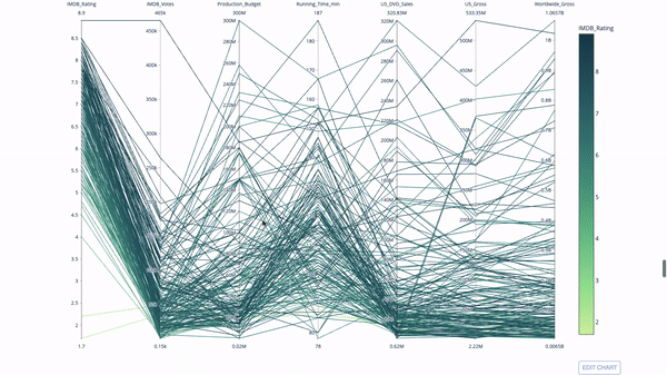
The code is as follows:
 import plotly.express as px
from vega_datasets import data
import pandas as pd
df = data.movies()
df = df.dropna()
df[ Genre_id ] = df.Major_Genre.factorize()[0]
fig = px.parallel_coordinates(
    df,
    dimensions=[
         IMDB_Rating ,  IMDB_Votes ,  Production_Budget ,  Running_Time_min ,
         US_Gross ,  Worldwide_Gross ,  US_DVD_Sales
    ],
    color= IMDB_Rating ,
    color_continuous_scale=px.colors.sequential.Emrld)
fig.show()
Gauge charts and indicators
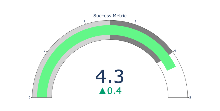
The scale chart is just for good looking. Use this chart when reporting on success indicators such as KPI s and showing how far they are from your goals.
Indicators are very useful in business and consulting. They can complement the visual effect through text marks, attract the attention of the audience and show your growth indicators.
 import plotly.graph_objects as go
fig = go.Figure(go.Indicator(
    domain = { x : [0, 1],  y : [0, 1]},
    value = 4.3,
    mode = "gauge+number+delta",
    title = { text : "Success Metric"},
    delta = { reference : 3.9},
    gauge = { bar : { color : "lightgreen"},
         axis : { range : [None, 5]},
              steps  : [
                 { range : [0, 2.5],  color : "lightgray"},
                 { range : [2.5, 4],  color : "gray"}],
          }))
fig.show()