After learning the concepts of box models, block-level elements and in-line elements, let's talk about one of the more important uses of CSS: layout. Previously, we learned that tables can be used to lay out pages, such as layout forms, but the actual layout of worksheets is usually only used to lay out forms. Most of the mould work is accomplished by CSS+DIV, because the table layout of complex pages needs frequent nesting, the code is more complex and difficult to maintain, while using CSS+DIV layout, the content and performance can be separated, the code is clean, readable, easy to maintain, and the style code can be reused, which improves the development efficiency. At the same time, after separation, the development of art and website can be improved. Personnel can also work together to further improve the efficiency of development and the quality of the overall website.
I. Conventional Flow Layout
Elements are displayed in their usual way, which has two characteristics:
1. Elements are displayed according to the location defined by their HTML elements (how to write and how to display)
2. Elements are displayed according to their regular display characteristics.
For example, block-level elements are arranged vertically and row-level elements are arranged horizontally.
When I didn't learn layout before, I actually used conventional flow layout.
2. Floating (by the way, explain the layout steps)
Specific code:
Left floating: left;
Right floating: right;
We know that programming generally has a routine, using CSS+DIV layout is no exception, generally divided into the following four steps:
Layout steps:
I. Drawing effect maps
Draw the frame of the page we want on the paper first. For example, we want to divide a web page into three parts: top, middle and bottom.
SEGMENTATION WITH DIV
For example, our web page is divided into three parts as a whole, so we can use three divs to divide the web page roughly first.
3. Using CSS to Control DIV Layout
Using CSS style to control the specific width and height of the layout, and using significant background annotation, you can clearly see the module when you need to modify.
Fourth, use the above three steps to subdivide
Each module should be partitioned through the above three steps.
Why use DIV to split the layout?
We know that every element in HTML is like a box. Each box can accommodate other elements, such as div element, p element, h4 element and so on. Why do we use div to accommodate other elements in our layout instead of p element, h4 element or other elements? This is because the div element is the cleanest box. It has no other attributes. In other words, if you only write the div label without any attributes, it is only a container without any attributes. Other elements, such as p element, have their own special attributes, such as layout with two p elements, and there are empty lines between them. If we use h4 layout, the text placed in h4 is increased. Containers such as p element and h4 element will affect the effect if they are used for layout, so we use DIV, the cleanest box without any features to layout.
Sample code:
<!DOCTYPE HTML PUBLIC "-//W3C//DTD HTML 4.01 Transitional//EN" "http://www.w3.org/TR/html4/loose.dtd">
<html lang="en">
<head>
    <meta http-equiv="Content-Type" content="text/html;charset=UTF-8">
    <title>Document</title>
    <style>
        *{
            margin:0px auto;
        }

        #all{
            text-align: center;
        }

        div.logo {
            width:1300px;
            height:60px;
            background-color: yellow;
        }

        div.copyright {
            width:1300px;
            height:60px;
            background-color: goldenrod;
        }

        div.middle {
            width:1300px;
            height: 500px;
        }

        div.menu {
            width:200px;
            height: 500px;
            background-color: #E4393C;
            /*Menu left floating*/
            float:left;
        }

        div.main {
            width:1100px;
            height: 500px;
            background-color: #bad0ef;
            /*Topic right floating*/
            float:right;
            /*Left float and right float can be used.*/
            float:left;
        }
    </style>
</head>
<body>
    <div id="all">

        <div class="logo">
            logo
        </div>

        <div class="middle">
             <div class="menu">
                menu
             </div>

            <div class="main">
                //Main Content of Website
            </div>
        </div>

        <div class="copyright">
            bottom
        </div>

    </div>
</body>
</html>
If floating is not used, the block-level elements are arranged vertically by default, while the row-level elements can not adjust the width and margin, so we use floating to make the two block-level elements arrange horizontally.
Multiple Classes: Don't use class selectors too much, which can lead to bloated code and poor readability. If you can use other selectors instead, use other selectors.
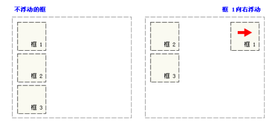
- Some Characteristics of Floating
- 1. Box 1 moves to the right
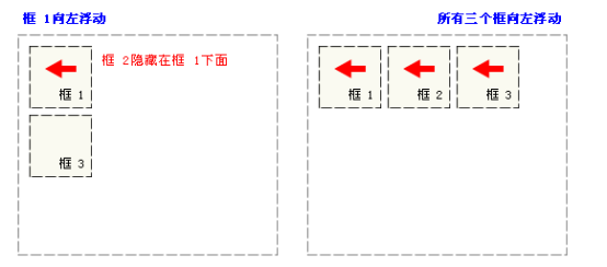
- 2. Box 1 floats to the left
-
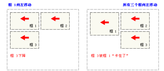
3. All three boxes float to the left
Clear floating
As in the case of "stuck" in Figure 3 above, or if we want the first two boxes to float left instead of the third one, we can add clear:left; attribute to the DVI of the third box. This means to clear the left float feature, and the third element is displayed directly in a newline.
- Level Navigation Menu Using Floating
Sample code:
<!DOCTYPE HTML PUBLIC "-//W3C//DTD HTML 4.01 Transitional//EN" "http://www.w3.org/TR/html4/loose.dtd">
<html lang="en">
<head>
    <meta http-equiv="Content-Type" content="text/html;charset=UTF-8">
    <title>Document</title>
    <style>
        * {
            margin:0px;
        }

        body {
            font: 12px/150% Arial, Verdana, "Song style";
        }

        /*Horizontal navigation menu start*/
        .horizontal-ul {
            list-style: none;
            margin: 0px;
            padding: 0px;
        }


        .horizontal-ul li {
            float: left;
        }

        .line {
            color: #ccc;
            padding: 0px 12px;
            /*background-color:green;*/
        }
        /*Horizontal Navigation Menu End*/

        a:link {
            text-decoration: none;
        }

        a:hover {
            text-decoration: underline;
        }

        .horizontal-ul li a {
            color: #666;
        }

        .horizontal-ul li span {
            color: #666;
        }

        div.horizontal-menu-div {
            width:1000px;
            height:auto;
            background-color:yellow;

        }
    </style>
</head>
<body>
    <div class="horizontal-menu-div">

    <ul class="horizontal-ul">
        <li><a href="">About us</a><span class="line">|</span></li>
        <li><a href="">Contact us</a><span class="line">|</span></li>
        <li><a href="">Talent recruitment</a><span class="line">|</span></li>
        <li><a href="">Merchant entry</a><span class="line">|</span></li>
        <li><a href="">Advertising service</a><span class="line">|</span></li>
        <li><a href="">Mobile Jingdong</a><span class="line">|</span></li>
        <li><a href="">Friendship link</a><span class="line">|</span></li>
        <li><a href="">Sales alliance</a><span class="line">|</span></li>
        <li><a href="">Jingdong community</a><span class="line">|</span></li>
        <li><a href="">Jingdong public interest</a><span class="line">|</span></li>
        <li><a href="">English Site</a></li>
    </ul>


</div>
</body>
</html>
3. Location and layout
1. Static positioning
position:static;
By default, not writing position is equivalent to writing position:static; when I did not learn positioning before, it was actually static positioning. Elements were displayed in their original location, even with top, left and so on, it did not work.
2. Relative positioning
Relative positioning is translating relative to its original position, if position: relative is set, it means relative positioning.
z-index: The larger the value, the higher the value
Note: z-index must be added to the elements that have been positioned before it works.
3. Absolute positioning
The positioning of the child container relative to the parent container, and the positioning of the child container relative to the body if there is no parent container.
position:absolute;
Sample code:
<!DOCTYPE HTML PUBLIC "-//W3C//DTD HTML 4.01 Transitional//EN" "http://www.w3.org/TR/html4/loose.dtd">
<html lang="en">
<head>
    <meta http-equiv="Content-Type" content="text/html;charset=UTF-8">
    <title>Document</title>
    <style type="text/css">
        *{
            margin:0;
        }

        div.grandpa{
            width: 100%;
            height:100%;
            background-color: gray;
            position: absolute;
        }

        div.father{
            width:100px;
            height:100px;
            top:100px;
            left:100px;
            position: absolute;
            background-color: blue;
        }

        div.son{
            width:50px;
            height: 50px;
            right: 0px;
            bottom:0px;
            position: absolute;
            background-color: green;
        }
    </style>
</head>
<body>
    <div class="grandpa">
        <div class="father">
            <div class="son"></div>
        </div>
    </div>

</body>
</html>
4.fixed Fixed Location
It's also relative positioning, relative to the window.
position:fixed;
So when do we use relative positioning and when do we use absolute positioning?
In general, we use relative positioning for top containers and absolute positioning for sub-containers. The advantage is that when the parent container moves, the sub-containers can follow the parent container without adjusting the position of the sub-containers.