If you are Xiaobai, this set of information can help you become a big bull. If you have rich development experience, this set of information can help you break through the bottleneck
2022web full set of video tutorial front-end architecture H5 vue node applet Video + data + code + interview questions.
Contents of this article
order
It's time to write your own components again
As a front-end developer, I usually have nothing to do. I can write custom components and increase my experience. I can also use CV method to develop quickly in actual development
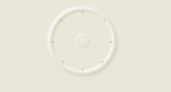
Let's take a look at the final effect in advance:

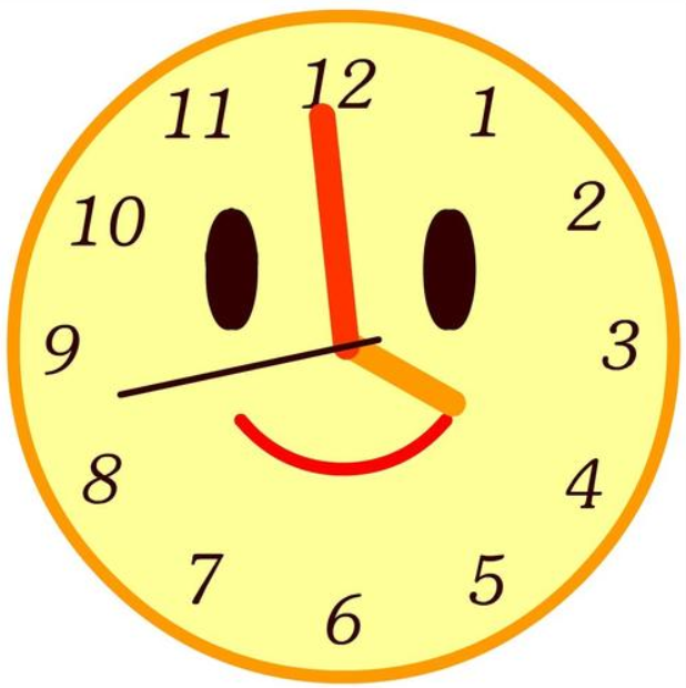
Let's ask a small question first. Now we are more used to seeing which style of time, clock type or digital type? (although your answer won't affect me to make a clock)
Clock time:
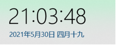
Digital time:
Neumorphism
At present, I don't like some clock styles on the Internet. I came across one before Neomorphism I can't help brightening my eyes with your design
So the style of the clock Assembly this time is decided by you - a new imitation

Neumorphism style page
Start of text
There is a pile of words on it, which increases the number of words. It's really enlightened
Let's officially start the manufacturing process of components
1, Clock dial writing
Because I use vue, so I write it vue component
First build a clock Vue components, set the width and height that props may receive, and the shadow color.
The shadow part is set with box shadow
The content of styleVar in Compute is similar to that in CSS: root
You can also check the related methods in this article: DIY abundant food and clothing series の custom drop-down box vue component
On the main page app Set the global color to #EBE6DA in Vue
In CSS style writing, the location equivalence can be calculated by calc plus var
code:
<template>
    <!-- Clock -->
    <div class="clock" :style="styleVar">
        <!-- Inner ring -->
        <div class="innerBorder">
            <!-- Clock scale -->
            <div class="scale mark1"></div>
            <div class="scale mark2"></div>
            <div class="scale mark3"></div>
            <div class="scale mark4"></div>
            <div class="scale mark5"></div>
            <div class="scale mark6"></div>
            <div class="scale mark7"></div>
            <div class="scale mark8"></div>
        </div>
        <!-- Inner circle wave -->
        <div class="wave"></div>
    </div>
</template>
<script>
export default {
    name: 'clock',
    components: {},
    props: {
        bgsize: {
            type: Number,
            default: 180
        },
        bgcolor: {
            type: String,
            default: '#D1CCC0'
        }
    },
    data() {
        return {
        };
    },
    created() {},
    mounted() {},
    watch: {},
    computed: {
        styleVar() {
            return {
                '--clock-size': this.bgsize + 'px',
                '--clock-bgcolor': this.bgcolor,
                '--length-log2E': ((this.bgsize - 10) / 2) / Math.LOG2E + 'px',
            }
        }
    },
    methods: {

    },
};
</script>
<style scoped>
    /* External size and shadows */
    .clock {
        width: var(--clock-size);
        height: var(--clock-size);
        border-radius: 50%;
        box-shadow: 5px 5px 10px var(--clock-bgcolor), -4px -4px 8px #fff;
    }
    /* Inner shadow */
    .innerBorder {
        /* calc Add var calculation */
        width: calc(var(--clock-size) - 10px);
        height: calc(var(--clock-size) - 10px);
        position: relative;
        left: 5px;
        top: 5px;
        box-shadow: -3px -3px 6px #fff inset, 3px 3px 6px var(--clock-bgcolor) inset;
        border-radius: 50%;
    }
    /* Clock scale */
    .scale {
        width: 2px;
        height: 8px;
        position: absolute;
        box-shadow: 1px 1px 1px #9D958F inset, -1px -1px 1px var(--clock-bgcolor) inset;
        border-radius: 1px;
    }
    /* Set minor scale position */
    .mark1 {
        left: calc(50% - 1px);
        top: 2px;
    }
    .mark2 {
        transform: rotate(45deg);
        left: calc(50% + var(--length-log2E) );
        top: calc(50% - var(--length-log2E) );
    }
    .mark3 {
        transform: rotate(90deg);
        left: calc(100% - 7px);
        top: calc(50% - 1px);
    }
    .mark4 {
        transform: rotate(135deg);
        left: calc(50% + var(--length-log2E) - 5px);
        top: calc(50% + var(--length-log2E) - 5px);
    }
    .mark5 {
        left: calc(50% - 1px);
        bottom: 2px;
    }
    .mark6 {
        transform: rotate(45deg);
        left: calc(50% - var(--length-log2E) + 5px);
        top: calc(50% + var(--length-log2E) - 5px);
    }
    .mark7 {
        transform: rotate(90deg);
        left: 2px;
        top: calc(50% - 1px);
    }
    .mark8 {
        transform: rotate(135deg);
        left: calc(50% - var(--length-log2E) );
        top: calc(50% - var(--length-log2E) );
    }
    /* Intermediate wave */
    .wave {
        width: 30%;
        height: 30%;
        position: absolute;
        left: 35%;
        top: 35%;
        box-shadow: 3px 3px 9px var(--clock-bgcolor), -3px -3px 9px #fff;
        border-radius: 50%;
        filter: blur(1px);
        animation: wavemove 4s infinite linear;
    }
    @keyframes wavemove {
        0% {
            transform: scale(0.5);
        }
        50% {
            transform: scale(1);
            opacity: 1;
        }
        100% {
            transform: scale(1.7);
            opacity: 0;
        }
    }
</style>
effect:
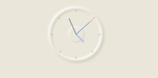
2, Clock pointer writing
When writing the pointer, it should be noted that the rotation movement of the pointer is around the center of the circle. Use transform to change the rotation
Therefore, you need to use transform origin: bottom to set the selected benchmark, and then rotate to change
After the style is written, you can combine the current Beijing time with the rotation of the pointer, minute hand and second hand
The principle here is actually simpler. Use new Date() to get the current hour, minute and second, and then convert the hour, minute and second into degrees deg in proportion
// Method of calibrating clock pointer
currentTime:function(){
    let date = new Date();
    this.hour = date.getHours();
    this.minute = date.getMinutes();
    this.second = date.getSeconds();
    document.getElementsByClassName('hourhand')[0].style.transform = 'rotate(' + this.hour / 24 * 360 + 'deg)';
    document.getElementsByClassName('minhand')[0].style.transform = 'rotate(' + this.minute / 60 * 360 + 'deg)';
    document.getElementsByClassName('sechand')[0].style.transform = 'rotate(' + this.second / 60 * 360 + 'deg)';
}
Use the setInterval timer to execute every 1000 milliseconds
In this way, the final desired effect can be achieved
3, Call of clock component
After writing the clock component, you can call it on the page
import clock from './components/clock'

export default {
  name: 'App',
  components: {
    clock
  }
}
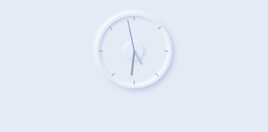
Call < clock > < / clock > to put the clock in the position you want
Because props was set before, you can adjust the size and color style of the clock through simple settings
<clock :bgsize="150" :bgcolor=color></clock>
color is #bec8e4
Current clock style:
Complete component code
<template>
    <!-- Clock -->
    <div class="clock" :style="styleVar">
        <!-- Inner ring -->
        <div class="innerBorder">
            <!-- Clock scale -->
            <div class="scale mark1"></div>
            <div class="scale mark2"></div>
            <div class="scale mark3"></div>
            <div class="scale mark4"></div>
            <div class="scale mark5"></div>
            <div class="scale mark6"></div>
            <div class="scale mark7"></div>
            <div class="scale mark8"></div>
        </div>
        <!-- Inner circle wave -->
        <div class="wave"></div>
        <!-- Hour hand, minute hand, second hand -->
        <div class="hands hourhand"></div>
        <div class="hands minhand"></div>
        <div class="hands sechand"></div>
    </div>
</template>

<script>
export default {
    name: 'clock',
    components: {},
    props: {
        bgsize: {
            type: Number,
            default: 180
        },
        bgcolor: {
            type: String,
            default: '#D1CCC0'
        }
    },
    data() {
        return {
            hour: 0,  //hour
            minute: 0,  //minute
            second: 0,  //second
        };
    },
    created() {},
    mounted() {
        this.currentTime();
        // Timing calibration
        setInterval(this.currentTime, 1000);
    },
    watch: {},
    computed: {
        styleVar() {
            return {
                '--clock-size': this.bgsize + 'px',
                '--clock-bgcolor': this.bgcolor,
                '--length-log2E': ((this.bgsize - 10) / 2) / Math.LOG2E + 'px',
            }
        }
    },
    methods: {
        // Method of calibrating clock pointer
        currentTime:function(){
            let date = new Date();
            this.hour = date.getHours();
            this.minute = date.getMinutes();
            this.second = date.getSeconds();

            document.getElementsByClassName('hourhand')[0].style.transform = 'rotate(' + this.hour / 24 * 360 + 'deg)';
            document.getElementsByClassName('minhand')[0].style.transform = 'rotate(' + this.minute / 60 * 360 + 'deg)';
            document.getElementsByClassName('sechand')[0].style.transform = 'rotate(' + this.second / 60 * 360 + 'deg)';
        }
    },
};
</script>
<style scoped>
    /* External size and shadows */
    .clock {
        width: var(--clock-size);
        height: var(--clock-size);
        border-radius: 50%;
        box-shadow: 5px 5px 10px var(--clock-bgcolor), -4px -4px 8px #fff;
    }
    /* Inner shadow */
    .innerBorder {
        /* calc Add var calculation */
        width: calc(var(--clock-size) - 10px);
        height: calc(var(--clock-size) - 10px);
        position: relative;
        left: 5px;
        top: 5px;
        box-shadow: -3px -3px 6px #fff inset, 3px 3px 6px var(--clock-bgcolor) inset;
        border-radius: 50%;
    }
    /* Clock scale */
    .scale {
        width: 2px;
        height: 8px;
        position: absolute;
        box-shadow: 1px 1px 1px #9D958F inset, -1px -1px 1px var(--clock-bgcolor) inset;
        border-radius: 1px;
    }
    /* Set minor scale position */
    .mark1 {
        left: calc(50% - 1px);
        top: 2px;
    }
    .mark2 {
        transform: rotate(45deg);
        left: calc(50% + var(--length-log2E) );
        top: calc(50% - var(--length-log2E) );
    }
    .mark3 {
        transform: rotate(90deg);
        left: calc(100% - 7px);
        top: calc(50% - 3px);
    }
    .mark4 {
        transform: rotate(135deg);
        left: calc(50% + var(--length-log2E) - 5px);
        top: calc(50% + var(--length-log2E) - 5px);
    }
    .mark5 {
        left: calc(50% - 1px);
        bottom: 2px;
    }
    .mark6 {
        transform: rotate(45deg);
        left: calc(50% - var(--length-log2E) + 5px);
        top: calc(50% + var(--length-log2E) - 5px);
    }
    .mark7 {
        transform: rotate(90deg);
        left: 2px;
        top: calc(50% - 3px);
    }
    .mark8 {
        transform: rotate(135deg);
        left: calc(50% - var(--length-log2E) );
        top: calc(50% - var(--length-log2E) );
    }
    /* Intermediate wave */
    .wave {
        width: 30%;
        height: 30%;
        position: absolute;
        left: 35%;
        top: 35%;
        box-shadow: 3px 3px 9px var(--clock-bgcolor), -3px -3px 9px #fff;
        border-radius: 50%;
        filter: blur(1px);  /* Fuzzy processing */
        animation: wavemove 4s infinite linear;
    }
    @keyframes wavemove {
        0% {
            transform: scale(0.5);
        }
        50% {
            transform: scale(1);
            opacity: 1;
        }
        100% {
            transform: scale(1.7);
            opacity: 0;
        }
    }
    /*************************** Hour hand, minute hand, second hand****************************/
    .hands {
        position: absolute;
        transform-origin: bottom;
        border-radius: 10px;
        z-index: 300;
        bottom: 50%;
        left: calc(50% - 1px);
    }
    .sechand {
        width: 2px;
        height: 42%;
        background-image:  linear-gradient( #CD69C9, #1CA6F3);
    }
    .minhand {
        width: 4px;
        height: 33%;
        background-color: #9BA5AA;
        left: calc(50% - 2px);
    }
    .hourhand {
        width: 6px;
        height: 21%;
        background-color: #BEC8E4;
        left: calc(50% - 3px);
    }
</style>