hello everyone
As for dynamic charts, I believe everyone has been in touch with them more or less. If the code level is good, you can choose Matplotlib. Of course, you can also use the relevant functions of pyechards. However, these tools focus on the production of charts, that is, you need to convert the data of charts by yourself. The visualization library introduced today perfectly combines the Pandas data format and the powerful function of Matplotlib, which makes it much easier for us to make dynamic drawings.
Introduction to Gallery
This awesome visual library is pandas_. Alive, although the current number of star s on GitHub is not very high, it is believed that with its powerful functions, it will emerge sooner or later
Project installation:
Just like the general Python library, you can directly use pip to install it. One thing to note here is that since you use Matplotlib to make motion pictures, you need to manually install the dependent tool imagemagick of Matplotlib. This is a picture processing tool. Interested students can check it by themselves
Project function:
This visualization library can support many types of charts, including dynamic bar chart, dynamic curve chart, bubble chart, pie chart and map. These charts can almost meet our daily use
Introduction to Cartography
Here, let's take a brief look at how to make dynamic charts. First, the dynamic bar chart is basically completed in 4 lines of code, with two lines of import
import pandas_aliveimport pandas as pdcovid_df = pd.read_csv('covid19.csv', index_col=0, parse_dates=[0])covid_df.diff().fillna(0).plot_animated(filename='line_chart.gif',kind='line',period_label={'x':0.25,'y':0.9})
How about it? Is it super convenient
Let's take a look at other chart making methods!
01 dynamic bar chart
import pandas_aliveimport pandas as pdcovid_df = pd.read_csv('covid19.csv', index_col=0, parse_dates=[0])covid_df.plot_animated(filename='examples/perpendicular-example.gif',perpendicular_bar_func='mean')
02 dynamic histogram
import pandas_aliveimport pandas as pdcovid_df = pd.read_csv('covid19.csv', index_col=0, parse_dates=[0])covid_df.plot_animated(filename='examples/example-barv-chart.gif',orientation='v')
03 dynamic curve
import pandas_aliveimport pandas as pdcovid_df = pd.read_csv('covid19.csv', index_col=0, parse_dates=[0])covid_df.diff().fillna(0).plot_animated(filename='examples/example-line-chart.gif',kind='line',period_label={'x':0.25,'y':0.9})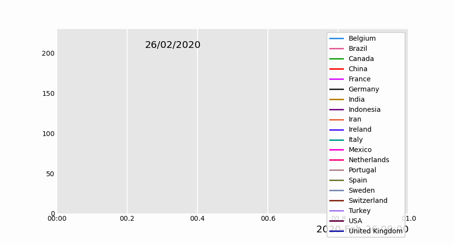
04 dynamic area map
import pandas_aliveimport pandas as pdcovid_df = pd.read_csv('covid19.csv', index_col=0, parse_dates=[0])covid_df.sum(axis=1).fillna(0).plot_animated(filename='examples/example-bar-chart.gif',kind='bar', period_label={'x':0.1,'y':0.9}, enable_progress_bar=True, steps_per_period=2, interpolate_period=True, period_length=200)
05 dynamic scatter diagram
import pandas as pdimport pandas_alivemax_temp_df = pd.read_csv( "data/Newcastle_Australia_Max_Temps.csv", parse_dates={"Timestamp": ["Year", "Month", "Day"]},)min_temp_df = pd.read_csv( "data/Newcastle_Australia_Min_Temps.csv", parse_dates={"Timestamp": ["Year", "Month", "Day"]},)merged_temp_df = pd.merge_asof(max_temp_df, min_temp_df, on="Timestamp")merged_temp_df.index = pd.to_datetime(merged_temp_df["Timestamp"].dt.strftime('%Y/%m/%d'))keep_columns = ["Minimum temperature (Degree C)", "Maximum temperature (Degree C)"]merged_temp_df[keep_columns].resample("Y").mean().plot_animated(filename='examples/example-scatter-chart.gif',kind="scatter",title='Max & Min Temperature Newcastle, Australia')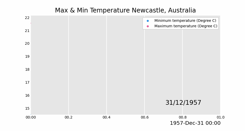
06 dynamic pie chart
import pandas_aliveimport pandas as pdcovid_df = pd.read_csv('covid19.csv', index_col=0, parse_dates=[0])covid_df.plot_animated(filename='examples/example-pie-chart.gif',kind="pie",rotatelabels=True,period_label={'x':0,'y':0})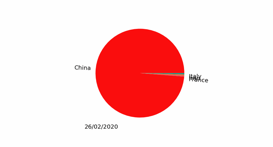
07 dynamic bubble chart
import pandas_alivemulti_index_df = pd.read_csv("data/multi.csv", header=[0, 1], index_col=0)multi_index_df.index = pd.to_datetime(multi_index_df.index,dayfirst=True)map_chart = multi_index_df.plot_animated( kind="bubble", filename="examples/example-bubble-chart.gif", x_data_label="Longitude", y_data_label="Latitude", size_data_label="Cases", color_data_label="Cases", vmax=5, steps_per_period=3, interpolate_period=True, period_length=500, dpi=100)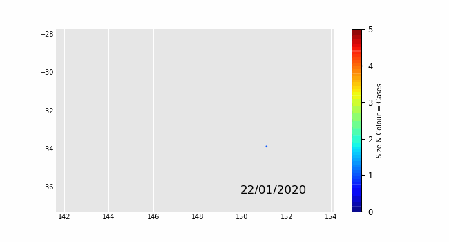
08 dynamic geographic chart
import geopandasimport pandas_aliveimport contextilygdf = geopandas.read_file('data/nsw-covid19-cases-by-postcode.gpkg')gdf.index = gdf.postcodegdf = gdf.drop('postcode',axis=1)map_chart = gdf.plot_animated(filename='examples/example-geo-point-chart.gif',basemap_format={'source':contextily.providers.Stamen.Terrain})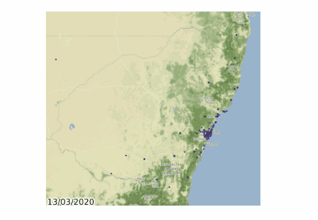
09 dynamic map of administrative area
import geopandasimport pandas_aliveimport contextilygdf = geopandas.read_file('data/italy-covid-region.gpkg')gdf.index = gdf.regiongdf = gdf.drop('region',axis=1)map_chart = gdf.plot_animated(filename='examples/example-geo-polygon-chart.gif',basemap_format={'source':contextily.providers.Stamen.Terrain})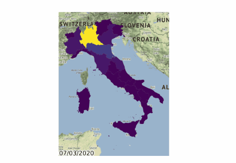
10 multi action diagram combination
import pandas_aliveimport pandas as pdcovid_df = pd.read_csv('covid19.csv', index_col=0, parse_dates=[0])animated_line_chart = covid_df.diff().fillna(0).plot_animated(kind='line',period_label=False,add_legend=False)animated_bar_chart = covid_df.plot_animated(n_visible=10)pandas_alive.animate_multiple_plots('examples/example-bar-and-line-chart.gif',[animated_bar_chart,animated_line_chart], enable_progress_bar=True)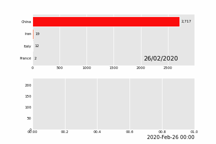
11 urban population change
import pandas_aliveurban_df = pandas_alive.load_dataset("urban_pop")animated_line_chart = ( urban_df.sum(axis=1) .pct_change() .fillna(method='bfill') .mul(100) .plot_animated(kind="line", title="Total % Change in Population",period_label=False,add_legend=False))animated_bar_chart = urban_df.plot_animated(n_visible=10,title='Top 10 Populous Countries',period_fmt="%Y")pandas_alive.animate_multiple_plots('examples/example-bar-and-line-urban-chart.gif',[animated_bar_chart,animated_line_chart], title='Urban Population 1977 - 2018', adjust_subplot_top=0.85, enable_progress_bar=True)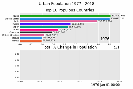
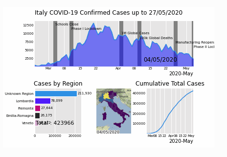
12 Italian epidemic
import geopandasimport pandas as pdimport pandas_aliveimport contextilyimport matplotlib.pyplot as pltregion_gdf = geopandas.read_file('data\geo-data\italy-with-regions')region_gdf.NOME_REG = region_gdf.NOME_REG.str.lower().str.title()region_gdf = region_gdf.replace('Trentino-Alto Adige/Sudtirol','Trentino-Alto Adige')region_gdf = region_gdf.replace("Valle D'Aosta/Vallée D'Aoste\r\nValle D'Aosta/Vallée D'Aoste","Valle d'Aosta")italy_df = pd.read_csv('data\Regional Data - Sheet1.csv',index_col=0,header=1,parse_dates=[0])italy_df = italy_df[italy_df['Region'] != 'NA']cases_df = italy_df.iloc[:,:3]cases_df['Date'] = cases_df.indexpivoted = cases_df.pivot(values='New positives',index='Date',columns='Region')pivoted.columns = pivoted.columns.astype(str)pivoted = pivoted.rename(columns={'nan':'Unknown Region'})cases_gdf = pivoted.Tcases_gdf['geometry'] = cases_gdf.index.map(region_gdf.set_index('NOME_REG')['geometry'].to_dict())cases_gdf = cases_gdf[cases_gdf['geometry'].notna()]cases_gdf = geopandas.GeoDataFrame(cases_gdf, crs=region_gdf.crs, geometry=cases_gdf.geometry)gdf = cases_gdfmap_chart = gdf.plot_animated(basemap_format={'source':contextily.providers.Stamen.Terrain},cmap='viridis')cases_df = pivotedfrom datetime import datetimebar_chart = cases_df.sum(axis=1).plot_animated( kind='line', label_events={ 'Schools Close':datetime.strptime("4/03/2020", "%d/%m/%Y"), 'Phase I Lockdown':datetime.strptime("11/03/2020", "%d/%m/%Y"), '1M Global Cases':datetime.strptime("02/04/2020", "%d/%m/%Y"), '100k Global Deaths':datetime.strptime("10/04/2020", "%d/%m/%Y"), 'Manufacturing Reopens':datetime.strptime("26/04/2020", "%d/%m/%Y"), 'Phase II Lockdown':datetime.strptime("4/05/2020", "%d/%m/%Y"), }, fill_under_line_color="blue", add_legend=False)map_chart.ax.set_title('Cases by Location')line_chart = ( cases_df.sum(axis=1) .cumsum() .fillna(0) .plot_animated(kind="line", period_label=False, title="Cumulative Total Cases",add_legend=False))def current_total(values): total = values.sum() s = f'Total : {int(total)}' return {'x': .85, 'y': .1, 's': s, 'ha': 'right', 'size': 11}race_chart = cases_df.cumsum().plot_animated( n_visible=5, title="Cases by Region", period_label=False,period_summary_func=current_total)import timetimestr = time.strftime("%d/%m/%Y")plots = [bar_chart, race_chart, map_chart, line_chart]# Otherwise titles overlap and adjust_subplot does nothingfrom matplotlib import rcParamsfrom matplotlib.animation import FuncAnimationrcParams.update({"figure.autolayout": False})# make sure figures are `Figure()` instancesfigs = plt.Figure()gs = figs.add_gridspec(2, 3, hspace=0.5)f3_ax1 = figs.add_subplot(gs[0, :])f3_ax1.set_title(bar_chart.title)bar_chart.ax = f3_ax1f3_ax2 = figs.add_subplot(gs[1, 0])f3_ax2.set_title(race_chart.title)race_chart.ax = f3_ax2f3_ax3 = figs.add_subplot(gs[1, 1])f3_ax3.set_title(map_chart.title)map_chart.ax = f3_ax3f3_ax4 = figs.add_subplot(gs[1, 2])f3_ax4.set_title(line_chart.title)line_chart.ax = f3_ax4axes = [f3_ax1, f3_ax2, f3_ax3, f3_ax4]timestr = cases_df.index.max().strftime("%d/%m/%Y")figs.suptitle(f"Italy COVID-19 Confirmed Cases up to {timestr}")pandas_alive.animate_multiple_plots( 'examples/italy-covid.gif', plots, figs, enable_progress_bar=True)