
Pay attention to the entrance of warehouse 1 here

The captain asked the women and children to get on the ship first, but the women and children who got on the ship first were first class.


I Data exploration
Let's import the data first
import pandas as pd
import matplotlib.pyplot as plt
plt.style.use('fivethirtyeight')
import seaborn as sns
import warnings
warnings.filterwarnings('ignore')


train_df = pd.read_csv(r'C:\Users\dahuo\Desktop\Dataset 2\train.csv')
print(train_df.columns)
PassengerId => passenger ID
Pclass => Passenger class(1/2/3 Class space)
Name => Passenger name
Sex => Gender
Age => Age
SibSp => male cousins/Number of sisters
Parch => Number of parents and children
Ticket => Ticket information
Fare => Ticket Price
Cabin => passenger cabin
Embarked => Boarding port
Data characteristics are divided into continuous value and discrete value
-
Discrete value: gender (male, female) boarding place (S,Q,C) cabin class (1, 2, 3)
-
Continuous value: age, ticket price
Then let's look at the survival of personnel
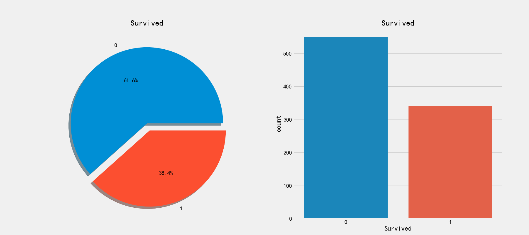
# View survival ratio
fig,axes = plt.subplots(1,2,figsize=(18,8))
train_df['Survived'].value_counts().plot.pie(explode=[0,0.1],autopct='%1.1f%%',ax=axes[0],shadow=True)
axes[0].set_title('Survived')
axes[0].set_ylabel(' ')

sns.countplot('Survived',data=train_df,ax=axes[1])
axes[1].set_title('Survived')
Here is only the data of the training set
Explore discrete features
Single feature
Only 38.4% of the personnel on the ship survived. Next, check the relationship between various attributes and retention!
# Relationship between gender and survival
fig,axes = plt.subplots(1,2,figsize=(18,8))
train_df[['Sex','Survived']].groupby(['Sex']).mean().plot.bar(ax=axes[0])
axes[0].set_title('Survived vs Sex')

sns.countplot('Sex',hue='Survived',data=train_df,ax=axes[1])
axes[1].set_title('Sex:Survived vs Dead')
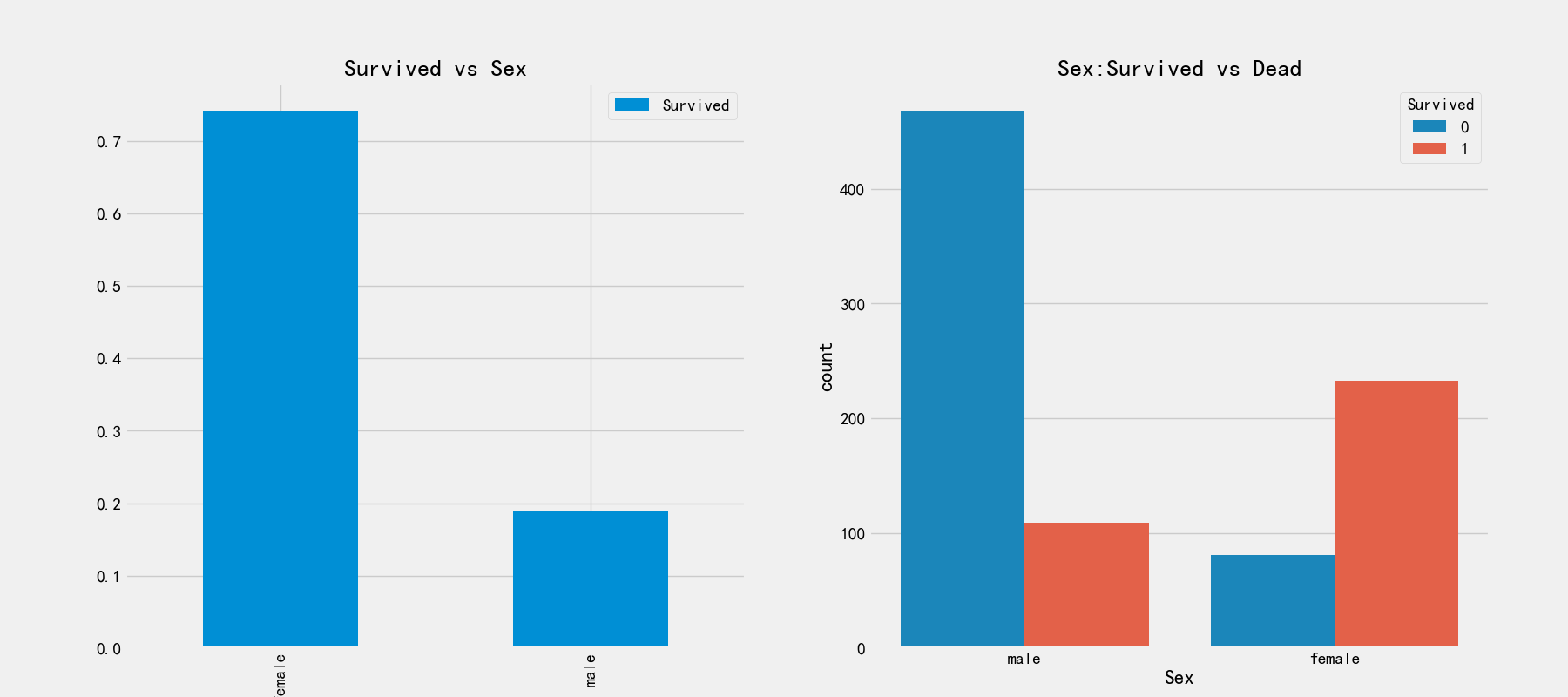
It can be seen from the first picture that the proportion of women rescued is 75%, while that of men is less than 20%. From the right picture, it can be observed that there are more men on board than women, but the survival rate is very low. This is a very distinguishing feature and must be used
Next, let's look at the relationship between cabin class and survival
# Relationship between cabin class and survival rate
print(pd.crosstab(train_df['Pclass'],train_df['Survived'],margins=True).style.background_gradient(cmap='summer_r'))

# Relationship between cabin class and survival rate
fig,axes = plt.subplots(1,2,figsize=(18,8))
train_df['Pclass'].value_counts().plot.bar(ax=axes[0])
axes[0].set_title('Number Of Passengers By Pclass')
axes[0].set_ylabel('Count')

sns.countplot('Pclass',hue='Survived',data=train_df,ax=axes[1])
axes[1].set_title('Pclass:Survived vs Dead')
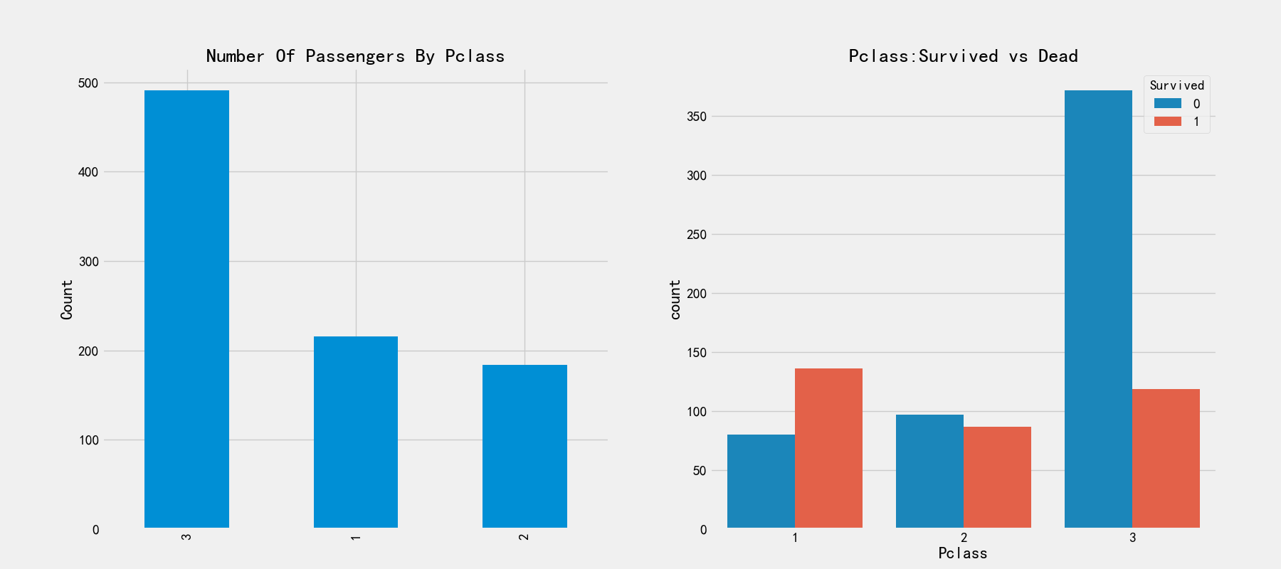
It can be seen from the figure on the left that the passengers with cabin registration of 3 are the lowest, but the corresponding survival rate in the figure on the right is very low. The survival rates of cabin registration of 1 and 2 are higher. We can analyze that the passengers in cabins 1 and 2 are high-level, rich and have a great chance of being rescued.
# Relationship between landing port and survival rate
fig,axes = plt.subplots(1,2,figsize=(18,8))
train_df['Embarked'].value_counts().plot.bar(ax=axes[0])
axes[0].set_title('Number Of Passengers By Embarked')
axes[0].set_ylabel('Count')

sns.countplot('Embarked',hue='Survived',data=train_df,ax=axes[1])
axes[1].set_title('Embarked:Survived vs Dead')
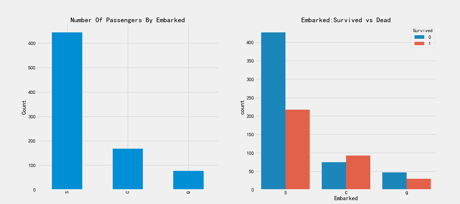
S. There is no significant difference between Q and S. s has the largest number of boarding. C. There are obvious differences between boarding ports. The number of boarding is the least, and the rescued proportion is higher than 50%. Let's remember this feature for the time being.
Let's now look at boarding ports and gender and survival
sns.barplot('Pclass','Survived',hue='Sex',data=train_df)

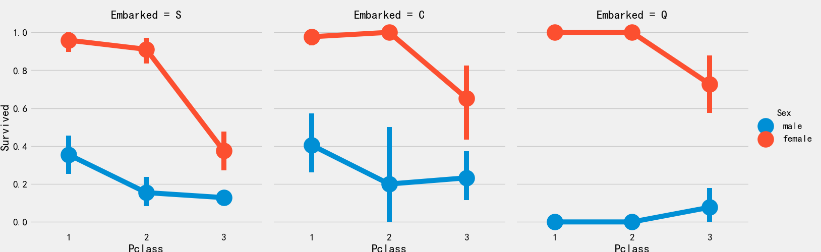
The survival rate of port 1 is relatively high, which is consistent with the previous analysis. The male survival rate of port 3 is the lowest, about 15%
Boarding port and cabin class and survival rate
sns.factorplot('Pclass','Survived',hue='Sex',col='Embarked',data=train_df)
plt.show()
Explore continuous features
# Age
print('Oldest Passenger was of:',train_df['Age'].max(),'Years')
print('Youngest Passenger was of:',train_df['Age'].min(),'Years')
print('Average Age on the ship:',train_df['Age'].mean(),'Years')
Oldest Passenger was of: 80.0 Years
Youngest Passenger was of: 0.42 Years
Average Age on the ship: 29.69911764705882 Years
# The effects of age, cabin class and gender on survival were visualized
fig,axes = plt.subplots(1,3,figsize=(18,8))
sns.violinplot('Pclass','Age',hue='Survived',data=train_df,split=True,ax=axes[0])
axes[0].set_title('Pclass and Age vs Survived')
axes[0].set_yticks(range(0,110,10))

sns.violinplot("Sex","Age", hue="Survived", data=train_df,split=True,ax=axes[1])
axes[1].set_title('Sex and Age vs Survived')
axes[1].set_yticks(range(0,110,10))

sns.violinplot("Embarked","Age", hue="Survived", data=train_df,split=True,ax=axes[2])
axes[2].set_title('Embarked and Age vs Survived')
axes[2].set_yticks(range(0,110,10))

Conclusion:
- The survival rate of children under 10 years old increased with the increase of the number of passenger s
- 20-50 year olds are more likely to be rescued
- Q port over 45 and under 5 years old are not likely to survive
Next, fill in the data
# Average age by group
train_df.groupby('Initial')['Age'].mean()
Initial
Master     4.574167
Miss      21.860000
Mr        32.739609
Mrs       35.981818
Other     45.888889
Name: Age, dtype: float64
# Fill in the missing values using the mean of each group
train_df.loc[(train_df.Age.isnull())&(train_df.Initial=='Mr'),'Age']=33
train_df.loc[(train_df.Age.isnull())&(train_df.Initial=='Mrs'),'Age']=36
train_df.loc[(train_df.Age.isnull())&(train_df.Initial=='Master'),'Age']=5
train_df.loc[(train_df.Age.isnull())&(train_df.Initial=='Miss'),'Age']=22
train_df.loc[(train_df.Age.isnull())&(train_df.Initial=='Other'),'Age']=46
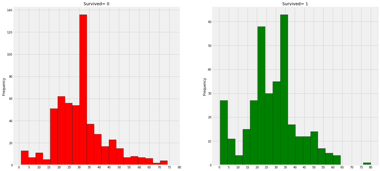
# Drawing visualization
fig,axes = plt.subplots(1,2,figsize=(20,10))
train_df[train_df['Survived']==0].Age.plot.hist(ax=axes[0],bins=20,edgecolor='black',color='red')
axes[0].set_title('Survived= 0')
x1 = list(range(0,85,5))
axes[0].set_xticks(x1)

train_df[train_df['Survived']==1].Age.plot.hist(ax=axes[1],color='green',bins=20,edgecolor='black')
axes[1].set_title('Survived= 1')
x2 = list(range(0,85,5))
axes[1].set_xticks(x2)
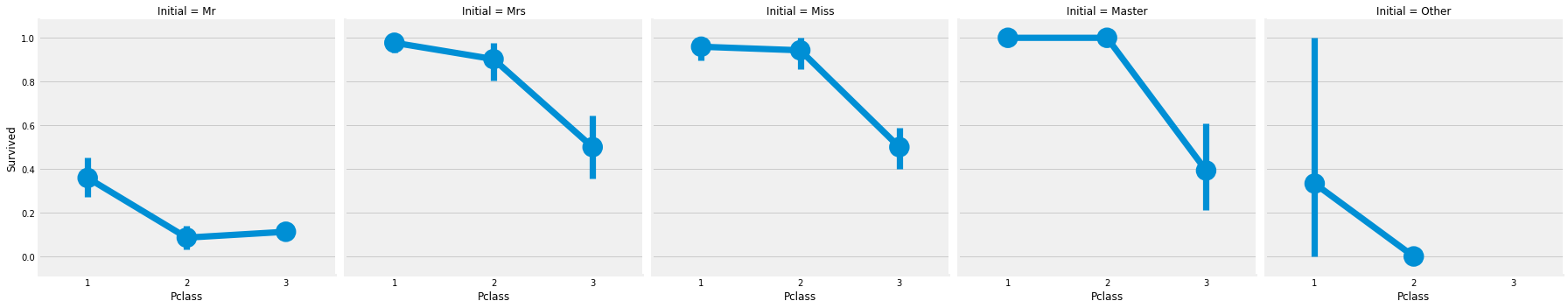
sns.factorplot('Pclass','Survived',col='Initial',data=train_df)
# Populate the embanked property with missing values
# Use the mode to fill in the missing value of port, and the mode is port S
train_df['Embarked'].fillna('S',inplace=True)
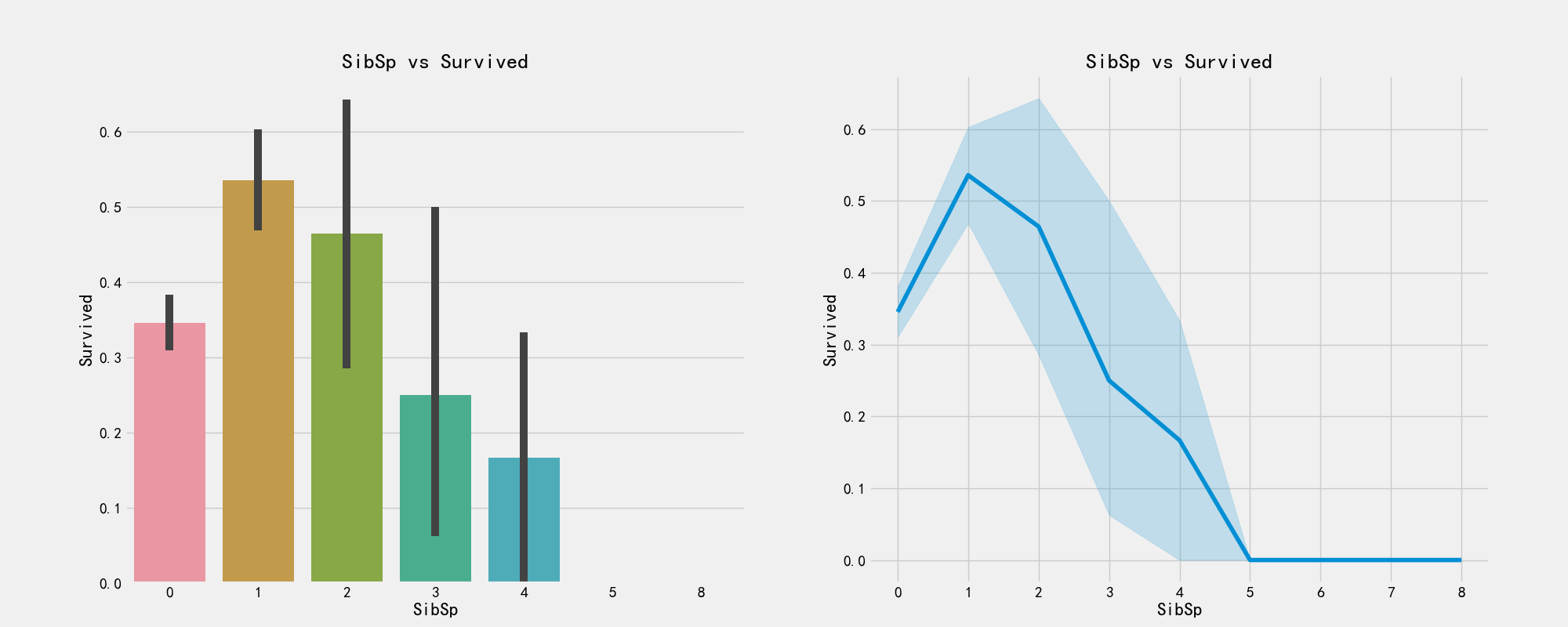
# Number of brothers and sisters
pd.crosstab(train_df['SibSp'],train_df['Survived']).style.background_gradient(cmap='summer_r')
# The plot shows the relationship between the number of siblings and survival
fig,axes = plt.subplots(1,2,figsize=(20,8))
sns.barplot('SibSp','Survived',data=train_df,ax=axes[0])
axes[0].set_title('SibSp vs Survived')

sns.factorplot('SibSp','Survived',data=train_df,ax=axes[1])
axes[1].set_title('SibSp vs Survived')

plt.close(2)
# Is there any relationship between brothers and sisters and cabin class
pd.crosstab(train_df['SibSp'],train_df['Pclass']).style.background_gradient(cmap='summer_r')
# Number of parents
pd.crosstab(train_df['Parch'],train_df['Pclass']).style.background_gradient(cmap='summer_r')
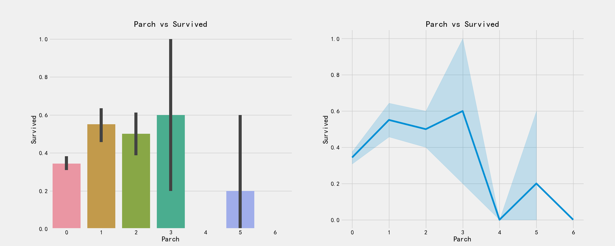
# The drawing visualizes whether there is a relationship between parents and children and survival
f,ax = plt.subplots(1,2,figsize=(20,8))
sns.barplot('Parch','Survived',data=train_df,ax=ax[0])
ax[0].set_title('Parch vs Survived')
sns.factorplot('Parch','Survived',data=train_df,ax=ax[1])
ax[1].set_title('Parch vs Survived')
plt.close(2)
plt.show()
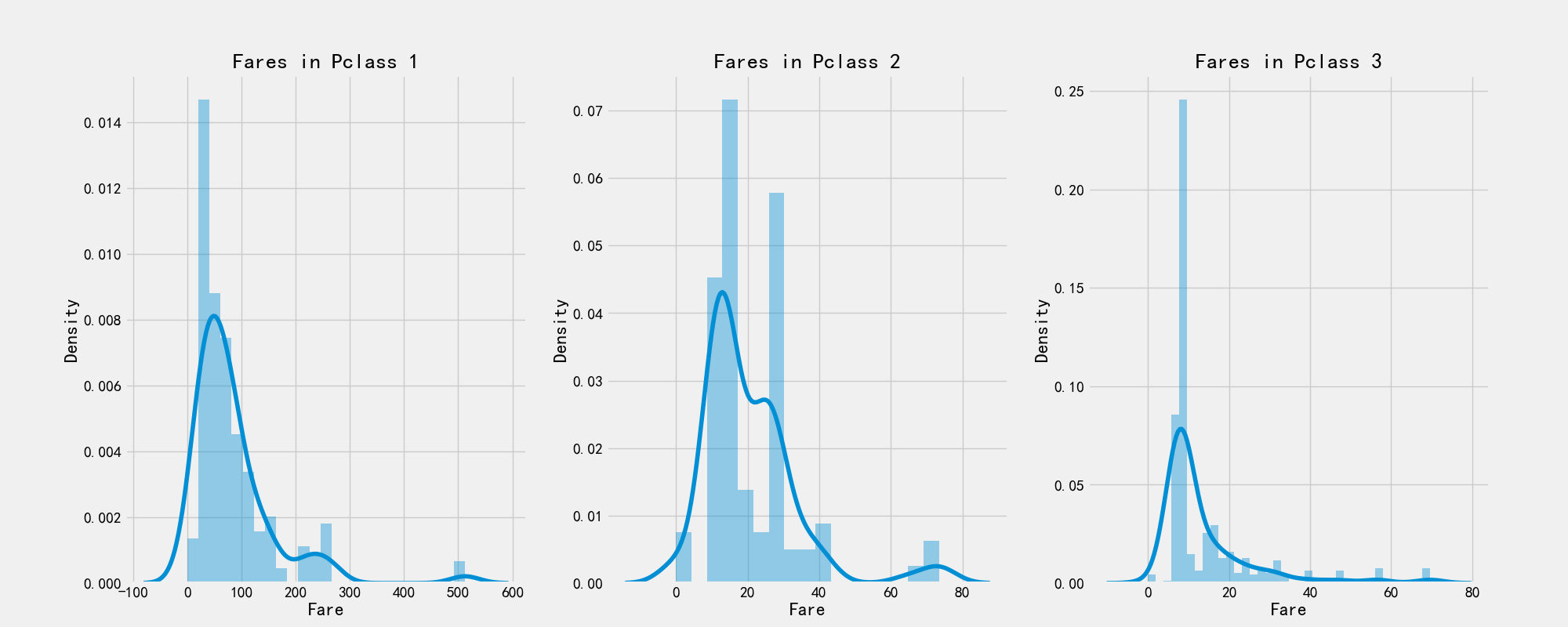
# Ticket price
print('Highest Fare was:',train_df['Fare'].max())
print('Lowest Fare was:',train_df['Fare'].min())
print('Average Fare was:',train_df['Fare'].mean())
Highest Fare was: 512.3292
Lowest Fare was: 0.0
Average Fare was: 32.204207968574636
# Drawing visualization
f,ax = plt.subplots(1,3,figsize=(20,8))
sns.distplot(train_df[train_df['Pclass']==1].Fare,ax=ax[0])
ax[0].set_title('Fares in Pclass 1')
sns.distplot(train_df[train_df['Pclass']==2].Fare,ax=ax[1])
ax[1].set_title('Fares in Pclass 2')
sns.distplot(train_df[train_df['Pclass']==3].Fare,ax=ax[2])
ax[2].set_title('Fares in Pclass 3')
- Gender: compared with men, women have a high chance of survival.
- Pclass: the survival rate of class I cabin is very high. Unfortunately, the survival rate of pclass3 is very low.
- Age: children younger than 5-10 years old have a high survival rate. Passengers between the ages of 15 and 35 die a lot.
- Port: there are also differences in the positions coming up, and the mortality is also great!
- Family: if you have 1-2 siblings, spouses or parents, you have a greater chance of survival than if you travel alone or with a large family.
II. Data cleaning
import pandas as pd
import matplotlib.pyplot as plt
plt.style.use('fivethirtyeight')
import seaborn as sns
import warnings
warnings.filterwarnings('ignore')
train_df = pd.read_csv(r'C:\Users\dahuo\Desktop\Dataset 2\train.csv')
print(train_df.columns)
# Draw a thermal map to see the correlation between the previous features
sns.heatmap(train_df.corr(),annot=True,cmap='RdYlGn',linewidths=0.2)

Missing value fill
Filling age missing value
train_df['Initial'] = train_df.Name.str.extract('([A-Za-z]+)\.')
train_df['Initial'].replace(['Mlle','Mme','Ms','Dr','Major','Lady','Countess','Jonkheer','Col','Rev','Capt','Sir','Don'],['Miss','Miss','Miss','Mr','Mr','Mrs','Mrs','Other','Other','Other','Mr','Mr','Mr'],inplace=True)
# Average age by group
train_df.groupby('Initial')['Age'].mean()
# Fill in the missing values using the mean of each group
train_df.loc[(train_df.Age.isnull())&(train_df.Initial=='Mr'),'Age']=33
train_df.loc[(train_df.Age.isnull())&(train_df.Initial=='Mrs'),'Age']=36
train_df.loc[(train_df.Age.isnull())&(train_df.Initial=='Master'),'Age']=5
train_df.loc[(train_df.Age.isnull())&(train_df.Initial=='Miss'),'Age']=22
train_df.loc[(train_df.Age.isnull())&(train_df.Initial=='Other'),'Age']=46
Fill in missing values
# Use mode S
train_df.Embarked.fillna('S',inplace=True)
train_df.Embarked.isnull().any()
Data cleaning
# Discretization of age characteristics
# The age distribution of passengers was divided into 5 groups, and the age interval of one group was 16
train_df.loc[train_df['Age']<=16,'Age_band'] = 0;
train_df.loc[(train_df['Age']>16)&(train_df['Age']<=32),'Age_band'] = 1;
train_df.loc[(train_df['Age']>32)&(train_df['Age']<=48),'Age_band'] = 2;
train_df.loc[(train_df['Age']>48)&(train_df['Age']<=64),'Age_band'] = 3;
train_df.loc[train_df['Age']>64,'Age_band'] = 4;
# Increase total household population
train_df['Family_num'] = train_df['Parch'] + train_df['SibSp']
# Whether to increase the characteristics of being alone
train_df['Alone'] = 0
train_df.loc[train_df['Family_num']==0,'Alone'] = 1;
fig,ax = plt.subplots(1,2,figsize=(18,6))
sns.factorplot('Family_num','Survived',data=train_df,ax=ax[0])
ax[0].set_title('Family_Size vs Survived')

sns.factorplot('Alone','Survived',data=train_df,ax=ax[1])
ax[1].set_title('Alone vs Survived')

plt.close(2)
plt.close(3)

It can be seen from the above figure that the possibility of surviving a lonely life is only 30%, which is quite different from those with relatives. At the same time, it can be seen that when the number of relatives > = 4, the possibility of surviving begins to decline
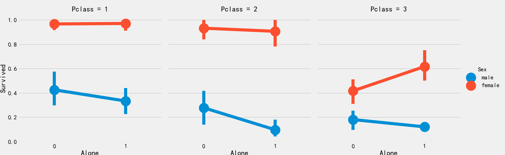
sns.factorplot('Alone','Survived',data=train_df,hue='Sex',col='Pclass')
# Ticket discretization
train_df['Fare_range'] = pd.qcut(train_df['Fare'],4)
train_df.groupby(['Fare_range'])['Survived'].mean().to_frame()
train_df.loc[train_df['Fare']<=7.91,'Fare_cat'] = 0
train_df.loc[(train_df['Fare']>7.91)&(train_df['Fare']<=14.454),'Fare_cat']=1
train_df.loc[(train_df['Fare']>14.454)&(train_df['Fare']<=31),'Fare_cat']=2
train_df.loc[(train_df['Fare']>31)&(train_df['Fare']<=513),'Fare_cat']=3
sns.lineplot('Fare_cat','Survived',hue='Sex',data=train_df)
plt.show()
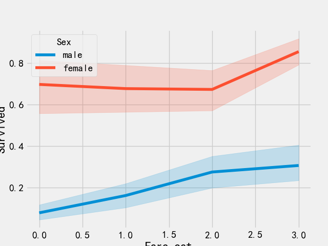
As can be seen from the above figure, the survival probability increases with the increase of ticket price
# Convert discrete features to numbers
train_df['Sex'].replace(['male','female'],[0,1],inplace=True)
train_df['Embarked'].replace(['S','C','Q'],[0,1,2],inplace=True)
train_df['Initial'].replace(['Mr','Mrs','Miss','Master','Other'],[0,1,2,3,4],inplace=True)
# Remove the characteristics of name, age, ticket number, ticket price, cabin number, etc
train_df.drop(['Name','Age','Ticket','Fare','Cabin','Fare_range','PassengerId'],axis=1,inplace=True)
train_df.info()
sns.heatmap(train_df.corr(),annot=True,cmap='RdYlGn',linewidths=0.2)
fig = plt.gcf()
fig.set_size_inches(18,15)
plt.xticks(fontsize=14)
plt.yticks(fontsize=14)
plt.show()

# Save the processed data temporarily
train_df.to_csv(r'C:\Users\dahuo\Desktop\Dataset 2\processed_train.csv',encoding='utf-8',index=False)
Three training model
import pandas as pd
import seaborn as sns
import matplotlib.pyplot as plt
from sklearn.linear_model import LogisticRegression
from sklearn import svm
from sklearn.ensemble import RandomForestClassifier
from sklearn.neighbors import KNeighborsClassifier
from sklearn.naive_bayes import GaussianNB
from sklearn.tree import DecisionTreeClassifier
from sklearn.model_selection import train_test_split
from sklearn import metrics
from sklearn.metrics import confusion_matrix


from sklearn.model_selection import KFold
from sklearn.model_selection import cross_val_score
from sklearn.model_selection import cross_val_predict

from sklearn.model_selection import GridSearchCV
Partition dataset
data = pd.read_csv(r'C:\Users\dahuo\Desktop\Dataset 2\processed_train.csv')
train_df,test_df = train_test_split(data,test_size=0.3,random_state=0,stratify=data['Survived'])

train_X = train_df[train_df.columns[1:]]
train_y = train_df[train_df.columns[:1]]

test_X = test_df[test_df.columns[1:]]
test_y = test_df[test_df.columns[:1]]

X = data[data.columns[1:]]
y = data['Survived']
SVM (Gaussian kernel)
model = svm.SVC(kernel='rbf',C=1,gamma=0.1)
model.fit(train_X,train_y)
prediction = model.predict(test_X)
metrics.accuracy_score(prediction,test_y)
SVM (linear)
model = svm.SVC(kernel='linear',C=0.1,gamma=0.1)
model.fit(train_X,train_y)
prediction = model.predict(test_X)
metrics.accuracy_score(prediction,test_y)
** LR**
model = LogisticRegression()
model.fit(train_X,train_y)
prediction = model.predict(test_X)
metrics.accuracy_score(prediction,test_y)
Decision tree
model = DecisionTreeClassifier()
model.fit(train_X,train_y)
prediction = model.predict(test_X)
metrics.accuracy_score(prediction,test_y)
KNN
model = KNeighborsClassifier(n_neighbors=9)
model.fit(train_X,train_y)
prediction = model.predict(test_X)
metrics.accuracy_score(prediction,test_y)
0.835820895522388
predict_arr = pd.Series()
for i in range(1,11):
    model = KNeighborsClassifier(n_neighbors=i)
    model.fit(train_X,train_y)
    prediction = model.predict(test_X)
    predict_arr = predict_arr.append(pd.Series(metrics.accuracy_score(prediction,test_y)))

# Drawing display
index = list(range(1,11))
plt.plot(index,predict_arr)
plt.xticks(list(range(0,11)))
print(predict_arr.values.max)

Naive Bayes
model = GaussianNB()
model.fit(train_X,train_y)
prediction = model.predict(test_X)
metrics.accuracy_score(prediction,test_y)
0.8134328358208955
Random forest
model = RandomForestClassifier(n_estimators=100)
model.fit(train_X,train_y)
prediction = model.predict(test_X)
metrics.accuracy_score(prediction,test_y)
Cross validation
kfold = KFold(n_splits=10,random_state=2019)
classifiers=['Linear Svm','Radial Svm','Logistic Regression','KNN','Decision Tree','Naive Bayes','Random Forest']
models = [svm.SVC(kernel='linear'),svm.SVC(kernel='rbf'),LogisticRegression(),KNeighborsClassifier(n_neighbors=9),DecisionTreeClassifier(),GaussianNB(),RandomForestClassifier(n_estimators=100)]

mean = []
std = []
auc = []
for model in models:
    res = cross_val_score(model,X,y,cv=kfold,scoring='accuracy')
    mean.append(res.mean())
    std.append(res.std())
    auc.append(res)

res_df = pd.DataFrame({'Mean':mean,'Std':std},index=classifiers)
Draw the box diagram corresponding to each algorithm
plt.subplots(figsize=(12,6))
box = pd.DataFrame(auc,index=[classifiers])
box.T.boxplot()


Draw the confusion matrix and give the number of correct and incorrect classifications
fig,ax = plt.subplots(3,3,figsize=(12,10))

y_pred = cross_val_predict(svm.SVC(kernel='rbf'),X,y,cv=10)
sns.heatmap(confusion_matrix(y,y_pred),ax=ax[0,0],annot=True,fmt='2.0f')
ax[0,0].set_title('Matrix for rbf-SVM')

y_pred = cross_val_predict(svm.SVC(kernel='linear'),X,y,cv=10)
sns.heatmap(confusion_matrix(y,y_pred),ax=ax[0,1],annot=True,fmt='2.0f')
ax[0,1].set_title('Matrix for Linear-SVM')

y_pred = cross_val_predict(KNeighborsClassifier(n_neighbors=9),X,y,cv=10)
sns.heatmap(confusion_matrix(y,y_pred),ax=ax[0,2],annot=True,fmt='2.0f')
ax[0,2].set_title('Matrix for KNN')

y_pred = cross_val_predict(RandomForestClassifier(n_estimators=100),X,y,cv=10)
sns.heatmap(confusion_matrix(y,y_pred),ax=ax[1,0],annot=True,fmt='2.0f')
ax[1,0].set_title('Matrix for Random-Forests')

y_pred = cross_val_predict(LogisticRegression(),X,y,cv=10)
sns.heatmap(confusion_matrix(y,y_pred),ax=ax[1,1],annot=True,fmt='2.0f')
ax[1,1].set_title('Matrix for Logistic Regression')

y_pred = cross_val_predict(DecisionTreeClassifier(),X,y,cv=10)
sns.heatmap(confusion_matrix(y,y_pred),ax=ax[1,2],annot=True,fmt='2.0f')
ax[1,2].set_title('Matrix for Decision Tree')

y_pred = cross_val_predict(GaussianNB(),X,y,cv=10)
sns.heatmap(confusion_matrix(y,y_pred),ax=ax[2,0],annot=True,fmt='2.0f')
ax[2,0].set_title('Matrix for Naive Bayes')
plt.subplots_adjust(hspace=0.2,wspace=0.2)
plt.show()

Super parameter setting using grid search
C = [0.05,0.1,0.2,0.3,0.25,0.4,0.5,0.6,0.7,0.8,0.9,1]
gamma = [0.1,0.2,0.3,0.4,0.5,0.6,0.7,0.8,0.9,1.0]
kernel = ['rbf','linear']

hyper = {'kernel':kernel,'C':C,'gamma':gamma}
gd = GridSearchCV(estimator=svm.SVC(),param_grid=hyper,verbose=True)
gd.fit(X,y)
print(gd.best_estimator_)
print(gd.best_score_)
C = 0.5
gamma = 0.1
n_estimators = range(100,1000,100)
hyper = {'n_estimators':n_estimators}

gd = GridSearchCV(estimator=RandomForestClassifier(random_state=0),param_grid=hyper,verbose=True)
gd.fit(X,y)
print(gd.best_score_)
print(gd.best_estimator_)
                         Mean       Std
Linear Svm           0.790075  0.033587
Radial Svm           0.828240  0.036060
Logistic Regression  0.809213  0.022927
KNN                  0.809176  0.026277
Decision Tree        0.817004  0.046226
Naive Bayes          0.803620  0.037507
Random Forest        0.815880  0.038200
Fitting 5 folds for each of 240 candidates, totalling 1200 fits
SVC(C=0.4, gamma=0.3)
0.8282593685267716
Fitting 5 folds for each of 9 candidates, totalling 45 fits
0.819327098110602
RandomForestClassifier(n_estimators=300, random_state=0)
Four model fusion
import pandas as pd
import seaborn as sns
import matplotlib.pyplot as plt

from sklearn.model_selection import KFold
from sklearn.model_selection import cross_val_score
from sklearn.model_selection import cross_val_predict
from sklearn.model_selection import GridSearchCV


from sklearn.linear_model import LogisticRegression
from sklearn import svm
from sklearn.ensemble import RandomForestClassifier
from sklearn.neighbors import KNeighborsClassifier
from sklearn.naive_bayes import GaussianNB
from sklearn.tree import DecisionTreeClassifier
from sklearn.model_selection import train_test_split
from sklearn import metrics
from sklearn.metrics import confusion_matrix

from sklearn.ensemble import VotingClassifier
import xgboost as xgb
from sklearn.ensemble import AdaBoostClassifier


data = pd.read_csv(r'C:\Users\dahuo\Desktop\Dataset 2\processed_train.csv')
train_df,test_df = train_test_split(data,test_size=0.3,random_state=0,stratify=data['Survived'])

train_X = train_df[train_df.columns[1:]]
train_y = train_df[train_df.columns[:1]]

test_X = test_df[test_df.columns[1:]]
test_y = test_df[test_df.columns[:1]]

X = data[data.columns[1:]]
y = data['Survived']


#Voting classifier
estimators = [
    ('linear_svm',svm.SVC(kernel='linear',probability=True)),
    ('rbf_svm',svm.SVC(kernel='rbf',C=0.5,gamma=0.1,probability=True)),
    ('lr',LogisticRegression(C=0.05)),
    ('knn',KNeighborsClassifier(n_neighbors=10)),
    ('rf',RandomForestClassifier(n_estimators=500,random_state=0)),
    ('dt',DecisionTreeClassifier(random_state=0)),
    ('nb',GaussianNB())
]
vc = VotingClassifier(estimators=estimators,voting='soft')
vc.fit(train_X,train_y)
print('The accuracy for ensembled model is:',vc.score(test_X,test_y))

# cross = cross_val_score(vc,X,y,cv=10,scoring='accuracy')
# mean=cross.mean()
# print(mean)


#xgboost
fig,ax = plt.subplots(2,2,figsize=(15,12))
model = xgb.XGBClassifier(n_estimators=900,learning_rate=0.1)
model.fit(X,y)
pd.Series(model.feature_importances_,X.columns).sort_values(ascending=True).plot.barh(width=0.8,ax=ax[0,0])
ax[0,0].set_title('Feature Importance in XgBoost')
plt.grid()

model = RandomForestClassifier(n_estimators=500,random_state=0)
model.fit(X,y)
pd.Series(model.feature_importances_,X.columns).sort_values(ascending=True).plot.barh(width=0.8,ax=ax[0,1])
ax[0,1].set_title('Feature Importance in Random Forest')
plt.grid()

model=AdaBoostClassifier(n_estimators=200,learning_rate=0.05,random_state=0)
model.fit(X,y)
pd.Series(model.feature_importances_,X.columns).sort_values(ascending=True).plot.barh(width=0.8,ax=ax[1,0])
ax[1,0].set_title('Feature Importance in Random Forest')
plt.grid()

model = RandomForestClassifier(n_estimators=500,random_state=0)
model.fit(X,y)
pd.Series(model.feature_importances_,X.columns).sort_values(ascending=True).plot.barh(width=0.8,ax=ax[0,1])
ax[0,1].set_title('Feature Importance in Random Forest')

plt.grid()
plt.show()
