abstract
- This article is about the study and summary of UGUI component Slider
- For better learning, we will analyze the component from the perspective of "self-made imitation", and finally make a simple Slider as the end.
Basic elements of Slider
- As a sliding rod, its main feature is sliding. Therefore, it must have a control that supports dragging, and dragging is limited by rules and cannot be dragged at will.
- In terms of visual effect, the sliding rod must reflect the current sliding amount, so a picture supporting dynamic length change is needed.
- In terms of actual function, it should also be able to represent the current sliding amplitude value. Slider is different from toggle. Toggle is a control that represents binary values. The slider is a control that can represent continuous values. If full close is set to 0 and full open is set to 1, it will be 0 when the slider does not slide, and the value in the sliding process will gradually change from 0 to 1.
Slider of UGUI
Unity preset Slider composition analysis
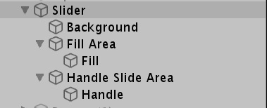
- The above is the expanded view of Slider. It can be seen from the observation that Slider, FillArea and HandleSliderArea are components that do not participate in graphics rendering. The main purpose of FillArea and HandleSliderArea is the adaptive setting of Rectransform
- Background is the bottom picture of the Slider, while Fill is the picture used to show the sliding range. Handle is the picture of the drag event
- From the actual interaction experience, when dragging the sliding handle, the sliding handle and filling picture are moved by changing the stretching scheme and setting the Anchor
Inspector window parameters
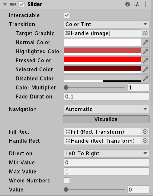
- From a simple observation, we can divide the parameters into upper and lower parts. The upper part is the same parameter as the Button, and the lower part is the unique parameter of the Slider
- Looking at the target Graphic in the upper part, we can see that the rendered object is Handle, that is, the UI that realizes drag and drop interaction. Therefore, the UI has the same visual performance as the Button.
- Check the two parameters FillRect and HandleRect in the lower part. Both of them are of Rect Transform type. These two parameters mainly control the changes of RectTransform during the interaction of the specified UI.
- Direction is the way to set up interaction
- MinValue and MaxValue are the values set when there is no sliding at all and when sliding to the bottom
- Whole Numbers is a Boolean value, which indicates whether the value is an integer value. If it is true, the value below can only be expressed as an integer. If min is 0 at the same time. If max is 1, then value becomes a binary value of 0 / 1
- Value will change dynamically according to the sliding amplitude and the settings of the above three parameters, and the value can be captured by the outside world
Slider common members
- Value: floating point attribute. You can get the current value or set a new value. After setting a new value, the UI sliding performance will change accordingly
- onValueChange: delegate, which can add event listener, with floating-point parameters as the input of value
Self made Slider
- Carefully observing the interaction process of the Slider, we can find that the filling picture and the movement of the drag bar are realized by constantly updating the anchor point and maintaining the anchor position. The specific process is complex. We use a simpler way: modify the length and abscissa (which means not making a variety of drag layouts, such as sliding bars from top to bottom)
- We know that only the parent object of the Slider has the Slider component to realize various interactive behaviors including drag and drop. The slide bars are pictures without special settings. This shows that its internal implementation rewrites the underlying radiographic detection logic. Here, taking advantage of the feature that ray detection can penetrate the parent object, we set the Raycast Target of the UI that does not need to receive ray detection, including the parent object, to false, which only ensures that only the Slider can be detected, so that only the Slider can show the interactive visual effect of the Button and provide support for the drag function.
- Because the Slider involves the knowledge points of the more complex RectTransform, only part of the implementation is given here.
public class CSlider : MonoBehaviour, IPointerEnterHandler, IPointerUpHandler, IPointerExitHandler, IPointerDownHandler, IPointerClickHandler,
        IDragHandler
    {
        #region Inspector Setting
        [SerializeField] private bool interactivable;
        [SerializeField] private Image targetImage;
        [SerializeField] private Text targetText;
        [SerializeField] private Color normalColor;
        [SerializeField] private Color highlightColor;
        [SerializeField] private Color pressedColor;
        [SerializeField] private Color selectColor;
        [SerializeField] private Color disableColor;

        [SerializeField] private RectTransform fillRect;
        [SerializeField] private RectTransform handleRect;
        [SerializeField] private float minValue;
        [SerializeField] private float maxValue;
        [SerializeField] private bool wholeNumebrs;
        [SerializeField] private float value;
        #endregion

        #region callBack Methods

        private void Awake()
        {
            if (interactivable)
            {
                if (targetImage != null)
                    targetImage.color = normalColor;
                if (targetText != null)
                    targetText.color = normalColor;
            }
            else
            {
                if (targetImage != null)
                    targetImage.color = disableColor;
                if (targetText != null)
                    targetText.color = disableColor;
            }
        }

        //focusing
        public void OnPointerEnter(PointerEventData eventData)
        {
            if (!Interactivable) return;
            //When focused, the color changes to a high bright color
            if (targetImage != null)
                targetImage.color = highlightColor;
            if (targetText != null)
                targetText.color = highlightColor;
        }

        //Defocus
        public void OnPointerExit(PointerEventData eventData)
        {
            if (!Interactivable) return;
            if (targetImage != null)
                targetImage.color = normalColor;
            if (targetText != null)
                targetText.color = normalColor;
        }

        //Click
        public void OnPointerDown(PointerEventData eventData)
        {
            if (!Interactivable) return;
            if (targetImage != null)
                targetImage.color = pressedColor;
            if (targetText != null)
                targetText.color = pressedColor;
        }
        //release
        public void OnPointerUp(PointerEventData eventData)
        {
            if (!Interactivable) return;

            if (targetImage != null)
                targetImage.color = selectColor;
            if (targetText != null)
                targetText.color = selectColor;
        }
        //click
        public void OnPointerClick(PointerEventData eventData)
        {
            onClickEvent?.Invoke(value);
        }

        public void OnDrag(PointerEventData eventData)
        {
            //Update the position of the slide bar
            //Calculate the current sliding rod proportion
            //Set a new value according to the proportion
            //Update the length and position of the filler
        }
        #endregion

        #region code read-in references
        //Click delegate
        public Action<float> onClickEvent { set; get; }
        //Can I interact
        public bool Interactivable { set => interactivable = value; get => interactivable; }
        //Control rendered objects
        public Image TargetImage { set => targetImage = value; get => targetImage; }
        public Text TargetText { set => targetText = value; get => targetText; }

        //Color of normal state
        public Color NormalColor { set => normalColor = value; get => normalColor; }
        //Color of focus state
        public Color HighlightColor { set => highlightColor = value; get => highlightColor; }
        //Color of click status
        public Color PressedColor { set => pressedColor = value; get => pressedColor; }
        //Color of the selected state
        public Color SelectColor { set => selectColor = value; get => selectColor; }
        //Color of disabled state
        public Color DisableColor { set => disableColor = value; get => disableColor; }

        public RectTransform FillRect { set => fillRect = value; get => fillRect; }

        public RectTransform HandleRect { set => handleRect = value; get => handleRect; }

        public float MinValue { set => minValue = value; get => minValue; }
        public float MaxValue { set => maxValue = value; get => maxValue; }

        #endregion
    }