Understand the background size in CSS3
Reading catalog
- Basic attributes of background size
- Set a fixed width and height for the picture
- Fixed width 400px and height 200px - use background - size:400px 200px zoom settings
- Fixed width 400px and height 200px - background size: 400px; The second parameter is automatically converted to auto
- Fixed width 400px and height 200px - use the background size: 100% zoom setting
- Fixed width 400px and height 200px - use the background size: 100% zoom setting
- Use the attribute cover to set the background picture
- Use the attribute contain to set the background picture
- Set the width attribute of the picture to 100%; Highly adaptive
- Use another way to solve the problem of image adaptation - image adaptation
- Use padding top: (percentage) to realize the responsive background picture
Basic attributes of background size
Background size: you can set the size of the background image. This attribute is in css3. It is used in many places on the mobile terminal. For example, when making responsive layout in the most common places, for example, there are rotating pictures in previous projects. In order to adapt to pictures of different sizes and resolutions, We need to use the media query in css3 to set the width and height for different resolutions. Although this method can solve the problem, the solution is not very good and cumbersome. Of course, we also want to directly use the percentage to set the size of the picture, such as width: 100%, height: 100%; However, setting 100% of the height of the image does not take effect, and the image is not displayed, because no specific height value is set, and there is no height when the browser renders. Therefore, the solution at that time was to use the media query in css3 to scale different height (height) in equal proportion to different resolutions; Today, we will learn the specific attribute value of background size again, and use a new method to solve the background image adaptation for responsive layout.
Degree of browser support: IE9 +, Firefox 4 +, opera, chrome, safari5 +;
Basic syntax: background size: length | percentage | cover | contain;
1: length
This attribute value sets the width and height of the background image. The first value is the width and the second value is the height. If only the first value is set, the second value will be automatically converted to "auto";
2: percentage
This attribute sets the width and height of the picture as a percentage of the parent element. The first value is the width and the second value is the height. If only one value is set, the second value will be set to "auto";
3: cover
Expand the image to the background large enough to completely cover the background.
4: contain
Expand the image to the maximum size so that the width and height fully fit the content area.
Set a fixed width and height for the picture
Now let's do some demo s to realize the basic use methods of the above attribute values;
The html code of the basic original image is as follows:
<h3>Original drawing</h3>
<div class="images"><img src="http://images2015.cnblogs.com/blog/561794/201603/561794-20160310002800647-50077395.jpg" width="100%"/></div>
The effect is shown in the following figure:

The code to set a fixed width and height for the picture is as follows:
For example, set a picture with a fixed width of 400px and a height of 200px;
The HTML code is as follows:
This code is by Java Architect must see network-Structure Sorting
<h3>Fixed width 400 px And height 200 px Picture after</h3>
<div class="bsize1"></div>
css code is as follows:
.bsize1 {
     width:400px;
     height:200px;
     background: url("http://images2015.cnblogs.com/blog/561794/201603/561794-20160310002800647-50077395.jpg") no-repeat;
     border:1px solid red;
     overflow: hidden;
  }
The effect is as follows:

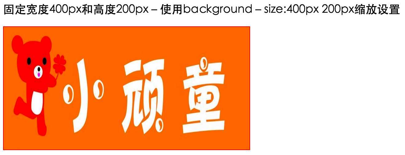
Fixed width 400px and height 200px - use background - size:400px 200px zoom settings
2. Fixed width 400px and height 200px - use background size: 400px and 200px zoom settings;
The HTML code is as follows:
This code is by Java Architect must see network-Structure Sorting
<h3>Fixed width 400 px And height 200 px-use background-size:400px 200px Zoom settings</h3>
<div class="bsize1 bsize2"></div>
css code is as follows:
.bsize2 {
         background-size: 400px 200px;
  }
The effect is as follows:
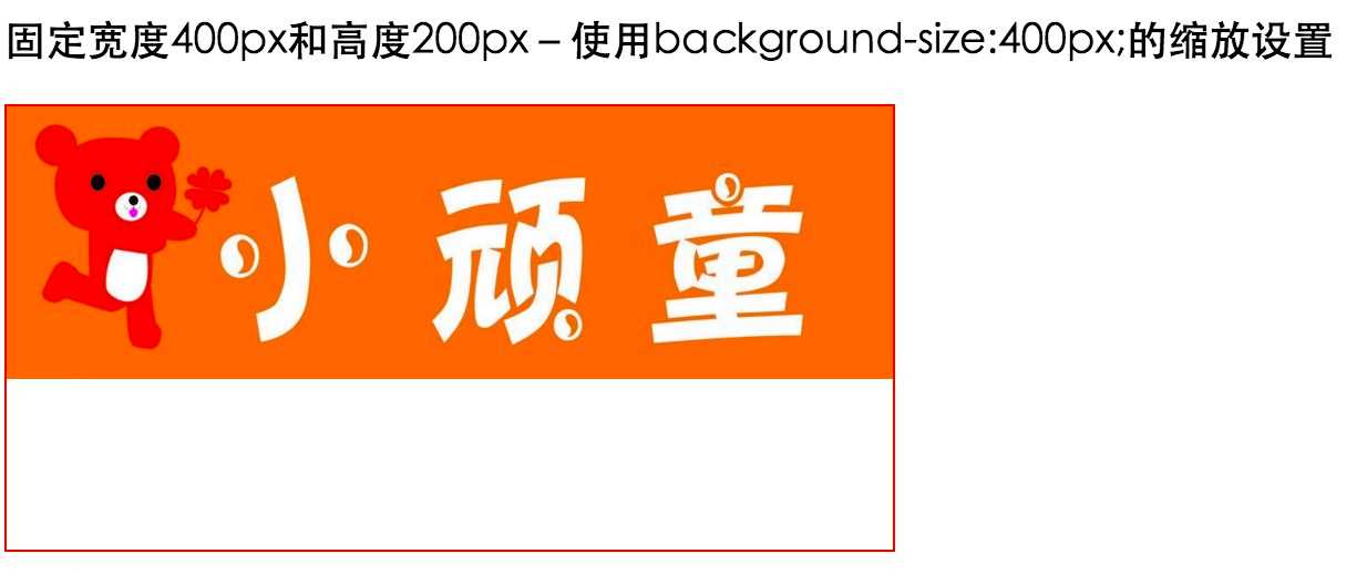
Fixed width 400px and height 200px - background size: 400px; Zoom settings for
3. Fixed width 400px and height 200px - background size: 400px; The second parameter will be automatically converted to auto;
The HTML code is as follows:
<h3>Fixed width 400 px And height 200 px-use background-size:400px;Zoom settings for</h3>
<div class="bsize1 bsize3"></div>
css code is as follows:
.bsize3 {
         background-size: 400px;
 }
The effect is as follows:
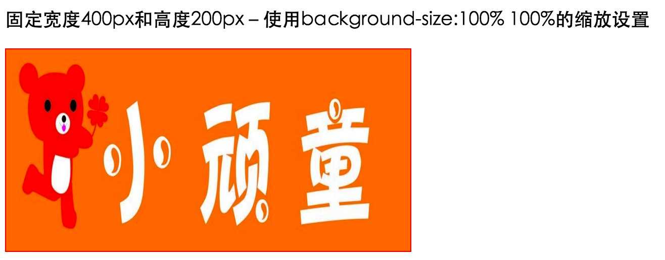
Fixed width 400px and height 200px - use the background size: 100% zoom setting
4. Fixed width 400px and height 200px - use the background size: 100% zoom setting
The HTML code is as follows:
<h3>Fixed width 400 px And height 200 px-use background-size:100% 100%Zoom settings for</h3>
<div class="bsize1 bsize4"></div>
css code is as follows:
.bsize4 {
        background-size:100% 100%;
  }
The effect is as follows:
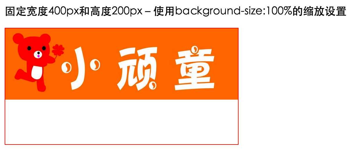
Fixed width 400px and height 200px - use the background size: 100% zoom setting
5. Fixed width 400px and height 200px - use the background size: 100% zoom setting.
The HTML code is as follows:
<h3>Fixed width 400 px And height 200 px-use background-size:100%Zoom settings for</h3>
<div class="bsize1 bsize5"></div>
css code is as follows:
.bsize5 {
         background-size: 100%;
  }
As follows:
Use the attribute cover to set the background picture
6. Use the attribute cover to set the background picture.
The HTML code is as follows:
<h3>Use properties cover To set the background picture</h3>
<div class="bsize1 cover"></div>
css code is as follows:
.cover {
        background-size:cover;
 }
The effect is as follows:

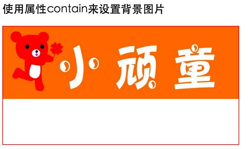
Use the attribute contain to set the background picture
7. Use the attribute contain to set the background picture.
The HTML code is as follows:
<h3>Use properties contain To set the background picture</h3>
<div class="bsize1 contain"></div>
css code is as follows:
.contain {
        background-size:contain;
  }
The effect is as follows:
Set the width attribute of the picture to 100%; Highly adaptive
8. Next, we use pictures. If we set the attribute width = 100% for the picture without using background pictures, its height will be adaptive. The following HTML code:
<h3>Set the attribute width of the picture to 100%In case of, the picture can be adaptive</h3>
<div class="bsize-padding"><img src="http://images2015.cnblogs.com/blog/561794/201603/561794-20160310002800647-50077395.jpg" width="100%"/></div>
The effect is as follows:

Use another way to solve the problem of image adaptation - image adaptation
9. Use another way to solve the problem of image adaptation - image adaptation. If the image width is set to 100%, there will be a problem of height collapse when the page is loaded. You can use padding top to set the percentage value to realize adaptation. Padding top = (image height / image width) * 100;
The following HTML code:
<h3>Picture adaptation problem, picture width setting 100%,There will be a problem of high collapse when the page is loaded</h3>
<p>have access to padding-top To set the percentage value for adaptation padding-top = (Height of picture/Width of picture)*100</p>
<div class="cover-paddingTop">
      <img src="http://images2015.cnblogs.com/blog/561794/201603/561794-20160310002800647-50077395.jpg"/>
 </div>
css code is as follows:
.cover-paddingTop {
       position: relative;
       padding-top: 50%;
       overflow: hidden;
  }
 .cover-paddingTop img{
      width:100%;
      position: absolute;
      top:0;
  }
The effect is as follows:

Use padding top: (percentage) to realize the responsive background picture
10. Use padding top: (percentage) to realize the responsive background picture
As we all know, when dealing with responsive layout, the background pictures are scaled equally. For example, if the above pictures are used, if the pictures introduced by < img / > are used, set their width attribute to 100%< IMG SRC = "width =" 100% "/ > the height will be scaled equally. This is a picture, but what if it is a background picture? The common practice in our previous projects is to scale the height of the background image in equal proportion according to the resolution of different mobile phones. Although this method can solve the problem, this way of setting through human flesh is not good and cumbersome, Today, we will learn to use the attribute padding top to set it;
Basic principle of implementation: the skill of maintaining the aspect ratio of the element will be used to add the value of padding top in the vertical direction to the element in the form of percentage. This value is determined relative to the width of the element. For example, the width of a picture above me is 1024px and the height is 316px; So now
Padding top = (height / width) * 100% = (316 / 1024) * 100% = 30.85%;
However, it is not enough to scale the height and width of the image. We must also add background size: cover to make the background covered with elements, but IE8 and below do not support this attribute. Therefore, in order to be compatible with the browser under ie, we need to add another attribute background position: Center; At the same time, we should also ensure that the width of the picture is at most equal to the width of the parent container; Therefore, the following HTML code is as follows:
<h3>use padding-top Achieve responsive pictures(The width of the picture is 1024 px,The height is 316 px)</h3>
 <div class="column">
       <div class="figure"></div>
  </div>
css code is as follows:
.column{
        max-width: 1024px;
 }
 .figure {
         padding-top:30.85%; /* 316 / 1024 */
         background: url("http://images2015.cnblogs.com/blog/561794/201603/561794-20160310002800647-50077395.jpg") no-repeat;
          background-size:cover;
          background-position:center;
    }
The effect is as follows:

Note: you can copy the code to the browser for specific effects