When it comes to Web pages, you may first think of HTML, CSS or JavaScript.
This time I'll introduce you how to make a data visualization web page with Python, using the Streamlit library.
Easily convert an Excel data file into a Web page for everyone to view online.
Whenever you save changes to Excel files, Web pages can be updated in real time. It's really good.
Streamlit's documentation and tutorials are addressed below.
https://docs.streamlit.io/en/stable/
https://streamlit.io/gallery
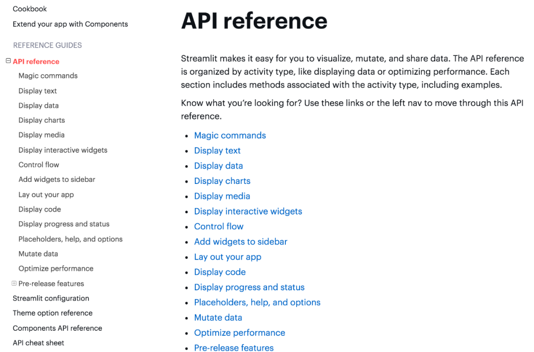
Relevant API usage can be viewed in the document, which has detailed explanations.
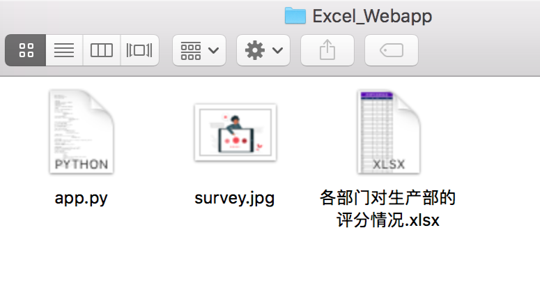
There are three files in the project: program, picture and Excel data.
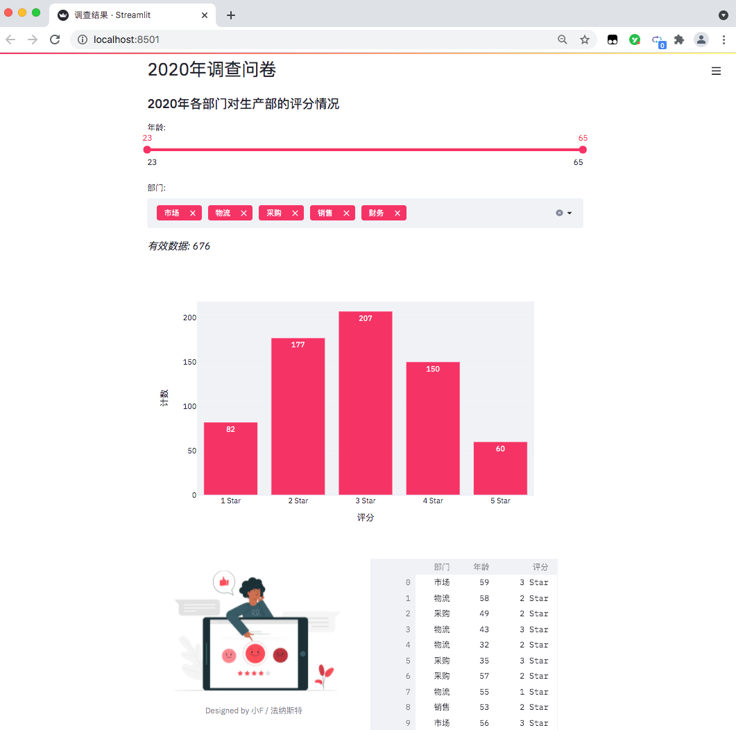
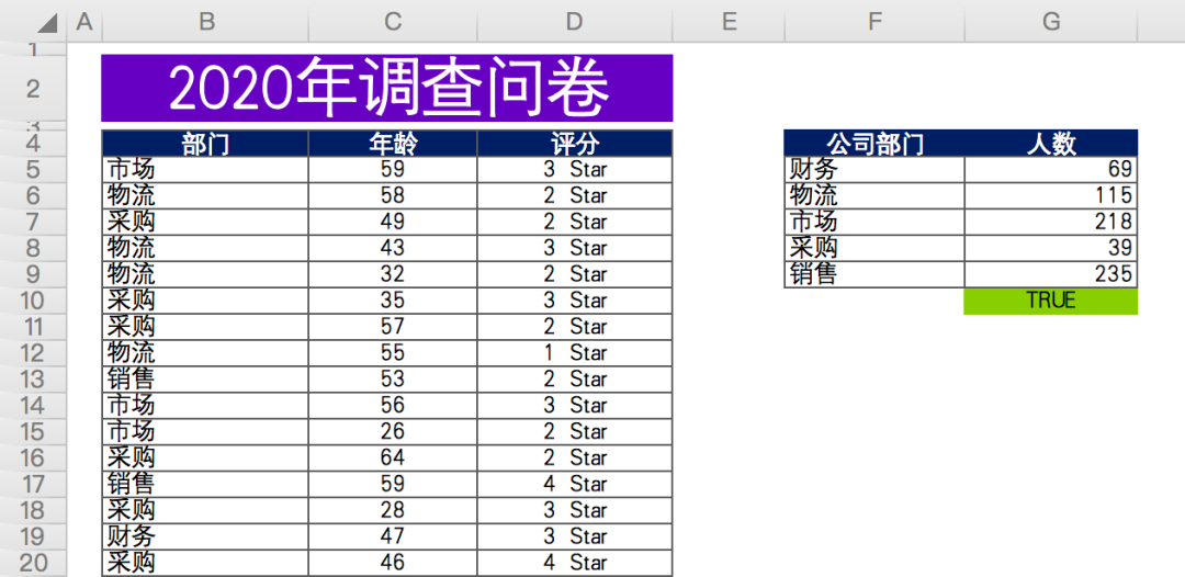
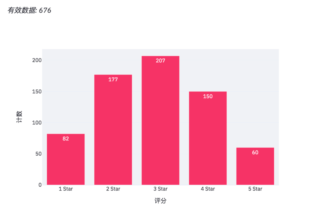
The data is as follows: in a questionnaire survey (fictitious data) conducted by a company at the end of the year, the relevant departments scored the work cooperation of the production department.
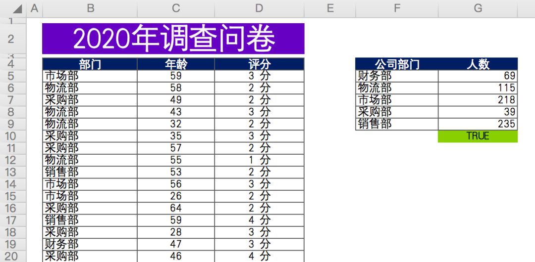
There are about 676 valid data in total, including anonymous questionnaire, including the Department, age and score of the person who filled in the questionnaire.
Finally, summarize and count the number of participants in each department (data on the right).
First, install the relevant Python library and use Baidu source.
#Installing streamlit
pip install streamlit -i https://mirror.baidu.com/pypi/simple/

#Install plot Express
pip install plotly_express==0.4.0 -i https://mirror.baidu.com/pypi/simple/

#Install xlrd
pip install xlrd==1.2.0 -i https://mirror.baidu.com/pypi/simple/
Because our data files are in xlsx format, the latest version of xlrd only supports xls files.
Therefore, you need to specify the xlrd version as 1.2.0 so that pandas can successfully read the data.
The command line terminal starts the web page.
#The path where the command line terminal opens the file
cd Excel_Webapp

#Run web page
streamlit run app.py
After success, there will be a prompt, and the browser will automatically pop up the web page.
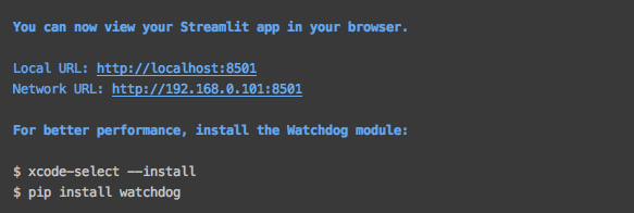
If it does not pop up automatically, you can directly access the address in the figure above.
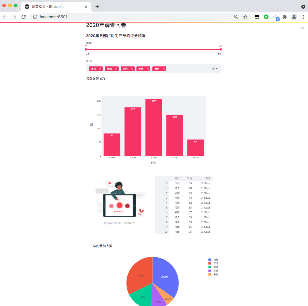
The results are as follows: a data visualization web page comes out.
At present, it can only be accessed locally. If you want to put it online, you can deploy it through the server and need to study it by yourself
Let's take a look at the specific code.
import pandas as pd
import streamlit as st
import plotly.express as px
from PIL import Image
#Set page name
st.set_page_config(page_title='Findings')
#Set page title
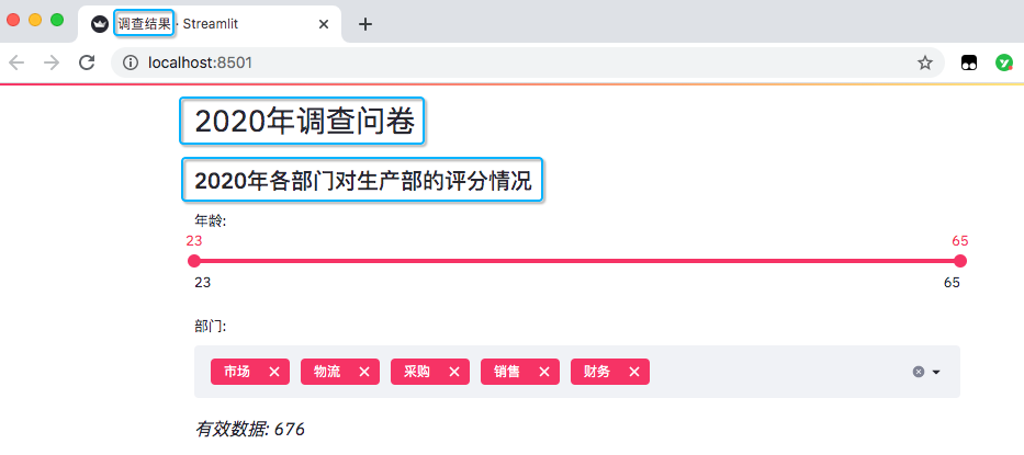
st.header('2020 Annual questionnaire')
#Set page subtitle
st.subheader('2020 Evaluation of production department by each department in')
Import relevant Python packages, pandas process data, and streamlit is used to generate web pages, plot Express generates charts and PIL reads pictures.
Set the page name, as well as the title and subtitle in the page.
#Read data
excel_file = 'Scoring of production department by each department.xlsx'
sheet_name = 'DATA'

df = pd.read_excel(excel_file,
                   sheet_name=sheet_name,
                   usecols='B:D',
                   header=3)

#Here is the number of people participating in the questionnaire survey of each department
df_participants = pd.read_excel(excel_file,
                                sheet_name=sheet_name,
                                usecols='F:G',
                                header=3)
df_participants.dropna(inplace=True)

#Multiple selection of streamlit (option data)
department = df['department'].unique().tolist()
#Slide bar for streamlit (age data)
ages = df['Age'].unique().tolist()
Read the Excel data and get the age distribution and department information. There are five departments in total.
Add data options for sliders and multiple selections.
#Sliding bar, maximum value, minimum value, interval value
age_selection = st.slider('Age:',
                          min_value=min(ages),
                          max_value=max(ages),
                          value=(min(ages), max(ages)))

#Multiple selection, select all by default
department_selection = st.multiselect('department:',
                                      department,
                                      default=department)
The results are as follows.
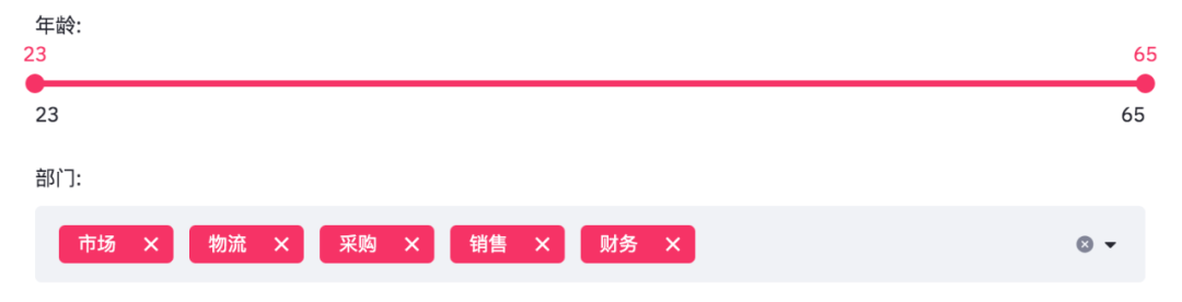
The age is from 23 to 65, and the departments are marketing, logistics, procurement, sales and finance.
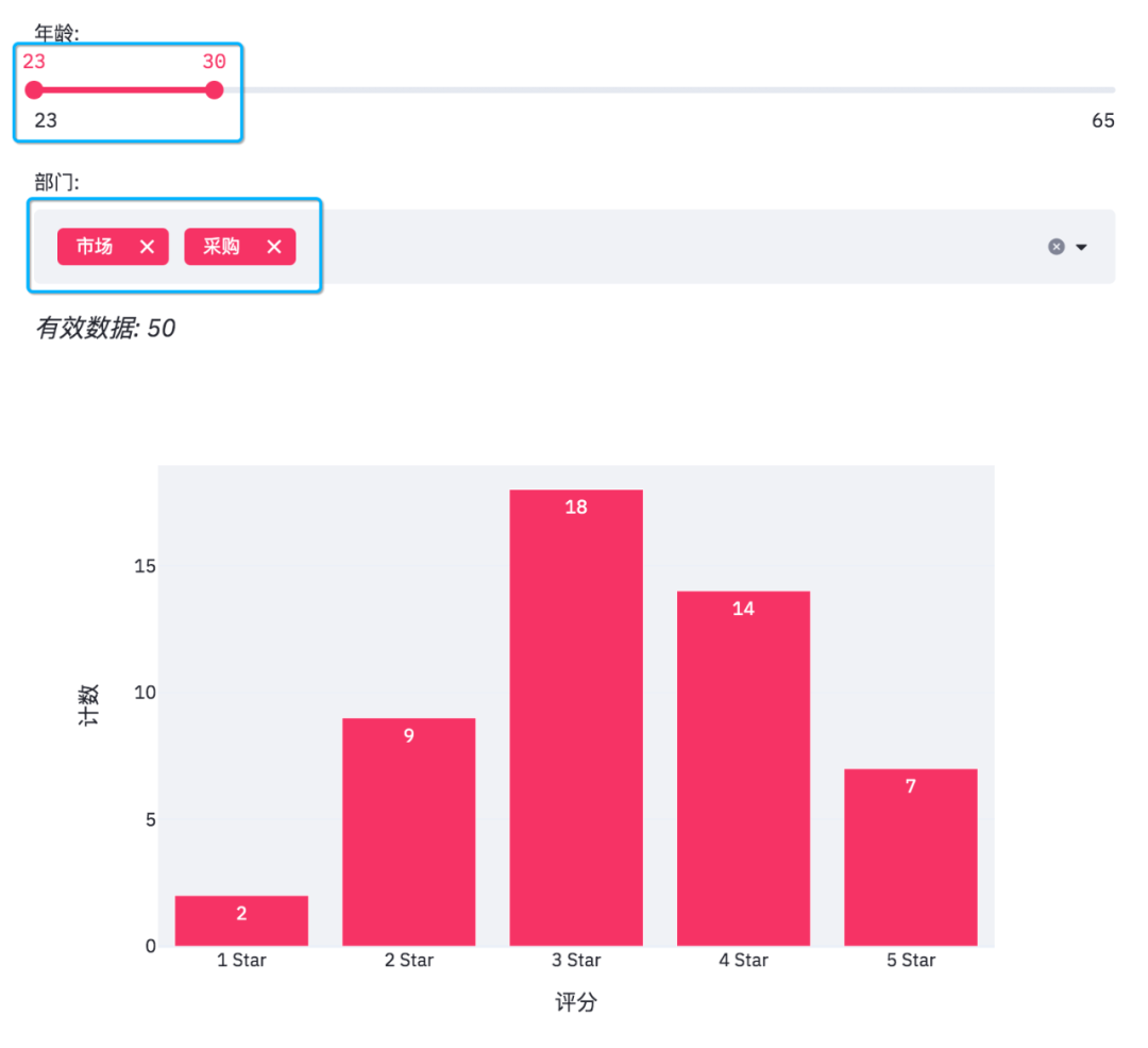
Since the slider and multiple selections are variable, the final data needs to be obtained according to the filtering conditions.
#Filter data according to selection
mask = (df['Age'].between(*age_selection)) & (df['department'].isin(department_selection))
number_of_result = df[mask].shape[0]

#According to the screening conditions, effective data can be obtained
st.markdown(f'*Valid data: {number_of_result}*')

#Group data according to selection
df_grouped = df[mask].groupby(by=['score']).count()[['Age']]
df_grouped = df_grouped.rename(columns={'Age': 'count'})
df_grouped = df_grouped.reset_index()
When you get the data, you can draw a histogram.
#Draw histogram and configure relevant parameters
bar_chart = px.bar(df_grouped,
                   x='score',
                   y='count',
                   text='count',
                   color_discrete_sequence=['#F63366']*len(df_grouped),
                   template='plotly_white')
st.plotly_chart(bar_chart)
Use plot to draw a histogram.
When we adjust the options on the web page, the effective data and histogram will also change.
In addition, streamlit can add pictures and interactive tables to web pages.
#Add pictures and interactive tables
col1, col2 = st.beta_columns(2)
image = Image.open('survey.jpg')
col1.image(image,
           caption='Designed by Programmer set sail',
           use_column_width=True)
col2.dataframe(df[mask], width=300)
The results are as follows.
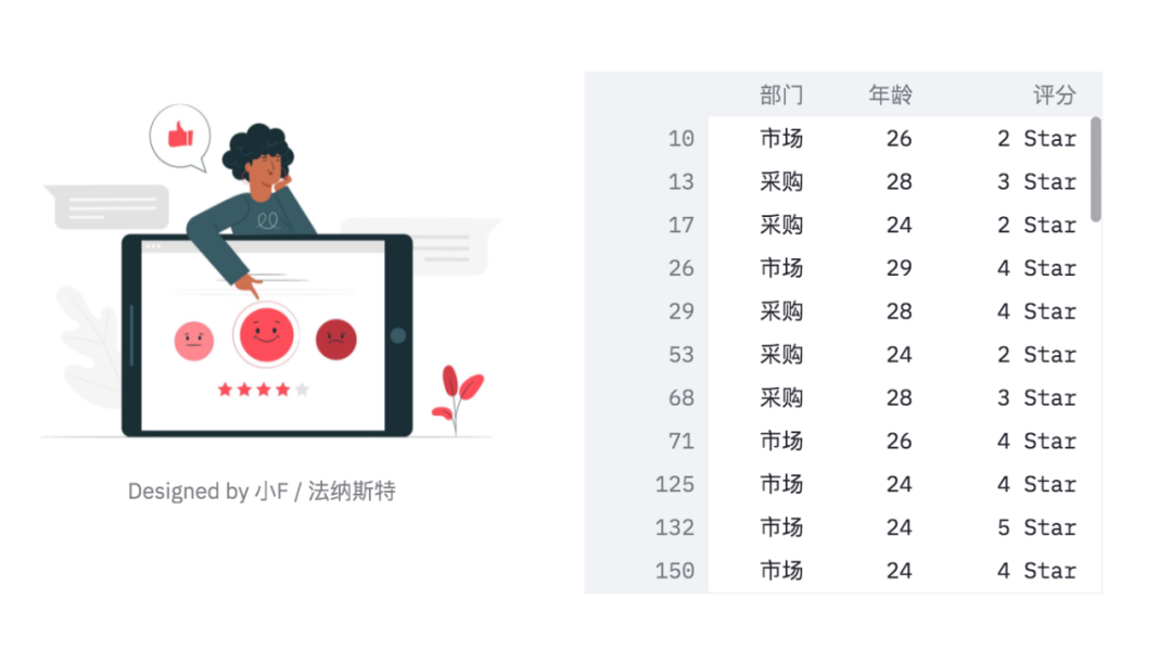
You can see that the table has a sliding bar, which can be viewed by scrolling with the mouse wheel.
Finally, draw a pie chart!
#Draw pie chart
pie_chart = px.pie(df_participants,
                   title='Total number of participants',
                   values='Number of people',
                   names='Company Department')
st.plotly_chart(pie_chart)
The results are as follows.
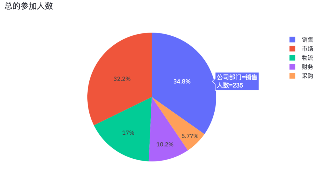
The number of people in each department participating in the questionnaire survey is also an interactive chart.
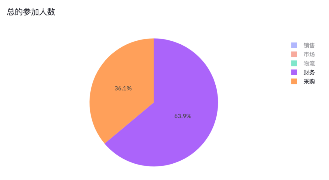
By canceling sales, marketing and logistics, we can see the proportion of Finance and procurement participating in the questionnaire survey.
Well, the sharing of this issue is over. Interested partners can practice and learn by themselves.
When the official account (programmer starts) returns to the "web", the code and data used will be obtained.

This is the end of the article. Thank you for watching
To be honest, I feel very happy every time I see some readers' responses in the background. I want to contribute some of my collection of programming dry goods to you and give back to every reader. I hope I can help you.
Dry goods mainly include:
① More than 2000 Python e-books (both mainstream and classic books should be available)
② Python standard library materials (the most complete Chinese version)
③ Project source code (forty or fifty interesting and classic hand training projects and source code)
④ Videos on basic introduction to Python, crawler, web development and big data analysis (suitable for Xiaobai)
⑤ Summary of all Python knowledge points (you can find out all directions and technologies of Python)
*If you can use it, you can take it directly. In my QQ technology exchange group, you can take it by yourself. The group number is 857113825*