Android 33_Android Chase UI Experience Upgrade-2
- FloatingActionButton
- Snackbar
- Coordinatorlayout
FloatingActionButton
Use is simple, just use it directly in the layout, it should be noted that conditional dependency
 <android.support.design.widget.FloatingActionButton
            android:layout_width="wrap_content"
            android:layout_height="wrap_content"
            android:src="@drawable/ic_menu_send"
            android:layout_margin="16dp"
            android:layout_gravity="bottom|right"
            android:elevation="10dp"
            />
Just like using common controls, you can choose to add one to the layout file directly. src represents the image. It should be noted that the default color is color Accent. elevation is the height of suspension.
Its eavesdropping is much simpler, just like the onClickListener of the ordinary View.
Snackbar Better Message Tips
Toast and Toast are good brothers for prompting messages
A simple example
floatingActionButton = (FloatingActionButton)findViewById(R.id.mainFloating);
    floatingActionButton.setOnClickListener(new View.OnClickListener() {
        @Override
        public void onClick(View view) {
            Snackbar.make(view,"Send Message",Snackbar.LENGTH_SHORT).setAction("Got it", new View.OnClickListener() {
                @Override
                public void onClick(View v) {
                    //TODO
                }
            }).show();
        }
    });
Taking the Floating Action Bar as the test target, we can see that Snackbar is beginning to be used in listening events in a very similar way to Toast.
It's intuitive to see that Snackbar has a better user experience than Toast, and that button can be clicked and monitored. A slight weakness is that Floating Action Bar seems to be in conflict with Snackbar. Of course, you can modify Floating's margin, but the best way is to have Floating Action Bar run with you.
Coordinator Layout Layout Layout with Coordinator Function
The name can see its role, coordination, is mainly to coordinate when the various sub-control events caused by the bad experience. For example, the cover on the top
Just put the parts that need to be coordinated into it.
<android.support.design.widget.CoordinatorLayout
android:layout_width="match_parent"
android:layout_height="match_parent">
<TextView
android:layout_width="match_parent"
android:layout_height="match_parent"
android:gravity="center"
android:text="Main body" />
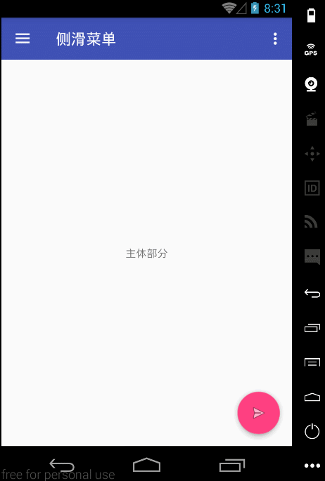
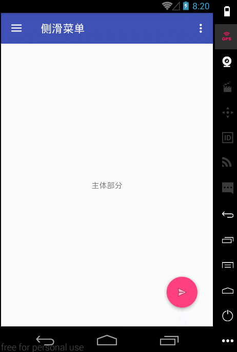
<android.support.design.widget.FloatingActionButton
android:id="@+id/mainFloating"
android:layout_width="wrap_content"
android:layout_height="wrap_content"
android:src="@drawable/ic_menu_send"
android:layout_margin="16dp"
android:layout_gravity="bottom|right"
android:elevation="10dp"
/>
</android.support.design.widget.CoordinatorLayout>