background
In the group, some students will ask relevant questions, how to use CSS to realize an inscribed corner button, and how to realize a button with an arrow?
Based on some high-frequency buttons in the design draft, this paper explains how to use CSS to realize them as much as possible.
Let's take a look at these button shapes that often appear:
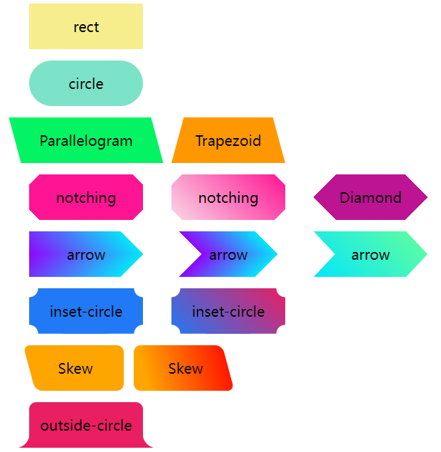
Rectangle and fillet buttons
Normally, there are two kinds of buttons we encounter -- rectangle and fillet:
They are very simple, width, height, rounded corners and background color.
    <div class='btn rect'>rect</div>
    <div class='btn circle'>circle</div>
.btn {
margin: 8px auto;
flex-shrink: 0;
width: 160px;
height: 64px;
}
.rect {
background: #f6ed8d;
}
.circle {
border-radius: 64px;
background: #7de3c8;
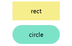
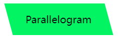
}Trapezoid and parallelogram
Next, based on the deformation of rectangle, the buttons of trapezoid and parallelogram often appear.
Transform is mainly used to realize them. However, it should be noted that after transform is used, the text in the label will be similarly deformed. Therefore, we usually use the pseudo element of the element to realize the modeling, so as not to affect the text in the button.
parallelogram
Use transform: skewX(). Pay attention to the above. Use the pseudo element of the element to realize the parallelogram without affecting the internal text.
<div class='btn parallelogram'>Parallelogram</div>
.parallelogram {
    position: relative;
    width: 160px;
    height: 64px;

    &::before {
        content: "";
        position: absolute;
        top: 0;
        left: 0;
        bottom: 0;
        right: 0;
        background: #03f463;
        transform: skewX(15deg);
    }
}
If you don't want to use pseudo elements, you can also use gradients for parallelograms in addition to transform: skewX().
That's about it:
{
    background: linear-gradient(45deg, transparent 22%, #04e6fb 22%, #9006fb 78%, transparent 0);
}
trapezoid
Trapezoid is a little more complex than parallelogram. It makes use of perspective. In fact, it makes use of a certain 3D transformation. The principle is that a rectangle rotates around the X axis, like this:

Use perspective and transform: rotateX(). Of course, they can be written together:
<div class='btn trapezoid'>Trapezoid</div>
.parallelogram {
    position: relative;
    width: 160px;
    height: 64px;

    &::after {
          content:"";
          position: absolute;
          top: 0; right: 0; bottom: 0; left: 0;
          transform: perspective(40px) rotateX(10deg);
          transform-origin: bottom;
          background: #ff9800;
    }
}
Chamfer -- solid background and gradient background
The next step is the corner cutting graph. The most common method is to use the gradient linear gradient to see such a graph
<div></div>
.notching {
background: linear-gradient(135deg, transparent 10px, #ff1493 0);
background-repeat: no-repeat;
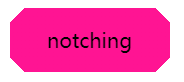
}The results are as follows,

Based on this, we only need to use multiple gradients to realize four such graphics, and use background position to locate the four corners:
<div class="notching">notching</div>
.notching {
    background:
        linear-gradient(135deg, transparent 10px, #ff1493 0) top left,
        linear-gradient(-135deg, transparent 10px, #ff1493 0) top right,
        linear-gradient(-45deg, transparent 10px, #ff1493 0) bottom right,
        linear-gradient(45deg, transparent 10px, #ff1493 0) bottom left;
    background-size: 50% 50%;
    background-repeat: no-repeat;
}
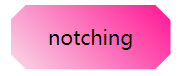
Using clip path to realize the corner cutting graphics of gradient background
Of course, there is a problem with this technique. When the background color is required to be a gradient, this method is more clumsy.
Fortunately, there is another way to cut a corner figure with the help of clip path. In this way, the background color can be any custom color, whether gradient or solid color:
<div class="clip-notching">notching</div>
.clip-notching {
    background: linear-gradient(
        45deg,
        #f9d9e7,
        #ff1493
    );
    clip-path: polygon(
        15px 0,
        calc(100% - 15px) 0,
        100% 15px,
        100% calc(100% - 15px),
        calc(100% - 15px) 100%,
        15px 100%,
        0 calc(100% - 15px),
        0 15px
    );
}
Simply implement a gradient background, and then the core is to use clip path: polygon() to cut out the shape we want (an octagon) based on the gradient rectangular shape:
Of course, the above code is very easy to associate with the following hexagon, which can be easily obtained by using gradient and clip path:
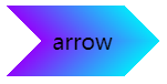
Arrow button
Next is the arrow button. Carefully observe the corner cutting button above. When enough corners are cut off on both sides, it becomes an arrow shape.
We can use double gradient to realize a single arrow button:
<div class="arrow">arrow</div>
&.arrow {
    background: linear-gradient(
                -135deg,
                transparent 22px,
                #04e6fb 22px,
                #65ff9a 100%
            )
            top right,
        linear-gradient(
                -45deg,
                transparent 22px,
                #04e6fb 22px,
                #65ff9a 100%
            )
            bottom right;
    background-size: 100% 50%;
    background-repeat: no-repeat;
}
An arrow comes out:
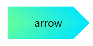
It is obtained by combining the upper and lower gradient blocks. You can immediately understand it by changing the color:
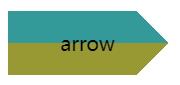
What if it is such an arrow shape?
Similarly, it is also the superposition of two gradients. The color of the gradient is transparent -- > color a -- > color B -- > transparent. Of course, you can also use clip path here:
Here is the solution of clip path:
{
    background: linear-gradient(45deg, #04e6fb, #65ff9a);
    clip-path: polygon(
        0 0,
        30px 50%,
        0 100%,
        calc(100% - 30px) 100%,
        100% 50%,
        calc(100% - 30px) 0
    );
}
Inscribed fillet
The following button shapes mostly appear in coupons. The most common solution is to use gradients. Of course, different from chamfer, radial gradients are used here.
First, let's take a simple example:
<div></div>
div {
    background-image: radial-gradient(circle at 100% 100%, transparent 0, transparent 12px, #2179f5 12px);
}
You can get such a graph:

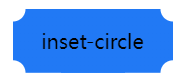
Therefore, you only need to control the background size and realize four such graphics in four corners:
<div class="inset-circle">inset-circle</div>
&.inset-circle {
    background-size: 70% 70%;
    background-image: radial-gradient(
            circle at 100% 100%,
            transparent 0,
            transparent 12px,
            #2179f5 13px
        ),
        radial-gradient(
            circle at 0 0,
            transparent 0,
            transparent 12px,
            #2179f5 13px
        ),
        radial-gradient(
            circle at 100% 0,
            transparent 0,
            transparent 12px,
            #2179f5 13px
        ),
        radial-gradient(
            circle at 0 100%,
            transparent 0,
            transparent 12px,
            #2179f5 13px
        );
    background-repeat: no-repeat;
    background-position: right bottom, left top, right top, left bottom;
}
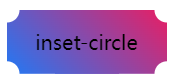
Use mask to realize the inscribed fillet button of gradient
What if the background color requires a gradient?
Suppose we have a rectangular background pattern, we only need to use mask to realize a layer of mask, and use the characteristics of mask to cover the four corners.
The code of mask is very similar to the above rounded corner code. The gradient inscribed rounded corner button can be obtained under simple modification:
<div class="mask-inset-circle">inset-circle</div>
.mask-inset-circle {
    background: linear-gradient(45deg, #2179f5, #e91e63);
    mask: radial-gradient(
            circle at 100% 100%,
            transparent 0,
            transparent 12px,
            #2179f5 13px
        ),
        radial-gradient(
            circle at 0 0,
            transparent 0,
            transparent 12px,
            #2179f5 13px
        ),
        radial-gradient(
            circle at 100% 0,
            transparent 0,
            transparent 12px,
            #2179f5 13px
        ),
        radial-gradient(
            circle at 0 100%,
            transparent 0,
            transparent 12px,
            #2179f5 13px
        );
    mask-repeat: no-repeat;
    mask-position: right bottom, left top, right top, left bottom;
    mask-size: 70% 70%;
}
In this way, we get such a figure:
Of course, to understand the above code, you need to first understand the principle of CSS mask attribute. If you are still unfamiliar with it, you can see my article:
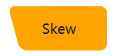
Rounded irregular rectangle
The following button shape is also the most asked recently. Let's take a look at its shape first:

It's not easy to name it. One side is a regular right angle with rounded corners, and the other side is a beveled edge with rounded corners.
In fact, it is composed of rounded rectangle + rounded parallelogram:

Therefore, with the help of two pseudo elements, they can be easily implemented:
<div class="skew">Skew</div>
.skew {
    position: relative;
    width: 120px;

    &::after {
        content: "";
        position: absolute;
        top: 0;
        left: 0;
        right: 0;
        bottom: 0;
        border-radius: 10px;
        background: orange;
        transform: skewX(15deg);
    }
    &::before {
        content: "";
        position: absolute;
        top: 0;
        right: -13px;
        width: 100px;
        height: 64px;
        border-radius: 10px;
        background: orange;
    }
}
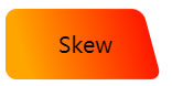
Because one pseudo element is superimposed on the other, gradient is used for one and solid color is used for the other, and their colors can be perfectly connected together, so as to realize the figure of gradient color:
Fillet button
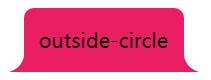
Next, the button shape is common on the Tab page, similar to Chrome paging:
Let's disassemble the button shape. Here is actually a superposition of three pieces:
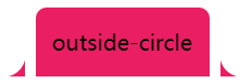
Just figure out how to realize the arc triangle on both sides. Here, the gradient radial gradient is used. In fact, it is like this. As shown in the figure below, we only need to replace the black part with transparent and use two pseudo elements:
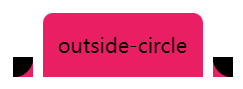
The code is as follows:
<div class="outside-circle">outside-circle</div>
.outside-circle {
    position: relative;
    background: #e91e63;
    border-radius: 10px 10px 0 0;

    &::before {
        content: "";
        position: absolute;
        width: 20px;
        height: 20px;
        left: -20px;
        bottom: 0;
        background: #000;
        background:radial-gradient(circle at 0 0, transparent 20px, #e91e63 21px);
    }
    &::after {
        content: "";
        position: absolute;
        width: 20px;
        height: 20px;
        right: -20px;
        bottom: 0;
        background: #000;
        background:radial-gradient(circle at 100% 0, transparent 20px, #e91e63 21px);
    }
}
You can get:
The complete code of all the above graphics can be seen here: Codepen demo -- CSS variant button shapes | CSS various modeling buttons
To sum up
Based on the above implementation, it is not difficult to find that some slightly special buttons are implemented by splicing, blinding, masking, etc.
In which:
- Gradient (linear gradient, radial gradient, multiple gradient)
- Mask mask
- Clip path clipping
- Deformation transform
Play an important role, skillfully use them, we can easily grasp these graphics, and we can calmly face the deformation based on them.
The above graphics, combined with filter: drop shadow(), can basically realize irregular shadow.
Furthermore, more complex graphics are as follows:
It's better to cut the picture. Although CSS is good, the input-output ratio also needs to be considered in practical use.
last
The purpose of this paper is more to be a simple manual. There may be better methods to achieve the above effects in practice. This paper does not enumerate them one by one, and you are welcome to add and correct them.
Well, this article ends here. I hope this article will help you:)
If you want Get to get the most interesting CSS information, don't miss my official account -- iCSS front end interesting news. 😄
More wonderful CSS technical articles are summarized in my Github -- iCSS , continuously updated. Welcome to a star subscription collection.
If you have any questions or suggestions, you can communicate more. The original articles have limited writing style and shallow talents. If there is anything wrong in the article, please let me know.