Author: shade
Translator: front end Xiaozhi
Source: dmitripavlutin
There are dreams and dry goods. Wechat search [Daqian world] pays attention to this dish washing wisdom who is still washing dishes in the early morning.
This article GitHub https://github.com/qq449245884/xiaozhi There are some complete series of articles and interview materials in our factory.
Grid layout is one of the most powerful functions in modern CSS. Using grid layout can help us build complex and fast layout without any external UI framework. In this article, we will introduce all the CSS grid knowledge we need to know?.
Basic knowledge of CSS grid
Let's go directly to the code, as shown below. First write some labels. The source code is in this link: https://codepen.io/Shadid/pen/zYqNvgv
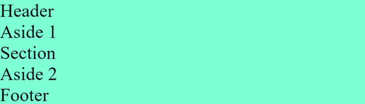
<div class="container">
  <header>Header</header>
  <aside>Aside 1</aside>
  <section>Section</section>
  <aside>Aside 2</aside>
  <footer>Footer</footer>
</div>
Above, we created a header, two sides and a footer element and wrapped them in a container element. We add background color and font size to all elements in the container element.
.container > * {
  background: aquamarine;
  font-size: 30px;
}
The running web pages are as follows:
Now let's add some grid attributes:
.container {
display: grid;
grid-gap: 5px;
grid-template-areas:
"header"
"aside-1"
"aside-2"
"section"
"footer"
}
/* Assign grid areas to elements */
header {
grid-area: header;
}
aside:nth-of-type(1) {
grid-area: aside-1;
}
aside:nth-of-type(2) {
grid-area: aside-2;
}
section {
grid-area: section;
}
footer {
grid-area: footer;
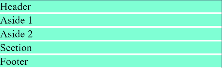
}First, we define display:grid, which will enable grid layout, and then we use grid gap to add gaps in grid elements.
Next, we assign a grid area name to each html element. In the container class, we can use the grid template areas' attribute to define the appearance of html templates, and pay attention to how the grid template areas are arranged.
grid-template-areas:
    "header"
    "aside-1"
    "aside-2"
    "section"
    "footer"
The order of elements is different from the dom structure. However, it is finally displayed in the order of our network area.
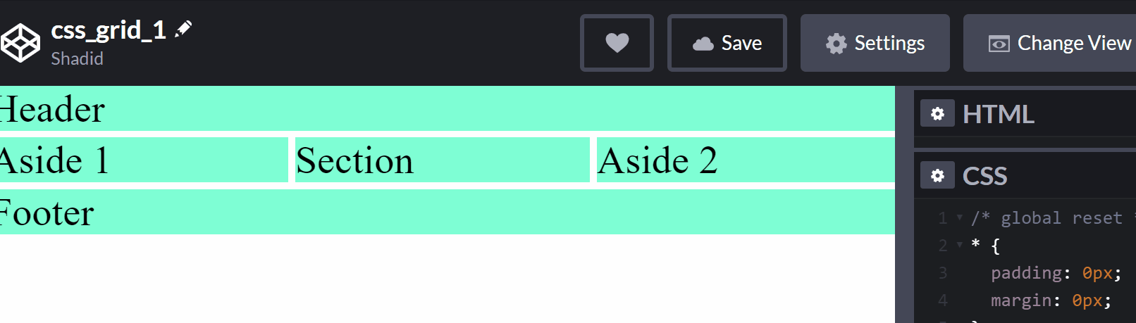
The next step is to make our page responsive. We want to use different layouts on a larger screen. CSS grids make it easy to handle media queries and create responsive layouts. Look at the following code:
@media (min-width: 670px) {
  .container {
    grid-template-areas:
      "header  header  header"
      "aside-1 section  aside-2"
      "footer    footer    footer"
  }
}
All we have to do is reorder the grid template area in the media query.
Grid columns and rows
How do I use CSS grids to organize columns and? Start with the following code:
<div class="container">
  <div class="item">One</div>
  <div class="item">Two</div>
  <div class="item">Three</div>
  <div class="item">Four</div>
  <div class="item">Five</div>
  <div class="item">Six</div>
</div>
Add some basic css
.container {
  display: grid;
  height: 100vh;
  grid-gap: 10px;
}

.item {
  background: lightcoral;
}
We used grid layout for the dom structure above, and used grid gap to increase the spacing between styles. Now we use the grid template columns attribute to add some columns.
.container {
    display: grid;
    height: 100vh;
    grid-gap: 10px;
    grid-template-columns: 100px 200px auto auto;
}
Like this, we use columns. We specify 100px for the first column and 200px for the second column. Since we applied auto in columns 3 and 4, the remaining screen length will be divided in half.
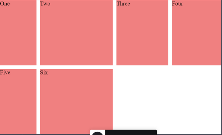
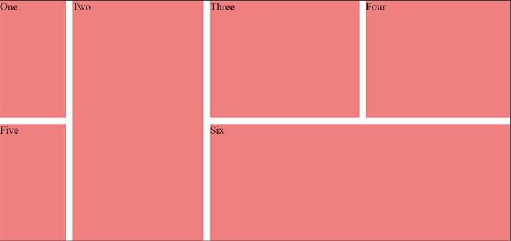
You can see that there is now a blank in the page. What if I want to move the sixth column to the third and fourth columns? To do this, we can use the grid column start and grid column end attributes.
.item:nth-of-type(6) {
  grid-column-start: 3;
  grid-column-end: 5;
}
Note that we use grid column end: 5, with a value of 5 pointing to the column line. The fourth column ends in the fifth row of the grid. Column grid and column grid are grid values.
If you find the value of gridlines confusing, you can also use span. The following effect is the same as above:
.item:nth-of-type(6) {
  grid-column-start: 3;
  grid-column-end: span 2;
}
For span 2, specify that the div occupies two slots in the grid. Now, suppose you want to expand the second column to fill the blank area below. We can also easily do this through the grid column start attribute.
.item:nth-of-type(2) {
  grid-row-start: span 2;
}
We use span and grid row start to specify that we want to occupy two slots.
As seen above, we have been able to use a small number of CSS grid properties to build very complex layouts.
Use grid templates effectively
Now let's look at grid templates. In this section, we will discuss how to create different layouts for different screen sizes.
First, let's start with a dom structure:
<div class="container">
  <header>header</header>
  <aside>Left</aside>
  <section>Section</section>
  <aside>Right</aside>
  <footer>Footer</footer>
</div>
Next, add some styles:
``
.container {
display: grid;
height: 100vh;
grid-gap: 10px;
}
.container > * {
background: coral;
display: flex;
justify-content: center;
align-items: center;
}`
``
We added a background color to the element. As you can see from the above code, we also use the flex attribute. We can combine flex and grid. In this particular example, we use the flex attribute center to align the content.
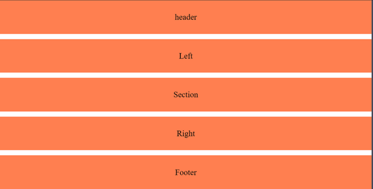
For the mobile terminal, we want the section under the header and right under the section. We can use the grid area to complete it. First, we define the grid area:
.container {
  display: grid;
  height: 100vh;
  grid-gap: 10px;
  grid-template-areas:
   "header"
    "section"
    "right"
    "left"
    "footer"
}

aside:nth-of-type(1) {
  grid-area: left;
}

aside:nth-of-type(2) {
  grid-area: right;
}

section {
  grid-area: section;
}

footer {
  grid-area: footer;
}

header {
  grid-area: header;
}
As you can see in grid template areas, we first have header, then section, then right, and finally left. In addition, we hope our section is larger than both left and right. To achieve this, we can use the rid template rows attribute?
.container {
  display: grid;
  height: 100vh;
  grid-gap: 10px;
  grid-template-areas:
    "header"
    "section"
    "right"
    "left"
    "footer";
  grid-template-rows: 1fr 6fr 2fr 2fr 1fr;
}
One picture is missing
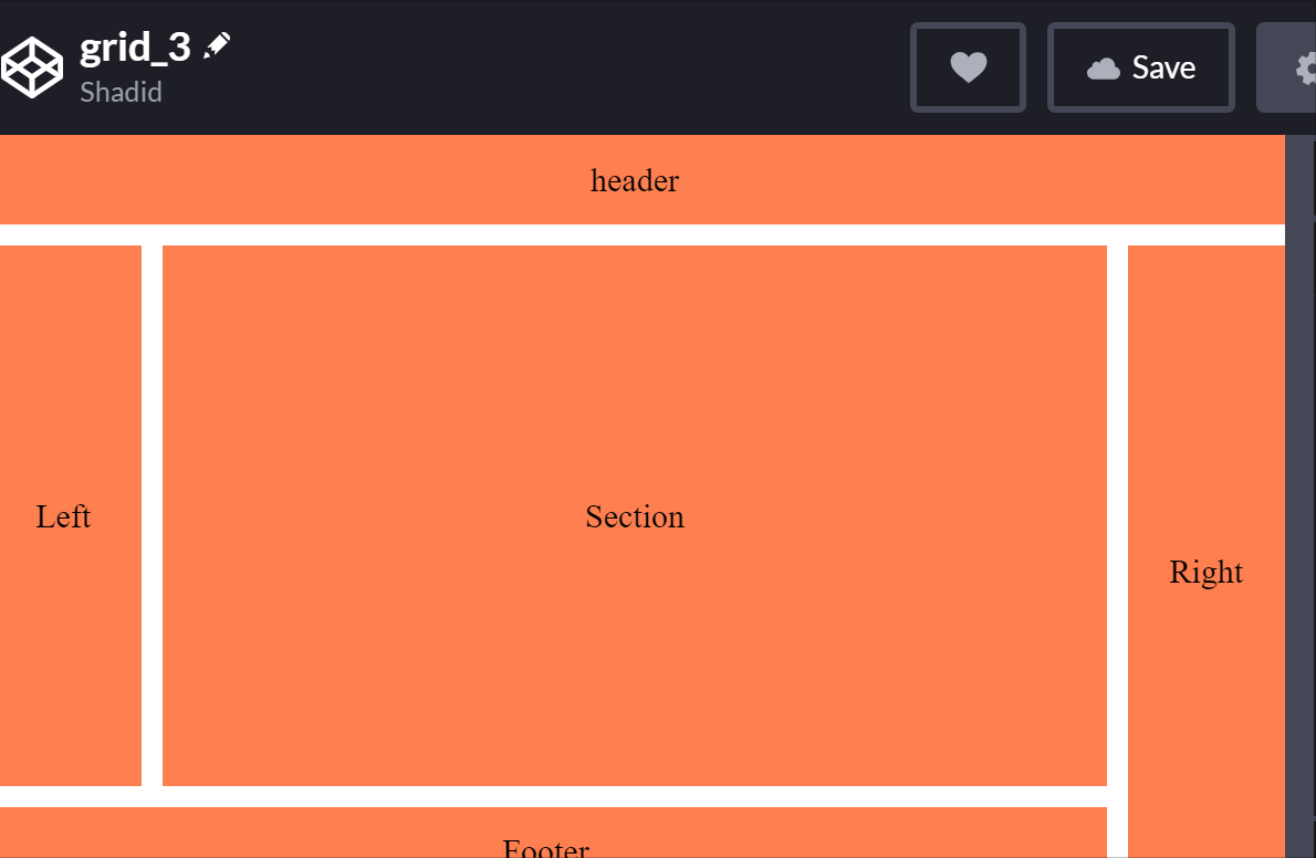
We can set the view of the mobile terminal as needed, and then we use media query to adapt to the following large screen:
@media (min-width: 500px)  {
  .container {
    grid-template-areas:
      "header header  header"
      "left   section right"
      "footer footer  right";
    grid-template-rows: 1fr 6fr 1fr;
    grid-template-columns: 1fr 6fr 1fr;
  }
}
How to use the minmax function to dynamically track the size of elements
Suppose we have two columns that evenly occupy the available space on the screen. We can do this easily by using grid template columns. But what if we want one of them to be between 200px and 500px? Our columns can accommodate different screen sizes, but one of them will never be greater than 500px or less than 200px.
For these types of scenes, we use the minmax function. Let's see its actual effect.
<div class="container">
  <div class="one">One</div>
  <div class="two">Two</div>
</div>
.container {
  display: grid;
  height: 100vh;
  grid-template-columns: minmax(200px, 500px) minmax(100px, auto);
}
.one {
  background: cyan;
}
.two {
  background: pink;
}
In this example, the first column is always between 200px and 500px. However, the minimum value of the second column can be 100px, which will cover the rest of the screen for a larger screen.
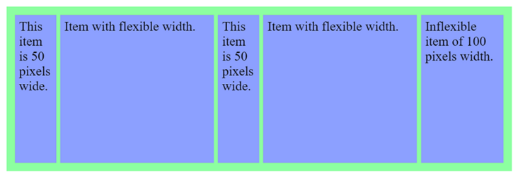
How to use the repeat function?
Let's talk about repetition patterns in elements. How do we deal with them? We can repeat our code or use javascript. However, there is another method that can be implemented with css. The repeat function represents a repeating fragment of the track list, allowing you to write a large number of columns or rows that display repeating patterns in a more compact form.
<div id="container">
  <div>
    This item is 50 pixels wide.
  </div>
  <div>
    Item with flexible width.
  </div>
  <div>
    This item is 50 pixels wide.
  </div>
  <div>
    Item with flexible width.
  </div>
  <div>
    Inflexible item of 100 pixels width.
  </div>
</div>
#container {
display: grid;
grid-template-columns: repeat(2, 50px 1fr) 100px;
grid-gap: 5px;
box-sizing: border-box;
height: 200px;
width: 100%;
background-color: #8cffa0;
padding: 10px;
}
#container > div {
background-color: #8ca0ff;
padding: 5px;
}
nesting grid
I can also nest the grid in another grid to see how to achieve this:
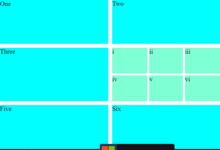
<div class="container">
  <div class="item">One</div>
  <div class="item">Two</div>
  <div class="item">Three</div>
  <div class="item inner-grid">
    <div class="item">i</div>
    <div class="item">ii</div>
    <div class="item">iii</div>
    <div class="item">iv</div>
    <div class="item">v</div>
    <div class="item">vi</div>
  </div>
  <div class="item">Five</div>
  <div class="item">Six</div>
</div>
First, we declare the grid on the external container:
.container {
  display: grid;
  height: 100vh;
  grid-gap: 10px;
  grid-template-columns: repeat(auto-fill, minmax(200px, auto))
}
Note that we have a repeat function in the mesh template and combine it with a minmax function. We can now also apply mesh properties to internal meshes.
.inner-grid {
  display: grid;
  background: white;
  height: 100%;
  grid-gap: 5px;
  grid-template-columns: repeat(3, auto);
}
In this way, we nested a grid in the grid.
I'll share it with you today. Thank you for watching. See you next time!
The bugs that may exist after the code is deployed cannot be known in real time. Afterwards, in order to solve these bugs, we spent a lot of time on log debugging. By the way, we recommend a useful BUG monitoring tool Fundebug.
Original text: https://blog.soshace.com/how-...
communication
There are dreams and dry goods. Wechat search [Daqian world] pays attention to this dish washing wisdom who is still washing dishes in the early morning.
This article GitHub https://github.com/qq44924588... It has been included. There are complete test sites, materials and my series of articles for the interview of front-line large factories.