Metronic Advanced Table It's a self-implemented table in the Metonic framework, with the bottom layer being Datatables This tutorial will mainly use Vue to implement the interactive part, Bootstrap to do style library, jQuery to do some user interaction (pop-up window).
Used libraries: Vue 2.0, Bootstrap 3, jQuery 2, font-awesome 4, are available CDN download
It should be noted that Vue is best used Development Version
Requirements and prototype design
The product goal is a book management form, book fields: book name, classification, price, update time.
Demand:
(1) Addition, deletion and alteration of book information
Paging function, and can choose page capacity by itself
(3) Entries that match keywords according to any field can be displayed.
(4) Automatically save the data of this operation.
Prototype:
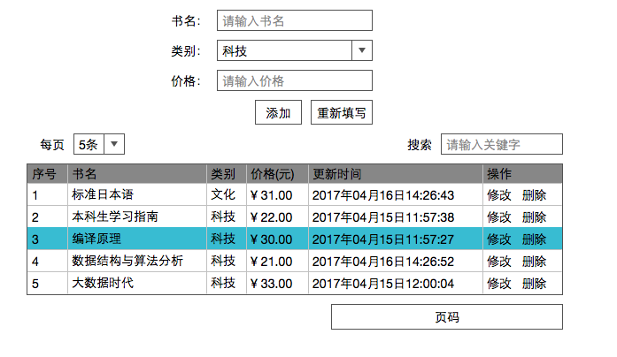
Prototype description:
(1) The page area provides the buttons on the previous page, the list of page numbers and the next page.
(2) When clicking on the modification, the content of the upper form is the original data, and the "Add" button becomes "Modify", then clicking on the modification will save the data into effect; if clicking on the filling in again at this time, the modification will be abandoned.
(3) Whether to delete the pop-up box prompt when clicking delete
II. Preparations
Establishment of Operating Environment
It is not recommended to use browser to open web pages directly. It is suggested to build a Web environment for testing.
It is recommended to use WAMP, XAMPP and other integrated environments, which are easy to install and operate.
(2) Introducing all kinds of Libraries
Notice the path of vue.js and download it locally for introduction (using the absolute web path'/ static/vue.js')<link href="https://cdn.bootcss.com/bootstrap/3.3.7/css/bootstrap.min.css" rel="stylesheet"> <link href="https://cdn.bootcss.com/font-awesome/4.7.0/css/font-awesome.min.css" rel="stylesheet"> <script src="https://cdn.bootcss.com/jquery/2.2.4/jquery.min.js"></script> <script src="https://cdn.bootcss.com/bootstrap/3.3.7/js/bootstrap.min.js"></script> <script src="/static/vue.js"></script>
(3) Conduct the simplest Vue test
<div id="content">
    {{msg}}
</div>
<script>
window.onload = function () {
var vm = new Vue({
el:'#content',
data: {
msg:'hello vue'
}
});
}
</script>The production version of vue does not generate warning messages and cannot render properly.
Data input (add, modify)
According to the prototype diagram:
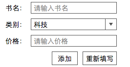
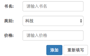
Write out the form:
<form action="" class="col-md-4 col-md-offset-4 form-horizontal">
    <div class="form-group">
        <label class="col-md-3 control-label" >Title: </label>
        <div class="col-md-9">
            <input type="text" class="form-control" placeholder="Please enter the title of the book.">
        </div>
    </div>
    <div class="form-group">
        <label class="col-md-3 control-label" >category: </label>
        <div class="col-md-9" >
            <select class="form-control">
                <option value="0">science and technology</option>
                <option value="1">Culture</option>
                <option value="2">Economics</option>
            </select>
        </div>
    </div>
    <div class="form-group">
        <label class="col-md-3 control-label" >Price: </label>
        <div class="col-md-9">
            <input type="text" class="form-control" placeholder="Please enter the price.">
        </div>
    </div>
    <div class="form-group text-right">
        <input type="button" class="btn btn-primary" value="Add to">
        <input type="reset" class="btn btn-default" value="Fill in again">
    </div>
</form>
It is worth noting that:
The class style of'form-control'will dominate the line. To make label and input in one line, the grid layout of bootstrap can be used. After adjustment, the layout of 3:9 is more appropriate.
(2) form-horizontal style can beautify tables by acting on form elements. It allows gaps between each form-group to make it less compact; it also centers the content of the label.
(3) The `col-md-4 col-md-offset-4'can center an element with a width of `col-md-4'.
IV. Display
(1) Surface Head


<div class="form-horizontal">
    <div class="form-group col-md-6 ">
        <label class="col-md-2 control-label" >each page</label>
        <div class="col-md-3">
            <select class="form-control">
                <option value="5">5 strip</option>
                <option value="10">10 strip</option>
                <option value="15">15 strip</option>
                <option value="20">20 strip</option>
            </select>
        </div>
    </div>
    <div class="form-group col-md-6">
        <label class="col-md-3 col-md-offset-3 control-label" >search: </label>
        <div class="col-md-6">
            <input type="text" class="form-control" placeholder="Please enter keywords">
        </div>
    </div>
</div>(2) Subject
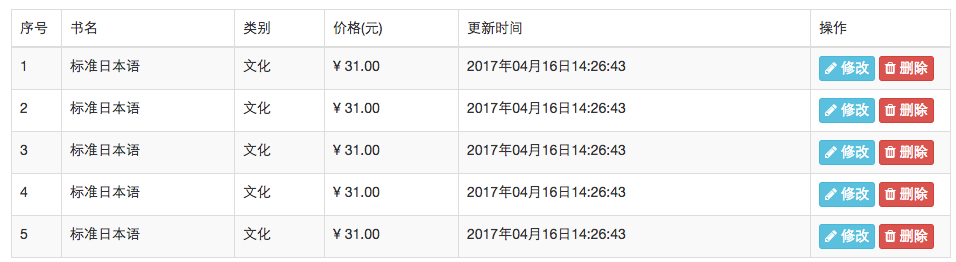
<table class="table table-bordered table-hover table-striped">
    <thead>
    <tr>
        <td width="50">Serial number</td>
        <td>Title</td>
        <td>category</td>
        <td>Price(element)</td>
        <td>Update time</td>
        <td width="140">operation</td>
    </tr>
    </thead>
    <tbody >
    <tr>
        <td>1</td>
        <td>Standard Japanese</td>
        <td>Culture</td>
        <td>¥ 31.00</td>
        <td>2017 16 April 2004 14:26:43</td>
        <td>
            <button class="btn btn-info btn-xs">
                <i class="fa fa-pencil"></i>
                modify
            </button>
            <button class="btn btn-danger btn-xs">
                <i class="fa fa-trash"></i>
                delete
            </button>
        </td>
    </tr>
    </tbody>
</table>(2) The'table-hover'mouse hovering line has a style.
(3) Effect of'table-striped'zebra crossing
V. Delete
Delete the bullet window, the prototype is not given, so use your imagination.
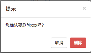
Modal box:
<div id="general_dialog" class="modal fade bs-example-modal-sm" role="dialog">
<div class="modal-dialog modal-sm" role="document">
<div class="modal-content">
<div class="modal-header">
<button class="close" data-dismiss="modal" >×</button>
<h4 class="modal-title">Tips</h4>
</div>
<div class="modal-body">
You confirm that you want to delete xxx Do you?
</div>
<div class="modal-footer text-right">
<button class="btn btn-default" data-dismiss="modal">cancel</button>
<button class="btn btn-danger" data-dismiss="modal">delete</button>
</div>
</div>
</div>
</div>Then when you click the button, it pops up (bootstrap.js need to be introduced here).data-toggle="modal" data-target="#general_dialog"
1 `fade'indicates that the modal box fades in and out.
(2)'bs-example-modal-sm'means that the size of the modal box is'sm'.‘
(3)'& times;'Is an entity marker, representing * * * * * * * * * * * * * * * * * * * * * * * *.
After completing the five steps, it looks like:
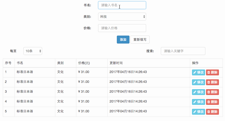
(This video recording tool seems to erase the effect of table-striped.)