1. Functional requirements
Use TemplatePart to implement the two requirements of the previous article (hide the HeaderContentPresenter when the Header is empty, and the HeaderContentPresent is translucent when the mouse is not placed on the control). Although the function has been implemented, the implementation will basically not be extended. For example, developers can't achieve the following functions by inheriting or modifying ControlTemplate:
- Opacity in translucency is not 0.7, but 0.5.
- There is a gradient animation when switching between translucent and opaque.
Of course, it is not impossible to implement these requirements with code, but it will be much more complex. Most developers are familiar with C ා and unfamiliar with XAML. It's easy to choose to use C ා as much as possible to realize all functions, concentrate all functions in the same place and process them in a familiar language. Of course, it has the advantages of doing so. However, since you are using XAML platform, you should make the best of the advantages of separating the UI and code of XAML platform.
This article uses the ContentView 2 example to explain how VisualState can implement the above requirements. ContentView 2 inherits from headerdcontentcontrol as ContentView in the previous article.
2. VisualState
Explain the concept of visual state before implementing the requirements.
VisualState specifies the appearance of the control when it is in a specific state. The code of the control specifies the state of the control. The root node in the ControlTemplate of the control contains VisualStateManager.VisualStateGroups Attach properties in which you determine the appearance of each VisualState.
Taking the CheckBox as an example, the CheckBox basically contains three states: Unchecked, Checked, and Indeterminate, which are transformed through the value of IsChecked.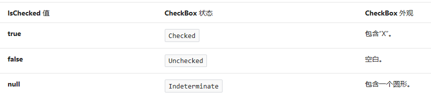
The appearance of these three states is as follows: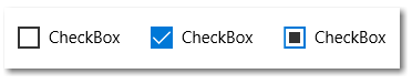
In fact, the visual state of Checkbox is much more complex. Here is the simplified model.
3. Confirm VisualState
To use VisualState, you first need to know which VisualState is included in the control. There are two groups of visualstates in ContentView2:
- CommonStates: the default is "Normal" and "PointerOver" when the mouse enters the control.
- HeaderStates: the default is "NoHeader". When the value of Header property is not empty, it is "HasHeader".
Among them, "CommonStates", "HeaderStates" are called VisualStateGroup, and "Normal", "PointerOver" are called VisualState. VisualState in the same VisualStateGroup is mutually exclusive, and the control can only be in one of each group of states. For example, a control can only be in the NoHeader state, or the HasHeader state.
A templated control can declare its VisualState using the TemplateVisualStateAttribute contract to inform the control's consumers that these visualstates are available. TemplateVisualStateAttribute is optional, and even if the control declares these visualstates, ControlTemplate can not contain any of them and will not throw an exception.
The TemplateVisualStateAttribute of ContentView2 is as follows:
[TemplateVisualState(Name = NormalState, GroupName = CommonStates)]
[TemplateVisualState(Name = PointerOverState,GroupName =CommonStates)]
[TemplateVisualState(Name = NoHeaderState, GroupName = HeaderStates)]
[TemplateVisualState(Name = HasHeaderState, GroupName = HeaderStates)]
public class ContentView2 : HeaderedContentControl
{
    public const string CommonStates = "CommonStates";
    public const string NormalState = "Normal";
    public const string PointerOverState = "PointerOver";

    public const string HeaderStates = "HeaderStates";
    public const string NoHeaderState = "NoHeader";
    public const string HasHeaderState = "HasHeader";


}
4. VisualStateManager
VisualState manager is used to manage VisualState and manipulate transformations between them.
public ContentView2()
{
    this.DefaultStyleKey = typeof(ContentView2);
}

private bool _isPointerEntered;

protected override void OnApplyTemplate()
{
    base.OnApplyTemplate();
    UpdateVisualState(false);
}

protected override void OnPointerEntered(PointerRoutedEventArgs e)
{
    base.OnPointerEntered(e);
    _isPointerEntered = true;
    UpdateVisualState();
}

protected override void OnPointerExited(PointerRoutedEventArgs e)
{
    base.OnPointerExited(e);
    _isPointerEntered = false;
    UpdateVisualState();
}

protected override void OnHeaderChanged(object oldValue, object newValue)
{
    base.OnHeaderChanged(oldValue, newValue);
    UpdateVisualState();
}

internal virtual void UpdateVisualState(bool useTransitions = true)
{
    if (_isPointerEntered)
        VisualStateManager.GoToState(this, PointerOverState, useTransitions);
    else
        VisualStateManager.GoToState(this, NormalState, useTransitions);

    if (Header == null)
        VisualStateManager.GoToState(this, NoHeaderState, useTransitions);
    else
        VisualStateManager.GoToState(this, HasHeaderState, useTransitions);
}
Other codes of ContentView2 are as shown above, which are used when OnApplyTemplate, OnHeaderChanged and mouse in and out VisualStateManager.GoToState(Control control, string stateName,bool useTransitions) update VisualState. The useTransitions parameter indicates whether to use VisualTransition for state transition. In short, when switching between visualstates, the animation defined in VisualTransition is not used.
Note the code in OnApplyTemplate: update visual state (false). Control needs to determine its state when loading the ControlTemplate. Generally, transition animation is not used at this time.
VisualStateManager.GoToState Does not make the control enter a state repeatedly, for example, if the control is already in PointerOverState, call again VisualStateManager.GoToState(this, PointerOverState, useTransitions) does not trigger any action, nor does it interrupt the in progress transition animation or repeatedly trigger the animation.
So far, ContentView2.cs has finished its work, and the next step is the responsibility of XAML.
5. Use Blend to edit ControlTemplate
When using Blend to edit the blank ControlTemplate of ContentView2, because the TemplateVisualStateAttribute has been declared, you can see that there is a defined state by default in the state window.
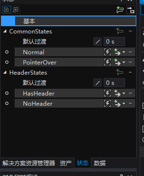
The results are as follows:
<VisualStateManager.VisualStateGroups>
    <VisualStateGroup x:Name="CommonStates">
        <VisualStateGroup.Transitions>
            <VisualTransition GeneratedDuration="0:0:0.5">
                <VisualTransition.GeneratedEasingFunction>
                    <CubicEase EasingMode="EaseInOut" />
                </VisualTransition.GeneratedEasingFunction>
            </VisualTransition>
        </VisualStateGroup.Transitions>
        <VisualState x:Name="Normal">
            <VisualState.Setters>
                <Setter Target="HeaderContentPresenter.(UIElement.Opacity)"
                        Value="0.5" />
            </VisualState.Setters>
        </VisualState>
        <VisualState x:Name="PointerOver">
            <VisualState.Setters>
                <Setter Target="HeaderContentPresenter.(UIElement.Opacity)"
                        Value="1" />
            </VisualState.Setters>
        </VisualState>
    </VisualStateGroup>
    <VisualStateGroup x:Name="HeaderStates">
        <VisualState x:Name="NoHeader">
            <VisualState.Setters>
                <Setter Target="HeaderContentPresenter.(UIElement.Visibility)"
                        Value="Collapsed" />
            </VisualState.Setters>
        </VisualState>
        <VisualState x:Name="HasHeader" />
    </VisualStateGroup>
</VisualStateManager.VisualStateGroups>
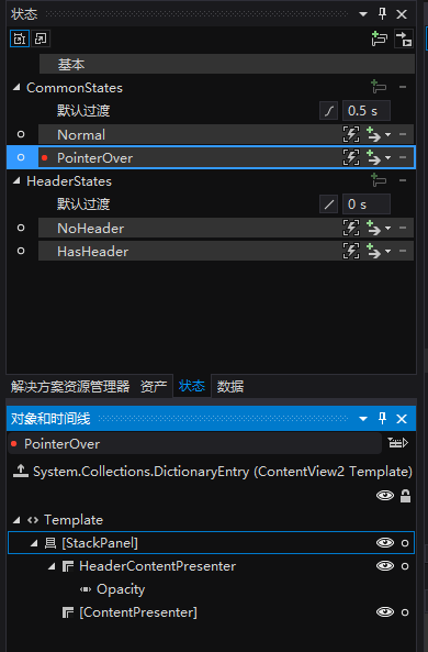
It can be seen from XAML that the Setter of the child node of VisualState is the key. For example, the VisualState of PointerOver changes the operation of the HeaderContentPresenter to 1 through Setter, which meets the requirement of "when the mouse moves to the control, set the operation of the Header = 1".
In addition, VisualStateGroup.Transitions The node defines the transition animation when CommonStates switches between states. VisualStateManager.GoToState The parameter useTransitions in (this, pointeroverstate, useTransitions) controls whether to use transition animation. The transition animation used in the example is CubicEase with a transition time of 0.5 seconds.
It should be noted that different visualstategroups should not operate on the same attribute of the same UI element as much as possible, otherwise it will cause conflicts.
This topic won't go into detail about using Blend to modify VisualState, because that takes up a lot of space. Fortunately, Blend is very easy to do in this area, and the basic operation has not changed for many years. You can find many articles in this area on the Internet.
6. Conclusion
In many cases, the visual state mode does not write less code than the TemplatePart mode. For example, the code amount of ContentView2 is basically the same as ContentView, and the number of XAML lines is more. However, the implementation of VisualState is more flexible and more in line with the principles of separation of UI and code and open and closed.