Visual common drawing (V) scatter diagram
I Introduction to scatter diagram
Scatter chart is also called X-Y chart. It displays all data in the form of points on the rectangular coordinate system to show the degree of interaction between variables. The position of points is determined by the value of variables.
By observing the distribution of data points on the scatter diagram, we can infer the correlation between variables. If there is no correlation between variables, it will appear as randomly distributed discrete points on the scatter diagram. If there is some correlation, most of the data points will be relatively dense and appear in a certain trend. The correlation of data is mainly divided into:
- Positive correlation (the values of two variables increase at the same time).
- Negative correlation (an increase in the value of one variable and a decrease in the value of another variable).
- Irrelevant.
- Linear correlation.
- Exponential correlation.
Scatter charts are often used in combination with regression lines to summarize and analyze existing data for prediction analysis.
For those variables that have close relationships, but these relationships can not be accurately expressed as mathematical formulas and physical formulas, scatter diagram is a good graphical tool. However, in the analysis process, it should be noted that the correlation between the two variables is not equal to the determined causal relationship, and other influencing factors may also need to be considered.
II Composition of scatter diagram
A standard scatter diagram shall at least include the following parts:
- Vertical axis: represents the value of one of the variables
- Horizontal axis: indicates the value of one of the variables
- Point: (X, Y)
- Regression line: the line that runs through all points most accurately
III Application scenario
Suitable for data: data from two consecutive data fields.
Main function: observe the distribution of data.
Number of applicable data: unlimited.
Note: in order to better observe the data distribution, you need to set the transparency or color of data points.
Suitable scenario:
- Displaying and comparing values can not only display trends, but also display the shape of data clusters and the relationship of data points in the data cloud.
Unsuitable scenario:
- Displays the proportion of each classification data.
IV realization
Scattergram is realized by scatter function in matplotlib. The functions are described as follows:
scatter(x, y, s=None, c=None, marker=None, cmap=None, norm=None,vmin=None, vmax=None, alpha=None, linewidths=None, *,edgecolors=None, plotnonfinite=False, data=None, **kwargs)
Parameter 1: x,y: Specifies the coordinates of the data scatter point.
Parameter 2: s: numeric type; specifies the size of scatter points.
Parameter 3: c: array or array like type, specifies the color of the scatter.
Parameter 4: marker: qualified string, specifying the marker type of scatter points (the default is' o ').
Parameter 5: cmap: Specifies the selected colormap.
Parameter 6: norm: unknown.
Parameters 7, 8: min, vmax and norm are used together to normalize the data.
Parameter 9: alpha: floating point, specifies the transparency of the scatter.
Parameter 10: linewidths: integer type; specifies the line width of the scatter edge; If the marker is None, a scatter marker is constructed using the value of verts
Parameter 11: verts: unknown.
Parameter 12: edgecolors: array type or array like type. Specify the edge color of scatter points, which will be displayed circularly.
Parameter 13: plotnonfinite: Boolean, combined with set_bad is used to specify whether it is an unrestricted point drawing.
Parameter 14: * * kwargs: the accepted keyword parameter is passed to the Collection instance.
Return value: the associated PathCollection instance.
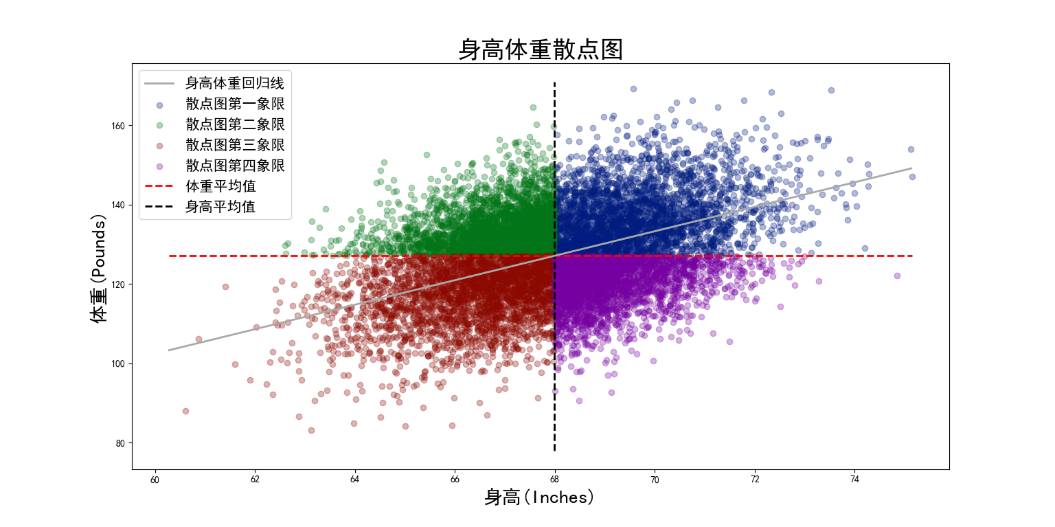
Use Socr Highweight Take the CSV data set as an example. The data set records the height and weight of 25000 objects. Take the height as the horizontal axis and the weight as the vertical axis to view the relationship between the two variables. The complete code is as follows:
import matplotlib.pyplot as plt

from sklearn.linear_model import LinearRegression

import numpy as np

import pandas as pd

plt.rcParams['font.sans-serif'] = ['SimHei']  # Settings support Chinese
plt.rcParams['axes.unicode_minus'] = False  # Setup - number
plt.style.use('seaborn-dark-palette')

df = pd.read_csv("SOCR-HeightWeight.csv", index_col=0)
height = df["Height(Inches)"].values.reshape(-1, 1)
weight = df["Weight(Pounds)"].values.reshape(-1, 1)

model = LinearRegression()
model.fit(height, weight)
coef = model.coef_[0]
intercept = model.intercept_[0]

height_avg = np.average(height)
weight_avg = np.average(weight)

quadrant1 = df[(df["Height(Inches)"] >= height_avg) & (df["Weight(Pounds)"] >= weight_avg)]
quadrant1_height = quadrant1["Height(Inches)"][:3000]
quadrant1_weight = quadrant1["Weight(Pounds)"][:3000]
plt.scatter(quadrant1_height, quadrant1_weight, alpha=0.3, label="Scatter diagram first quadrant")

quadrant2 = df[(df["Height(Inches)"] <= height_avg) & (df["Weight(Pounds)"] >= weight_avg)]
quadrant2_height = quadrant2["Height(Inches)"][:3000]
quadrant2_weight = quadrant2["Weight(Pounds)"][:3000]
plt.scatter(quadrant2_height, quadrant2_weight, alpha=0.3, label="Scatter plot second quadrant")

quadrant3 = df[(df["Height(Inches)"] <= height_avg) & (df["Weight(Pounds)"] <= weight_avg)]
quadrant3_height = quadrant3["Height(Inches)"][:3000]
quadrant3_weight = quadrant3["Weight(Pounds)"][:3000]
plt.scatter(quadrant3_height, quadrant3_weight, alpha=0.3, label="Third quadrant of scatter chart")

quadrant4 = df[(df["Height(Inches)"] >= height_avg) & (df["Weight(Pounds)"] <= weight_avg)]
quadrant4_height = quadrant4["Height(Inches)"][:3000]
quadrant4_weight = quadrant4["Weight(Pounds)"][:3000]
plt.scatter(quadrant4_height, quadrant4_weight, alpha=0.3, label="Fourth quadrant of scatter chart")

# Draw average
plt.hlines(weight_avg, min(height), max(height), ls="--", color='r', lw=2, label='Average weight')
plt.vlines(height_avg, min(weight), max(weight), ls='--', color='k', lw=2, label='Average height')
x = np.arange(min(height), max(height), 0.05)
y = coef * x + intercept
plt.plot(x, y, lw=2, color="darkgray", label="Regression line of height and weight")
plt.title("Scatter diagram of height and weight", fontsize=25, fontweight="bold")
plt.xlabel("height(Inches)", fontsize=20)
plt.ylabel("weight(Pounds)", fontsize=20)
plt.legend(fontsize=15)
plt.show()
The results are as follows:
