Dynamic component
Objective: multiple components use the same mount point and switch dynamically, which is called dynamic components
Steps:
- 2 components to be switched - username.vue / userinfo.vue
- Import to UseDynamic.vue registration
- Prepare variables to host the component name to display
- Set the mount point < component >, and use the is attribute to set which component to display
- Click the button – modify the "component name" in the comName variable
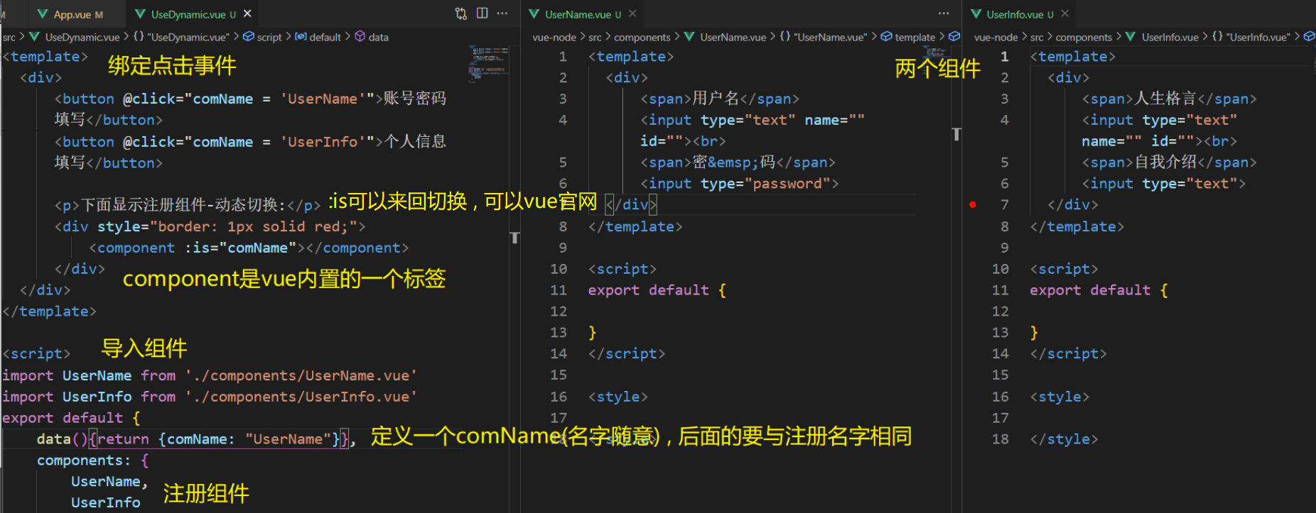
Finally, import UseDynamic.vue into app.vue and register for use
Let's look at the source code
//  UseDynamic.vue
<template>
  <div>
      <button @click="comName = 'UserName'">Account and password filling</button>
      <button @click="comName = 'UserInfo'">Fill in personal information</button>

      <p>The registration component is shown below-Dynamic switching:</p>
      <div style="border: 1px solid red;">
          <component :is="comName"></component>
      </div>
  </div>
</template>

<script>
// Target: dynamic component - toggle component display
// Scenario: the same mount point needs to switch the display of different components
// 1. Create the component to be switched - label + style
// 2. Import into the vue file to be displayed and register
// 3. Variable - carries the name of the component to be displayed
// 4. Set mount point: is = "variable" > < / component >
// 5. Click the button - switch the value of comName to the component name to be displayed
import UserName from './components/UserName.vue'
import UserInfo from './components/UserInfo.vue'
export default {
    data(){return {comName: "UserName"}},
    components: {
        UserName,
        UserInfo
    }
}
</script>
// UserName.vue
<template>
<div>
<span>user name</span>
<input type="text" name="" id=""><br>
<span>dense code</span>
<input type="password">
</div>
</template>
<script>
export default {
}
</script>
<style>
</style>// UserInfo.vue
<template>
<div>
<span>Life motto</span>
<input type="text" name="" id=""><br>
<span>self-introduction</span>
<input type="text">
</div>
</template>
<script>
export default {
}
</script>
<style>
</style>Component cache
Objective: component switching will lead to frequent destruction and re creation of components, and the performance is not high
With the built-in keep alive component of Vue, the package components can be saved in memory without being destroyed
<div style="border: 1px solid red;">
    <!-- Vue built-in keep-alive assembly, Cache the packaged components -->
    <keep-alive>
        <component :is="comName"></component>
    </keep-alive>
</div>
Component active and inactive
Target: cached components are no longer created and destroyed, but activated and deactivated
Add 2 hook method names:
Activated – triggered when activated
deactivated – triggered when the active state is lost
Component slot
Objective: it is used to realize the content distribution of components. Through the slot tag, you can receive the content written in the component tag

Let's look at the source code
<template>
  <div id="container">
    <div id="app">
      <h3>Case: folding panel</h3>
      <Pannel>
          Heavenly King covering the earth tiger
      </Pannel>
    </div>
  </div>
</template>

<script>
import Pannel from "./components/Pannel.vue"
export default {
  components: {
    Pannel
  },
};
</script>
<template>
<div>
<!-- Button title -->
<div class="title">
<h4>Send Xin Jian from Furong building</h4>
<span class="btn" @click="isShow = !isShow">
{{ isShow ? "Put away" : "open" }}
</span>
</div>
<slot></slot>
<!-- Drop down content -->
<div class="container" v-show="isShow">
<p>Cold and rainy rivers enter Wu at night,</p>
<p>Seeing off guests in pingming, Chu mountain is lonely.</p>
<p>Luoyang relatives and friends ask each other,</p>
<p>A piece of ice is in the jade pot.</p>
</div>
</div>
</template>
<script>
export default {
data() {
return {
isShow: false,
};
},
};
</script>
<style scoped>
h3 {
text-align: center;
}
.title {
display: flex;
justify-content: space-between;
align-items: center;
border: 1px solid #ccc;
padding: 0 1em;
}
.title h4 {
line-height: 2;
margin: 0;
}
.container {
border: 1px solid #ccc;
padding: 0 1em;
}
.btn {
/* Change the mouse to the shape of the hand */
cursor: pointer;
}
img {
width: 50%;
}
</style>Slot default content
Objective: if you don't send it outside, you want to give a default display content
Pithy formula: < slot > the content clamped is displayed by default. If you do not pass anything to the slot, the content clamped by < slot > will be displayed in place
<slot>What's in it? What's in it<slot>
Named slot
Objective: when there are more than 2 places in a component where external incoming labels are required v-slot can be simplified to # use
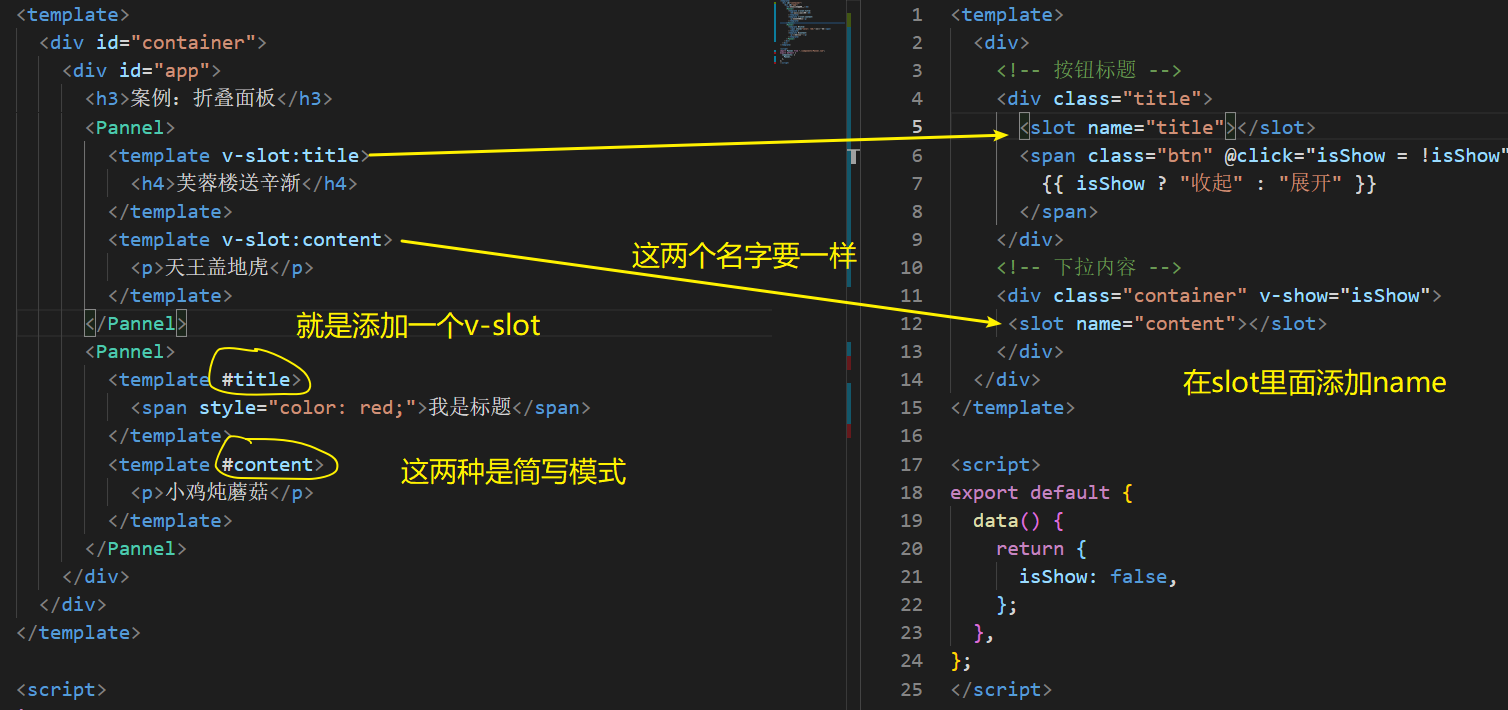
The following is the source code. You can try it and add some content yourself
<template>
  <div id="container">
    <div id="app">
      <h3>Case: folding panel</h3>
      <Pannel>
        <template v-slot:title>
          <h4>Send Xin Jian from Furong building</h4>
        </template>
        <template v-slot:content>
          <p>Heavenly King covering the earth tiger</p>
        </template>
      </Pannel>
      <Pannel>
        <template #title>
          <span style="color: red;">I'm the title</span>
        </template>
        <template #content>
          <p>Stewed mushroom with chicken</p>
        </template>
      </Pannel>
    </div>
  </div>
</template>

<script>
import Pannel from "./components/Pannel.vue";
export default {
  components: {
    Pannel,
  },
};
</script>
<template>
<div>
<!-- Button title -->
<div class="title">
<slot name="title"></slot>
<span class="btn" @click="isShow = !isShow">
{{ isShow ? "Put away" : "open" }}
</span>
</div>
<!-- Drop down content -->
<div class="container" v-show="isShow">
<slot name="content"></slot>
</div>
</div>
</template>
<script>
export default {
data() {
return {
isShow: false,
};
},
};
</script>
<style scoped>
h3 {
text-align: center;
}
.title {
display: flex;
justify-content: space-between;
align-items: center;
border: 1px solid #ccc;
padding: 0 1em;
}
.title h4 {
line-height: 2;
margin: 0;
}
.container {
border: 1px solid #ccc;
padding: 0 1em;
}
.btn {
/* Change the mouse to the shape of the hand */
cursor: pointer;
}
img {
width: 50%;
}
</style>Scope slot
Objective: when using slots, you want to use variables in subcomponents
- Sub component: bind attributes and values in the sub component on the slot
- Use components, pass in custom tags, and use template and v-slot = "custom variable name"
- The scope variable name is automatically bound to all attributes and values on the slot scope = {row: defaultObj}
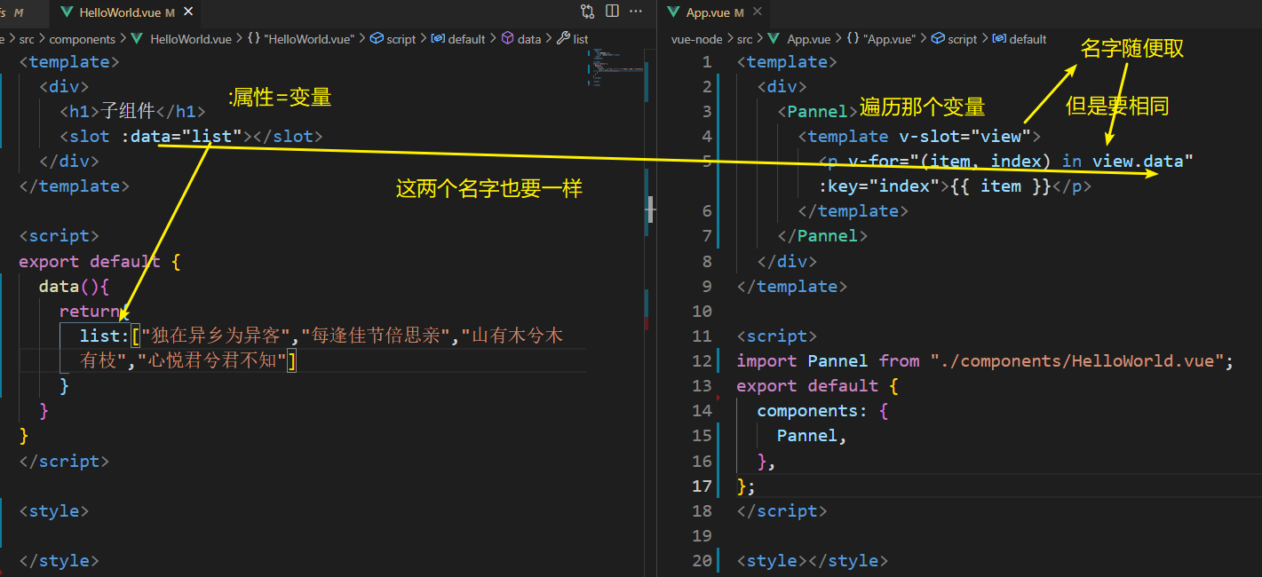
Here is the source code
<template>
  <div>
    <Pannel>
      <template v-slot="view">
        <p v-for="(item, index) in view.data" :key="index">{{ item }}</p>
      </template>
    </Pannel>
  </div>
</template>

<script>
import Pannel from "./components/HelloWorld.vue";
export default {
  components: {
    Pannel,
  },
};
</script>

<style></style>
<template>
  <div>
    <h1>Subcomponents</h1>
    <slot :data="list"></slot>
  </div>
</template>

<script>
export default {
  data(){
    return{
      list:["Be a stranger in a foreign land alone","I miss my family every festival","Mountains have trees and trees have branches","You don't know how happy you are"]
    }
  }
}
</script>

<style>

</style>
Custom instruction
Objective: to obtain tags and expand additional functions
When Vue built-in instructions cannot meet the requirements, you can define and use them yourself
Global registration -- syntax
Vue.directive("Instruction name", {
  "inserted"(el) {
    //Additional functionality can be extended for ek tags
  }
})
Local registration -- syntax
directives:{
    "Instruction name":{
      inserted(el){
        // Operate on el
      }
    }
}
Look at the example Use the v-instruction name
//  main.js

import Vue from 'vue'
import App from './App.vue'

Vue.config.productionTip = false

//Global registration custom focus
Vue.directive("gfocus", {
  "inserted"(el) {
    el.focus()
  }
})

new Vue({
  render: h => h(App),
}).$mount('#app')
// App.vue
<template>
  <div>
    <h1>Auto focus</h1>
    <!-- Auto focus customization-->
    <input type="text" v-gfocus />
  </div>
</template>

<script>
// Objective: to create a "custom command" to make the input box auto focus
// 1. Create custom instructions
// Global / local
// 2. Use the custom instruction v- instruction name on the label
export default {
  // Local definition
  directives: {
    gfocus: {
      inserted(el) {
        el.focus();
      },
    },
  },
};
</script>

<style></style>
Custom instruction - value transfer
Target: pass in a value using a custom directive
be careful:
- Inserted method - the tag where the instruction is located. It is triggered when it is inserted into the web page (once)
- update method - this method is executed when the corresponding data / label of the instruction is updated
Click to change the text color (I wrote global registration, you can try to write with local registration)
// main.js
import Vue from 'vue'
import App from './App.vue'

Vue.config.productionTip = false

// Target: custom instruction value transfer
Vue.directive('color', {
  inserted(el, binding) { // Called when the bound element is inserted into the parent element
    el.style.color = binding.value
  },
  update(el, binding) {  // This function is triggered when the value or template is updated
    el.style.color = binding.value
  }
})

new Vue({
  render: h => h(App),
}).$mount('#app')
// App.vue
<template>
  <div>
    <p v-color="colorStr" @click="changeColor">Change text color</p>
  </div>
</template>

<script>
export default {
  data() {
    return {
      colorStr: "pink",
    };
  },
  methods: {
    changeColor() {
      this.colorStr = 'skyblue';
    },
  },
};
</script>

<style></style>