Project effect display:
1. Project overview
1.1 overview of basic business of e-commerce project
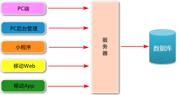
Generally, the business services used by customers include: PC, applet, mobile web and mobile app.
Business services used by administrators: PC background management end;
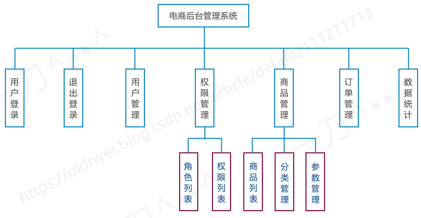
- Functions of PC background management end
Manage user account (login, logout, user management, permission management), commodity management (commodity classification, classification parameters, commodity information, order), data statistics;
- Development mode
The project (e-commerce background management system) adopts the development mode of "separation of front and back ends".
The front-end project is a Vue based SPA (single page application) project;
- Technical selection of the project
Front end project technology stack ()
- Vue;
- Vue-Router;
- Element-UI;
- Axios;
- Echarts
Backend project technology stack
- Node.js;
- Express;
- Jwt (simulated session);
- Mysql;
- Sequenize (framework for operating the database)
1.2 functions of e-commerce background management system
The e-commerce background management system is used to manage user account, commodity classification, commodity information, orders, data statistics and other business functions.
1.3 development mode of e-commerce background management system (separation of front and back ends)
The e-commerce background management system as a whole adopts the development mode of front-end and back-end separation, in which the front-end project is a SPA project based on Vue technology stack.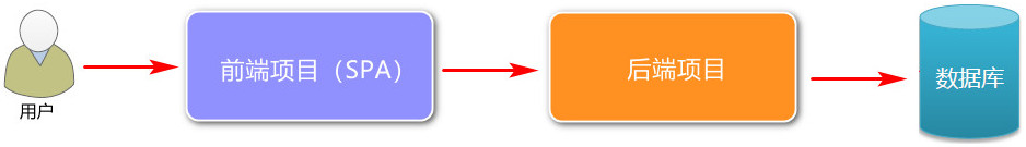
What is the development model of {front-end and back-end separation?
- Front end: it is mainly responsible for drawing pages. At the same time, it calls the API interface provided by the back end based on Ajax technology;
- Back end: it is mainly responsible for} operating the database and exposing API interfaces to the front end.
The development mode of separating front end and back end is the current} mainstream development mode.
Advantages: high development efficiency and easy maintenance of the project.

2. Project initialization
2.1 front end project initialization steps
- Installation of Vue scaffold

Install the Vue CLI interactive project scaffold (a complete system for rapid development based on Vue.js).
-
1) cmd to install the Vue CLI package:
npm install -g @vue/cli
2) After installation, check whether the version is correct:
vue --version
The package name of Vue CLI is changed from Vue CLI to @ vue/cli. If you have globally installed the old version of Vue CLI (1. X or 2.x), you need to uninstall it through {NPM uninstall Vue CLI - G} or {yarn global remove Vue CLI}.
Node version requirements:
Vue CLI 4.x requires Node js v8. 9 or higher (v10 or higher is recommended). You can use n, nvm or nvm windows to manage multiple Node versions on the same computer.
2. Create the project through Vue scaffold (this project development is created by "visual panel")
1) cmd terminal input:
vue ui
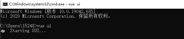
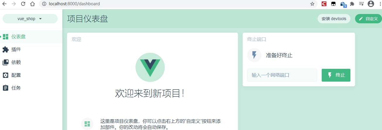
After running, the following page will be opened automatically: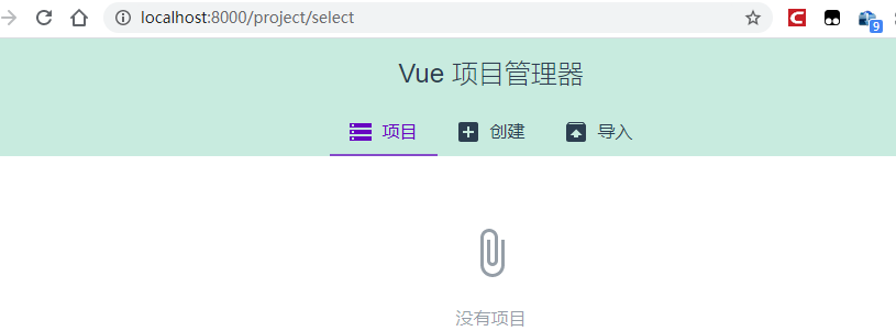
2) Click "+ create" to enter the directory selection panel and select the directory. Then click "+ create new directory here" button.
Fill in project information: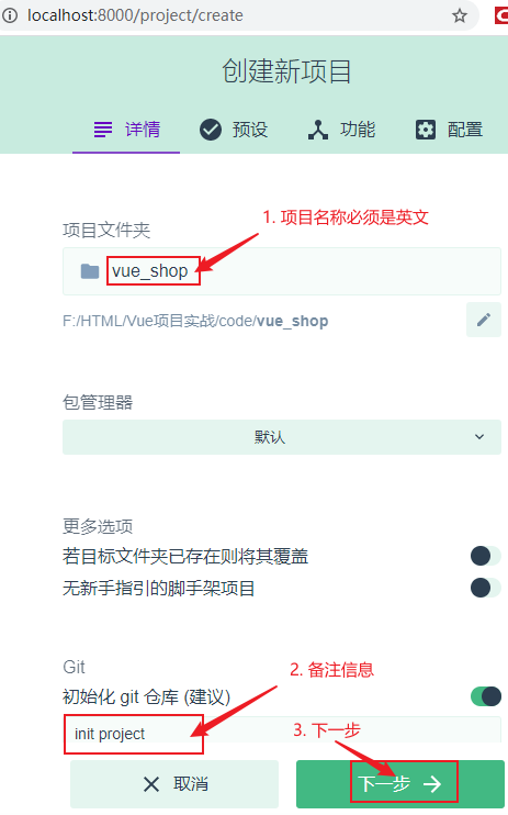
3) Enter the preset panel and check it as shown below: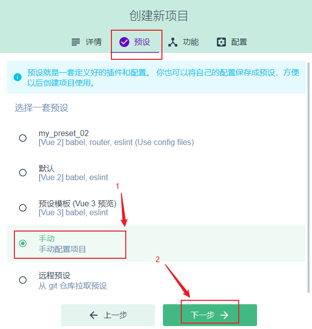
4) Click next to enter the "function" selection panel:
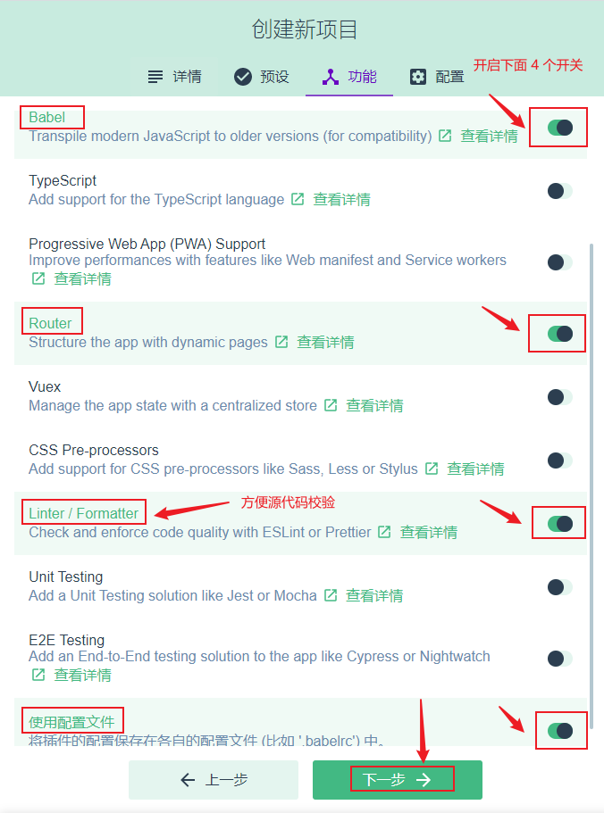
In the above figure, after "use profile" is checked, different configurations} will be stored as one profile. Click next to open the configuration panel.
5) Complete the following operations: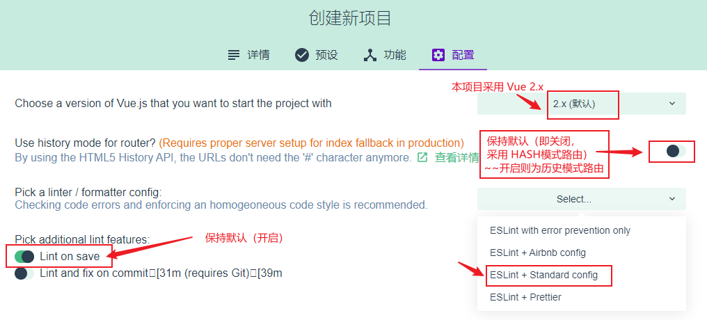
6) Click next. Prompt whether to save the new preset (it is convenient to directly select the configuration next time / or not).
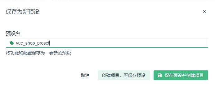
After clicking "save preset and create item", the system automatically creates items as follows:
3. Configure Vue routing
It has been automatically configured in the above steps.
4. Configure element UI component library: install in plug-in and search Vue cli plugin element
1) Open the dashboard, click the plug-in button on the left, and then click "+ add plug-in" in the upper right corner
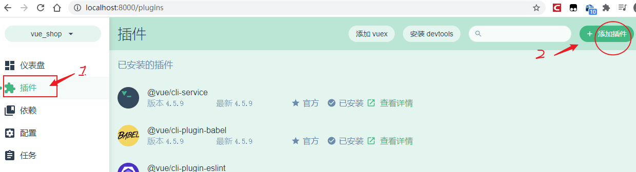
2) Search for the plug-in Vue cli plugin element and install it.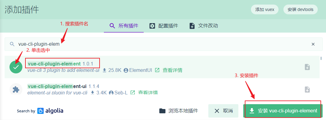
3) Jump to the "configure plug-ins" panel, as follows: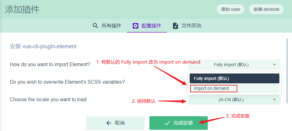
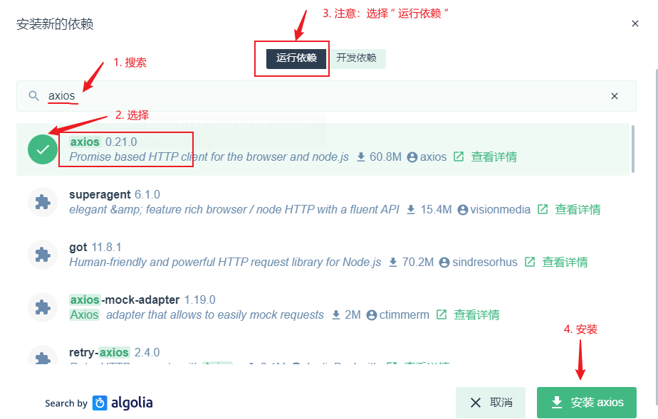
5. Configure axios Library: install in dependency and search for axios (run dependency)
1) Click the "dependency" button in the left sidebar, and then click "install dependency" in the upper right corner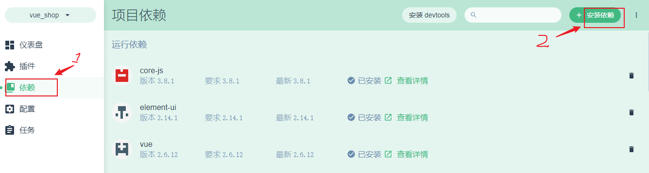
2) Installation dependency
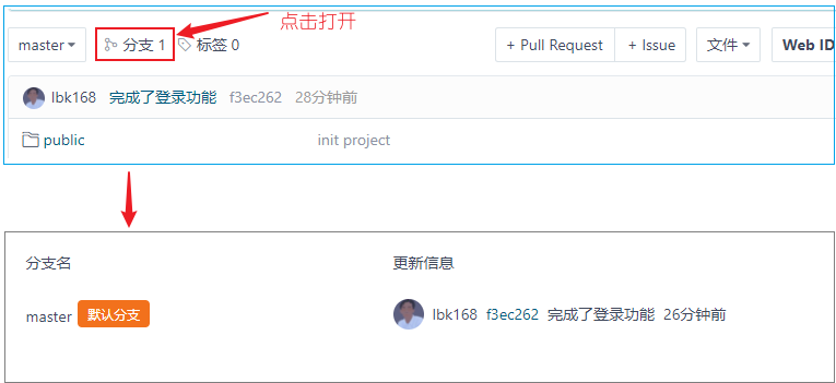
6. Initialize git remote warehouse
7. Hosting local projects in Github or code cloud (facilitating collaborative development by team members)
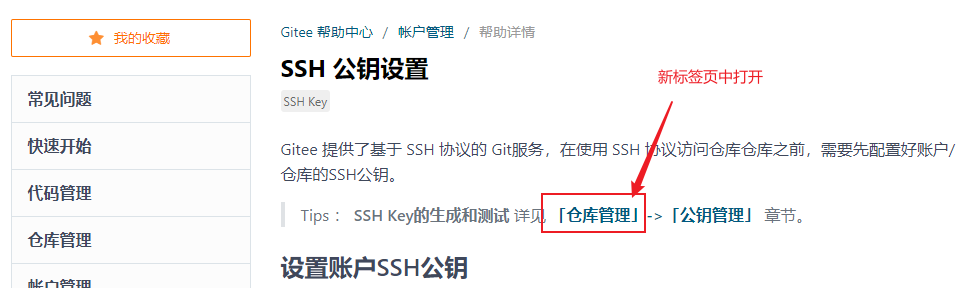
Code cloud related operations
1. Registered login code, cloud account, registered address: https://gitee.com/signup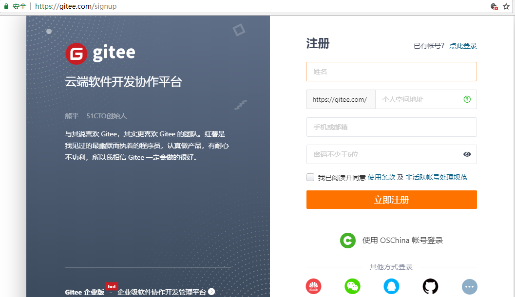
2. Install git
If you use Git on Windows, you can download the installer directly from the Git official website for installation.
Test: git --version (printing the publication number in the terminal means the installation is successful)
3. Click "login" in the upper right corner of the website, login code cloud, and set the account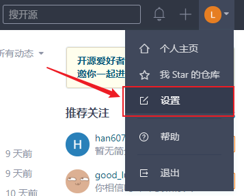
next step:
next step:
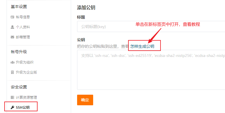
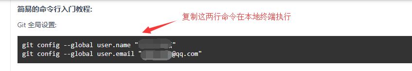
4. Create a public key locally (run the following command in the terminal)
ssh-keygen -t rsa -C "xxx@xxx.com"
Note: in the above command (example)“ xxx@xxx.com ”Please be sure to replace it with your real email when registering gitee, and then press enter to execute!
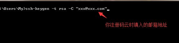
Then press enter, and then press enter 3 times in a row (no operation is required in the middle) to generate the public key, as shown in the figure:
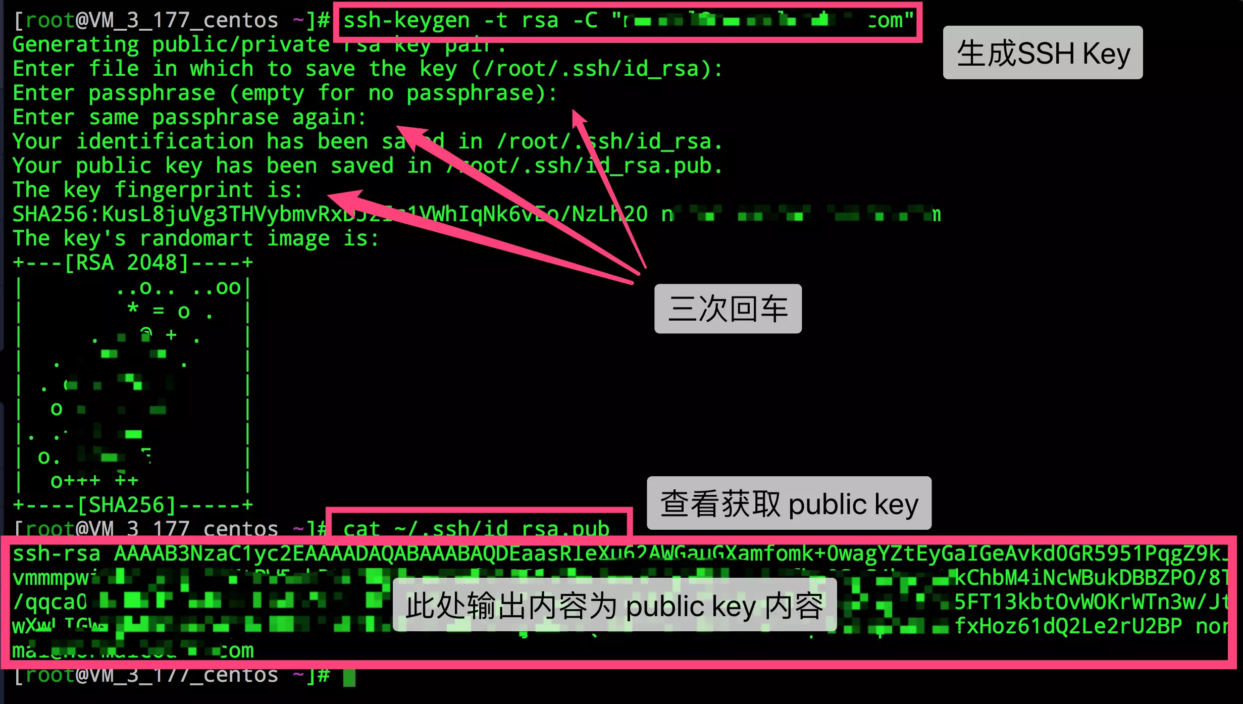
5. Find the public key address
Your identification has been saved in /c/Users/My/.ssh/id_rsa;
Your public key has been saved in /c/Users/My/.ssh/ id_rsa.pub.
After creating the public key, please pay attention to the printed message "Your public key has been saved in"
/c/Users/My/. ssh/id_rsa.pub: users under Disk C, my under disk C ID under SSH_ rsa. Pub is the created public key.
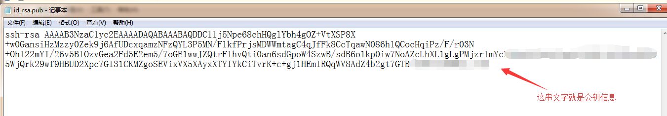
6. Open ID with Notepad or other editor_ rsa. Pub file, copy all codes in the file:
Then click the SSH public key button in the code cloud to paste the copied public key into the public key text box.
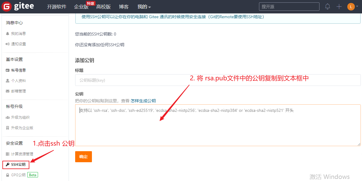
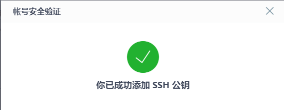
Click the "OK" button, and then enter the verification password according to the prompt to complete the addition of ssh public key:
7. Test whether the public key is added successfully
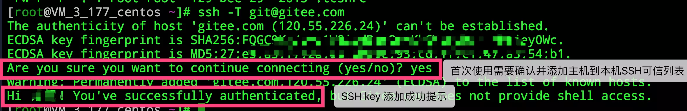
After adding the public key in the "gitee" setting, enter in the cmd terminal:
ssh -T git@gitee.com
In the process, when the query (continue connection?) as shown in the figure below appears, enter "yes" and press enter to continue until the command execution is completed.

For the first use, confirm and add the host to the local SSH trusted list. If hi XXX is returned! You’ve successfully authenticated, but Gitee.com does not provide shell access. Content, it proves that the addition is successful. As shown in the figure below:
Run the command SSH - t again git@gitee.com , you can also see the following information: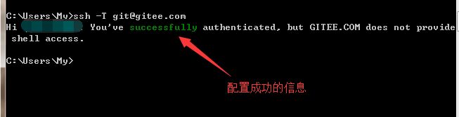
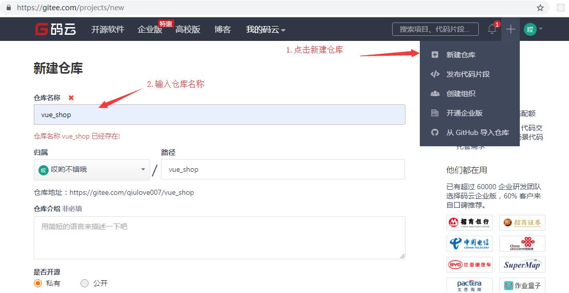
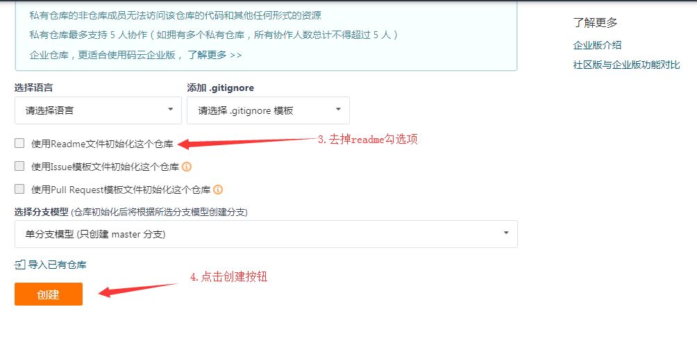
8. Hosting the local code into the code cloud
Click the + sign in the upper right corner of the code cloud - > new warehouse
9. Configure git
Note: before executing the following commands, you must ensure that {git has been installed on this machine, otherwise} errors will be reported in the terminal.
10. First project submission
1) Check status: enter the following command under the project root directory
git status
The operation results show that there are untracked files in the project that have not been submitted, as shown below: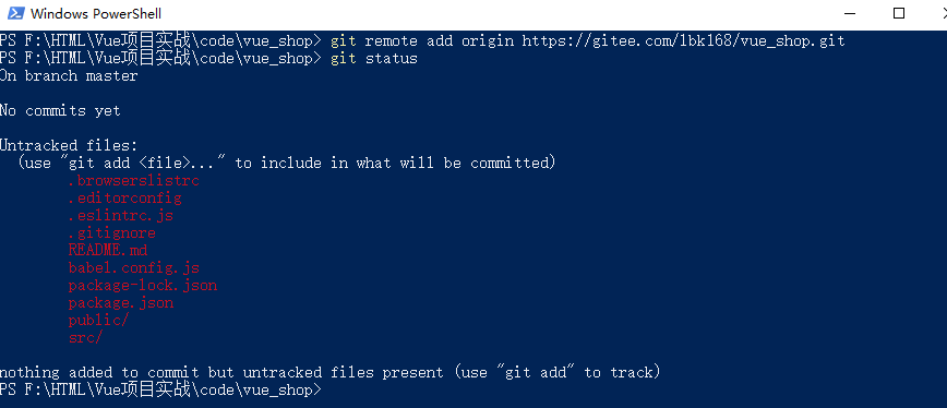
At this time, you need to add all the files to the temporary storage area.
2) Add to} staging area: run the following command:
git add .
Note: add in the command and the following (small dot) there is a space in the middle, otherwise an error will be reported.
3) Submit locally: submit files in staging area to} local warehouse:
git commit -m "add files"
Recheck the status:
git status
The operation results are as follows:
It indicates that "it is in the main branch and the working directory is clean", that is, there are no files to be submitted.
However, the current operations only operate the warehouse locally, and the warehouse has not been uploaded to the code cloud,
4) Associate local warehouse with remote {git warehouse}
Find and run the code (the two sentences provided at the bottom of your new code cloud warehouse vue_shop page) in the terminal, as follows:
git remote add origin https://gitee.com/XXXXX/vue_shop.git
git push -u origin master
Note: XXXX is your code cloud account name (not your email name). If an error is reported during operation, please click here See solutions.
When executing the second command, the following security verification will pop up. After entering the user name and password for confirmation, wait for the submission to be completed.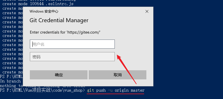
Note: if the code is submitted to the code cloud for the first time, the account and password input window of the code cloud will pop up (it will not appear again in the future)
5) Check whether the upload (remote warehouse) is successful
Click "Refresh" in the remote warehouse to see the submitted information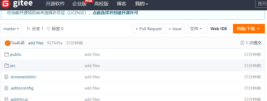
Like this, it means that the local warehouse has been successfully uploaded to the code cloud.
2.2 background project environment installation configuration
2.2. 1 install MySQL database
① phpStudy provided in the installation material, fool installation.
② Decompress the compressed package in the material and remember the decompression path.
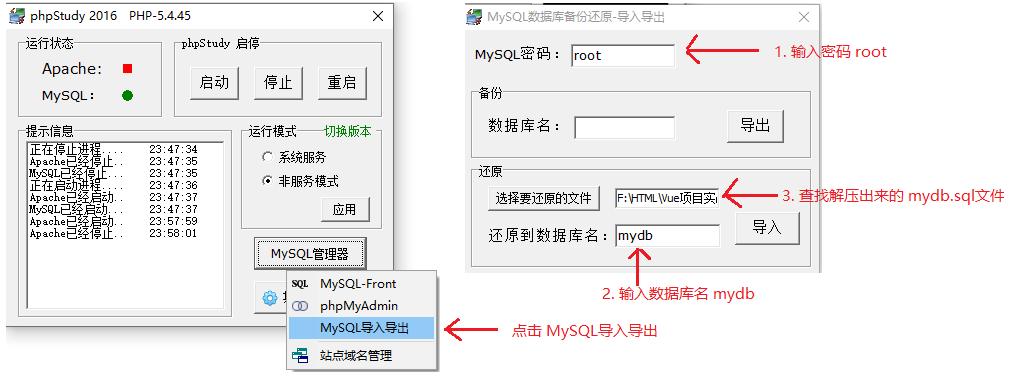
③ Run phpStudy, click the MySQL Manager button, and select the MySQL import / export menu item.
④ As shown in the figure above, find mydb in the extracted db folder under the corresponding path SQL database script file, click the "import" button, and a black command line window will pop up automatically to restore the database (this time is a little longer, please wait patiently ~);
reminder! At the end of restore, the black command line window will close automatically. At this time, you can view the generated database as shown below.
If you can see the path and file shown in the following figure in the database directory, it means that the database is restored successfully!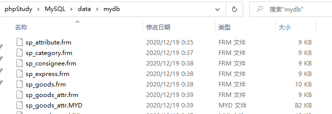
Note: since Apache does not need to be used in the development process, you can "stop" the service, as shown in the figure below: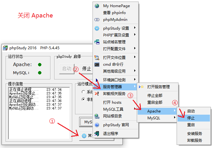
2.2. 2. Configure background items
Vue, which has been decompressed earlier_ api_ Server is the background API project. However, you need to {install the dependency package} before it can run normally.
A. Install the {nodeJS} environment and configure background projects
B. Install project dependency package
Enter} Vue_ api_ In the server directory, shift + right click select "open Powershell window here" in the pop-up menu to open the terminal, and enter the command to install the project dependency package:
npm install
C. Start project
Continue to enter the following command in the terminal to start the project:
node .\app.js
Note: before starting, you must start the MySQL service of phpStudy.
D. Use the # postman # to test whether the # API # interface is normal.
Installing postman software( Click here to download ), start PostMan and fill in relevant parameters (simple registration is required for the first use of the software), as shown below:
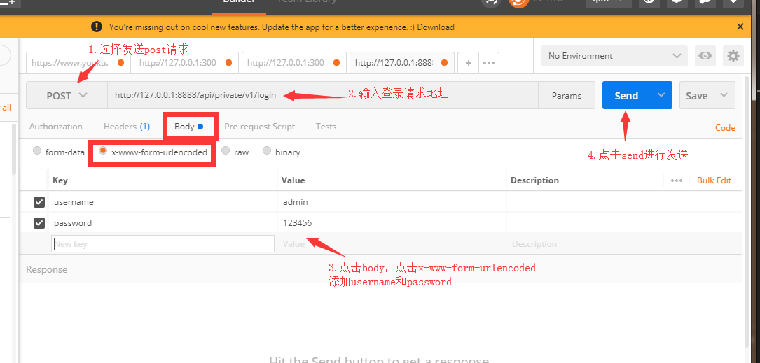
Note: when entering the login request address, user field name and password field name, be sure to be consistent with the API document;
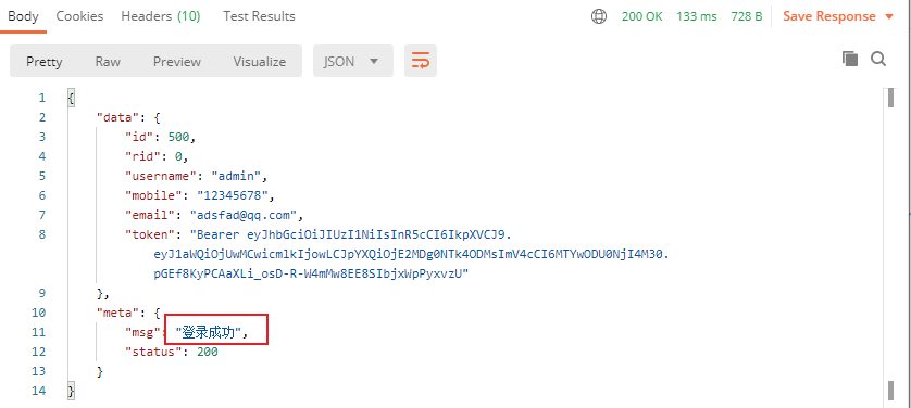
After clicking "Send", the server will return the following information:
E-commerce management background {API interface document} Download: https://pan.baidu.com/s/1OGxh05B0BocQm9cP3BWO7w Extraction code:
3. Login / logout function
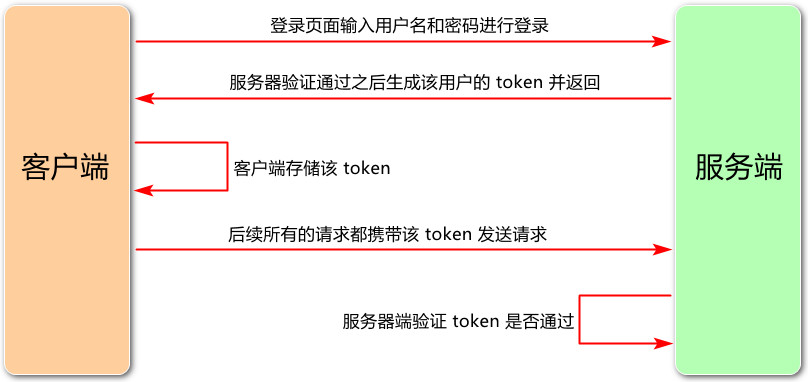
3.1 login overview
1. Login business process
-
Enter your user name and password on the login page
-
Call the background interface for verification
-
After verification, jump to the project home page according to the response status of the background
2. Relevant technical points of login service
-
http} is stateless;
-
Record the status on the client through a cookie;
-
Record the status on the server through session;
-
Maintain the status through token (recommended for domain token)
3.2 login token principle analysis
3.3 realize login function
-
1, Login logic:
Enter the account and password on the login page to log in, and send the data to the server = = > the server returns the login result. If the login is successful, the data is returned with a token = = > the client obtains the token and saves it. Subsequent requests need to send the token to the server, and the server will verify the token to ensure the user identity.
2, Login status remains:
1) If the server and client are of the same origin 1 , it is recommended to use cookie s or session s to maintain login status;
2) If the client and server are} cross domain 2 , it is recommended to use token to maintain login status.
http://www.123.com/index.html call http://www.123.com/abc.do (non cross domain)
http://www.123.com/index.html call http://www.456.com/abc.do (different primary domain names: 123 / 456, cross domain)
http://abc.123.com/index.html call http://def.123.com/server.do (different subdomains: abc/def, cross domain)
http://www.123.com:8080/index.html call http://www.123.com:8081/server.do (different ports: 8080 / 8081, cross domain)
http://www.123.com/index.html call https://www.123.com/server.do (different protocols: http/https, cross domain)
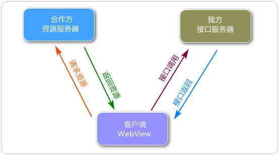
Because the partner domain name is different from our domain name, when calling our interface from the partner loading page, a cross domain error will appear.
3, Add a new branch login and develop the current project Vue in the login branch_ shop:
1) Open Vue in the project root directory_ Shop} terminal (shift + right click to open through vs code), and use git status command to determine the current project status (whether it is clean or not).
git status
The operation results are as follows: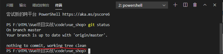
Indicates that the current workspace is clean and can be used to draw the login page.
——You need to create a new branch.
2) After confirming that the current working directory is clean, create a new branch and switch to the branch for development. After development, merge it into the master
git checkout -b login
Note: when developing a new function, try to put it into a new branch. When the function is developed, merge it into the main branch master.
3) Then the git branch command looks at the newly created branch and determines that we are using the login branch to develop.
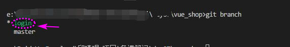
Green ^ indicates the current branch.
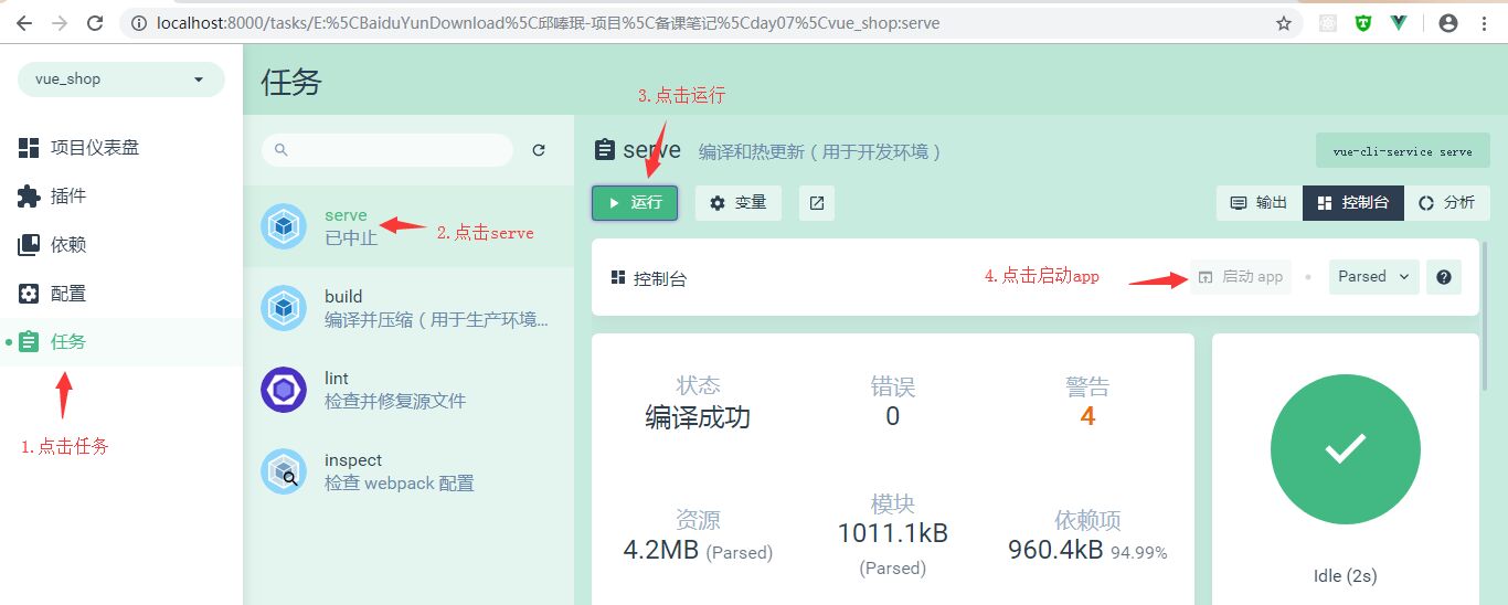
4) Next, execute the vue ui command to open the vue ui interface, then run serve and run app to view the effect of the current project.
4, Layout of login page
Click "start App" to open the project: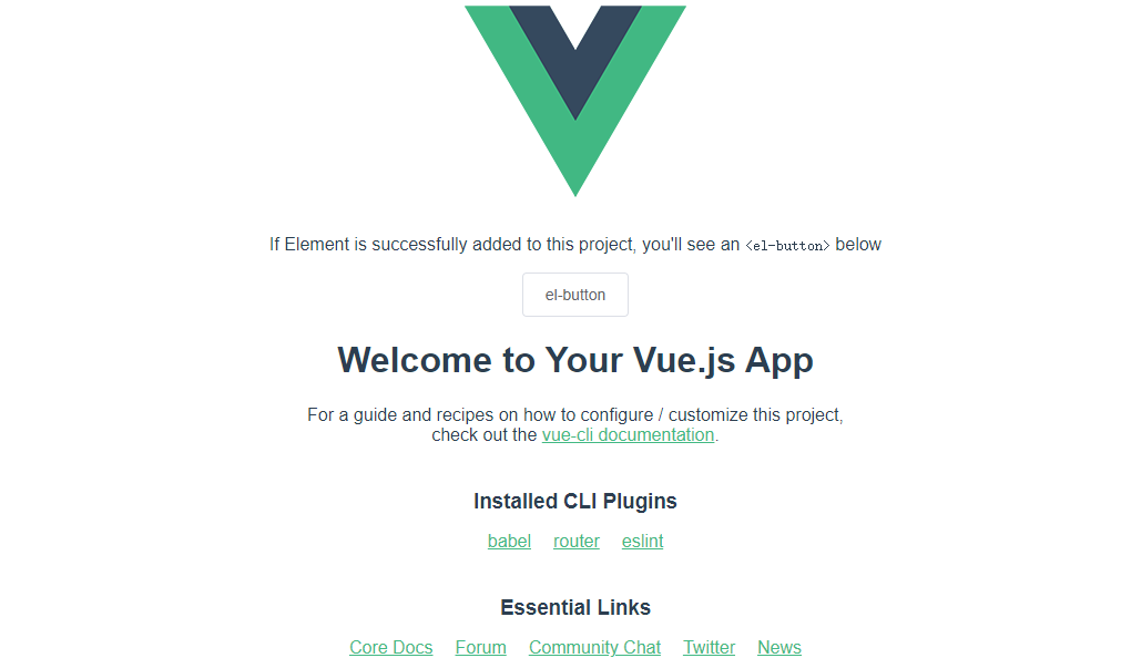
At this point, we can see that it is only a default page, and we need to reset it to a blank page:
1) Open the src directory of the project and click View main JS file (this is the} entry file of the whole project):
import Vue from 'vue'
import App from './App.vue'
import router from './router'
import './plugins/element.js'

Vue.config.productionTip = false

new Vue({
	// Mount the router route to the instance
	router,
	// Render the App root component to the page through the render function
	render: h => h(App)
}).$mount('#app')
2) Open app Vue (root component), clean up the contents of the root component (only the root node is left in template, the default export is left in script, the components are removed, and all styles are removed in style). After cleaning, it is as follows:
<template>
	<div id="app">
		<router-view></router-view>
	</div>
</template>

<script>
export default {
	name: 'app'
}
</script>

<style>
</style>
3) Then open index. Under the routing folder JS (for projects created by some versions of Vue ui, the routing file in the router folder is named router.js), clear all the default routing rules in the routes array, and then delete views:
import Vue from 'vue'
import Router from 'vue-router'

Vue.use(Router)

export default new Router({
	routes: [

	]
})
5, New login Vue component
1) Put HelloWorld. In the components folder Vue delete and create a new login Vue is a single file component. Add the "template", "script" and "style" tags. The "scoped" in the style tag can prevent style conflicts between components (without scoped, the style is global).
<template>
	<div class="login_container">

    </div>
</template>

<script>
export default {

}
</script>

<style lang="less" scoped>
.login_container {
	background-color: #2b4b6b;
	height: 100%;
}

</style>
scoped: it is a vue instruction used to control the effective range of the component (it means that it is only effective in the current component, and it should be added as long as it is a single file component)
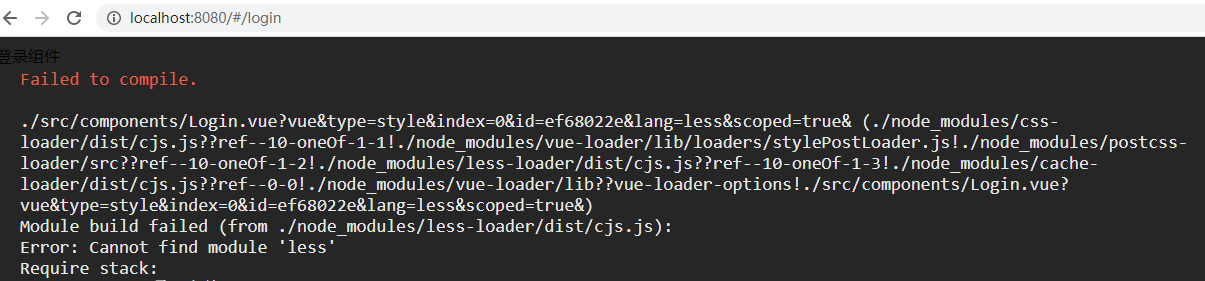
Note: after adding the background style and saving the code modification, the browser will report the error "less loader not found", as shown in the following figure:
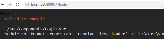
This is because the project created by Vue's cli tool does not have the {less} related} loader installed by default. If you want to use the} less} syntax (such as < style lang = "less" scoped >), you need to configure the} less loader (development dependency) and install} less (development dependency).
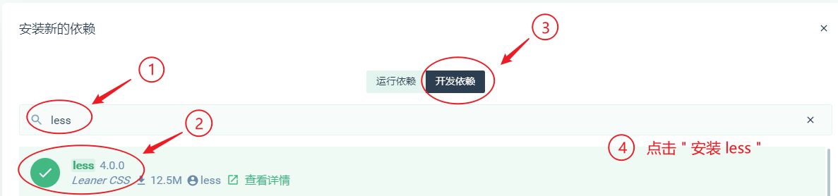
Therefore, next, open the visualization panel and install the # less loader # and # less: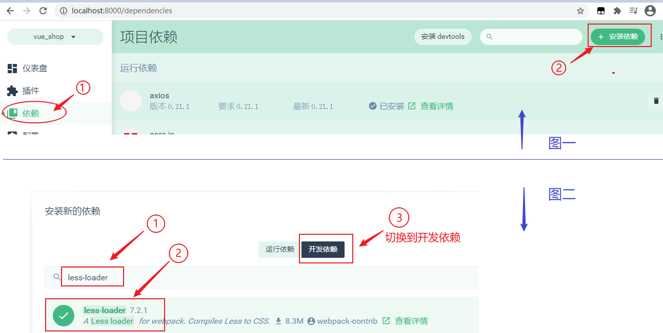
As shown in the figure above, after searching and installing the} less loader, the browser still reports an error, as shown below:
At this time, go back to the install dependencies interface, search for less again and install it (because less loader depends on less).
At this time, refreshing the web page does not take effect (it is still in the error status). Next, close the web page, stop the {server, and click} run} again.
2) In the routing file {index JS Vue components and set rules;
const router = new Router({
	routes: [
		// When the user accesses the address / login, specify the component login to be displayed through the component attribute
		{ path: '/login', component: Login }
	]
})
3) In app Add a route placeholder to Vue:
<template>
  <div id="app">
    <!-- Routing Point Identifier -->
    <router-view></router-view>
  </div>
</template>
4) Since the default access is localhost:8080 / #/ (i.e. the root path), you need to manually add / login to access the login component.
Therefore, in order to realize "automatically redirect to the / login address as long as the user accesses the / (slash) root path", a redirection routing rule must be added here. That is, add a sentence {path: '/', redirect: '/login'} in the routing file index.js, as shown below:
const router = new Router({
	routes: [
		// Redirection Route
		{ path: '/', redirect: '/login' },
		// When the user accesses the address / login, specify the component login to be displayed through the component attribute
		{ path: '/login', component: Login }
	]
})
5) Then you need to add a public style, add a css folder under the "assets" folder, and create a global css file, add global style.
/* Global style sheet */
html,body,#app{
    width: 100%;
    height: 100%;
    margin: 0;
    padding: 0;
}
6) In the entry file, @ main JS , import , global CSS to make the global style effective
import "./assets/css/global.css"
7) Then, add login The root element in Vue # is also set to hold the full screen (height:100%)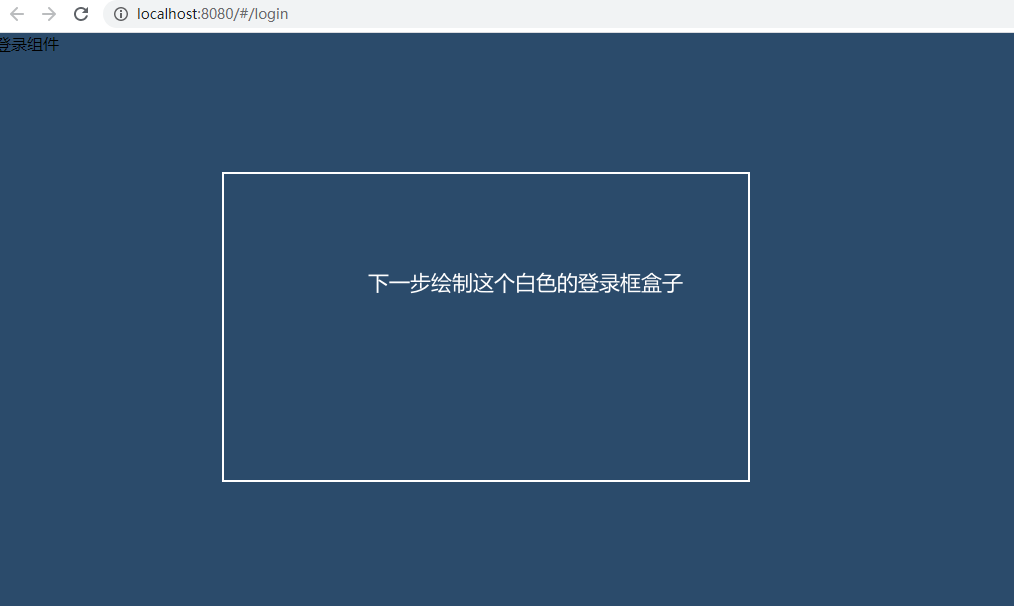
8) in login Draw login box in Vue
<div class="login_box"></div>
Add style:
.login_box {
    width: 450px;
    height: 300px;
    background-color: #fff;
    border-radius: 3px;
    position: absolute;
    left: 50%;
    top: 50%;
    transform: translate(-50%,-50%); /* Displacement, x-axis, y-axis*/
}
Transform attribute, which defines 2D or 3D conversion for {rotation, scaling, moving and tilting. Among them, the value of translate(x,y) is 2D transform (CSS3). For more details, click here ).
After adding a style, the effect is as follows:
9) Draw the default avatar box at the top_ box
<div class="login_box">
	<div class="avatar_box">
		<img src="../assets/logo.png" alt="">
	</div>
</div>
Write Avatar_ css style of box # (nested within the style of # login_box):
.avatar_box {
        height: 130px;
        width: 130px;
        border: 1px solid #eee;
        border-radius: 50%;
        padding: 10px;
        box-shadow: 0 0 10px #ddd; /*  Add box shadow*/
        position: absolute;
        left:50%;
        transform: translate(-50%,-50%);
        background-color: #fff;
        img {
            width: 100%;
            height: 100%;
            border-radius:50%;
            background-color: #eee;
        }
    }
The box shadow attribute adds one or more shadows to the box. This attribute is a comma separated list of shadows. Each shadow is specified by 2-4 length values, optional color values, and optional inset keywords. The value of the omitted length is 0 (for more details, click here ).
The effects are as follows:
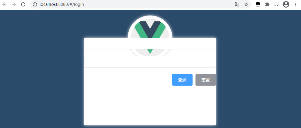
10) Layout of login page
Realize page layout through element UI:
- el-form
- el-form-item
- el-input
- el-button
- Font Icon
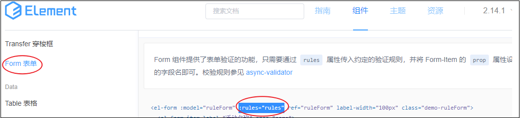
Open the official website element-cn.eleme.io/#/zh-CN Component found:
Click "component" in the top navigation, select Form form in the side bar, and then click "display code":
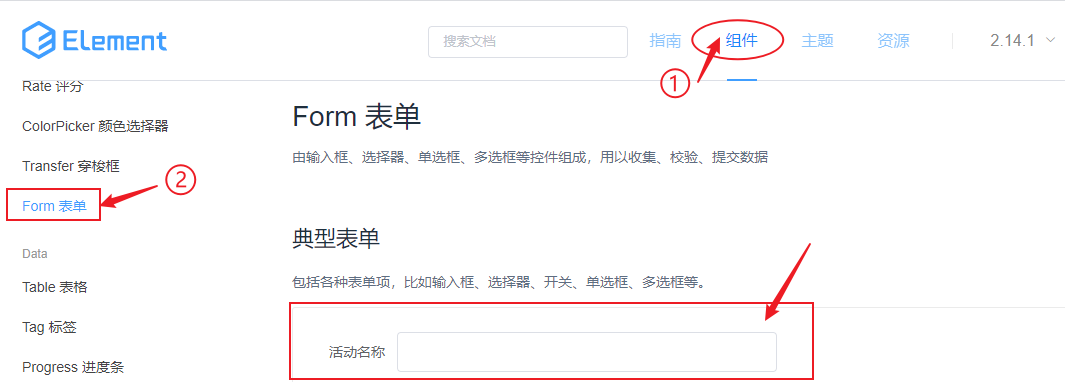
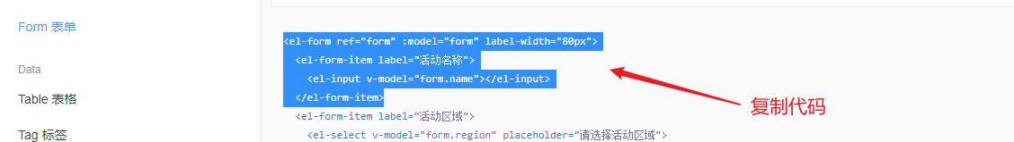
Copy the code of an item item (as shown below), paste it into the Login component, delete the unnecessary attribute binding, and add the end tag, as shown below:
<el-form label-width="80px">
	<el-form-item label="Activity name">
		<el-input ></el-input>
	</el-form-item>
</el-form>
After saving, check the page and find that the console reports an error and cannot access these elements:
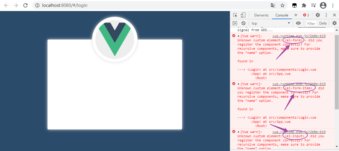
This is because the element UI is used through on-demand import. It must be imported before it can be used normally.
At this point, open the # element under the # plugins # file JS file to import the required components (an error may be reported if imported several times):
import { Button, Form, FormItem, Input } from 'element-ui'
Remove the unnecessary text label = "activity name" in the input box code of the Form component, reset the placeholder label width = "80px" to 0, and copy the structure code of two groups of El Form item elements (add a password input box and a button area):
 <!-- Login form area -->
<el-form label-width="0">
	<!-- user name -->
	<el-form-item>
		<el-input ></el-input>
	</el-form-item>
	<!-- password -->
	<el-form-item>
		<el-input ></el-input>
	</el-form-item>
	<!-- Button area -->
	<el-form-item>

	</el-form-item>
</el-form>
The effect of the saved page is as follows: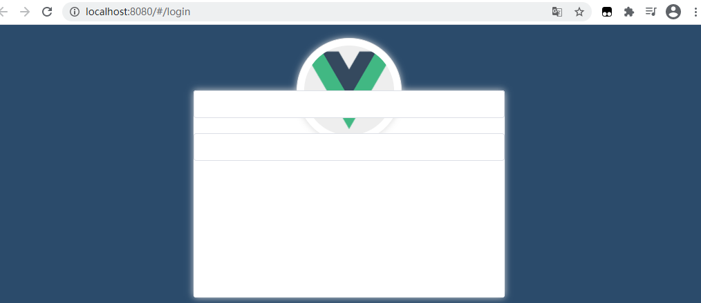
In Element Official website Find the button component and copy the code of the button:
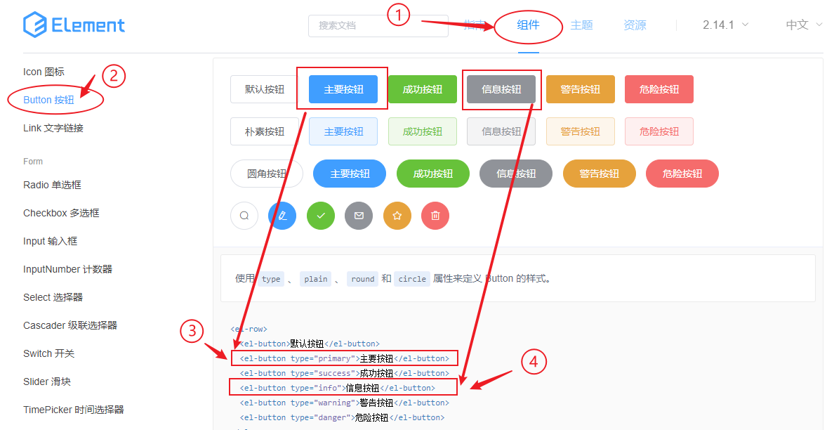
Paste the copied code into the button area and add a btns class name to it to set the style. The code is as follows:
<!-- Login form area -->
<el-form label-width="0">
	<!-- user name -->
	<el-form-item>
	 	<el-input ></el-input>
	</el-form-item>
	<!-- password -->
	<el-form-item>
		<el-input ></el-input>
	</el-form-item>
	<!-- Button area -->
	<el-form-item class="btns">
		<el-button type="primary">Sign in</el-button>
		<el-button type="info">Reset</el-button>
</el-form-item>
Since the < El button > button is aligned to the left by default, it needs to be aligned to the right. In login css style is written inside the < style > tag of Vue:
.btns {
    display: flex;  /* Elastic layout */
    justify-content: flex-end; /* The horizontal axis item is located at the end of the container*/
}
Flex flexible layout can easily, completely and responsively realize various page layouts: control the position and arrangement of sub boxes by adding flex attribute to the parent box, and click > > View details
Justify content is used to set or retrieve the alignment of elastic box elements in the main axis (horizontal axis). Visit W3C School > > View details
Note: when the parent box is set as flex layout, the float, clear and vertical align attributes of child elements will become invalid.
At this time, the page effect is as follows:
Next, align the bottom of the entire form area, which requires adding a class name login to the < El form > tag_ Form and add a style:
.login_form {
    position: absolute;
    bottom: 0;
    width:100%;
    padding: 0 20px;
}
The effect is shown in the figure: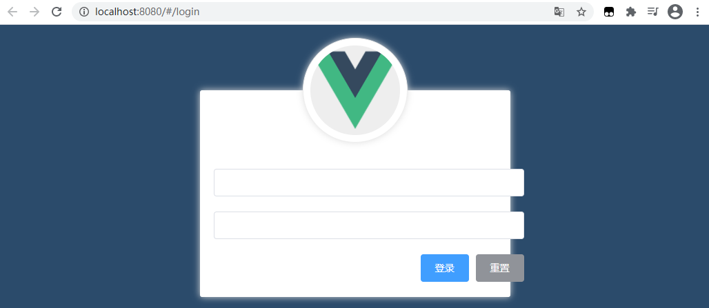 After padding: 0 20px , the box is enlarged because the boxsizing , attribute value of the form form is , content box (i.e. traditional box model) by default, which needs to be set to , border box (i.e. css3 box model):
.login_form {
    position: absolute;
    bottom: 0;
    width:100%;
    padding: 0 20px;
    box-sizing: border-box; /* C3 Box model */
}
The box sizing attribute defines how to calculate the total width and height of an element. Just add "box sizing: border box;" This sentence, then turn an ordinary box into a CSS3 box model, and padding and border will no longer support large boxes. Click > > here for details.
After adding, the effect is as follows: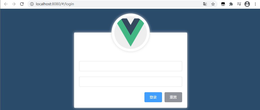
Next, draw the small icons in front of the user name and password input boxes
In Element UI official website Find the input component menu item and the corresponding style: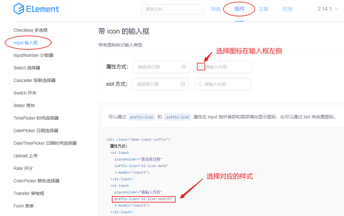
Paste the copied code into the project file login In Vue:
 <!-- user name -->
<el-form-item>
	<el-input prefix-icon="el-icon-search"></el-input>
</el-form-item>
<!-- password -->
<el-form-item>
	<el-input prefix-icon="el-icon-search"></el-input>
</el-form-item>
The effect after entry into force is as follows: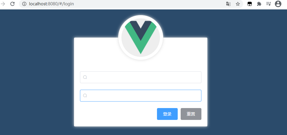
Again from Element UI official website In the menu, click the icon icon menu item in the sidebar to find out whether there is a corresponding user and password Icon:
From the Element UI official website menu, click the icon menu item in the sidebar to find out whether there is a corresponding user and password Icon: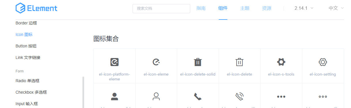
Since we can't find the required icon here, we need to use a third-party icon library.
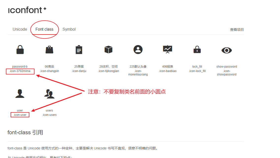
Here we use Ali Icon Library , select the required font icon and download it locally. After extracting the font compressed file, name the resulting folder as "fonts" and put it in the "src \ assets \ directory.
Next, in the entry file main JS, import the css style sheet of the Font Icon:
// Import Font Icon
import './assets/fonts/iconfont.css'
In the browser, open the # demo under the # fonts # folder_ index. HTML , HTML file, view the usage examples, and place the icons in , login Replace the original magnifying glass icon in the corresponding user name and password input label of Vue component file:
Open the demo under the fonts folder in the browser_ index. HTML file, view the usage examples, and place the icons in login. HTML respectively Replace the original magnifying glass icon in the corresponding user name and password input label of Vue component file:
The code is as follows:
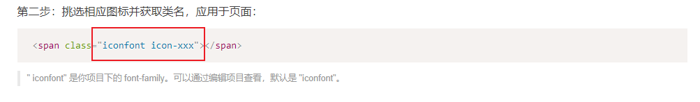
(Note: iconfont is a basic class and cannot be missing. Icon XXX is the icon name)
<!-- user name -->
<el-form-item>
	<el-input prefix-icon="iconfont icon-user"></el-input>
</el-form-item>
<!-- password -->
<el-form-item>
	<el-input prefix-icon="iconfont icon-3702mima"></el-input>
</el-form-item>
Replace the original icon class name and save it. The UI effect of the login box is as follows: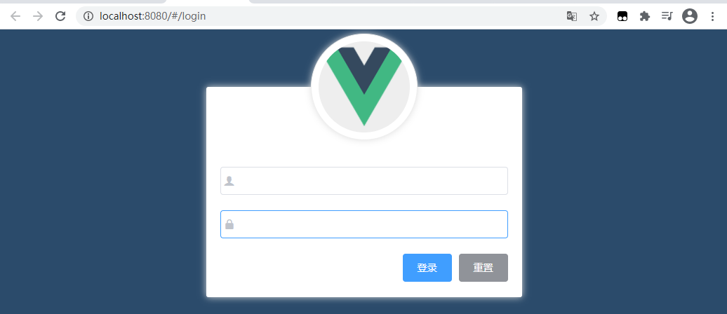
11) data binding of login form (automatically bind the values corresponding to user name and password to the data source):
Open Element UI On the official website, find the definition of the Form, expand the code structure in the typical Form, and you can see that on the first line < El Form >, there is an attribute binding: model represents data binding: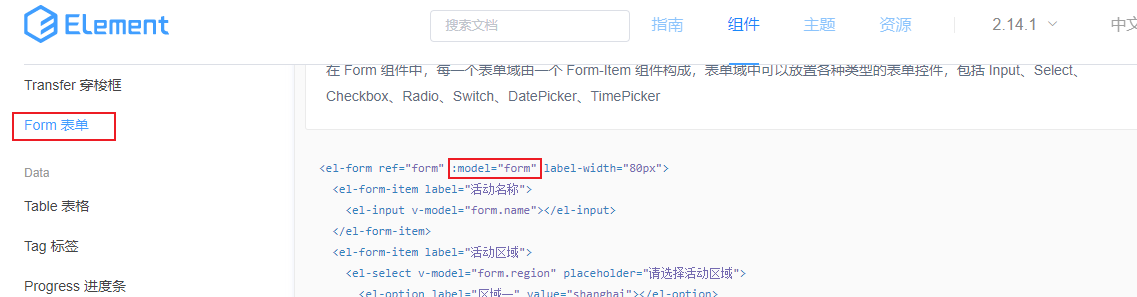
That is, the example shows that all data filled in the < El form > form will be automatically synchronized to the "form" object pointed to by the model. Form is a data object, and its definition is as follows: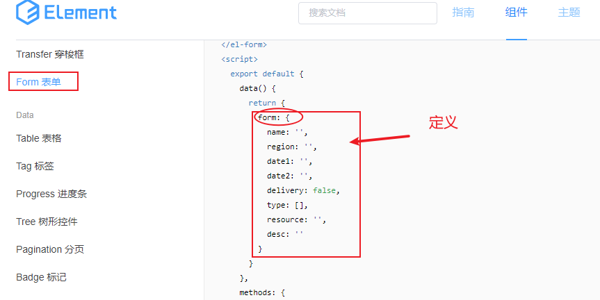
Summary: the steps of adding data binding to the form are as follows:
1) Step 1: first add the model attribute to < El form > for data binding, pointing to a data object;
2) Step 2: bind the text input box in each form item to the corresponding attribute on the data object through v-model.
The implementation is as follows:
1) Open login Vue , file, bind a newly named data object , loginForm through: model , and the code is as follows:
<!-- Login form area -->
<el-form :model="loginForm" label-width="0" class="login_form">
	<!-- Omit irrelevant codes-->
</el-form>
2) Next, define the data object "loginForm" in the behavior area where the "script" tag is located:
<script>
export default {
    data () {
        return {
            // Data binding object for login form
            loginForm: {
                username: 'admin',
                password: '123456'
            }
        }
    }
}
</script>
3) Bind the objects , username , and , password in , loginForm , through v-model , to the user name and password input boxes respectively. The code is as follows:
<!-- Login form area -->
<el-form :model="loginForm" label-width="0" class="login_form">
	<!-- user name -->
	<el-form-item>
		<el-input v-model="loginForm.username" prefix-icon="iconfont icon-user"></el-input>
	</el-form-item>
	<!-- password -->
	<el-form-item>
		<el-input v-model="loginForm.password" prefix-icon="iconfont icon-3702mima"></el-input>
	</el-form-item>
	<!-- The button area code is omitted here-->
<el-form>
At this time, the implementation effect is shown in the following figure: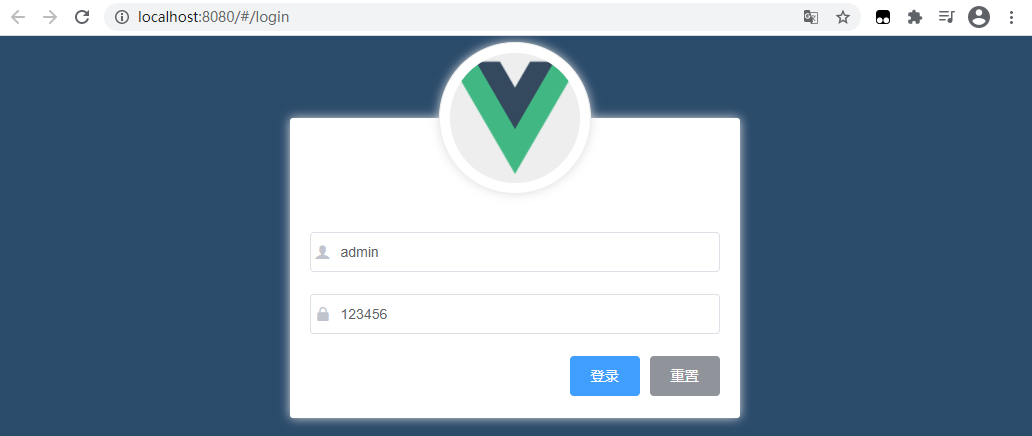
Then add a type attribute to the password input box, and set the attribute value to password, so that the password is displayed with a * sign to ensure the security of the user account.
<el-input type="password" v-model="loginForm.password" prefix-icon="iconfont icon-3702mima"></el-input>
12) Realize the data verification of the form
Objective: after filling in the user name and password, as soon as the mouse leaves the text box, the legitimacy of the filled data will be verified immediately. How do you add data validation behavior?
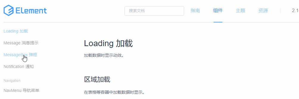
Method: open Element UI On the official website, Form, find the Form verification at the back of the component page:
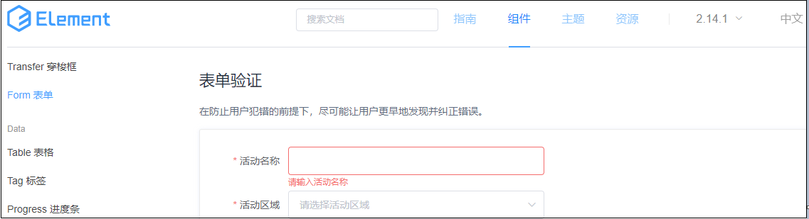
Analysis: the expanded structure code as shown in the figure above is interpreted as follows,
First, bind the properties for the < El form > component, bind the rules attribute, and its property value is a form validation rule object;
Secondly, the validation rule object should be defined in the data in the < script > tag behavior area, where each attribute is a validation rule.
Finally, specify different validation rules for different form {item} items through the} prop} attribute to validate the form.
Specific implementation:
1) Open the login component login Vue, on the < El form > element, bind the new validation rule object {loginFormRules through: rules}:
 <!-- Login form area -->
<el-form :model="loginForm" :rules="loginFormRules" label-width="0" class="login_form">
2) Copy the {loginfomrules} object name to} login The Vue file is defined in the {data} in the {script} behavior area:
 // Validation rule object for form
loginFormRules: {
	// Verify that the user name is legal
	username: [],
	// Verify that the password is valid
	password: []
}
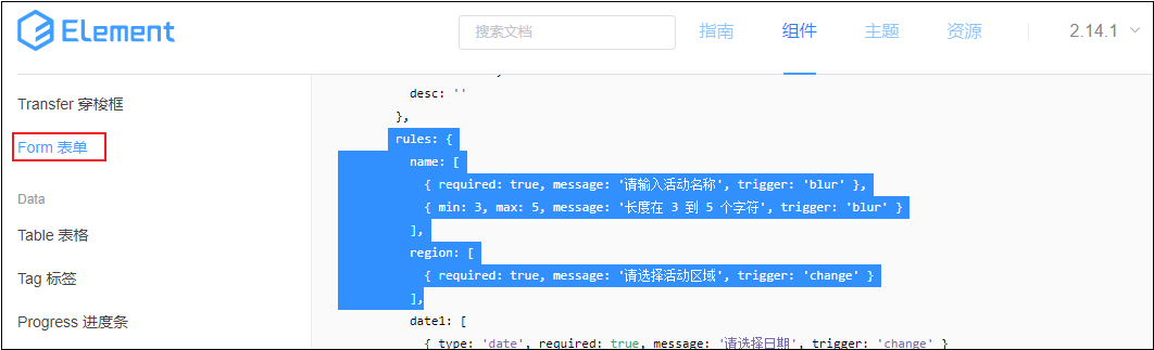
Validation rules can be directly to Element UI Copy on the official website:
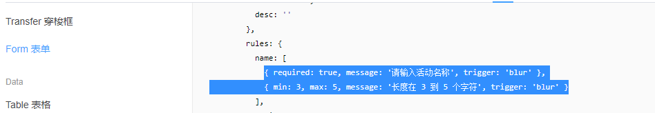
Modify the prompt text in the copied code appropriately, and the sorted code is as follows:
// Validation rule object for form
loginFormRules: {
	// Verify that the user name is legal
	username: [
		{ required: true, message: 'enter one user name', trigger: 'blur' },
		{ min: 3, max: 10, message: 'The user name must be between 3 and 10 characters in length', trigger: 'blur' }
	],
	// Verify that the password is valid
	password: [
		{ required: true, message: 'Please enter the login password', trigger: 'blur' },
		{ min: 6, max: 15, message: 'Passwords are required to be between 6 and 15 characters in length', trigger: 'blur' }
	]
}
3) Apply the defined rules to the form
Add the prop attribute in the < El form item > element tag of the user name and password input boxes respectively, and point to username and password:
<!-- user name -->
<el-form-item prop="username">
	<el-input v-model="loginForm.username" prefix-icon="iconfont icon-user"></el-input>
</el-form-item>

<!-- password -->
<el-form-item prop="password">
	<el-input v-model="loginForm.password" prefix-icon="iconfont icon-3702mima" type="password"></el-input>
</el-form-item>
The completion effect is as follows: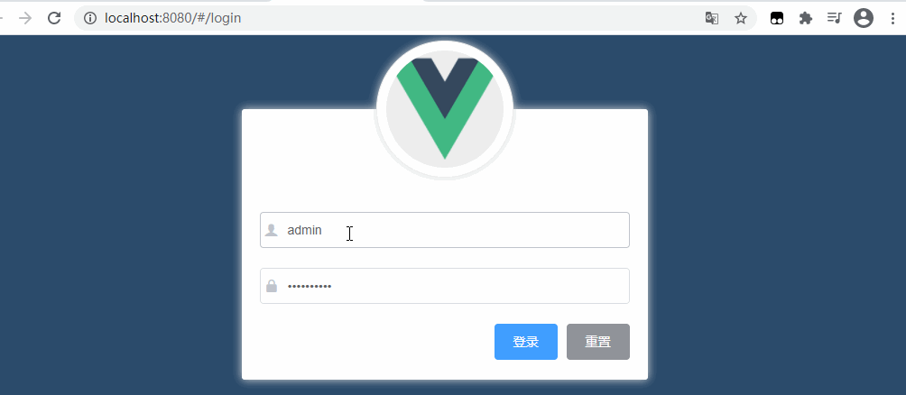
13) Realize the reset function of the form
Objective: when the "reset" button is clicked, the verification result can be reset
How? Check Element UI In the official document, a method is provided at the bottom of the page corresponding to the Form component:
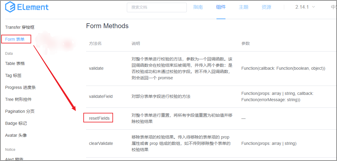
As long as we get the instance object of the form, we can directly access (call) the resetFields() function through the instance object, so as to reset the whole form, reset all field values to the initial values, and remove the verification results.
How do I get the instance object of the form?
analysis:
① To get the instance object of the < El form > component, we need to add a ref reference to it. The reference name is defined as login formref;
② Next, you can get the instance object of the {El form} form as long as you can get the} loginfomref. That is,} loginfomref is the instance object of the form. You can call the} resetFields} function directly through it to reset the form.
Implementation process:
① To add a ref reference to a component:
<!-- Login form area -->
<el-form ref="loginFormRef" :model="loginForm" :rules="loginFormRules" label-width="0" class="login_form">
② Bind the} click event} resetLoginForm through the @ click} reset button:
<!-- Button area -->
<el-form-item class="btns">
	<el-button type="primary">Sign in</el-button>
	<el-button type="info" @click="resetLoginForm">Reset</el-button>
</el-form-item>
③ Define * resetLoginForm "method in export default of script, print out * this first and check its specific direction.
 methods: {
	// Click the reset button to reset the login form
	resetLoginForm () {
		console.log(this)
	}
}
As can be seen from the print result, this refers to the instance object VueComponent {...} of a component, Under this object, you can see a data object $refs: {loginfomref: VueComponent}. One of the attributes loginfomref is the ref reference name previously defined for El form, as shown in the following figure: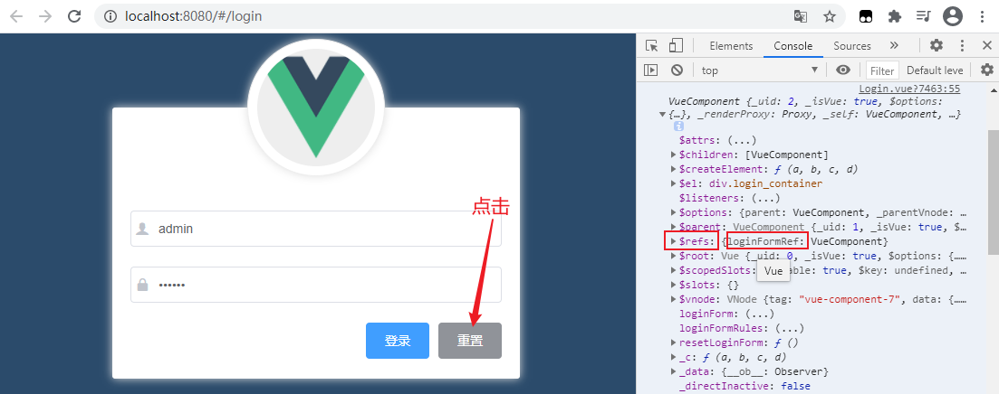
Therefore, through this$ Ref , can directly obtain the reference object , resetLoginForm , which is an instance of , El form ,. The codes and effects are as follows:
 methods: {
	// Click the reset button to reset the login form
	resetLoginForm () {
		// console.log(this)
        this.$refs.loginFormRef.resetFields()
	}
}
 In this way, the function of resetting the verification result when clicking the "reset" button is realized. What's the reason why the text box doesn't seem to be empty? In fact, this is an illusion. That's because the text box is bound to the data in {data} in both directions, and the data is set with the default value. After reset, the default value is written into the cleared text box.
13) Pre verification before login
When we click the login button, we should not directly initiate a data request, but pre verify the form data before the request. Only after the verification is passed can we initiate a network request. Otherwise, you should directly prompt the user that the form data {is illegal.
Implementation idea: when clicking login, verify by calling a function of the form. Which function to call? Also in Element UI On the official website, find the} validate function of the} component = > Form = > Form Methods} node:
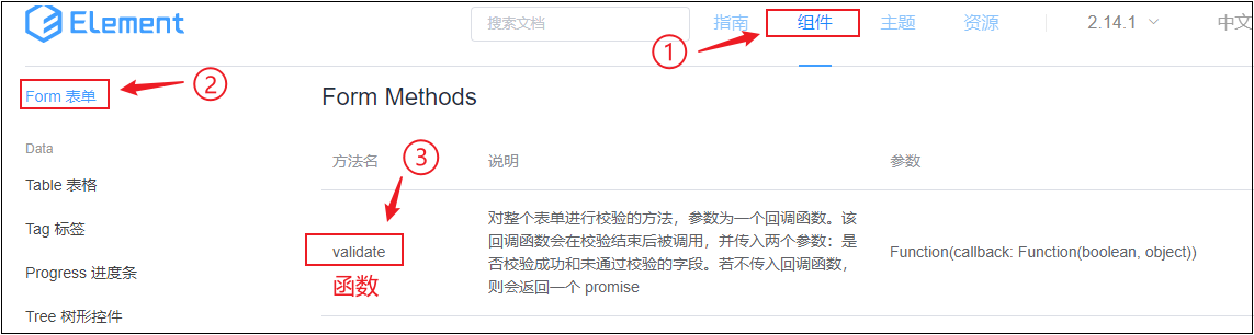
Function(callback: Function(boolean, object))
This function receives a callback function. The first line parameter of the callback function is a Boolean value, representing the verification result. If the verification passes, it returns {true; Otherwise, false is returned.
How to call the validate function?
Call method:
① Bind the click event to the login button through @ click (the event handling function is named login);
<el-button type="primary" @click="login">Sign in</el-button>
② Get the reference object of the form through ref, and then call the validate function with the reference object:
login () {
	this.$refs.loginFormRef.validate(valid => {
        console.log(valid)   // Can the test obtain the verification results
 })
Then, judge the verification result and decide whether to initiate a login request.
login () {
this.$refs.loginFormRef.validate(valid => {
		// console.log(valid)
		if (!valid) return false
	})
}
be careful! Since the "axios" package is not configured globally in the project at this time, the request cannot be initiated. Therefore, it is necessary to create the "axios" package in the entry file "main" Global configuration of {axios} in JS:
① To import {axios} packages:
import axios from 'axios'
② Mount the package on the Vue prototype object:
Vue.prototype.$http = axios
In this way, each Vue component can directly access $http through {this} to initiate an} ajax} request.
③ After attaching the properties of the prototype, set the root path of the request for {ajax} later:
axios.defaults.baseURL = 'http://127.0.0.1:8888/api/private/v1/'
(this root path can be found in the API document of the project)
The complete code of these three steps is as follows:
import axios from 'axios'
// Configure the root path of the request
axios.defaults.baseURL = 'http://127.0.0.1:8888/api/private/v1/'
Vue.prototype.$http = axios
After configuring {Ajax, now go back to} login In the Vue login component, you can access the $http} member on the prototype through {this}, so as to initiate an} Ajax request through it (request address login, request method post):
login () {
this.$refs.loginFormRef.validate(valid => {
	// console.log(valid)
	if (!valid) return false
	const result = this.$http.post('login', this.loginForm)  // eslint-disable-line no-unused-vars
	console.log(result)
	})
}
Note: in the data, there is a login from, that is, the data binding object of the login form. Since the data filled in by the user in the El form form will be automatically synchronized to this object. Therefore, you can directly use this login from as the request parameter.
Next, start the MySQL database service~
Now, you can test it: fill in the user name and password in the login form, click login, and see what the request result output, as shown in the following figure: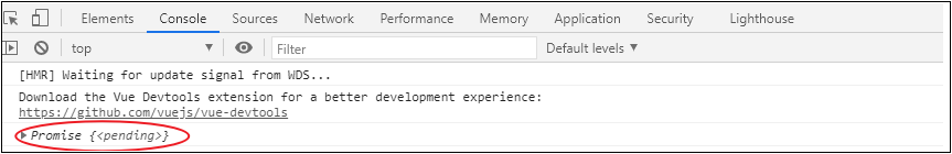
In this way, the function of resetting the verification result when clicking the "reset" button is realized. What's the reason why the text box doesn't seem to be empty? In fact, this is an illusion. That's because the text box is bound to the data in data in both directions, and the data is set with the default value. After reset, the default value is written into the cleared text box.
You can see that the , Promise , object is output on the console. We know that if the return value of a method is , Promise, you can use , async and await , to simplify the Promise operation. Therefore, the previous code can be written as follows:
login () {
	this.$refs.loginFormRef.validate(async valid => {
		// console.log(valid)
    	if (!valid) return false
        const result = await this.$http.post('login', this.loginForm) // eslint-disable-line no-unused-vars
        console.log(result)
    })
}
Note: if only 'await' is added, an error will be reported: 'await' is only allowed within async functions. This is because , await , can only be used in methods modified by , async , (here, the arrow function , valid , is modified into a function of , asynchronous ,).
When printing again after modification, it can be found that result is no longer a Promise object, but a specific response object. The object contains , 6 , attributes, which are encapsulated by , axios , and data , is the real data returned by the server (we don't need the other 5 attributes), as shown in the following figure: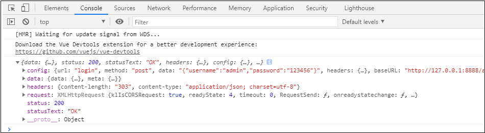
At this time, we can assign a value to the deconstruction from the data attribute of the result object and rename it to result, which means that we can access the real data:
const {data: res} = await this.$http.post('login', this.loginForm) // eslint-disable-line no-unused-vars
console.log(res)
Enter the user name and password at will, click the login button, and the console will print as follows:
Now let's judge the login status:
login () {
this.$refs.loginFormRef.validate(async valid => {
// console.log(valid)
if (!valid) return false // Block login requests
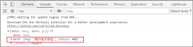
const { data: res } = await this.$http.post('login', this.loginForm) // eslint-disable-line no-unused-vars
// console.log(res)
if (res.meta.status !== 200) return alert('Login failed!')
alert('Login succeeded!')
})
}
The page test is as follows: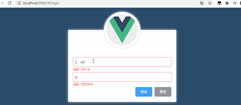
Then, with the help of Element UI The Message pop-up layer of adds a Message prompt indicating whether the login is successful or not to the login, which is more friendly, as shown below:
Use of message components
1) In element JS to import the Message component:
import { Button, Form, FormItem, Input, Message } from 'element-ui'
// Vue.use(Message) / / incorrect writing
Note: the configuration of Message is different from other components. It needs to be globally mounted, that is, Mount Message as an attribute on Vue prototype;
2) Configure Message:
// import { Button, Form, FormItem, Input, Message } from 'element-ui'
Vue.prototype.$Message = Message
Note: $Message , here is our custom attribute name, which can be any legal name. "=" Message "after" = "is the component name, which must be written according to this spelling (that is, mount the pop-up frame component to the prototype object, so that each component can access $Message through" this "for pop-up prompt!).
3) Use of Message
// If (res.meta.status! = = 200) return alert ('login failed! ')
// alert('login succeeded! ')
// Change to
if (res.meta.status !== 200) return this.$message.error('Login failed!')
this.$message.success('Login succeeded!')
At this time, the effect is shown in the following figure: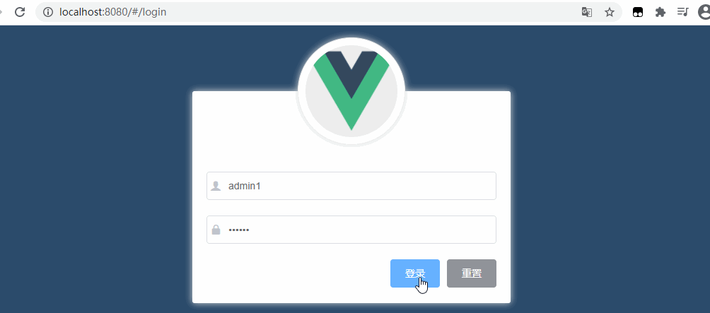
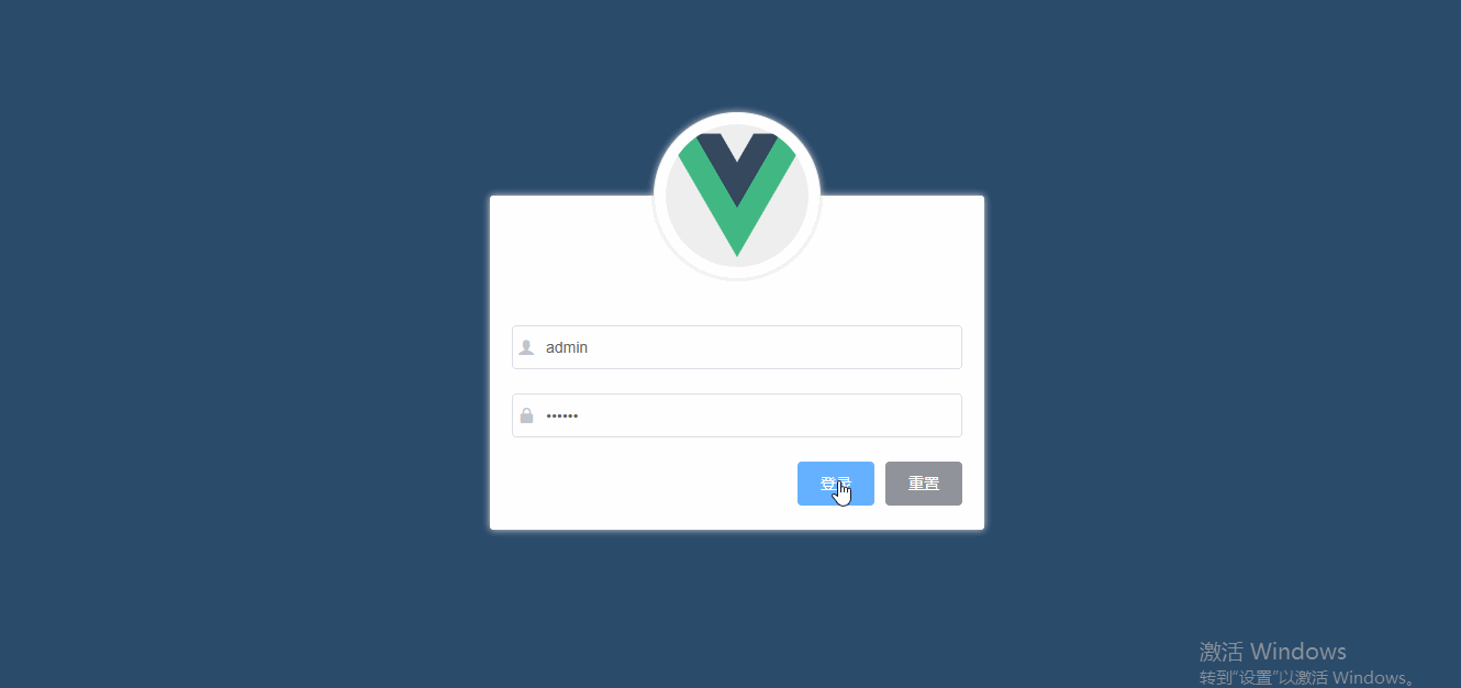
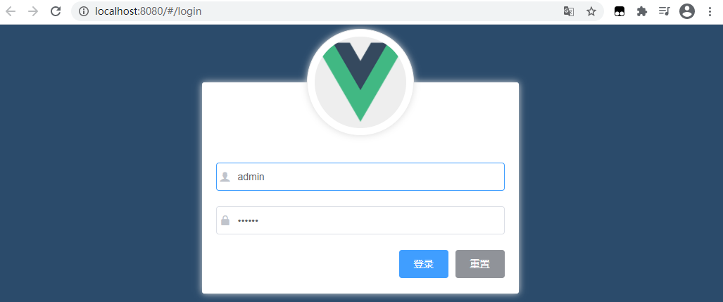
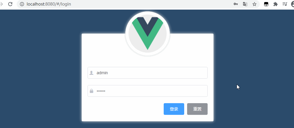
Finally, complete login Vue# component code, as follows:
<template>
	<div class="login_container">
        <!-- Login box  -->
        <div class="login_box">
            <!-- head portrait -->
            <div class="avatar_box">
                <img src="../assets/logo.png" alt="">
            </div>
            <!-- login form  -->
            <el-form :model="loginForm" ref="LoginFormRef" :rules="loginFormRules" label-width="0px" class="login_form">
                <!-- user name -->
                <el-form-item prop="username">
                    <el-input v-model="loginForm.username" prefix-icon="iconfont icon-user" ></el-input>
                </el-form-item>
                <!-- password -->
                <el-form-item prop="password">
                    <el-input type="password" v-model="loginForm.password" prefix-icon="iconfont icon-3702mima"></el-input>
                </el-form-item>
                <!-- Button -->
                <el-form-item class="btns">
                    <el-button type="primary" @click="login">Sign in</el-button>
                    <el-button type="info" @click="resetLoginForm">Reset</el-button>
                </el-form-item>
            </el-form>
        </div>
    </div>
</template>

<script>
export default {
	data() {
    	return {
      	//Data binding
      		loginForm: {
        		username: 'admin',
        		password: '123456'
      		},
      	//Form validation rules
      	loginFormRules: {
       		username: [
          		{ required: true, message: 'Please enter login', trigger: 'blur' },
          		{
            		min: 3,
            		max: 10,
            		message: 'The login name is between 3 and 10 characters long',
            		trigger: 'blur'
          		}
        	],
        	password: [
          		{ required: true, message: 'Please input a password', trigger: 'blur' },
          		{
           			min: 6,
            		max: 15,
            		message: 'The password is between 6 and 15 characters long',
            		trigger: 'blur'
          		}
        	]
      	}
    }
},

//Add behavior,
methods: {
	//Add form reset method
	resetLoginForm() {
    	// This = > the current component object, in which the attribute $refs contains the set form ref
		// console.log(this)
      this.$refs.LoginFormRef.resetFields()
    },
    login() {
    	//When clicking login, first call the validate method to verify whether the form content is correct
      	this.$refs.LoginFormRef.validate(async valid => {
        	console.log(this.loginFormRules)
        	//If the valid parameter is true, the validation passes
        	if (!valid) {
          		return
        	}

    	//Send a request to log in
        const { data: res } = await this.$http.post('login', this.loginForm)
        //  console.log(res);
        if (res.meta.status !== 200) {
        	 //console.log("login failed:" + res.meta.msg)
        	return this.$message.error('Login failed:' + res.meta.msg)
        }

        this.$message.success('Login succeeded')
        console.log(res)
        //Save token
        window.sessionStorage.setItem('token', res.data.token)
        // Navigate to / home
        this.$router.push('/home')
      })
    }
  }
}
</script>

<style lang="less" scoped>

.login_container {
	background-color: #2b5b6b;
	height: 100%;
}

.login_box {
	width: 450px;
  	height: 300px;
  	background: #fff;
  	border-radius: 3px;
  	position: absolute;
  	left: 50%;
  	top: 50%;
  	transform: translate(-50%, -50%);
  	.avatar_box {
    	height: 130px;
    	width: 130px;
    	border: 1px solid #eee;
    	border-radius: 50%;
    	padding: 10px;
    	box-shadow: 0 0 10px #ddd;
    	position: absolute;
    	left: 50%;
    	transform: translate(-50%, -50%);
    	background-color: #fff;
    	img {
      		width: 100%;
      		height: 100%;
      		border-radius: 50%;
      		background-color: #eee;
    	}
  	}
}

.login_form {
  	position: absolute;
  	bottom: 0;
  	width: 100%;
  	padding: 0 20px;
  	box-sizing: border-box;
}

.btns {
  	display: flex;
  	justify-content: flex-end;
}
</style>
Among them, the following contents are useful and need to be further processed:
Ⅰ. Add the form component of element UI
Open element in the plugins folder JS file to import elementui on demand:
import Vue from 'vue'
import { Button } from 'element-ui'
import { Form, FormItem } from 'element-ui'
import { Input } from 'element-ui'

Vue.use(Button)
Vue.use(Form)
Vue.use(FormItem)
Vue.use(Input)
Ⅱ. Add third party fonts
Copy the "fonts" folder in the material to "assets", and in the entry file "main" JS import:
import './assets/fonts/iconfont.css'
Then directly < El input prefix icon = "iconfont icon-3702mima" > < / El input >
Then add the login box
Ⅲ. To add form validation
1) Add attributes to < El form >: rules="rules", which are a bunch of validation rules defined in script.
2) Add rules: export default {data() {return {..., rules:{
name: [
        { required: true, message: 'Please enter the activity name', trigger: 'blur' },
        { min: 3, max: 5, message: 'The length is between 3 and 5 characters', trigger: 'blur' }
      ],
      region: [
        { required: true, message: 'Please select an active area', trigger: 'change' }
      ]
3) Set the validation rule < El form item label = "activity name" prop = "name" >
4) Import axios} to send ajax requests
Open main JS, import axios:
import axios from 'axios';
Set the root path of the request:
axios.defaults.baseURL = 'http://127.0.0.1:8888/api/private/v1/';
Mount axios:
Vue.prototype.$http = axios;
5) Configure pop-up prompt
Open element in the plugins folder JS file to import elementui on demand:
import {Message} from 'element-ui'
To mount globally:
Vue.prototype.$message = Message;
In login Write pop-up code in vue# component:
this.$message.error('Login failed')
6, Actions after successful login
Implementation idea:
1. Save the token after successful login to the sessionStorage of the client;
The reasons are as follows:
- API interfaces other than login in the project can only be accessed after login (a token is provided when accessing the interface to indicate login);
- The token should only take effect during the opening of the current website, so save the token in sessionStorage.
- The reason why it is saved in sessionStorage instead of localStorage is that localStorage is a persistent storage mechanism, while sessionStorage is a storage mechanism during a session.
2. Jump to the background home page through programmed navigation, and the routing address is / home (programmed navigation: jump by calling the push method through the $router object).
code implementation
A. Keep user token information
To save a token, you must be able to access it first:
console.log(res)
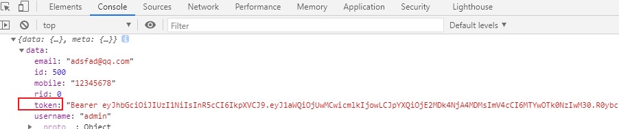
You can see that there is a {data} attribute on {res}. The data attribute contains the} token string. You can call sessionStorage Setitem, the API interface, saves the token in sessionStorage:
window.sessionStorage.setItem('token', res.data.token)
The parameters in parentheses are in the form of key value pairs (key: token, value: res.data.token).
Therefore, after the login is successful, we save the token returned in the background to sessionStorage. After the operation, we need to jump to the / home directory:
this.$router.push('/home')
The login method code is as follows:
login () {
	this.$refs.loginFormRef.validate(async valid => {
		// console.log(valid)
		if (!valid) return false
		const { data: res } = await this.$http.post('login', this.loginForm) // eslint-disable-line no-unused-vars
		// console.log(res)
		if (res.meta.status !== 200) return this.$message.error('Login failed!')
		this.$message.success('Login succeeded!')
		// console.log(res)
		window.sessionStorage.setItem('token', res.data.token)
		this.$router.push('/home')
	})
}
Debug and run the program. After clicking login, the {token} value is saved in {session Storage} in the Application. At the same time, a page jump occurred through this} programming navigation. As follows:
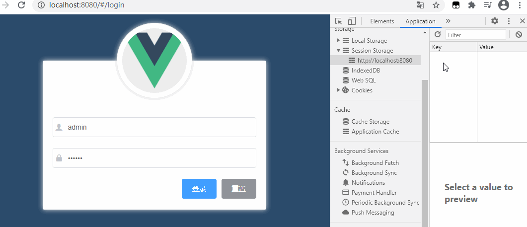
However, the home page is blank.
Create home page and improve routing rules
1) Create home page: create a new home page in the components directory Vue# component files;
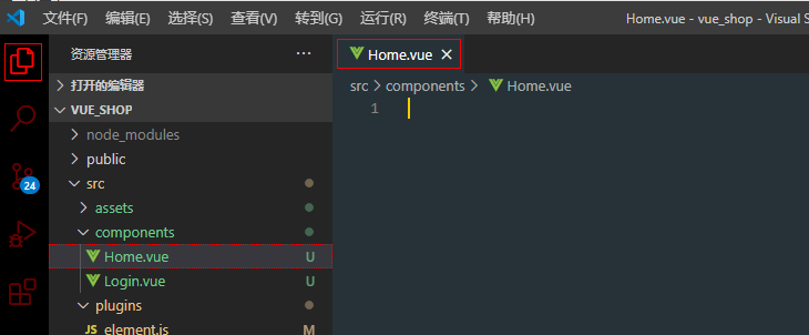
When printing again after modification, it can be found that result is no longer a Promise object, but a specific response object. The object contains six attributes encapsulated by axios. Among them, data is the real data returned by the server (we don't need the other five attributes), as shown in the following figure:
2) write the basic structure code with the "template" label:
<template>
    <div>
        Home assembly
    </div>
</template>

<script>
export default {}
</script>

<style lang="less" scoped>
</style>
3) Index. In the routing folder JS to import components and add} routing rules:
import Home from '../components/Home.vue'

export default new VueRouter({
    routes: [
        { path: '/', redirect: '/login' },
        { path: '/login', component: Login },
        { path: '/home', component: Home }
    ]
})
Route navigation guard controls page access
The page corresponding to the current "/ home" can only be accessed when logging in.
Therefore, if the user does not log in and directly accesses a specific (permission required) page through the URL # URL, he / she needs to re navigate (i.e. force jump) to the login page.
So, how to navigate?
This requires the routing , navigation guard: call a , beforeEach , function for the routing object , router , which is called , navigation guard.
router.beforeEach ((to, from, next) => { })
This function receives a callback function, including 3 line parameters, namely to, from and next, where:
- To: the path to be accessed;
- From: which page to jump from;
- next: a function of release. next() means direct release; next('/login') indicates a forced jump.
Usage of route navigation guard
Judge whether the address corresponding to {to} is / login,
- If yes, it means that the user wants to access the login page, and the login page does not need permission. In this case, directly call the next function (return next()) to allow access to the login page;
- If not, judge whether there is a token in sessionStorage.
Take out the token first, and then judge whether there is a token. If there is no token, it proves that the user has not logged in. At this time, it is necessary to forcibly jump to the login page (/ login) to allow the user to log in and then access. If there is a token, release it directly (next())
Code implementation (navigation jump):
Open the file corresponding to the route (the name of the route file generated by some versions of Vue ui is router.js). Here is {index.js. The code we have completed earlier:
import Vue from 'vue'
import VueRouter from 'vue-router'
import Login from '../components/Login.vue'
import Home from '../components/Home.vue'

Vue.use(VueRouter)

export default new VueRouter({
    routes: [
        { path: '/', redirect: '/login' },
        { path: '/login', component: Login },
        { path: '/home', component: Home }
    ]
})
The code needs to be modified here. The current export default new VueRouter({}) means that a VueRouter object is directly created and exported by default.
At this time, you need to separate , export default , and , VueRouter , get the , VueRouter , object, attach a , navigation guard to it, and then expose it with , export default ,. Amend as follows:
const router = new VueRouter({
	routes: [
		{ path: '/', redirect: '/login' },
		{ path: '/login', component: Login },
		{ path: '/home', component: Home }
	]
})

// Mount the routing guard before exposing the routing object
router.beforeEach((to, from, next) => {
    if (to.push === '/login') return next()
    // Get token
    const tokenStr = window.sessionStorage.getItem('token')
    if (!tokenStr) return next('/login')
    next()
})

export default router
3.4 realize exit function
1. Implementation principle:
The method based on {token} is relatively simple. You only need to} destroy the local token. In this way, subsequent requests will not carry tokens. You must log in again to generate a new token before you can access the page.
2. Function realization
Add an exit function button in the # Home # component, add a # click event to the # exit button, and add the event processing code as follows:
export default {
    methods:{
        logout(){
        	// Empty token
            window.sessionStorage.clear();
            // Jump to login page
            this.$router.push('/login');
        }
    }
}
Handling ESLint warnings
supplement
A. Handling ESLint warnings
Open the scaffold panel and view the} warning information
By default, ESLint , and VS code , formatting tools have , conflicts. You need to add a configuration file to resolve the conflicts.
1) Create a new in the project root directory prettierrc.json} file (note the small dot in front of pretierrc):
{
	"semi":false,  // Semicolon at the end (;)
    "singleQuote":true  // Single quotation mark
}
2) Open eslintrc.js file, disable checking of {space before function paren}:
rules: {
    'no-console': process.env.NODE_ENV === 'production' ? 'error' : 'off',
    'no-debugger': process.env.NODE_ENV === 'production' ? 'error' : 'off',
    'space-before-function-paren' : 0
  },
3) * other methods (Note: this method comes from the network and is not tested in person! It is only recorded here for reference)
If babel and eslint have been selected when using Vue cli to create a project, only the missing packages need to be installed:
npm i prettier prettier-eslint --save-dev
In this way, the correct format can also be obtained. The principle is to format the code with prettier, and then use ESLint fix.
B. Merge element UI imported on demand
import Vue from 'vue'
import { Button, Form, FormItem, Input, Message } from 'element-ui'

Vue.use(Button)
Vue.use(Form)
Vue.use(FormItem)
Vue.use(Input)
// To mount globally:
Vue.prototype.$message = Message
C. Submit code to code cloud
① Create a new project terminal and enter the command to view the modified or newly added file content:
git status
② Add all files to staging:
git add.
At this point, all files turn green, indicating that they have been added to the staging area
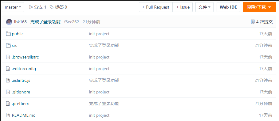
③ Submit all codes to the local warehouse:
git commit -m "Add login function and/home Basic structure of"
④ View the branch (all code is submitted to the login branch):
git branch
⑤ Merge the {login} branch code into the} master} main branch:
a. Switch to} master first:
git checkout master
b. Merge codes in the {master} branch:
git merge login
⑥ Push the latest local} master} to the remote code cloud:
git push
Open the warehouse in the code cloud, as shown in the figure below (indicating that the local master branch has been pushed to the cloud warehouse for saving).
⑦ push local sub branches to code cloud
As shown in the following figure, there is only one master branch and no login sub branch in the cloud:
Therefore, you also need to push the login branch to the cloud:
a. Switch to sub branch first:
git checkout Branch name
b. Then push to the code cloud:
At this time, if git push is directly used, it will not succeed, because there is no login Sub Branch recorded in the cloud.
Since this is the first time to push the login branch to the cloud branch, at this time, you need to add a parameter - u to push. The complete command is as follows:
git push -u origin Remote branch name
After refreshing, you can see that there is an additional login sub branch in the warehouse: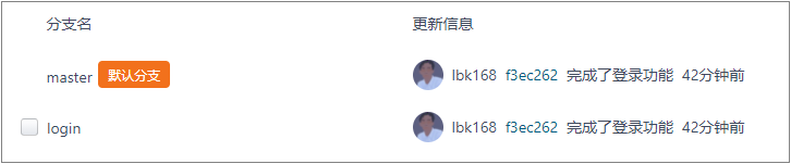
[about push]
The source code we wrote has no problem after testing. We must merge it into the main branch first, and then push the main branch to the cloud warehouse. At the same time, don't forget to push the new sub branch to the cloud warehouse.
4. Home page layout
- Realize the basic layout of the background home page
- Implement the left menu bar
- User list display
- Implement adding users
4.1 basic layout of background home page
Overall layout: first divide up and down, and then divide left and right.
With the help of Element UI Layout container in:
-
get into Official website , locate the Container layout Container component:
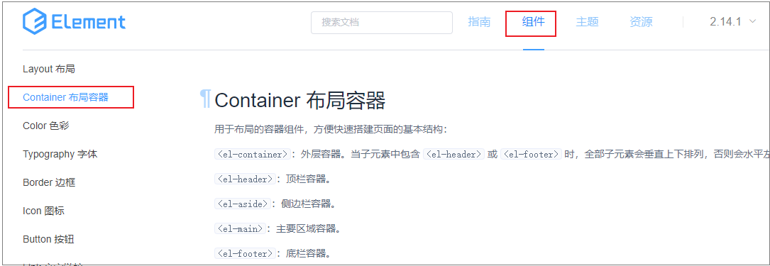
-
Find a style that matches the home page design:
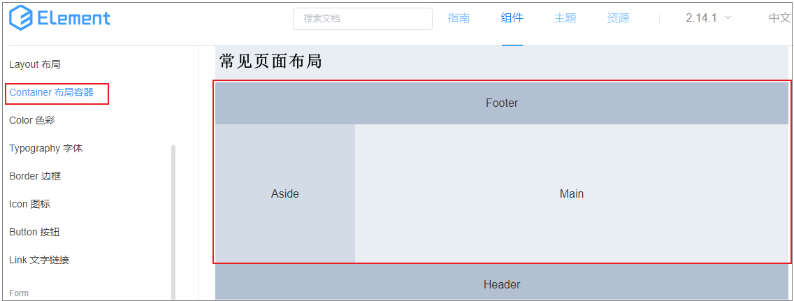
-
Find the code of the layout structure, expand it, copy and paste it into the project
Basic layout: open home Vue components
-
Original home Structure code in Vue file:
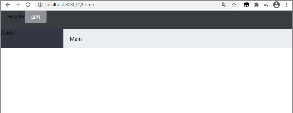
<template>
    <div>
        <el-button type="info" @click="logout">sign out</el-button>
    </div>
</template>
Modify the structure of the layout container provided for the official:
<template>
    <el-container>
        <!-- Head area -->
        <el-header>Header<el-button type="info" @click="logout">sign out</el-button></el-header>
        <!-- Page body area -->
        <el-container>
            <!-- sidebar  -->
            <el-aside width="200px">Aside</el-aside>
            <!-- Right content body -->
            <el-main>Main</el-main>
        </el-container>
    </el-container>
</template>
After saving, the desired effect is not seen when opening the page, and an error is reported in the terminal, as shown in the following figure:
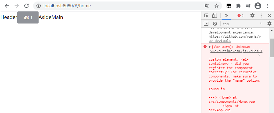
This is because we have not registered El container components.
In the plugins \ JS to import components:
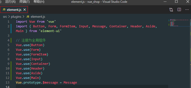
After saving, the page effect is as follows:
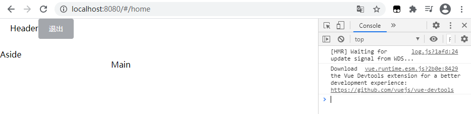
At this time, although it is ugly, it has begun to take shape, and the problem of error reporting has also been solved.
Next, at home css style is added inside the < style > tag in the Vue file.
By default, the name of a component similar to element UI is the name of the element UI class, which can be used to directly add styles to the corresponding components.
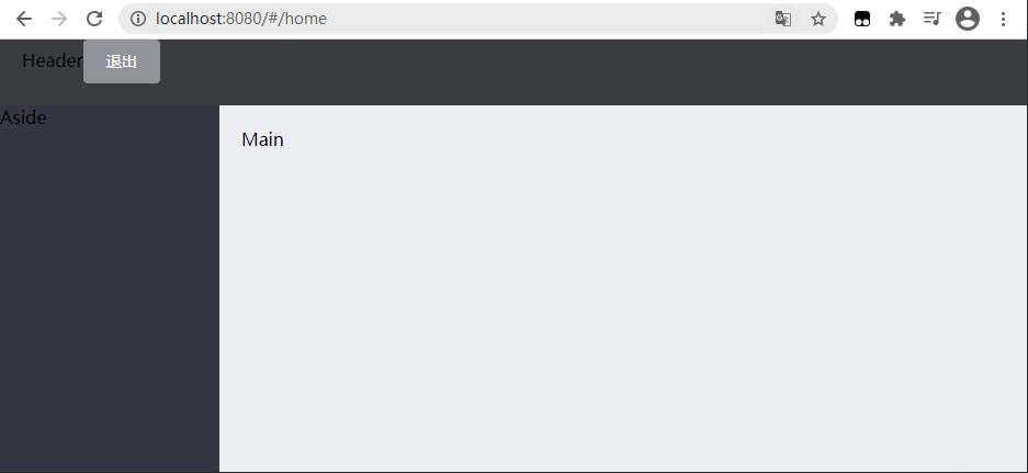
.home-container {
	height: 100%;
}
.el-header{
	background-color:#373D41;
}
.el-aside{
	background-color:#333744;
}
.el-main{
	background-color:#eaedf1;
}
After saving and refreshing the page, see the following figure:
The next problem to be solved is to fill the whole main area of the page with the screen. You need to check the element first to see what caused it
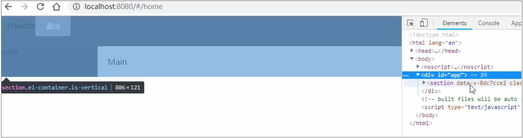
Then you can see that the section element is actually the outermost < El container > in the layout container component structure code. As long as it is full screen, the page layout effect can be realized.
To home Add a class name home container in < El container > in Vue and set it to 100%:
<el-container class="home-container">
.home-container {
    height:100%
}
In this way, the effect of filling the whole screen is realized, as shown in the following figure:
4.2 top layout, sidebar layout
4.2. 1. Top layout
1) HTML: Top original structure:
<!-- Home.vue Head area -->
<el-header>Header<el-button type="info" @click="logout">sign out</el-button></el-header>
HTML: the modified structure is:
<!-- Home.vue Head area -->
<el-header>
	<div>
		<img src="../assets/heima.png" alt="">
		<span>E-commerce background management system</span>
	</div>
	<el-button type="info" @click="logout">sign out</el-button>
</el-header>
2). Add CSS Style
CSS: Top original style:
.el-header{
    background-color:#373D41;
}
CSS: Top modified style:
.el-header{
    background-color:#373D41;
    display:flex;
    justify-content: space-between;
    padding-left: 10px;
    align-items: center;
    font-size: 20px;
    color:#f1d277;
    div {
        display: flex;
        align-items: center;
    }
    span {
    	margin-left: 15px;
    	user-select:none;
	}
}
[note] align items: Center: align vertically; justify content: space between: align horizontally; user select: none: text cannot be selected.
The effect is as follows: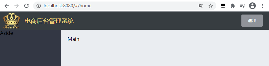
4.2. 2 sidebar menu layout
The menu is divided into two levels and can be folded.
The main structure is as follows:
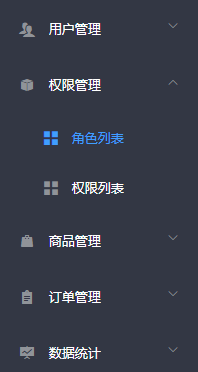
<el-menu>
	<el-submenu>
		<!-- this template Is the content template of the first level menu -->
		<i class="el-icon-menu"></i>
		<span>First level menu</span>
		<!-- In the primary menu, you can nest secondary menus -->
		<el-menu-item>
			<i class="el-icon-menu"></i>
			<span slot="title">Secondary menu</span>
		</el-menu-item>
	</el-submenu>
</el-menu>
The outermost < El Menu > is a package container. The outermost layer of the entire menu item must be wrapped with < El Menu >. In the first level menu item, use < I > to specify the icon item and < span > to specify the first level menu text. The secondary menu is < El menu item >, with icons and text.
In element UI Find the navigation menu component on the official website:
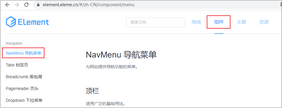
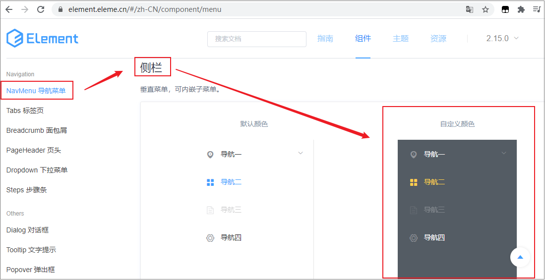
Click the display code to find the code corresponding to the "custom color" menu:
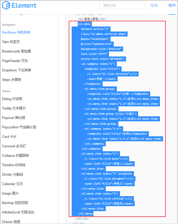
After selecting all UI structures, paste them into home Sidebar area in Vue.
Sidebar original code:
 <!-- sidebar  -->
<el-aside width="200px">Aside</el-aside>
Delete the "Aside" text in the label, copy the UI structure code in the official website and paste it. At the same time, after deleting unnecessary attributes, the sidebar code is as follows:
<!-- Home.vue file -->
<!-- sidebar  -->
<el-aside width="200px">
	<!-- Sidebar menu area -->
	<el-menu  background-color="#545c64" text-color="#fff" active-text-color="#ffd04b">
		<el-submenu index="1">
			<template slot="title">
				<i class="el-icon-location"></i>
				<span>Navigation one</span>
			</template>
			<el-menu-item-group>
				<template slot="title">Group I</template>
				<el-menu-item index="1-1">Option 1</el-menu-item>
				<el-menu-item index="1-2">Option 2</el-menu-item>
			</el-menu-item-group>
			<el-menu-item-group title="Group 2">
				<el-menu-item index="1-3">Option 3</el-menu-item>
			</el-menu-item-group>
			<el-submenu index="1-4">
				<template slot="title">Option 4</template>
				<el-menu-item index="1-4-1">Option 1</el-menu-item>
			</el-submenu>
		</el-submenu>
		<el-menu-item index="2">
			<i class="el-icon-menu"></i>
			<span slot="title">Navigation II</span>
		</el-menu-item>
		<el-menu-item index="3" disabled>
			<i class="el-icon-document"></i>
			<span slot="title">Navigation III</span>
		</el-menu-item>
		<el-menu-item index="4">
			<i class="el-icon-setting"></i>
			<span slot="title">Navigation IV</span>
		</el-menu-item>
	</el-menu>
</el-aside>
Deleted unnecessary attributes in < El Menu >, including: default active = "2", class = "El menu vertical demo", @ open="handleOpen" and @ close="handleClose".
At this time, since the components used in the sidebar have not been imported "on demand", open the "element" under the plugins path JS file:
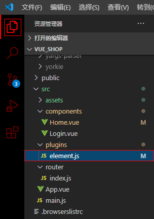
Import and register the following components:
- Menu;
- Submenu;
- MenuItemGroup;
- MenuItem
The code is as follows:
// element.js file
import { Menu, Submenu, MenuItemGroup, MenuItem } from 'element-ui'
Vue.use(Menu)
Vue.use(Submenu)
Vue.use(MenuItemGroup)
Vue.use(MenuItem)
At this time, the effects are as follows:
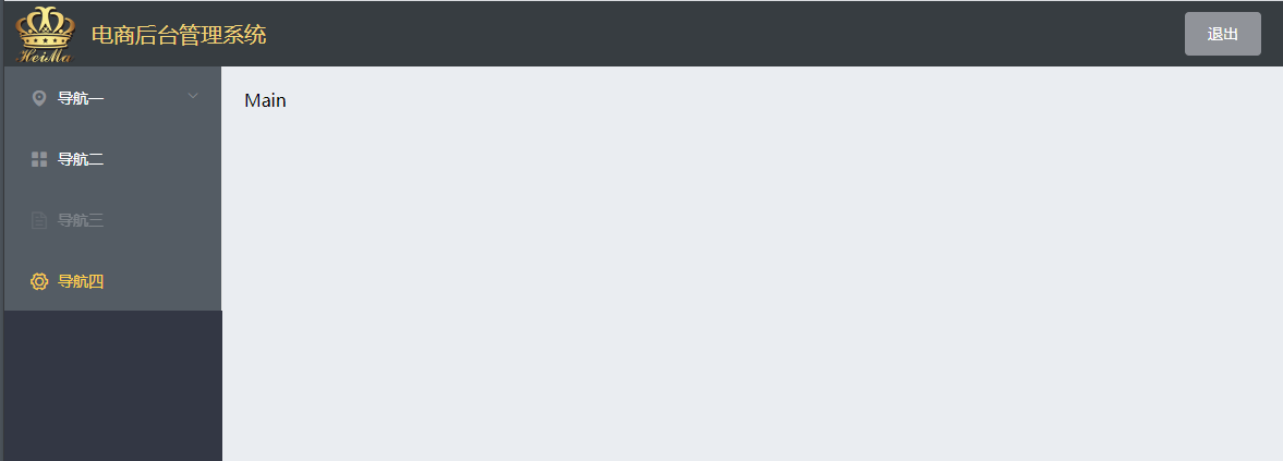
However, the color of the current sidebar is inconsistent with that of the whole sidebar. The value of the background color attribute of the < El Menu > tag needs to be modified #333744:
<el-menu background-color="#333744" text-color="#fff" active-text-color="#ffd04b">
Modified effect: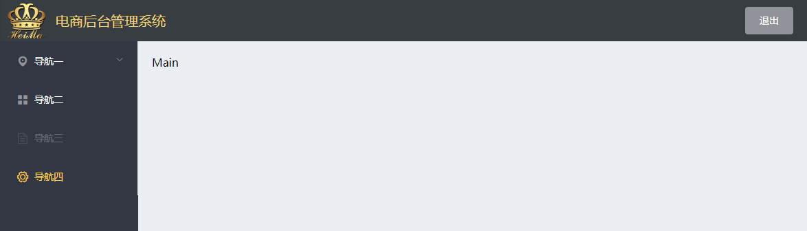
This officially provided sidebar has disabled and three-level menus by default. However, this project only needs primary and secondary menus, and there is no need for redundant menus. Therefore, it is necessary to comb again to remove the unnecessary.
- After deleting all the codes of navigation 2, 3 and 4, the structure is as follows:
<!-- sidebar  -->
<el-aside width="200px">
	<el-menu  background-color="#333744" text-color="#fff" active-text-color="#ffd04b">
		<!-- First level menu -->
		<el-submenu index="1">
			<!-- Template area of first level menu -->
			<template slot="title">
				<i class="el-icon-location"></i>
				<span>Navigation one</span>
			</template>
			<!-- Secondary menu -->
			<el-menu-item index="1-4-1">Option 1</el-menu-item>
		</el-submenu>
	</el-menu>
</el-aside>
As shown below:
However, there is no icon in the secondary menu at this time. You need to copy the < I > label and < span > label in the primary menu and paste them into the < El menu item > label of the secondary menu:
4.3 obtaining menu data through interface
- axios request interceptor
In addition to the login interface, the background needs to verify the {token} permission. Add} token by adding} axios request interceptor to ensure the permission to obtain data.
In main Add code in JS , and add corresponding code before mounting , axios , to , vue , prototype:
Open the portal file main JS, find the axios configuration node:
// Configure the root path of the request
axios.defaults.baseURL = 'http://127.0.0.1:8888/api/private/v1/'
Vue.prototype.$http = axios
Before mounting to the prototype object, set the interceptor for it:
// Configure the root path of the request
axios.defaults.baseURL = 'http://127.0.0.1:8888/api/private/v1/'
axios.interceptors.request.use(config => {
    console.log(config)
    return config
})
Vue.prototype.$http = axios
config is the request object, which contains many attributes. By printing, you can see that it contains the request header: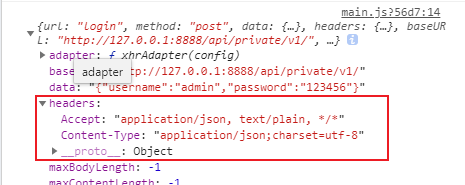
Interface Description:
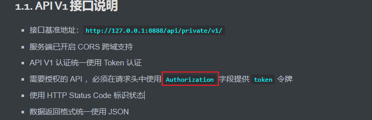
According to the API interface description, you need to mount an Authorization field for the request object, but there is no {headers field at present. You need to add it manually. Its value is the token string saved in SessionStorage.
//Before the request reaches the server, the callback function in use will be called to add the request header information
// Configure the root path of the request
axios.defaults.baseURL = 'http://127.0.0.1:8888/api/private/v1/'
axios.interceptors.request.use(config => {
    // console.log(config)
    config.headers.Author = window.sessionStorage.getItem('token')
    // Finally, you must return config
    return config
})
Vue.prototype.$http = axios
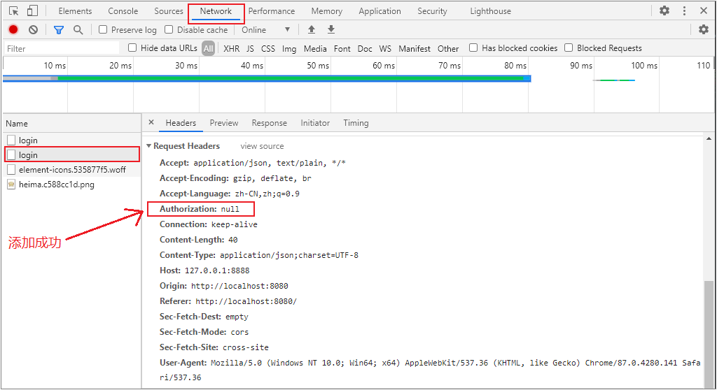
The authorization field was added successfully, but its value is null. The reason is that we initiated a "login" request, and the server has not issued a token during login. If you log on to another interface and monitor the request again, you will find that the value of Authorization is a real token token.
In this way, the Authorization request header is mounted for each API request, and the API with permission requirements can be successfully called.
notes:
Request is the request interceptor. It mounts a callback function for the request interceptor. As long as the user sends a data request to the server through axios, it will give priority to calling the use callback function during the request and preprocess the requested data before the request reaches the server.
return config - this sentence must be written at the end, which means that the request header has been preprocessed (fixed writing).
The request interceptor is equivalent to a preprocessing process.
At this point, main The complete code of JS file is as follows:
import Vue from 'vue'
import App from './App.vue'
import router from './router'
import './plugins/element.js'
// Import global style sheet
import './assets/css/global.css'
// Import Font Icon
import './assets/fonts/iconfont.css'

import axios from 'axios'
// Configure the root path of the request
axios.defaults.baseURL = 'http://127.0.0.1:8888/api/private/v1/'
axios.interceptors.request.use(config => {
    // console.log(config)
    config.headers.Authorization = window.sessionStorage.getItem('token')
    // Finally, you must return config to fix the writing method
    return config
})
Vue.prototype.$http = axios
Vue.config.productionTip = false

new Vue({
    router,
    render: h => h(App)
}).$mount('#app')
Initiate a request to get the left navigation menu
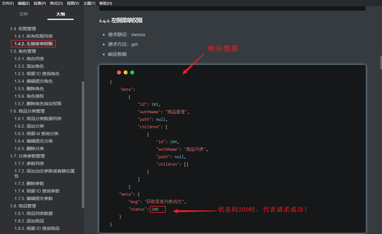
API interface:
- Request path: menu
- Request method: get
- Response data:
. 1) open home Vue file, add relevant code
Analysis: as soon as the web page is loaded, you should get the left menu immediately. Therefore, you need to define a life cycle function in the behavior area:
Before adding:
<script>
export default {
    methods: {
        logout () {
            window.sessionStorage.clear()
            this.$router.push('/login')
        }
    }
}
</script>
After adding:
<script>
export default {
    created() {
        this.getMenuList()
    },
    methods: {
        logout () {
            window.sessionStorage.clear()
            this.$router.push('/login')
        },
        // Get all menus
        async getMenuList () {
            const { data: res } = await this.$http.get('menus')
            console.log(res)
        }
    }
}
</script>
The printing results of res console are as follows:
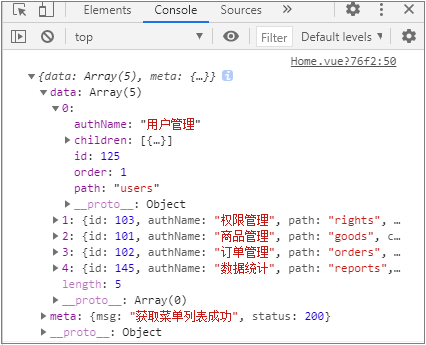
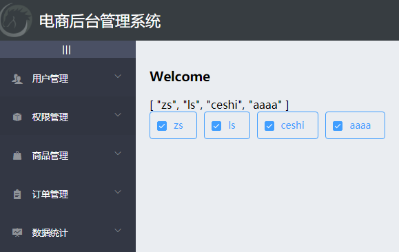
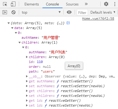
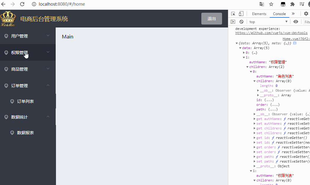
As shown in the figure above, you get an object that displays "get menu list successfully". There are 5 level-1 menus in total, and in the level-1 menu, its own level-2 menu is nested through the children attribute.
In order to render in the next step in the page, the obtained data should be immediately attached to its own data , and the private data , data of a component should be defined:
data () {
        return {
            // Left menu data
            menulist: []
        }
    }
Judgment:
// Get all menus
async getMenuList () {
	const { data: res } = await this.$http.get('menus')
	if (res.meta.status !== 200) return this.$message.error(res.meta.msg)
	this.menulist = res.data
	console.log(res)
}
4.4 dynamically render menu data and route control
A. Request sidebar data
<script>
export default {
	data() {
		return {
      	// Left menu data
      	menuList: null
    	}
  	},
  	created() {
    	// The left menu data is requested in the created phase
    	this.getMenuList()
  	},
  	methods: {
    	logout() {
      		window.sessionStorage.clear()
      		this.$router.push('/login')
    	},
    	async getMenuList() {
      		// Send request to get left menu data
      		const { data: res } = await this.$http.get('menus')
      		if (res.meta.status !== 200) return this.$message.error(res.meta.msg)

      	this.menuList = res.data
      	console.log(res)
    	}
  	}
}
</script
B. Rendering the left menu through v-for double loop
As shown in the above figure, since there are primary and secondary menu items in the menuList groups of the menu data on the left, a double-layer loop is required to render the menu. The outer layer obtains the primary menu and the inner layer obtains the secondary menu:
1) First level menu
Before adding loop rendering:
<!-- Home.vue Structure area: first level menu -->
<el-submenu index="1">
 	<!-- Template area of first level menu -->
	<template slot="title">
		<i class="el-icon-location"></i>
		<span>Navigation one</span>
	</template>
After adding loop rendering:
<!-- First level menu -->
<el-submenu index="1" v-for="item in menulist" :key="item.id">
	<!-- Template area of first level menu -->
	<template slot="title">
		<i class="el-icon-location"></i>
		<span>{{item.authName}}</span>
	</template>
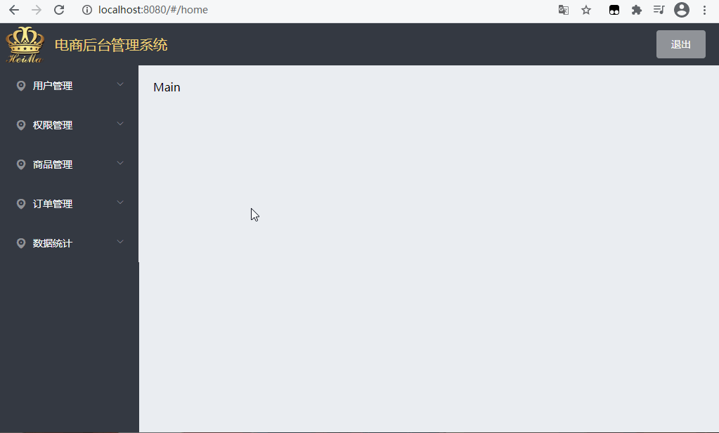
The effects are as follows:
However, it can be found that if you click any one of the first level menus, all menu items will be expanded at the same time, which does not meet the requirements (only your own menu items can be expanded, and other items cannot be affected).
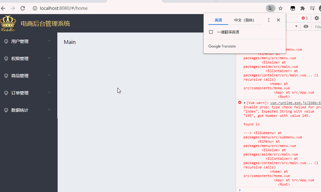
At this time, you need to specify a unique index for < El submenu > (all are index="1", the same!). We know that item.id is unique in the data obtained by menulist, so you can bind a dynamic value to index, that is, modify index="1" to index="item.id", as follows:
<!-- <el-submenu index="1" v-for = "item in menulist" :key = "item.id"> -->
<el-submenu :index="item.id" v-for="item in menulist" :key="item.id">
At this time, when you click the current menu item, other menu items will not be expanded synchronously, as shown in the following figure: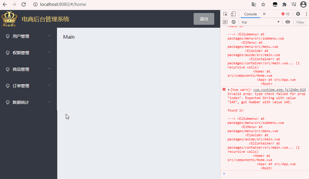
But, we can also see that the console reports an error because index only receives "string", but item ID is a numeric value. The simplest way is to splice it with an empty string, item ID + '', as follows:
<el-submenu :index="item.id + ''" v-for="item in menulist" :key="item.id">
At this point, the first level menu rendering is completed.
2) Secondary menu
The secondary menu is to cycle the "children" attribute of all primary menus
Before adding a cycle:
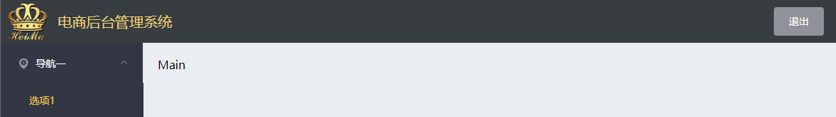
<!-- Secondary menu -->
<el-menu-item index="1-4-1">
<i class="el-icon-location"></i>
<span>Navigation one</span>
</el-menu-item>
After adding loop rendering:
 <!-- Secondary menu -->
<el-menu-item index="subItem.id + ''" v-for="subItem in item.children" :key="subItem.id">
	<i class="el-icon-location"></i>
	<span>{{subItem.authName}}</span>
</el-menu-item>
So far, the {structure of the menu on the left is rendered.
The structure code of this part is as follows:
<el-menu
	background-color="#333744"
  	text-color="#fff"
  	active-text-color="#ffd04b">
  	<!-- First level menu -->
  	<el-submenu :index="item.id+''" v-for="item in menuList" :key="item.id">
    <!-- First level menu template -->
    <template slot="title">
      	<!-- Icon -->
      	<i class="el-icon-location"></i>
      	<!-- text -->
      	<span>{{item.authName}}</span>
    </template>
    <!-- Secondary submenu -->
    <el-menu-item :index="subItem.id+''" v-for="subItem in item.children" :key="subItem.id">
      	<!-- Secondary menu template -->
      	<template slot="title">
        	<!-- Icon -->
        	<i class="el-icon-location"></i>
        	<!-- text -->
        	<span>{{subItem.authName}}</span>
      	</template>
	</el-menu-item>
  </el-submenu>
 </el-menu>
4.5 setting the active submenu style
By changing the active text color attribute of El menu, you can set the text color of the active item clicked in the sidebar menu;
By changing the class name of the i tag in the menu item template, you can set the icon in the menu bar on the left. We need to use the third-party Font Icon in the project;
Add an iconsObj to the data:
1) Left menu beautification
-
① Modify the color of the active menu item text in the left menu:
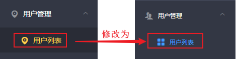
Modify the value of the active text color attribute in the outermost < El Menu > to the target color #409eff
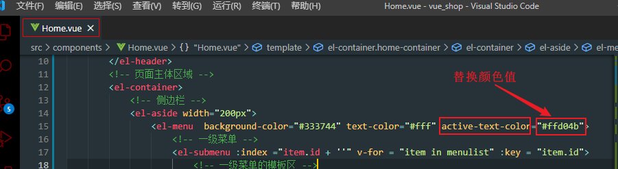
② modify the secondary menu item icon
In Element UI Found on the official website Icon icon , modify the original default icon class name: -
<!-- Secondary menu -->
 <el-menu-item :index="subItem.id + ''" v-for="subItem in item.children" :key="subItem.id">
	<!-- <i class="el-icon-location"></i> -->
	<i class="el-icon-menu"></i>
③ modify the primary menu icon
-
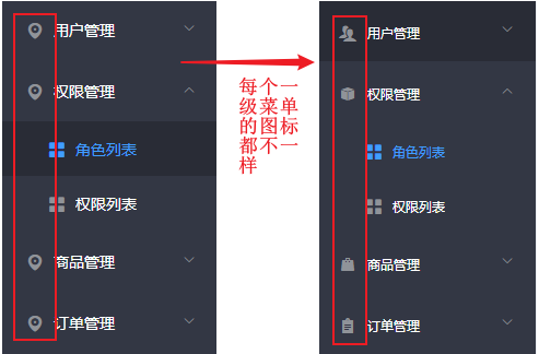
Because the icons of each level-1 menu item are different, one icon cannot be added uniformly like the level-2 menu. Therefore, it needs to be solved in the form of custom icons.
The Font Icon Library of the third party used previously is still used here. It has been downloaded and placed in \ assets\fonts:
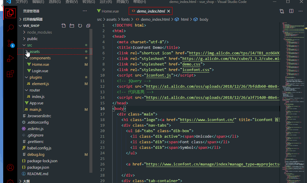
[question]:
Each item of our first level menu is automatically generated through the for loop. So, how to make it automatically generate icons during the generation of primary menus?
-
[solution]:
In , data , first define a font icon object , iconsObj, take , id , of each menu item as , Key, and the icon corresponding to id , as value.
Find the , id , value of the first level menu item, put it in , iconsObj , and point to the class name of the Font Icon respectively
-
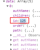
The code for defining the font icon object is as follows:
data () {
	return {
		// Left menu data
		menulist: [],
		iconsObj: {
			'125': 'iconfont icon-user',
			'103': 'iconfont icon-showpassword',
			'101': 'iconfont icon-shangpin',
			'102': 'iconfont icon-danju',
			'145': 'iconfont icon-baobiao'
		}
	}
},
Note: if the syntax is wrong, you can remove the quotation marks of the package Key, such as 125: 'iconfont icon user'.
Then bind the icon class name to the data in iconsObj:
Next, modify the code of the original font icon for dynamic binding, that is, take out the class corresponding to its id according to the iconsObj object once a cycle and put it in the icon label < I >
<!-- First level menu -->
<el-submenu :index="item.id + ''" v-for="item in menulist" :key="item.id">
	<!-- Template area of first level menu -->
	<template slot="title">
		<i :class="iconsObj[item.id]"></i>
		<span>{{item.authName}}</span>
	</template>
After saving, the icon will have the following effects:
-
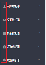
You need to space the icon and menu item text. Because these font icons have a common class "iconfont", you only need to write in the < style > < / style > style area label:
.iconfont {
    margin-right: 10px;
}
2) You can expand only one menu item at a time and resolve the border problem
- ① Solve the problem that multiple menu items can be expanded at the same time
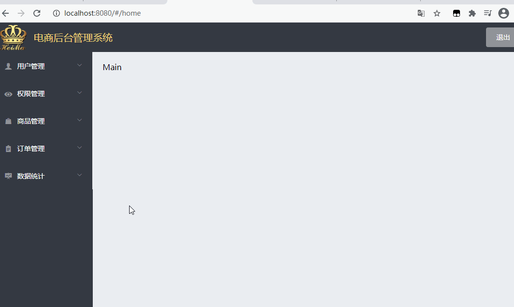
[question]: Currently, all menus can be expanded at the same time, but the actual demand only allows one expansion at a time, and the rest are folded.
[solution]
In the NavMenu navigation menu component of the official Element UI, the unique opened attribute is provided for < El Menu >, and its value type is Boolean. The default value is false, that is, several menu items can be expanded at the same time.
Therefore, in order to keep the menu on the left open only one at a time and display the sub menu, you can add a property unique opened in El menu;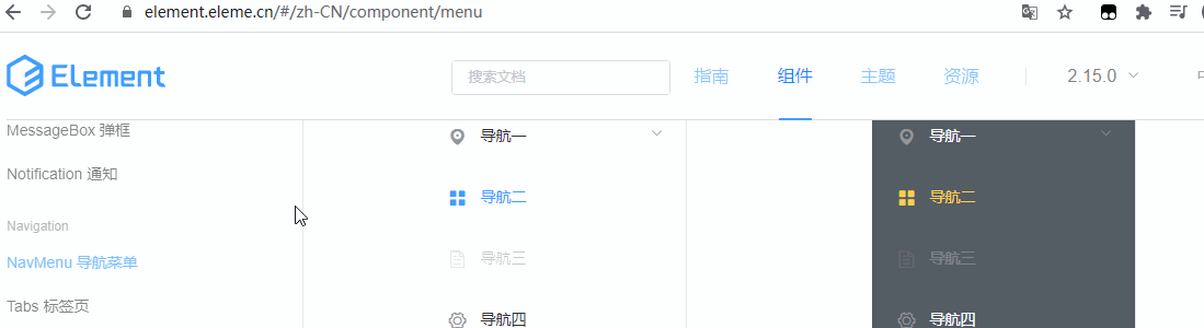
Reset the "unique opened" property value to "true" (only one menu item is expanded at a time). Add the property and reset it to "true" as follows: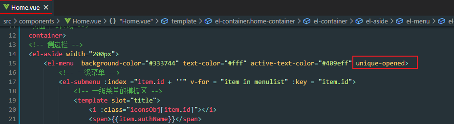
Note: or it can be set by data binding (at this time, true is considered as a bool value rather than a string): unique opened = "true"
In this way, only one menu item is expanded at a time, as shown in the following figure: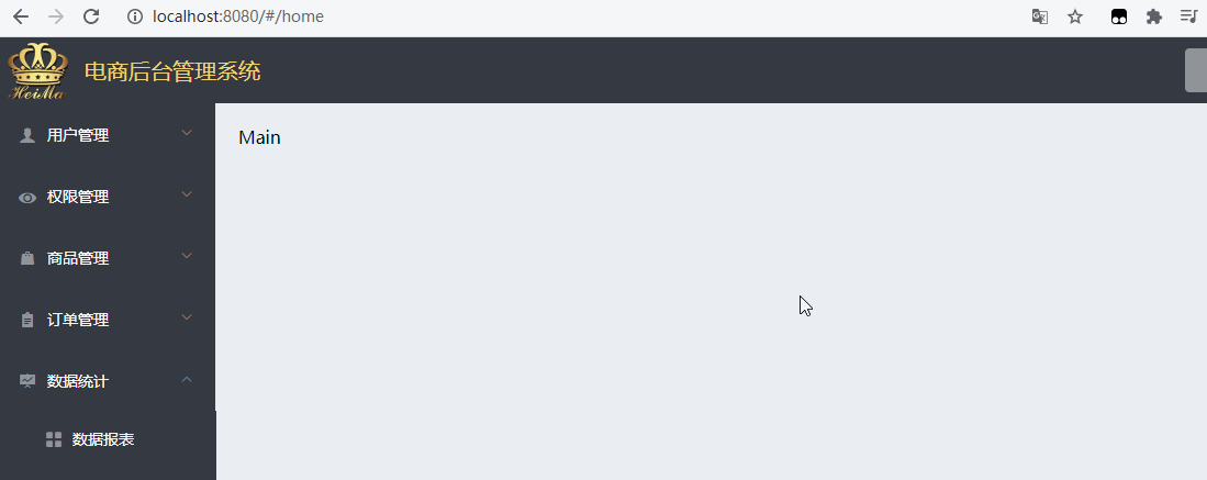
② solve the problem that the border lines are not aligned
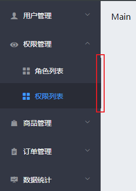
By checking the element, it is found that there is a border right with a value of 1px in the style of El menu class, as shown in the following figure:
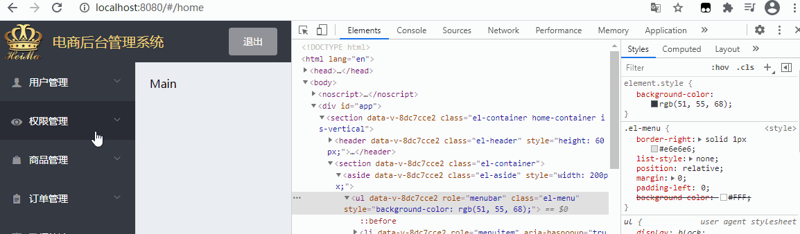
Reset it to {none through the class name selector:
.el-aside {
    background-color:#333744;
    .el-menu {
        border-right: none;
    }
}
4.6 make the telescopic (expand / fold) function of the side menu bar
- Open home Vue file, add a "div" box inside the sidebar and above the menu:
<!-- sidebar  -->
<el-aside width="200px">
	<div class="toggle-button">|||</div>
	<el-menu  background-color="#333744" text-color="#fff" active-text-color="#409eff" unique-opened>
- At home In the < style > style area in Vue , set the style for the expand collapse button box:
.toggle-button {
    background-color: #4a5064;
    font-size: 10px;
    line-height: 34px;
    color: #fff;
    text-align: center;
    letter-spacing: 0.4em;
    cursor: pointer;
}
Note: the "letter spacing" attribute increases or decreases the space between characters (character spacing). See "W3school" for details letter-spacing Documentation for.
-
The effects are as follows:
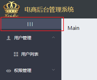
To realize the function of folding and expanding, define an event name on the button box,) toggleCollapse, and bind the button box with a click event:
<div class="toggle-button" @click="toggleCollapse">|||</div>
Next, you need to define the event function in the method {methods}.
[analysis]:
Because in the , Element UI , official website, NavMenu navigation menu The Menu attribute provides a Boolean value of the {collapse} parameter with the value type of} Boolean value:
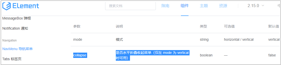
Therefore, we only need to switch the value of the < El Menu > tag's "collapse" attribute to "true" or "false" when clicking the button to expand and collapse, and return to the code:
1) In , data , define a Boolean , isCollapse:
data () {
	return {
		// Left menu data
		menulist: [],
		iconsObj: {...},
		// Whether the left menu bar is folded horizontally: it is not folded by default
		isCollapse: false
	}
},
Bind the Boolean isCollapse to < El Menu >:
<!-- sidebar  -->
<el-aside width="200px">
	<div class="toggle-button"  @click="toggleCollapse">|||</div>
	<el-menu  background-color="#333744" text-color="#fff" active-text-color="#409eff" unique-opened :collapse="isCollapse">
3) Event handler:
// Click the button to switch the collapse and expansion of the menu
toggleCollapse() {
	this.isCollapse = !this.isCollapse
}
The operation effect is as follows:
It can be found that the default unfolding and folding animation effect is ugly. In order to make it smooth, you need to turn off the default animation effect.
In the Menu attribute of Element UI NavMenu navigation Menu, there is a collapse transition parameter to control whether the animation is displayed. The default parameter value is true. Therefore, if its value is set to false, the animation can be closed.
Continue in < El Menu >, bind the collapse transition attribute to turn off the animation:
<el-menu background-color="#333744" text-color="#fff" active-text-color="#409eff" unique-opened :collapse="isCollapse" :collapse-transition="false">
However, it is found by running that the background of the menu bar does not become smaller due to the folding of the menu, as shown below: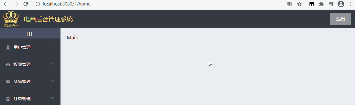
This is because in the template structure, the width of the sidebar is written dead:
<!-- sidebar  -->
<el-aside width="200px">
Normally, after folding, that is, when isCollapse value is "true", the sidebar width becomes smaller. When its value is "false", it can be reset to 200px.
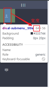
According to the element inspection, the minimum width is {64px. Therefore, the code to judge the width to be bound by ternary expression is as follows:
<!-- sidebar ,The width is set according to whether it is folded or not -->
<el-aside :width="isCollapse ? '64px':'200px'">
	<!-- Telescopic sidebar button -->
	<div class="toggle-button" @click="toggleCollapse">|||</div>
	<!-- Sidebar menu,:collapse="isCollapse"(Set the collapse menu to bound isCollapse Value),:collapse-transition="false"(Turn off (default collapse animation) -->
	<el-menu
	:collapse="isCollapse"
	:collapse-transition="false"
	......
The effect is as follows: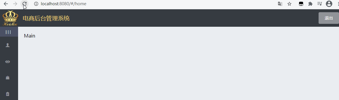
4.7 add child routes on the background home page
4.7. 1 home page - redirect home page routing
[requirements]: after we log in successfully, we need to redirect to a Welcome page and display the Welcome component in the Main area of the Main page.
[implementation process]:
- Add child routing component welcome vue.
Create a new @ welcome. In the components path Vue# component file, as shown in the figure:
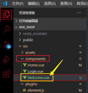
Also at welcome Vue , defines a basic , template , structure:
<template>
    <div>
        <h3>Welcome</h3>
    </div>
</template>
Note: if there is no required style and behavior in the component for the time being, you can not write it. Writing a template alone will not report an error.
In the router JS, and set routing rules and default redirection of child routes;
import Welcome from '../components/Welcome.vue'
...
{
    path: '/home',
    component: Home,
    redirect: '/welcome',
    children: [{ path: '/welcome', component: Welcome }]
}
Note that Welcome , exists in the , Home , rule in the form of sub route (the Welcome page is nested in the Home page), so , Welcome , should be used as the sub route rule of , Home , so here is a new , children , attribute (that is, sub route is an array, and the rule object of sub route is placed in the array).
- path: routing rule address;
- Component: used to specify the component to display.
- Redirect: redirect.
As shown in the figure:
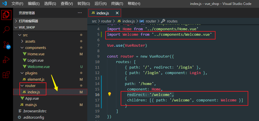
Add a route placeholder to the main structure
Open home Vue, add a route placeholder < router View > in the main structure of main;
<!-- Right content body -->
<el-main>Main</el-main>
After adding the routing point identifier, it is as follows:
<!-- Right content body -->
<el-main>
	<router-view></router-view>
</el-main>
So far, the redirection of home page routing is realized.
After making the Welcome sub route, we need to transform all the sidebar secondary menus into sub route links;
Set Welcome route as a sub routing rule of Home route
[purpose]: click the secondary menu in the menu bar on the left to switch and display different component pages in the main area on the right.
[implementation principle]: change each secondary menu to route link to realize jump - ps: of course, it is not to set route link separately, but there is a simpler way.
[solution]:
In Element UI In the Menu attribute of, there is a router parameter, which is used to control whether to use Vue router mode. The type of parameter value is Boolean. The default value is false, that is, it is not turned on. As shown in the figure below: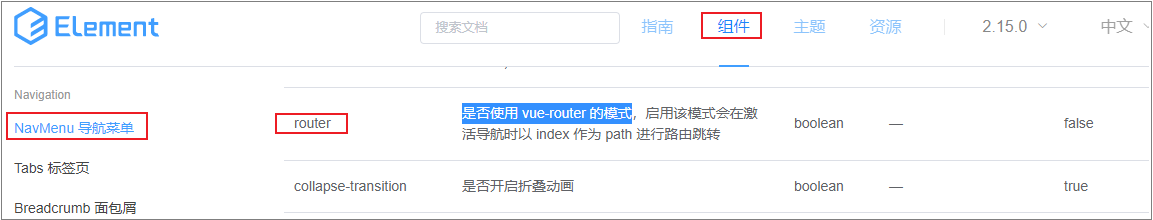
Therefore, you only need to set the "router" attribute of "El menu" to true. At this time, when we click the secondary menu, we will jump the route according to the index attribute of the menu, such as: / 110,
<el-menu background-color="#333744" text-color="#fff" active-text-color="#409eff" unique-opened :collapse="isCollapse" :collapse-transition="false" router>
As shown in the figure: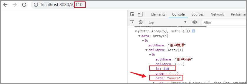
However, it is not appropriate to use index id as the jump path. We can rebind the value of index as: index="'/'+subItem.path". When setting, you need to manually fill in a slash ("/") before the path address name.
Before modification:
<!-- Secondary menu -->
<el-menu-item :index="subItem.id + ''" v-for="subItem in item.
Modify the binding value of "index" to "path" as the jump address:
<!-- Secondary menu -->
<el-menu-item :index= "'/'+ subItem.path + ''" v-for="subItem in item.
So far, the sidebar routing transformation has been realized. Since these routing links have not been monitored, the open pages are blank.
The effect is as follows: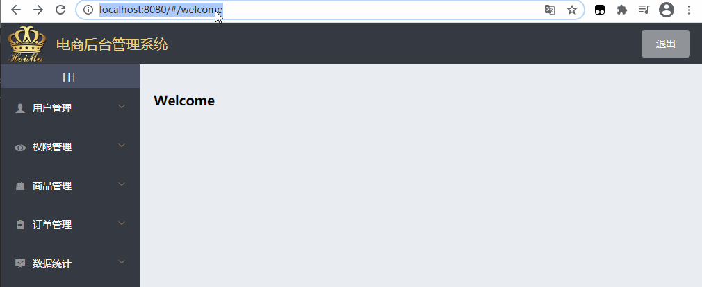
5. User management
5.1 overview of user management
Manage the user's account information through the background, including user information display, addition, modification, deletion, role assignment, account activation / logoff, etc.
-
User information list display
-
Add user
-
Modify user
-
delete user
-
Enable or disable users
-
User role assignment
5.2 user management - list display
5.2. 1 user list layout
The main area of the user list is mainly divided into two parts. The specific layout is divided as follows: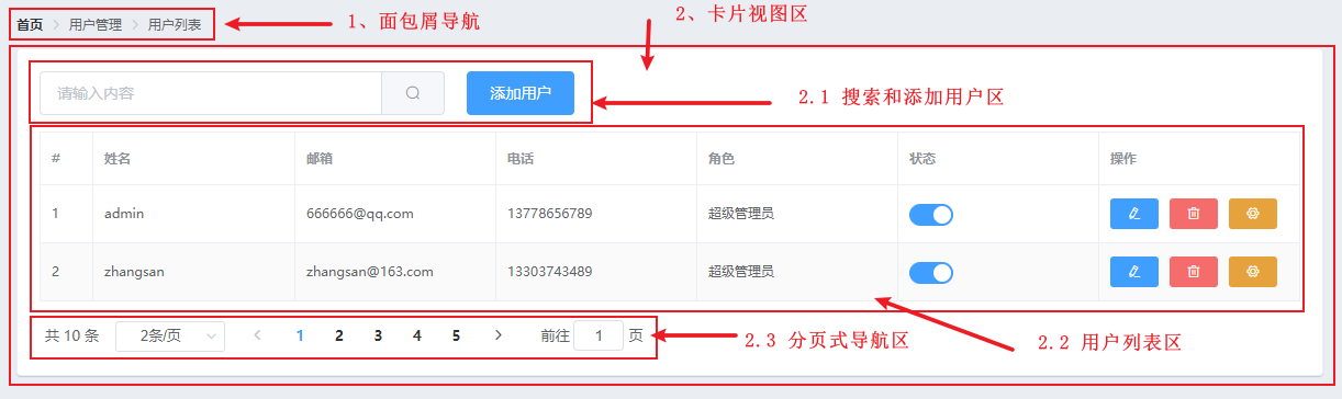
Page layout implementation:
-
Create the component page corresponding to the user list link
-
In the component directory , components , create a new , user , directory, and then create , users under this path Vue# components, as shown in the figure:
-
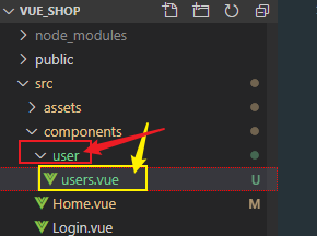
-
To create a basic page structure in a new component:
<template>
    <div>
       <h3>User list component</h3>
    </div>
</template>

<script>
export default {

}
</script>

<style lang="less" scoped>
</style>
3. In the form of routing, the user list is displayed in the main area on the right
-
Index. In the router directory JS routing file, import the user list component and define routing rules:
... // Other imported components
import Users from '../components/user/Users.vue'

Vue.use(VueRouter)

const router = new VueRouter({
    routes: [
		... // Other routing rules
        {
          path: '/home',
          component: Home,
          redirect: '/welcome',
          children: [
             { path: '/welcome', component: Welcome },
             { path: '/users', component: Users }
            ]
        }
    ]
})
However, it is found that the active menu text is not highlighted at this time:
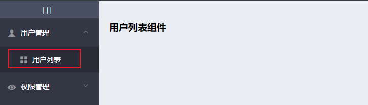
There is a "default active" parameter in the Menu attribute, indicating that the "index" of the currently active Menu can be assigned to "default active".
That is, if you want to highlight an item in the Menu when it is activated, assign the corresponding "index" to the attribute "default active" of the whole "Menu".
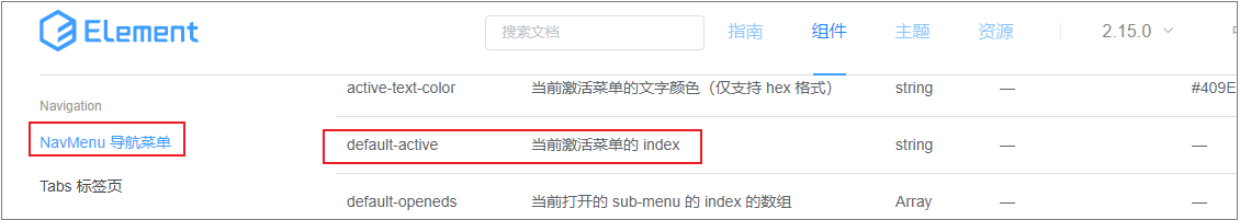
Open home Vue, add the "default active" attribute in < El Menu >. To facilitate testing, write its value as / users directly, that is, default active = "/ users". The effect is as follows:
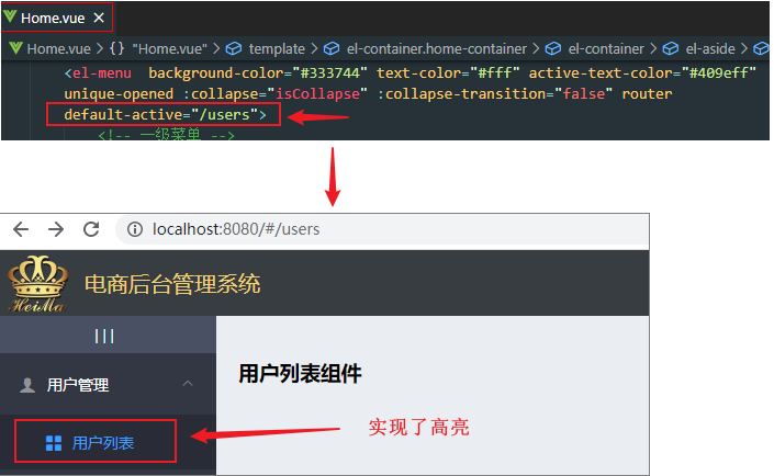
-
If you want to change the "index" of the active item to dynamic, how do you implement???
Implementation idea:
When we click the link, save the corresponding address to Session Storage first. When the page is refreshed (i.e. the Home component has just been created), this value is taken out and dynamically assigned to the "default active" attribute in the "El menu".
Step 1: bind a click event to all secondary menus, named "saveNavState", and store the "path" value in the click event:
<!-- Secondary menu -->
<el-menu-item :index="'/'+subItem.path + ''" v-for="subItem in item.children" :key="subItem.id" @click="saveNavState('/'+subItem.path)">
Step 2: define the saveNavState function
// Save the activation status of the link
saveNavState(activePath) {
	window.sessionStorage.setItem('activePath', activePath)
 }
After running the program, you can save the path {value:
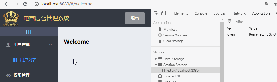
Next, you need to take out the saved value
Step 3: define activePath in data to save data. It is empty by default: activePath: ''. Then bind activePath to the default active attribute of < El Menu >. Replace the original write dead value / users.
Step 4: dynamic assignment
As soon as the whole Home component is created, it will immediately take the value from Session Storage and assign it to activePath;
Since the Created life cycle function is executed at the first time when the component is Created, the value is directly assigned in Created:
created() {
	this.getMenuList()
	this.activePath = window.sessionStorage.getItem('ctivePath')
}
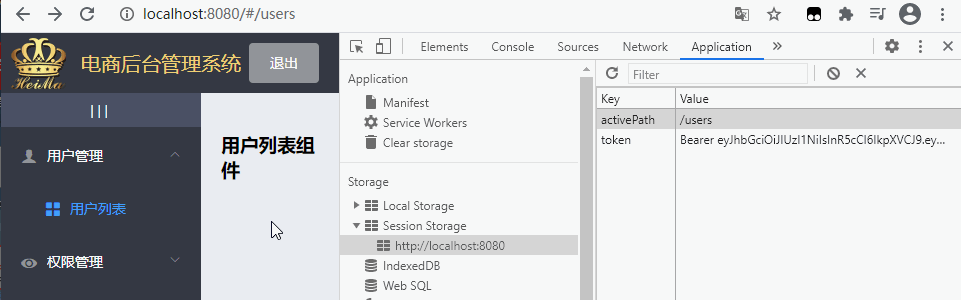
We found that when you click another link and click "user list" again, the corresponding link text is not highlighted because one step is missing. When clicking different links, you should also re assign the value to the current active path (in the saveNavState click event):
// Save the activation status of the link
saveNavState(activePath) {
	window.sessionStorage.setItem('activePath', activePath)
	// When you click the link, re assign the value
	this.activePath = activePath
 }
2. Draw basic UI} structure of user list
- Breadcrumb navigation: El breadcrumb
- Element UI} grid system basic usage: El row
- Table layout: El table, El Pagination
In Element UI In the official breadcrumb navigation component, find the corresponding code and copy it.
Open users Vue file, paste the copied code into the template area of the component file:
<template>
    <div>
       <!-- Breadcrumb navigation area -->
       <el-breadcrumb separator-class="el-icon-arrow-right">
            <el-breadcrumb-item :to="{ path: '/home' }">home page</el-breadcrumb-item>
            <el-breadcrumb-item>user management </el-breadcrumb-item>
            <el-breadcrumb-item>User list</el-breadcrumb-item>
        </el-breadcrumb>
    </div>
</template>
Next, in element JS, import and register the Breadcrumb and BreadcrumbItem components as needed (otherwise it will not take effect):
import Vue from 'vue'
... // Other components
import { Breadcrumb, breadcrumbItem } from 'element-ui'

// Register global components
... // Other registered components
Vue.use(Breadcrumb)
Vue.use(breadcrumbItem)

Vue.prototype.$message = Message
-
At this time, the breadcrumb navigation function is completed as follows:
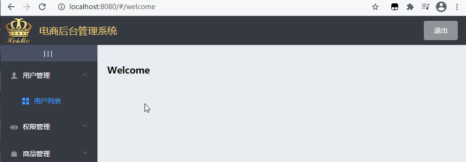
Draw card view area:
In Element UI official website Find the {card} component in the,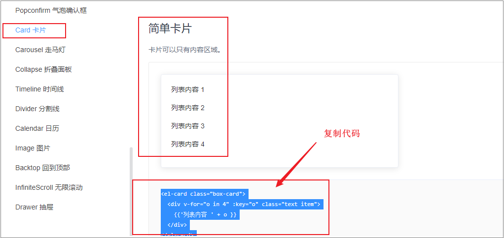
Paste the copied code into users In Vue file:
<!-- Card view area -->
<el-card class="box-card">
	<div v-for="o in 4" :key="o" class="text item">
	 	{{'List content ' + o }}
	</div>
</el-card>
Sort out the code, delete the unnecessary , for , loop and , box card , and the structure code is as follows:
<!-- Card view area -->
<el-card>
	123
</el-card>
Then click element After importing the {card} card in JS as needed, the effect is as follows: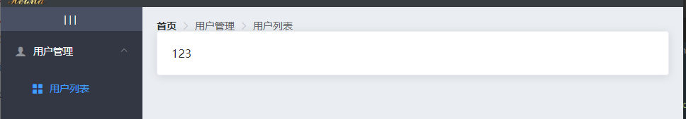
Visually, the card is too close to the breadcrumb navigation. Under the css directory in assets, find global css, set the upper spacing for the card view area. Here, add a value of "margin -bottom" to the bread crumb through the bread crumb class name selector "El breadcrumb", and squeeze the card box down a little:
.el-breadcrumb {
    margin-bottom: 15px;
    font-size: 12px;
}
After saving, the basic effect is as follows:
Resets the shadow style for the card view.
.el-car {
    box-shadow: 0 1px 1px rgba(0, 0 ,0.15) !important;
}
5.2. 2 user status column and operation column processing
- Scope slot
- Interface call
<template slot-scope="scope">
	<!-- switch -->
	<el-switch v-model="scope.row.mg_state" @change="stateChanged(scope.row.id, scope.row.mg_state)">
	<!--  -->
	</el-switch>
</template>
5.2. 3 table data filling
- Call the background interface;
- Initial filling of table data
const { data: res } = await this.$http.get('users', { params: this.queryInfo })
if (res.meta.status !== 200) {
	return this.$message.error('Failed to query user list!')
}
this.total = res.data.total
this.userlist = res.data.users
5.2. 4 table data paging
Paging component usage:
-
Current page: pagenum
-
Number of entries per page: pagesize
-
total records: total
-
Page change event
-
Number of entries per page change event
-
Paging bar menu control
<el-pagination
	@size-change="handleSizeChange"
	@current-change="handleCurrentChange"
	:current-page="queryInfo.pagenum"
	:page-sizes="[2, 3, 5, 10]"
	:page-size="queryInfo.pagesize"
	layout="total, sizes, prev, pager, next, jumper"
	:total="total">
</el-pagination>
5.2. 5 search function
Add the search keyword , as the , parameter , to the parameters of the list query.
<el-input placeholder="Please enter the search content"	v-model="queryInfo.query" clearable @clear="getUserList">
	<el-button slot="append" icon="el-icon-search" @click="getUserList"> </el-button>
</el-input>
5.3 user management - user status control
-
Usage of switch assembly
-
Interface call to change the user's state
<el-switch v-model="scope.row.mg_state" @change="stateChanged(scope.row.id, scope.row.mg_state)">
</el-switch>
async stateChanged(id, newState) {
	const { data: res } = await this.$http.put(`users/${id}/state/${newState}`)
	if (res.meta.status !== 200) {
		return this.$message.error('Failed to modify status!')
	}
}
5.4 user management - adding users
5.4. 1 add user form pop-up layout
-
Pop up window assembly usage
-
Control pop-up display and hiding
<el-dialog title="Add user" :visible.sync="addDialogVisible" width="50%">
	<el-form :model="addForm" label-width="70px">
		<el-form-item label="user name" prop="username">
			<el-input v-model="addForm.username"></el-input>
		</el-form-item>
		<!-- More form items -->
	</el-form>
	<span slot="footer" class="dialog-footer">
		<el-button @click="resetAddForm">Cancel</el-button>
		<el-button type="primary" @click="addUser">determine</el-button>
	</span>
</el-dialog>
5.4. 2 form validation
- Built in} form validation rules:
<el-form :model="addForm" :rules="addFormRules" ref="addFormRef" >
	<!-- form  -->
</el-form>
addFormRules: {
	username: [{ required: true, message: 'enter one user name', trigger: 'blur' }],
	password: [{ required: true, message: 'Please input a password', trigger: 'blur' }],
}
this.$refs.addFormRef.validate(async valid => {
	if (!valid) return
})
Custom} form validation rules
Mobile number verification rules
const checkMobile = (rule, value, cb) => {
	let reg = /^(0|86|17951)?(13[0-9]|15[012356789]|17[678]|18[0-9]|14[57])[0-9]{8}$/
	if (reg.test(value)) {
		cb()
	} else {
		cb(new Error('Incorrect mobile phone number format'))
	}
}
mobile: [
	{ required: true, message: 'Please enter your mobile phone number', trigger: 'blur' },
	{ validator: checkMobile, trigger: 'blur' }
]
5.4. 3 form submission
Take the user information as a parameter and call the background interface to add users.
this.$refs.addFormRef.validate(async valid => {
	if (!valid) return
	const { data: res } = await this.$http.post('users', this.addForm)
	if (res.meta.status !== 201) {
		return this.$message.error('Failed to add user!')
	}
	this.$message.success('User added successfully!')
	this.addDialogVisible = false
	this.getUserList()
})
5.5 user management - edit user
5.5. 1. Query user information according to ID
<el-button type="primary" size="mini" icon="el-icon-edit" @click="showEditDialog(scope.row.id)">
</el-button>
async showEditDialog(id) {
	const { data: res } = await this.$http.get('users/' + id)
	if (res.meta.status !== 200) {
		return this.$message.error('Failed to query user information!')
	}
	// Save the obtained user information object to the edit form data object
	this.editForm = res.data
	this.editDialogVisible = true
}
5.5. 2 Edit submission form
this.$refs.editFormRef.validate(async valid => {
	if (!valid) return
	// Request for modification
	const { data: res } = await this.$http.put('users/' + this.editForm.id, {
		email: this.editForm.email,
		mobile: this.editForm.mobile
	})
	if (res.meta.status !== 200) {
		return this.$message.error('Failed to edit user information!')
	}
	this.$message.success('User information edited successfully!')
	this.getUserList()
	this.editDialogVisible = false
})
5.6 user management - delete user
When clicking the delete button, the prompt message box shall pop up to let the user confirm the deletion operation.
If you want to use the confirm cancel prompt box, you need to mount the prompt message box in vue first.
-
A. Import the MessageBox component and mount the MessageBox component to the instance.
Vue.prototype.$confirm = MessageBox.confirm
B. Add an event to the delete button in the user list, pop up the confirm cancel window in the event handling function, and finally send a request to delete the user according to the id
<el-button type="danger" size="mini" icon="el-icon-delete" @click="remove(scope.row.id)"></el-button>
async remove(id) {
	// Ask if you want to delete
	const confirmResult = await this.$confirm('This action will permanently delete the user, Continue?', 'Tips', {
		confirmButtonText: 'determine',
		cancelButtonText: 'cancel',
		type: 'warning'
	}).catch(err => err)
	//If the user clicks confirm, the confirm result is' confirm '
	//If the user clicks cancel, the confirmResult will get the catch error message 'Cancel'
	if(confirmResult != "confirm"){
    	return this.$message.info("The deletion has been cancelled")
	}
	//Send a request and complete the deletion operation according to the id
	const { data: res } = await this.$http.delete('users/' + id)
	if (res.meta.status !== 200) return this.$message.error('Failed to delete user!')
	this.$message.success('User deleted successfully!')
	this.getUserList()
},
6 authority management
6.1 permission management business analysis
The permission management module controls what operations different users can perform. Specifically, it can be controlled by role, that is, each user is assigned a specific role, and the role includes different functional permissions.
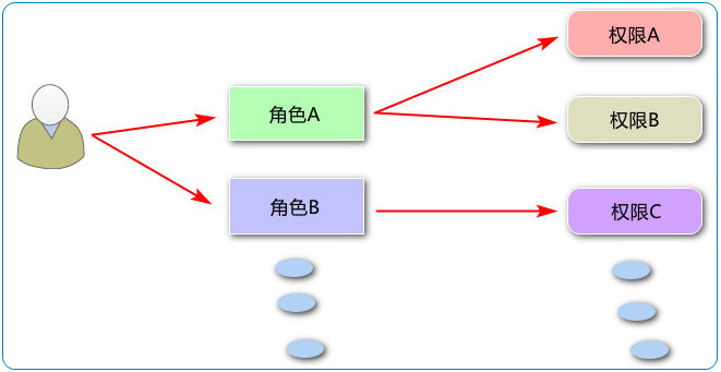
6.2 add permission list route
Create a permission management component * * (Rights.vue) and add corresponding routing rules in router.js
import Rights from './components/power/Rights.vue'
......
	path: '/home', component: Home, redirect: '/welcome', children: [
		{ path: "/welcome", component: Welcome },
		{ path: "/users", component: Users },
		{ path: "/rights", component: Rights }
	]
......
6.3 adding breadcrumbs
At {rights Add breadcrumb component to Vue , to show navigation path.
6.4} permission list display
Add a rightsList data in data, provide a getRightsList method in methods to send request to get permission list data, and call this method in created to get data.
<el-table :data="rightsList" stripe>
    <el-table-column type="index"></el-table-column>
    <el-table-column label="Permission name" prop="authName"></el-table-column>
    <el-table-column label="route" prop="path"></el-table-column>
    <el-table-column label="privilege level" prop="level">
        <template slot-scope="scope">
            <el-tag v-if="scope.row.level === 0">First level authority</el-tag>
            <el-tag v-if="scope.row.level === 1" type="success">Secondary authority</el-tag>
            <el-tag v-if="scope.row.level === 2" type="warning">Three level authority</el-tag>
        </template>
    </el-table-column>
</el-table>
<script>
export default {
    data(){
        return {
            //Permissions in list form
            rightsList:[]
        }
    },
    created(){
        this.getRightsList();
    },
    methods:{
        async getRightsList(){
            const {data:res} = await this.$http.get('rights/list')
            //If the returned status is abnormal, an error is reported and returned
            if (res.meta.status !== 200)
                return this.$message.error('Failed to get permission list')
            //If the return status is normal, save the requested data in data
            this.rightsList = res.data
        }
    }
}
</script>
The complete functions of adding permission, deleting permission and editing permission are not listed here. Please refer to the previously written role management code and interface documents.
Get permission list data
// Get permission list data
async getRightsList() {
	const { data: res } = await this.$http.get('rights/list')
	if (res.meta.status !== 200) {
		return this.$message.error('Failed to get permission list!')
	}
	this.rightsList = res.data
}
6.5} role list display
- Call the background interface to obtain the role list data
- Role list display
// Get a list of all roles
async getRolesList() {
	const { data: res } = await this.$http.get('roles')
	if (res.meta.status !== 200) {
		return this.$message.error('Failed to get role list!')
	}
	this.rolesList = res.data
},
6.6 user role assignment
6.6. 1 show role dialog box
① Implement user role dialog layout
② Controls the display and hiding of the character dialog box
③ When the role dialog box is displayed, the role list data is loaded
async showSetRoleDialog(userInfo) {
	this.userInfo = userInfo
	// Initiate a request to get a list of all roles
	const { data: res } = await this.$http.get('roles')
	if (res.meta.status !== 200) {
		return this.$message.error('Failed to get role list!')
	}
	this.rolesList = res.data
	this.setRoleDialogVidible = true
}
6.6. 2. Complete the role assignment function
async saveNewRole() {
	if (this.selectedRoleId === '') {
		return this.$message.error('Please select a new role before saving!')
	}
	const { data: res } = await this.$http.put(`users/${this.userInfo.id}/role`, {
		rid: this.selectedRoleId
	})
	if (res.meta.status !== 200) {
		return this.$message.error('Failed to assign role!')
	}
	this.$message.success('Role assignment succeeded!')
	this.getUserList()
	this.setRoleDialogVidible = false
}
6.7} role permission assignment
Notes:
-
Homology: the same protocol, domain name and port
The purpose of homology strategy is to ensure the security of user information and prevent malicious websites from stealing data. ↩︎
-
Cross domain: it means that the browser cannot execute scripts of other websites. It is caused by the browser's homology policy and is the browser's security restriction on javascript.