Catalogue of series articles
For developing a vue project, the following steps are usually required:
1, Front end project initialization
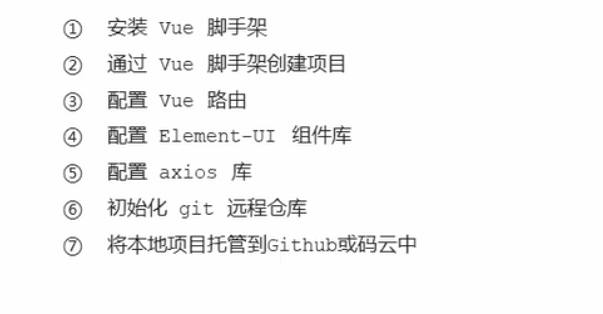
Installation of Vue scaffold:
To install Vue in the global environment, the installation steps are as follows:
1. First: from nodejs Download nodejs - > and install vue globally.
npm install vue-cli -g
2. Initialize the project with vue cli: enter vue init in cmd to initialize and create a vue based project`
vue init webpack xxx
3. Install dependent resources
Drag the file into vscode and npm install to download the dependent resources
4. Command to run the project
npm run serve
2, login component
The routing of a component can be set as follows:
import Vue from 'vue'
import Router from 'vue-router'
import Login from '../components/Login.vue'

Vue.use(Router)

export default new Router({
  routes: [
    { path: '/login', component: Login }
  ]
})
On app Place a route placeholder in Vue
<template>
  <div id="app">
  <router-view></router-view>
  </div>
</template>   //Show it in router view
All components matched through the route will be rendered into the router view.
When the user accesses the home page, we want the user to see the login interface, so we need to reposition it to the page, that is, in router JS specifies the routing rules:
export default new Router({
  routes: [
    { path: '/', redirect: '/login' },
    { path: '/login', component: Login }
  ]
})
Set global style: create a new global in the assets folder CSS file in which to set the global style:
html,
body,
#app{
    height: 100%;
    margin:0;
    padding: 0;
}
After setting, this style is introduced into the entry file main JS:
import './assets/css/global.css'
For the login component, we can divide it into three areas:
1.template (template area)
2.script (behavior area)
3.style (style area)
// Template area
<template>
    <div>
        Login component
    </div>
</template>

<script>
export default {}
</script>

<style lang="less" scoped>
</style>
2.1 template area
Set the component template in the template, import the corresponding required components on the element UI official website, and click element. In the plugin folder JS
<el-form ref="form" :model="form" label-width="80px">
  <el-form-item label="Activity name">
    <el-input v-model="form.name"></el-input>
  </el-form-item>
<template>
    <div class="login_container">
        <div class="login_box">
            <div class="avatar_box">
                <img src="../assets/logo.png" alt="">
            </div>
        </div>
    </div>
</template>
2.2script area
Set behavior in script
① Set properties for El form for bidirectional data binding. First, set the form in the template area of the template: model="loginForm" set its attribute to loginform in the dependent user name and password Username or loginform password
:model="loginForm"
v-model="loginForm.username"
v-model="loginForm.password"
Then enter the script area and set data:
  data () {
    return {
      loginForm: {
        username: '',
        password: ''
      }
    }
  }
Finally, because the password should be hidden, you can add a type attribute of password.
② Data validation of forms:
Bind a rules rule to specify the verification object, define the rules in the data (each attribute is a set of rules), and specify different verification rules for different form item items through different prop s.
For example, for the user name box:
        username: [
          { required: true, message: 'Please enter login name', trigger: 'blur' },
          { min: 3, max: 10, message: 'Length in 3-10 Characters', trigger: 'blur' }
        ]
Trigger indicates when to trigger the display of the message, that is, when it is out of focus; min and max indicate the length.
Then bind this rule to the template for the component.: Rules = "loginfomrules" (note that the function corresponding to rules should be written in data)
  <el-form :rules="loginFormRules" :model="loginForm" class="login_form" >
   <el-form-item prop='username'>
③ Realize the data reset of the form: if you want to obtain the instance object of the component, you only need to add a ref attribute to the component to obtain it (the name is optional, preferably indicated by ref suffix). Because the function to be realized is to click the reset button to reset the form. Viewing the document, you can find that it has a method: resetLoginForm
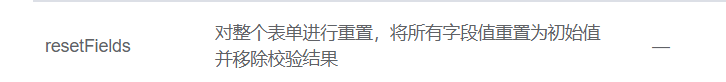
So when you want to use this method, you have to get the instance object and call the method on it.
ref="loginFormRef"
    resetLoginForm () {
    //   console.log(this)
      this.$refs.loginFormRef.resetFields()
    }
④ Realize the data pre validation of the form: there is still a method validate, so as in the above process, just call the method through the instance object. It can be seen from reading the document that the parameter of this method is a callback function, and the first parameter of the callback function is boolean type, indicating whether the verification result is correct.
 login () {
      this.$refs.loginFormRef.validate((valid, object) => {
        if (!valid) return
        console.log(valid, object)
      })
    }
  }
⑤ Realize the initiation of network request:
In main Introduce axios into JS and mount it into the prototype of vue. Therefore, the $symbol should be added before the module mounted to the global vue, so that each component can access this function through this
import axios from 'axios'
axios.defaults.baseURL = 'https://www.liulongbin.top:8888/api/private/v1/'
Vue.prototype.$http = axios
Back to Vue, for setting the login function:
    login () {
      this.$refs.loginFormRef.validate((valid, object) => {
        if (!valid) return
        this.$http.post('login', this.loginForm)
        if (res.meta.status !== 200) return console.log('fail')
        console.log('fail')
      })
    }
⑥ Message prompt function:
First, introduce the Message and load it into Vue In prototype:
Vue.prototype.$message = Message
Next, replace the above part that uses the console to print the prompt message. When it is true, call the message
        if (res.meta.status !== 200) return this.$message.error('fail')
        else return this.$message.success('success')
⑦ Detail processing part
7.1 save the token after successful login to the sessionId of the client: here, directly obtain the sessionId value after successful request and save it to the session
window.sessionStorage.setItem('token', res.data.token)
7.2 finally, go directly to the home page:
this.$router.push('home')
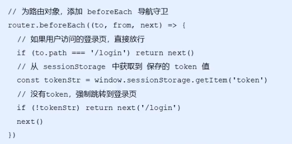
⑧ Implementation of route navigation guard function: the page can be seen only after successful login. router. Before each is a navigation guard,
2.3style area
Set page style in style:
It is worth noting that if the scoped attribute is added to the style tag, the node style will only take effect in the component, otherwise it will take effect globally. So single file component + scoped prevents style conflicts
Style boxes and picture frames:
.login_container{
    background-color: #2b4b6b ;
    height:100%;
}
.login_box{
    width: 450px;
    height: 300px;
    background-color: white;
    border-radius: 3px;
    position: absolute;
    top: 50%;
    left: 50%;
    transform: translate(-50% ,-50%);
    .avatar_box{
        width: 130px;
        height: 130px;
        border: 1px solid #eee;
        border-radius: 50%;
        padding: 10px;
        box-shadow: 0 0 10px #ddd;
        position: absolute;
        left: 50%;
        transform: translate(-50% ,-50%);
        background-color: #fff;
        img{
            width:100%;
            height: 100%;
            border-radius: 50%;
            background-color: #eee;
        }
    }
}
Set login box style:
.login_form {
    width: 100%;
    padding: 0 20px;
    box-sizing: border-box;
    position: absolute;
    bottom: 0;
}
.btns {
    display: flex;
    justify-content: flex-end;
}
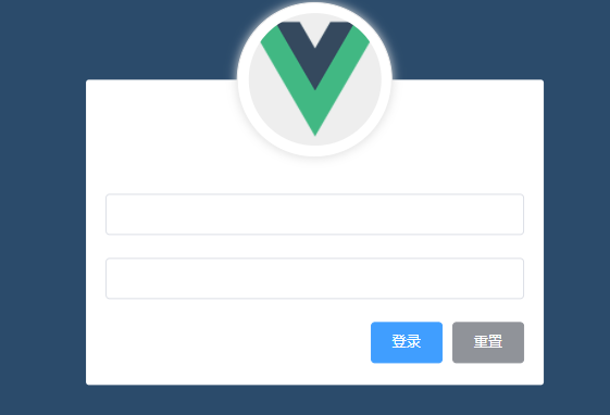
Draw Icon:
Add attributes to the input tag:
prefix-icon="xxx"
To use Ali icon library, download the corresponding file and then main JS can be used normally:
<el-input prefix-icon="iconfont icon-yonghuming"></el-input>
3, Home page
3.1 template area:
Directly refer to the components in element UI on the layout:
<template>
  <el-container class="home-container" >
    <!-- Head area -->
  <el-header>
    <div>
      <!-- <img src="../assets/heima.png" alt=""> -->
      <span>E-commerce background management system</span>
    </div>
    <el-button type='info' @click='logout'>sign out</el-button>
  </el-header>
  <!-- Page body area -->
  <el-container>
    <!-- sidebar  -->
    <el-aside width="200px">
      <!-- Sidebar menu area -->
        <el-menu background-color="#545c64" text-color="#fff" active-text-color="#ffd04b">
          <!-- This is the first level menu -->
      <el-submenu index="1">
        <!-- Template area of first level menu -->
        <template slot="title">
          <!-- Icon -->
          <i class="el-icon-location"></i>
          <!-- text -->
          <span>Navigation one</span>
        </template>
        <!-- Secondary menu -->
        <el-menu-item index="1-4-1">
         <template slot="title">
          <!-- Icon -->
          <i class="el-icon-location"></i>
          <!-- text -->
          <span>Navigation one</span>
        </template>
        </el-menu-item>
      </el-submenu>
    </el-menu>
    </el-aside>
    <!-- Right content body -->
    <el-main>Main</el-main>
  </el-container>
</el-container>
</template>
3.2script area:
① Except for the login interface, other interfaces of the back-end server need to have certain permissions before they can be used normally. Therefore, use the axios interceptor to add token verification:
Here, axios comes with an interceptors attribute, which has Request, a request interceptor, can be used use mounts an intercepted callback function to achieve the request of the request before it reaches the advanced request of a request. After processing, it is sent back to the server. It needs entrance file main.. JS file:
axios.interceptors.request.use(config=>
  {
    config.headers.Authorization=window.sessionStorage.getItem('token')
    return config
  })
This means that an Authorization attribute is added to the header with the attribute value of token, so that the authorized API can be called successfully.
② Call the back-end data interface: this process should occur in the life cycle of created(),
  created() {
    this.getMenuList()
  },
Define the function in methods. After obtaining the data, mount it in the property data of vue:
  data() {
    return{
      // Left menu data
     menulist=[]
    }
  },
     async getMenuList() {
    //  Destructuring assignment
    const { data:res } =  await this.$http.get('menu')
    if( res.meta.status!==200)
    return this.$message.error(res.meta.msg)
    this.menulist=res.data
    }
After pulling the data, go back to the template to render the corresponding content, and use v-for to realize this process. However, it should be noted that if you directly render, click a menu to expand it with it, so we should change its index value to unique.
          <el-submenu :index="item.id+''" v-for="item in menuList" :key="item.id" >
            <!-- Template area of the first level menu -->
            <template slot="title">
              <i :class="iconObj[item.id]"></i>
              <span>{{ item.authName}}</span>
            </template>
         </el-submenu>
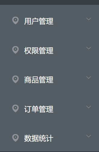
Continue to render the secondary menu with data.
         <el-menu-item :index="'/' + subItem.path" v-for="subItem in item.children" :key="subItem.id" @click="saveNavState('/' + subItem.path)">
              <!-- Navigation enable routing mode:
                take index Value as navigation route -->
              <!-- Template area of secondary menu -->
              <template slot="title">
                <i class="el-icon-menu"></i>
                <span>{{ subItem.authName}}</span>
              </template>
            </el-menu-item>
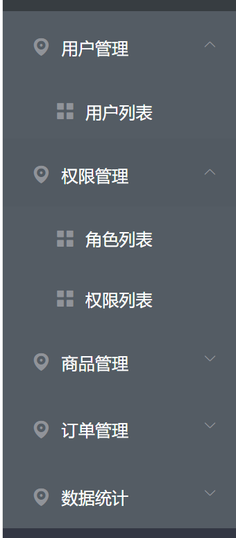
Modify each icon in the loop: add an icon item to the data:
      iconObj: {
        '125': 'iconfont icon-user',
        '103': 'iconfont icon-tijikongjian',
        '101': 'iconfont icon-shangpin',
        '102': 'iconfont icon-danju',
        '145': 'iconfont icon-baobiao'
      },
Change template to:
<i :class="iconObj[item.id]"></i>
If you only open one menu at a time, you can directly use the internal properties of the component:
<el-menu background-color="#545c64" text-color="#fff" active-text-color="#409Eff" unique-opened>
Bind a click event to the button bar, and click the button to switch the collapse and expansion of the menu:
<el-menu background-color="#545c64" text-color="#fff" active-text-color="#409Eff" unique-opened :collapse="isCollapse" :collapse-transition='false'>
The change of this process is determined according to the dynamic data
Let his width change accordingly:
<el-aside :width="isCollapse ?'64px':'200px'">
② To implement the jump of components within a component, first define corresponding rules within the component, such as loading a welcome component in the home component. Then load it into the routing rule as the children route of home, so that the corresponding loading can be realized:
    { path: '/home', component: Home,
     redirect:'/welcome',
     children:[
      { path: '/welcome',component:Welcome }
    ] }
③ Directly open the routing mode for the side menu bar (add a router attribute, and its jump path is the activePath we pass in next). How can we get this path? There are two methods. One is to directly:
:default-active='$route.path
Or just click the menu bar and the function saves the path to sessionStorage,
   saveNavState(activePath) {
     window.sessionStorage.setItem('activePath',activePath)
     this.activePath=activePath
   }
Then, within the created life cycle, take the value from sessionStorage and assign it to activePath in prop
created() {
 this.activePath=window.sessionStorage.getItem('activePath')
 }
In addition, in order to ensure the realization of the highlight effect, we also need to save the path function:
this.activePath=activePath
3.3style area:
Set the corresponding style for it: still use scoped to control the scope of the style
<style lang="less" scoped>
.el-container {
  height: 100%;
}
.el-header {
  background-color: #373f41;
  display: flex;
  justify-content: space-between;
  padding-left: 0;
  align-items: center;
  color: #fff;
  font-size: 20px;
  > div {
    display: flex;
    align-items: center;
    img {
      height: 40px;
    }
    span {
      margin-left: 15px;
    }
  }
}
.el-aside {
  background-color: #333744;

  .el-menu {
    border: none;
  }
}
.el-main {
  background-color: #eaedf1;
}
.iconfont{
  margin-right: 10px;
}
.toggle-button {
  background-color: #4A5064;
  font-size: 10px;
  line-height: 24px;
  color: #fff;
  text-align: center;
  letter-spacing: 0.2em;
  // Put the mouse up and turn it into a small hand
  cursor: pointer;
}
</style>
3.4 exit Button: exit function implementation
1. Exit function: the exit function based on token is implemented in a simple way. You only need to destroy the local token, so that the token will not be carried when sending the request in the future. You must log in again to generate a new token before accessing the page: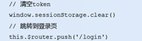
First, the template indicates the html template
<template>
  <div class="test">
    <el-button type='info' @click='logout'>sign out</el-button>
  </div>
</template>
Declare the mounting method in the script, that is, clear the token and jump to the login page
export default {
  methods:{
    logout() {
      window.sessionStorage.clear()
      this.$router.push('/login')
    }
  }
}
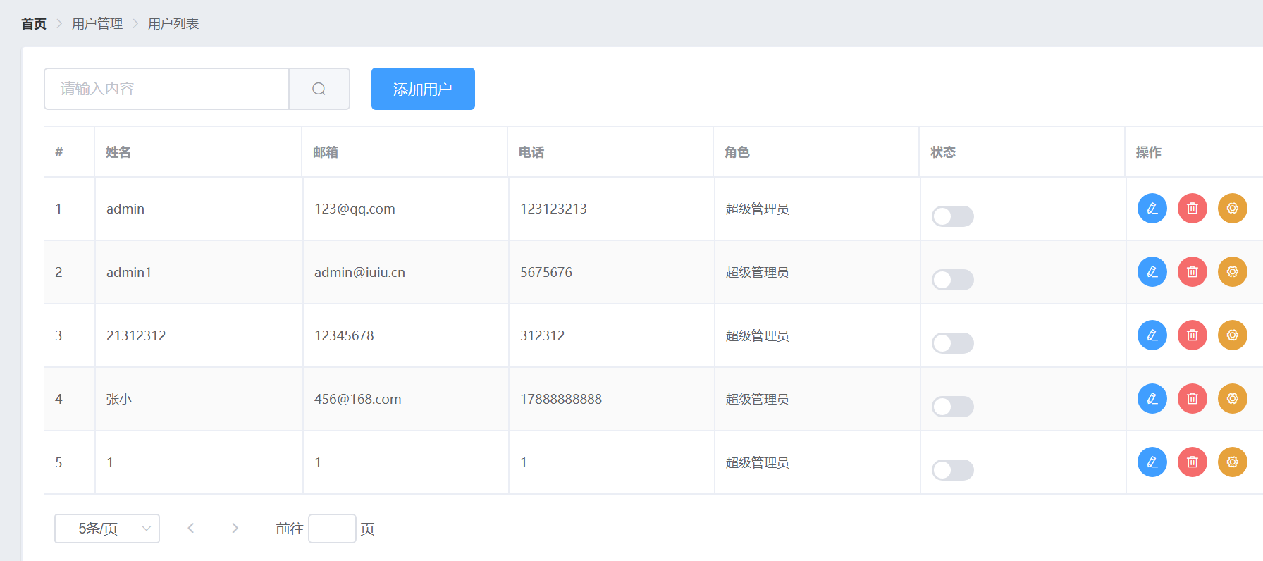
4, User list page
4.1 template area
Still use the element UI template
4.2script area
1. Add user
① Pull the background data interface to obtain the user list, that is, make data requests in the created life cycle, then store the data in data, render the interface in template, and the functions to request data from the background are as follows:
    async getUserList () {
      const { data: res } = await this.$http.get('users', {
        params: this.queryInfo
      })//Rename data to res
      if (res.meta.status !== 200) {
        return this.$message.error('Failed to get user list!')
      }
      this.userlist = res.data.users //Update data
      this.totle = res.data.totle
    },
① For the button to change the component state, the concept of scope slot needs to be used here. Why use scope slot? This is because it is set in the element UI that if you want to customize a column in the table layout, you must use template and bind a slot for it, add corresponding components in it, and render according to the attribute value of the slot. According to the element UI document, in vue, you can use v-slot to bind a slot, and v-slot="scope" to bind the attribute of the slot to scope, so you can use scope row. XXX can get all the data bound to the table at that time. Because this is a state switching, switching according to the boolean value, so scope row. mg_ State can be represented by binding the switch, and the changed state should be saved to the database.
<template v-slot="scope">
<el-switch v-model="scope.row.mg_state"
@change="userStateChanged(scope.row)"></el-switch>
</template>
Bind the change event to a function, userStateChanged, and use it to send a request to the background interface to change the user's state in the database (most of the changes are put requests) and if the update fails, note that the foreground also needs to be unchanged, so it needs to be reversed.
    async userStateChanged (userInfo) {
      // console.log(userInfo)
      const { data: res } = await this.$http.put(
        `users/${userInfo.id}/state/${userInfo.mg_state}`
      )
      //Processing failed
      if (res.meta.status !== 200) {
        userInfo.mg_state = !userInfo.mg_state
        return this.$message.error('Failed to update user status')
      }
      this.$message.success('User status updated successfully!')
    },
② Realize the search function: first, implement a two-way binding to the search box, that is, bind the input of the search box, and then bind a click event to the search button. As long as you click it, the corresponding event will be triggered - the request to query the user is still getUserList. Then, for further optimization, a one click Clear button is added to the input to reset all data. This is also an inherent function to directly add a clearable attribute to the input box. In addition, I also want to realize that once I click to empty the data, all the data will come back. Looking at the document, I can see that there is a @ clear event in the input box. This function can be realized by binding getUserList to this event.
③ For the implementation of various dialog functions, this component also exists in the element UI. We just need to directly introduce it, and then directly change the state of this value for click events in the template area.
<el-dialog title="Add user" :visible.sync="addDialogVisible" width="50%" @close="addDialogClosed">
<el-button type="primary" @click="addDialogVisible = true">Add user</el-button>
Further implementation of the add user dialog box: directly change the contents contained in the above pop-up dialog box into a form, and submit data in this form. For this form, the verification method is as follows: bind a rule directly to this form, and then define the corresponding verification rule in the data function:
      addUserFormRules: {
        username: [
          { required: true, message: 'enter one user name', trigger: 'blur' },
          {
            min: 2,
            max: 10,
            message: 'The length of the user name is 2~10 Word',
            trigger: 'blur'
          }
        ],
        password: [
          { required: true, message: 'Please enter the user password', trigger: 'blur' },
          {
            min: 6,
            max: 18,
            message: 'The length of the user password is 6~18 Word',
            trigger: 'blur'
          }
        ],
        email: [
          { required: true, message: 'Please enter email address', trigger: 'blur' },
          { validator: checkEmail, trigger: 'blur' }
        ],
        mobile: [
          { required: true, message: 'Please enter your mobile phone number', trigger: 'blur' },
          { validator: checkMobile, trigger: 'blur' }
        ]
      },
And for data binding, use model to bind it.
      <el-form
        :model="addUserForm"
        ref="addUserFormRef"
        :rules="addUserFormRules"
        label-width="100px"
      >
        <el-form-item label="user name" prop="username">
          <el-input v-model="addUserForm.username"></el-input>
        </el-form-item>
        <el-form-item label="password" prop="password">
          <el-input v-model="addUserForm.password"></el-input>
        </el-form-item>
        <el-form-item label="mailbox" prop="email">
          <el-input v-model="addUserForm.email"></el-input>
        </el-form-item>
        <el-form-item label="mobile phone" prop="mobile">
          <el-input v-model="addUserForm.mobile"></el-input>
        </el-form-item>
      </el-form>
④ Custom verification rules: among the officially provided verification rules, we cannot perform specific verification. We can only verify whether it is a required option and length. At this time, we need to perform custom verification, but the corresponding verification format has been provided for us in the element UI. We only need to define the function according to the template, The corresponding verification can be realized. The document points out that as long as the function name of the verification rule is specified through the validator, the function is specified in the data, and then the verification time is specified through the trigger, the corresponding verification can be completed: mailbox: declare a function in the data, checkEmail:
    let checkEmail = (rule, value, callback) => {
      const regEmail = /^\w+@\w+(\.\w+)+$/
      //You can check whether there is a match through test, and the match is true
      if (regEmail.test(value)) {
        // Legal mailbox
        return callback()
      }
      callback(new Error('Please enter a legal email address'))
    }
Mobile phone: declare a function checkPhone in data. The process is the same:
    let checkMobile = (rule, value, callback) => {
      const regMobile = /^1[34578]\d{9}$/
      if (regMobile.test(value)) {
        return callback()
      }
      // Returns an error message
      callback(new Error('Please enter a valid mobile phone number'))
    }
Finally, add them to rules:
  { validator: checkEmail, trigger: 'blur' }
  { validator: checkMobile, trigger: 'blur' }
⑤ Reset the form, that is, after closing the form, the last entered information in the form has been cleared: the idea is to monitor the status of the dialog box. If it is closed, its data will be cleared. The implementation is as follows: to bind a close event for it, the event corresponds to a function, and the instance of the form is accessed in the function, and an empty method in the form is invoked in the instance.
<el-dialog @close="addDialogClosed">
    addDialogClosed () {
      this.$refs.addUserFormRef.resetFields()
    },
⑥ Pre check the form before adding users: that is, check the completeness of the form before clicking the OK add button. The implementation idea is also very simple. It is to monitor the click event for the OK button and bind a function to realize the pre check of the form in the function, and the whole form instance should be obtained in the function, Then call the validate method for this instance through addUserFormRef:
 this.$refs.addUserFormRef.validate(async valid => {
 if (!valid) return
})
After the verification is successful, we can add our data to the API through the post request (defined according to the API). Don't forget to hide the dialog box and call the getUserList method again after adding.
const { data: res } = await this.$http.post('users', this.addUserForm)
        if (res.meta.status !== 201) {
          this.$message.error('Failed to add user!')
        }
        this.$message.success('User added successfully!')
        // Hide the add user dialog box
        this.addDialogVisible = false
        this.getUserList()
2. Modify user
The function we want to achieve here is to click the Modify button to pop up the user information, in which the user name is read-only, and we can only modify the mobile phone and email here.
Implementation process: listen to the listening event of the Modify button, bind a function to the event, bind a function to the Modify button in the function, and add a dialog in the template area... The implementation method is the same as adding users, so I won't repeat it. The difference is that when we click Modify, we query the old data and render it to the form. Here, we can still use scope row. id to get the id and pass it into the modification function to initiate a background data request, then save the queried user information in data, and change the display status of dialog to true.
            <el-button
              type="primary"
              icon="el-icon-edit"
              size="mini"
              circle
              @click="showEditDialog(scope.row.id)"
            ></el-button>
    async showEditDialog (id) {
      const { data: res } = await this.$http.get('users/' + id)
      if (res.meta.status !== 200) {
        return this.$message.error('Failed to query user information!')
      }
      this.editUserForm = res.data
      this.editDialogVisible = true
    }
Now that the data is available, render it to the form, that is, bind the obtained data in both directions, and then add corresponding verification rules for it:
      editUserFormRules: {
        email: [
          { required: true, message: 'Please enter email address', trigger: 'blur' },
          { validator: checkEmail, trigger: 'blur' }
        ],
        mobile: [
          { required: true, message: 'Please enter your mobile phone number', trigger: 'blur' },
          { validator: checkMobile, trigger: 'blur' }
        ]
      }
Then you also need to pre verify the form + send data to the background. This process is the same as adding users. I won't repeat it.
3. Delete user
Implementation function: when clicking delete, a message box will pop up to let the user determine whether to really delete the information.
This can also be achieved by using the components in the element UI. When the messageBox component is mounted to the global and then triggered for deletion, this$ Confirm can be implemented. According to the document, we can also see the corresponding return form. A promise object will be returned in this method.
    async removeUserById (id) {
      const confirmResult = await this.$confirm(
        'This action will permanently delete the user, Continue?',
        'Tips',
        {
          confirmButtonText: 'determine',
          cancelButtonText: 'cancel',
          type: 'warning'
        }
      ).catch(err => err)
      // Click OK and the return value is confirm
      // Click Cancel and the return value is cancel
      if (confirmResult !== 'confirm') {
        return this.$message.info('Deletion cancelled')
      }
      const { data: res } = await this.$http.delete('users/' + id)
      if (res.meta.status !== 200) return this.$message.error('Failed to delete user!')
      this.$message.success('User deleted successfully!')
      this.getUserList()
    },
4.3style area
No special style, no setting.
The results are as follows:
5, Rights management page
4.1 template area
Still use the element UI template:
Rights.vue:
    <!-- Breadcrumb navigation area -->
    <el-breadcrumb separator-class="el-icon-arrow-right">
      <el-breadcrumb-item :to="{ path: '/home' }">home page</el-breadcrumb-item>
      <el-breadcrumb-item>Authority management</el-breadcrumb-item>
      <el-breadcrumb-item>Permission list</el-breadcrumb-item>
    </el-breadcrumb>
    <!-- Card view -->
    <el-card>
      <el-table :data="rightsList" border stripe>
        <el-table-column type="index" label="#"></el-table-column>
        <el-table-column label="Permission name" prop="authName"></el-table-column>
        <el-table-column label="route" prop="path"></el-table-column>
        <el-table-column label="privilege level" prop="level">
          <template slot-scope="scope">
            <el-tag v-if="scope.row.level === '0'">class a</el-tag>
            <el-tag type="success" v-else-if="scope.row.level === '1'">second level</el-tag>
            <el-tag type="danger" v-else>Tertiary</el-tag>
          </template>
        </el-table-column>
      </el-table>
    </el-card>
4.2script area
Rights.vue:
First, load the new component into the route. Because it still belongs to the home component, it should be added to our home route accordingly:
      path: '/home',
      component: Home,
      redirect: '/welcome',
      children: [
        { path: '/welcome', component: Welcome },
        { path: '/users', component: Users },
        { path: '/rights', component: Rights }
1. Call API to obtain data:
When obtaining data here, the background stores the data in two formats: a tree structure and an array structure (each item is independent of each other)
At rights The data applied in Vue is the data of array structure. Here, as in the previous data acquisition part, directly initiate the request in created and define the corresponding request function in methods:
  created () {
    this.getRightsList()
  },
  methods: {
    async getRightsList () {
      const { data: res } = await this.$http.get('rights/list')
      if (res.meta.status !== 200) {
        return this.$message.error('Failed to get permission list!')
      }
      this.rightsList = res.data
    }
  }
2. Render list by data
It is still a table component, so you can directly bind the data to it. For each column, prop can formulate the data name corresponding to the corresponding rendering item. Then we want to add the permissions of each level in this column. Here, we still use the form acting on the slot to put the El tag component here, However, it should be noted that we hope that each user can display the corresponding permission level accordingly, so here we need to use the v-if series of statements to judge it:
<el-tag v-if="scope.row.level === '0'">class a</el-tag>
<el-tag type="success" v-else-if="scope.row.level === '1'">second level</el-tag>
<el-tag type="danger" v-else>Tertiary</el-tag>
User rights management business analysis
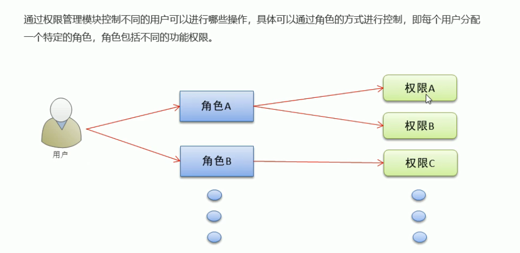
An intermediate role is added to the logic here, so that as long as users have the corresponding role, they will have all the permissions owned by this role.
Roles.vue
As mentioned earlier, we need a roles component as the middle part. So we define a new vue file here to assign corresponding roles.
The first step is still added to the routing. It is still the sub routing rule:
{ path: '/roles', component: Roles }
1. Call API to obtain data:
Here, as in the above process, the code is pasted directly:
  created () {
    this.getRolesList()
  },
  methods: {
    async getRolesList () {
      const { data: res } = await this.$http.get('roles')
      if (res.meta.status !== 200) {
        return this.$message.error('Failed to get role list!')
      }
      this.rolesList = res.data
    }
2. Render list by data
It is also the same as the above process (index column)
  <el-table :data="rolesList" border stripe>
 <el-table-column type="index" label="#"></el-table-column>
        <el-table-column label="Role name" prop="roleName"></el-table-column>
        <el-table-column label="Role description" prop="roleDesc"></el-table-column>
        <el-table-column label="operation" width="300px">
          </el-table>
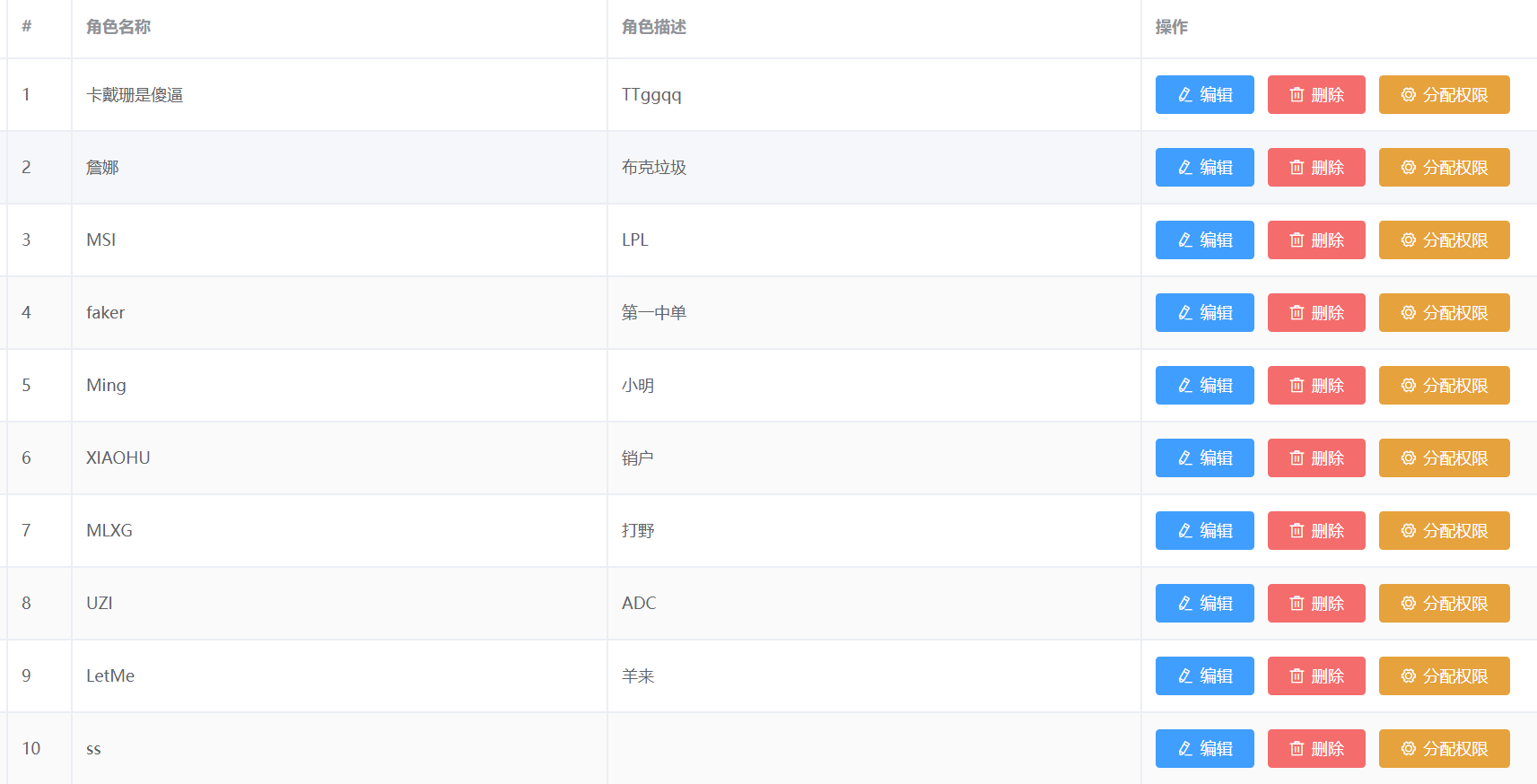
Next, there should be a corresponding expanded column display area, that is, add another column directly before the index column

<el-table-column type="expand">
This is an expanded column.
3. Expand column details
Here, because there are three layers of permissions in our API data, we still obtain our data through the built-in scope slot attribute. This data structure is relatively special. There is still one layer of children in each layer of permissions, and each layer of children represents one layer of permissions. Are array structures, so you can complete this process by traversing the for loop:

Here we will put a grid system to complete the three-tier list:
We have five first level permissions, and nineteen second level and third level permissions. You can specify them directly
            <el-row
              :class="['bdbottom', i1 === 0 ? 'bdtop' : '', 'vcenter']"
              v-for="(item1, i1) in scope.row.children"
              :key="item1.id"
            >
              <!-- First level authority -->
              <el-col :span="5">
                <el-tag closable @close="removeRightById(scope.row, item1.id)">{{ item1.authName}}</el-tag>
                <i class="el-icon-caret-right"></i>
              </el-col>
              <!-- Secondary and tertiary -->
              <el-col :span="19">
                <!-- adopt for Loop render secondary permissions -->
                <el-row
                  :class="[i2 === 0 ? '' : 'bdtop', 'vcenter']"
                  v-for="(item2, i2) in item1.children"
                  :key="item2.id"
                >
                  <el-col :span="6 ">
                    <el-tag
                      type="success"
                      closable
                      @close="removeRightById(scope.row, item2.id)"
                    >{{ item2.authName }}</el-tag>
                    <i class="el-icon-caret-right"></i>
                  </el-col>
                  <el-col :span="18">
                    <el-tag
                      type="warning"
                      v-for="(item3) in item2.children"
                      :key="item3.id"
                      closable
                      @close="removeRightById(scope.row, item3.id)"
                    >{{ item3.authName}}</el-tag>
                  </el-col>
                </el-row>
              </el-col>
            </el-row>
4. Implementation of deletion function
For component display, we can still use the built-in @ close event. For this event, we bind a function to realize the deletion function. Similarly, we pass the corresponding id into the function through the slot.
@close="removeRightById(scope.row, item2.id)"
The next operation is the same as the above process
  async removeRightById (role, rightId) {
      // Pop up prompt delete
      const confirmResult = await this.$confirm(
        'This action will permanently delete the permission, Continue?',
        'Tips',
        {
          confirmButtonText: 'determine',
          cancelButtonText: 'cancel',
          type: 'warning'
        }
      ).catch(err => err)
      // Click OK and the return value is confirm
      // Click Cancel and the return value is cancel
      if (confirmResult !== 'confirm') {
        return this.$message.info('Permission deletion canceled')
      }
      const { data: res } = await this.$http.delete(
        `roles/${role.id}/rights/${rightId}`
      )
      if (res.meta.status !== 200) {
        return this.$message.error('Failed to delete permission!')
      }
      role.children = res.data
      //   Not recommended
      // this.getRolesList()
    }
After deletion, if we pull the data again for rendering, the drop-down list will be closed, so we only need to re assign the data without initiating the request again.
5. Realization of permission assignment function
Click the assign permission button to bind a click event corresponding to a function. The function displays the dialog, which is the same as the above dialog display process (slot passing id, function sending request, changing data)... No more details
2. Some errors are reported
Use the less loader to set the style, and install the dependent packages through NPM install less loader -- save, but it is found that errors are always reported:
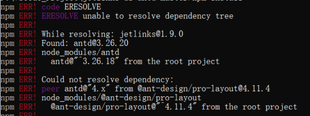
At this time, you can reduce the npm version and reinstall it.
npm install npm@6.14.10 -g
Then reinstall
npm install less-loader --save
Then download a series of related dependencies
npm install
If it is found that the error is still reported, the error information is as follows:
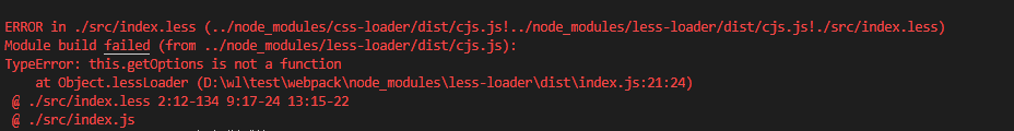
This is because the less version is too high:
 npm install less-loader@5.0.0 -s
 npm install less@3.9.0 -s
Successfully solved!