Reference documents: Introduction | Vue js
API documentation: API | Vue.js
1, Global method: Application API | Vue js
component:
Register or retrieve global components. Registration also automatically sets the name of the component using the given name parameter.
config:
An object that contains the application configuration.
directive:
Register or retrieve global directives.
mixin:
Apply a mixin to the whole application range. Once registered, they can use it in any component template in the current application. Plug in authors can use this method to inject custom behavior into components. Not recommended for use in application code.
mount:
The # innerHTML # of the provided DOM element will be replaced with the template rendering result of the application root component.
provide:
Set a value that can be injected into all components in the application scope. The component should use {inject} to receive the value of provide.
From the perspective of "provide/inject", an application can be regarded as the ancestor of the root level, and the root component is its only child.
This method should not be associated with provide component options Or combined API provide method Confusion. Although they are also part of the same "provide/inject" mechanism, they are used to configure components rather than apply the value of the provided.
Providing values through applications is particularly useful when writing plug-ins, because plug-ins generally cannot use components to provide values. That's right globalProperties Alternative options.
be careful
The provide # and # inject # bindings are not responsive. This is intentional. However, if you pass down a responsive object, the property on the object will remain responsive.
unmount:
Uninstall the root component of the application instance.
use:
Install Vue JS plug-in. If the plug-in is an object, it must expose an install method. If the plug-in itself is a function, it will be treated as an install method.
The # install # method will be called with the application instance as the first parameter. Other # options # parameters passed to # use # will be passed into the installation method as subsequent parameters.
When this method is called multiple times on the same plug-in, the plug-in will be installed only once.
version:
Provide the version number of the installed Vue as a string. This is for communities that use different policies based on different versions plug-in unit Especially useful for.
2, Project directory structure:
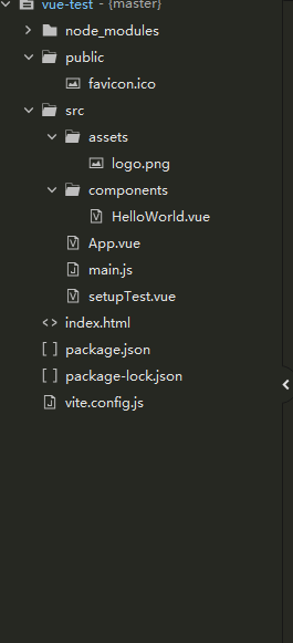
index.html: main interface
<!DOCTYPE html>
<html lang="en">
  <head>
    <meta charset="UTF-8" />
    <link rel="icon" href="./favicon.ico" />
    <meta name="viewport" content="width=device-width, initial-scale=1.0" />
    <title>VUE test</title>
  </head>
  <body>
    <div id="app"></div>
    <script type="module" src="./src/main.js"></script>
  </body>
</html>
main.js: Main js
import { createApp } from 'vue'
import App from './App.vue'
//Create an instance and register it on the app element
createApp(App).mount('#app')
App.vue: application definition
<script setup>
	// This starter template is using Vue 3 <script setup> SFCs
	// Check out https://v3.vuejs.org/api/sfc-script-setup.html#sfc-script-setup
	import HelloWorld from './components/HelloWorld.vue'
</script>

<template>
	<img alt="Vue logo" src="./assets/logo.png" />
	<HelloWorld msg="Hello Vue 3 + Vite" />
</template>

<style>
	#app {
		font-family: Avenir, Helvetica, Arial, sans-serif;
		-webkit-font-smoothing: antialiased;
		-moz-osx-font-smoothing: grayscale;
		text-align: center;
		color: #2c3e50;
		margin-top: 60px;
	}
</style>
HelloWorld.vue: component
<script setup>
import { ref } from 'vue'

defineProps({
  msg: String
})

const count = ref(0)
</script>

<template>
  <h1>{{ msg }}</h1>

  <p>
    Welcome:
    <a href="https://hx.dcloud.net.cn/" target="_blank">HBuilderX</a>
  </p>

  <p>
    <a href="https://vitejs.dev/guide/features.html" target="_blank">
      Vite Documentation
    </a>
    |
    <a href="https://v3.vuejs.org/" target="_blank">Vue 3 Documentation</a>
  </p>

  <button type="button" @click="count++">count is: {{ count }}</button>
  <p>
    Edit
    <code>components/HelloWorld.vue</code> to test hot module replacement.
  </p>
</template>

<style scoped>
a {
  color: #42b983;
}
</style>
3, Life cycle:
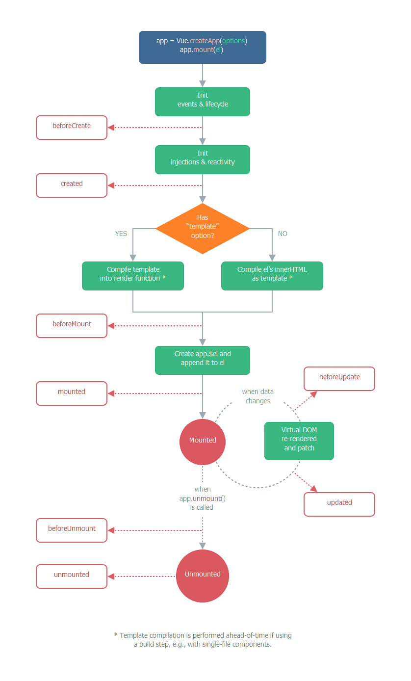
Reference documents: Lifecycle hook | Vue js
beforeCreate:
Call synchronously after instance initialization and before data listening and event / listener configuration.
created:
It is called synchronously immediately after the instance is created. In this step, the instance has completed the processing of options, which means that the following contents have been configured: Data listening, calculation properties, methods, callback functions of events / listeners. However, the $el property phase is not yet available.
beforeMount:
Called before the mount starts: the relevant render function is called for the first time.
This hook is not called during server-side rendering.
mounted:
It is called after the instance is mounted. At this time, it is passed to the app.mount The element of has been created by the newly created VM$ El# replaced. If the root instance is mounted on an element in a document, when {mounted} is called, VM$ El# will also be in the document. Note that mounted does not guarantee that all sub components are also mounted. If you want to wait for the whole view to be rendered, you can use it inside mounted vm.$nextTick:
mounted() {
  this.$nextTick(function () {
    // Code that runs only after the entire view is rendered
  })
}
This hook is not called during server-side rendering.
beforeUpdate:
After the data changes, the DOM is called before it is updated. This is suitable for accessing the existing DOM before it will be updated, such as removing manually added event listeners.
This hook is not called during server-side rendering because only the first rendering takes place on the server side.
updated:
Called after the virtual DOM is re rendered and updated due to data changes.
When this hook is called, the component DOM has been updated, so you can now perform DOM dependent operations. However, in most cases, you should avoid changing state during this period. If you want to change the state accordingly, it is usually best to use Calculation properties or Listener replace.
Note that updated # does not guarantee that all sub components will also be re rendered. If you want to wait for the whole view to be rendered, you can use it internally in updated vm.$nextTick:
updated() {
  this.$nextTick(function () {
    // Code that runs only after the entire view has been re rendered
  })
}
This hook is not called during server-side rendering.
beforeUnmount:
Call before unloading the component instance. At this stage, the instance is still completely normal.
This hook is not called during server-side rendering.
unmounted:
When the component instance is unloaded, it is called. When this hook is called, all instructions of the component instance are unbound, all event listeners are removed, and all sub component instances are unloaded.
This hook is not called during server-side rendering.
errorCaptured:
Called when an error from a descendant component is caught. This hook will receive three parameters: the error object, the component instance where the error occurred, and a string containing the error source information. This hook can return false to prevent the error from continuing to propagate upward.
TIP
You can modify the status of components in this hook. Therefore, when capturing errors, it is very important to have a condition judgment in the template or rendering function to bypass other contents; Otherwise, the component may enter an infinite rendering cycle.
Error propagation rules
-
By default, if the global config Errorhandler is defined, and all errors will still be sent, so these errors will still be reported to a single analysis service.
-
If there are multiple error captured hooks in the inheritance chain or parent chain of a component, they will be aroused one by one by the same error.
-
If this # errorCaptured # hook throws an error, the new error and the originally captured error will be sent to the global # config errorHandler.
-
An "errorCaptured" hook can return "false" to prevent the error from spreading upward. In essence, it means "this mistake has been solved and should be ignored". It will block any other error captured hook and global error config that will be aroused by this error errorHandler.
renderTracked:
Called when tracing virtual DOM re rendering. The hook receives "debugger event" as a parameter. This event tells you which operation tracks the component and the target object and key of the operation.
renderTriggered:
Called when virtual DOM re rendering is triggered. And renderTracked Similarly, receive "debugger event" as a parameter. This event tells you what operation triggered the re rendering, and the target object and key of the operation.
activated:
Called when a component cached by keep alive is activated.
This hook is not called during server-side rendering.
deactivated :
Called when a component cached by keep alive is deactivated.
This hook is not called during server-side rendering.
4: Example method
$watch:
Listen for changes in the calculation results of the responsive property or function on the component instance. The parameters obtained by the callback function are new values and old values. We can only pass the name of the top-level , data, props , or , computed , property as a string. For more complex expressions, replace with a function.
$emit:
Triggers an event on the current instance. Additional parameters are passed to the listener callback.
$forceUpdate:
Force component instances to re render. Note that it only affects the instance itself and the subcomponents inserted into the slot content, not all subcomponents.
$nextTick:
Delay the callback until after the next DOM update cycle. Use it immediately after modifying the data, and then wait for the DOM to update. It is the same as the global method # nextTick # except that the # this # of the callback is automatically bound to the instance calling it.
5: Global API
If you are using a CDN build, the global API can be accessed through the global object Vue, for example:
const { createApp, h, nextTick } = Vue
If you use ES modules, they can be imported directly:
import { createApp, h, nextTick } from 'vue'createApp:
Returns an application instance that provides an application context. The entire component tree mounted by an application instance shares the same context.
const app = createApp({})
You can chain call other methods after "createApp". These methods can be Application API Found in.
h:
Returns a "virtual node", usually abbreviated as VNode: a common object that contains information describing to Vue which node it should render on the page, including the description of all child nodes. It is intended for manual writing Rendering function:
render() {
  return h('h1', {}, 'Some title')
}
defineComponent:
In terms of implementation, defineComponent {only returns the objects passed to it. However, in terms of type, the returned value has a constructor of composite type for manual rendering function, TSX and IDE tool support.
defineAsyncComponent:
Create an asynchronous component that will only be loaded when needed.
defineCustomElement:
The method accepts and defineComponent Same parameter, but returns a native Custom element , this element can be used for any framework or not based on the framework.
resolveComponent:
WARNING
resolveComponent , can only be used in , render , or , setup , functions.
If it is available in the current application instance, it is allowed to resolve the} component by name.
Returns a Component. If not found, the received parameter {name is returned.
const app = createApp({})
app.component('MyComponent', {
  /* ... */
})
import { resolveComponent } from 'vue'
render() {
  const MyComponent = resolveComponent('MyComponent')
}
resolveDynamicComponent:
WARNING
resolveDynamicComponent , can only be used in , render , or , setup , functions.
It is allowed to use the same mechanism as < component: is = "" > to resolve a component.
Returns the resolved Component or newly created VNode, where the Component name is used as the node label. If the Component is not found, a warning is issued.
import { resolveDynamicComponent } from 'vue'
render () {
  const MyComponent = resolveDynamicComponent('MyComponent')
}
resolveDirective :
WARNING
resolveDirective can only be used in the 'render' or 'setup' functions.
If it is available in the current application instance, it is allowed to resolve a} directive through its name.
Returns a} Directive. If it is not found, it returns "undefined".
const app = createApp({})
app.directive('highlight', {})
import { resolveDirective } from 'vue'
render () {
  const highlightDirective = resolveDirective('highlight')
}
withDirectives:
WARNING
withDirectives , can only be used in the , render , or , setup , functions.
Allows instructions to be applied to VNode. Returns a VNode containing application instructions.
import { withDirectives, resolveDirective } from 'vue'
const foo = resolveDirective('foo')
const bar = resolveDirective('bar')

return withDirectives(h('div'), [
  [foo, this.x],
  [bar, this.y]
])
createRenderer:
The createRenderer function accepts two generic parameters: HostNode and HostElement, which correspond to the Node and Element types in the host environment.
For example, for runtime DOM, HostNode will be the DOM # Node interface and HostElement will be the DOM # Element # interface.
A custom renderer can pass in platform specific types as follows:
import { createRenderer } from 'vue'
const { render, createApp } = createRenderer<Node, Element>({
  patchProp,
  ...nodeOps
})
nextTick:
Postpone the callback until after the next DOM update cycle. Use the DOM immediately after you change some data to wait for it to update.
import { createApp, nextTick } from 'vue'

const app = createApp({
  setup() {
    const message = ref('Hello!')
    const changeMessage = async newMessage => {
      message.value = newMessage
      await nextTick()
      console.log('Now DOM is updated')
    }
  }
})
mergeProps:
Merge multiple objects containing VNode prop into a single object. It returns a newly created object, and the object passed as a parameter will not be modified.
An unlimited number of objects can be passed, and the property of the following parameters takes precedence. Event listeners are specially handled, as are class and style. The values of these properties are merged rather than overwritten.
import { h, mergeProps } from 'vue'
export default {
  inheritAttrs: false,
  render() {
    const props = mergeProps(
      {
        // This class will be merged with other classes in $attrs.
        class: 'active'
      },
      this.$attrs
    )

    return h('div', props)
  }
}
useCssModule:
WARNING
useCssModule , can only be used in , render , or , setup , functions.
Allow in setup Yes Single file component Function to access the CSS module.
<script>
import { h, useCssModule } from 'vue'
export default {
  setup() {
    const style = useCssModule()
    return () =>
      h(
        'div',
        {
          class: style.success
        },
        'Task complete!'
      )
  }
}
</script>
<style module>
.success {
  color: #090;
}
</style>
version:
Provide the version number of the installed Vue as a string.
const version = Number(Vue.version.split('.')[0])
if (version === 3) {
  // Vue 3
} else if (version === 2) {
  // Vue 2
} else {
  // Unsupported version of Vue
}
6: Instance property
$data:
The data object on which the component instance is listening. The component instance proxies access to its data object property.
$props:
Props object received by the current component. The component instance proxies access to its props object property.
$el:
The root DOM element that the component instance is using.
For use fragment $el , is a placeholder DOM node, which Vue uses to track the location of components in the dom. Recommended use Reference template To access DOM elements directly instead of relying on $el.
$options:
Initialization options for the current component instance. It is useful when you need to include custom properties in the options:
const app = createApp({
  customOption: 'foo',
  created() {
    console.log(this.$options.customOption) // => 'foo'
  }
})
$parent:
Parent instance, if the current instance exists.
$root:
The root component instance of the current component tree. If the current instance does not have a parent instance, the instance will be its own.
$slots:
Used to programmatically access Slot distribution Content of the. each Named slot Each has its corresponding property (for example, the content in: v-slot:foo , will be found in this.$slots.foo()). Default property includes all nodes that are not included in the named slot, or the contents of "v-slot:default".
in use Rendering function When writing a component, access this$ Slots # can be very helpful.
$refs:
An object that has been registered ref attribute All DOM elements and component instances of.
$attrs:
Contains components that are not in the parent scope props Or Custom event attribute binding and event. When a component does not declare any prop, the binding of all parent scopes will be included here, and the internal components can be passed in through "v-bind="$attrs "- which is very useful when creating high-level components.
7: Built in components
component:
Render a "meta component" as a dynamic component. Determine which component is rendered according to the value of # is #. The value of is is a string, which can be either an HTML tag name or a component name.
<!--  Dynamic components by vm Instance `componentId` property control -->
<component :is="componentId"></component>

<!-- You can also render registered components or prop Incoming components-->
<component :is="$options.components.child"></component>

<!-- Components can be referenced by strings -->
<component :is="condition ? 'FooComponent' : 'BarComponent'"></component>

<!-- Can be used to render native HTML element -->
<component :is="href ? 'a' : 'span'"></component>
transition:
The < transition > element acts as a transition effect for a single element / component< Transition > only applies the transition effect to the content of its package without rendering additional DOM elements or appearing at the component level that can be checked.
<!-- Single element -->
<transition>
  <div v-if="ok">toggled content</div>
</transition>

<!-- Dynamic component -->
<transition name="fade" mode="out-in" appear>
  <component :is="view"></component>
</transition>

<!-- event hook  -->
<div id="transition-demo">
  <transition @after-enter="transitionComplete">
    <div v-show="ok">toggled content</div>
  </transition>
</div>
const app = createApp({
  ...
  methods: {
    transitionComplete (el) {
      // Because the DOM element of 'el' is passed as a parameter
    }
  }
  ...
})

app.mount('#transition-demo')
transition-group:
< transition group > provides the transition effect of multiple elements / components. By default, it does not render a DOM element wrapper, but it can be defined through the tag attribute.
Note that each < transition group > child node must have Independent key Animation can only work properly.
< transition group > supports transition movement through CSS transform. When a child node is updated and its position changes from the screen, it will be applied to a moving CSS class (automatically generated by configuring the "name attribute" or "move class" attribute). If CSS transform property is a "transitive" property, it will be used when applying mobile classes FLIP Technology Make the element reach the end of the animation smoothly.
<transition-group tag="ul" name="slide">
  <li v-for="item in items" :key="item.id">
    {{ item.text }}
  </li>
</transition-group>
keep-alive:
-
< keep alive > when wrapping dynamic components, inactive component instances are cached rather than destroyed. Similar to < transition >, < keep alive > is an abstract component: it does not render a DOM element itself, nor does it appear in the parent component chain of the component.
When a component is switched in < keep alive >, its # mounted # and # unmounted # life cycle hooks are not called, but # activated # and # deactivated # instead. (this will be applied to the direct child nodes of < keep alive > and all their descendants.)
Mainly used to preserve component state or avoid re rendering.
<!-- basic -->
<keep-alive>
  <component :is="view"></component>
</keep-alive>

<!-- Subcomponents of multiple conditional judgments -->
<keep-alive>
  <comp-a v-if="a > 1"></comp-a>
  <comp-b v-else></comp-b>
</keep-alive>

<!-- and `<transition>` Use together -->
<transition>
  <keep-alive>
    <component :is="view"></component>
  </keep-alive>
</transition>
Note that < keep alive > is used when one of its immediate subcomponents is switched. If you have # v-for # in it, you won't work. If there are multiple conditional child elements mentioned above, < keep alive > requires that only one child element be rendered at the same time.
-
include and exclude
include # and # exclude # prop allow components to cache conditionally. Both can be represented by comma separated strings, regular expressions, or an array:
<!-- Comma separated string -->
<keep-alive include="a,b">
  <component :is="view"></component>
</keep-alive>

<!-- regex (use `v-bind`) -->
<keep-alive :include="/a|b/">
  <component :is="view"></component>
</keep-alive>

<!-- Array (use `v-bind`) -->
<keep-alive :include="['a', 'b']">
  <component :is="view"></component>
</keep-alive>
To match, first check the "name" option of the component itself. If the "name" option is unavailable, match its local registered name (the key value of the "components" option of the parent component). Anonymous components cannot be matched.
-
max
The maximum number of component instances that can be cached. Once this number is reached, the longest unreachable instance in the cached component will be destroyed before the new instance is created.
<keep-alive :max="10">
  <component :is="view"></component>
</keep-alive>
WARNING
< keep alive > doesn't work in functional components because they don't have cached instances.
slot:
The < slot > element acts as a content distribution slot in the component template< The slot > element itself will be replaced.
For detailed usage, please refer to the link of the following tutorial.
teleport:
- to - string. prop is required and must be a valid query selector or HTMLElement (if used in a browser environment). Specifies the target element in which the < report > content will be moved
<!-- correct -->
<teleport to="#some-id" />
<teleport to=".some-class" />
<teleport to="[data-teleport]" />

<!-- error -->
<teleport to="h1" />
<teleport to="some-string" />
- disabled - boolean. This optional attribute can be used to disable the function of < report >, which means that its slot content will not be moved to any location, but will be rendered where you have specified < report > in the surrounding parent component.
<teleport to="#popup" :disabled="displayVideoInline">
  <video src="./my-movie.mp4">
</teleport>
Note that this will move the actual DOM node instead of being destroyed and recreated, and it will also keep any component instances active. All stateful HTML elements (that is, videos played) will remain in their state.
8, Application configuration
errorHandler:
app.config.errorHandler = (err, vm, info) => {
  // Processing error
  // `info ` is Vue specific error information, such as the life cycle hook of the error
}
Specifies a handler to handle uncapped errors thrown during the execution of component rendering functions and listeners. When this processing function is called, the error information and the corresponding application instance can be obtained.
Error tracking service Sentry And Bugsnag Use this option to provide official integration.
warnHandler:
app.config.warnHandler = function(msg, vm, trace) {
  // `Trace ` is the inheritance relationship trace of the component
}
Specify a custom handler for Vue's runtime warnings. Note that this will only work in the development environment and will be ignored in the production environment.
globalProperties:
app.config.globalProperties.foo = 'bar'

app.component('child-component', {
  mounted() {
    console.log(this.foo) // 'bar'
  }
})
Add a global property that can be accessed in any component instance of the application. The property of the component has priority in case of naming conflict.
This can replace Vue 2 Vue of X Prototype} extension:
// Before (Vue 2.x)
Vue.prototype.$http = () => {}

// After (Vue 3.x)
const app = createApp({})
app.config.globalProperties.$http = () => {}
optionMergeStrategies:
const app = createApp({
  mounted() {
    console.log(this.$options.hello)
  }
})

app.config.optionMergeStrategies.hello = (parent, child) => {
  return `Hello, ${child}`
}

app.mixin({
  hello: 'Vue'
})

// 'Hello, Vue'
Define a merge policy for custom options.
The merge policy option receives the values of the options defined on the parent and child instances as the first and second parameters, respectively.
performance:
Set to true to enable performance tracking of component initialization, compilation, rendering, and updates in the performance/timeline panel of the browser development tool. Only applicable to development mode and support performance.mark API browser.
compilerOptions 3.1+:
Configure options for the runtime compiler. The value set on this object will be passed into the template compiler in the browser and affect each component in the configured application. Note that you can also use compilerOptions options Override these options on a per component basis.
important
This configuration option only takes effect in the full build version (that is, a stand-alone version of the template, Vue. JS, can be compiled in the browser). If you are using a runtime only version with additional build settings, the compiler option must be passed into @ Vue / compiler DOM through the configuration of the build tool instead.
-
For Vue loader: Passed in through the # compilerOptions # loader option . You can also refer to Configuration mode in Vue cli.
-
For # vite #: Passed in through @ vitejs / plugin Vue # option.
isCustomElement:
// Any element starting with 'ion -' is recognized as a custom element
app.config.compilerOptions.isCustomElement = tag => tag.startsWith('ion-')
Specify a method to identify custom elements defined outside Vue (for example, through the Web Components API). If a component matches this condition, it does not need to be registered locally or globally, and Vue will not throw a warning of "Unknown custom element".
Note that all native HTML and SVG tags do not need to be matched by this function - Vue's parser will automatically do this check.
whitespace:
app.config.compilerOptions.whitespace = 'preserve'
By default, Vue removes / compresses spaces between template elements to produce more efficient compilation results:
- Multiple start / end spaces within an element are compressed into one space
- Multiple spaces between elements, including line breaks, are removed
- The space that can be compressed between text nodes will be compressed into a space
Setting the value to 'preserve' disables (2) and (3).
delimiters:
// Set separator to ES6 template string style
app.config.compilerOptions.delimiters = ['${', '}']
Separator used to configure text interpolation within the template.
This option is generally used to avoid conflicts with server-side frameworks that also use double brace syntax.
comments:
app.config.compilerOptions.comments = true
By default, Vue removes HTML comments from the template in the production environment. Setting this option to true forces Vue to retain comments in the production environment. In the development environment, annotations are always retained.
This option is generally used for other libraries that rely on HTML comments in conjunction with Vue.