Continued< 20. Realize home page routing redirection and left menu routing link>
In the previous article, we realized the routing redirection of the home page and the effect of transforming the menu on the left into a routing link. In this article, we formally realized the first function of the menu, user list.
1, Effect to be achieved
The final effect of the user list is to click the user management menu on the left, and the main area on the right displays the user's table list to display the user's basic information. There are operation buttons such as edit and delete on the far right. You can search in the upper left corner and turn pages in the lower left corner: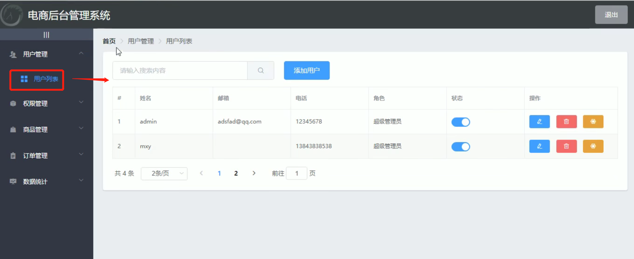
The page layout of this user list is divided into the navigation column in the upper left corner and the card view of display function. The card view is divided into three areas (search area, information area and paging area).
2, Create a user list component and register a route
First, we need to create a component of the user module, create a user folder under components (all components of the user class can be placed in this folder), and create a new Users.vue file to write the user list function: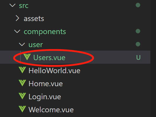
Write some infrastructure code:
<template>
    <div>
        <h3>User list component</h3>
    </div>
</template>

<script>
export default {}
</script>

<style scoped>
</style>
Then add the component to the route, open the route configuration file router/index.js, import the Users component, and then configure the user as a sub route of home, so that the user content can be displayed in the main area on the right:
import Vue from 'vue'
import VueRouter from 'vue-router'
import Login from '../components/Login.vue' //Reference Login component
import Home from '../components/Home.vue'
import Welcome from '../components/Welcome.vue'
import Users from '../components/user/Users.vue'

Vue.use(VueRouter)
const routes = []
const router = new VueRouter({
  routes: [
    { path: '/', redirect: '/login' },
    { path: '/login', component: Login }, //Define the routing address to access the page
    {
      path: '/home',
      component: Home,
      redirect: '/welcome',
      children: [
        {path:'/welcome',component:Welcome},
        {path:'/users',component:Users}
      ]
    }
  ]
})
//The following code is omitted
Refresh the page. Click the user list menu under user management to see the Users page we wrote: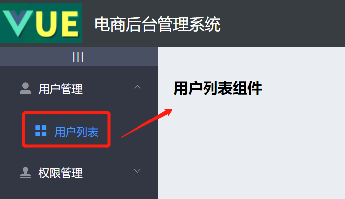
We also need to add the highlight effect to the clicked menu after clicking the menu. Use the default active attribute of the El menu tag to specify the attribute value as the index value of the menu to be highlighted.
It is not difficult to realize this dynamic highlighting method. We set a click event for the secondary menu. After each click, record the index value of the menu to a public attribute, and then specify the default active attribute of the main menu as the public attribute. The specific writing method is as follows:
First, bind a click event for the secondary menu:
<!-- Secondary menu -->
<el-menu-item :index="'/'+subItem.path" v-for="subItem in item.children"
  :key="subItem.id" @click="saveNavState('/'+subItem.path)">
Then write the event and store the index value of the menu in sessionStorage:
//Save the index value of the menu (keep the menu active)
saveNavState(activePath){
  window.sessionStorage.setItem('activePath',activePath);
  this.activePath = activePath;
}
Then define a public property named "activePath" in the data area. In order to highlight the page after it comes in, we dynamically obtain the activePath stored in sessionStorage in the method in which the component is created:
//Code omission on
data(){
  return {
    //Left menu data
    menuList:[],
    iconsObj: {
      '125':'el-icon-user-solid',//user management
      '103':'el-icon-s-check',//Authority management
      '101':'el-icon-s-goods',//Commodity management
      '102':'el-icon-s-order',//Order management
      '145':'el-icon-s-data',//data management
    },
    isCollapse: false,
    activePath: '' //Activated menu
  }
},
created(){
  this.getMenuList();
  this.activePath = window.sessionStorage.getItem('activePath');
},
//Next code omitted
Then set this dynamic value for the default active property of the main menu:
<el-menu background-color="#333744" text-color="#fff"
          active-text-color="#409BFF" :unique-opened="true"
          :collapse="isCollapse" :collapse-transition="false"
          :router="true" :default-active="activePath">
effect: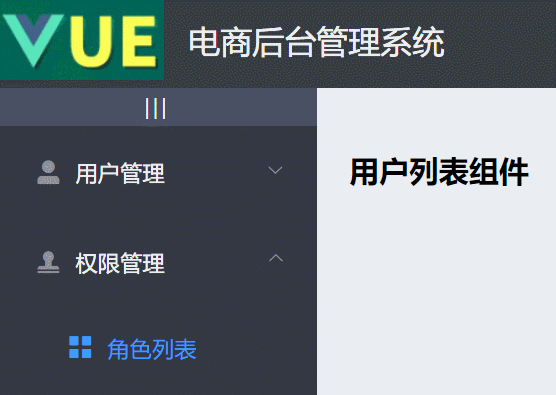
3, Draw the basic UI structure of the user list
1. Breadcrumb navigation
Let's draw the navigation curtain of the head first: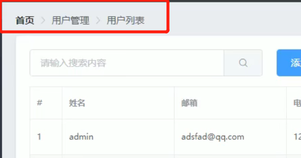
There are ready-made components on the official website to navigate "Breadcrumb bread crumbs":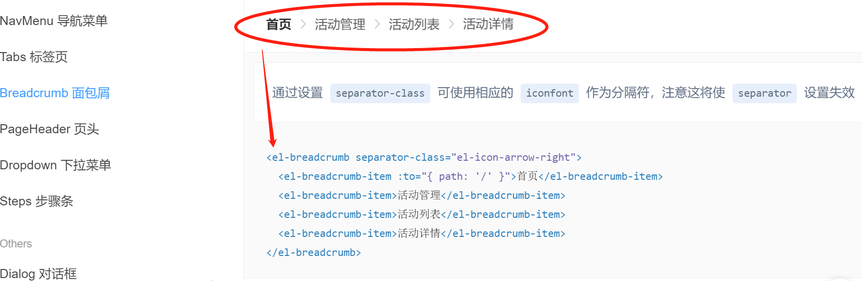
We copy the code to the Users component and modify it:
<template>
    <div>
        <!-- Breadcrumb navigation -->
        <el-breadcrumb separator-class="el-icon-arrow-right">
            <el-breadcrumb-item :to="{ path: '/home' }">home page</el-breadcrumb-item>
            <el-breadcrumb-item>user management </el-breadcrumb-item>
            <el-breadcrumb-item>User list</el-breadcrumb-item>
        </el-breadcrumb>
    </div>
</template>

<script>
export default {}
</script>

<style scoped>
</style>
Don't forget to import these components (Breadcrumb and BreadcrumbItem) in plugins/element.js:
import Vue from 'vue'
import { Button, Form, FormItem, Input, Message, Container,
    Header, Aside, Main, Menu, Submenu, MenuItem, MenuItemGroup,
    Breadcrumb,BreadcrumbItem } from 'element-ui'

Vue.use(Button)
Vue.use(Form)
Vue.use(FormItem)
Vue.use(Input)
Vue.use(Container)
Vue.use(Header)
Vue.use(Aside)
Vue.use(Main)
Vue.use(Menu)
Vue.use(Submenu)
Vue.use(MenuItem)
Vue.use(MenuItemGroup)
Vue.use(Breadcrumb)
Vue.use(BreadcrumbItem)
Vue.prototype.$message = Message
Refresh the page, and the breadcrumb navigation is completed: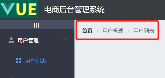
2. Draw card view area
The Card view also has a corresponding component, which is "Card":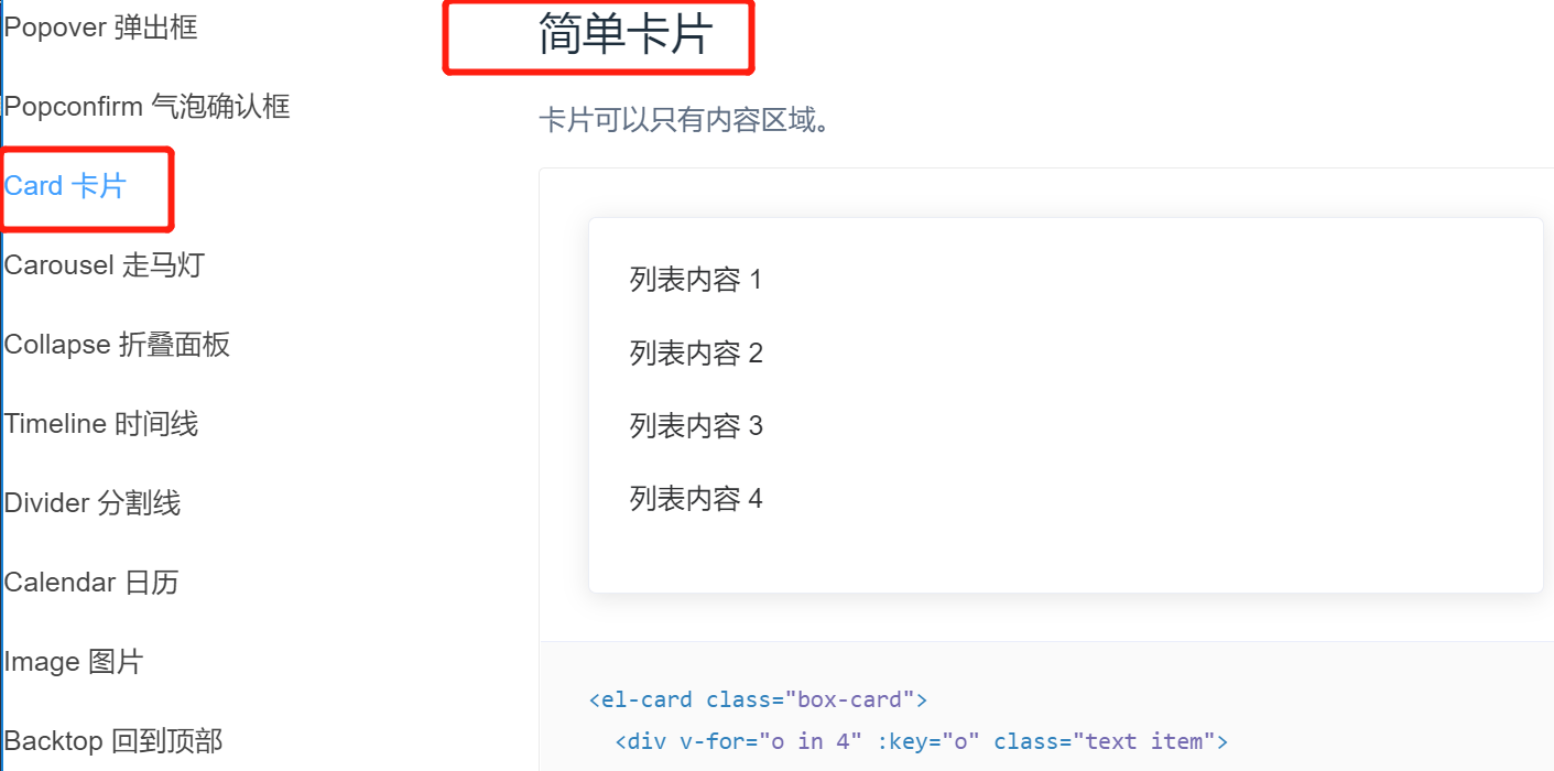
Copy the relevant code, paste it into the Users component and modify it:
<template>
    <div>
        <!-- Breadcrumb navigation -->
        <el-breadcrumb separator-class="el-icon-arrow-right">
            <el-breadcrumb-item :to="{ path: '/home' }">home page</el-breadcrumb-item>
            <el-breadcrumb-item>user management </el-breadcrumb-item>
            <el-breadcrumb-item>User list</el-breadcrumb-item>
        </el-breadcrumb>

        <!-- Card view -->
        <el-card>
            123
        </el-card>
    </div>
</template>
Note: remember to import the "Card" component in plugins/element.js.
effect: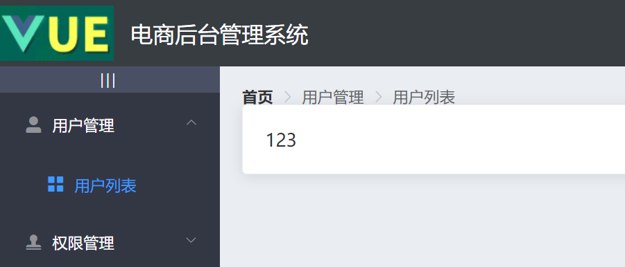
The card is a little upward. Let's modify the global style for the breadcrumb navigation to make it have some bottom margins (in assets/css/global.css), and adjust the shadow of the card view to make the shadow less deep:
/* Global style sheet */
html,
body,
#app{
    height: 100%;
    margin: 0;
    padding: 0;
}

.el-breadcrumb{
    margin-bottom: 15px;
    font-size: 12px;
}

.el-card{
  box-shadow: 0 1px 1px rgba(0, 0, 0, 0.15) !important;
}
effect: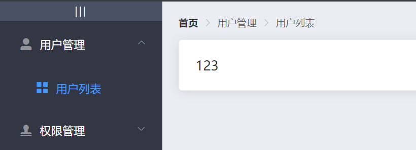
3. Draw the search area and add button area
Write an input box with search in El card, and the code can be copied from the official website: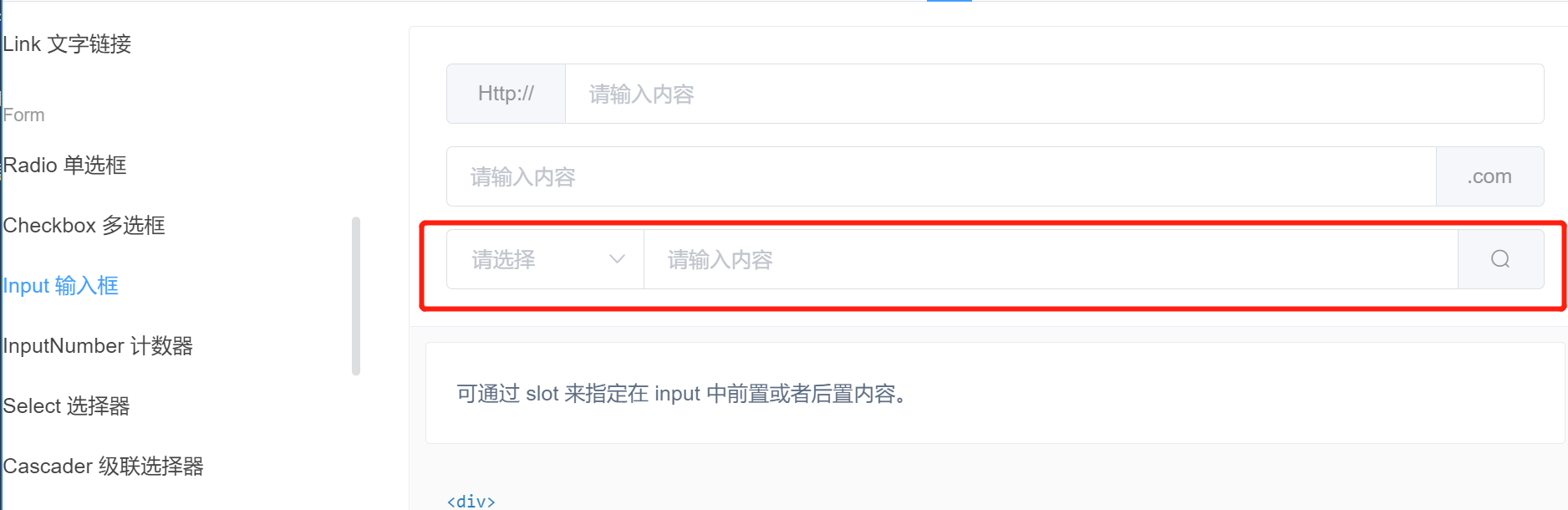
Modified code:
<!-- Card view -->
<el-card>
    <!-- Search and add areas -->
    <el-input placeholder="Please enter the content">
        <el-button slot="append" icon="el-icon-search"></el-button>
    </el-input>
</el-card>
effect:
Here, the entire search box occupies all the widths. We need to use the layout layout to adjust and divide the rows into columns: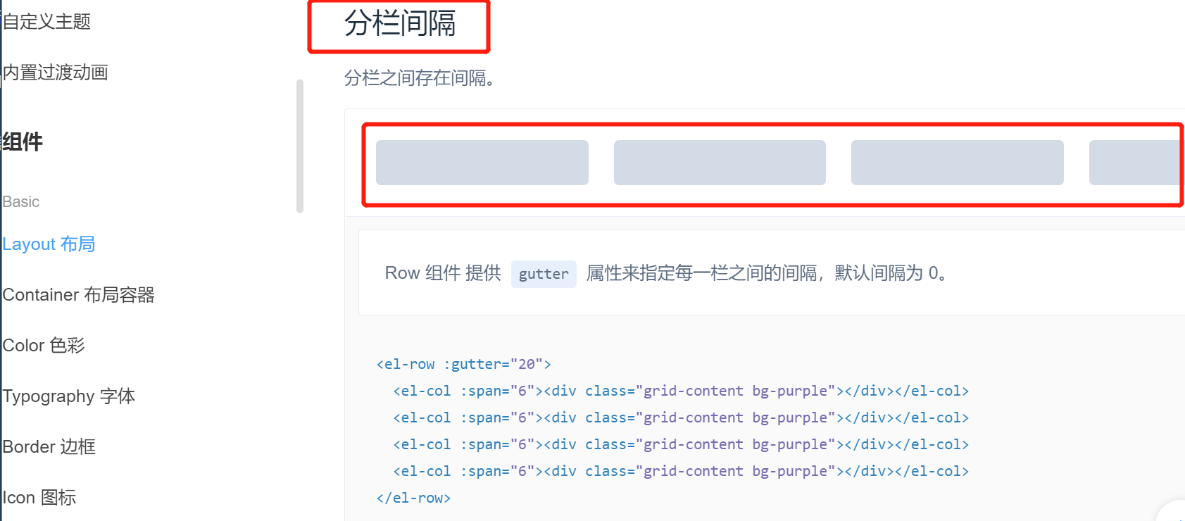
Modified code (add the new button):
<!-- Card view -->
<el-card>
    <el-row :gutter="20"><!-- gutter Is to specify the interval for each column -->
        <!-- There are 24 columns in total, 7 for the search box and 4 for the buttons -->
        <el-col :span="7">
            <!-- Search and add areas -->
            <el-input placeholder="Please enter the content">
                <el-button slot="append" icon="el-icon-search"></el-button>
            </el-input>
        </el-col>
        <el-col :span="4">
            <el-button type="primary">Add user</el-button>
        </el-col>
    </el-row>
</el-card>
Note: remember to import Row and Col in plugins/element.js.
You can see that the search box is narrowed to the width you specify, and the new button also has its own width:
So far, the basic UI layout of the user list has been written. In the next article, we will continue to write and render the user list data.
Reference: dark horse programmer (www.itheima.com) Vue project practical teaching video
Please indicate the source for Reprint: https://blog.csdn.net/u013517797/article/details/121580602