Before using Vue to develop mobile pages, we need to do some pre-work to ensure that what users see when they visit the pages does not have different effects because of the different devices. For example, a page is displayed normally on the iPhone 7 plus, and then switch to the iPhone 5 because a small part of the content of the screen is blocked, affecting users'normal use and experience. Of course, there are some details that need to be optimized, such as the 1-pixel border problem at the mobile end, the 300-millisecond click delay at the mobile end, and so on. These can be optimized to make the user experience better.
1. <meta> tag added viewpoit, in order to dynamically obtain the screen width of user equipment and not allow users to manually zoom in and out of pages.
<!DOCTYPE html>
<html>
<head>
<meta charset="utf-8">
<! - Add viewport to the index.html page of Vue project. The content is the same as mine. You can copy and paste directly. After adding, open the page and press F12 to add successfully without alarm or error.
<meta name="viewport" content="width=device-width,initial-scale=1,maximum-scale=1,minimum-scale=1,user-scalable=no">
<title>travel</title>
</head>
<body>
<div id="app"></div>
<!-- built files will be auto injected -->
</body>
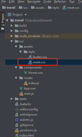
</html>2. Add reset.css to clear the initial styles of different mobile browsers, so that the initial styles of various browsers are consistent.
The content of reset.css can be copied directly and then created and incorporated into your project.
/*! minireset.css v0.0.2 | MIT License | github.com/jgthms/minireset.css */
html,
body,
p,
ol,
ul,
li,
dl,
dt,
dd,
blockquote,
figure,
fieldset,
legend,
textarea,
pre,
iframe,
hr,
h1,
h2,
h3,
h4,
h5,
h6 {
  margin: 0;
  padding: 0;
}

h1,
h2,
h3,
h4,
h5,
h6 {
  font-size: 100%;
  font-weight: normal;
}

ul {
  list-style: none;
}

button,
input,
select,
textarea {
  margin: 0;
}

html {
  box-sizing: border-box;
}

* {
  box-sizing: inherit;
}
*:before, *:after {
  box-sizing: inherit;
}

img,
embed,
object,
audio,
video {
  height: auto;
  max-width: 100%;
}

iframe {
  border: 0;
}

table {
  border-collapse: collapse;
  border-spacing: 0;
}

td,
th {
  padding: 0;
  text-align: left;
}
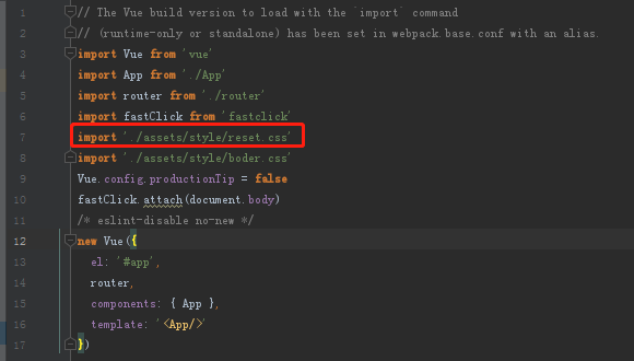
Introduce to your project by modifying main.js import
3. Add boder.css and set a 1-pixel border to prevent the mobile CSS from writing 1px, which actually looks thicker than 1px.
/*Mobile 1-Pixel Border*/
@charset "utf-8";
.border,
.border-top,
.border-right,
.border-bottom,
.border-left,
.border-topbottom,
.border-rightleft,
.border-topleft,
.border-rightbottom,
.border-topright,
.border-bottomleft {
  position: relative;
}

.border::before,
.border-top::before,
.border-right::before,
.border-bottom::before,
.border-left::before,
.border-topbottom::before,
.border-topbottom::after,
.border-rightleft::before,
.border-rightleft::after,
.border-topleft::before,
.border-topleft::after,
.border-rightbottom::before,
.border-rightbottom::after,
.border-topright::before,
.border-topright::after,
.border-bottomleft::before,
.border-bottomleft::after {
  content: "\0020";
  overflow: hidden;
  position: absolute;
}

/* border
 * Because the border is covered by a pseudo-element region at the parent level
 * Therefore, if the sub-level has interaction, the sub-level needs to be set up.
 * Location and z-axis
 */
.border::before {
  box-sizing: border-box;
  top: 0;
  left: 0;
  height: 100%;
  width: 100%;
  border: 1px solid #eaeaea;
  transform-origin: 0 0;
}

.border-top::before,
.border-bottom::before,
.border-topbottom::before,
.border-topbottom::after,
.border-topleft::before,
.border-rightbottom::after,
.border-topright::before,
.border-bottomleft::before {
  left: 0;
  width: 100%;
  height: 1px;
}

.border-right::before,
.border-left::before,
.border-rightleft::before,
.border-rightleft::after,
.border-topleft::after,
.border-rightbottom::before,
.border-topright::after,
.border-bottomleft::after {
  top: 0;
  width: 1px;
  height: 100%;
}

.border-top::before,
.border-topbottom::before,
.border-topleft::before,
.border-topright::before {
  border-top: 1px solid #eaeaea;
  transform-origin: 0 0;
}

.border-right::before,
.border-rightbottom::before,
.border-rightleft::before,
.border-topright::after {
  border-right: 1px solid #eaeaea;
  transform-origin: 100% 0;
}

.border-bottom::before,
.border-topbottom::after,
.border-rightbottom::after,
.border-bottomleft::before {
  border-bottom: 1px solid #eaeaea;
  transform-origin: 0 100%;
}

.border-left::before,
.border-topleft::after,
.border-rightleft::after,
.border-bottomleft::after {
  border-left: 1px solid #eaeaea;
  transform-origin: 0 0;
}

.border-top::before,
.border-topbottom::before,
.border-topleft::before,
.border-topright::before {
  top: 0;
}

.border-right::before,
.border-rightleft::after,
.border-rightbottom::before,
.border-topright::after {
  right: 0;
}

.border-bottom::before,
.border-topbottom::after,
.border-rightbottom::after,
.border-bottomleft::after {
  bottom: 0;
}

.border-left::before,
.border-rightleft::before,
.border-topleft::after,
.border-bottomleft::before {
  left: 0;
}

@media (max--moz-device-pixel-ratio: 1.49), (-webkit-max-device-pixel-ratio: 1.49), (max-device-pixel-ratio: 1.49), (max-resolution: 143dpi), (max-resolution: 1.49dppx) {
  /* Default value, no need to reset */
}

@media (min--moz-device-pixel-ratio: 1.5) and (max--moz-device-pixel-ratio: 2.49), (-webkit-min-device-pixel-ratio: 1.5) and (-webkit-max-device-pixel-ratio: 2.49), (min-device-pixel-ratio: 1.5) and (max-device-pixel-ratio: 2.49), (min-resolution: 144dpi) and (max-resolution: 239dpi), (min-resolution: 1.5dppx) and (max-resolution: 2.49dppx) {
  .border::before {
    width: 200%;
    height: 200%;
    transform: scale(.5);
  }

  .border-top::before,
  .border-bottom::before,
  .border-topbottom::before,
  .border-topbottom::after,
  .border-topleft::before,
  .border-rightbottom::after,
  .border-topright::before,
  .border-bottomleft::before {
    transform: scaleY(.5);
  }

  .border-right::before,
  .border-left::before,
  .border-rightleft::before,
  .border-rightleft::after,
  .border-topleft::after,
  .border-rightbottom::before,
  .border-topright::after,
  .border-bottomleft::after {
    transform: scaleX(.5);
  }
}

@media (min--moz-device-pixel-ratio: 2.5), (-webkit-min-device-pixel-ratio: 2.5), (min-device-pixel-ratio: 2.5), (min-resolution: 240dpi), (min-resolution: 2.5dppx) {
  .border::before {
    width: 300%;
    height: 300%;
    transform: scale(.33333);
  }

  .border-top::before,
  .border-bottom::before,
  .border-topbottom::before,
  .border-topbottom::after,
  .border-topleft::before,
  .border-rightbottom::after,
  .border-topright::before,
  .border-bottomleft::before {
    transform: scaleY(.33333);
  }

  .border-right::before,
  .border-left::before,
  .border-rightleft::before,
  .border-rightleft::after,
  .border-topleft::after,
  .border-rightbottom::before,
  .border-topright::after,
  .border-bottomleft::after {
    transform: scaleX(.33333);
  }
}
Like reset.css, you need to import it into your project through main.js import after adding it.
4. Solve the problem of 300 milliseconds delay of mobile click
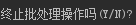
First use the command ctrl+c and then type Y to terminate your current project.
Then enter the command in the root directory of your project: NPM install fastclick - save knock back patiently waiting, download speed may be slower, if you really can't stand the snail speed, suggest you install the Node image of Taobao, download super fast through cnpm, the specific method please Baidu, here is not a waste of space.
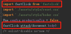
After the installation is completed, introduce in main.js:
Open the browser, press F12 if you do not see the console warning and error reporting, that means the introduction is successful.
5. Create Iconfont
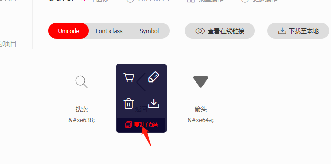
In the process of development, icons such as arrows, search and so on are often used. These icons need not be made. Using these icon libraries provided by Alibaba can achieve cool UI effect quickly and well, and page rendering will be faster than using pictures.
Official website: https://www.iconfont.cn/
Entry can be registered or associated with github account.
Then create a project that you are going to develop, and add all the pictures you need in the project into the project by adding a shopping cart.
Then download the zip package - > decompress - > copy the files specified in iconfont.css and url in iconfont.css to your project assets (recommend you build a folder to store these contents).
Then change the url in iconfont.css to the corresponding location of the file in the current project.
Introduce iconfont.css in main.js, then open the browser and press F12 to test. If the console has no warning and error, the configuration is successful.
When using it, you just need to make the class of its label = "iconfont", then copy the corresponding icon code into the label, and save it to display on the page.
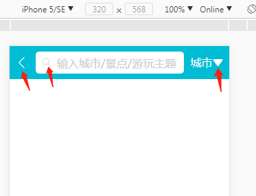
<div class="header">
<div class="header-left">
<!--The format is as follows,First add the class name class="iconfont",Then paste the copied code into the label.-->
<div class="iconfont back-icon"></div>
</div>
<div class="header-input">
<span class="iconfont search-icon"></span>
//Enter City/Scenic Spot/Play Theme
</div>
<div class="header-right">
//City <span class="iconfont arrow-icon"> #xe64a;</span>
</div>
</div>Effect:
With these preparatory work, we will encounter less trouble in the formal development. Here's a summary, standby.