Demo address: https://github.com/iotjin/jh-vue-demo app1 project for
This article mainly introduces how to use vant's navbar, tabbar and vue router to create a vue version of APP basic framework (suitable for Liu Haiping)
The main interface of app is generally composed of three parts: navbar + main content + tabbar, as shown in the following figure:
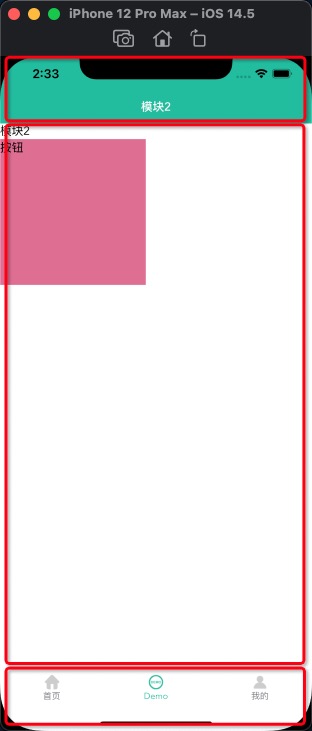
Therefore, you need to create navbar component and tabbar component, and then map components through router view to connect a single page
1. First, there must be a Vue project
2. vant installation
3. Implementation of navbar component
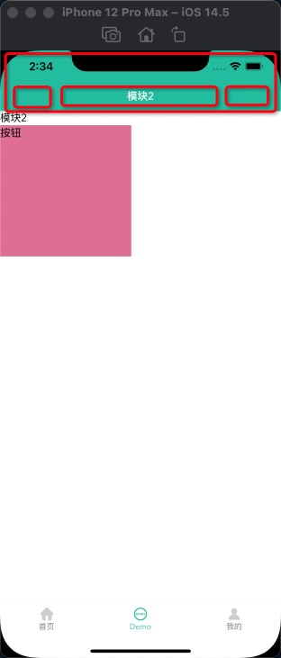
The navigation bar is generally composed of item on the left, title in the middle and item on the right. When the page jumps, there is a return button on the left. Click to return to the previous page. The left and right items change greatly, so you need to set slot. In addition, there are usually 4 or 5 main pages, so the default setting on the left is the return button
3.1. Attributes of external exposure props
  props: {
    // Whether to display the return button. The default is true and the priority is lower than slot
    isBack: { type: [Boolean, String], default: true },
    // Default return button color
    backIconColor: { type: String, default: "white" },
    // title
    title: { type: String, default: "" },
    // When fixed at the top, whether to generate a space occupying element with equal height at the label position
    isPlaceholder: { type: Boolean, default: false },
  },
3.2,template
 <template>
  <div class="navBar">
    <van-nav-bar
      :title="title"
      fixed
      safe-area-inset-top
      @click-left="onClickLeft"
      @click-right="onClickRight"
    >
      <div v-if="$slots.left" slot="left">
        <slot name="left"></slot>
      </div>
      <div v-else-if="isBack" slot="left">
        <van-icon name="arrow-left" size="18" :color="backIconColor" />
      </div>
      <div slot="right">
        <slot name="right"></slot>
      </div>
    </van-nav-bar>
    <div class="nav-top-placeholder" v-if="isPlaceholder"></div>
  </div>
</template>
3.3 background color, title color and top space occupation
<style>
.van-nav-bar {
  background: white;
  background: #38bc9d;
}

.van-nav-bar__title {
  color: black;
  color: white;
}

.nav-top-placeholder {
  padding-top: constant(safe-area-inset-top);
  padding-top: env(safe-area-inset-top);
  height: 44px;
}
</style>
3.4. Adaptation of banged screen
vant's navbar has an attribute placeholder: whether to generate a space occupying element with equal height at the label position when it is fixed at the top. The default value is false. The default is not used in this article, but if no placeholder is added, the bangs will shift upward, so a placeholder div is customized
3.5 usage
<BaseNavBar :title="title" :isBack="isBack" :isPlaceholder="true">
  <van-icon name="cross" size="18" slot="left" />
  <van-icon name="circle" size="18" slot="right" />
</BaseNavBar>

import BaseNavBar from "../../components/BaseNavBar.vue";
export default {
  components: {
    BaseNavBar,
  },
  data() {
    return {
      title: "title",
      isBack: false,
    };
  },
  methods: {},
  created() {},
};
Or in main JS global reference navbar component
import BaseNavBar from "./components/BaseNavBar.vue";

Vue.component('BaseNavBar',BaseNavBar)
4. tabbar component implementation
Each item of tabbar component is generally composed of text, default picture, selected picture and small red dot. In addition, to bind to the page, you need a path parameter. Item switching also needs to be able to monitor externally,
If children is not used in the route during page Jump on the home page, tabbar needs to deal with hidden display.
Add: v-if="$route.meta.isShowTabBar" in tabbar component and: meta: {isshowtabbar: true} in route configuration
Another method is through children processing, which is not expanded in this article, but demo of app2 see
code implementation
<template>
  <div v-if="$route.meta.isShowTabBar">
    <van-tabbar
      v-model="currentSelected"
      :inactive-color="color"
      :active-color="selectedColor"
      @change="onChange"
      route
      placeholder
      safe-area-inset-bottom
    >
      <template v-for="item in tabBars">
        <van-tabbar-item
          :key="item.name"
          :to="item.name"
          :badge="item.badge"
          :dot="item.isShowRedDot"
          replace
        >
          <span>{{ item.text }}</span>
          <template #icon="props">
            <img :src="props.active ? item.selectedIconPath : item.iconPath" />
          </template>
        </van-tabbar-item>
      </template>
    </van-tabbar>
  </div>
</template>

<script>
import { Tabbar, TabbarItem } from "vant";

export default {
  components: {
    [Tabbar.name]: Tabbar,
    [TabbarItem.name]: TabbarItem,
  },
  props: {
    // Check tabbar
    selected: { type: Number, default: 0 },
    // Default color
    color: { type: String, default: "#7d7e80" },
    // Select color
    selectedColor: { type: String, default: "#38BC9D" },
    //item array
    tabBars: {
      type: Array,
      default: () => [],
    },
  },
  data() {
    return {
      //Check
      active: 0,
      //Currently selected
      currentSelected: this.selected,
    };
  },
  methods: {
    onChange(index) {
      // console.log("internal - switch to tabbar:" + index);
      this.$emit("onChange", index); //Transmit value outward
    },
  },
  // Initialization page selection status
  created() {
    if (this.$route.path === "/Main" && this.tabBars.length) {
      this.$router.push(this.tabBars[this.currentSelected].name);
    }
  },
  mounted() {},
};
</script>

<style></style>
5. Implementation of Vue router
5.1 installation
npm install vue-router
5.2 router configuration
import Vue from "vue";
import VueRouter from "vue-router";
import Root from "../views/root/index.vue";
import Main from "../views/root/main.vue";
import Module1 from "../views/module1/index.vue";
import Module2 from "../views/module2/index.vue";
import Module3 from "../views/module3/index.vue";
import Module4 from "../views/module4/index.vue";

import DemoList from "../views/module2/DemoList";


Vue.use(VueRouter);

const routes = [
  { path: "/", name: "Root", component: Root },
  { path: "/Main", name: "Main", component: Main },
  { path: "/Module1", name: "Module1", component: Module1, meta: { isShowTabBar: true } },
  { path: "/Module2", name: "Module2", component: Module2, meta: { isShowTabBar: true } },
  { path: "/Module3", name: "Module3", component: Module3, meta: { isShowTabBar: true } },
  { path: "/Module4", name: "Module4", component: Module4, meta: { isShowTabBar: true } },
  { path: "/Module2/DemoList", name: "DemoList", component: DemoList, },
];

const router = new VueRouter({
  routes,
});

export default router;
6. app main interface implementation
The app main interface consists of three parts: navbar + main content + tabbar,
navbar is used once on the main page. If a single page needs to be customized, it is used again in each module
The main content is < router View > < / router View >
The bottom is tabbar. The main page jumps to hide tabbar. Set meta: {isshowtabbar: true} in the routing configuration
Project structure

6.1. Main code implementation (main page)
<template>
  <div class="bg">
    <BaseNavBar :title="title" :isBack="isBack" :isPlaceholder="true">
    </BaseNavBar>
    <router-view></router-view>
    <BaseTabBar
      :selected="selected"
      :tabBars="tabBars"
      @onChange="onChange"
    ></BaseTabBar>
  </div>
</template>

<script>
import BaseNavBar from "../../components/BaseNavBar.vue";
import BaseTabBar from "../../components/BaseTabBar.vue";
export default {
  components: {
    BaseNavBar,
    BaseTabBar,
  },
  data() {
    return {
      title: "title",
      isBack: false,
      selected: 1,
      tabBars: [
        {
          name: "/Module1",
          isShowRedDot: false,
          badge: "",
          text: "home page",
          iconPath: require("@assets/tab/tab1.png"),
          selectedIconPath: require("@assets/tab/tab1_select.png"),
        },
        {
          name: "/Module2",
          isShowRedDot: false,
          badge: "",
          text: "Demo",
          iconPath: require("@assets/tab/tab2.png"),
          selectedIconPath: require("@assets/tab/tab2_select.png"),
        },
        {
          name: "/Module3",
          isShowRedDot: true,
          badge: "",
          text: "my",
          iconPath: require("@assets/tab/tab3.png"),
          selectedIconPath: require("@assets/tab/tab3_select.png"),
        },
      ],
    };
  },
  methods: {
    onChange(index) {
      console.log("external-Switch to tabbar: " + index);
      this.tabBars[index].isShowRedDot = this.tabBars[index].isShowRedDot
        ? false
        : false;
    },
  },
  created() {},
};
</script>

<style></style>
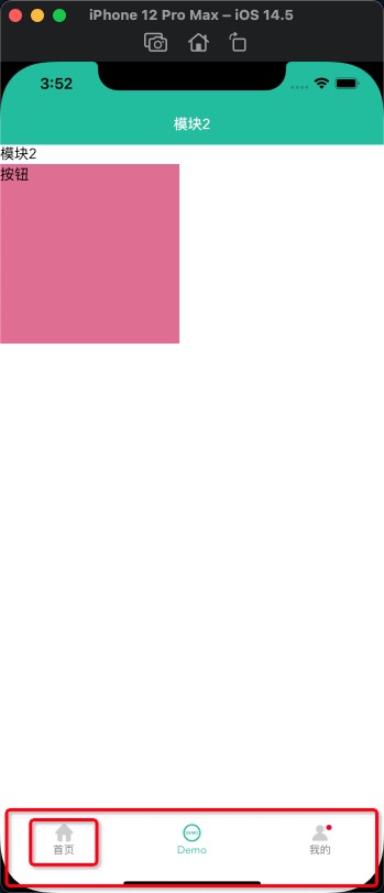
6.2 code implementation of module2 (single page)
<template>
  <div class="bg2" v-bind:class="{ bg10: isActive }">
    <BaseNavBar :title="title" :isBack="false"> </BaseNavBar>
    Module 2
    <div class="button" @click="onClick">Button</div>
  </div>
</template>

<script>
export default {
  components: {},
  data() {
    return {
      title: "Module 2",
      isActive: false,
    };
  },
  methods: {
    onClick() {
      console.log("Click the button");
      this.$router.push({ name: "DemoList", params: { setid: 111222 } });
    },
    created() {
      console.log("Module 2");
    },
  },
};
</script>

<style>
.bg2 {
  width: auto;
  height: 100vh;
  /* background: red; */
}
.button {
  width: 200px;
  height: 200px;
  background: palevioletred;
}
.bg10 {
  background: pink;
}
</style>