catalogue
1. Pie chart component chart pie doughnut
1. Pie chart component chart pie doughnut
- Effect display:
- Data type required for import (officially defined by Echarts)
-
import * as echarts from 'echarts';
-
import { EChartsOption as EchartsOptions, PieSeriesOption } from 'echarts/types/src/export/option.d';
import { CallbackDataParams as CallbackDataParamss, OptionDataValueNumeric } from 'echarts/types/src/util/types.d';
import { PieDataItemOption } from 'echarts/types/src/chart/pie/PieSeries.d'; -
// import { EventCallback, EChartsType } from 'echarts/types/dist/echarts.d'; / / TODO: you should have taken it from dist, but you can't get it?
-
export type EChartsOption = EchartsOptions;
export type CallbackDataParams = CallbackDataParamss;
- Define the required data type
- The most basic compatible data type: both string and number are acceptable
- Data type accepted by pie chart: contains name / value
- Vulva pattern and separation pattern between each sector
- Style data for data list (legend)
- Built in color (for legend)
- Built in theme color (for external shadow and fan spacing)
// Type definition compatible types
export type BaseValue = string | number;
// Type definition compatible type array
export type BaseValueArray = BaseValue[];
// Define interface pie chart data type
export interface DataValue {
  name: string;
  value: BaseValue;
}
// Defines the interface outer ring shadow style
export interface ShadowValue {
  color?: string;
  opacity?: number;
}
// Type definitions separate data types
export interface SeparationData {
  width: BaseValue;
  color?: string;
}
// Type definition css Style
export type CStyle = {[key: string]: BaseValue};
// Define interface data list
export interface ListStyleData {
  align: 'top'|'left'|'right'|'bottom';
  value: boolean;
  fontSize?: number;
  iconSize?: number;
  col?: number;
  cStyle?: CStyle;
}
// Define interface data list
export interface StyleData {
  root?: CStyle;
  chart?: CStyle;
  legendRoot?: CStyle,
  legendRow?: CStyle,
  legendItem?: CStyle,
  legendIcon?: CStyle,
  legendName?: CStyle,
  legendValue?: CStyle,
}
// Type definition pie chart data array
export type DataValueArray = DataValue[];
// Type definition string array
export type StringArray = string[];
// Type definition number array
export type NumberArray = number[];
// Type definition Boolean array
export type BooleanArray = boolean[];


// Built in color
const DEFAULT_COLORS = ['#03F7FF', '#0167FF', '#0FD588',
'#FAD201', '#FF8B15', '#F94F3D'];

// Theme color
const THEME_COLORS = {
  light: {
    dataColor: '#666666',
    fontColor: '#666666',
    separationColor: '#EEE',
    separationColorOpacity: 1,
    maskColor: '#FFF',
    maskColorOpacity: 0.8,
  },
  dark: {
    dataColor: '#03F7FF',
    fontColor: '#FFFFFF',
    separationColor: '#a7b2da',
    separationColorOpacity: 0.1,
    maskColor: '#09102b',
    maskColorOpacity: 0.7,
  },
};- Define built-in contaminant formatting
// Pollutant format
const POLLUTION_HTML = [
  {
    name: 'O3',
    html: 'O<small><sub>3</sub></small>',
  },
  {
    name: 'PM10',
    html: 'PM<small><sub>10</sub></small>',
  },
  {
    name: 'PM25',
    html: 'PM<small><sub>2.5</sub></small>',
  },
  {
    name: 'SO2',
    html: 'SO<small><sub>2</sub></small>',
  },
  {
    name: 'SO3',
    html: 'SO<small><sub>3</sub></small>',
  },
  {
    name: 'CO',
    html: 'CO',
  },
  {
    name: 'CODMN',
    html: 'COD<small><sub>mn</sub></small>',
  },
  {
    name: 'VOCS',
    html: 'VOC<small><sub>s</sub></small>',
  },
  {
    name: 'NO',
    html: 'NO',
  },
  {
    name: 'NO2',
    html: 'NO<small><sub>2</sub></small>',
  },
  {
    name: 'NH3',
    html: 'NH<small><sub>3</sub></small>',
  },
  {
    name: 'NOX',
    html: 'NO<small><sub>x</sub></small>',
  },
  {
    name: 'NH4',
    html: 'NH<small><sub>4</sub><sup>+</sup></small>',
  },
  {
    name: 'MNO4',
    html: 'MnO<small><sub>4</sub><sup>-</sup></small>',
  },
  {
    name: 'PH',
    html: 'pH',
  },
];- Acceptable parameters (props)
- Pie chart data: validator: (data: datavaluearray) = >!! data,
- Width and height, chart name, title, data unit {unit
- User defined color validation colors: validator: (data: stringarray): Boolean = >! data. some((color) => !/# [0-9a-fA-F]{3,6}/. test(color.toString()))
- Pie chart radius (must be an array containing two elements, because it is a ring default: () = > ['45%,'70% '])
- Pie chart separation (must have separation width and color)
- Outer ring shadow radius: () shadowRadius (must be an array containing two elements, because it is a ring default: () = > ['43.5% ','85%'])
- Outer ring shadow style shadowStyle (must have separated color and transparency)
- Inner ring showInner (not displayed by default)
- Data list showList (default display)
- Data list arrangement listStyle (align, value, fontSize, iconSize, col, cStyle)
- Custom style cStyle (root, chart, legendRoot, legendRow, legendItem, legendIcon, legendName, legendValue)
- List container custom style lStyle
- Echarts native configuration} options (the options type here is actually the type officially defined by import)
/**
 * t-chart-pie-doughnut-data
 * @param {DataValueArray} [data] - Pie chart data
 * @param {string} [width] - Graph width
 * @param {string} [height] - Graphic height
 * @param {string} [title] - Drawing naming
 * @param {StringArray} [colors] - Image color, expressed in hexadecimal, such as #00FF00
 * @param {StringArray} [radius] - Pie chart radius
 * @param {SeparationData} [separation] - Pie chart data separation
 * @param {string} [unit] - Data unit
 * @param {StringArray} [shadow-radius] - External shadow radius
 * @param {boolean} [show-inner] - Show default Center
 * @param {boolean} [show-list] - Display data list
 * @param {ListStyleData} [list-style] - Data list arrangement
 * @param {ListStyleData} [c-style] - Data list arrangement
 * @param {EChartsOption} [options] - echarts Native configuration
 * @param {string} [theme-style] - theme
 * @param {slot} - slot
 *
 * @example
    <t-chart-pie-doughnut-data
      :data="chartData"
      unit="(g/L)"
      :options="chartOptions"
    >
      <p style="color: #000;">Slot</p>
    </t-chart-pie-doughnut-data>
 */

  props: {
    // Pie chart data
    data: {
      type: Array as PropType<DataValueArray>,
      default: () => [],
      required: true,
      validator: (data: DataValueArray) => !!data,
    },
    // Entire drawing width
    width: {
      type: String,
      default: '100%',
      required: false,
    },
    // Entire drawing height
    height: {
      type: String,
      default: '300px',
      required: false,
    },
    // Naming the entire drawing
    title: {
      type: String,
      default: '',
      required: false,
    },
    // Image color
    colors: {
      type: Array as PropType<StringArray>,
      default: () => DEFAULT_COLORS,
      required: false,
      validator: (data: StringArray): boolean => !data.some((color) => !/#[0-9a-fA-F]{3,6}/.test(color.toString())),
    },
    // Pie chart radius
    radius: {
      type: Array as PropType<StringArray>,
      default: () => ['45%', '70%'],
      required: false,
      validator: (data: StringArray): boolean => data.length === 2,
    },
    // Pie chart data separation
    separation: {
      type: Object as PropType<SeparationData>,
      default: () => ({ width: 2 }),
      required: false,
      validator: (data: SeparationData) => {
        let right = true;
        if (typeof data.width === 'string') {
          right = /^\d+(\.\d+)?%$/.test(data.width);
        }
        if (right && data.color) {
          return /#[0-9a-fA-F]{3,6}/.test(data.color);
        }
        return right;
      },
    },
    // Data unit
    unit: {
      type: String,
      default: '',
      required: false,
    },
    // Outer ring shadow width
    shadowRadius: {
      type: Array as PropType<StringArray>,
      default: () => ['43.5%', '85%'],
      required: false,
      validator: (data: StringArray): boolean => data.length === 2,
    },
    // Outer ring shadow color
    shadowStyle: {
      type: Object as PropType<ShadowValue>,
      default: () => ({}),
      required: false,
      validator: (data: ShadowValue) => {
        let right = true;
        if (data.opacity !== undefined) {
          right = data.opacity >= 0 && data.opacity <= 1;
        }
        if (right && data.color) {
          return /#[0-9a-fA-F]{3,6}/.test(data.color);
        }
        return right;
      },
    },
    // Inner ring
    showInner: {
      type: Boolean,
      default: true,
      required: false,
    },
    // Display data list
    showList: {
      type: Boolean,
      default: true,
      required: false,
    },
    // Data list arrangement
    listStyle: {
      type: Object as PropType<ListStyleData>,
      default: () => ({
        align: 'right',
        value: true,
        fontSize: 14,
        iconSize: 14,
        col: 2,
        cStyle: {},
      }),
      required: false,
      validator: (data: ListStyleData): boolean => !!data,
    },
    // custom style
    cStyle: {
      type: Object as PropType<StyleData>,
      default: () => ({
        root: {},
        chart: {},
        legendRoot: {},
        legendRow: {},
        legendItem: {},
        legendIcon: {},
        legendName: {},
        legendValue: {},
      }),
      required: false,
      validator: (data: StyleData): boolean => !!data,
    },
    // List container custom styles
    lStyle: {
      type: Object as PropType<CStyle>,
      default: () => ({}),
      required: false,
      validator: (data: CStyle): boolean => !!data,
    },
    // Echorts native configuration
    options: {
      type: Object as PropType<EChartsOption>,
      default: () => ({}),
      required: false,
    },
    // Theme style depth
    themeStyle: {
      type: String as PropType<ThemeStyle.LIGHT | ThemeStyle.DARK>,
      default: ThemeStyle.DARK,
    },
  },

emits: ['legend-click'],- Legend Click event that pie chart component needs to listen for: emits: ['legend click ']
- Let's start defining setup()
- Obtain the ecarts render node: const | charts = ref < HtmlElement | null > (null);
- The node has two possible types (null / HTMLElement)
- Obtain the corresponding theme color according to the theme parameters
- Theme color includes data color, font color, separation color, transparency of separation color, shade color and transparency of shade color
- const getColorByTheme = () => THEME_COLORS[props.themeStyle];
- In fact, enumeration values are used here, which are responsive, so you need to wrap them with functions
- Obtain the legend list display style according to the passed showList parameter
- Including parameters: show: display method, value: whether to display data, style: style
- If this parameter is not passed in, the default style is:
- if (!props.showList) {
return {
show: '',
value: false,
style: {},
cStyle: {},
};
} - If a parameter is passed in and the legend position is left / right
- The legend and chart are displayed in one row by default, using the following style:
- if (['left', 'right'].includes(props.listStyle.align)) {
return {
show: 'row', / / display by line (horizontal)
value: !!props.listStyle.value,
style: {/ / if the legend is to the right, a normal line will be displayed. If the legend is to the left, the display will be reversed
flexDirection: props.listStyle.align === 'right' ? 'row' : 'row-reverse',
alignItems: 'center',
},
cStyle: props.listStyle.cStyle,
};
} - If a parameter is passed in and the legend position is an up-down structure
- By default, the legend and chart top and bottom structure display (col), using the following style:
- return {
show: 'col', / / display by column (vertical)
value: !!props.listStyle.value,
style: {/ / if the legend is lower, the vertical display is normal. If the legend is higher, the display is reversed
flexDirection: props.listStyle.align === 'bottom' ? 'column' : 'column-reverse',
alignItems: 'center',
},
cStyle: props.listStyle.cStyle,
}; - Convert hex color to rgba format color
- /**
* @ description: convert hex color to rgba format color
* @param rgb #FFFFFF
* @ param # alp # transparency
* @returns rgba(0,0,0,alp)
*/
const rgb2rgba = (rgb:string, alp:number): string => {
const r = parseInt(rgb.substr(1, 2), 16);
const g = parseInt(rgb.substr(3, 2), 16);
const b = parseInt(rgb.substr(5, 2), 16);
return `rgba(${r},${g},${b},${alp})`;
}; - Note here that the native js method for converting base is parseInt(number, base);
- Split arrays (Group arrays)
- /**
* @ description: split and group the array
* @ param # arr original array
* @ param # n # number of split groups
* @ returns * grouped array
*/
const splitArray = (arr: unknown[], n = 2): unknown[] => {
If (! n) {/ / if the number of splitting groups is not passed in, an exception is thrown
throw new Error(`error in params n: ${n}`);
}
const arrTemp: unknown[] = [...arr]; // Original array
const every: number = Math.ceil(arrTemp.length / n) || 1; // Calculate the number of array elements that should be included in each new array
const ret: unknown[] = []; // Total container of grouped arrays - it contains multiple grouped arrays
// eslint-disable-next-line no-constant-condition
while (true) {
const temp: unknown[] = arrTemp.splice(0, every); // Single array container
if (!temp || temp.length === 0) {
break;
}
ret.push(temp);
}
return ret;
}; - Format common pollutants
- /**
* @ description: format common pollutants and return as is without built-in in front
* @ param # name # pollutant name
* @ returns @ html
*/
const getPollutionHtml = (name: string): string => {
const pollutionName: string = name.toUpperCase().replace(/[-.+_]/g, ''); // Convert the contaminant string to uppercase and remove redundant symbols
const maped = POLLUTION_HTML.filter((item) => item.name === pollutionName); // Traverse the previously defined pollutant conversion array, return the filtered array after the names are consistent, and stop when one is filtered
if (maped.length > 0) {
return maped[0].html; // When there are built-in pollutants, the treated pollutants are returned
}
return name; // When there are no built-in pollutants, return as is
}; - Use the above method to style the data
- /**
* @ description: set style for data
* @ param # arr data array
* @ returns * data array containing styles
*/
const setColorForData = (arr: unknown[], colors: string[] = DEFAULT_COLORS): unknown[] => {
const temp: unknown[] = [...arr];
const themeColor = getColorByTheme(); // Gets the current theme color
return temp.map((item: any, index: number) => ({
... item, / / data
name: getPollutionHtml(item.name), / / processed format pollutants
style: {
color: colors[index% colors.length], / / take the mold and cycle to obtain the colors in order
legend: {
nameColor: themeColor.fontColor,
valueColor: themeColor.dataColor,
backgroundColor: colors[index % colors.length],
borderColor: rgb2rgba(colors[index% colors.length], 0.5), / / color conversion is used
},
},
}));
}; - Gets the numeric part of the data with a percent sign. If it does not contain%, the number is returned directly
- /**
* @ description: get the percentage number. If% is not included, it will be returned directly
* @ param # percentValue # percentage
* @ returns {BaseValue} data
*/
const getPercentValue = (percentValue: BaseValue): number => {
if (String(percentValue).includes('%') {/ / if the number passed in contains a percent sign
return Number(String(percentValue).split('%')[0]); // Split the string into an array and return the numeric part
}
return Number(percentValue);
}; - Subtract the percentage
- /**
* @ description give percentage subtraction
* @ param # percentValue # subtracted
* @ param # subValue # subtract, how much
* @ returns @ result percentage
*/
const subPercent = (percentValue: string, subValue: number): string => {
if (!percentValue.includes('%')) {
return percentValue; / / get the digital part of the subtracted number (without%)
}
const value = getPercentValue(percentValue); // Gets the numeric portion of the subtracted number (with%)
if (value < subValue) {
throw new Error('subtraction too large ');
}
return `${value - subValue}%`;
}; - Format pie chart data
- /**
* @ description: format graph data
* @ returns {OptionDataValueNumeric} data
*/
const formateData = (): OptionDataValueNumeric[] | OptionDataValueNumeric[][] | PieDataItemOption[] => {
const ret: unknown[] = [];
const total = props.data.reduce((t, item) => (typeof item === 'object' ? (t + Number(item.value)) : (t + Number(item))), 0);
props.data.forEach((item, i) => {
ret.push({
value: typeof item === 'object' ? item.value: item, / / judge whether the incoming data is an object or pure data. If it is an object, you need to Value. If not, the value will be returned directly
name: typeof item === 'object' ? item.name : '',
itemStyle: {
color: props.colors[i],
},
}, {/ / calculate the separation width, which may be 0 or the total number * the percentage of separation
value: props.separation.width === 0 || props.separation.width === '0%' ? 0 : total * (getPercentValue(props.separation.width) / 100),
name: '',
itemStyle: separationStyle,
});
});
return ret as OptionDataValueNumeric[] | OptionDataValueNumeric[][] | PieDataItemOption[];
}; - Array.reduce(): equivalent to traversal and summation
- Data required when instantiating Echarts
- Image instance: let myChart: any = null;
- Processing legend:
- const chartDataRow = ref(splitArray(setColorForData(props.data), props.listStyle.col || 2));
- First, set the style setColorForData(props.data) for the incoming data
- Then judge the number of packets, and give priority to the number of legend packets passed in by the user, prios listStyle. Col, if not, 2 will be passed in (that is, two rows of legends are displayed by default)
- Finally, group the data with the added style according to the number of groups
- Add a style to the incoming data and process it responsively:
- const chartData = ref(setColorForData(props.data));
- Draw graph ()
- Instantiate image instance:
- if (!myChart) {
myChart = echarts.init(charts.value as HTMLElement);
} - Graphics configuration:
- const chartOptions: EChartsOption = {
... props.options, / / the graphic configuration passed in by the user
color: props.colors || DEFAULT_COLORS, / / the color passed in by the user or the default color
Series: [], / / bring out the series separately to control the drawing style of the chart
}; - Data series:
- const dataSeries: PieSeriesOption = {
name: props.title,
type: 'pie',
radius: props.radius, / / pie chart drawing radius
avoidLabelOverlap: true, / / whether to enable the policy of preventing label overlap
/ / silent: true, / / FIXME: copy the ecarts sample code for direct use, and the sector cannot be highlighted
Clockwise: true, / / clockwise
label: { show: false },
... props.options.dataSeries # as # unknown # as # PieSeriesOption, / / merge the incoming series
Data: formateData(), / / adopt the data with added style
}; - Outer ring shadow:
- const outerSeries: PieSeriesOption = {
z: 1, / / attention level
name: 'outer ring shadow',
type: 'pie',
radius: props.shadowRadius,
avoidLabelOverlap: true,
silent: true,
clockwise: true,
label: { show: false },
itemStyle: {
color: props.shadowStyle.color || getColorByTheme().separationColor, / / the shadow color passed in by the user, or the default shadow color of the theme color. The same is true for the transparency below
opacity: props.shadowStyle.opacity === undefined ? getColorByTheme().separationColorOpacity : props.shadowStyle.opacity,
},
data: [
{value: 100, name: 'outer ring shadow'},
],
...props.options.outerSeries as unknown as PieSeriesOption,
}; - Inner ring mask:
- const innerSeries: PieSeriesOption = {
z: 4, / / attention level
name: 'inner ring shadow',
type: 'pie',
radius: ['0% ', subPercent(props.radius[1], 10)], / / the inner ring mask is 10% smaller than the pie ring itself by default
avoidLabelOverlap: true,
silent: true,
clockwise: true,
label: { show: false },
itemStyle: {
color: getColorByTheme().maskColor, / / the inner ring adopts theme color and built-in mask color
opacity: getColorByTheme().maskColorOpacity,
},
data: [
{value: 100, name: 'inner ring mask'},
],
...props.options.innerSeries as unknown as PieSeriesOption,
}; - series in fill graph configuration:
- chartOptions.series = [
outerSeries, / / external shadow
innerSeries, / / internal mask
dataSeries, / / pie chart data series
]; - Charting: mychart setOption(chartOptions);
- Chart adaptive size:
- window.onresize = () => {
myChart.resize();
}; - Listen for legend click events
- function handleLegendItemClick(item: unknown, index: number) {
emit('legend-click', {
current: item, / / the currently clicked item
currentIndex: index, / / click the serial number
all: props.data, / / all data of pie chart
});
} - Listen to this legend click event. When the parent component triggers the pie chart legend click event, the transmitted information will be obtained:
- All data of current clicked item, current clicked sequence number and pie chart
- When the component is initialized, the chart is drawn
- onMounted(() => {
drawChart();
}); - Listening for responsive data changes (redrawing charts, reprocessing data)
- watch(() => props.data, () => {
drawChart();
chartDataRow.value = splitArray(setColorForData(props.data), props.listStyle.col || 2);
chartData.value = setColorForData(props.data);
}); - Data returned to the template for use
- return {
chart: charts, / / the corresponding responsive dom of ecarts
chartDataRow, / / added and grouped Legends
chartData, / / added pie chart data of style
listDataStyle: getListStyle(), / / display configuration of legend
style: {/ / if the legend is displayed, the chart width is replaced by the height. If the legend is not displayed, the chart width is customized
width: props.showList ? props.height : props.width,
height: props.height,
},
cStyles: {/ / the user's incoming and default styles
root: {},
chart: {},
legendRoot: {},
legendRow: {},
legendItem: {},
legendIcon: {},
legendName: {},
legendValue: {},
...props.cStyle,
},
Handlelegendetemclick, / / Legend Click event
};
- Write template section
- It contains three parts: chart, legend of left and right layout, and diagram of up and down layout
- Chart part: contains the chart container ref="chart", and the slot content slot in the middle of the chart
    <div :style="{ ...style, ...cStyles.chart }" class="chart">
      <div ref="chart" />
      <div class="slot">
        <slot />
      </div>
</div>- Legend of left and right layout:
- Through the cycle, except for the x Group legend, this is also more than the up-down layout legend
- Each group of legends is bound with legend click events, including legend icon, legend name, legend data and unit
    <div v-if="listDataStyle.show === 'row'" :style="{ ...lStyle, ...cStyles.legendRoot }" class="row-list">
      // Here is more than the top-down structure
      <div v-for="(col, index) in chartDataRow" :key="index" :style="{ ...cStyles.legendRow }" class="list-wrap">
        // A data container. Click events are added here
        <div
          v-for="(item, inner) in col"
          :key="item"
          :style="{ ...listStyle.cStyle, ...cStyles.legendItem }"
          class="list-item"
          @click="handleLegendItemClick(item, index * Math.ceil(data.length / listStyle.col) + inner)"
        >
          // Legend icon (including outer layer and inner layer)
          <div
            :style="{
              backgroundColor: item.style.legend.borderColor,
              width: listStyle.iconSize ? listStyle.iconSize + 'px' : '14px',
              height: listStyle.iconSize ? listStyle.iconSize + 'px' : '14px',
              ...cStyles.legendIcon,
            }"
            class="list-item__icon"
          >
            <div :style="{ backgroundColor: item.style.legend.backgroundColor }" />
          </div>
          // Write legend name via v-html
          <div
            :style="{
              color: item.style.legend.nameColor,
              fontSize: listStyle.fontSize ? listStyle.fontSize + 'px' : '14px',
              ...cStyles.legendName,
            }"
            class="list-item__name"
            v-html="item.name"
          />
          // Legend value and unit
          <div
            v-if="listDataStyle.value"
            :style="{
              color: item.style.legend.valueColor,
              fontSize: listStyle.fontSize ? listStyle.fontSize + 'px' : '14px',
              ...cStyles.legendValue,
            }"
            class="list-item__value"
          >
            {{ item.value }}{{ unit }}
          </div>
        </div>
      </div>
</div>- Up and down layout legend:
- The style is basically the same as above, except that there is no circular column operation
    <div v-if="listDataStyle.show === 'col'" :style="{ ...lStyle, ...cStyles.legendRoot }" class="col-list">
      // A data container. Click events are added here
      <div
        v-for="(item, index) in chartData"
        :key="index"
        :style="{ ...listStyle.cStyle, ...cStyles.legendItem }"
        class="list-item"
        @click="handleLegendItemClick(item, index)"
      >
        // //Legend icon (including outer layer and inner layer)
        <div
          :style="{
            backgroundColor: item.style.legend.borderColor,
            width: listStyle.iconSize ? listStyle.iconSize + 'px' : '14px',
            height: listStyle.iconSize ? listStyle.iconSize + 'px' : '14px',
            ...cStyles.legendIcon,
          }"
          class="list-item__icon"
        >
          <div :style="{ backgroundColor: item.style.legend.backgroundColor }" />
        </div>
        <div
          :style="{
            color: item.style.legend.nameColor,
            fontSize: listStyle.fontSize ? listStyle.fontSize + 'px' : '14px',
            ...cStyles.legendName,
          }"
          class="list-item__name"
          v-html="item.name"
        />
        // Legend value and unit
        <div
          v-if="listDataStyle.value"
          :style="{
            color: item.style.legend.valueColor,
            fontSize: listStyle.fontSize ? listStyle.fontSize + 'px' : '14px',
            ...cStyles.legendValue,
          }"
          class="list-item__value"
        >
          {{ item.value }}{{ unit }}
        </div>
      </div>
</div>- style
<style lang="scss">
  /*$px Is the font size to be converted*/
  @function px2rem($px) {
    @return $px / 16px * 1rem;
  }

  .t-chart-pie-doughnut-data {
    display: flex;
    justify-content: space-around;

    .chart {
      position: relative;
      &>div {
        width: 100%;
        height: 100%;
      }
    }
    .list-item {
      height: 50px;
      min-width: 120px;
      display: flex;
      align-items: center;
      color: #666;
      .list-item__icon {
        width: px2rem(14px);
        height: px2rem(14px);
        display: flex;
        justify-content: center;
        align-items: center;
        div {
          width: 50%;
          height: 50%;
        }
      }
      .list-item__name {
        flex: 1;
        margin-left: 10px;
        overflow: hidden;
        white-space: nowrap;
        text-overflow: ellipsis;
      }
      .list-item__value {
        white-space: nowrap;
      }
    }

    .row-list {
      display: flex;
      align-items: flex-start;
      .list-wrap {
        flex: 1;
        display: flex;
        flex-direction: column;
      }
    }

    .col-list {
      padding: 0 10px;
      display: flex;
      flex-wrap: wrap;
      .list-item {
        margin-right: 20px;
      }
    }

    .slot {
      display: flex;
      position: absolute;
      top: 0;
      left: 0;
      z-index: 10;
      width: 100%;
      height: 100%;
      justify-content: center;
      align-items: center;
    }
  }
</style>
2. Use of chart pie doughnut
<div class="dark" style="background: var(--background-color)">
<t-chart-pie-doughnut-data
theme-style="dark"
:data="chartData"
unit="(g/L)"
:separation="{ width: '2.5%' }"
:list-style="{
align: 'right',
value: true,
fontSize: 12,
iconSize: 12,
col: 1,
}"
:c-style="{
legendRoot: { flex: 1, margin: '0 10px 0 100px' },
legendItem: { height: '40px' },
legendValue: { textAlign: 'right' }
}"
:options="chartOptions"
>
// Here's the middle slot
<div class="chart-center">
<div class="chart-center-rotate" />
<div class="chart-center-icon" />
</div>
</t-chart-pie-doughnut-data>
</div>
======================================================================
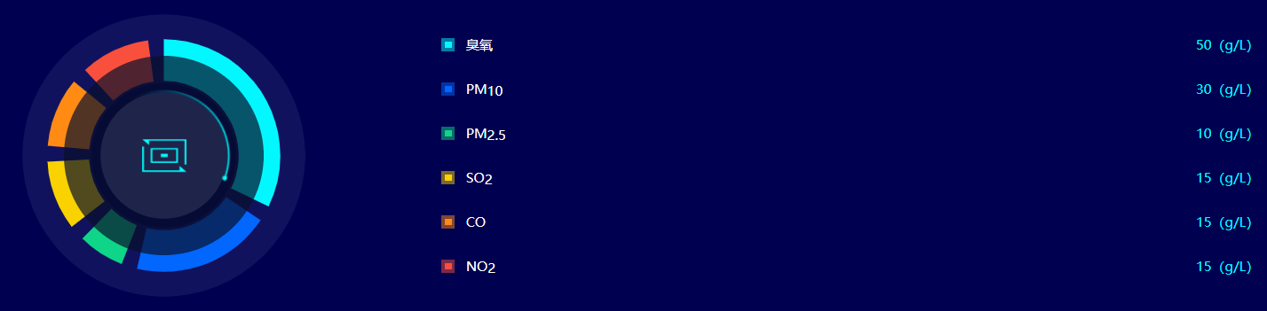
// Pie chart data
const chartData = [
{ value: 50, name: 'ozone' },
{ value: 30, name: 'PM10' },
{ value: 10, name: 'PM25' },
{ value: 15, name: 'SO2' },
{ value: 15, name: 'CO' },
{ value: 15, name: 'NO2' },
];
// The pie chart data interval width can also be written directly as a number, for example, width: 10 = width: '10%'
const chartSeparation = { width: '2.5%' };
// Data list arrangement
const chartListStyle = {
align: 'right',
value: true,
fontSize: 12,
iconSize: 12,
col: 1,
};
// Native configuration
const chartOptions = {};
========================================================================
<style lang="scss">
$size: 120px;
// Doughnut pie chart central animation
.chart-center{
position: relative;
width: $size;
height: $size;
.chart-center-rotate {
position: absolute;
top: 0;
left: 0;
z-index: 666;
width: $size;
height: $size;
border-radius: 50%;
background: url(./images/dark-rotate.png) center / 100% 100% no-repeat;
animation: turn 2s linear infinite;
}
.chart-center-icon {
position: absolute;
top: 50%;
left: 50%;
width: $size / 3;
height: $size / 4;
transform: translate(-50%, -50%);
background: url(./images/dark-icon.png) center / 100% 100% no-repeat;
}
@keyframes turn {
0% {
transform: rotate(0deg);
}
25% {
transform: rotate(90deg);
}
50% {
transform: rotate(180deg);
}
75% {
transform: rotate(270deg);
}
100% {
transform: rotate(360deg);
}
}
}
</style>