When it comes to Vue's component library, you must have been familiar with it for a long time. You can easily list a lot. Then why do you need to build it yourself? Based on my own experience, highly customized components are often required in business. Both UI and interaction may be quite different from the existing component libraries on the market. At this time, if you modify based on the existing component library, the understanding cost and modification cost are not small, even higher than building a set yourself. Therefore, it is quite common to build your own component library.
For a component library, in addition to "component" "Besides itself, another very important thing is document display. Referring to the excellent open source component libraries on the market, there are both high-quality components and a set of very standardized and detailed documents. In addition to describing the functions of components, the documents also have the ability of component interactive preview, so as to reduce the learning cost of users as much as possible.
For many programmers, the most annoying thing is nothing more than two things. One is that others don't write documents, and the other is to write documents themselves. Since documents are essential in component library, we should reduce the pain of writing documents as much as possible, especially such documents with both code display and text description.
There are also many frameworks for component document display in the market, such as Story Book, Docz, Dumi, etc. they all have their own rules to enable you to display your components, but the learning cost is high for the team. At the same time, they also separate the experience between "development" and "writing documents" to a certain extent.
If you can preview debugging while developing the component library, the content of preview debugging is a part of the document. Developers only need to pay attention to the development of the component itself, and then add a little necessary API and event description.
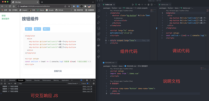
We are going to build such a set of component library development framework to experience super silky. First, we will give an example of the final result, and then teach you to implement it step by step.
1, Development framework initialization
This set of development framework is named my kit. Vite + Vue3 + Typescript is used in technology selection.
Execute the following command in an empty directory:
yarn create vite
After filling in the project name and selecting Vue ts, the project initialization will be completed automatically. The code structure is as follows:
.
├── README.md
├── index.html
├── package.json
├── public
├── src
├── tsconfig.json
├── vite.config.ts
└── yarn.lock
Create a new / packages directory under the root directory, and subsequent component development will be carried out in this directory. Take a < my button / > component as an example to see what is inside the / packages Directory:
packages
├── Button
│   ├── docs
│   │   ├── README.md  // Component documentation
│   │   └── demo.vue   // Interactive preview instance
│   ├── index.ts       // Module export file
│   └── src
│       └── index.vue  // Component body
├── index.ts           // Component library export file
└── list.json          // Component list
Let's take a look at what these files are.
packages/Button/src/index.vue
The file is the ontology of the component, and the code is as follows:
<template>
  <button class="my-button" @click="$emit('click', $event)">
    <slot></slot>
  </button>
</template>

<script lang="ts" setup>
defineEmits(['click']);
</script>

<style scoped>
.my-button {
  // Style part omitted
}
</style>
packages/Button/index.ts
In order for the component library to allow both global calls:
import { createApp } from 'vue'
import App from './app.vue'

import MyKit from 'my-kit'

createApp(App).use(MyKit)
Local calls are also allowed:
import { Button } from 'my-kit'

Vue.component('my-button', Button)
Therefore, you need to define a VuePlugin reference method for each component. The contents of package/Button/index.ts are as follows:
import { App, Plugin } from 'vue';
import Button from './src/index.vue';

export const ButtonPlugin: Plugin = {
  install(app: App) {
    app.component('q-button', Button);
  },
};

export { Button };
packages/index.ts
This file is the export file of the component library itself. By default, it exports a VuePlugin and also exports different components:
import { App, Plugin } from 'vue';

import { ButtonPlugin } from './Button';

const MyKitPlugin: Plugin = {
  install(app: App) {
    ButtonPlugin.install?.(app);
  },
};

export default MyKitPlugin;

export * from './Button';
/packages/list.json
Finally, a description file of the component library is used to record various descriptions of the components in it. We will use this later:
[
  {
    "compName": "Button",
    "compZhName": "Button",
    "compDesc": "This is a button",
    "compClassName": "button"
  }
]
After the initialization of the above component library directory is completed, our my kit can be used directly by the business side.
Go back to the root directory and find the src/main.ts file. We import the whole my kit:
import { createApp } from 'vue'
import App from './App.vue'

import MyKit from '../packages';

createApp(App).use(MyKit).mount('#app')
Rewrite src/App.vue and introduce < my button > < / my button > to try:
<template>
  <my-button>I'm a custom button</my-button>
</template>
After running yarn dev and starting Vite's server, you can directly see the effect on the browser:

2, Real time interactive document
A component library must have more than a Button component, and each component should have its own document. This document not only describes the functions of the component, but also has the functions of component preview and component code view. We can call this document "interactive document" At the same time, for a good component development experience, we hope that the document is real-time. If you modify the code here, you can see the latest effect in the document in real time. Next, let's implement such a function.
Component documents are usually written in Markdown, which is no exception here. We want one Markdown page, so we need to use vue-router@next To achieve routing control.
Create router.ts under / src in the root directory and write the following code:
import { createRouter, createWebHashHistory, RouterOptions } from 'vue-router'

const routes = [{
  title: 'Button',
  name: 'Button',
  path: '/components/Button',
  component: () => import(`packages/Button/docs/README.md`),
}];

const routerConfig = {
  history: createWebHashHistory(),
  routes,
  scrollBehavior(to: any, from: any) {
    if (to.path !== from.path) {
      return { top: 0 };
    }
  },
};

const router = createRouter(routerConfig as RouterOptions);

export default router;
As you can see, this is a typical vue-router@next For configuration, careful readers will find that a Markdown file is introduced for the route with path of / components/Button, which is invalid in the default Vite configuration. We need to introduce the Vite plugin MD plug-in to parse the Markdown file and turn it into a Vue file. Go back to the root directory, find vite.config.ts and add the plug-in:
import Markdown from 'vite-plugin-md'

export default defineConfig({
  // Default configuration
  plugins: [
    vue({ include: [/\.vue$/, /\.md$/] }),
    Markdown(),
  ],
})
After this configuration, any Markdown file can be used like a Vue file.
Go back to / src/App.vue and rewrite it slightly to add a sidebar and main area:
<template>
  <div class="my-kit-doc">
    <aside>
      <router-link v-for="(link, index) in data.links" :key="index" :to="link.path">{{ link.name }}</router-link>
    </aside>
    <main>
      <router-view></router-view>
    </main>
  </div>
</template>

<script setup>
import ComponentList from 'packages/list.json';
import { reactive } from 'vue'

const data = reactive({
  links: ComponentList.map(item => ({
    path: `/components/${item.compName}`,
    name: item.compZhName
  }))
})
</script>

<style lang="less">
html,
body {
  margin: 0;
  padding: 0;
}
.my-kit-doc {
  display: flex;
  min-height: 100vh;
  aside {
    width: 200px;
    padding: 15px;
    border-right: 1px solid #ccc;
  }
  main {
    width: 100%;
    flex: 1;
    padding: 15px;
  }
}
</style>
Finally, let's write something in / packages/Button/docs/README.md:
# Button assembly

<my-button>I'm a custom button</my-button>
After completion, you can see the effect on the browser: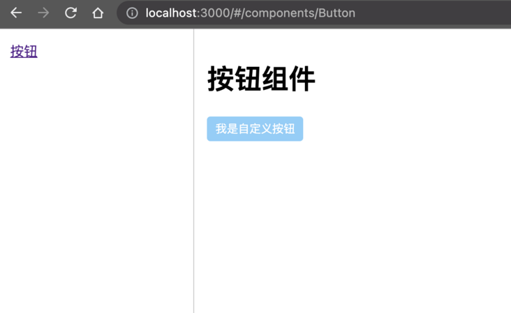
Due to the introduction of my kit globally, all the registered custom components can be written directly in the Markdown file and rendered correctly like ordinary HTML tags. However, there is another problem here, that is, these components are static and event free and cannot execute JS logic. For example, when I want to click a button to trigger a click event and then pop up a button When the alarm pops up, it cannot be written directly as follows:
# Button assembly

<my-button @click="() => { alert(123) }">I'm a custom button</my-button>
What should we do? Remember the newly introduced vite plugin MD for parsing Markdown? Look carefully at its documentation. It supports writing setup functions in Markdown! Therefore, we can package the code that needs to execute JS logic into a component, and then introduce it in Markdown through setup.
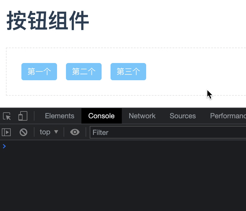
First, create a demo.vue in the packages/Button/docs Directory:
<template>
  <div>
    <my-button @click="onClick(1)">first</my-button>
    <my-button @click="onClick(2)">the second</my-button>
    <my-button @click="onClick(3)">Third</my-button>
  </div>
</template>

<script setup>
const onClick = (num) => { console.log(`I'm the third ${num} Custom buttons`) }
</script>
Then introduce it in Markdown:
<script setup>
import demo from './demo.vue'
</script>

# Button assembly

<demo />
Finally, click response can be realized.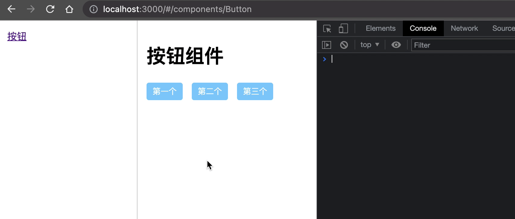
At the same time, if we make any modification to the ontology Vue file of < my button / >, it can be reflected in the document in real time.
3, Code preview function
The interactive document is basically ready, but there is another problem, that is, you can't preview the code intuitively. You might say that it's easy to preview the code. Just paste the code directly in Markdown? There is nothing wrong with that, but adhering to the principle that "laziness is the first productivity", it is estimated that no one likes to copy the code he has written again. He must hope to have a way to not only display the demo written in the document, but also directly see its code, for example:
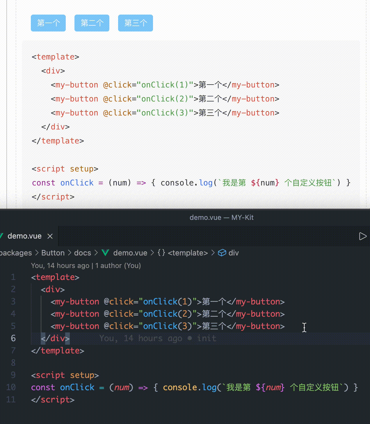
As long as you put the component into a < preview / > tab, you can directly display the code of the component, and also have the function of code highlighting, which is what interactive documents really look like! Next, let's study how to implement this function.
In Vite's Development documentation It is recorded that it supports adding a suffix to the end of the resource to control the type of the introduced resource. For example, you can import xx from 'xx?raw 'introduces the xx file as a string. Based on this capability, we can obtain the file source code to be displayed in the < preview / > component.
First, create a preview The core content of Vue file is to get the source code path through Props, and then get the source code through dynamic import. The following shows the core code (the template part is omitted temporarily)
export default {
  props: {
    /** Component name */
    compName: {
      type: String,
      default: '',
      require: true,
    },
    /** Component to display code */
    demoName: {
      type: String,
      default: '',
      require: true,
    },
  },
  data() {
    return {
      sourceCode: '',
    };
  },
  mounted() {
    this.sourceCode = (
      await import(/* @vite-ignore */ `../../packages/${this.compName}/docs/${this.demoName}.vue?raw`)
    ).default;
  }
}
The @ Vite ignore annotation is needed here because Vite is based on Rollup. In Rollup, dynamic import is required to pass in the determined path, not this dynamic splicing path. The specific reason is related to its static analysis. Interested students can search and understand it by themselves. Adding this comment here will ignore the requirements of Rollup and directly support this writing method.
However, this writing method is available in dev mode. If you run it after the build is actually executed, you will find an error. The reason is the same. Because Rollup cannot perform static analysis, it cannot process files requiring dynamic import during the construction phase, resulting in the failure to find corresponding resources. So far (December 11, 2021), there is no good way to solve this problem, so we have to judge the environment variables and bypass it through the source code of fetch request file in build mode. Rewrite as follows:
const isDev = import.meta.env.MODE === 'development';

if (isDev) {
  this.sourceCode = (
    await import(/* @vite-ignore */ `../../packages/${this.compName}/docs/${this.demoName}.vue?raw`)
  ).default;
} else {
  this.sourceCode = await fetch(`/packages/${this.compName}/docs/${this.demoName}.vue`).then((res) => res.text());
}
Assuming that the output directory after construction is / docs, remember to copy the / packages directory after construction, otherwise 404 will occur when running in build mode.
Some students may ask why it's so troublesome. Can't you go through the fetch request directly in dev mode? The answer is no, because in Vite's dev mode, it is to pull and process file resources through http requests before it is given to the business layer. Therefore, the Vue file source code obtained through fetch in dev mode has been processed by Vite.
After you get the source code, you just need to show it:
<template>
  <pre>{{ sourceCode }}</pre>
</template>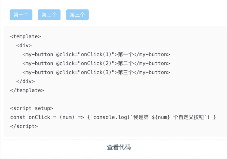
But such source code display is very ugly. There are only dry characters. We need to highlight them. For the highlighted scheme, I chose prism JS, which is very small and flexible. I just need to introduce a related CSS theme file and execute prism Highlightall(). CSS theme file used in this example Already placed in warehouse , you can take it by yourself.
Back to the project, execute yarn add prismjs -D to install PrismJS, and then introduce in the < preview / > component:
import Prism from 'prismjs';
import '../assets/prism.css'; // Theme CSS

export default {
  // ... Omit
  async mounted() {
    // ... Omit
    await this.$nextTick(); // Make sure to highlight after the source code is rendered
    Prism.highlightAll();
  },
}
Since PrismJS does not support the declaration of Vue files, Vue source code highlighting is realized by setting it to HTML type. In the < preview / > component template, we directly specify that the source code type is HTML:
<pre class="language-html"><code class="language-html">{{ sourceCode }}</code></pre>
After this adjustment, PrismJS will automatically highlight the source code.
4, Command new component
So far, our whole "real-time interactive document" has been built. Does it mean that it can be delivered to other students for real component development? Suppose you are another development classmate, I tell you, "you just create these files here, here and here, and then modify the configuration here and here to create a new component!" Do you really want to hit people? As a component developer, you don't want to care about my configuration or how the framework runs. You just want to initialize a new component in the shortest time and then start development. In order to meet this idea, it is necessary to make the previous processing steps more automated and the learning cost lower.
According to international practice, we should first look at the completion effect and then the realization method: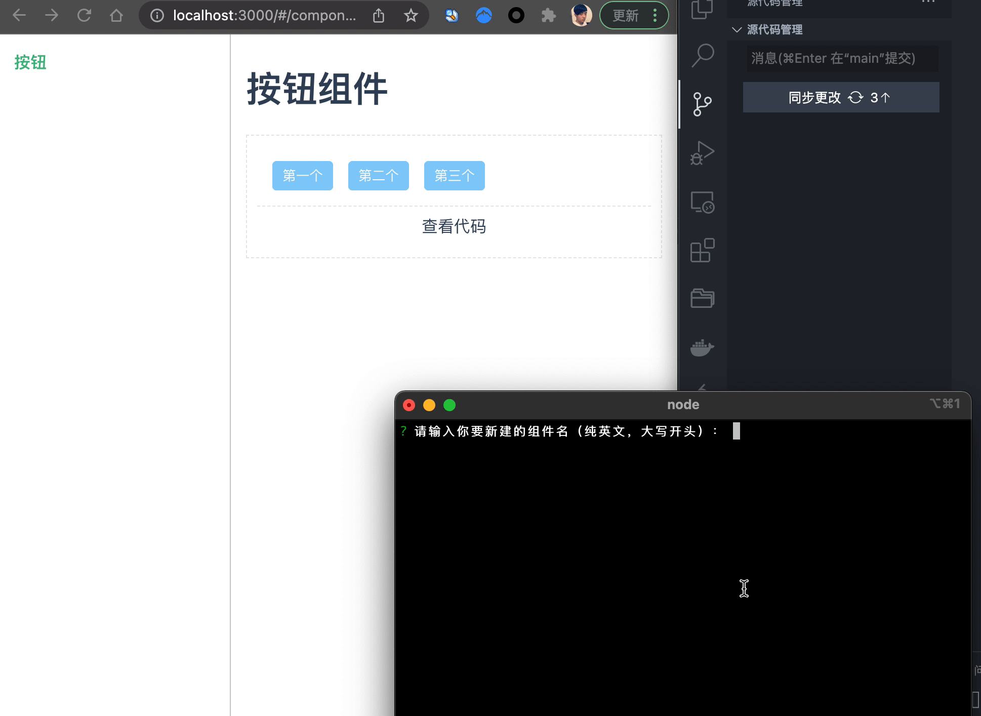
As can be seen from the rendering, after the terminal answers three questions, a new component Foo is automatically generated. At the same time, whether creating a new file or modifying the configuration is done with one click, without manual intervention. The next work only needs to focus on Foo, a new component. We can call this one click component generation method "command new component".
To implement this function, we use two tools, inquirer and handlebars. The former is used to create an interactive terminal to ask questions and collect answers; The latter is used to generate content from templates. Let's start with an interactive terminal.
Go back to the root directory, create a new / script/genNewComp directory, and then create an infocollector JS file:
const inquirer = require('inquirer')
const fs = require('fs-extra')
const { resolve } = require('path')

const listFilePath = '../../packages/list.json'

// FooBar --> foo-bar
const kebabCase = string => string
  .replace(/([a-z])([A-Z])/g, "$1-$2")
  .replace(/[\s_]+/g, '-')
  .toLowerCase();

module.exports = async () => {
  const meta = await inquirer
    .prompt([
      {
        type: 'input',
        message: 'Please enter the name of the component you want to create (English only, beginning with uppercase):',
        name: 'compName',
      },
      {
        type: 'input',
        message: 'Please enter the name of the component you want to create (Chinese):',
        name: 'compZhName'
      },
      {
        type: 'input',
        message: 'Please enter the function description of the component:',
        name: 'compDesc',
        default: 'Default: This is a new component'
      }
    ])
  const { compName } = meta
  meta.compClassName = kebabCase(compName)
  return meta
}
When running the file through node, three questions related to component information will be asked in the terminal in turn, and the answers compName (English name of component), compZhName (Chinese name of component) and compDesc (component description) will be saved in the meta object and exported.
After collecting the component related information, you need to replace the content in the template through handlebars to generate or modify the file.
Create a new one in / script/genNewComp template directory, and then create templates for all files required by the new component as needed. In our framework, the directory of a component is as follows:
Foo
├── docs
│   ├── README.md
│   └── demo.vue
├── index.ts
└── src
    └── index.vue
There are four files in total, so you need to create a new index ts.tpl,index.vue.tpl,README.md.tpl and demo vue. tpl. At the same time, because the new component needs a new route, the router TS also requires a corresponding template. Due to the length, it is not fully displayed. Only the core index is selected Ts.tpl:
import { App, Plugin } from 'vue';
import {{ compName }} from './src/index.vue';

export const {{ compName }}Plugin: Plugin = {
  install(app: App) {
    app.component('my-{{ compClassName }}', {{ compName }});
  },
};

export {
  {{ compName }},
};
The contents in the double brackets {}} will eventually be replaced by handlebars. For example, we have learned that the information of a new component is as follows:
{
  "compName": "Button",
  "compZhName": "Button",
  "compDesc": "This is a button",
  "compClassName": "button"
}
Then the template index Ts.tpl will eventually be replaced by:
import { App, Plugin } from 'vue';
import Button from './src/index.vue';

export const ButtonPlugin: Plugin = {
  install(app: App) {
    app.component('my-button', Button);
  },
};

export { Button };
The core code of template replacement is as follows:
const fs = require('fs-extra')
const handlebars = require('handlebars')
const { resolve } = require('path')

const installTsTplReplacer = (listFileContent) => {
  // Set input / output path
  const installFileFrom = './.template/install.ts.tpl'
  const installFileTo = '../../packages/index.ts'

  // Read template content
  const installFileTpl = fs.readFileSync(resolve(__dirname, installFileFrom), 'utf-8')

  // Construct data based on incoming information
  const installMeta = {
    importPlugins: listFileContent.map(({ compName }) => `import { ${compName}Plugin } from './${compName}';`).join('\n'),
    installPlugins: listFileContent.map(({ compName }) => `${compName}Plugin.install?.(app);`).join('\n    '),
    exportPlugins: listFileContent.map(({ compName }) => `export * from './${compName}'`).join('\n'),
  }

  // Replace template content with handlebars
  const installFileContent = handlebars.compile(installFileTpl, { noEscape: true })(installMeta)

  // Render the template and export to the specified directory
  fs.outputFile(resolve(__dirname, installFileTo), installFileContent, err => {
    if (err) console.log(err)
  })
}
listFileContent in the above code is / packages / list The JSON file also needs to be dynamically updated according to the new components.
After completing the relevant logic of template replacement, you can put them all into an executable file:
const infoCollector = require('./infoCollector')
const tplReplacer = require('./tplReplacer')

async function run() {
  const meta = await infoCollector()
  tplReplacer(meta)
}

run()
Add a npm script to package json:
{
  "scripts": {
    "gen": "node ./script/genNewComp/index.js"
  },
}
Next, you can enter the interactive terminal by executing yarn gen, answer questions, automatically complete the functions of creating component files and modifying configuration, and preview the effect in real time in interactive documents.
5, Separate the construction logic of documents and libraries
In the default Vite configuration, the product built by executing yarn build is an "interactive document website", not the "component library" itself. In order to build a my kit component library and publish it to npm, we need to separate the logic of the build.
Add a / build directory under the root directory and write it to base js,lib.js and doc JS, including basic configuration, library configuration and document configuration.
base.js
For basic configuration, you need to determine the path alias and configure Vue plug-in and Markdown plug-in for the resolution of corresponding files.
import { resolve } from 'path';
import { defineConfig } from 'vite';
import vue from '@vitejs/plugin-vue';
import Markdown from 'vite-plugin-md';

// file: https://vitejs.dev/config/
export default defineConfig({
  resolve: {
    alias: {
      '@': resolve(__dirname, './src'),
      packages: resolve(__dirname, './packages'),
    },
  },
  plugins: [
    vue({ include: [/\.vue$/, /\.md$/] }),
    Markdown(),
  ],
});
lib.js
Library construction is used to build the component library located in the / packages directory. Vite plugin DTS is needed to help package some TS declaration files.
import baseConfig from './base.config';
import { defineConfig } from 'vite';
import { resolve } from 'path';
import dts from 'vite-plugin-dts';

export default defineConfig({
  ...baseConfig,
  build: {
    outDir: 'dist',
    lib: {
      entry: resolve(__dirname, '../packages/index.ts'),
      name: 'MYKit',
      fileName: (format) => `my-kit.${format}.js`,
    },
    rollupOptions: {
      // Make sure that externalization deals with dependencies that you don't want to package into the library
      external: ['vue'],
      output: {
        // In UMD build mode, a global variable is provided for these externalized dependencies
        globals: {
          vue: 'Vue'
        }
      }
    }
  },
  plugins: [
    ...baseConfig.plugins,
    dts(),
  ]
});
doc.js
The configuration of interactive document construction is almost the same as that of base. You only need to modify the output directory to docs.
import baseConfig from './vite.base.config';
import { defineConfig } from 'vite';

export default defineConfig({
  ...baseConfig,
  build: {
    outDir: 'docs',
  },
});
Remember the above mentioned that you need to copy the / packages directory to the output directory when building documents? I personally tested several Vite replication plug-ins, but they didn't work well. I just wrote one myself:
const child_process = require('child_process');

const copyDir = (src, dist) => {
  child_process.spawn('cp', ['-r', , src, dist]);
};

copyDir('./packages', './docs');
After completing the above build configurations, modify the npm script:
"dev": "vite --config ./build/base.config.ts",
"build:lib": "vue-tsc --noEmit && vite build --config ./build/lib.config.ts",
"build:doc": "vue-tsc --noEmit && vite build --config ./build/doc.config.ts && node script/copyDir.js",
Product of build:lib:
dist
├── my-kit.es.js
├── my-kit.umd.js
├── packages
│   ├── Button
│   │   ├── index.d.ts
│   │   └── src
│   │       └── index.vue.d.ts
│   ├── Foo
│   │   └── index.d.ts
│   └── index.d.ts
├── src
│   └── env.d.ts
└── style.css
Product of build:doc:
docs
├── assets
│   ├── README.04f9b87a.js
│   ├── README.e8face78.js
│   ├── index.917a75eb.js
│   ├── index.f005ac77.css
│   └── vendor.234e3e3c.js
├── index.html
└── packages
be accomplished!
6, End
So far, our component development framework has been basically completed. It has relatively complete code development, real-time interactive documents, command new components and other capabilities. Developing components on it has had a super smooth experience. Of course, it is still a long way from perfection. For example, unit testing and E2E testing have not been integrated. The version management of component library and CHANGELOG still need to be accessed. These imperfect parts are worth adding. This article is purely to attract jade, but also look forward to more exchanges~