preface
This may be the most convenient and appropriate way to use Icon at present, especially in Vue3. Do you think it is only applicable to Vue3? No, don't be deceived by the title. It supports many mainstream frameworks such as Vue2/Vue3, React, React, Solid and Svelte. Similarly, it also supports Vite, Roullp, Webpack, Nuxt, VueCLI, Svelte Kit, Svelte + Vite and next JS and other mainstream construction tools. The reason why Vue3 and ElementPlus are included in the title is simply because this article is produced under this background, and the sample code is also based on this.
If you are not in this environment, you can still read this article, because different environments are only slightly different in configuration and completely consistent in use. Of course, whether to use it in the end depends on your own choice!
Write in front
Since the last year, Vue has officially changed the default branch to vue3 0, ElementPlus is also officially released, and the technology is updated quickly. With it, more fun, new and creative tools will appear in the ecosystem.
If you have the conditions, you must try to update. On the one hand, with the iteration of the large version of the framework, especially the great change of the use mode and the large update of the surrounding ecology, you will find a new continent. On the other hand, as Vue3 has been officially set as the default library, more users will use Vue3 directly in succession. When everyone is using what you think is new, If you don't use it, you've fallen behind in this technology trend..
Several mainstream Icon usage methods in the project, such as Img Icon, CSS Sprite, Icon Font and SVG Icon. This paper focuses on SVG Icon and provides a more elegant SVG Icon usage method. Let's review this method: separate the customized Icon into a separate module in the development environment, Use svgLoader to parse SVG Icon, and then write a Vue component < svgicon iconclass = "iconname" / > to load it uniformly. Every time you need to use an Icon, download an SVG Icon into the Icon module, use the component and pass in the SVG file name to load the Icon. If you don't understand, please see the above. This method is also estimated to be used by most students in the Vue2 project.
Then one might ask, is this not applicable in Vue3?
No, it still applies. Then why should we change it?
That's about to be said.
PS: in the following, ElementUI refers to the component library applicable to Vue2, and ElementPlus refers to the component library applicable to Vue3!
I believe that many of you are based on ElementUI, but the built-in Icon Library in ElementUI is Font Icon. Many students, including myself, will use some built-in Font icons more or less (especially the operation icons on some buttons) in order to save trouble. They will only use custom icons as a last resort, that is, the SVG Icon above, This leads to the use of both Font Icon and SVG Icon in a project. Of course, this is not a big problem.
The problem is that Vue has been upgraded. Now it is Vue3. If we want to use Vue3 in the project, the ElementUI must be upgraded to ElementPlus. Compared with before, many components of ElementPlus are subversive, especially the icon component, because it is migrated from font icon to SVG icon, and the way of use is much different.
There's no way. You have to upgrade if you need to upgrade. Then change it. After the change, the problem will appear. If we still use the previous < svgicon / > to load custom icons, there will be an embarrassing situation. It's the same SVG icon, the same project, two ways of use...
For the unity of the project (well, it's obsessive-compulsive disorder!!!), This must not be allowed. There are two solutions:
- Do not use component library built-in icons.
- Keep the usage of custom icons consistent with the component library.
Um.. I just found it written by antFu unplugin-icons The plug-in can make the use of custom icons consistent with the icons in the component library, and can also provide great convenience for our development (in fact, I think ElementPlus also refers to this). It's nice, so there's this article.
So we are still talking about using SVG Icon in this article. The difference is that the use method has changed. As the title says, this method is more elegant!!!
Huh? Why use SVG Icon?
Well, you don't know why you use SVG Icon?
Then let's simply compare several ways of using Icon. Of course, Img and CSS sprite will not be mentioned, because the most commonly used are vector icons, so let's simply compare the advantages and disadvantages of the most commonly used font icons and SVG icons.
As mentioned above, we can see that in addition to browser support, SVG icon is a complete victory over Font Icon. As for browser support, it is meaningless in the current era of Chrome kernel hegemony.
OK, let's start the actual combat!
Using Icon in ElementPlus
First, let's briefly understand how to use Icon in ElementPlus. If you want to use the Icon library of ElementPlus, you must first install the official Icon library package, because it is not in the package of ElementPlus.
Install Icon Library
# NPM
$ npm install @element-plus/icons-vue
# Yarn
$ yarn add @element-plus/icons-vue
# pnpm
$ pnpm install @element-plus/icons-vue
Copy code
Use Icon
The icon library of ElementPlus has been migrated from the previous Icon Font to SVG Icon, which is used in a very different way. We only need to import the icons used and then use the icon name as a Vue component, as follows:
<template>
  <Expand />
  <Fold />
</template>

<script setup>
import { Expand, Fold } from '@element-plus/icons-vue';
</script>
Copy code
In addition, ElementPlus also provides us with an icon component to modify the icon style. We only need to import the icon component in the form of slot, and then modify the color and size of the icon through the color and size attributes of the component. Of course, if there are special requirements, you can also use the class attribute and style attribute to define the icon style, But generally, we only modify the color and size, as follows:
<template>
  <el-icon color="#000" size="22">
    <Expand />
  </el-icon>

  <el-icon style="color: #000; font-size: 22px;">
    <Fold />
  </el-icon>
</template>

<script setup>
import { Expand, Fold } from '@element-plus/icons-vue';
</script>
Copy code
It can be seen that the SVG Icon is pulled out separately in ElementPlus. For loading an Icon, we don't need to pay attention to modifying its style. Just introduce loading, and then a unified component will modify the style.
Some people feel uncomfortable when they first use this method. When you use it for a long time, you will find that this method is really super convenient, because we don't need to write CSS Class classes and then write styles to change icons. Writing an icon only needs to be introduced and used. As for style modification, it can be solved through two properties of ElIcon component, Sometimes we don't even need to pass in attributes. The default style of ElIcon is OK and can remain unified. When we customize icons, we don't have to write a component to load SVG icons.
Next, let's look at how to customize icons.
Custom Icon
Custom icons need to be written by antFu boss unplugin-icons Plug in, let's first understand what this plug-in does.
The plug-in core is used to parse and load svg Icon on demand, and it is based on iconify The icon library supports access to tens of thousands of icons on demand. Of course, we can not use the icon library.
Install plug-ins
First, we need to install this plug-in:
npm i -D unplugin-icons
Copy code
Using plug-ins
After the plug-in is installed, it is also very simple to use. Let's take Vue3 + VueCLI as an example to see how it is used in Vue config. JS file configures the following contents:
// vue.config.js
// introduce
const Icons = require('unplugin-icons/webpack')
module.exports = {
  configureWebpack: {
    plugins: [
      // use
      Icons({ compiler: 'vue3' }),
    ],
  }
}
Copy code
If you are Vue3 + Vite, you only need to be in vite config. JS can be configured as follows:
// vite.config.js
import Icons from 'unplugin-icons/vite'

export default defineConfig({
  plugins: [
    Icons({ compiler: 'vue3' }),
  ],
})
Copy code
Yes, the use is so simple. Of course, if you are in other environments, you can also configure according to the documents on GitHub.
Use icon library
As mentioned above, the plug-in supports access to tens of thousands of icons on demand based on the iconify icon library. Let's see how to use the iconify icon library. Let's first introduce some concepts of this icon library.
iconify can be used as the data source of the plugin icons plug-in because it is really easy to use. There are 100 + icon sets in this library, and there are thousands of icons in each icon set, so it is very, very complete.
The icon set under the iconify library can be understood as a module. The corresponding icon file is under each module (icon set), and the number of icons in each icon set is also very large.
We open the official website of this icon library:
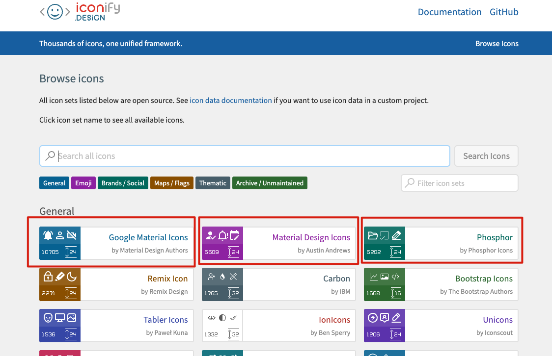
As shown in the figure above, the red circle is the icon set. Take the first Google Material Icons for example, there are 1w + icons under this icon set.
We click this icon set and select an icon:
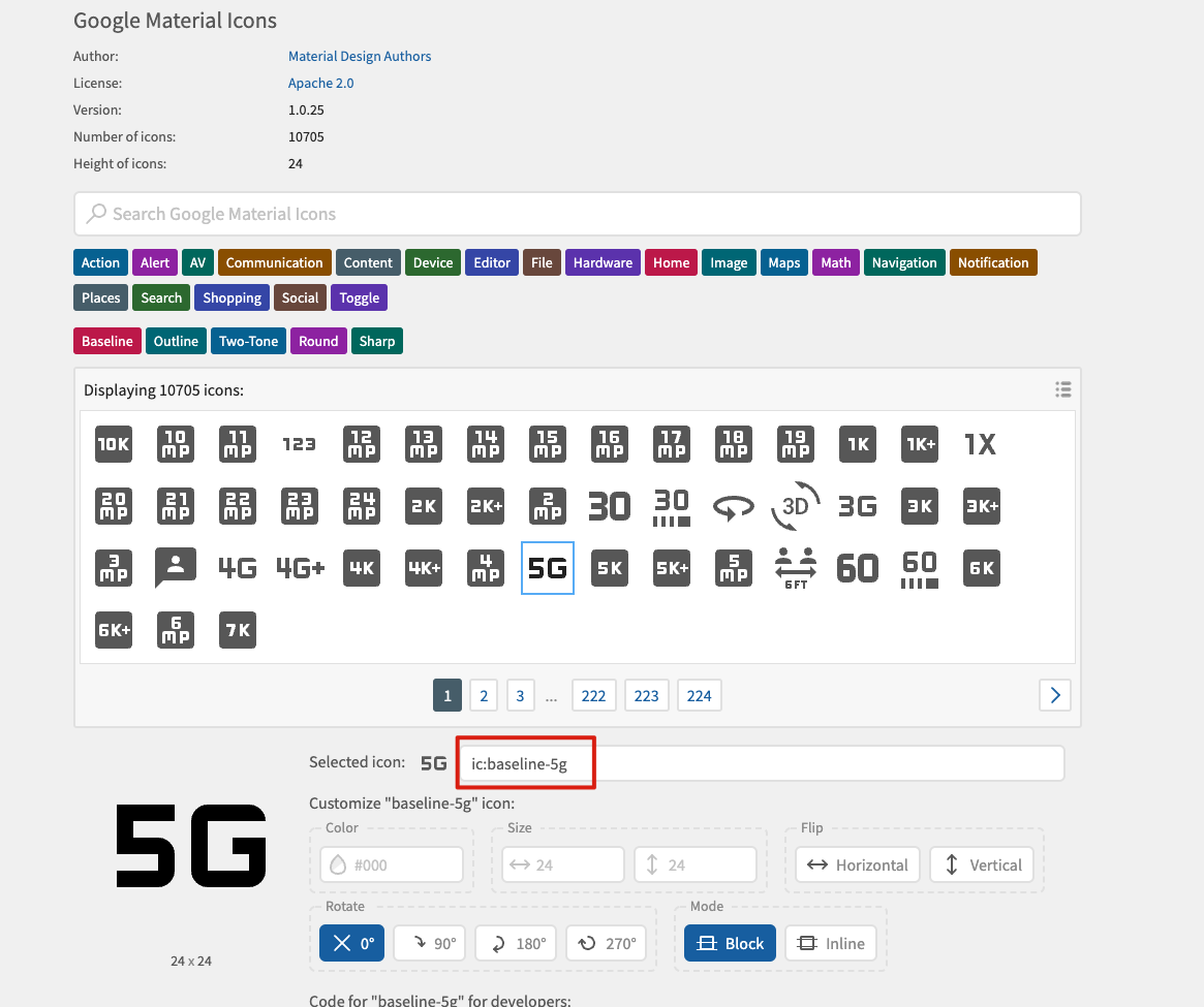
We selected the icon 5G, as shown in the red circle in the figure above. The full name of the icon is ic:baseline-5g, where ic is the name of the icon set and baseline-5g is the name of the icon. We need to know this first.
After understanding the relevant knowledge of iconify icon library, let's use it with plug-ins. Since we want to use it, we must install it. The plugin icons plug-in supports three ways to install this icon library. Let's look at it in turn.
Manually install Icon Library
The first is to manually install the icon library, such as the name, and directly install the entire iconify library. This library is about 120MB in size. Of course, you don't need to worry. In the production environment, only the icons you use will be packaged.
npm i -D @iconify/json
Copy code
Manually install icon set
Although the plug-in will only package the icons you use in the production environment, the 120MB installation is still too slow. Therefore, the second installation method is to manually install the Icon set. Because there are too many icons, sometimes we only need to use the Icon of one Icon set. In this case, we can only install the Icon set we use.
npm i -D @iconify-json/xxx
Copy code
With the above command, we only need to select the icon set to be used and replace xxx with the name of the icon set. You can view the name of the icon set on the official website of the icon library in the way we said above.
Auto install icon set
Installing icon set is also very tired? It doesn't matter. The plug-in also supports automatic installation of icon sets. It's very simple. Just add a line of code to the configuration.
// vue.config.js
const Icons = require('unplugin-icons/webpack')
module.exports = {
  configureWebpack: {
    plugins: [
      Icons({
        compiler: 'vue3',
        // Automatic installation
        autoInstall: true
      }),
    ],
  }
}
Copy code
As mentioned above, it is ok as long as we pass in the autoInstall attribute as true in the configuration, and the plug-in will automatically download the icon set when it detects that we have introduced an icon, which is much easier.
Needless to think, everyone should use automatic installation.
Use icon library
Let's take a look at how to use icons in an icon library in a project. Take the 5G icon above as an example. Its icon set is ic, and the icon name is baseline-5g, which is used as follows:
<template>
  <IconBaseline5g />
</template>

<script setup>
import IconBaseline5g from '~icons/ic/baseline-5g'
</script>
Copy code
Yes, it's that simple. If we configure automatic installation, the plug-in will detect and automatically install the ic icon set through the package management tool when we finish writing and saving the above code.
As like as two peas, we found that the Icon is exactly the same as ElementPlus. Can we also use ElementPlus's ElIcon component?
The answer is, of course:
<template>
  <el-icon size="22" color="#000">
    <IconBaseline5g />
  </el-icon>
</template>

<script setup>
import IconBaseline5g from '~icons/ic/baseline-5g'
</script>
Copy code
Well, it's kind of interesting.
Custom SVG Icon
Finally, there are our customized icons. Although iconify provides a lot of icon libraries, and there are some in ElementPlus, sometimes UI designers don't play cards according to the routine and have to design their own. Of course, there's no problem. You can directly ask the designer to export an SVG file to you.
Taking Vue3 + VueCLI as an example, let's make some preparations. First, add a new SVG / directory (defined according to your preferences) in the src/assets directory. We can create different folders under SVG / according to the module. These folders are used to store our customized SVG icon files.
src/assets/svg/home/jihua.svg
src/assets/svg/about/kefu.svg
Copy code
Above are the two icons I built. Next, let's configure the loading of custom icons.
There is a customCollections attribute in the unplugin icons plug-in, which is used to load custom icons. However, since we need to import SVG files, we also need a loader for SVG file parsing. This plug-in also takes this into account. There is this loader under the unplugin icons plug-in package, which we can directly import and use, as follows:
// vue.config.js
const Icons = require('unplugin-icons/webpack')
// Import loader
const { FileSystemIconLoader } = require('unplugin-icons/loaders')
module.exports = {
  configureWebpack: {
    plugins: [
      Icons({
        compiler: 'vue3',
        autoInstall: true,
        // Custom icon loading
        customCollections: {
          // home icon set
          // Set the fill="currentColor" attribute to the svg file to make the color of the icon adaptive
          home: FileSystemIconLoader('src/assets/svg/home', svg => svg.replace(/^<svg /, '<svg fill="currentColor" ')),
	  // about icon set
          about: FileSystemIconLoader('src/assets/svg/about', svg => svg.replace(/^<svg /, '<svg fill="currentColor" ')),
        },
      }),
    ],
  }
}
Copy code
As mentioned above, we take each folder under the svg / directory as a module, and the files under it can be parsed by loader, and then they can be used happily:
<template>
  <el-icon size="22" color="#000"><IconBaseline5g /></el-icon>
  <el-icon size="22" color="#000"><IconHomeJiHua /></el-icon>
  <el-icon size="22" color="#000"><IconAboutKeFu /></el-icon>
</template>

<script setup>
// iconify Icon
import IconBaseline5g from '~icons/ic/baseline-5g';
// Custom icon
import IconHomeJiHua from '~icons/home/jihua';
import IconAboutKeFu from '~icons/about/kefu';
</script>
Copy code
So far, there is only one way to use the icon of the whole project. You can use it and quote it, nice!
Wait, you think it's over? No!
It needs to be introduced when using, which is really troublesome.. Is there any way to introduce it automatically, and we can use it wherever we want?
Sure. Let's go on.
Automatic introduction
If we want to achieve automatic introduction, we also need the cooperation of a plug-in, which is also written by antFu boss unplugin-vue-components plug-in unit.
I have to say that antFu is really the first brother of Vue3 ecological wheel!!!
The function of this plug-in is to provide Vue with the function of automatically introducing components. It supports Vue2 and Vue3 out of the box, components and instructions, as well as Vite, Webpack, VueCLI, Rollup and ESbuild. Most importantly, it fits perfectly with unplugin icons.
Install plug-ins
The first is installation:
npm i unplugin-vue-components -D
Copy code
Using plug-ins
The next step is to use or follow the Vue3 + VueCLI environment. Other environments can view the documents by themselves. In fact, it is just to import the package of another environment.
Let's use the plug-in first. The configuration is as follows:
// vue.config.js
const Icons = require('unplugin-icons/webpack')
const { FileSystemIconLoader } = require('unplugin-icons/loaders')
// Import auto import plug-in
const Components = require('unplugin-vue-components/webpack')
module.exports = {
  configureWebpack: {
    plugins: [
      // Using auto import plug-ins
      Components({ /** options **/ }),
      Icons({
        compiler: 'vue3',
        autoInstall: true,
        customCollections: {
          home: FileSystemIconLoader('src/assets/svg/home', svg => svg.replace(/^<svg /, '<svg fill="currentColor" ')),
          about: FileSystemIconLoader('src/assets/svg/about', svg => svg.replace(/^<svg /, '<svg fill="currentColor" ')),
        },
      }),
    ],
  }
}
Copy code
As mentioned above, after we use the plug-in, we don't need to introduce the custom components in the project.
Write an example. For example, we write a HelloWord component anywhere in the src / directory, and then find a place to use it directly:
<template>
  <div>
    <HelloWorld msg="Hello Vue 3.0 + Vite" />
  </div>
</template>

<script>
// There is no need to introduce HelloWorld components
</script>
Copy code
As above, using this component in a page component as usual, it will import components on demand, and there is no need to import and register components. The plug-in will automatically parse the above code into the following when compiling:
<template>
  <div>
    <HelloWorld msg="Hello Vue 3.0 + Vite" />
  </div>
</template>

<script>
import HelloWorld from './src/xxxxxxxxx/HelloWorld.vue'

export default {
  components: {
    HelloWorld
  }
}
</script>
Copy code
Of course, this is limited to our own components written in the project (it is also supported in the case of asynchronous registration of parent components or delayed routing, and the automatically imported components will be split together with their parent components).
The automatic import resolution of components in the project is built-in in the plug-in, but for the icon component above, since it is an externally imported component, we need to configure its unique parser. The unplugin icons plug-in provides us with an unplugin icons / resolver package, which is used to handle the automatic import resolution related to Icon, We call it icon auto import parser. In fact, the implementation is very simple. See the following custom auto import for details.
Then we configure as follows:
// vue.config.js
const Icons = require('unplugin-icons/webpack')
const { FileSystemIconLoader } = require('unplugin-icons/loaders')
// Introduction of Icon and automatic introduction of parser
const IconsResolver = require('unplugin-icons/resolver')
// Import auto import plug-in
const Components = require('unplugin-vue-components/webpack')
module.exports = {
  configureWebpack: {
    plugins: [
      // Using auto import plug-ins
      Components({
	// Configure parser
        resolvers: [
	  // Icon automatically introduces the parser
          IconsResolver({
	    // The uniform prefix of Icon components automatically introduced is i by default, and false is set to no prefix required
            prefix: 'icon',
            // When the icon set name is too long, you can use the set alias
            alias: {
              system: 'system-uicons'
            }
          })
        ]
      }),
      Icons({
        compiler: 'vue3',
        autoInstall: true,
        customCollections: {
          home: FileSystemIconLoader('src/assets/svg/home', svg => svg.replace(/^<svg /, '<svg fill="currentColor" ')),
          about: FileSystemIconLoader('src/assets/svg/about', svg => svg.replace(/^<svg /, '<svg fill="currentColor" ')),
        },
      }),
    ],
  }
}
Copy code
OK, after starting the project, we can directly use the Icon component without introducing it. Note that when using the Icon component parser, we must follow the name conversion to correctly infer the Icon, that is, if we want to automatically introduce the Icon component, we must write the component name in the following format:
// Prefix - prefix, which is i by default. We configured icon above, that is, the component name starts with icon
// collection - icon set name
// Icon - icon name
{prefix}-{collection}-{icon}

// Of course, the big hump can also be used. The following is the big hump, because it looks good
Copy code
Let's first take a look at the case when there is no automatic import:
<template>
  <el-icon size="22" color="#000"><IconBaseline5g /></el-icon>
  <el-icon size="22" color="#000"><IconSystemUiconsBell /></el-icon>
  <el-icon size="22" color="#000"><IconHomeJiHua /></el-icon>
  <el-icon size="22" color="#000"><IconAboutKeFu /></el-icon>
</template>

<script setup>
// iconify icon, icon set ic
import IconBaseline5g from '~icons/ic/baseline-5g';
// iconify icon, icon set system uicons
import IconSystemUiconsBell from '~icons/system-uicons/bell';
// Custom icon
import IconHomeJiHua from '~icons/home/jihua';
import IconAboutKeFu from '~icons/about/kefu';
</script>
Copy code
Let's take another look at the case of automatic introduction (note that the alias system is configured in the icon set of iconify, and the bell icon in this icon set is loaded below):
<template>
  <el-icon size="22" color="#000"><IconBaseline5g /></el-icon>
  <!-- IconSystemUiconsBell -> IconSystemBell -->
  <el-icon size="22" color="#000"><IconSystemBell /></el-icon>
  <el-icon size="22" color="#000"><IconHomeJiHua /></el-icon>
  <el-icon size="22" color="#000"><IconAboutKeFu /></el-icon>
</template>
<script setup>
// There is no need to manually introduce icon components
</script>
Copy code
Is it very concise!!!
Custom icon auto import
If you write a demo according to the above configuration while reading the article, you can certainly find that the two customized icons are not loaded when they are automatically introduced..
This is because the customized Icon set needs to be imported automatically. You need to use the customCollections attribute to mark the module name of the customized Icon set in the configuration of Icon automatic import resolver.
We used two custom icon sets above, so we can pass in the names of the two custom icon sets so that the automatic import plug-in can recognize and parse them:
// vue.config.js
const Icons = require('unplugin-icons/webpack')
const { FileSystemIconLoader } = require('unplugin-icons/loaders')
const IconsResolver = require('unplugin-icons/resolver')
const Components = require('unplugin-vue-components/webpack')
module.exports = {
  configureWebpack: {
    plugins: [
      Components({
        resolvers: [
          IconsResolver({
            prefix: 'icon',
            alias: {
              system: 'system-uicons'
            },
            // Identify custom icon sets
            customCollections: ['home', 'about']
          })
        ]
      }),
      Icons({
        compiler: 'vue3',
        autoInstall: true,
        customCollections: {
          home: FileSystemIconLoader('src/assets/svg/home', svg => svg.replace(/^<svg /, '<svg fill="currentColor" ')),
          about: FileSystemIconLoader('src/assets/svg/about', svg => svg.replace(/^<svg /, '<svg fill="currentColor" ')),
        },
      }),
    ],
  }
}
Copy code
As above, run the project again and you can see that the four icons have been completely displayed!
Some other uses of automatic introduction
Now that we have all the automatic plug-ins, do we still need to manually import the component library on demand???
For example, when using ElementPlus, we all know that it can be used in two ways:
- Global import
- On demand import
Generally, we choose to import on demand, but import on demand requires us to import the corresponding components separately every time we use it, which is very troublesome. Then, with the automatic introduction of plug-ins, this will become extremely simple.
In fact, several parsers are directly built into the auto import plug-in for popular UI libraries such as Vuetify, Ant Design Vue and ElementPlus. We don't even need a handwriting parser to use it seamlessly.
Take ElementPlus as an example:
// vue.config.js
const Icons = require('unplugin-icons/webpack')
const { FileSystemIconLoader } = require('unplugin-icons/loaders')
const IconsResolver = require('unplugin-icons/resolver')
const Components = require('unplugin-vue-components/webpack')
// Introducing ElementPlus automatic parser
const { ElementPlusResolver } = require('unplugin-vue-components/resolvers')
module.exports = {
  configureWebpack: {
    plugins: [
      Components({
        resolvers: [
          IconsResolver({
            prefix: 'icon',
            alias: {
              system: 'system-uicons'
            },
            customCollections: ['home', 'about']
          }),
          // Using ElementPlus to automatically import parsers
          ElementPlusResolver(),
        ]
      }),
      Icons({
        compiler: 'vue3',
        autoInstall: true,
        customCollections: {
          home: FileSystemIconLoader('src/assets/svg/home', svg => svg.replace(/^<svg /, '<svg fill="currentColor" ')),
          about: FileSystemIconLoader('src/assets/svg/about', svg => svg.replace(/^<svg /, '<svg fill="currentColor" ')),
        },
      }),
    ],
  }
}
Copy code
Let's write an example code:
<template>
  <el-button>This is automatically introduced El Button</el-button>
</template>
<script setup>
// There is no need to manually import component library components
</script>
Copy code
As mentioned above, it can be loaded perfectly. There is no need to import the component library globally or on demand. If you want to use it, you can write the component directly!
Customize the scenario of automatically introducing parser
If the company has its own component library, how to import it automatically?
Since the internal component library is also an external component, and there is no parser written for us on the official website, we need to write a parser ourselves!!!
It is also very simple. For example, our component library is named xx UI, the component prefix is xx, and the xx button component is used in the project.
First, we install the component library XX UI:
npm install xx-ui
Copy code
Let's configure the auto import parser of this component library:
Components({
  resolvers: [
    // ...  Other parsers
    // Custom XX UI parser
    (name) => {
      // Name refers to the custom component loaded during project compilation, and the component name of String type large hump format
      // For example: name = XxButton
      // Determine component prefix
      if (name.startsWith('Xx')){
        return {
          // Package name, xxbutton - > button
          importName: name.slice(2),
          // Write the package name directly to the path, because we have installed this package
          path: 'xx-ui'
        }
      }
    }
  ]
})
Copy code
In this way, when using:
<template>
  <xx-button></xx-button>
</template>
<script setup>
// There is no need to import this component library component
<script>
Copy code
The above code will be converted to the following when compiling:
<template>
  <xx-button></xx-button>
</template>
<script setup>
import { Button } from "xx-ui"
<script>
Copy code
Here is just a simple example. There are more interesting ones. For example, as we said above, the plugin Vue components plug-in supports not only components but also instructions. Of course, you need to explore these by yourself!
reflection
See here, do you think this way is more elegant?
There must be better ways to use Icon. If you know, please give me advice in the comment area!!!
The composition API is too fragrant, and the script setup is even more fragrant. Whoever uses it knows that you can't learn Vue3 just by looking at the documents - to you who haven't used Vue3 so far.
It seems that you have all the topics in the next article. Get Vue3 tips you don't know! So hurry up and smell it...
last
If you think this article is a little helpful to you, give it a compliment. Or you can join my development exchange group: 1025263163 learn from each other, and we will have professional technical Q & A to solve doubts
If you think this article is useful to you, please click star: http://github.crmeb.net/u/defu Thank you very much!
PHP learning manual: https://doc.crmeb.com
Technical exchange forum: https://q.crmeb.com