CSS definition and precautions
CSS
-Understand-
Cascading Style Sheets
matters needing attention
-
Each CSS style consists of two parts: selector and declaration
-
The declaration consists of two parts: attribute and attribute value
-
The declaration must be placed in curly braces {} (internal style and external style), and the attribute and attribute value are connected with: `
-
For each statement; end
-
When an attribute has multiple attribute values, each attribute value is separated by a space
-
Spaces and line breaks do not affect the effect
Selector{
    attribute:Attribute value;
    attribute:Attribute value;
}
CSS introduction method
Inline style
<div style="width:200px;height:200px">content</div>
The inline style is written in the style attribute in the html tag
Internal style
<head>
    <style>
        div{
            width:200px;
            height:200px;
        }
    </style>
</head>
The internal style is written in the head tag and wrapped with the style tag
One of the external styles
<head>
    <link rel="stylesheet" type="text/css" href="mystyle.css">
</head>
The external style is to use the link tag in the head tag to link the external CSS file
External style II
-Understand-
<head>
    <style>
        @import url(mystyle.css);
    </style>
</head>
Importing css files using @ import
Comparison between link and import
Link is an html tag and import is provided by CSS. When the page is loaded, link will be loaded together with the page, and import will be loaded after the page is loaded. This will cause the page to have no style at the beginning of loading, which will cause the page to flicker BUG. At the same time, the compatibility of import is not as good as link
Priority value of style
According to the principle of proximity, in line style > internal style > external style
However, when using the important keyword, the priority value is the highest
CSS selector
-Key points-
tag chooser
<style>
        div{
            width:200px;
            height:200px;
        }
</style>
Use html tags directly
Class selector
<head>
    <style>
        .box{
            width:200px;
            height:200px;
        }
    </style>
</head>
<body>
    <div class="box"></div>
</body>
- Define the attribute class in the html tag and name it with = (assuming className)
- If there are multiple classnames in html, you can connect them with spaces
- Use in style className reference
- When there are duplicate attributes in multiple classes and the weights are the same, the final result takes the attribute value of the attribute of the last class
- The same class can act on multiple html tags
id selector
<head>
    <style>
        #box{
            width:200px;
            height:200px;
        }
    </style>
</head>
<body>
    <div id="box"></div>
</body>
- Define the attribute id in the html tag and name it with = (assuming idName)
- An html tag can only have one id
- Using #idName references in style
- The same id can act on multiple html tags, but it is strongly not recommended, because most of the functions of id are used for JaveScript calls and need to be unique
Wildcard selector
<head>
    <style>
        *{
            padding:0;
            margin:0;
        }
    </style>
</head>
Use * to refer to all tag elements, which are generally used for initialization. Remove the self-contained styles of all tags, which is helpful to customize CSS styles
Group selector
<head>
    <style>
        div,.className,#idName{
            padding:0;
            margin:0;
        }
    </style>
</head>
Group selector is just a way of writing. It is a way of splicing all kinds of selectors. It is not a real selector
When some label styles are the same, the common styles of these labels can be extracted and spliced with their respective selectors (label selector, class selector or id selector, etc.) to act together
Level selector
<div>
        <p class="p1">
            <h3>
                <p class="p2"></p>
            </h3>
        </p>
        <p class="p3">ha-ha</p>
</div>
- html is hierarchical
- All tags inside div are descendants of Div. similarly, h3 and class="p2" are descendants of div and p tag of class="p1"
- class="p1" and class="p3" are brothers
- class="p1" and class="p3" are the descendants of div
Descendant Selectors
<head>
    <style>
        div .className #idName {/ * select the tag with class as className and internal id as idName in div tag*/
            padding:0;
            margin:0;
        }
        div p{ /*Select all the p tags under the div tag without limiting the number of levels*/
            background:red
        }
    </style>
</head>
<body>
    <div>
        <p class="className">
            <h3>
                <p id="idName"></p>
            </h3>
        </p>
    </div>
</body>
- When there is a hierarchical relationship between html tags, we generally call the inner tag the descendant of the outer tag
- Offspring can be separated by multiple generations, not next to each other, unlike offspring selectors
- Tag selector, class selector and id selector can be mixed
- When there are labels that are difficult to distinguish but specific labels have to be specified, the descendant selector can be used when acting on the style, and spaces can be used to connect according to the hierarchical relationship
principle
When the descendant selector is running, it is now looking for qualified external objects internally
For example, in the example, first find the tag whose id is idName, and then find the tag whose class is className externally, and then find the div tag on the outside that meets these conditions
Progeny selector
<head>
    <style>
        div>p{ /*Select the first level p label under the div label, and the class is p1
        Labels for and p3*/
            background:red
        }
    </style>
</head>
<body>
    <div>
        <p class="p1">
            <h3>
                <p class="p2"></p>
            </h3>
        </p>
        <p class="p3">ha-ha</p>
    </div>
</body>
- Choose a son (first level)
- Splice with > sign
First brother selector
<head>
    <style>
        .p0+p{ /*Select the tag of class=p0, and its brothers will follow it
        First element of face*/
            background:red
        }
    </style>
</head>
<body>
    <div>
        <p class="p0">Roar</p>
        <span>hey</span>
        <p class="p1">
            <h3>
                <p class="p2"></p>
            </h3>
        </p>
        <p class="p3">ha-ha</p>
        <p class="p4">Hee hee</p>
    </div>
</body>
- The choice is to follow their first brother tag, not including themselves
- If the first label immediately following you is not the specified label, the style is invalid. For example, the first brother of class="p0" in the example is span, which is not the specified p label, so the style is invalid
All sibling selectors
<head>
    <style>
        .p0~p{ /*Select the tag with class=p0, and all its siblings are the elements with p tag*/
            background:red
        }
    </style>
</head>
<body>
    <div>
        <p class="p0">Roar</p>
        <span>hey</span>
        <p class="p1">
            <h3>
                <p class="p2"></p>
            </h3>
        </p>
        <p class="p3">ha-ha</p>
        <p class="p4">Hee hee</p>
    </div>
</body>
- The selected is all the sibling elements behind you, and the specified label does not contain you
- In the example, all the siblings of class="p0" are selected as p-labeled elements, not including themselves and span tags
attribute selectors
<head>
    <style>
        div{
            width: 100%;
            height: 50px;
        }
        [class]{ /*It means that only those with class attribute are allowed */
            background-color: red;
        }
        [class][id]{/*Represents a with both class and id attributes */
            background-color: darkcyan;
        }
        div[class]{ /*Represents a div with a class attribute */
            background-color: rosybrown;
        }
        div [class]{ /*Indicates that the descendant of the div tag has the class attribute */
            background-color: yellow;
        }
        div[class="box2"]{ /*Exactly matched, div with only one class and box2 class
            ,Equivalent to div.box2*/
            background-color: darkorange;
        }
        div[class~="box2"] {/*As long as you have a div with class box2*/
            background-color: darkorchid;
        }
        [class^=b] { /*className Label elements starting with b*/
            background-color: black;
        }
        [class$=b] { /*className Tag element ending with b*/
            background-color: black;
        }
        [class*=b] { /*className Label element containing b in*/
            background-color: black;
        }

    </style>
</head>
<body>
    <p class="p1"></p>
    <div class="box1">
        <div class="box2">
            <div class=box3></div>
        </div>
        <div id="box6"></div>
        <div class="box2 box4 box5"></div>
    </div>
</body>
- Brackets [] indicate
- Multiple splices, multiple restrictions
- If there is no space, then there is no space on it
- For tags, all attributes are applicable, such as class, id, name, and so on
Pseudo class selector
State pseudo class
<head>
    <style>
        a{
            color:red;
        }
        a:link{ /* Initial state */
            color:yellow;
        }
        a:visited{ /* After visit */
            color: red;
        }
        a:hover{ /* Mouse over or over */
            color:orange;
        }
        a:active{ /* Click activate */
            color:green;
        }
    </style>
</head>
<body>
    <a href="http://www.baidu. Com "> Baidu</a>
</body>
- Writing style: pseudo class
- It is commonly used for < a > tags, but it can also be used for other tags without limitation
- If these four pseudo classes are used, there can be multiple pseudo classes missing a certain live class, but the order cannot be changed
- Generally, after setting the < a > tag's own attributes, only the pseudo class: hover is usually used
Structural pseudo class
<head>
    <style>
        *{
            padding: 0;
            margin: 0;
        }
        .box{
            width: 940px;
            height: 100px;
            margin:0 auto;
            background:yellow;
        }

        .box div{
            float:left;
            width: 300px;
            height: 100px;
            background: red;
            margin-right: 20px;
            border: 1px solid black;
            box-sizing: border-box;
        }
        .box div div{
            width: 50px;
            height: 50px;
            background-color: blueviolet;
        }
        .box div:last-child{ /*Select the last element in the descendant element whose className is box and whose level is div tag*/
            margin-right: 0;
            background-color: aqua;
        }

    </style>
</head>
<body>
        <div class="box">
            <div></div>
            <div></div>
            <div class="box2">
                <div></div>
                <div class="box3"></div>
            </div>
        </div>
</body>
- A way to style through the structure of html element tags
- Used to select a label and does not apply to the parent class
- Search layer by layer. For example, div with class=box2 in the first level will be used as pseudo class, and div with class=box3 in the internal level will be used as pseudo class
Common pseudo class elements
: first child first element
: last child last element
: nth child (n) nth element
: nth child (even) all even elements
: nth child (odd) all odd elements
: only child element with only one child element
: empty no descendant elements and no content (including spaces and line breaks)
Root: select the root directory, which refers to HTML
Pseudo element selector
::after
<head>
    <style>
        p::after {
            content:"- say";
            background-color:yellow;
            color:red;
            font-weight:bold;
        }
    </style>
</head>
<body>
    <p>I am a duck</p>
    <p>I live in Duckburg.</p>
</body>
- Insert content after the content of the selected element
- Use the content attribute to specify the content to insert
::before
<head>
    <style>
        p::before {
            content:"- say";
            background-color:yellow;
            color:red;
            font-weight:bold;
        }
    </style>
</head>
<body>
    <p>I am a duck</p>
    <p>I live in Duckburg.</p>
</body>
- Insert content before the content of the selected element
- Use the content attribute to specify the content to insert
::first-letter
<head>
    <style>
        p:first-letter {
            font-size:200%;
            color:#8A2BE2;
        }
    </style>
</head>
<body>
    <h1>Welcome to My Homepage</h1>
    <p>My name is Donald.</p>
    <p>I live in Duckburg.</p>
    <p>My best friend is Mickey.</p>
</body>
- Select the initial letter of the element label and style it
::first-line
<head>
    <style>
        p:first-line {
            font-size:200%;
            color:#8A2BE2;
        }
    </style>
</head>
<body>
    <h1>Welcome to My Homepage</h1>
    <p>My name is Donald.</p>
    <p>I live in Duckburg.</p>
    <p>My best friend is Mickey.</p>
</body>
- Select and style the first row of the element label
UI element pseudo class selector
E: When enabled is available
E:disabled when disabled
E: When checked is selected
E: The part that is selected or highlighted
E:fouse when getting focus
- To put it bluntly, when a tag is in what state, what do we want it to do
- Commonly used in form
- Generally, appearance:none is used to remove the default style. For example, when type=checkbox, it will be affected by the default style and the custom style will be overwritten
Negative selector
<head>
    <style>
        :not(p) { /*Other than p tag*/
            background-color: #ff0000;
        }
    </style>
</head>
<body>
    <h1>Welcome to My Homepage</h1>
    <p>My name is Donald.</p>
    <p>I live in Duckburg.</p>
    <p>My best friend is Mickey.</p>
</body>
- Writing method: not(s), s refers to the attribute / class / id / element label to be denied, etc
Weight of selector
Generally, the weight of the selector is represented by four digit 0
Element selector 0 1
Class selector 0 0 1 0
id selector 0 1 0 0
Inline style 1 0
Sum of offspring selector weights
!important 1 0 0 0 0
- In case of style conflict, the one with high weight covers the one with low weight
- When the weight is the same, the principle of proximity shall be followed
attribute
Text properties
Font size text size
Default 16px
Font family font
Multiple fonts are separated by commas
Color font color
Font weight bold
bolder | blod | normal | lighter
100 (thin) | 400 | 700 (BOLD)
Font style tilt
italic | normal
Text align align text horizontally
left | right | center | justify
Line height
The text is vertically centered, and the row height is set to the height of the wrapper, which is used for single line
Letter spacing character spacing
Words and characters, letters and letters
Word spacing
For word letters
Text indent first line indent
It is generally set as em unit, which is used as the multiple relationship of font size. In this way, this attribute does not need to be changed when changing font size
Text decoration
none is generally used to remove the underline of < a > labels
underline | overline | line through
Text transform English case conversion
capitalize | lowercase | uppercase
Text shadow text shadow
Horizontal vertical blur shadow color
Shadows can have multiple directions, with different directions separated by commas
<style>
       div{
           text-shadow: 0px -10px 1px red, 0px 10px 1px yellow;
           /* text-shadow: 0px 10px 1px yellow; */
       }

</style>
font text attribute compound writing method
font-style font-weight font-size/line-height font-family
The order cannot be changed. Font size and font family must be specified, and other attributes can be omitted. These two attributes cannot be omitted
List properties
List style type list style
disc | circle | square | none
List style image sets the picture as a list style
List style image: URL (path)
List style position
outside | inside
Rarely used
List style compound writing
type image position in random order
Common none, clear all styles
Background properties
Background color
Background image: URL () background image
Background repeat tiling effect
Repeat (default) | repeat-x | repeat-y | none repeat
Background position
It is generally used when setting background image: url()
Four values can be set, top left and bottom right
You can use pixels | percentage | English words
Commonly used x-axis: left center right | y-axis: top center bottom
It is necessary to set the width and height, otherwise it will be invalid
Background size background size
Pixel | percentage | cover (equal scale enlargement or reduction, covering the whole element, but cutting the picture) | contain (equal scale enlargement, covering the elements with the whole picture as the boundary, but there may be elements that will not be covered)
Background attachment fixed background image
scroll | fixed (fixed in the browser window, separated from the parent class relative to the browser window)
After setting the background image, the parent class changes the position through positioning and other methods. At this time, the background image is not displayed. Because the position of the parent class changes, the position of the outer frame carrying the image changes. The image is in the original position and is not carried as the parent class, so it is similar to hiding
<style>
       .box{
          height: 300px;
          width: 300px;
          background-color: yellow;
          background-image: url(img/0.jpg);
          background-repeat: no-repeat;
          background-attachment: fixed;
          margin:0 auto;
       }
</style>
For example, margin:0 auto changes the position of the parent container, and the picture is not displayed
background compound writing
Background size can only be written separately and cannot be used in compound writing
Other attributes are in random order and missing at will
float
<head>
    <style>
        p {
            width:200px;
            height:200px;
            background-color: #ff0000;
            float:left;
        }
    </style>
</head>
<body>
    <h1>Welcome to My Homepage</h1>
    <p>My name is Donald.</p>
    <p>I live in Duckburg.</p>
    <p>My best friend is Mickey.</p>
</body>
float:left | right |none
- Enables elements that are exclusive to one line to be displayed on one line
- Floating will break away from the document flow
- After floating, the text in the element will have the effect of text wrapping
Clear float
- Define the same height for the parent class of the floating element
- Use clear for the siblings of the parent class of the floating element
- Add an empty brother to the floating element and use clear
- Use overflow:hidden for the parent class of a floating element
- Universal clear float
-
<style>
    div::after{
          content: "";
          clear: both;
          display: block;
          width: 0;
          height: 0;
          visibility: hidden;
      }
</style>
clear:none | left | right | both
Box model
The width and height of the box consists of three parts
Box width and height = content width and height + inner margin + border width
padding
The distance between the padding content and the border. Negative values are not supported
padding-top/-right/-bottom/-left
When one value, the four sides are the same
Two values, up / down / left / right
Three values, up / left / right / down
Four values, up / right / down / left (clockwise)
frame
Border border
Border width
Same on all sides | up and down / left and right | up / left and right / down | up, right, down and left
Border style border style
solid | double | dashed | dotted
Border color border color
Border radius border fillet
It supports the independent setting of four directions, first vertical and then horizontal
border-top-left-radius | border-top-right-radius | border-bottom-left-radius | border-bottom-right-radius
Support multi value writing
At one value, the four angular radians are the same
When there are two values, top left and bottom right | top right and bottom left
For three values, top left | top right | bottom left | bottom right
Four values, top left | top right | bottom right | bottom left (clockwise)
It supports setting the length horizontally and vertically to produce radians
Only border radius is supported
Writing method: horizontal / vertical
Set different values for multiple angles
h1 h2 h3 h4/v1 v2 v3 v4
Turn the box into a circle
- height=width, i.e. square
- border-radius:50%;
Compound border:width style color
If border is set to null, it is 0, not none
Margin
The distance between the margin box and other elements can be negative
margin:0 auto centers the screen horizontally
margin-top/-right/-bottom/-left
When one value, the four sides are the same
Two values, up / down / left / right
Three values, up / left / right / down
Four values, up / right / down / left (clockwise)
Outer distance characteristic
Brother box
In the vertical direction, if one sets the lower margin and the other sets the upper margin, the larger margin between the two boxes shall prevail. If it is horizontal, it is the combination of the two margins
Parent and child classes
When setting margin top for a subclass, the effect will be generated on the parent class
Solution
- Abandon the margin top of the subclass and adopt the margin top of the parent class
- Set the border of the parent class
- Floating can be generated for both subclasses and superclasses
- Use overflow:hidden for parent class
img tag properties
< img > is an inline block element. Both the initialization margin and padding are set to 0, which has no effect on this label. When it is matched with other labels, it will produce spacing. Use display: block to convert it into a block element.
box-sizing
Under normal circumstances, if you add padding or border after setting the width and height of the box, you need to recalculate the width and height of the content, otherwise the total width and height of the box will change
Center box: by default, the width and height need to be recalculated
Border box: allows padding and border to be included in the existing width and height without recalculation
Inherit: inherit the parent class
Box shadow
box-shadow
h-shadow: must be the shadow position in the horizontal direction
v-shadow: the shadow position must be vertical
Blur: optional, blur distance
spread: optional, shadow size
Color: optional, shadow color
inset: optional, Inner Shadow
Overflow attribute
How does overflow solve the content of overflow boundary
visible: by default, overflow content will be displayed outside the element
hidden: overflow content hiding
Scroll: the overflow content produces a scroll bar
auto: if there is overflow, a scroll bar will be generated, and if there is no overflow, it will be displayed normally
free space
White space specifies how text is displayed
normal: default
nowarp: the text does not break into lines. You know that you encounter < br >
Pre: pre format, display spaces, enter, no line breaks
Pre warp: pre format, display spaces, enter, and wrap
Pre line: displays enter, no spaces, and line breaks
Display ellipsis for extra text
 <style>
        div{
            background:yellow;
            width: 200px;
            height: 200px;
            white-space: nowrap;
            overflow: hidden;
            text-overflow: ellipsis;
        }
</style>
- Width must be set
- Must be white space: nowrap
- Must overflow:hidden
- Text overflow: ellipsis | clip
Element type conversion
display
Block: block element
Inline: inline element
Inline block: inline block element
none: hide
location
position
Generally, the principle of "the son is independent of the father" is used, that is, the absolute positioning of the child and the relative positioning of the parent
static: default
Absolute: absolute positioning
Detach from document flow
When there is no parent element or the parent element is not located, the reference is the first screen of the browser
There is a parent element and a location (generally relative), and the reference is the parent element
Will turn inline elements into block elements
Relative: relative positioning
Relative to their original position changes, the original position remains occupied
Do not break away from document flow
Fixed: fixed positioning
Browser's current window
Detach from document flow
Sticky: sticky positioning
Ceiling effect, but the compatibility is not good, so it is not recommended
Use top | right | bottom | left to generate the position
z-index
When position is set, the last written is on the top layer by default
Change the hierarchical relationship and use z-index. The higher the value, the higher the value
Without position, z-index is meaningless
Use position to set the triangle
<style>
    span{
            width: 0;
            height: 0;
            display: inline-block;
            border:5px solid transparent;
            border-top:5px solid black;
            position: relative;
            top:2.5px;
        }
</style>
Horizontal vertical center
<style>
      /*Son Jue father phase*/
      .box{
          position:relative;
      }
      .box div{
          position:absolute;
          top:50%;
          right:50%;
          margin-left:-width/2;
          margin-top:-height/2;
      }
</style>
- For browsers, you do not need to set relative positioning
- The absolute parent phase of a child is the position in the parent class relative to the child class
Positioning on floating difference
- Floating is semi detached from the document flow, which will produce a text wrapping effect
- Absolute positioning is completely separated from the document flow
Inline element chunk element
- display:block
- position:absolute
- float
transparency
opacity
0: transparent, 1: opaque
Hide scroll bar
<style>
    ::-webkit-scrollbar {
            display: none;
    }
</style>
Anchor point
Use the < a > tag to jump to different areas of the page
<ul>
    <li>
        <a href="#a">A page</a>
    </li>
    <li>
        <a href="#b">B page</a>
    </li>
    <li>
        <a href="#c">C page</a>
    </li>
    <li>
        <a href="#d">D page</a>
    </li>
</ul>

<div id="a">
    a page
</div>
<div id="b">
    b page
</div>
<div id="c">
    c page
</div>
<div id="d">
    d page
</div>
- Associate the href attribute of the < a > tag through the id of a region
Width adaptation
Applicable block elements
<style>
        *{
            margin:0;
            padding:0;
        }
        div{
            width: auto; /*Not writing or auto is adaptive*/
            height: 100px;
            padding-left: 100px;
            background:yellow;
        }
</style>
Highly adaptive
- If the parent class height is not set, it is supported by the content
- Min height is usually set to ensure the rationality and aesthetics of the basic layout
Hide attributes
- display: none does not occupy the space to hide
- visibility:hidden
Font introduction
<style>
        @font-face{
            font-family: fontName;
            src:url(font/ygyxsziti2.0.ttf);
        }
        div{
            font-family: fontName;
            font-size: 50px;
            color:red;
            text-shadow: 5px 0px 0px green;
        }
    </style>
- Customize foneName and font path
- Use font family to reference custom fontName
Window adaptation
Commonly used in mobile terminal
<head>
    <style>
        *{
            margin:0;
            padding: 0;
        }
        html,body{
            height: 100%;
        }
        .box{
            width: 100%;
            height: 100%;
        }
        .child1{
            background:blue;
            height: 50%;
        }
        .child2{
            background:red;
            height: 50%;
        }
    </style>
</head>
<body>
    <div class="box">
        <div class="child1"></div>
        <div class="child2"></div>
    </div>
</body>
- html,body { height: 100%; }
- Element {width: 100%; height: 100%;}
Dynamic calculation function - calc()
width:calc(100% - 20px);
Support + - * /, follow operation priority
Elastic box
Applicable to mobile terminal layout
Set display:flex for parent class
<head>
    <style>
        .box{
            width: 500px;
            height: 500px;
            border:2px solid black;
            margin:100px auto;
            display: flex;/* Elastic box */
        }
        .box span{
            width: 100px;
            height: 100px;
            border:1px dashed red;
            margin:auto;
        }
    </style>
</head>
<body>
    <div class="box">
        <span>1111</span>
        <span>2222</span>
        <span>3333</span>
        <span>4444</span>
    </div>
</body>
- Child elements are arranged horizontally by default
- Inline elements become block level elements
- When there is only one element, margin:auto is automatically centered
Elastic box shaft
By default, the horizontal right is the main axis and the vertical down is the side axis
Change elastic box spindle
flex-direction
Row landscape | row reverse landscape
Column vertical | column reverse vertical reverse
Container and item definitions
The elastic box is called a container, and the internal elements are called items
Elastic container
Spindle alignment
justify-content
Flex start: close to the start position of the spindle
Flex end: position near the end of the spindle
center: spindle centered
After the elastic distance between the two ends of the main axis of the item, align it evenly with the end of the main axis
Space around: the distance between the start and end of the main axis is divided equally. The elastic items are evenly distributed on the line, with half of the space left on both sides, and the margins on both sides are half of the margins of the two items
Side axis alignment
align-item
Flex start: close to the cross start position of the side axis
Flex end: near the end of the side shaft
Center: near center
basekine: aligns to the text centerline (baseline) in the project
stretch: the default value. When height is not set, the side axis is filled and stretched by default, and the limit of min / max width / height attribute will be followed
Elastic box folding
By default, too many items will squeeze each other
flex-warp:warp; Generate line break
Row spacing
align-content
Flex start: position starting from the side axis
Flex end: from the end position of the side shaft
center: the side axis is centered
Space between: the two ends are aligned, the first and last items of the side shaft are close to the edge of the container, and then the distance is bisected
Space around: the two ends of the side shaft also divide the distance equally between the edges of the container. Half of the space is reserved on both sides, and the margins on both sides are half of the margins of the two projects
Elastic project
Alignment on side axis
align-self
Flex start: close to the cross start position of the side axis
Flex end: near the end of the side shaft
Center: near center
basekine: aligns to the text centerline (baseline) in the project
stretch: the default value. When height is not set, the side axis is filled and stretched by default, and the limit of min / max width / height attribute will be followed
Adjust project order
order
Default 0
Use integer values to define the arrangement order, and the ones with small values are in the front. Can be negative
Remaining space
flex
Numerical type
- When there are multiple items, such as box1, box2, box3
- Box1, box2 set width or height, box3 set flex any value, box1 and 2 are affected by width and height, and box3 takes up the remaining space
- When width or height are both set, but flex is set at the same time, width or height will be invalid, and all spaces will be allocated proportionally according to their respective flex values
Squeeze space
flex-shrink
Numerical type
Shrinkage extrusion occurs only when the total width of the item exceeds the width of the container
1 is the default value, and the extruded items meet the container space
0 means no extrusion is allowed, and the scroll bar is displayed if it exceeds the width of the container
For other values, recalculate the width according to the flex shrink value
For example, the width of the container is 400px, and the three sub items are 250px, 150px and 100px respectively. The total width is 250+150+100=500px. The container cannot be put down, and the extra space needs to be absorbed by each sub item according to its own flex shrink. Flex shrink of sub item 1: 1 (not set to 1 by default), flex shrink of sub item 2: 2, flex shrink of sub item 3: 2.
The space to be absorbed by sub item 1 is (250*1)/(250*1+150*2+100*2) * 100 = 33.33px, and the real space of sub item 1 is 250-33.33 = 216.67px. Similarly, the space absorbed by sub item 2 is (150*2)/(250*1+150*2+100*2) * 100=40px, and the real space of sub item 2 is 150-40 = 110px. The space absorbed by sub item 3 is (100*2)/(250*1+150*2+100*2) * 100 = 26.67px, and the real space is 100-26.67=73.33px.
The last multiplied by 100 is the default value
Mobile terminal layout
There are three ways of mobile terminal layout
- percentage
- Elastic box
- rem layout
Mobile terminal mandatory label
<meta name="viewport" content="width=device-width, initial-scale=1.0,user-scalable=no">
viewport
The viewport on the mobile device is the area on the screen of the device that can be used to display our web pages. Specifically, it is the area on the browser (or WebView in an app) that can be used to display web pages. However, the viewport is not limited to the size of the viewable area of the browser. It may be larger than the viewable area of the browser, It may also be smaller than the viewable area of the browser. By default, generally speaking, the viewport on the mobile device is larger than the viewing area of the browser. This is because considering that the resolution of the mobile device is relatively small compared with that of the desktop computer, in order to normally display those websites designed for the desktop browser on the mobile device, Browsers on mobile devices will set their default viewport to 980px or 1024px (or other values, which are determined by the device itself), but the consequence is that the browser will appear a horizontal scroll bar, because the width of the browser's viewing area is smaller than that of the default viewport.
width
Set the width of the layout viewport to a positive integer or the string "width device"
initial-scale
Set the initial scaling value of the page as a number, with decimals
user-scalable
Whether the user is allowed to zoom. The value is "no" or "yes". No means not allowed, and yes means allowed
resolving power
- The mobile pixel in developer mode is CSS pixel, which is the px unit commonly used
- The resolution of the mobile phone is the physical resolution, which is the real pixel of the device
- It is not necessary to write code on the design side of P1x, but on the mobile side
Device pixel ratio
Device pixel ratio (dpr) = physical pixels / CSS pixels
Talking about css pixel and physical pixel
In css, we generally use PX as the unit. In desktop browsers, a pixel of css often corresponds to a physical pixel of the computer screen, which may lead to an illusion that the pixel in css is the physical pixel of the device. But the actual situation is not the case. The pixels in css are just an abstract unit. The physical pixels of devices represented by 1px in css are different in different devices or environments. We don't have to worry about this in web pages designed for desktop browsers, but on mobile devices, we must understand this. In previous mobile devices, the density of screen pixels was relatively low, such as the iPhone 3, which has a resolution of 320x480. On the iPhone 3, a css pixel is indeed equal to a physical pixel of the screen. Later, with the development of technology, the screen pixel density of mobile devices became higher and higher. Starting from iPhone 4, Apple launched the so-called Retina screen. The resolution doubled to 640x960, but the screen size did not change, which means that on the screen of the same size, the pixels doubled. At this time, a css pixel is equal to two physical pixels. The same is true for other brands of mobile devices. For example, Android devices can be divided into different levels such as ldpi, mdpi, hdpi and xhdpi according to the screen pixel density, and the resolution is also varied. How many screen physical pixels are equivalent to a css pixel on Android devices also varies according to different devices, and there is no final conclusion.
Another factor that can also cause PX changes in css is user scaling. For example, when the user doubles the page size, the physical pixels represented by 1px in css will also double; Conversely, if you double the size of the page, the physical pixels represented by 1px in css will also be doubled. Through devicePixelRatio, we can know how many physical pixels a css pixel on the device represents. For example, on the iphone of Retina screen, the value of devicePixelRatio is 2, that is, one css pixel is equivalent to two physical pixels. However, it should be noted that there are some compatibility problems with devicepixel ratio in different browsers, so we can't fully trust it yet
Common unit
px and em and rem
px pixel
Relative to the font size of the parent element, em always looks for the parent element to define its own value
Relative to the font size of the root element html, rem is commonly used in mobile terminal layout
vw and vh
vh view-height
100vh = height of viewport
vw view-width
100vw = width of viewport
Difference between 100vw and 100%
100vw == 100% without scroll bar
With scroll bar
100vw contains the window size of the scroll bar, and 100% does not contain the size of the scroll bar
Multi column layout
Most are used for waterfall flows
<head>
    <style>
        .box{
            column-count: 5;
            /* Set the number of display columns */
        }
        .box img {
            width: 100%;
        }
        .box div{
            border:3px solid green;
            padding:5px;
            margin-bottom: 10px;
            break-inside: avoid;
            /* No folding inside the box */
        }
        .box div p {
            line-height: 30px;
            text-align: center;
            font-size: 14px;
        }
    </style>
</head>
<body>
    <div class="box">
        <div>
            <img src="images/1.jpg" alt="">
            <p>title</p>
        </div>
        <div>
            <img src="images/2.jpg" alt="">
            <p>title</p>
        </div>
        <div>
            <img src="images/3.jpg" alt="">
            <p>title</p>
        </div>
        .
        .
        .
        .
        .
        .

    </div>
</body>
Column count displays the number of columns
Parent class
Column gap column spacing
Parent class
Column rule column border
Parent class
width style color
There is a space line between columns
Column span span span
Acts on child elements, not parent classes
All (across all columns)
Break inside sets the interrupt (line break) effect inside the box
To child element, not parent
avoid forbidden terminal (line folding)
<style>
.list {
 -webkit-column-break-inside: avoid; /* Chrome, Safari, Opera */
           page-break-inside: avoid; /* Firefox */
                break-inside: avoid; /* IE 10+, Chrome, Safari, Opera */
}
</style>
Grid layout
display:grid
Turns the element into a block level element
Divide the container into rows and columns and generate cells
Gridlines: gridlines are divided across rows and columns
- Remember the number of grid lines
During layout, the number of rows and columns to be divided and the correct width shall be calculated reasonably to avoid the situation that the width of rows or columns exceeds the container
Container properties
Width of rows and columns
Grid template rows row width
Grid template columns column width
<head>
    <style>
        div.box{
            width: 600px;
            height: 600px;
            border:5px solid gray;
            display: grid;

            /* 1 Fixed value */
            grid-template-rows: 200px 200px  200px;
            grid-template-columns: 200px 200px  200px;

            /* 2 percentage */
            grid-template-rows: 33.3% 33.3% 33.4% ;
            grid-template-columns: 33.3% 33.3% 33.4% ;

            /* 3 repeat */
            grid-template-rows: repeat(3,33.33%);
            grid-template-columns: repeat(3,33.33%);

            /* 4. repeate autofill */
            grid-template-rows: repeat(auto-fill,200px);
            grid-template-columns: repeat(auto-fill,20%);

            /* 5. fr fragment */
            grid-template-rows: 1fr 2fr  1fr;
            grid-template-columns: 1fr 2fr  1fr;

            /* 6. minmax */
            grid-template-rows: minmax(100px,200px)  200px 100px;
            grid-template-columns: 200px  200px 200px;

            /* 7 auto */
            grid-template-rows: 100px  200px auto;
            grid-template-columns: 100px  200px auto;
        }
    </style>
</head>
<body>
    <div class="box">
        <div>1</div>
        <div>2</div>
        <div>3</div>
        <div>4</div>
        <div>5</div>
        <div>6</div>
        <div>7</div>
        <div>8</div>
        <div>9</div>
    </div>
</body>
repeat function
Repetition width
auto-fill
It is often used in conjunction with the repeat function to automatically divide cells (rows or columns) according to the following width
fr fragment
Divide the cells according to the quantity proportion of fr
minmax value
It's useless. Take one of your two values according to the width behind, and you will definitely take one of them, which may cause the total width to exceed the width of the container
auto automatically fills up the remaining space
Row / column spacing
Gap row spacing
Grid column gap column spacing
Grid gap compound writing method
To set the row / column spacing, resize the cells so that the total width does not exceed the container
merge cell
Grid template area division area
Grid area designated area
<head>
    <style>
        .box {
            width: 600px;
            height: 600px;
            /* background:red; */
            display: grid;
            border: 5px solid gray;

            grid-template-columns: 200px 200px 200px;
            grid-template-rows: 200px 200px 200px;

            grid-template-areas: 'a e e'
                                 'a e e'
                                 'g h i'
            ;
        }
        .box div{
            width: 100%;
            height: 100%;
            border: 1px solid red;
        }
        .box div:nth-child(1){
            grid-area:g;
        }
        .box div:nth-child(2){
            grid-area:e;
        }
    </style>
</head>

<body>
    <div class="box">
        <div>1</div>
        <div>2</div>
        <div>3</div>
        <div>4</div>
        <div>5</div>
        <div>7</div>
    </div>
</body>
- Specify the number and width of cells through grid template rows and grid template columns
- Divide the area through grid template area
The cells are represented by English letters. The same letters will produce the merging effect. Do not use the same letters across other cells. Ensure that the same letters are adjacent
- Specify the area by using grid area for the project
In the project, the alphabetic area is specified according to the order, and it should not be specified indiscriminately as far as possible. For example, in the example, the area g specified by div1 will cause confusion in development
Alignment
Arrangement direction of items in container
grid-auto-flow
row
By default, items are arranged and folded from left to right in the container
column
Arrange items from top to bottom, and fold from top to bottom
Alignment of cells in containers
When the width set by the cell cannot completely occupy the container
<head>
    <style>
        .box{
            width: 600px;
            height: 600px;
            border:5px solid gray;
            display: grid;
            grid-template-rows: repeat(3,100px);
            grid-template-columns: repeat(3,100px);
            justify-content: space-around;
            align-content: center;
        }
    </style>
</head>
<body>
    <div class="box">
        <div>1</div>
        <div>2</div>
        <div>3</div>
        <div>4</div>
        <div>5</div>
        <div>6</div>
        <div>7</div>
        <div>8</div>
        <div>9</div>
</div>
</body>
Justify content horizontal alignment
Align content vertical alignment
Place content compound writing, align | justify
- place-content:space-evenly center
space-evenly
Row / column spacing
space-around
Arrange each element evenly and allocate the same space around each element
space-between
Arrange each element evenly. The first element is placed at the starting point and the last element is placed at the end point
center
Center in container
start
Arrange from the beginning of the line in the container
end
Start at the end of the container
Alignment of items in cells
<head>
    <style>
        .box{
            width: 600px;
            height: 600px;
            /* background:red; */
            border:5px solid gray;
            display: grid;
            grid-template-rows: repeat(3,100px);
            grid-template-columns: repeat(3,100px);
            place-content: center center;
            justify-items: center;
            align-items:center;
        }

        .box div{
            border:1px solid green;
            width: 50px;
            height: 50px;
        }


    </style>
</head>
<body>
    <div class="box">
        <div>1</div>
        <div>2</div>
        <div>3</div>
        <div>4</div>
        <div>5</div>
        <div>6</div>
        <div>7</div>
        <div>8</div>
        <div>9</div>
</div>
</body>
Justify items horizontal alignment within cells
Align items vertical alignment
Place items, align justify
- place-items:start center
stretch
By default, when the width and height of the project are not set, it will be filled automatically
center
Center in cell
start
First place in cell
end
At the end of the cell
Project properties
merge cell
Merge cells through gridlines
that 's ok
Grid row start start grid line number
Grid row end termination grid line number
Grid row compound writing, start / end
grid-row:1/3
column
Gird column start start grid line number
Grid column end stop grid line number
Grid column compound writing, start / end
grid-column:2/4
Responsive layout
It is suitable for display pages, but not for e-commerce pages, which is inefficient
<style>
     @media screen and (max-width:1000px) and (min-width:500px){
            body{
                background:red;
            }
        }
</style>
@media query
Type device type
all equipment | screen display, mobile terminal
Logical keyword
And and | only limit | not exclude
Some common attributes that limit
Min height minimum height
Max height maximum height
Min width min width
Max width maximum width
Orientation screen orientation
portrait vertical screen and landscape horizontal screen
Common breakpoints
320px (primary) | 480px (secondary) | 640px (secondary) | 720px (primary) | 768px (secondary) | 1024px (primary)
rem layout
<style>
        *{
            margin:0;
            padding:0;
        }
        html{
            /*Benchmark font size*/
            font-size: 100px;
        }
</style>
<script>
        //Font size calculation px
        document.documentElement.style.fontSize=document.documentElement.clientWidth/750 * 100 +'px'

        //Font size calculation vw
        document.documentElement.style.fontSize=100/750 * 100 +'vw'
</script>
- Set html root directory benchmark font size
- There are two ways to set script code
- Get px dynamically
Font size = css layout width / physical resolution of the current equipment (width of design draft) * benchmark font size + 'px'
- Get vw dynamically
Font size = 100 / physical resolution (width of design draft) * benchmark font size + 'vw'
Gradient function
Linear gradient
background/background-image:linear-gradient(direction, color-stop1, color-stop2, ...)
Direction: the angle or direction of the gradient
0deg stands for bottom-up
Direction:
- To bottom from top to bottom (default) | to top from bottom to top | to left from right to left | to right from left to right
- to top right from lower left corner to upper right corner | to top left from lower right corner to upper left corner | to bottom right from upper left corner to lower right corner | to bottom left from upper right corner to lower left corner
Color: the ending color of the gradient. It supports multi-color gradient and percentage. The general writing method is color percent, which is connected with spaces
<head>
    <style>
        div{
            width: 500px;
            height: 500px;
            border:10px solid gray;
            background:linear-gradient(red 10%,yellow 10% ,yellow 30%,green 30%);
        }
    </style>
</head>
<body>
    <div></div>
</body>
Percentage means that the position to percent is solid color, so the same percentage in the example is that there is no transition effect between the two colors
Radial Gradient
background/background-image:radial-gradient(shape size at position,color-stop1,color-stop2, ...)
Position: the starting position of the gradient, which can be a percentage. It can be written in English as center by default
The browser support prefix needs to be considered
percentage
Writing rules horizontal percentage vertical percentage
English Writing
center | top | bottom
Shape: radial gradient shape, but affected by the shape of the outer box, if it is a circle, the outer box needs to be square
- Ellipse (default): Specifies the radial gradient of the ellipse
- Circle: Specifies the radial gradient of the circle
size: defines the ending principle of the gradient
- Farthest corner (default): Specifies that the radius length of the radial gradient is from the center of the circle to the angle farthest from the center of the circle
- Closest side: Specifies that the radius length of the radial gradient is from the center of the circle to the edge closest to the center of the circle
- Closest corner: Specifies that the radius length of the radial gradient is from the center of the circle to the angle closest to the center of the circle
- Farthest side: Specifies that the radius length of the radial gradient is from the center of the circle to the edge farthest from the center of the circle
The ending color of color gradient supports multi-color gradient and percentage. The general writing method is color percent, which is connected with spaces
<head>
    <style>
        div{
            width: 500px;
            height: 500px;
            border:10px solid gray;
            background-image: radial-gradient(circle farthest-side at 60% 55%, blue, green, yellow, black);
        }
    </style>
</head>
<body>
    <div></div>
</body>
Repeat gradient
repeating-linear/radial-gradient(......)
Animation transition
transition: label attribute animation duration curve delay time of the executed animation;
Multiple animations can be separated by commas
Label attribute of the executed Animation: single attribute / all (all attributes)
Time curve
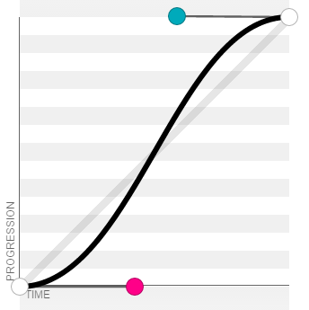
- ease corresponds to custom cubic Bezier (. 25,. 01,. 25,1). The effect is slow first, fast then slow;
- linear corresponds to a custom cubic Bezier (0,0,1,1), and the effect is a uniform straight line;
- Ease in corresponds to a custom cubic Bezier (. 42,0,1,1). The effect is slow first and then fast;
- Ease out corresponds to a custom cubic Bezier (0,0,. 58,1). The effect is fast first and then slow;
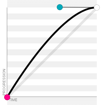
- Ease in out corresponds to a custom cubic Bezier (. 42,0,. 58,1). The effect is slow first, fast then slow.
Set a single transition
Transition property: the label property of the animation to be executed
Transition duration: animation duration
Transition timing function: time curve
Transition delay: delay time
Animation properties
transform
Multiple animations are supported. Each animation is connected with a space. Generally, the displacement must be done first and then other animations
Transition animation can be implemented in conjunction with transition, otherwise the animation will jump
Coordinate system

10. The Z axis is clockwise and the Y axis is counterclockwise
2D/3D platform
transform-style
flat: default 2D platform; can be omitted
preserve-3d: 3D platform
3D depth of field
perspective:800/900px
It is generally set to 800px or 900px scene depth
Change center position
transform-origin:(x,y,z)
z: Use px for 3d attribute
x: left | center | right | px | %
y: top | center | bottom | px | %
Essential attributes of 3D effect
transform-style:preserve-3d
perspective:800px
Displacement animation
-
2D displacement
translate(X,Y)
- translateX(px)
- translateY(px)
-
3D displacement
translateZ(px)
-
Compound writing
translate3d(X,Y,Z)
<head>
    <style>
        div{
            width: 200px;
            height: 200px;
            background:red;
            transition:all 2s;/*Transition animation*/
            transform: translateX(50px);/*Initially move a certain displacement*/
        }
        div:hover{
            transform: translate(100px,100px);/*Produce the final effect of animation*/
        }
    </style>
</head>
<body>
    <div></div>
</body>
zoom
-
2D zoom
Scale (multiple)
- scaleX()
- scaleY()
-
3D zoom
Scalez (multiple)
-
Compound writing
scale3d(x,y,z)
rotate
-
2D rotation
rotate(deg)
- rotateZ() default
-
3D rotation
rotateX()
rotateY()
-
Compound writing
rotate3d(x,y,z,deg)
x. The value of Y and Z is 0-1, and the final rotation effect is obtained by multiplying the value of deg
tilt
skew(xdeg,ydeg)
- The lower right corner of skewX() is pulled to the right
- Draw from the lower right corner of "skew"
Keyframe animation
Animation: animation name duration curve repetitions
Number of repetitions
number | infinite
Please refer to animation transition for time curve
Declaration animation
-
from and to
 <head>
     <style>
         div{
             width: 200px;
             height: 200px;
             background:red;
             animation: whchange 2s linear infinite;
             /* infinite Infinite times */
         }

         /* Declaration animation */
         @keyframes whchange {
             from{
                 width: 200px;
                 height: 200px;
                 background:red;
             }

             to{
                 width: 400px;
                 height: 600px;
                 background:green;
             }
         }
     </style>
 </head>
 <body>
     <div></div>
 </body>
format
@keyframes animation name{ from{ Attribute initial value } to{ Property termination value } } -
percentage
 <head>
     <style>
         div{
             width: 200px;
             height: 200px;
             background:red;
             animation: whchange 2s linear infinite;
             /* infinite Infinite times */
         }

         /* Declaration animation */
         @keyframes whchange {
         0%{
             transform: translateX(0);
         }
         5%{
             transform: translateX(-640px);
         }

         25%{
             transform: translateX(-640px);
         }

         30%{
             transform: translateX(-1280px);
         }

         50%{
             transform: translateX(-1280px);
         }

         55%{
             transform: translateX(-1920px);
         }

         75%{
             transform: translateX(-1920px);
         }

         80%{
             transform: translateX(-2560px);
         }

         100%{
             transform: translateX(-2560px);
         }
     }
     </style>
 </head>
 <body>
     <div></div>
 </body>
format
 @keyframes animation name{
     0%{
         attribute
     }
     10%{
         attribute
     }
     .
     .
     .
     100%{
         attribute
     }
 }
Keyframe animation single attribute
Animation name: animation name
Animation duration: duration
Animation timing function: time curve
Animation delay: delay time
Animation iteration count: the number of animation repetitions
Animation b-play-state: animation state
running | paused
Animation direction: animation running state
normal | reverse | alternate positive and negative | alternate reverse
Animation fill mode: animation stop state
none default | forwards last frame
frame-by-frame animation
animation: run 5s steps(1,end);
Steps (steps, frame status)
The greater the number of steps, the more moderate the transition
Frame state
-
end
Keep the current frame until the end of the animation
The current frame is the frame being played. The first frame is 0%. When the animation reaches 100% at the end, it means that the animation has ended. Therefore, 100% will be played at a speed that cannot be captured by the naked eye and return to 0%, so the last frame cannot be seen at this value
You can add forwards to keep the last frame
-
start
Keep the next frame until the end of the animation
Keeping the next frame will cause 0% to pass at a fast speed and the first frame will not be seen
You can cycle the first frame 0% after 100%, so you can see it all
Note: steps and time curve are mutually exclusive