1, Foreword
The powerful effect of css3 animation is self-evident. Since its emergence, it has been hot, and its advantages and disadvantages with js animation have always been the topic of debate in the front-end industry. There is no doubt that the emergence of css3 animation reduces the difficulty of realizing animation effect to a certain extent, which is conducive to the front-end learning. Its simplified code liberates us from the annoying js debugging, Of course, the animation effect of css has its limitations. We can't simulate all animation only with css3. In addition, there is the compatibility of browsers. This time we use css3 to realize a rotation picture effect and experience the power of css3.
First of all, we can only realize the automatic rotation at one time, and the effect is also the most common fade in and fade out, and the click rotation effect is not realized. At least at my current level, the pure css3 can only choose one of the automatic rotation and click rotation. If you can realize the two effects at the same time, please tell me.
2, Layout
<section class="slider-contaner">
    <ul class="slider">
        <li class="slider-item slider-item1"></li>
        <li class="slider-item slider-item2"></li>
        <li class="slider-item slider-item3"></li>
        <li class="slider-item slider-item4"></li>
        <li class="slider-item slider-item5"></li>
    </ul>
</section>
There is nothing to say about html code. For style, first of all, the large box of the slider must be relatively positioned. In addition, we add background image in the li tag, because it is possible to use pure css to realize the response. In addition, in order to see the whole picture in the response, the background size: 100% must be used in the background image. In addition, there is a high problem, Obviously, the height of the slider container must be consistent with that of li, because the height must not be fixed in the response formula, so it is obviously not possible to use the height attribute. The padding attribute can solve this problem. First, the background image can be displayed in padding, and second, the padding is based on the width of the parent element in% units.
*{
      margin:0;
      padding:0;
}
ul,li{
      list-style: none;
}
.floatfix {
      *zoom: 1;
}
.floatfix:after {
      content: "";
      display: table;
      clear: both;
}
.slider-contaner{
      width:100%;
      position:relative;
}
.slider,.slider-item{
      padding-bottom:40%;
}
.slider-item{
      width:100%;
      position:absolute;
      background-size:100%;
}
.slider-item1{
      background-image:url(imgs/1.jpg);
}
.slider-item2{
      background-image:url(imgs/2.jpg);
}
.slider-item3{
      background-image:url(imgs/3.jpg);
}
.slider-item4{
      background-image:url(imgs/4.jpg);
}
.slider-item5{
      background-image:url(imgs/5.jpg);
}
3, Design Animation
The fade in and fade out effect must be the use of opacity. First of all, the fade in and fade out of all pictures are the same animation, but the time is different. This must be controlled by animation delay. The infinite rotation of animation must use animation iteration count: infinite. We have five pictures this time. The whole animation is divided into two effects: picture stay and fade in and fade out, It is shown in the figure below, and the arrow indicates the fade in and fade out process.

Because there is no attribute in css3 that specifies the time interval between two animations, we must write the effect of other pictures when they fade in and out into the animation. Obviously, it is opacity:0 at this time;
For the convenience of writing animation, we use linear function, that is, animation timing function: linear; The whole process takes 20 seconds, 3 seconds for a stay, and 1 s for a fade in and fade out, which is converted into a percentage, that is, 15% and 5%;
@keyframes fade{
0%{
      opacity:0;
      z-index:2;
}
5%{
      opacity:1;
      z-index: 1;
}
20%{
      opacity:1;
      z-index:1;
}
25%{
      opacity:0;
      z-index:0;
}
100%{
      opacity:0;
      z-index:0;
}
}
The next step is to add an animation delay for each picture. Because the first picture must be displayed at the front, others use opacity:0 through the adjacent brother selector. The first picture does not need to fade in and out at the beginning, and directly jumps to stay, that is, 5%. Therefore, the animation delay is - 1s, the second picture is 20% away from the first one, that is, 4s, and the animation delay is 3s, and so on
.slider-item + .slider-item{
      opacity:0;
}
.slider-item1{
      animation-delay: -1s;
}
.slider-item2{
      animation-delay: 3s;
}
.slider-item3{
      animation-delay: 7s;
}
.slider-item4{
      animation-delay: 11s;
}
.slider-item5{
      animation-delay: 15s;
}
At this time, our rotation chart can be moved
4, Add rotation focus
Of course, the purpose of adding the rotation focus is not to click, but to tell the visitors that there are several pictures here and the location of the current pictures. At least personally, the rotation focus is very important, because if I don't know how many pictures there are in the rotation and I can't click, I will be very uneasy and feel that I don't see the whole page. So let's add a rotation focus. First of all, it is very clear that the above animation can still be used. In addition, the layout must use position: absolute. In addition, it is obvious that we must write the focus twice, one is the style of the current picture and the other is the style of the non current picture
<div class="focus-container">
<ul class="floatfix">
<li><div class="focus-item focus-item1"></div></li>
<li><div class="focus-item focus-item2"></div></li>
<li><div class="focus-item focus-item3"></div></li>
<li><div class="focus-item focus-item4"></div></li>
<li><div class="focus-item focus-item5"></div></li>
</ul>
</div>
.focus-container{
      position:absolute;
      bottom:2%;
      z-index:7;
      margin:0 auto;
      left:0;
      right:0;
}
.focus-container ul{
      margin-left:46%;
}
.focus-container li{
      width:10px;
      height:10px;
      border-radius:50%;
      float:left;
      margin-right:10px;
      background:#fff;
}
.focus-item{
      width:100%;
      height:100%;
      background:#51B1D9;
      border-radius:inherit;
      animation-duration: 20s;
      animation-timing-function: linear;
      animation-name:fade;
      animation-iteration-count: infinite;
}
.focus-item1{
      animation-delay: -1s;
}
.focus-item2{
      animation-delay: 3s;
}
.focus-item3{
      animation-delay: 7s;
}
.focus-item4{
      animation-delay: 11s;
}
.focus-item5{
      animation-delay: 15s;
}
5, Comb code
If you have maintained other people's code, you will know the importance of code sorting for later maintenance. If you write css code arbitrarily without sorting, it is a disaster for later maintenance. Personally, css code sorting must first add necessary comments and partition the css code, The other is to minimize the areas that need to be modified in the later stage. This is mainly the problem of code reconstruction. I have considered this problem when writing the code, so the main task is to add comments and tell the maintainer where the code is most frequently modified. We follow the principle of putting the most frequently modified code to the last.
Let's analyze where our code may need to be modified if it is used by others. First, it must be the picture path, so we put this style last, and then the picture height, the color of the rotation focus, the setting of animation time (here also involves the number of pictures), the position of the rotation focus, and of course, the size of the rotation focus may also be modified. The reconstructed code is as follows:
<section class="slider-contaner">
<ul class="slider">
<li class="slider-item slider-item1"></li>
<li class="slider-item slider-item2"></li>
<li class="slider-item slider-item3"></li>
<li class="slider-item slider-item4"></li>
<li class="slider-item slider-item5"></li>
</ul>
<div class="focus-container">
<ul class="floatfix">
<li><div class="focus-item focus-item1"></div></li>
<li><div class="focus-item focus-item2"></div></li>
<li><div class="focus-item focus-item3"></div></li>
<li><div class="focus-item focus-item4"></div></li>
<li><div class="focus-item focus-item5"></div></li>
</ul>
</div>
</section>
/*css reset start*/
*{
margin:0;
padding:0;
}
ul,li{
list-style: none;
}
/*css reset end*/

/*css public start*/
.floatfix {
*zoom: 1;
}
.floatfix:after {
content: "";
display: table;
clear: both;
}
/*css public end*/

/*slider start*/
.slider-contaner{
width:100%;
position:relative;
}
.slider-item + .slider-item{
opacity:0;
}
.slider-item{
width:100%;
position:absolute;
animation-timing-function: linear;
animation-name:fade;
animation-iteration-count: infinite;
background-size:100%;
}
.focus-container{
position:absolute;
z-index:7;
margin:0 auto;
left:0;
right:0;
}
.focus-container li{
width:10px;
height:10px;
border-radius:50%;
float:left;
margin-right:10px;
background:#fff;
}
.focus-item{
width:100%;
height:100%;
border-radius:inherit;
animation-timing-function: linear;
animation-name:fade;
animation-iteration-count: infinite;
}
.focus-item2,.focus-item3,.focus-item4,.focus-item5{
opacity:0;
}
.focus-container ul{
margin-left:46%;
}
/*Set the position of the rotation focus*/
.focus-container{
bottom:2%;
}
/*Sets the color of the focus of the current picture*/
.focus-item{
background:#51B1D9;
}
/*To animate, please modify the number of seconds as needed*/
.slider-item,.focus-item{
animation-duration: 20s;
}
.slider-item1,.focus-item1{
animation-delay: -1s;
}
.slider-item2,.focus-item2{
animation-delay: 3s;
}
.slider-item3,.focus-item3{
animation-delay: 7s;
}
.slider-item4,.focus-item4{
animation-delay: 11s;
}
.slider-item5,.focus-item5{
animation-delay: 15s;
}
@keyframes fade{
0%{
opacity:0;
z-index:2;
}
5%{
opacity:1;
z-index: 1;
}
20%{
opacity:1;
z-index:1;
}
25%{
opacity:0;
z-index:0;
}
100%{
opacity:0;
z-index:0;
}
}
/*Setting the background, responsive, please use the media query to modify the path according to the breakpoint*/
.slider-item1{
background-image:url(imgs/1.jpg);
}
.slider-item2{
background-image:url(imgs/2.jpg);
}
.slider-item3{
background-image:url(imgs/3.jpg);
}
.slider-item4{
background-image:url(imgs/4.jpg);
}
.slider-item5{
background-image:url(imgs/5.jpg);
}
/*To set the height of the picture, please modify the percentage according to specific needs, and modify this value in a responsive manner*/
.slider,.slider-item{
padding-bottom:40%;
}
6, Last two sentences
The disadvantages of this rotation chart implemented by css3 are self-evident. You can only choose one of click rotation and automatic rotation. However, automatic rotation can be used on the mobile phone, which is a good choice. In addition, most websites are column design, and there are few web pages, especially the home page of the website. Sometimes it is not the advantages and disadvantages of website design, On the contrary, whoever chooses a good-looking picture may be favored. In this case, we can actually consider turning the rotation picture into the rotation of the background. At this time, the rotation focus can not be used. I believe that using the background rotation on your blog home page or product home page will have a very good effect
Last share
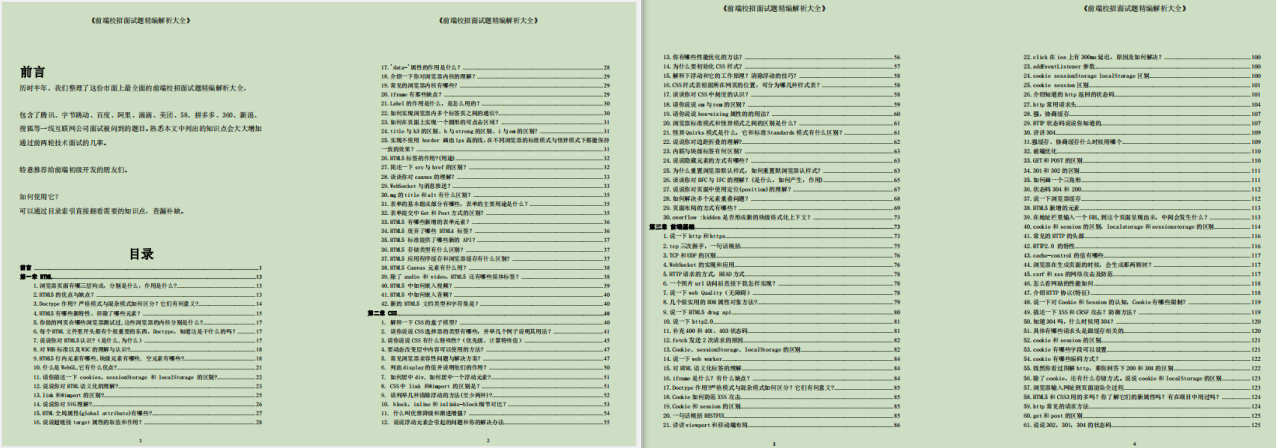
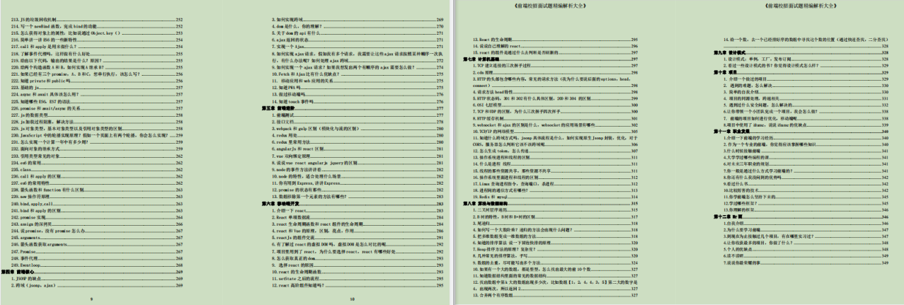
**The outline of 350 pages of front-end recruitment interview questions * * mainly includes HTML, CSS, front-end foundation, front-end core, front-end advanced, mobile terminal development, computer foundation, algorithm and data structure, project, career development, etc


Automatic rotation can only choose one of the two, but automatic rotation can be used on the mobile phone, which is a good choice. In addition, most websites are column design, and there are few web pages, especially on the home page. Sometimes it is not the advantages and disadvantages of website design, but who chooses the good-looking pictures, who may be favored, In this case, we can actually consider changing the rotation diagram into the rotation of the background. At this time, the rotation focus can not be used. I believe that the background rotation will be very good on your blog home page or product home page
Last share
**The outline of 350 pages of front-end recruitment interview questions * * mainly includes HTML, CSS, front-end foundation, front-end core, front-end advanced, mobile terminal development, computer foundation, algorithm and data structure, project, career development, etc
[external chain picture transferring... (img-YO5ybt1b-1627102450967)]
[external chain picture transferring... (img-tHcW5PBF-1627102450968)]