Here is to use linear-gradient to achieve, that is, drawing circles, and then using the background color to cover part of the circle; using the css3 attribute perspective s and rotation to achieve the cube
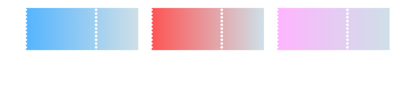
1.css realizes wave line
html
<div class="card-list">
    <div class="wave-container">
        <div class="wave"></div>
        <!-- Achieving wave line div -->
        <div class="wave-left-decorate"></div>
        <div class="wave-right-decorate"></div>
    </div>
</div>
css
.card-list{
    display: flex;
    padding: 20px;
    width: 100%;
}
.wave-container{
    position: relative;
    margin-right: 28px;
    width: 20%;
}
.wave{
    width: 100%;
    height: 90px;
    background: linear-gradient(to right, rgb(85, 181, 255), rgb(207, 224, 232));
}
/* Wavy line */
.wave-left-decorate{
    position: absolute;
    top: -4px;
    width: 90px;
    height: 8px;
    transform-origin: center left;
    transform: rotate(90deg);
    background: radial-gradient(circle, #fff 2px, #fff, transparent 3px, transparent 4px, transparent 4px, transparent);
    background-size: 8px 8px;
}
Design sketch
Small partners interested in web front end technology can be added to our learning circle, because I am not 211985, just an ordinary undergraduate student, English is not particularly good, and math is not particularly good. So I chose the front end. In my sixth year of work, I am glad that I have chosen this road. 767-273-102 autumn skirt. I worked in a goose factory, and I fooled with the entrepreneurs. I want to share my technology with you. If you are still confused, I hope to help you with some of my meagre efforts. It's a group of people with dreams. We may be in different cities, but we will go together. Front-end, front-end, front-end
2. Implementing Cubes
html file
<div class="content">
    <div class="leftContent">
        <div class="leftContentItem">
            <div class="itemImg">
                <img class="leftContentImg" src="images/rabbit.jpg" alt=""/>
                <img class="leftContentImg" src="images/rabbit.jpg" alt=""/>
                <img class="leftContentImg" src="images/rabbit.jpg" alt=""/>
                <img class="leftContentImg" src="images/rabbit.jpg" alt=""/>
                <img class="leftContentImg" src="images/rabbit.jpg" alt=""/>
                <img class="leftContentImg" src="images/rabbit.jpg" alt=""/>
            </div>
        </div>
    </div>
css file
.content{
    position: relative;
    display: flex;
    margin: 0 auto;
    padding-top: 50px;
    width: 1200px;
    height: 380px;
    background: url(../images/bg2.jpg) no-repeat;
    background-size: 1200px 100%;
}
.content .leftContent{
    margin-right: 25px;
    padding-left: 45px;
    padding-bottom: 30px;
    box-sizing: border-box;
}
/* Rotating pictures */
.content .leftContent .leftContentItem{
    width: 350px;
    height: 350px;
    /* Set depth of field */
    perspective: 1000px;
    /* Set the background color to be elliptical in the middle */
    /*background: radial-gradient(ellipse at center, #430d6d 0%, #000 100%);*/
}
.leftContent .leftContentItem .itemImg{
    position: absolute;
    left: 20%;
    top: 20%;
    width: 200px;
    height: 200px;
    /* Realizing 3D rendering */
    transform-style: preserve-3d;
    transform: rotateX(-20deg) rotateY(-20deg);
    -webkit-animation: 6s imgRotate linear infinite;
    -o-animation: 6s imgRotate linear infinite;
    animation: 6s imgRotate linear infinite;
}
.leftContent .leftContentItem .itemImg *{
    position: absolute;
    width: 100%;
    height: 100%;
    box-shadow: 0 0 25px rgba(0, 128, 0, .4);
}
.leftContentItem .itemImg .leftContentImg{
    position: absolute;
    width: 100%;
    height: 100%;
}
/* Rotation and translation operations are performed on each surface. */
.leftContentItem .itemImg .leftContentImg:nth-child(1){
    transform: translateZ(100px);
}
.leftContentItem .itemImg .leftContentImg:nth-child(2){
    transform: rotateX(180deg) translateZ(100px);
}
.leftContentItem .itemImg .leftContentImg:nth-child(3){
    transform: rotateY(-90deg) translateZ(100px);
}
.leftContentItem .itemImg .leftContentImg:nth-child(4){
    transform: rotateY(90deg) translateZ(100px);
}
.leftContentItem .itemImg .leftContentImg:nth-child(5){
    transform: rotateX(90deg) translateZ(100px);
}
.leftContentItem .itemImg .leftContentImg:nth-child(6){
    transform: rotateX(-90deg) translateZ(100px);
}
@-webkit-keyframes imgRotate {
    from{
        transform: translateZ(-100px) rotateX(0) rotateY(0);
    }
    to{
        transform: translateZ(-100px) rotateX(360deg) rotateY(360deg);
    }
}
Design sketch
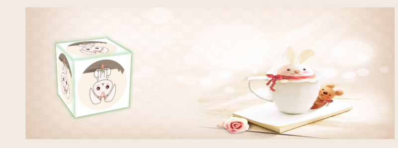
The main thing is to set the depth of field perspective, and then rotate and translate each surface.