Day 8
css3 animation
1. Transform
The following are the attribute values of transform
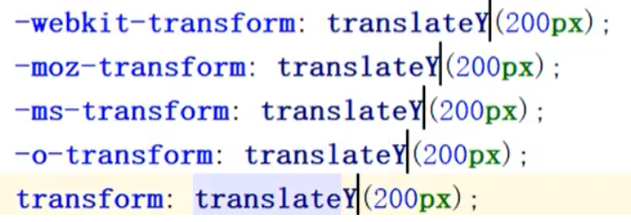
translate(x,y) defines a 2D transformation that moves elements along the X and Y axes.
That is, translate to the x or y axis
With one parameter, the x-axis is translated and the y-axis is not moved
translateX(n) defines a 2D transformation that moves elements along the X axis
translateY(n) defines a 2D transformation that moves elements along the Y axis
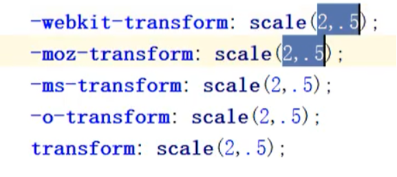
scale(x,y) defines the 2D scaling transformation, changing the width and height of the element.
I.e. zoom in / out
With one parameter, the x and y axes can be enlarged or reduced by this multiple
Decimals can be used. When decimals are used, the first 0 can be omitted
scaleX(n) defines the 2D scaling transformation and changes the width of the element
scaleY(n) defines the 2D scaling transformation and changes the height of the element
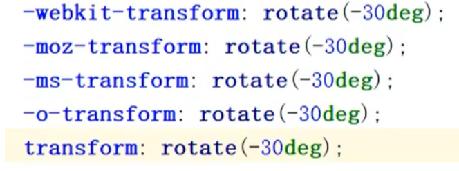
rotate(angle) defines 2D rotation and specifies the angle in the parameter
Negative numbers can be used for angles, ranging from (- 360deg-360deg)
Often use X and rotate, see next point
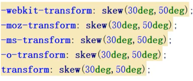
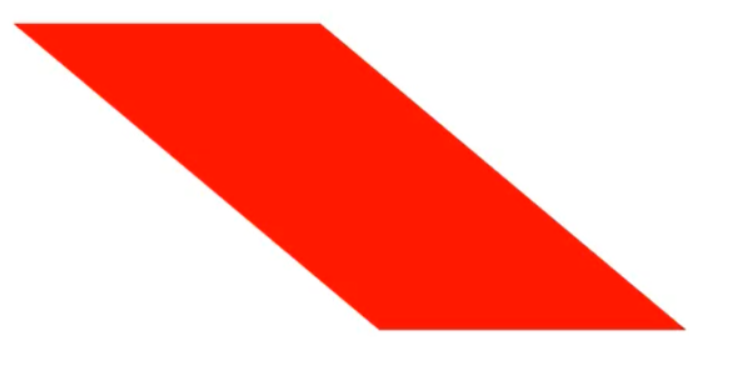
skew(x-angle,y-angle) defines 2D tilt conversion, along the X and Y axes
That is, distortion.
One parameter can be taken. When one parameter is taken, the x direction is distorted and the y direction is not distorted.
skew(x-angle) defines the 2D tilt conversion, along the X axis
skew(Y-angle) defines the 2D tilt conversion, along the Y axis
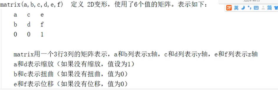
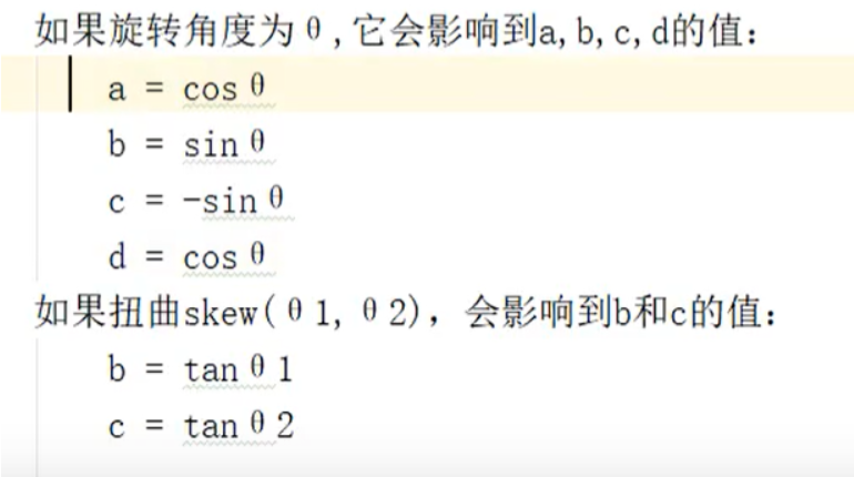
matrix(n,n,n,n,n,n) defines a 2D transformation using a matrix of six values
Each rotation and twist will produce a new matrix, and the resulting multiple matrices need to be multiplied
If there are rotation, distortion, scaling and displacement for an element at the same time, multiple matrices need to be multiplied here. Priority should be given to rotation and scaling!!!!
tip: vendor compatible prefix:
Google / Apple webkit-
Firefox moz-
IE -ms-
Oupeng-o-
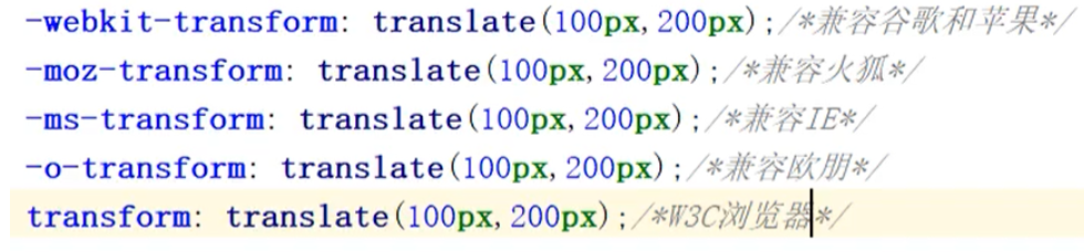
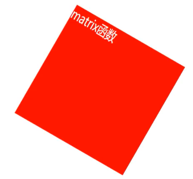
Requirements: move the div right 100px, down 200px, rotate 30 degrees, scale the x-axis by 1.5 times, and scale the y-axis by 2 times.
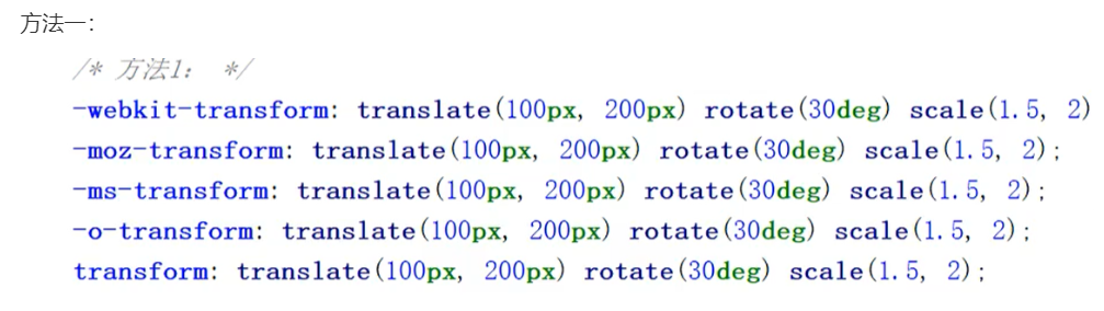
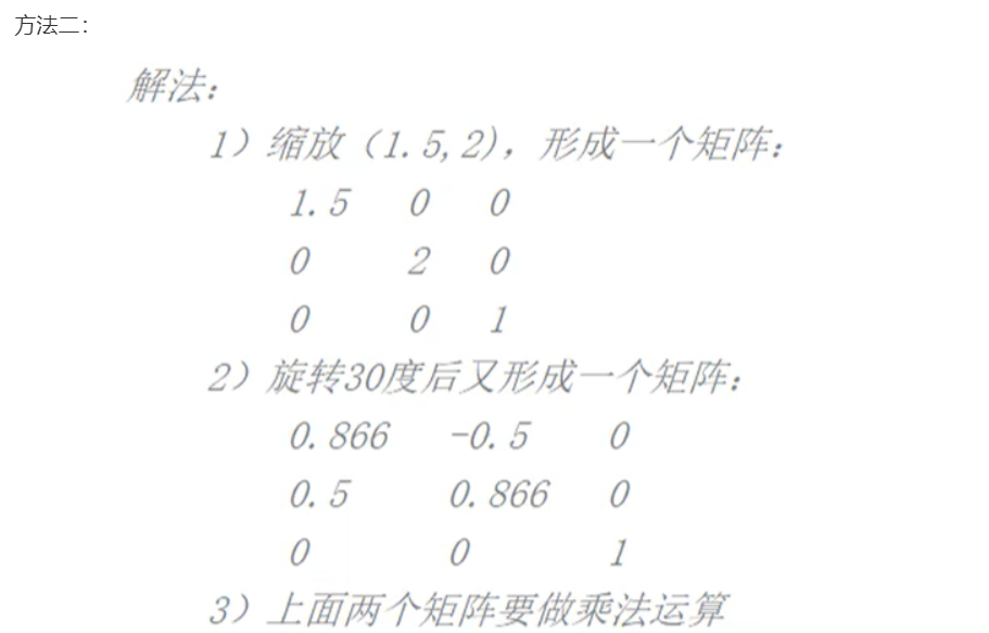
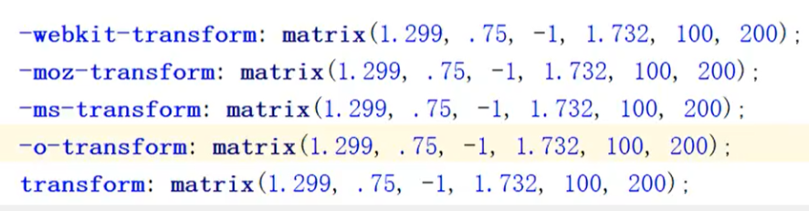
The general effects of the two methods are as follows:
2. Transform origin: adjust the base point of the element
Attribute value:
X-axis: defines where the view is placed on the x-axis.
Possible values: left, center, right, length,%
Y-axis: defines where the view is placed on the y-axis
Possible values: top,center,bottom,length,%
Z-axis: defines where the view is placed on the z-axis
Possible values: length
eg:
transform-origin: left top;
3.perspective
Let child elements get perspective effect.
perspective:number|none;
Mainstream browsers don't support it. Google needs to add - webkit - Or add px length unit after it
Usage:
!DOCTYPE html>
<html lang="en">
<head>
<meta charset="UTF-8">
<meta http-equiv="X-UA-Compatible" content="IE=edge">
<meta name="viewport" content="width=device-width, initial-scale=1.0">
<title>Document</title>
<style>
.demo {
margin: 0 auto;
width: 400px;
height: 300px;
border: 1px solid #ccc;
position: relative;
padding: 20px;
perspective: 100px;
}
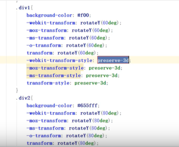
.div1 {
width: 200px;
height: 300px;
border: 1px solid #f0f;
background-color: #0ff;
position: absolute;
left: 50%;
margin-left: -100px;
transform: rotateX(40deg);
}
</style>
</head>
<body>
<div class="demo">
<div class="div1"></div>
</div>
</body>
</html>
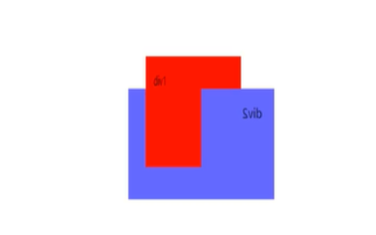
4.transform-style
Specifies how nested elements are rendered in 3D space
Note: this attribute must be used with the transform attribute
Syntax: Transform style: flat Perspective
flat: by default, the child element no longer retains the 3d position
preserve-3d: the child element reports the 3D position.
example:
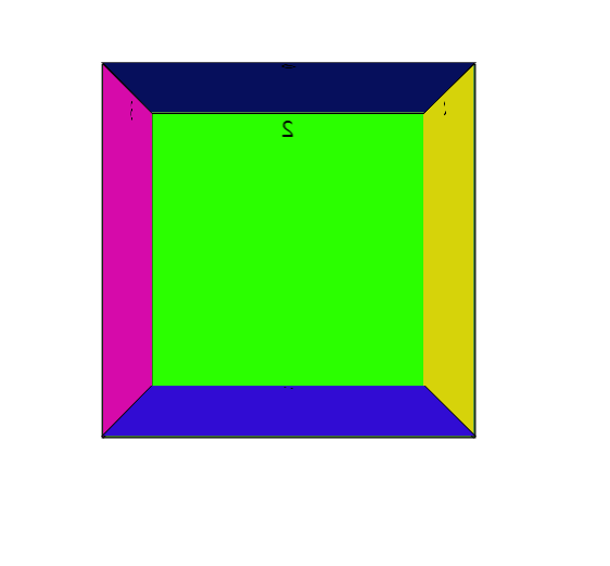
5.rotate-Z
The rotation angle of 3d space rotates clockwise in the direction perpendicular to the Z axis.
Draw a cube and see the effect of the code example:
<!DOCTYPE html>
<html lang="en">

<head>
    <meta charset="UTF-8">
    <meta http-equiv="X-UA-Compatible" content="IE=edge">
    <meta name="viewport" content="width=device-width, initial-scale=1.0">
    </style>
    <title>Document</title>
    <style>
        .container {
            position: relative;
            perspective: 1000px;
            width: 200px;
            height: 200px;
            margin: 200px auto;
        }

        .container div {
            position: absolute;
            width: 200px;
            height: 200px;
            border: 1px solid #000;
            text-align: center;
        }

        .pre {
            background: rgba(43, 255, 0, 0.5);
            transform: rotateY(0) translateZ(200px);
        }

        .back {
            background: rgba(43, 255, 0, 1);
            transform: rotateY(180deg) translateZ(0);
        }

        .left {
            left: -100px;
            background: rgb(214, 10, 170);
            transform: rotateY(-90deg) translateX(100px);
        }

        .right {
            left: 100px;
            background: rgb(214, 211, 10);
            /* Because it rotates from the center point, it needs to move 100px outward */
            transform: rotateY(90deg) translateX(-100px);
        }

        .top {
            top: 100px;
            transform: rotateX(90deg) translateY(100px);
            background-color: rgb(49, 12, 211);
        }

        .bottom {
            bottom: 100px;
            transform: rotateX(-90deg) translateY(-100px);
            background-color: rgb(6, 15, 92);
        }
    </style>
</head>

<body>
    <div class="container">
        <div class="pre">1</div>
        <div class="back">2</div>
        <div class="left">3</div>
        <div class="right">4</div>
        <div class="top">5</div>
        <div class="bottom">6</div>
    </div>
</body>

</html>
Actual effect:
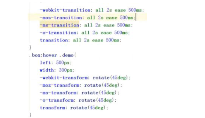
6. Transition animation
1. General usage:
transition-property;
transition-duration
transition-timing-function
transition-delay
2. Simple (compound) usage:
transition:property-name-list|all duration time-function delay;
a. The following attributes can be used:
1) Colour
color background-color border-color outline-color
2) Location
background-position:left right top bottom
3) Length
max-height min-height max-width min-width
height width
border-width margin pading outline-width
outline-offset font-size line-height
text-indent vertical-align border-spacing
letter-spacing word-spacing
4) Figures
opacity visibility z-index font-weight zoom
5) Combination
text-shadow transform box-shadow clip
6) Other
gradient
b)duration: animation duration, generally in seconds (S) or milliseconds (ms)
c) Timing function: animation function
1) linear: uniform speed
2) ease: speed change (slow first, then fast, and then slow last)
3) Ease in: speed change (from slow to fast)
4) Ease out: speed change (from fast to slow)
5) Slow out: (slow start, slow end)
6) Cubic Bezier (n, N, N, n): set the speed change by yourself, and the value of n is between 0-1
d) delay: animation delay time, generally in seconds (S) or milliseconds (ms)
tips:
If you haven't learned js button, you can use hover to replace it temporarily
Usage:
transition: all 2s ease 500ms;
7. Frame animation
Step 1: set keys
a) If there are only 2 keyframes:
@keyframes animation name{
0%: {style sheet}
100%: {style sheet}
}
Or:
@keyframes animation name{
from: {stylesheet}
to: {style sheet}
}
b) If there are multiple keyframes
@keyframes animation name{
0%: {style sheet}
30%: {style sheet}
...
100%: {style sheet}
}
Note: the percentage here is generally in ascending order, which can be any value between 0% - 100%, or flashback.
Step 2: implement animation
a) General usage
animation-name:
Animation name from @ keyframes definition - no default
animation-duration:
The duration of animation is generally in seconds (s) or milliseconds (ms) -- the default value is 0
animation-timing-function:
Animation functions:
1) linear: uniform speed -- the default value is uniform speed
2) ease: speed change (slow first, then fast, and then slow last)
3) Ease in: speed change (from slow to fast)
4) Ease out: speed change (from fast to slow)
5) Ease in out: speed change (slow start, slow end)
6) Cubic Bezier (n, N, N, n): set the speed by yourself. The value of n is between 0-1.
animation-delay:
Animation delay time is generally in seconds (s) or milliseconds (ms)
---------The default is no delay
animation-iteration-count:
Number of animation repetitions ----------- the default value is 0
1)number: sets the number of repeated playback
2) infinite: keep looping
animation-direction :
After the animation is played, it is played in reverse
1) normal: not reverse ----- the default value is not reverse
2) alternate: reverse
animation-play-state :
Set playback | pause
1)paused: pause playback
2)running: play (default)
b) Concise usage
animate : name duration timing-function delay
iteration-count direction
tips:
The animate play state is set separately
If js is not used, you can temporarily use hover to achieve similar effects
It is best to use absolute relative positioning to facilitate operations such as left.
You can also use translate in transform (2d or 3d operation can be realized by translation)
Usage example:
<!DOCTYPE html>
<html lang="en">

<head>
    <meta charset="UTF-8">
    <meta http-equiv="X-UA-Compatible" content="IE=edge">
    <meta name="viewport" content="width=device-width, initial-scale=1.0">
    <title>Document</title>
    <style>
        * {
            margin: 0px;
            padding: 0px;
        }

        .container {
            position: relative;
            width: 100%;
            height: 800px;
            border: 1px solid #eee;
        }

        @keyframes moverotate {
            0% {
                left: 0;
                transform: rotate(0deg);
            }
            25% {
                left: 200px;
                transform: rotate(90deg);
            }
            50% {
                top: 200px;
                transform: rotate(180deg);
            }
            75% {
                left: 0px;
                transform: rotate(270deg);
            }
            100% {
                top: 0px;
                transform: rotate(360deg);
            }
        }

        .div1 {
            margin: 200px auto;
            position: absolute;
            width: 200px;
            height: 200px;
            border: 2px solid skyblue;
            box-shadow: 2px 2px 2px #ccc;
            border-radius: 50%;
            background: url(img/circle.jpg) skyblue;
            background-size: 100% 100%;
            animation: moverotate 5s linear 100ms infinite;
        }

        .pause:hover+.div1 {
            animation-play-state: paused;
            -webkit-animation-play-state: paused;
        }

        .run:hover+.div1 {
            animation-play-state: running;
            -webkit-animation-play-state: running;
        }

        button {
            width: 100px;
            height: 100px;
            margin: 100px auto;
            z-index: 5;
        }
    </style>

</head>

<body>
    <div class="container">
        <button class="pause">suspend</button>
        <button class="run">start</button>
        <div class="div1"></div>
    </div>
</body>

</html>