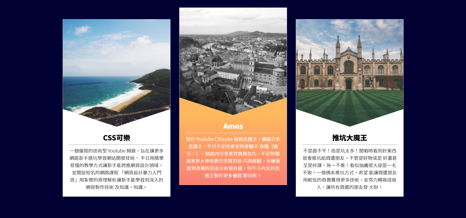
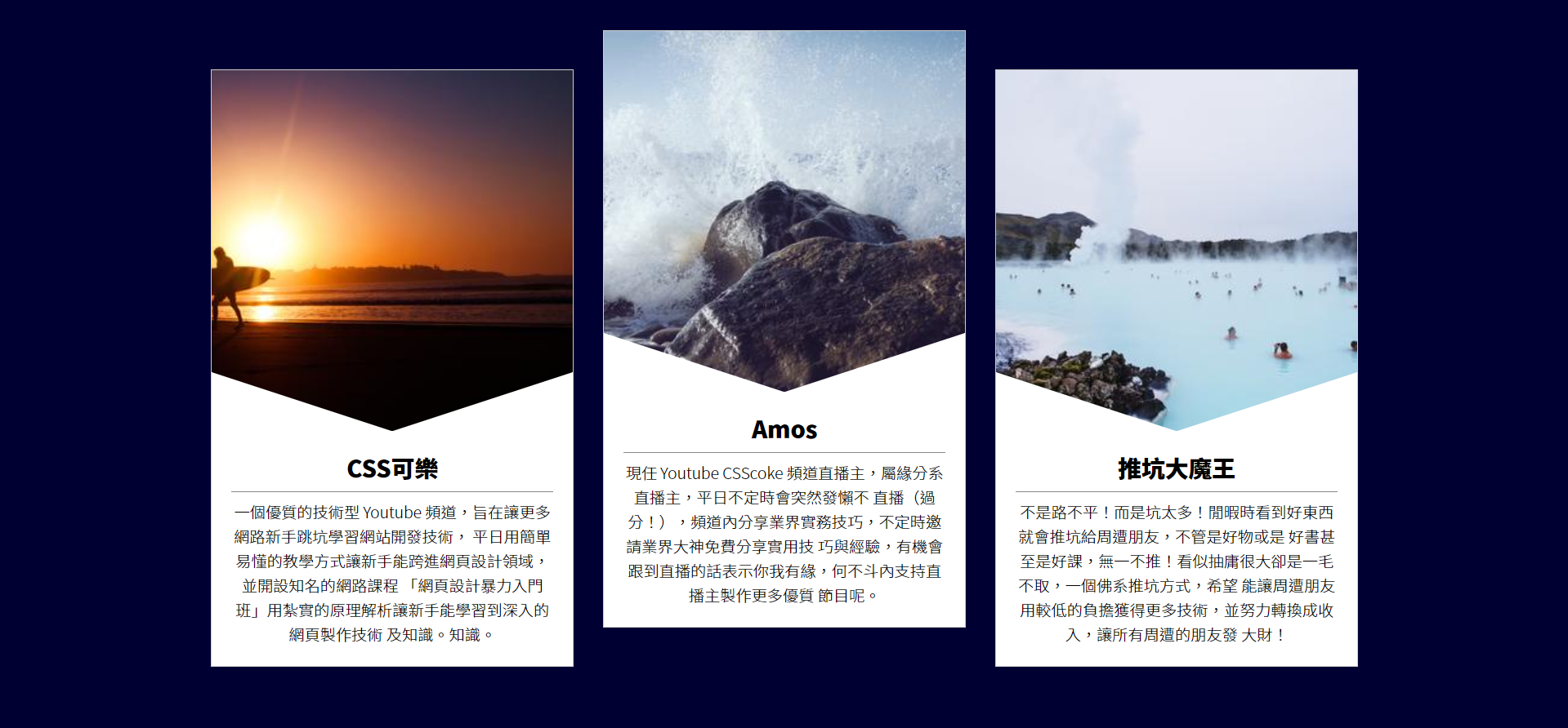
Producer introduction card
target
Step 1.
Basic structure and text content
Each item container has picture and text blocks
<body>
<div class="wrap">
<div class="item">
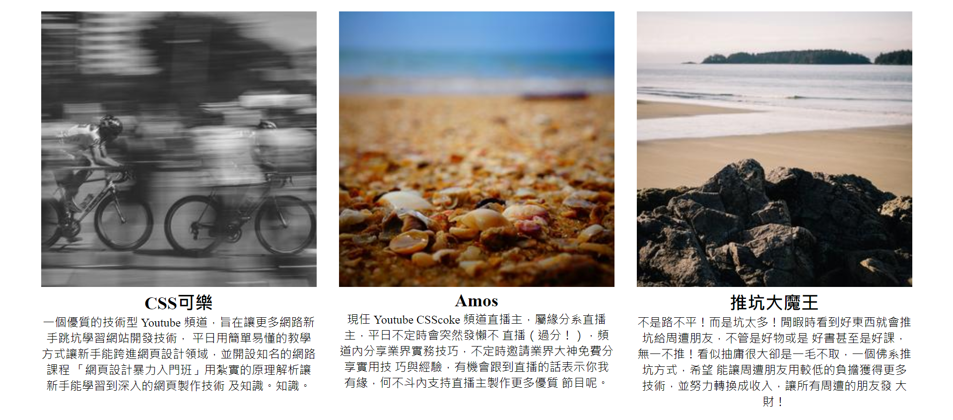
<img src="https://picsum.photos/300/300/?random=1">
<div class="txt">
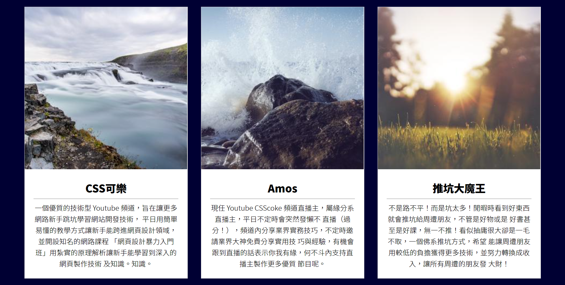
<h2>CSS Coke</h2>
<p>A high-quality technical Youtube The channel aims to enable more novices to jump into the pit and learn website development technology,
On weekdays, simple and understandable teaching methods enable novices to enter the field of web design and set up well-known online courses
「Introduction to web design」With solid principle analysis, novices can learn in-depth web page making technology
And knowledge. Knowledge.</p>
</div>
</div>
<div class="item">
<img src="https://picsum.photos/300/300/?random=2">
<div class="txt">
<h2>Amos</h2>
<p>Incumbent Youtube CSScoke The channel's live broadcast host belongs to the live broadcast host of fate department. It will suddenly become lazy from time to time on weekdays
Live (excessive!), Share the practical skills of the industry in the channel, and invite the great gods of the industry to share the practical skills for free from time to time
Skill and experience, if you have the opportunity to follow the live broadcast, it means that you and I are destined. Why not support the live broadcast host to produce more high-quality products
What about the show.</p>
</div>
</div>
<div class="item">
<img src="https://picsum.photos/300/300/?random=3">
<div class="txt">
<h2>Push pit demon king</h2>
<p>It's not a rough road! But too many pits! When you see good things in your spare time, you will push the pit to your friends around, whether they are good things or not
Good books and even good classes are pushed! It seems to be a big draw, but it doesn't take a dime. It's a Buddhist way to push the pit, hope
It can enable friends around to obtain more technology with a lower burden, and strive to convert it into income, so that all friends around can make money
Big money!</p>
</div>
</div>
</div>
</body>
Step 2.
Layout initialization
<style>
	* {
	    margin: 0;
	    padding: 0;
	    list-style: none;
	}
</style>
Step 3.
wrap container CSS settings
<style>
	.wrap {
	    width: 1200px;
	    display: flex;
	    margin: auto;
	}
</style>
margin: auto;auto means that the left and right sides share the remaining available space together, so you can get the result of setting.
Step 4.
item container CSS settings
<style>
	.item {
	     width: 370px; /* 400- 15*2(margin) */
	     margin: 15px;
	     text-align: center; /* Text centering */
	 }
	 .item img {
	     width: 100%;
	 }
</style>
Step 5.
Add a bottom line under the heading and set the line height for the paragraph
<style>
	.item h2 {
	    border-bottom: 1px solid #888;
	    padding-bottom: .3em;
	    margin-bottom: .3em;
	}
	.item p {
	    line-height: 1.6; /* Row height */
	}
</style>
Know the "em" unit
in CSS, the em unit is the relative length unit. It is a value relative to the font size of the element itself (font size attribute).
if other attributes on an "element" without font size set take em as the length unit, it will inherit the font size attribute value of the "parent element" as the reference value of EM unit. If the parent element has no set font size attribute value, continue to inherit upward until the root element; If there is no setting in CSS, it will be set according to the browser preset value: usually 16px.
Step 6.
Set Web page font and text thickness (using google api)
<link href="https://fonts.googleapis.com/css2?family=Noto+Sans+TC:wght@100;300;500;900&display=swap" rel="stylesheet">
<style>
    * {
        margin: 0;
        padding: 0;
        list-style: none;
        font-family: 'Noto Sans TC', sans-serif;
    }
    .item h2 {
        border-bottom: 1px solid #888;
        padding-bottom: .3em;
        margin-bottom: .3em;
        font-weight: 900;
    }
    .item p {
        line-height: 1.6;
        font-weight: 300;
    }
</style>
Step 7.
Set the background color (dark blue) for the web page, center the item container vertically and change it to a white background
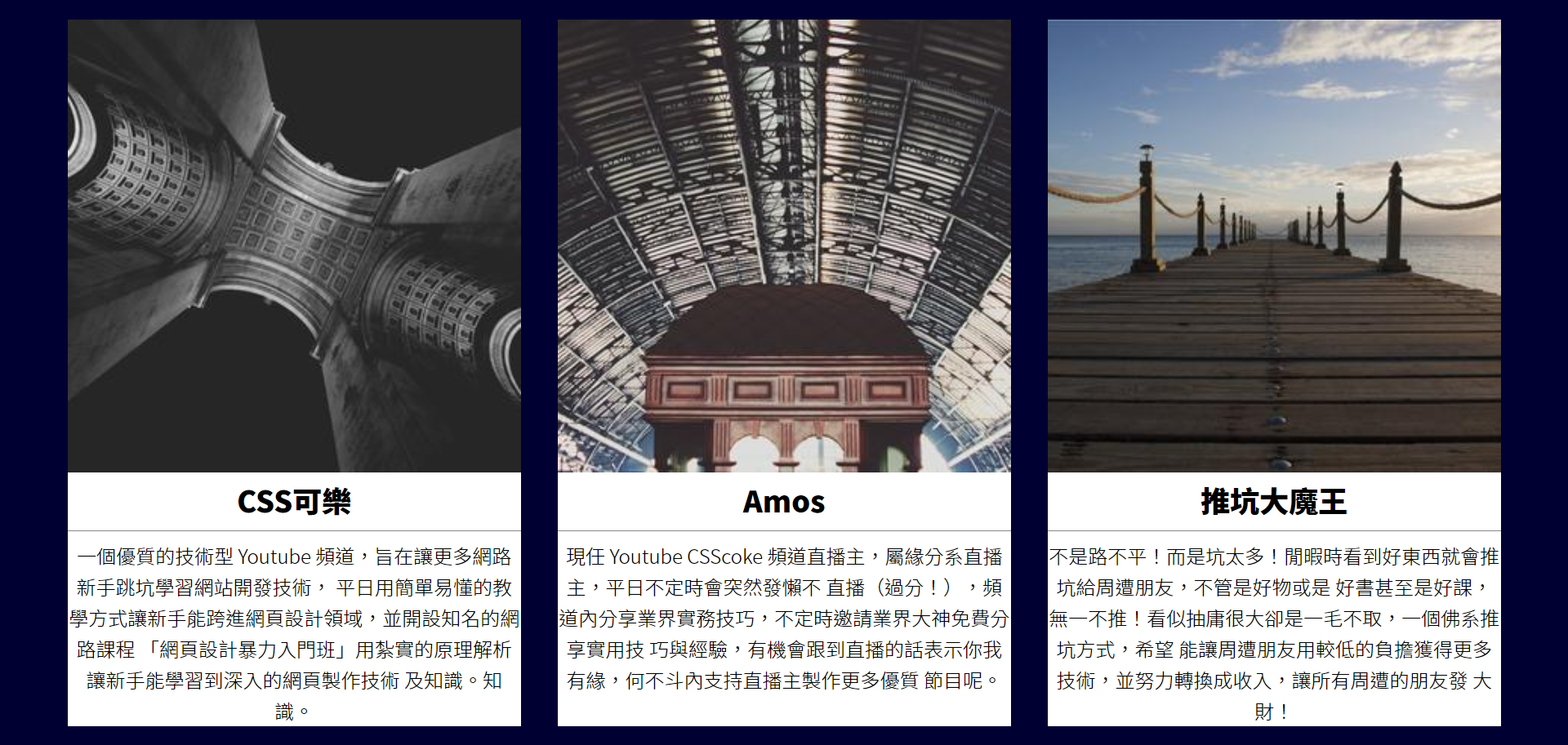
<style>
        html, body {
            height: 100%;
        }
        body {
            display: flex;
            align-items: center;
            background-color: #003; /*  Dark blue*/
        }
        .item {
            width: 370px;
            margin: 15px;
            text-align: center;
            background-color: #fff; /*  White background*/
        }
    </style>
Step 8.
Add an edge option for the item container (the width should be deducted), and add padding for the text
<style>
	.item {
	     width: 368px;
	     margin: 15px;
	     text-align: center;
	     background-color: #fff;
	     border: 1px solid #ccc; /* Bian Kuang*/
	 }
	 .item .txt {
	     padding: 20px;
	 }
</style>
Step 9.
Establish triangle area
<style>
	.item .txt {
	    padding: 20px;
	    position: relative;
	}
	.item .txt:before{
	    content: '';
	    position: absolute; /*After setting the positioning, things will automatically turn into block s*/
	    width: 0;
	    height: 0;
	    left: 0; /*position*/
	    top: 0; /*position*/
	    border-top: 60px solid #f00;
	    border-left: 184px solid #0f0;
	    border-right: 184px solid #0f0;
	}
</style>
Step 10.
Remove the blank area below the picture
This can be achieved by setting vertical align to a value other than baseline.
<style>
	.item img {
	    width: 100%;
	    vertical-align: middle;
	}
</style>
Step 11.
Change the color of the edge line (transparent, white) and move it to the appropriate position
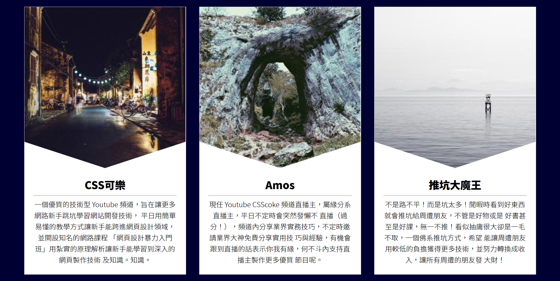
<style>
	.item .txt:before{
	   content: '';
	    position: absolute;
	    width: 0;
	    height: 0;
	    left: 0;
	    top: 0;
	    border-top: 60px solid transparent; /*transparent color*/
	    border-left: 184px solid #fff; /* White*/
	    border-right: 184px solid #fff; /* White*/
	    transform: translateY(-100%);
	}
</style>
Introduction to translate function
Syntax:
Transform: translate (unit or percentage, unit or percentage);
Transform: translatex (unit or percentage);
Transform: translatey (unit or percentage);
The first syntax can declare the translation values of x-axis and y-axis at the same time; The second and third syntax can simply declare the translation value of x-axis or y-axis.
-
Unit translation
The method of unit translation is very simple. You can translate as much as the unit value is, and transform supports negative values. -
%Percentage translation
The percentage benchmark of translate is its own width and height.
Step 12.
Make the animation of moving up and down. When the mouse touches the item block, it will move up
<style>
	.item {
	    width: 368px;
	    margin: 15px;
	    text-align: center;
	    background-color: #fff;
	    border: 1px solid #ccc;
	    transform: translateY(0px);
	    transition: .5s;
	}
	.item:hover {
	    transform: translateY(-40px);
	}
</style>
Step 13.
Make color changing animation for txt block background, edge line, text and bottom line
- The background becomes a gradual orange
- The border line turns orange
- The text and the bottom line turn white

<style>
    .item p {
        line-height: 1.6;
        font-weight: 300;
        transition: .25s; /*Animation length*/
    }
    .item:hover .txt {
        background-image: linear-gradient(0deg, #FB8076, #FEB85D ); /* Change color from bottom to top*/
    }
    .item:hover .txt:before {
        border-left: 184px solid #FEB85D; /* Orange*/
        border-right: 184px solid #FEB85D; /* Orange*/
    }
    .item:hover h2 {
        color: #fff; /* White*/
        border-bottom-color: #fff; /* White bottom line*/
    }
    .item:hover p {
        color: #fff; /* White*/
    }
</style>
References:
How to cut the screen of this web page that goldfish can understand: personnel introduction card