1. Basic introduction to CSS
1.1 understanding CSS
CSS(Cascading Style Sheets):
- CSS, or cascading style sheet, is a computer language used to represent file styles such as HTML (an application of Standard General Markup Language) or XML (a subset of Standard General Markup Language). CSS can not only modify the web page statically, but also format the elements of the web page dynamically with various scripting languages.
- CSS can accurately control the layout of elements in the web page at the pixel level, support almost all font and size styles, and have the ability to edit web page objects and model styles.
- CSS describes how to display HTML elements on screen, paper, or other media
- Styles define how HTML elements are displayed
- Styles are usually stored in style sheets
- Multiple style definitions can be stacked into one, that is, multiple styles can be applied to the same element, and there will be superposition between these styles
1.2 CSS basic syntax specification
1.2.1 basic grammar
selector {
	One/N Article statement
}
- Selector: absolutely for whom
- Declaration: decide what to modify
- The declared attributes are written in the form of key value pairs, in which different key value pairs are semicolon area codes, and the keys and values of each key value pair are distinguished by colons
Internal style example:
<!DOCTYPE html>
<html lang="en">
<head>
<meta charset="UTF-8">
<meta http-equiv="X-UA-Compatible" content="IE=edge">
<meta name="viewport" content="width=device-width, initial-scale=1.0">
<title>test1</title>
<style>
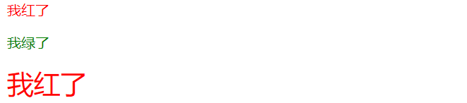
p {
/* Set font color */
color: green;
/* Set font size */
font-size: 30px;
}
</style>
</head>
<body>
<p>I'm green</p>
</body>
</html>
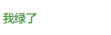
- CSS code can be placed in a special style tag (internal style). The style tag itself can be placed anywhere on the page, usually in the head tag
- The comment character in CSS is / * * /, and you can use the shortcut key Ctrl +/
- In the above example, the selector is the paragraph label p, and the declared content includes setting the font color to green and the font size to 30px
1.2.2 style
-
Compact style
p { color: green; font-size: 30px;} -
Deployment style (recommended)
p {
    color: green;
    font-size: 30px;
}
1.2.3 style case
Because it is not case sensitive in CSS, so
- In development, lowercase letters are used uniformly
- Attribute names also use the spine naming method, that is, if an attribute is composed of multiple words, it is separated by -
1.2.4 space specification
- Colon followed by space
- Space between selector and {symbol
1.3 introduction method
1.3.1 internal style
Basic introduction: put the CSS code into a special style tag. The style tag itself can be placed anywhere on the page, usually in the head tag
Example code:
<!DOCTYPE html>
<html lang="en">
<head>
    <meta charset="UTF-8">
    <meta http-equiv="X-UA-Compatible" content="IE=edge">
    <meta name="viewport" content="width=device-width, initial-scale=1.0">
    <title>test1</title>
    <style>
        p {
            /* Set font color */
            color: green;
            /* Set font size */
            font-size: 30px;
        }
    </style>
</head>
<body>
    <p>I'm green</p>
</body>
</html>
Advantages: the internal style can realize the separation of style and page structure
Disadvantages: the separation of style and page structure is not thorough enough, especially when there is a lot of CSS content
1.3.2 inline style
Basic introduction: write the CSS code to the tag in the form of style attribute
Example code:
<!DOCTYPE html>
<html lang="en">
<head>
    <meta charset="UTF-8">
    <meta http-equiv="X-UA-Compatible" content="IE=edge">
    <meta name="viewport" content="width=device-width, initial-scale=1.0">
    <title>test1</title>
</head>
<body>
    <p style="color: green ;font-size: 30px">I'm green</p>
</body>
</html>
Advantages: suitable for writing simple styles
Disadvantages: it only works for a label and cannot write too complex styles
Note: in line styles have higher priority and will overwrite other styles
1.3.3 external style
Basic introduction: the most commonly used way in actual development is to create a CSS file first, and then use the link tag to introduce CSS
Example code:
-
Create a CSS file (create a style.css here) to write the content of specific styles
p { color: green; font-size: 30px; } -
In HTML files, the written CSS is introduced through the link tag
<!DOCTYPE html> <html lang="en"> <head> <meta charset="UTF-8"> <meta http-equiv="X-UA-Compatible" content="IE=edge"> <meta name="viewport" content="width=device-width, initial-scale=1.0"> <title>test1</title> <link rel="stylesheet" href="style.css"> </head> <body> <p>I'm green</p> </body> </html>- The rel attribute value in the link tag is fixed to stylesheet
- The href attribute value in the link tag is the path of CSS
Advantage: external style can completely separate style from page structure
Disadvantages: the use of external styles will be affected by the browser cache, and the modification may not take effect immediately
Supplement: browser cache knowledge
Browser caching is a common technical means to improve the performance of computers. The resources (HTML/CSS/JS / picture / font, etc.) that the web page depends on are usually obtained from the server. If you visit the website frequently, these external resources do not need to be obtained from the server repeatedly. You can use the cache to save them first (i.e. save them to the local disk), and then access them directly from the disk, so as to improve the access efficiency.
You can force the page to refresh by Ctrl + F5, so that the browser can retrieve the CSS file
2. Selector
2.1 function of selector
The CSS selector is used to select the tag element specified in the page. Just like when playing a game, you have to select the enemy to attack before you can give the other party the damage you want to cause.
2.2 type of selector
Here, selectors are mainly divided into two categories and eight sub categories
- Base selector: consisting of a single selector
- tag chooser
- Class selector
- id selector
- Wildcard selector
- Compound selector: a combination of multiple basic selectors
- Descendant Selectors
- Child selectors
- Union selector
- Pseudo class selector
In addition to the eight selectors described above, there are many other selectors in CSS. Only these eight commonly used selectors are introduced in detail here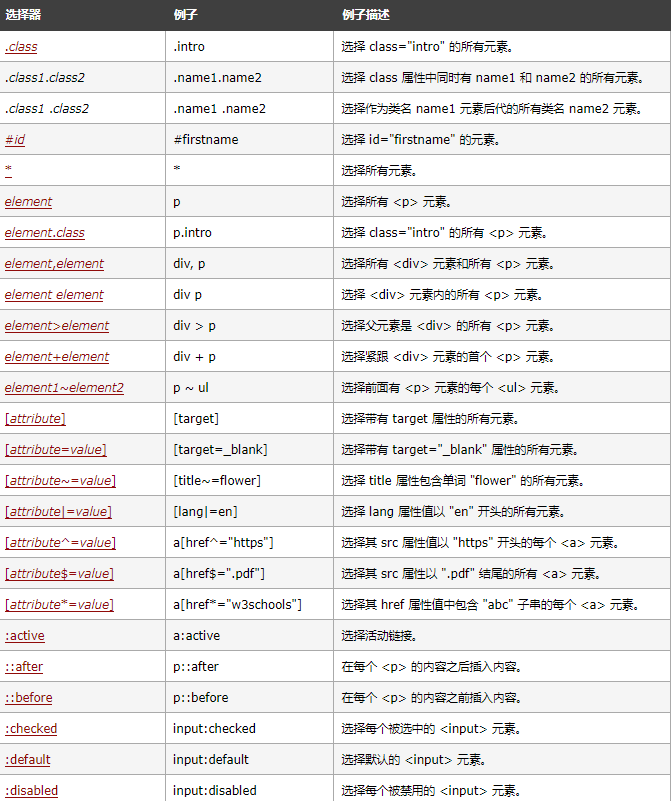
Reference documents: https://www.w3school.com.cn/cssref/css_selectors.asp
2.3 foundation selector
2.3.1 label selector
Basic introduction: the object of the selector is a label. After selecting it, you can modify the contents of all the labels
Features: it can quickly modify the contents of the same type of labels, but it cannot be selected differently
Example code:
<!DOCTYPE html>
<html lang="en">
<head>
    <meta charset="UTF-8">
    <meta http-equiv="X-UA-Compatible" content="IE=edge">
    <meta name="viewport" content="width=device-width, initial-scale=1.0">
    <title>test1</title>
    <style>
        p {
            color: green;
            font-size: 30px;
        }
        div {
            color: red;
            font-size: 50px;
        }
    </style>
</head>
<body>
    <p>I'm green</p>
    <div>I'm red</div>
</body>
</html>
Type 2.3.2 selector
Basic introduction: you can set one or more class attributes for labels, and then the object of the selector can be a class name. After selection, you can modify the contents of all labels belonging to this class
Syntax details:
- The value of the class attribute set in the tag: it cannot be named with pure numbers, Chinese or tag name
- If the value of the class attribute is too long, you can use - split
- A class can be used by multiple labels, and a label can also use multiple classes (multiple class names are separated by spaces)
- Use point numbers in CSS The beginning represents the class selector, which is better Followed by the specific class name
Features: different labels can be differentiated, and multiple labels can use the same style
Example code:
<!DOCTYPE html>
<html lang="en">
<head>
    <meta charset="UTF-8">
    <meta http-equiv="X-UA-Compatible" content="IE=edge">
    <meta name="viewport" content="width=device-width, initial-scale=1.0">
    <title>test1</title>
    <style>
        .red {
            color: red;
        }
        .green {
            color: green;
        }
        .font-size {
            font-size: 30px;
        }
    </style>
</head>
<body>
    <p class="red">I'm red</p>
    <p class="green">I'm green</p>
    <div class="red font-size">I'm red</div>
</body>
</html>
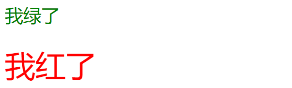
2.3.3 id selector
Basic introduction: you can set an id attribute for each tag, and then the object of the selector can be the id name. After selecting it, you can modify the content of the tag that is an id
Syntax details:
- Each tag can only set one id attribute, and the value of the id attribute is unique
- CSS starts with # to represent the id selector, # followed by the specific id value
Features: you can select a specific tag to modify the content through the id selector
Example code:
<!DOCTYPE html>
<html lang="en">
<head>
    <meta charset="UTF-8">
    <meta http-equiv="X-UA-Compatible" content="IE=edge">
    <meta name="viewport" content="width=device-width, initial-scale=1.0">
    <title>test1</title>
    <style>
        #one {
            color: red;
        }
        #two {
            color: green;
        }
    </style>
</head>
<body>
    <p id="one">I'm red</p>
    <p id="two">I'm green</p>
</body>
</html>
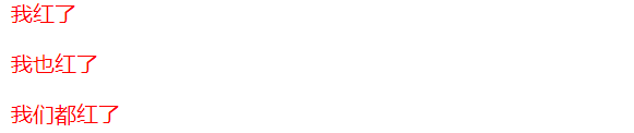
2.3.4 wildcard selector
Basic introduction: the object of the selector is * which means that it is a wildcard selector, which can select all labels. Commonly used to clarify the default style of the browser
Features: wildcard selector can make all labels of the page be modified
Example code:
<!DOCTYPE html>
<html lang="en">
<head>
    <meta charset="UTF-8">
    <meta http-equiv="X-UA-Compatible" content="IE=edge">
    <meta name="viewport" content="width=device-width, initial-scale=1.0">
    <title>test1</title>
    <style>
        * {
            color: red;
        }

    </style>
</head>
<body>
    <p>I'm red</p>
    <div>I'm red, too</p>
    <p>We're all red</p>
</body>
</html>
2.3.5 summary of foundation selector
| selector | effect | characteristic | priority |
|---|---|---|---|
| tag chooser | Be able to select all the same labels | Non differentiated choice | Lower |
| Class selector | Be able to select one or more similar labels | According to the demand, it is the most flexible and commonly used | higher |
| id selector | Can select a unique id tag | The same id can only appear once in an HTML | highest |
| Wildcard selector | Able to select all labels | Special emptying use (e.g. clear browser default style) | minimum |
Because selectors can be combined, there is a priority in the basic selector (that is, the stronger the pertinence to the element, the higher the priority). The combined basic selector will display the modified content according to the higher priority
However, since CSS also has compound selectors, priority actually has a complex calculation rule, which should be judged according to the specific situation
2.4 compound selector
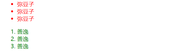
2.4.1 offspring selector
Basic introduction: the selection object of descendant selector is a child element (including grandchildren) of a parent element
Syntax details:
Element 1 element 2 {Style declaration}
- Element 1 is the parent and element 2 is the child
- Use space separation between element 1 and element 2
- Descendant selectors affect only element 2, not element 1
- Descendant selectors can be not only a combination of label selectors, but also a combination of class selectors or id selectors
Example code:
<!DOCTYPE html>
<html lang="en">
<head>
<meta charset="UTF-8">
<meta http-equiv="X-UA-Compatible" content="IE=edge">
<meta name="viewport" content="width=device-width, initial-scale=1.0">
<title>test1</title>
<style>
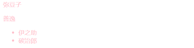
ul li {
color: red;
}
.green li {
color: green;
}
</style>
</head>
<body>
<ul>
<li>Mi Douzi</li>
<li>Mi Douzi</li>
<li>Mi Douzi</li>
</ul>
<ol class="green">
<li>Shanyi</li>
<li>Shanyi</li>
<li>Shanyi</li>
</ol>
</body>
</html>
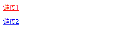
2.4.2 sub selector
Basic introduction: similar to the descendant selector, the object of the selector is the child element of a parent element, but it can only be a child element, not a grandson element
Syntax details:
Element 1>Element 2 {Style declaration}
- Element 1 is the parent and element 2 is the child
- Elements 1 and 2 are separated by >
- The child selector selects only the parent son, not the grandson element
Example code:
<!DOCTYPE html>
<html lang="en">
<head>
    <meta charset="UTF-8">
    <meta http-equiv="X-UA-Compatible" content="IE=edge">
    <meta name="viewport" content="width=device-width, initial-scale=1.0">
    <title>test1</title>
    <style>
        .red>a {
            color: red;
        }
    </style>
</head>
<body>
    <div class="red">
        <a href="#"> link 1</a>
        <p><a href="#"> link 2</a></p>
    </div>
</body>
</html>
2.4.3 union selector
Basic introduction: Union selector is used to select multiple groups of labels, which can be collectively declared
Syntax details:
Element 1,
Element 2,
...,
element N {Style declaration}
- Separate the elements with commas
- Any base selector can use the union selector
- Union selectors are recommended to be written vertically, and each selector occupies one line
Example code:
<!DOCTYPE html>
<html lang="en">
<head>
    <meta charset="UTF-8">
    <meta http-equiv="X-UA-Compatible" content="IE=edge">
    <meta name="viewport" content="width=device-width, initial-scale=1.0">
    <title>test1</title>
    <style>
        div,
        p,
        ul>li {
            color: pink;
        }
    </style>
</head>
<body>
    <div>Mi Douzi</div>
    <p>Shanyi</p>
    <ul>
        <li>Yi Zhizhu</li>
        <li>Carbon zhilang</li>
    </ul>
</body>
</html>
2.4.4 pseudo class selector
Basic introduction: pseudo class selector is divided into link pseudo class selector and focus pseudo class selector
-
Link pseudo class selector
-
Syntax details:
Object of selector meaning a:link Select links that have not been visited a:visted Select links that have been visited a:hover Select the link over which the mouse pointer hovers a:active Select the link that the mouse pressed but did not pop up -
Note: link selectors are generally written in the order of LVHA (memory rule "greening"). If active is brought to the front, it will lead to active failure
-
Example code:
<!DOCTYPE html>
<html lang="en">
<head>
    <meta charset="UTF-8">
    <meta http-equiv="X-UA-Compatible" content="IE=edge">
    <meta name="viewport" content="width=device-width, initial-scale=1.0">
    <title>test1</title>
    <style>
        a:link {
            color: red;
        }
        a:visited {
            color: black;
        }
        a:hover {
            color: blue;
        }
        a:active {
            color: green;
        }
    </style>
</head>
<body>
    <a href="#"> I'm a link</a>
</body>
</html>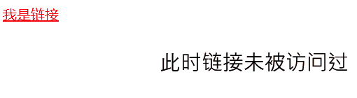
-
-
: focus pseudo class selector
-
Basic introduction: focus pseudo class selector can select the input form element to obtain the focus (this is only introduced here, and it's OK to understand)
-
Example code:
<!DOCTYPE html>
<html lang="en">
<head>
    <meta charset="UTF-8">
    <meta http-equiv="X-UA-Compatible" content="IE=edge">
    <meta name="viewport" content="width=device-width, initial-scale=1.0">
    <title>test1</title>
    <style>
        .one>input:focus {
            color: red;
        }
        .two>input:focus {
            color: green;
        }
    </style>
</head>
<body>
    <div class="one">
        <input type="text">
        <input type="text">
    </div>
    <div class="two">
        <input type="text">
        <input type="text">
    </div>
</body>
</html>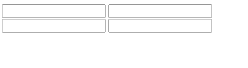
-
2.4.5 summary of composite selector
| selector | effect | matters needing attention |
|---|---|---|
| Descendant Selectors | Select descendant element | Descendants contain grandchildren |
| Child selectors | Select child element | Child elements can only be sons, not grandchildren |
| Union selector | Select elements with the same style | Better code reuse |
| Link pseudo class selector | Select links in different states | Pay attention to the writing order of LVHA |
| : focus pseudo class selector | Select the selected element | Only input:focus is introduced here |
3. Common element attributes
There are many properties of CSS, just like many methods in Java. Here we only focus on some common elements. For more information, see the reference documentation.
Reference documents: https://www.w3school.com.cn/cssref/index.asp
3.1 font attributes
3.1.1 text font
Properties:
font-family
matters needing attention:
- The font name can be in Chinese, but it is not recommended
- If the value has multiple fonts, the multiple fonts are separated by commas (the font will be found from left to right, and if not, the default font will be used)
- Fonts can be enclosed in quotation marks to prevent spaces between fonts
- It is recommended to use common fonts and ensure that the set fonts exist on personal machines
Example code:
<!DOCTYPE html>
<html lang="en">
<head>
<meta charset="UTF-8">
<meta http-equiv="X-UA-Compatible" content="IE=edge">
<meta name="viewport" content="width=device-width, initial-scale=1.0">
<title>test1</title>
<style>
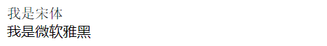
#one {
font-family: 'Song style';
}
#two {
font-family: "Microsoft YaHei";
}
</style>
</head>
<body>
<div id="one">I'm in song style</div>
<div id="two">I'm Microsoft YaHei</div>
</body>
</html>
3.1.2 text size
Properties:
font-size
matters needing attention:
-
Since the default font size of different browsers is different, it is best to give a clear value
-
The value of font size can be a specific number, and the unit is pixel px
-
The value of font size can also be a fixed English word
value describe xx-small,x-small,small,medium,large,x-large,xx-large Set the font size to different sizes, from XX small to XX Large. Default: medium. smaller Set font size to a smaller size than the parent element. larger Set font size to a larger size than the parent element. length Set font size to a fixed value. % Set font size to a percentage value based on the parent element. inherit Specifies that the font size should be inherited from the parent element. -
In fact, in the set font, the height of the character box will be affected by the zoom of the browser, which is different from the actual set value
Example code:
<!DOCTYPE html>
<html lang="en">
<head>
    <meta charset="UTF-8">
    <meta http-equiv="X-UA-Compatible" content="IE=edge">
    <meta name="viewport" content="width=device-width, initial-scale=1.0">
    <title>test1</title>
    <style>
        #one {
            font-size: 10px;

        }
        #two {
            font-size: xx-large;
        }
    </style>
</head>
<body>
    <div id="one">I'm 10 px Size of</div>
    <div id="two">I am xx-large Size of</div>
</body>
</html>
3.1.3 text thickness
Properties:
font-weight
matters needing attention:
-
Font weight can be set as a number with no unit, but the value range must be the whole hundred value of [100900]
-
The value set by font weight can be English words
value describe normal Default value. Defines the standard character. bold Define bold characters. bolder Define thicker characters. lighter Define finer characters. inherit Specifies that the font weight should be inherited from the parent element. -
The number 400 is equivalent to normal and 700 is equivalent to bold.
Example code:
<!DOCTYPE html>
<html lang="en">
<head>
<meta charset="UTF-8">
<meta http-equiv="X-UA-Compatible" content="IE=edge">
<meta name="viewport" content="width=device-width, initial-scale=1.0">
<title>test1</title>
<style>
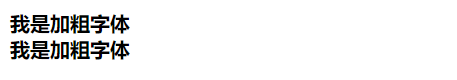
#one {
font-weight: 700;
}
#two {
font-weight: bold;
}
</style>
</head>
<body>
<div id="one">I'm bold</div>
<div id="two">I'm bold</div>
</body>
</html>
3.1.4 text style
Properties:
font-style
matters needing attention:
-
Font style can be set to the following values:
value describe normal Default value. The browser displays a standard font style. italic The browser displays an italic font style. oblique The browser displays an oblique font style. inherit Specifies that the font style should be inherited from the parent element. -
In fact, it is rare to tilt a text, but often change the inclined font to normal
Example code:
<!DOCTYPE html>
<html lang="en">
<head>
<meta charset="UTF-8">
<meta http-equiv="X-UA-Compatible" content="IE=edge">
<meta name="viewport" content="width=device-width, initial-scale=1.0">
<title>test1</title>
<style>
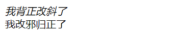
#one {
font-style: italic;
}
#two em{
font-style: normal;
}
</style>
</head>
<body>
<div id="one" >My back is straight and tilted</div>
<div id="two"><em>I've changed my ways</em></div>
</body>
</html>
3.2 text attributes
3.2.1 text color
Properties:
color
matters needing attention:
- The value of color can be some English words representing color (red, green, blue, black, etc.)
- The value of color can be hexadecimal, such as: #ff0000
- The value of color can be RGB, such as rgb(255, 0, 0)
Supplement: brief introduction of RGB
- The computer uses RGB to represent colors, R (red), G (green) and B (blue). If the three colors of red, green and blue are full, they will turn white. If the three colors are very light, they will turn black. By matching these three colors in different proportions, you can mix colorful effects
- Color depth represents a color. In CSS, 8 bit s are used to represent a color, that is, a byte represents a color.
- There are two ways to represent color by color depth
- One is expressed in hexadecimal. Because a hexadecimal digit is 4 bit s, a color needs two hexadecimal digits, and an RGB value needs six hexadecimal digits, i.e.: #ff0000. (every two hexadecimal digits represent a color, 00 indicates that the component has no value, and FF indicates that the value of the component is full. If the two digits of each color are the same, it can be simplified. For example, #ff0000 can write #f00)
- On the other hand, each component is directly represented by decimal digits. Since a color has 8 bit bits, the value of each component ranges from 0 to 255. The writing method is as follows: rgb(255, 0, 0)
Example code:
<!DOCTYPE html>
<html lang="en">
<head>
    <meta charset="UTF-8">
    <meta http-equiv="X-UA-Compatible" content="IE=edge">
    <meta name="viewport" content="width=device-width, initial-scale=1.0">
    <title>test1</title>
    <style>
        #one {
            color: red;
        }
        #two {
            color: #ff0000;
        }
        #three {
            color: rgb(255,0,0);
        }
    </style>
</head>
<body>
    <div id="one" >Mi Douzi</div>
    <div id="two">Shanyi</div>
    <div id="three">Yi Zhizhu</div>
</body>
</html>
3.2.2 text alignment
Properties:
text-align
matters needing attention:
-
The value of text align can be
value describe left Arrange the text to the left. Default: determined by the browser. right Arrange the text to the right. center Arrange the text in the middle. justify Align text at both ends. inherit Specifies that the value of the text align attribute should be inherited from the parent element -
This attribute can not only control the text alignment, but also control the center or right of elements such as pictures
Example code:
<!DOCTYPE html>
<html lang="en">
<head>
    <meta charset="UTF-8">
    <meta http-equiv="X-UA-Compatible" content="IE=edge">
    <meta name="viewport" content="width=device-width, initial-scale=1.0">
    <title>test1</title>
    <style>
        #one {
            text-align: left;
        }
        #two {
            text-align: center;
        }
        #three {
            text-align: right;
        }
    </style>
</head>
<body>
    <div id="one" >Mi Douzi</div>
    <div id="two">Shanyi</div>
    <div id="three">Yi Zhizhu</div>
</body>
</html>

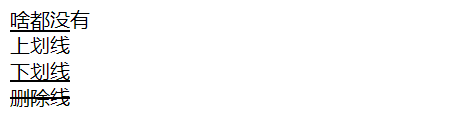
3.2.3 text decoration
Properties:
text-decoration
matters needing attention:
-
The value of text decoration can be
value describe none Default, that is, add nothing underline Defines a line under the text, the underline overline Define a line on the text, that is, the dash line line-through Defines a line that passes under the text, the strikethrough blink Defines the blinking text. inherit Specifies that the value of the text decoration attribute should be inherited from the parent element. -
none can underline the a tag
Example code:
<!DOCTYPE html>
<html lang="en">
<head>
    <meta charset="UTF-8">
    <meta http-equiv="X-UA-Compatible" content="IE=edge">
    <meta name="viewport" content="width=device-width, initial-scale=1.0">
    <title>test1</title>
    <style>
        #one {
            text-decoration: none;
        }
        #two {
            text-decoration: overline;
        }
        #three {
            text-decoration: underline;
        }
        #four {
            text-decoration: line-through;
        }
    </style>
</head>
<body>
    <div id="one" >Nothing</div>
    <div id="two">Upper scribe</div>
    <div id="three">Underline</div>
    <div id="four">Delete line</div>
</body>
</html>
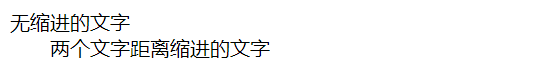
3.2.4 text indentation
Properties:
text-indent
matters needing attention:
- The value of text indent can be a number, and the unit can be px or em. px is in pixel units, while EM units represent the text size of the current element, that is, 1em represents a text size
- The indent can be a negative value, which means to indent to the left, which will cause the opening text not to be in the display box
Example code:
<!DOCTYPE html>
<html lang="en">
<head>
    <meta charset="UTF-8">
    <meta http-equiv="X-UA-Compatible" content="IE=edge">
    <meta name="viewport" content="width=device-width, initial-scale=1.0">
    <title>test1</title>
    <style>
        /* #one {
            text-indent: 0em;
        } */
        #two {
            text-indent: 2em;
        }
    </style>
</head>
<body>
    <div id="one" >Text without indentation</div>
    <div id="two">Text indented by two text distances</div>
</body>
</html>
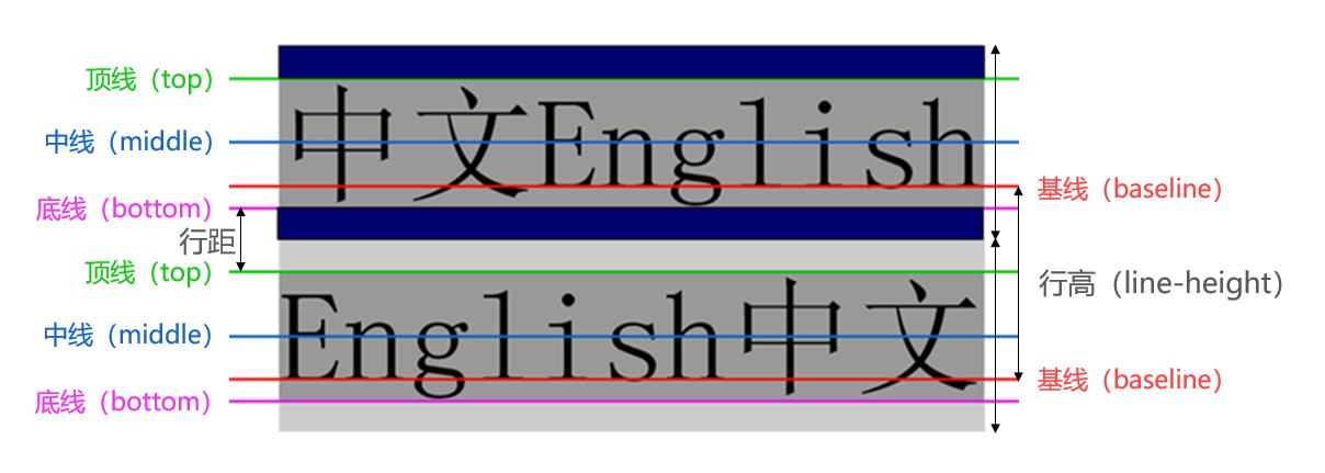
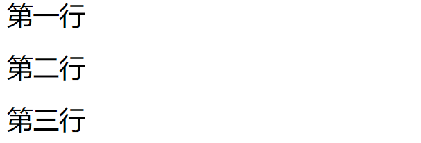
3.2.5 text line height
Properties:
line-height
matters needing attention:
- Line height refers to the baseline distance between the lines of the context (line height = height of the text itself + line spacing)
- The value of line height is the row height, and the unit is px
Supplement: Several baselines involved in displaying text in HTML
Example code:
<!DOCTYPE html>
<html lang="en">
<head>
    <meta charset="UTF-8">
    <meta http-equiv="X-UA-Compatible" content="IE=edge">
    <meta name="viewport" content="width=device-width, initial-scale=1.0">
    <title>test1</title>
    <style>
        div {
            font-size: 30px;
            line-height: 60px;
        }
    </style>
</head>
<body>
    <div>first line</div>
    <div>Second line</div>
    <div>Third line</div>
</body>
</html>
3.3 background attributes
3.3.1 background color
Properties:
background-color
matters needing attention:
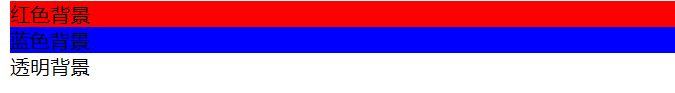
- The value of background color is the same as that of color, which can be set in three ways
- The default value of background color is transparent, which means transparent
Example code:
<!DOCTYPE html>
<html lang="en">
<head>
    <meta charset="UTF-8">
    <meta http-equiv="X-UA-Compatible" content="IE=edge">
    <meta name="viewport" content="width=device-width, initial-scale=1.0">
    <title>test1</title>
    <style>
        .one {
            background-color: #ff0000;
        }
        .two {
            background-color: rgb(0,0,255);
        }
        .three {
            background: transparent;
        }
    </style>
</head>
<body>
    <div class="one">Red background</div>
    <div class="two">Blue background</div>
    <div class="three">Transparent background</div>
</body>
</html>
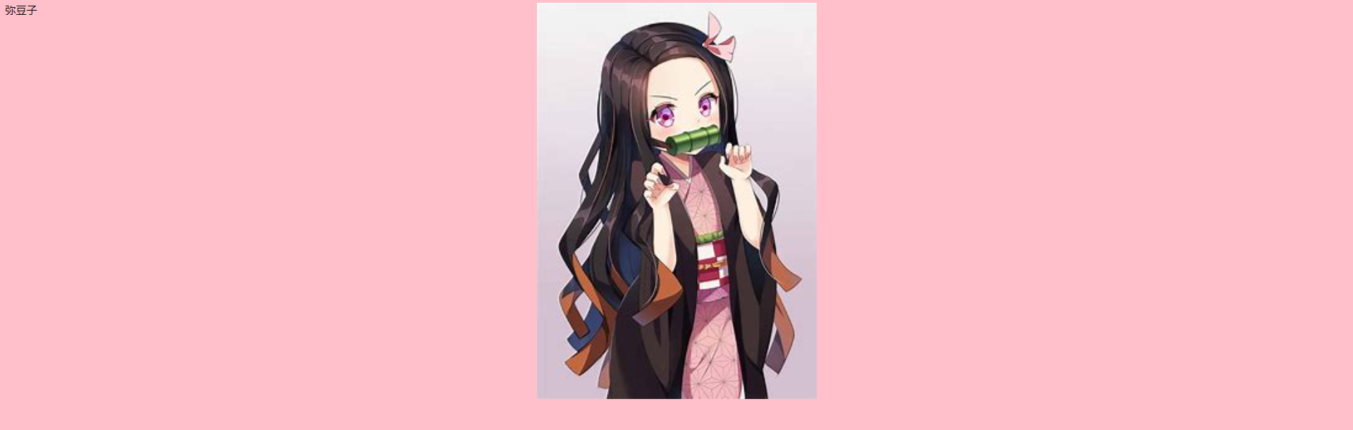
3.3.2 background picture
Properties:
background-image: url()
matters needing attention:
- The url of background image is the image path
- The url can be quoted or not
- Background image displays images in a "tiled" manner by default
Example code:
<!DOCTYPE html>
<html lang="en">
<head>
<meta charset="UTF-8">
<meta http-equiv="X-UA-Compatible" content="IE=edge">
<meta name="viewport" content="width=device-width, initial-scale=1.0">
<title>test1</title>
<style>
.one {
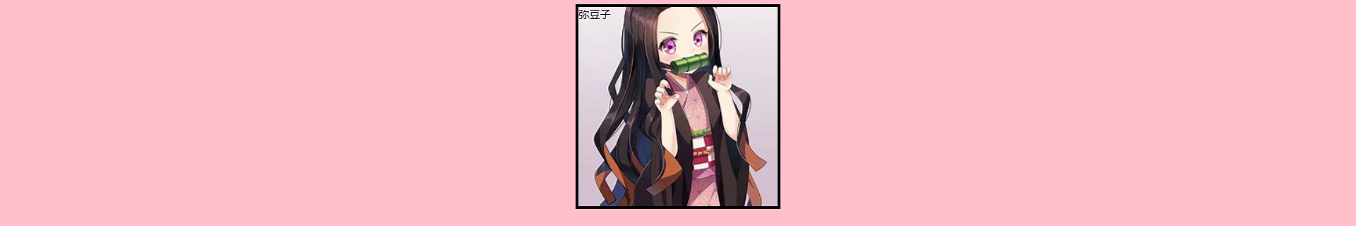
background-image: url(./image/Mi Douzi.jpg);
height: 300px;
}
.two {
background-image: url(./image/Shanyi.jpg);
height: 300px;
}
</style>
</head>
<body>
<div class="one">Mi Douzi</div>
<div class="two">Shanyi</div>
</body>
</html>
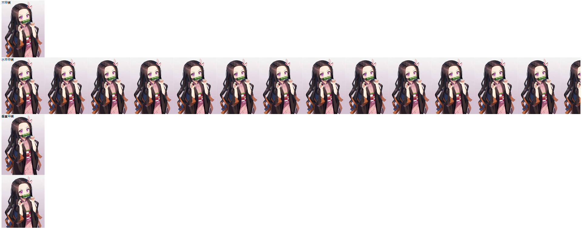
3.3.3 background tiling
Properties:
background-repeat
matters needing attention:
-
Background repeat is used to set the tiling method. The values are as follows
value describe repeat Default. The background image repeats vertically and horizontally repeat-x The background image will repeat in the horizontal direction, i.e. tile horizontally repeat-y The background image will repeat in the vertical direction, i.e. tile vertically no-repeat The background image will be displayed only once without tiling inherit Specifies that the setting of the background repeat attribute should be inherited from the parent element. -
The default value of background repeat is repeat
Example code:
<!DOCTYPE html>
<html lang="en">
<head>
    <meta charset="UTF-8">
    <meta http-equiv="X-UA-Compatible" content="IE=edge">
    <meta name="viewport" content="width=device-width, initial-scale=1.0">
    <title>test1</title>
    <style>
        .one {
            background-image: url(./image/Mi Douzi.jpg);
            height: 300px;
            background-repeat: no-repeat;
        }
        .two {
            background-image: url(./image/Mi Douzi.jpg);
            height: 300px;
            background-repeat: repeat-x;
        }
        .three {
            background-image: url(./image/Mi Douzi.jpg);
            height: 600px;
            background-repeat: repeat-y;
        }
    </style>
</head>
<body>
    <div class="one">no-repeat </div>
    <div class="two">tile horizontally</div>
    <div class="three">Tile Vertically </div>
</body>
</html>
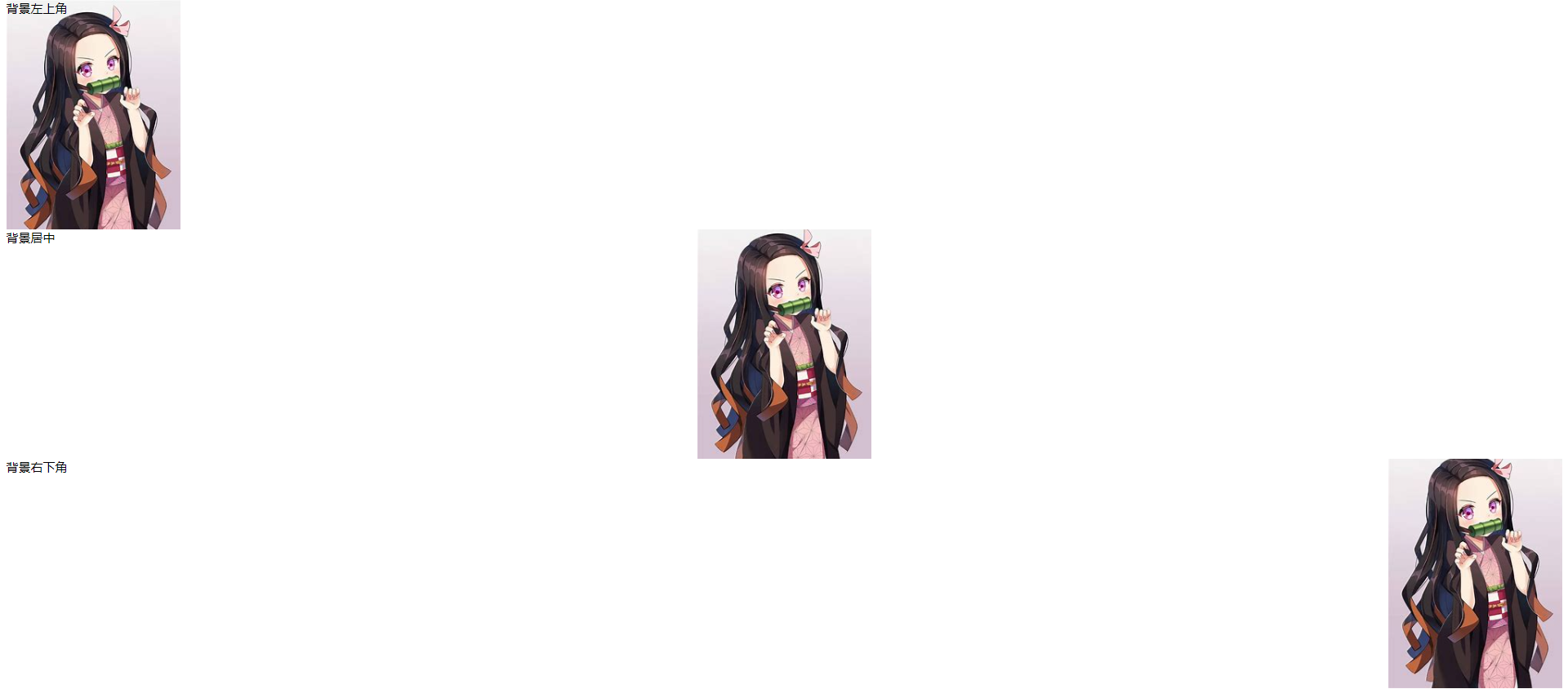
3.3.4 background position
Properties:
background-position
matters needing attention:
-
There are three types of background position values
value describe top left,top center,top right,center left,center center,center right,bottom left,bottom center,bottom right If you specify only one keyword, the second value will be "center". Default: 0%. x% y% The first value is the horizontal position and the second value is the vertical position. The upper left corner is 0%. The lower right corner is 100%. If you specify only one value, the other value will be 50%. xpos ypos The first value is the horizontal position and the second value is the vertical position. The upper left corner is 0. The units are pixels (0px, 0px) or any other CSS units. If you specify only one value, the other value will be 50%. You can mix the% and position values. -
In the plane coordinate system of the computer, the upper left corner is the origin, the right is the positive x axis, and the down is the positive y axis
-
If both values of the parameter are location nouns, it has nothing to do with the order of the previous and subsequent parameters (for example, left center and center left have the same meaning)
-
If only one location noun is specified, the second one will be centered by default (for example, left actually means left center)
-
If the parameter is an exact value, the first one must be x and the second one must be y (for example, 100 200 means that x is 100 and Y is 200)
-
If the parameter is an exact value, and only one parameter is given, the parameter must be x, and the other is vertically centered by default (for example, 100 indicates that the abscissa is 100 and vertically centered)
-
If the parameter is a mixed unit, the first value must be x and the second value must be y (for example, 100 center means the abscissa is 100 and the vertical center is 100)
Example code:
<!DOCTYPE html>
<html lang="en">
<head>
    <meta charset="UTF-8">
    <meta http-equiv="X-UA-Compatible" content="IE=edge">
    <meta name="viewport" content="width=device-width, initial-scale=1.0">
    <title>test1</title>
    <style>
        .one {
            background-image: url(./image/Mi Douzi.jpg);
            height: 300px;
            background-repeat: no-repeat;
            background-position: 0 0;
        }
        .two {
            background-image: url(./image/Mi Douzi.jpg);
            height: 300px;
            background-repeat: no-repeat;
            background-position: center center;
        }
        .three {
            background-image: url(./image/Mi Douzi.jpg);
            height: 300px;
            background-position: 100% 100%;
            background-repeat: no-repeat;
        }
    </style>
</head>
<body>
    <div class="one">Upper left corner of background</div>
    <div class="two">Background centered</div>
    <div class="three">Lower right corner of background</div>
</body>
</html>
3.3.5 background size
Properties:
background-size
matters needing attention:
-
There are four types of background size values
value describe length Sets the height and width of the background image. The first value sets the width and the second value sets the height. If only one value is set, the second value is set to "auto". percentage Sets the width and height of the background image as a percentage of the parent element. The first value sets the width and the second value sets the height. If only one value is set, the second value is set to "auto". cover The background image is expanded to be large enough so that the background image completely covers the background area. Some parts of the background image may not be displayed in the background positioning area. contain Expand the image to the maximum size so that its width and height fully adapt to the content area. -
contain is to put the size to the maximum size, while cover is to completely cover the background area with the background image, which may cause some areas to exceed the display area
Example code:
<!DOCTYPE html>
<html lang="en">
<head>
    <meta charset="UTF-8">
    <meta http-equiv="X-UA-Compatible" content="IE=edge">
    <meta name="viewport" content="width=device-width, initial-scale=1.0">
    <title>test1</title>
    <style>
        .one {
            background-image: url(./image/Mi Douzi.jpg);
            height: 600px;
            background-repeat: no-repeat;
            background-position: center;
            background-size: contain;
        }
        body {
            background-color: pink;
        }
    </style>
</head>
<body>
    <div class="one">Mi Douzi</div>
</body>
</html>
3.4 rounded rectangle
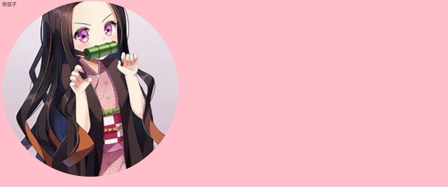
3.3.1 basic usage
border-radius
- The value of border radius represents the radius of the inscribed circle in the four corners of the rectangle
- The larger the radius of the inscribed circle, the rounder the rectangle will be
- Border radius is actually a writing method, which can also be set separately for four corners
- Border top left radius indicates the upper left corner
- Border top right radius indicates the upper right corner
- Border bottom right radius indicates the lower right corner
- Border bottom left radius indicates the lower left corner
- Border radius itself can directly set four values, and the order of values is clockwise from top left to top right to bottom right to bottom left
3.3.2 generating a circle
When the diameter of the inscribed circle is equal to that of the rectangle, a circle can be generated
Example code:
<!DOCTYPE html>
<html lang="en">
<head>
    <meta charset="UTF-8">
    <meta http-equiv="X-UA-Compatible" content="IE=edge">
    <meta name="viewport" content="width=device-width, initial-scale=1.0">
    <title>test1</title>
    <style>
        .one {
            background-image: url(./image/Mi Douzi.jpg);
            height: 600px;
            width: 600px;
            background-repeat: no-repeat;
            background-position: center;
            background-size: cover;
            border-radius: 600px;
        }
        body {
            background-color: pink;
        }
    </style>
</head>
<body>
    <div class="one">Mi Douzi</div>
</body>
</html>
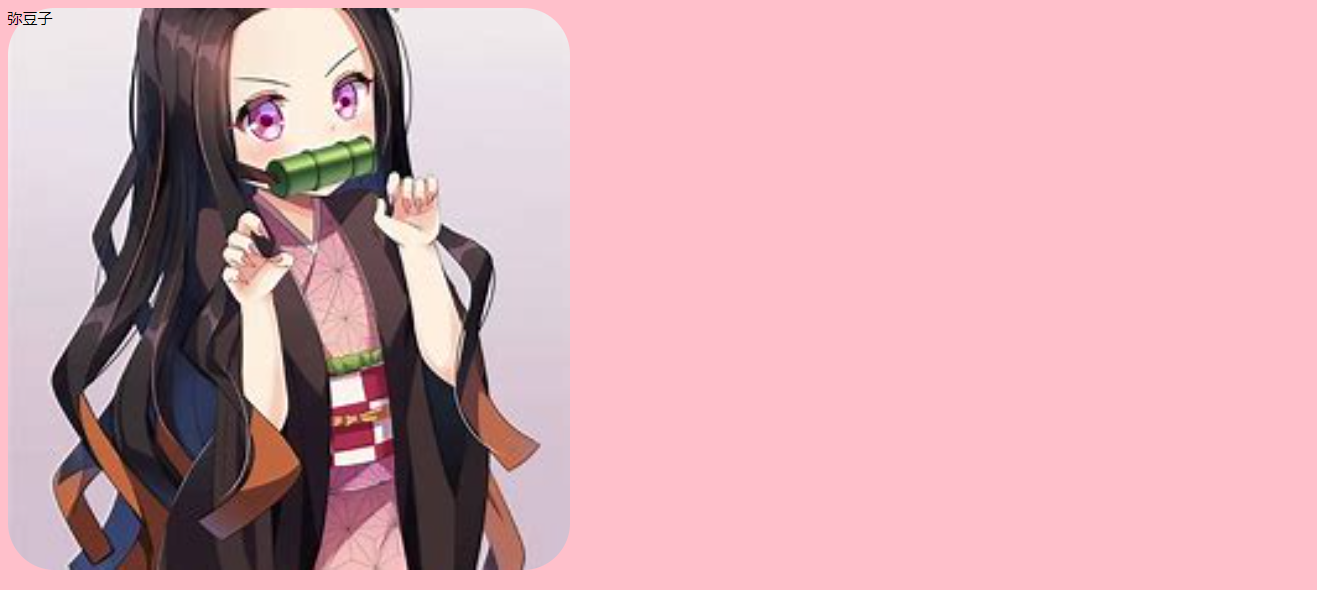
3.3.3 generate rounded rectangle
When the value of border radius is appropriate, a rounded rectangle can be generated
Example code:
<!DOCTYPE html>
<html lang="en">
<head>
    <meta charset="UTF-8">
    <meta http-equiv="X-UA-Compatible" content="IE=edge">
    <meta name="viewport" content="width=device-width, initial-scale=1.0">
    <title>test1</title>
    <style>
        .one {
            background-image: url(./image/Mi Douzi.jpg);
            height: 600px;
            width: 600px;
            background-repeat: no-repeat;
            background-position: center;
            background-size: cover;
            border-radius: 50px;
        }
        body {
            background-color: pink;
        }
    </style>
</head>
<body>
    <div class="one">Mi Douzi</div>
</body>
</html>
4. Display mode of elements
In CSS, there are many display modes for HTML tags. Here we mainly introduce block level elements and inline elements
4.1 block level elements
Common block level elements:
h1 - h6
p
div
ul
ol
li
...
characteristic:
- Exclusive row
- Height, width, inner and outer margins and row height can be controlled
- The width defaults to 100% of the width of the parent element
- Block level elements and inline elements can be nested inside
be careful:
- Block level elements cannot be used inside elements of a text class
- p tags are mainly used to store text. Block level elements, especially div, cannot be placed inside
4.2 inline elements
Common inline elements:
a
strong
b
em
i
del
s
ins
u
span
...
characteristic:
- Not exclusive to one line, one line can display multiple elements
- Setting height, width and row height is invalid
- The left and right outer margins are valid, the upper and lower outer margins are invalid, and the inner margins are valid
- The default width is the width of the content itself
- Inline elements can only contain text and other inline elements, not block level elements
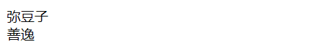
4.3 changing the display mode
Attribute: use the display attribute to modify the display mode of the element
display
- Display: change block representation to block level element
- display: inline means to change to an inline element
Example code:
<!DOCTYPE html>
<html lang="en">
<head>
    <meta charset="UTF-8">
    <meta http-equiv="X-UA-Compatible" content="IE=edge">
    <meta name="viewport" content="width=device-width, initial-scale=1.0">
    <title>test1</title>
    <style>
        span {
            display: block;
        }
    </style>
</head>
<body>
    <span>Mi Douzi</span>
    <span>Shanyi</span>
</body>
</html>
5. Box model
5.1 basic introduction
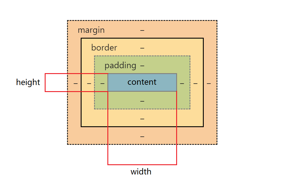
Each HTML element is equivalent to a rectangular "box". The box consists of the following parts
- Border: the border of the box
- Inside margin padding: the distance between the border and the content
- margin: the distance between boxes
- content: the contents of the box
5.2 border
5.2.1 basic attributes
Properties:
border-width
border-style
border-color
- Border width indicates the thickness of the border
- Border style indicates the style of the border. The default is no border
- Solid indicates a solid border
- Dashed indicates a dashed border
- Dotted indicates a dotted border
- Border color indicates the border color
- You can change the four directions of the border respectively
- Border top top border
- Border bottom bottom border
- Border left left border
- Border right right right border
Example code:
<!DOCTYPE html>
<html lang="en">
<head>
    <meta charset="UTF-8">
    <meta http-equiv="X-UA-Compatible" content="IE=edge">
    <meta name="viewport" content="width=device-width, initial-scale=1.0">
    <title>test1</title>
    <style>
        .one {
            background-image: url(./image/Mi Douzi.jpg);
            height: 300px;
            width: 300px;
            background-repeat: no-repeat;
            background-position: center;
            background-size: cover;
            border-width: 5px;
            border-style: solid;
            background-color: black;
        }
        body {
            background-color: pink;
        }
    </style>
</head>
<body>
    <div class="one">Mi Douzi</div>
</body>
</html>
5.2.2 the frame will support the box
The width and height properties we set do not contain borders. If there is no border, the size of the element is the same as that set; If there is a border, the whole element will be enlarged.
In order to facilitate calculation during layout, we prefer to include borders when setting dimensions. You can set the box sizing property to border box to indicate that the set width and height contain borders.
* {
	box-sizing: border-box;
}
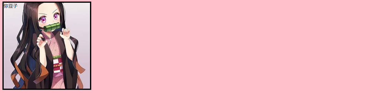
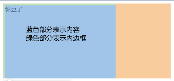
5.3 inner margin
5.3.1 basic attributes
Property: set the distance between the content and the border through the padding property
padding
-
Padding top indicates the upper and inner margins
-
Padding bottom indicates the bottom inner margin
-
Padding left indicates the left inner margin
-
Padding right indicates the right inner margin
-
You can combine padding in multiple directions, but you should pay attention to the writing method. An example is as follows
padding: 5px; It means 5 in all four directions px
padding: 5px 10px; Indicates the top and bottom inner margin 5 px, The left and right inner margins are 10 px
padding: 5px 10px 20px; Indicates the top margin of 5 px, The left and right inner margins are 10 px, The bottom inner margin is 20 px
padding: 5px 10px 20px 30px; Indicates upper 5 px, Right 10 px, Lower 20 px, Left 30 px (Clockwise)
Example code:
<!DOCTYPE html>
<html lang="en">
<head>
    <meta charset="UTF-8">
    <meta http-equiv="X-UA-Compatible" content="IE=edge">
    <meta name="viewport" content="width=device-width, initial-scale=1.0">
    <title>test1</title>
    <style>
        div {
            height: 200px;
            width: 300px;
            padding-top: 5px;
            padding-left: 5px;
        }
    </style>
</head>
<body>
    <div>
        Mi Douzi
    </div>
</body>
</html>
5.3.2 the inner margin will support the box
In fact, the inner margin will also support the box. Like the border, you can set the box sizing property to border box to indicate that the set width and height include the inner margin.
* {
	box-sizing: border-box;
}
5.4 outer margin
5.4.1 basic attributes
Attribute: the outer margin controls the distance between boxes, which is controlled by the margin attribute
margin
-
Margin top indicates the upper and outer margins
-
Margin bottom indicates the bottom outer margin
-
Margin left indicates the left outer margin
-
Margin right indicates the right outer margin
-
You can combine margin s in multiple directions, but you need to pay attention to the writing method. An example is as follows
margin: 10px; // Set in all four directions
margin: 10px 20px; // 10 up and down, 20 left and right
margin: 10px 20px 30px; // Up 10, left and right 20, down 30
margin: 10px 20px 30px 40px; // Top 10, right 20, bottom 30, left 40
Example code:
<!DOCTYPE html>
<html lang="en">
<head>
    <meta charset="UTF-8">
    <meta http-equiv="X-UA-Compatible" content="IE=edge">
    <meta name="viewport" content="width=device-width, initial-scale=1.0">
    <title>test1</title>
    <style>
        div {
            height: 200px;
            width: 300px;
            padding-top: 5px;
            padding-left: 5px;
            margin-top: 5px;
            margin-left: 5px;
        }
    </style>
</head>
<body>
    <div>
        Mi Douzi
    </div>
    <div>
        Mi Douzi
    </div>
</body>
</html>
5.4.2 block level horizontal elements are centered
Premise: set the horizontal margin to auto, that is, set margin left and margin right to auto
Methods: there are three ways
margin-left: auto; margin-right: auto;
margin: auto;
margin: 0 auto;
be careful:
- This method is different from text align (described later). margin: auto is to center the block level elements horizontally, and text align: Center is to center the inline elements or inline block elements
- This method cannot be used for vertical centering
Example code:
<!DOCTYPE html>
<html lang="en">
<head>
    <meta charset="UTF-8">
    <meta http-equiv="X-UA-Compatible" content="IE=edge">
    <meta name="viewport" content="width=device-width, initial-scale=1.0">
    <title>test1</title>
    <style>
        .one {
            background-image: url(./image/Mi Douzi.jpg);
            height: 300px;
            width: 300px;
            background-repeat: no-repeat;
            background-position: center;
            background-size: cover;
            border-width: 5px;
            border-style: solid;
            margin: auto;
        }
        body {
            background-color: pink;
        }
    </style>
</head>
<body>
    <div class="one">Mi Douzi</div>
</body>
</html>
5.5 remove browser default style
Because the browser will add some default styles to the elements, especially the inner and outer margins. Therefore, in order to ensure that different browsers can display in a unified style, we often remove the browser's default style. The method is as follows
* {
    margin: 0;
    padding: 0;
}
6. Flexible layout
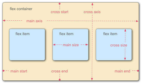
6.1 understand flex layout
-
flex is the abbreviation of flexible box, which means "elastic box", which is used to provide maximum flexibility for boxed models.
-
Any container can be specified as a flex layout
-
The essence of flex layout is to add the display: flex attribute to the parent box to control the position and arrangement of the box
-
Elements with flex layout are called flex container s, or "containers" for short, and are set through display:flex
-
All child elements of a flex container automatically become members of the container, which is called a flex item, or "item" for short.
-
The container has two axes by default: the horizontal main axis and the vertical cross axis. The starting position of the spindle (the intersection with the border) is called main start, and the ending position is called main end; The start position of the cross axis is called cross start and the end position is called cross end.
-
Items are arranged along the main axis by default. The spindle space occupied by a single item is called main size, and the cross axis space occupied is called cross size.
-
When the display: flex attribute is set to the parent element, the elements in the parent element must follow the elastic layout rules, and the child elements will no longer be arranged according to the rules of block level elements / inline elements
be careful:
When the parent element is set to display: flex, the float, clear and vertical align of the child element will become invalid
6.2 common attributes
6.2.1 justify-content
Basic introduction:
This attribute is used to set the arrangement of child elements on the spindle
Attribute value:
| Value | describe |
|---|---|
| flex-start | By default, the item is at the beginning of the container |
| flex-end | The item is at the end of the container |
| center | The item is located in the center of the container |
| space-between | Items are spaced between lines |
| space-around | Items are spaced before / between lines and after lines |
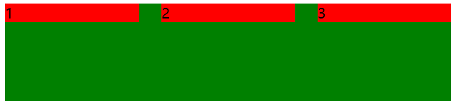
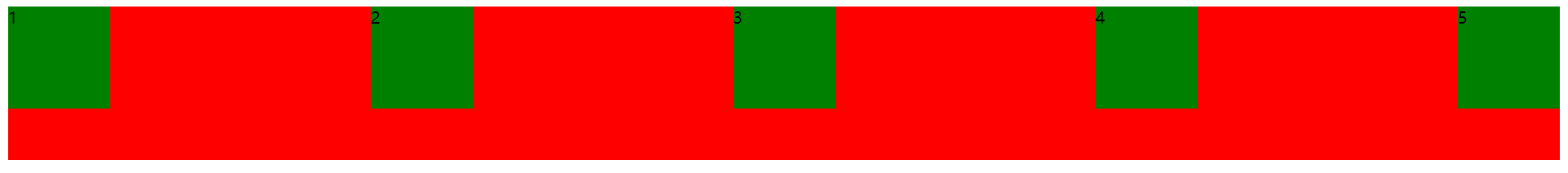
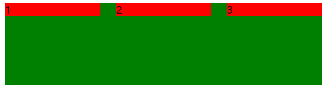
Example code 1: when the justify content attribute is not specified, the layout is from left to right by default
<!DOCTYPE html>
<html lang="en">
<head>
    <meta charset="UTF-8">
    <meta http-equiv="X-UA-Compatible" content="IE=edge">
    <meta name="viewport" content="width=device-width, initial-scale=1.0">
    <title>test1</title>
    <style>
        div {
        width: 100%;
        height: 150px;
        background-color: red;
        display: flex;
        }
        div span {
        width: 100px;
        height: 100px;
        background-color: green;
        }
    </style>
</head>
<body>
    <div>
        <span>1</span>
        <span>2</span>
        <span>3</span>
        <span>4</span>
        <span>5</span>
    </div>
</body>
</html>
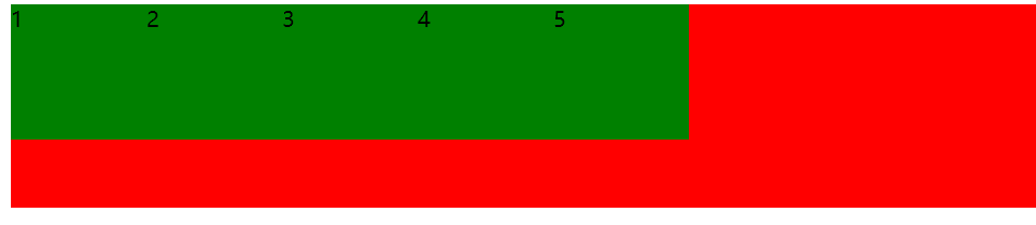
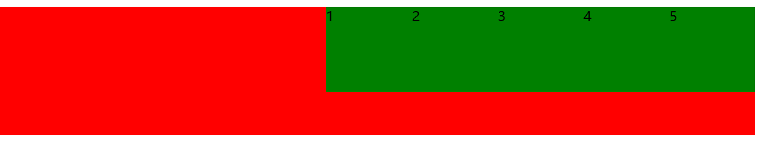
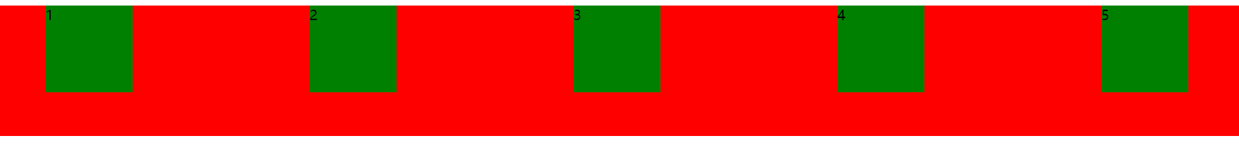
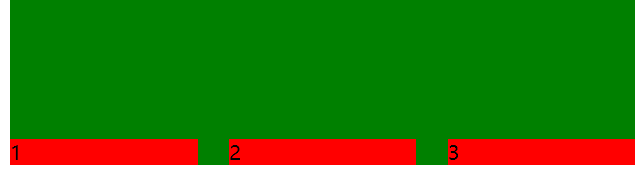
Example code 2: add justify content: Flex end to example code 1. At this time, the elements are arranged to the right
Example code 3: add justify content: Center to example code 1. At this time, the elements are arranged in the center

Example code 4: add justify content: space around to example code 1. At this time, the element divides the remaining space equally
Example code 5: add just content: space between to example code 1. At this time, the elements on both sides are close to the edge, and then divide the remaining space equally
6.2.2 align-items
Basic introduction:
This attribute is used to set the arrangement of elements on the side axis
Attribute value:
| Value | describe |
|---|---|
| stretch | By default, rows stretch to take up the remaining space |
| center | The item is located in the center of the container |
| flex-start | The item is at the beginning of the container |
| flex-end | The item is at the end of the container |
| baseline | The item is positioned to the baseline of the container |
Example code 1: when the align items attribute is not specified, the child element is not displayed, and the specified height will fill the height of the parent element
<!DOCTYPE html>
<html lang="en">
<head>
    <meta charset="UTF-8">
    <meta http-equiv="X-UA-Compatible" content="IE=edge">
    <meta name="viewport" content="width=device-width, initial-scale=1.0">
    <title>test1</title>
    <style>
        div {
        width: 500px;
        height: 500px;
        background-color: green;
        display: flex;
        }
        div span {
        width: 150px;
        background-color: red;
        }
    </style>
</head>
<body>
    <div>
        <span>1</span>
        <span>2</span>
        <span>3</span>
    </div>
</body>
</html>
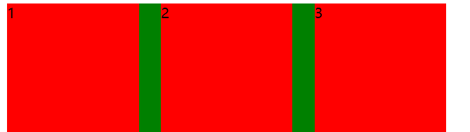
Example code 2: add align items: Center to example code 1. At this time, the element is vertically centered
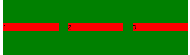
Example code 3: add align items: Flex start to example code 1, and the element is implemented at the top
Example code 4: add align items: end to example code 1, and the element is implemented at the bottom
Example code 5: add align items: baseline to example code 1. At this time, the element is aligned with the baseline