Media Component - Audio
< audio > </audio > audio control
Note: Since version 1.6.0, this component is no longer maintained. It is recommended to use the more powerful wx.createInnerAudioContext interface, which will be introduced later in the course.
Audito audio Attribute List - Basic Attributes
Case study:
<audio
  id="audioId"
  src="{{srcVal}}"
  poster="{{posterVal}}"
  name="{{nameVal}}"
  author="{{authorVal}}"
  controls
  loop
></audio>
data: {
    // Music path
    srcVal:'http://sc1.111ttt.cn:8282/2018/1/03m/13/396131155339.m4a#.mp3',
    // Thumbnail path
    posterVal:'/imgs/02.jpg',
    // Song name
    nameVal:'In the end, we weren't together.',
    // singer
    authorVal:'Bai Xiao Bai'
},
audio control, then add the play and pause button:
<button type="primary" bindtap="audioPlay">play</button>
<button type="primary" bindtap="audioPause">suspend</button>
Step 1: Get an audio context instance and bind it to a variable
onReady: function (option) {
    // Getting audio context using wx.createAudioContext
    this.audioCtx = wx.createAudioContext('audioId')
},
Step 2: Operate the corresponding audio through an audio context instance
audioPlay(){
    this.audioCtx.play()
  },
  audioPause(){
    this.audioCtx.pause()
},
audio control, then add other functions
For example, set the current playback time function
<button type= "primary" bindtap= "audioSet">Set the current event to 8 seconds </button>
audioSet(){
    this.audioCtx.seek(8)
  },
At this point, clicking the button will quickly jump to the 10th second, and if the seek method passes zero, it will jump to the beginning of the audio.
Audito audio Attribute List - Event Binding Attribute
Case study:
bindplay starts + bindpause pauses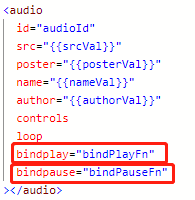
  // Triggered at the start of playback
  bindPlayFn(option){
    console.log(option)
  },
  // Triggered while pausing playback
  bindPauseFn(option){
    console.log(option)
  },

At this point, clicking on playback and pausing will penalize bindplay and bindpause event attributes respectively, and other verification methods are similar.
Media Component - Video
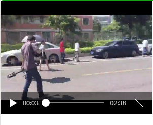
Note: The relevant api is wx.createVideoContext, even if you use wx.createVideoContext to get the video context
Case study:
<video src="{{videoSrc}}"></video>
// Video resource address
 videoSrc:'//f.video.weibocdn.com/002fhquDlx07wSlDN3y801041200ANCq0E010.mp4?label=mp4_hd&template=720x404.24.0&trans_finger=ac6fb6d5c49a67fe2901ae638b222ab2&Expires=1568253439&ssig=8MdWeQ67wu&KID=unistore,video'
video Attribute List - Basic Attributes
Case study:
<video
  src="{{videoSrc}}"
  duration="{{durationValue}}"
  controls="{{controlsValue}}"
  autoplay="{{autoPlayValue}}"
  loop="{{loopValue}}"
  muted="{{mutedValue}}"
  initial-time="{{initialValue}}"></video>
 // Video path
    videoSrc:'//f.video.weibocdn.com/002fhquDlx07wSlDN3y801041200ANCq0E010.mp4?label=mp4_hd&template=720x404.24.0&trans_finger=ac6fb6d5c49a67fe2901ae638b222ab2&Expires=1568253439&ssig=8MdWeQ67wu&KID=unistore,video',
    // Specify Video Time
    durationValue:20 ,
    // Whether to display default playback space
    controlsValue:true,
    // Whether to Play Automatically
    autoPlayValue:true,
    // Whether to Play Loop or not
    loopValue:true,
    // Whether to play in silence or not
    mutedValue:true,
    // Specify the location of the initial video playback
    initialValue:30
video Attribute List - Control Attribute
Note: Many attributes are invalid. At present, the official hasn't fixed the bug, just skip it.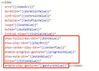
    // Whether to Display Full Screen Play Button
    btnValue:true,
    // Whether to display the playback button of the bottom control bar of the video
    playBtn:true,
    // Whether to display the play button in the middle of the video
    centerPlay:true,
    // Whether to turn on the gesture of controlling progress
    progressValue:true,
    // Whether to display silent playback button
    muteValue:true,
    // Title of Video
    titleValue:'2019/9/12 video',
    // Whether to turn on double-click pause/playback
    gestureValue:true
video Attribute List - Barrage Attribute:
Case validation of barrage attributes:
Relevant attributes: danmu-list: bullet curtain list, enable-danmu: whether to display the bullet curtain,
danmu-btn: Bullet Curtain Button, Control: Whether to Display Video controls
Step 1: danmu-list can be used to set the content of the bullet screen, the font color and the time point of appearance in the video screen.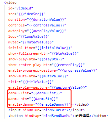
 // Display barrage
    enableDanmu:true,
    danmuList:[
      { text: 'The first barrage', color: '#ff5857', time: 1 },
      { text: 'The second barrage', color: '#ff5857', time: 2 },
      { text: 'The Third Barrage', color: '#ff5857', time: 3 },
      { text: 'The Fourth Barrage', color: '#ff5857', time: 4 },
      { text: 'The fifth barrage', color: '#ff5857', time: 5 }
    ],
    danmuBtn:true,
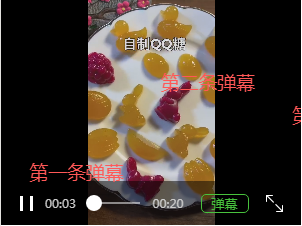
Next, I'll show you how to send the barrage.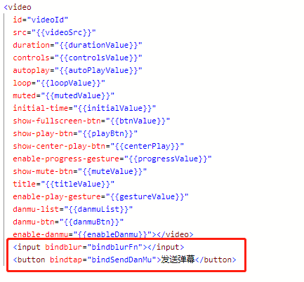
inputValue:''
// Barrage valuation
  bindblurFn(option){
    console.log(option)
    this.setData({
      inputValue:option.detail.value
    })
  },
  bindSendDanMu(option){
    this.videoCtx.sendDanmu({
      text:this.data.inputValue
    })
  },

At this time, we can send the bullet screen, but there is still a problem: the font color of the bullet screen is white, so we add random color to the bullet screen next.
Step 1: Encapsulating random color functions outside registers
function getRandomColor() {
  let rgb = []
  for (let i = 0; i < 3; i++) {
    let color = Math.floor(Math.random() * 255).toString(16)
    color = color.length == 1 ? '0' + color : color
    rgb.push(color)
  }
  return '#' + rgb.join('')
}
Note: Write it on page ({}).
Step 2: Call the random color when sending the barrage
// Send barrage
  bindSendDanMu(option){
    this.videoCtx.sendDanmu({
      text: this.data.inputValue,
      // Call Random Colors when Sending Barrage
      color: getRandomColor()
    })
  },
At this time, the display and transmission of the barrage are realized.
video Attribute List - Other Operational Attributes
Note: Some attributes are invalid and the official bug is unresolved.
Media Component - Pictures
< Image > </image > picture label
Note: Pictures, support JPG, PNG, SVG format.
Key word:
IOS image filling mode: ScaleToFill, ScaleAspectFit, ScaleAspectFill, widthFix
IOS image clipping mode: top, bottom, left, right, center, top left, top right, bottom left, bottom right.
Picture Label Properties: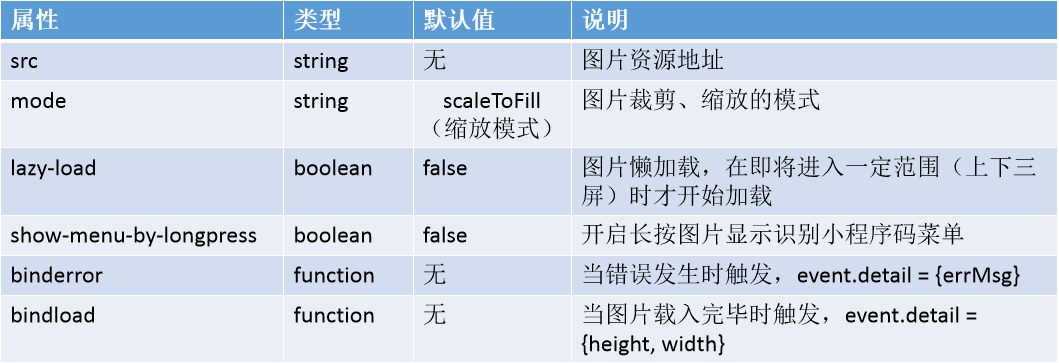
Mode scaling mode attribute values:
Model tailors schema attribute values: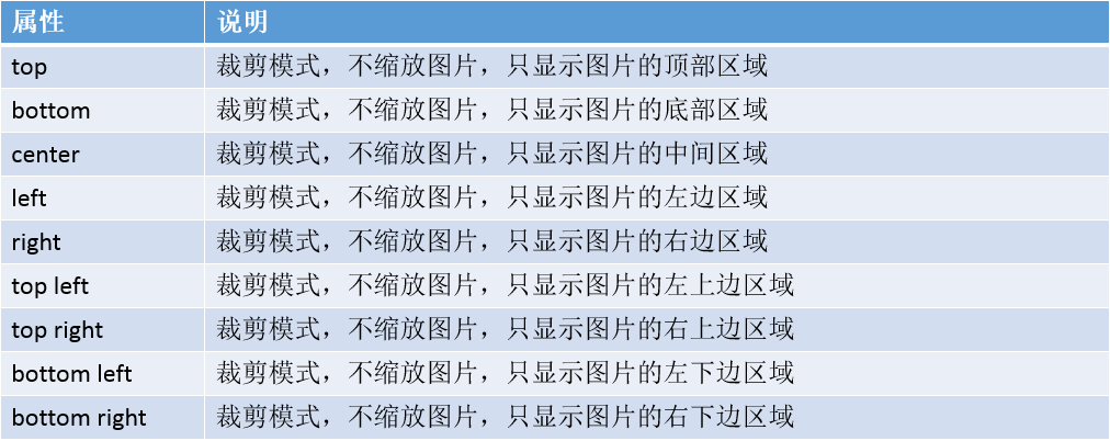
Validation of the mode l attribute value of the image label:
<!-- picture -->
  <block>
    <view class="imgArea" wx:for="{{imgList}}" wx:key="index">
      <image src="{{item.imgSrc}}" mode="{{item.imgMode}}"></image>
      <text class="text">{{item.text}}</text>
    </view>
  </block>
.imgArea{
  width: 100%;
  height: 300rpx;
  margin-top: 10rpx;
}
.imgArea image{
  width: 300rpx;
  height: 300rpx;
  float: left;
}
.text{
  float: right;
  width: 400rpx;
  height: 300rpx;
  display: inline-block;
  font-size: 30rpx;
  line-height: 60rpx;
  text-align: center;
}
imgList:[
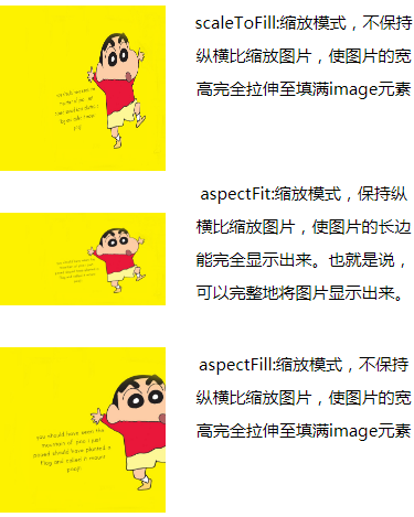
      { imgSrc: '/imgs/02.jpg', imgMode: 'scaleToFill', text:'scaleToFill:Zoom mode, do not keep the aspect ratio zoom picture, so that the width of the picture fully stretched to fill image element'},
      { imgSrc: '/imgs/02.jpg', imgMode: 'aspectFit', text: 'aspectFit:Zoom mode, keep the aspect ratio of zoom image, so that the long side of the picture can be fully displayed. That is to say, the picture can be displayed completely.'},
      { imgSrc: '/imgs/02.jpg', imgMode: 'aspectFill', text: 'aspectFill:Zoom mode, do not keep the aspect ratio zoom picture, so that the width of the picture fully stretched to fill image element'},
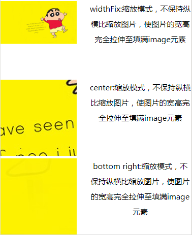
      { imgSrc: '/imgs/02.jpg', imgMode: 'widthFix', text: 'widthFix:Zoom mode, do not keep the aspect ratio zoom picture, so that the width of the picture fully stretched to fill image element'},
      { imgSrc: '/imgs/02.jpg', imgMode: 'center', text: 'center:Zoom mode, do not keep the aspect ratio zoom picture, so that the width of the picture fully stretched to fill image element'},
      { imgSrc: '/imgs/02.jpg', imgMode: 'bottom right', text: 'bottom right:Zoom mode, do not keep the aspect ratio zoom picture, so that the width of the picture fully stretched to fill image element'},
    ]
Summary of common attribute values:
(1) The UIView Content Model Scale ToFill image is filled quasi-control size (take ellipse as an example, deformation)
(2) The UIView Content Model Scale AspectFit image is filled with its own aspect ratio, and the remaining space is transparent (not deformed)
(3) The UIView Content Model Scale AspectFill image is not fully displayed, which is similar to zooming in and displaying part of it.
Be careful:
The default width and height of image components are 300 PX and 225 PX
(2) Two-dimensional code/small program code pictures in image components do not support long-press recognition. Long press recognition is only supported in wx.previewImage
Media Component - Camera
< Camera > </camera > camera label
The system has two-dimensional code scanning function and needs to upgrade the Wechat client to 6.7.3. User authorization scope.camera is required.
Relevant API: wx.createCameraContext, which creates CameraContext objects in the camera context.
Be careful:
The CameraContext instance can be obtained through wx.createCameraContext. (2) CameraContext binds to the unique camera component in the page and operates on the corresponding camera component.
Camera Label - Basic Properties
The above is the basic attributes of camera tags, followed by an introduction.
mode attribute
Model attribute value:
device-position attribute
device-position attribute value:
flash attribute
flash attribute value:
frame-size attribute
flash attribute value:
Case study:
<camera
    mode="{{modeVal}}"
    device-position="{{devicePosition}}"
    flash="{{flashVal}}"
    frame-size="{{frameSize}}"
    bindstop="bindstopFn"
    binderror="binderrorFn"
    bindinitdone="bindinitdoneFn"
    ></camera>
<button type="primary" bindtap="takePhoto">Photograph</button>
<view>
  <image mode="aspectFit" src="{{src}}"></image>
</view>
/* camera */
camera{
  width: 100%;
  height: 400rpx;
}
// Camera mode
modeVal: 'normal',
// Rear Camera
devicePosition:'back',
// Flash lamp
flashVal:'auto',
// Camera frame number data size
frameSize: 'large'
// Photograph
  takePhoto(){
    const ctx=wx.createCameraContext();
    ctx.takePhoto({
      quality: 'high',
      success:(res)=>{
        this.setData({
          src:res.tempImagePath
        })
      }
    })
  },
// Users are not allowed to use cameras to trigger
  binderrorFn(event){
    console.log(event)
  },
Media Component - Real-time Audio and Video
<live-player> </live-player> Real-time audio and video playback
Be careful:
Real-time audio and video playback is only open to domestic main bodies in the following categories of small programs. It needs to pass the category audit first, then in the background of small program management, "development" - "interface settings" to self-open the component rights.
Live-pusher > </live-pusher > real-time audio and video recording
Be careful:
Real-time audio and video recording. Users are required to authorize scope.camera, scope.record.
For the time being, it is only open for small programs in the following categories, which need to be audited first, and then in the background of small program management, "development" - "interface settings" to self-open the rights of the component.
Certification is required and knowledge is enough.