Custom components
developers can abstract the functional modules in the page into custom components for reuse in different pages; Complex pages can also be divided into multiple low coupling modules, which is helpful for code maintenance. Custom components are very similar to basic components when used.
Create custom components
similar to a page, a custom component consists of four files: json, wxml, wxss and js.
to write a custom component, you first need to declare the custom component in the json file (set the component field to true to set this group of files as custom components):
{
  "component": true
}
You can also right-click to create a component file, which will directly create json, wxml, wxss and js files.
- The methods in the js file created in this way will be in the form of components.
- The json file "component" will also be set to true.

At the same time, we should also write component templates in wxml files and add component styles in wxss files.
- The styles in wxss apply only to this custom component (ID selectors, belonging selectors, and tag name selectors should not be used in wxss)
- The attribute value and internal data of the component will be used for the rendering of the component wxml, where the attribute value can be passed in from outside the component.
Using custom components
before using registered custom components, first make a reference declaration in the json file of the page. At this time, you need to provide the label name of each custom component and the corresponding custom component file path:
{
  "usingComponents": {
    "component-tag-name": "path/to/the/custom/component"
  }
}
in this way, you can use custom components in the wxml of the page just like the basic components. The node name is the label name of the custom component, and the node attribute is the attribute value passed to the component.
<view>
  <!-- The following is a reference to a custom component -->
  <component-tag-name></component-tag-name>
</view>
after the wxml node structure of the custom component is combined with the data, it will be inserted into the reference location.
matters needing attention
- Because the tag name of WXML node can only be a combination of lowercase letters, dashes and underscores, the tag name of custom components can only contain these characters.
- The reference method of custom components is similar to that of custom components.
- The root directory name of the project where the custom component and page are located cannot be prefixed with "wx-", otherwise an error will be reported.
Note that whether usingComponents are used in the page file will make the prototype of this object of the page slightly different, including:
- The prototype of using components page is inconsistent with that of not using it, i.e. object Getprototypeof (this) results are different.
- When using usingComponents, there will be more methods, such as selectComponent.
- For performance reasons, when using usingComponents, the setData content will not be directly and deeply copied, that is, this This after setData ({field: Obj}) data. field === obj . (deep copy occurs when this value is passed between components.)
- If the page is complex, it is recommended to retest when adding or deleting usingComponents definition segments.
Data transmission
The parent component passes data to the child component
The parent component (page) transmits data to the child component through the tag attribute.
parent.wxml
<parent name="{{name}}" age="{{age}}"></parent>
parent.js
data:{
	name: 'qw',
	age: 22
}
child.js
properties:{
	name:{
		type: String,
		value: 'qy'
	},
	age: Number
}
the parent component passes values to the child component in the form of attributes, and the child component receives them in properties, and can specify the data type and the default value value. In wxml, it can be directly used in the form of {{name}}, while in js, it can be used in the form of this properties. Name get.
The child component passes data to the parent component
The child component transmits data to the parent component through events:
- Add a custom event on the label of the sub component;
- Subcomponents through this The triggerevent method calls a custom event to pass data.
The child component passes data to the parent component using this Triggerevent method, which accepts three parameters:
thiis.triggerEvent('myevent', myEventDetail, myEventOption);
- myevent: is the method name.
- myEventDetail: data transferred outside the component.
- myEventOption: has 3 parameters:
① Bubbles -- Boolean type -- not required -- default false -- function: whether the event bubbles
② composed - Boolean type - not required - default false - function: whether the event can cross the component boundary. When it is false, the event will only be triggered on the node tree of the referenced component and will not enter any other component.
③ capturePhase - Boolean type - not required - default false - function: whether the event has a capture phase.
Events are divided into bubbling events and non bubbling events:
- Bubbling event: when an event on a component is triggered, the event will be passed to the parent node.
- Non bubbling event: when an event on a component is triggered, the event will not be passed to the parent node.
Capture phase: the capture phase is located before the bubble phase, and in the capture phase, the order of events reaching the node is just opposite to the bubble phase. When you need to listen for events in the capture phase, you can use the capture bind and capture catch keywords, which will interrupt the capture phase and cancel the bubbling phase.
In the following code, clicking inner view will call handleTap2, handleTap4, handleTap3 and handleTap1 successively.
<view id="outer" bind:touchstart="handleTap1" capture-bind:touchstart="handleTap2">
  outer view
  <view id="inner" bind:touchstart="handleTap3" capture-bind:touchstart="handleTap4">
    inner view
  </view>
</view>
If the first capture bind in the above code is changed to capture catch, only handleTap2 will be triggered.
<view id="outer" bind:touchstart="handleTap1" capture-catch:touchstart="handleTap2">
  outer view
  <view id="inner" bind:touchstart="handleTap3" capture-bind:touchstart="handleTap4">
    inner view
  </view>
</view>
child.js
//child.js
methods: {
	changeName() {
		this.triggerEvent('changeName', {name: 'yj'});
	}
}
parent.wxml
<parent name="{{name}}" age="{{age}}" bindchangeName="changeName"></parent>
parent.js
//parent.js
changeName(event) {
	console.log(event.detail);
	//{name: 'yj'}
}
Get sub component instance object
You can call this in the parent component Selectcomponent to get the instance object of the sub component.
When calling, you need to pass in a matching selector, such as this selectComponent(".my-component").
selector syntax
Selector is similar to CSS selector, but only supports the following syntax.
- ID selector: #the-id
- Class selector (multiple can be specified consecutively): a-class.another-class
- Child element selector: the-parent > . the-child
- Descendant selector: the-ancestor .the-descendant
- Descendant selector across custom components: the-ancestor >>> . the-descendant
- Union of multiple selectors: #a-node some-other-nodes
// Parent component
Page({
  data: {},
  getChildComponent: function () {
    const child = this.selectComponent('.my-component');
    console.log(child)
  }
})
In the above example, the parent component will obtain the child component instance object with class my component, that is, this of the child component.
Note: by default, components between applets and plug-ins and between different plug-ins cannot get component instances through selectComponent (null will be returned). If you want a component to still be returned by selectComponent under the above conditions, you can customize its return result (see below).
If you need to customize the data returned by selectComponent, you can use the built-in behavior: Wx: / / component export
When using this behavior, the export definition section in the custom component will be used to specify the return value when the component is called by selectComponent.
// Custom component my component internal
Component({
  behaviors: ['wx://component-export'],
  export() {
    return { myField: 'myValue' }
  }
})
Parent component call
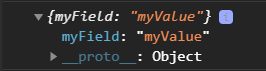
const child = this.selectComponent('#the ID') / / equal to {myField: 'myValue'}
When the parent component obtains the child component instance with the id of the id, it gets the object {myField: 'myValue'}.
slot of component wxml
the slot tag is actually a placeholder (slot). Wait until the parent component calls the child component, and then pass the tag. Finally, these passed tags will replace the position of the slot slot.
By default, a component can only have one slot in its wxml. When you need to use multiple slots, you can declare it enabled in the component js.
Component({
  options: {
    multipleSlots: true // When multiple options defined in slot are enabled
  },
  properties: { /* ... */ },
  methods: { /* ... */ }
})
At this time, you can use multiple slot s in the wxml of this component to distinguish them by different name s.
<!-- Component template -->
<view class="wrapper">
  <slot name="before"></slot>
  <view>Here are the internal details of the component</view>
  <slot name="after"></slot>
</view>
When using, use the slot attribute to insert nodes into different slots.
<!-- Page template referencing component -->
<view>
  <component-tag-name>
    <!-- This part will be placed in the component <slot name="before"> On the location of -->
    <view slot="before">Here is insert into component slot name="before"Content in</view>
    <!-- This part will be placed in the component <slot name="after"> On the location of -->
    <view slot="after">Here is insert into component slot name="after"Content in</view>
  </component-tag-name>
</view>
Component constructor (component js method properties)
| Definition segment | type | Required | describe |
|---|---|---|---|
| properties | Object Map | no | The external attribute of a component is the mapping table from attribute name to attribute setting |
| data | Object | no | The internal data of the component is used for the template rendering of the component together with the properties |
| observers | Object | no | The component data field listener is used to listen for changes in properties and data |
| methods | Object | no | Component methods, including event response functions and any custom methods, about the use of event response functions |
| behaviors | String Array | no | Code reuse mechanism between components similar to mixins and traits |
| created | Function | no | Component life cycle function - executed when the component instance has just been created. Note that setData cannot be called at this time) |
| attached | Function | no | Component life cycle function (executed when the component instance enters the page node tree) |
| ready | Function | no | Component lifecycle function - execute after component layout is completed) |
| moved | Function | no | Component lifecycle function - executed when a component instance is moved to another location in the node tree) |
| detached | Function | no | Component lifecycle function - executed when a component instance is removed from the page node tree) |
| lifetimes | Object | no | Component lifecycle declaration object |
| pageLifetimes | Object | no | The lifecycle declaration object of the page where the component is located |
properties definition
| Definition segment | type | Required | describe |
|---|---|---|---|
| type | yes | Type of property | |
| optionalTypes | Array | no | Type of property (multiple can be specified) The type of the property can be one of String Number Boolean Object Array or null, indicating that the type is not restricted In most cases, it is best to specify an exact type for a property |
| value | no | Initial value of the property | |
| observer | Function | no | Callback function when the property value changes (not recommended, observers with Component constructor) |
Component({
  properties: {
    min: {
      type: Number,
      value: 0
    },
    min: {
      type: Number,
      value: 0,
      observer: function(newVal, oldVal) {
        // Execute when attribute value changes
      }
    },
    lastLeaf: {
      // This attribute can be one of Number, String and Boolean
      type: Number,
      optionalTypes: [String, Object],
      value: 0
    }
  }
})
observers data listener
The data listener can be used to listen and respond to changes in any attribute and data field.
Component({
  attached: function() {
    this.setData({
      numberA: 1,
      numberB: 2,
    })
  },
  observers: {
    'numberA, numberB': function(numberA, numberB) {
      // Execute this function when numberA or numberB is set
      this.setData({ // this.data.sum is always this data. Numbera and this data. Sum of numberb
        sum: numberA + numberB
      })
    }
  }
})
The data listener supports monitoring the changes of attributes or internal data, and can monitor multiple at the same time. setData can trigger each listener at most once at a time.
At the same time, the listener can listen to sub data fields. (① use the wildcard * * to monitor the changes of all sub data fields; ② use the wildcard * * to monitor all setData.)
Component({
  observers: {
    'some.subfield': function(subfield) {
      // Use setData to set this data. some. Triggered on subfield
      // (in addition, setting this.data.some with setData will also trigger)
      subfield === this.data.some.subfield
    },
    'arr[12]': function(arr12) {
      // Use setData to set this data. Triggered when arr [12]
      // (in addition, setting this.data.arr with setData will also trigger)
      arr12 === this.data.arr[12]
    },
    'some.field.**': function(field) { // Use the wildcard * * to listen for changes in all sub data fields
      // Use setData to set this data. some. Triggered when the field itself or any of its child data fields
      // (in addition, setting this.data.some with setData will also trigger)
      field === this.data.some.field
    },
    '**': function() {
      // Every time setData is triggered
    },
  }
})
matters needing attention
- The data listener listens to the data fields involved in setData. Even if the values of these data fields do not change, the data listener will still be triggered.
- If setData is used in the data listener function to set the data field it listens to, it may lead to an endless loop, which needs special attention.
- Data listeners are stronger and usually have better performance than attribute observer s.
behaviors
behaviors are features used for code sharing between components, similar to "mixins" or "traits" in some programming languages.
Each behavior can contain a set of properties, data, lifecycle functions, and methods. When a component references it, its properties, data and methods will be merged into the component, and the life cycle function will be called at the corresponding time. Each component can refer to multiple behaviors, and behaviors can also refer to other behaviors.
created
When the Component instance is just created, the created life cycle is triggered. At this point, the Component data this Data is the data defined in the Component constructor. setData cannot be called at this time. In general, this lifecycle should only be used to add some custom attribute fields to the Component this.
attached
After the component is fully initialized and enters the page node tree, the attached life cycle is triggered. At this point, this Data has been initialized to the current value of the component. This life cycle is very useful. Most initialization work can be carried out at this time.
detached
After the component leaves the page node tree, the detached life cycle is triggered. When exiting a page, detached will be triggered if the component is still in the page node tree.
pageLifetimes
| life cycle | parameter | describe |
|---|---|---|
| show | nothing | Execute when the page where the component is located is displayed |
| hide | nothing | Execute when the page where the component is located is hidden |
| resize | Object Size | Execute when the page size of the component changes |
Component({
  pageLifetimes: {
    show: function() {
      // The page is displayed
    },
    hide: function() {
      // The page is hidden
    },
    resize: function(size) {
      // Page size change
    }
  }
})
lifetimes
The life cycle of a component can also be declared in the life times field (this is the recommended method, with the highest priority).
Component({
  lifetimes: {
    attached: function() {
      // Execute when the component instance enters the page node tree
    },
    detached: function() {
      // Execute when the component instance is removed from the page node tree
    },
  },
  // The following is an old-fashioned definition method, which can maintain compatibility with the < 2.2.3 basic library
  attached: function() {
    // Execute when the component instance enters the page node tree
  },
  detached: function() {
    // Execute when the component instance is removed from the page node tree
  },
  // ...
})
life cycle
| life cycle | parameter | describe |
|---|---|---|
| created | nothing | Execute when the component instance has just been created |
| attached | nothing | Execute when the component instance enters the page node tree |
| ready | nothing | Execute after the component is laid out in the view layer |
| moved | nothing | Execute when the component instance is moved to another location in the node tree |
| detached | nothing | Execute when the component instance is removed from the page node tree |
| error | Object Error | Execute whenever a component method throws an error |
Relationships between components (relations hips definition section)
The relations hips definition section contains the target component path and its corresponding options. The options that can be included are shown in the following table.
| option | type | Required | describe |
|---|---|---|---|
| type | String | yes | The relative relationship of target components. The optional values are parent, child, ancestor and descendant |
| linked | Function | no | The relationship life cycle function is triggered when the relationship is established in the page node tree, and the trigger time is after the attached life cycle of the component |
| linkChanged | Function | no | The relationship life cycle function is triggered when the relationship changes in the page node tree. The trigger time is after the component moved life cycle |
| unlinked | Function | no | The relationship life cycle function is triggered when the relationship is separated from the page node tree. The trigger time is after the component detached life cycle |
| target | String | no | If this item is set, it indicates the behavior that the associated target node should have, and all component nodes with this behavior will be associated |
<custom-ul>
  <custom-li> item 1 </custom-li>
  <custom-li> item 2 </custom-li>
</custom-ul>
// path/to/custom-ul.js
Component({
relations: {
'./custom-li-component': {
type: 'child', // The associated target node should be a child node
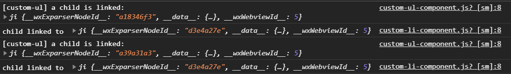
linked: function (target) {
// Every time a custom Li is inserted, it is executed. target is the instance object of the node, which is triggered after the attached life cycle of the node
console.log('[custom-ul] a child is linked: ', target)
},
linkChanged: function (target) {
// Every time a custom Li is moved, it is executed. target is the instance object of the node, which is triggered after the moved life cycle of the node
},
unlinked: function (target) {
// Every time a custom Li is removed, it is executed. target is the instance object of the node, which is triggered after the detached life cycle of the node
}
}
},
methods: {
_getAllLi: function () {
// Using getRelationNodes, you can obtain the nodes array, which contains all the associated custom Li and is ordered
var nodes = this.getRelationNodes('./custom-li-component')
console.log(nodes)
}
},
ready: function () {
this._getAllLi()
}
})
// path/to/custom-li.js
Component({
  relations: {
    './custom-ul-component': {
      type: 'parent', // The associated target node should be the parent node
      linked: function (target) {
        // It is executed every time it is inserted into custom UL. target is the instance object of custom UL node, which is triggered after the attached life cycle
        console.log('child linked to ', target)
      },
      linkChanged: function (target) {
        // Executed after each move, target is the custom UL node instance object, which is triggered after the moved life cycle
      },
      unlinked: function (target) {
        // Executed every time it is removed, target is the custom UL node instance object, which is triggered after the detached life cycle
      }
    }
  }
})
Note: the relations hips definition must be added to both component definitions, otherwise it will not take effect.
Space occupying assembly
When using features such as subcontract asynchronization or time injection, other custom components referenced by custom components may be unavailable at the beginning of rendering. At this time, in order to prevent the rendering process from being blocked, unavailable custom components need a "Component placeholder". The base library will replace the unavailable component with the placeholder component for rendering, and then replace the placeholder component back to the component after the component is available.
The placeholder component of a custom component can be another custom component or a built-in component.
The componentPlaceholder field in the JSON configuration corresponding to the page or custom component is used to specify the placeholder component, such as:
{
  "usingComponents": {
    "comp-a": "../comp/compA",
    "comp-b": "../comp/compB",
    "comp-c": "../comp/compC"
  },
  "componentPlaceholder": {
    "comp-a": "view",
    "comp-b": "comp-c"
  }
}
This configuration indicates:
- The occupied component of comp-a is a built-in component view
- The placeholder component of component comp-b is custom component comp-c (its path is configured in usingComponents)
<button ontap="onTap">Display components</button>
<comp-a wx-if="{{ visible }}">
  <comp-b prop="{{ p }}">text in slot</comp-b>
</comp-a>
If visible is false when the applet is started, only button will be rendered; After clicking the button, this SetData ({visible: true}) is executed. At this time, if comp-a and Comp-B are not available, the page will be rendered as:
<button>Display components</button>
<view>
  <comp-c prop="{{ p }}">text in slot</comp-c>
</view>
After comp-a and comp-b are prepared, the page is replaced with:
<button>Display components</button>
<comp-a>
  <comp-b prop="{{ p }}">text in slot</comp-b>
</comp-a>
matters needing attention
- When a component is specified as a placeholder component (such as comp-c in the above example), it is invalid to specify a placeholder component for it. It can be understood that if a component needs to be a placeholder component of other components, it must be available from the beginning;
- Currently, customized components are unavailable:
1. When the subcontract asynchronization feature is used, other subcontracted components are referenced, but the corresponding subcontract has not been downloaded;
2. When using the time-consuming injection feature, the component has not been injected; - If a component is unavailable and its placeholder component does not exist, an error will be reported and thrown during rendering;
- If a component does not exist, but an available placeholder component is specified for it, the placeholder component can be rendered normally, but an error will be reported and thrown in the subsequent attempt to prepare for replacement.