[wechat applet] parking space online sales platform (III)
preface
In the previous chapter, we have introduced the general content of home page development. In this chapter, we will develop the personal center.
1, Background color
First, we add a new layer of orange red gradient background on the monotonous gray background
Here we first set a range for the background color:
Here I set the height to 400rpx and the width to 100%
.background{
    display: flex;
    width: 100%;
    height: 400rpx;
}
Then we import the background color:
background: -webkit-linear-gradient(Fill in the color you want);
2, Personal information
On this basis, we add avatars, nicknames and inboxes
For convenience, I arrange them horizontally
The first is the Avatar:
The avatar adopts van image component and adds wx:if to judge whether the user logs in
    <!-- Avatar not logged in -->
    <van-image class="portrait"
        wx:if="{{noLogin}}"   //Determine whether to log in
        round width="160rpx"
        height="160rpx"
        fit="cover"
        src="{{head_portrait}}"
        bind:click="login" />
        <!-- Avatar logged in -->
    <van-image class="portrait"
        wx:if="{{!noLogin}}"
        round width="160rpx"
        height="160rpx"
        fit="cover"
        src="{{head_portrait}}"/>
Then add a personal nickname on the right:
Here, I make the login judgment in the js file, and only one binding code is reserved in the wxml file
wxml:
    <!-- Personal Nickname -->
    <text class="username">
        {{username}}
    </text>

wxss:
	/* user name */
.username{
    margin-left: 30rpx;
    margin-top:80rpx;
    font-size: 38rpx;
    font-weight: bold;
    width: 360rpx;
    color:white;
}
Finally, add the inbox Icon:
    <!-- mailbox -->
    <van-icon name="envelop-o"
        wx:if="{{!noLogin}}"
        dot="true"
        bindtap="jump_info"
        custom-class="envelop"
        color="white"
        size="60rpx"/>
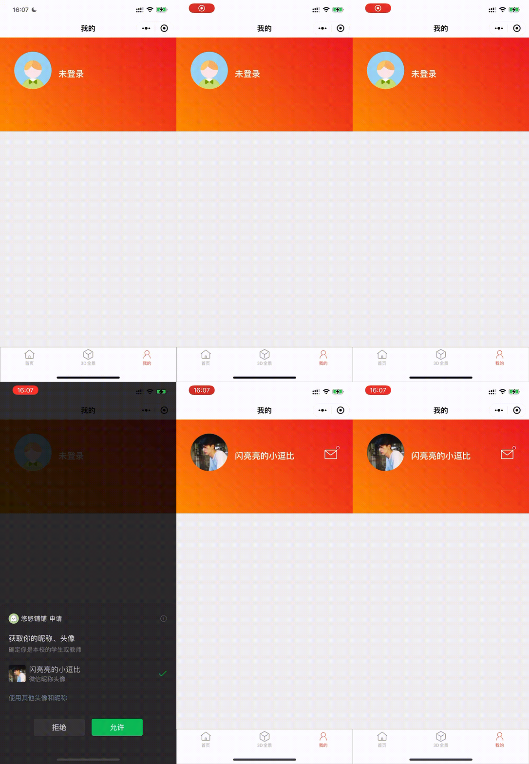
Save and refresh the operation. The effect is as follows:

3, Parking order
The parking space order column is divided into five statuses: all orders, pending approval, pending signing, pending payment and completed
Many forms are similar to mall applets
First, divide the order column into a white area and center it horizontally:
wxml:
<!-- Overlay white layer -->
<view class="order_block">
</view>

wxss:
/* Order section */
.order_block{
    display: flex;
    flex-direction: column;
    width:700rpx;
    height: 250rpx;
    margin-left: 25rpx;
    margin-top: -120rpx;
    border-radius: 10rpx;
    background-color: white;
}
Then use the grid to arrange:
<!-- Overlay white layer -->
<view class="order_block">
    <text class="title">Parking order</text>
    <van-grid column-num="5" border="{{ false }}" icon-color="red" wx:if="{{!noLogin}}">
        <van-grid-item icon="shopping-cart" text="All orders" icon-color="red" link-type="navigateTo" url="../user/order/order"/>
        <van-grid-item icon="clock" text="To be reviewed" icon-color="red" link-type="navigateTo" url="../user/order/order"/>
        <van-grid-item icon="balance-list" text="To be signed" icon-color="red" link-type="navigateTo" url="../user/order/order"/>
        <van-grid-item icon="todo-list" text="To be paid" icon-color="red" link-type="navigateTo" url="../user/order/order"/>
        <van-grid-item icon="checked" text="Completed" icon-color="red" link-type="navigateTo" url="../user/order/order"/>
    </van-grid>
</view>
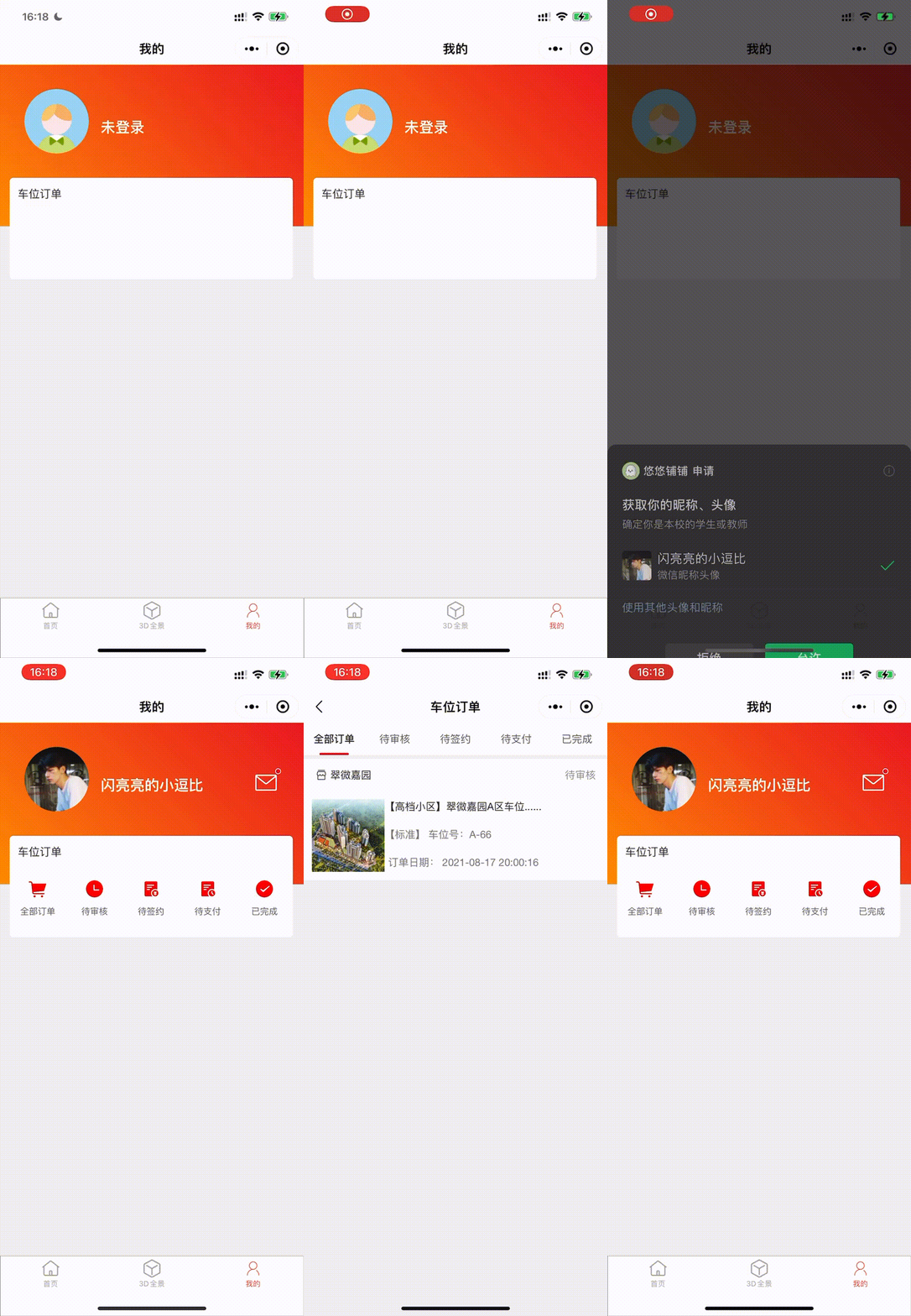
I do every jump in the van grid item. At the same time, I judge whether the user logs in. When the user does not log in, the palace grid content is not displayed. Save and refresh the operation. The effect is as follows:

4, Common functions
In addition to the main orders, the applet comes with some common functions: coupons, card bags, collections, lottery numbers, and new person invitations
Here I use cells for vertical arrangement, which is similar to the form of order:
<!-- Host content layer -->
<view class="main_block">
    <text class="title">Common functions</text>
    <view class="main_block2">
        <van-cell-group custom-class="cell_group" border="{{false}}" wx:if="{{!noLogin}}">
            <van-cell title="My coupon" is-link title-style="font-size:28rpx" icon="coupon-o" link-type="navigateTo"url="../user/coupon/coupon"/>
            <van-cell title="My card bag" is-link title-style="font-size:28rpx" icon="paid" link-type="navigateTo"url="../user/card/card" />
            <van-cell title="My collection" is-link title-style="font-size:28rpx" icon="star-o" link-type="navigateTo"url="../user/collection/collection" />
            <van-cell title="My Yaohao" is-link title-style="font-size:28rpx" icon="service-o" link-type="navigateTo"url="../user/yaohao/yaohao" />
            <van-cell title="My invitation" is-link title-style="font-size:28rpx" icon="share-o"  link-type="navigateTo"url="../user/share/share" />
            <van-cell border="{{false}}" title="personal information" is-link title-style="font-size:28rpx" icon="setting-o" link-type="navigateTo"url="../user/setting/setting" />
        </van-cell-group>
    </view>
</view>
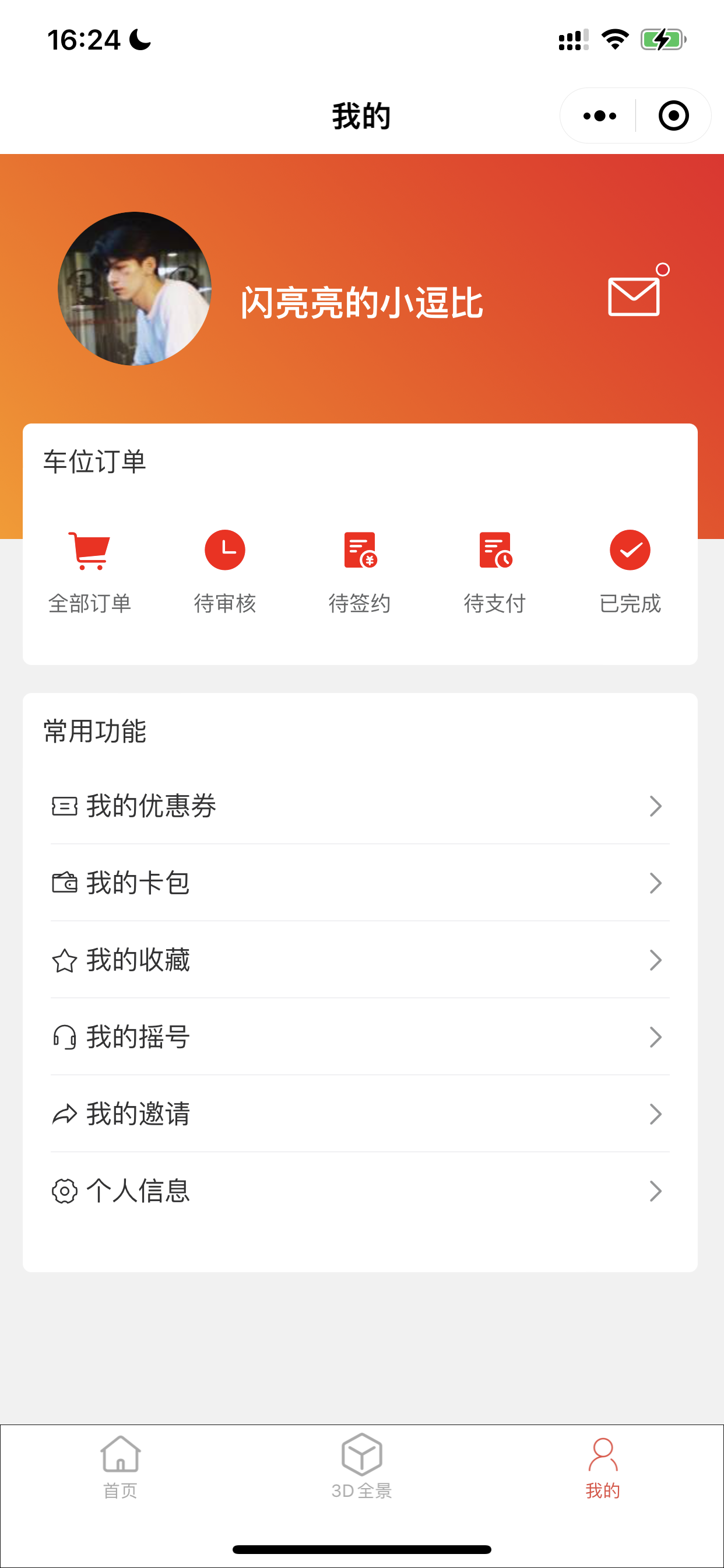
Save and refresh the operation. The effect is as follows:

5, Summary
The personal center involves a lot of page Jump and state judgment, so I won't introduce it in detail here.