The example of this article shares the specific code of the display of the left and right switching of the wechat applet for your reference. The specific content is as follows
Analysis
1. Set the data current property to: when clicking the current item, process e.dataset.current in the swichNav event to get the target value of the click.
2. The current component of the swiper component is used to control which page is currently displayed
3. The switch component binds the change event switchTab to get the current page through e.detail.current
4. Need to get the width and height of the device to switch with the navigation bar
wxml:
<view class="container">
    <!-- tab Navigation bar -->
    <!-- scroll-left Property to control scroll bar position -->
    <!-- scroll-with-animation Scroll to add animation transition -->
    <scroll-view scroll-x="true" class="nav" scroll-left="{{navScrollLeft}}" scroll-with-animation="{{true}}">
        <block wx:for="{{navData}}" wx:for-index="idx" wx:for-item="navItem" wx:key="idx">
            <view class="nav-item {{currentTab == idx ?'active':''}}"  data-current="{{idx}}" bindtap="switchNav">{{navItem.text}}</view>
        </block>
    </scroll-view>
    <!-- Page content -->
    <swiper class="tab-box" current="{{currentTab}}" duration="300" bindchange="switchTab">
        <swiper-item wx:for="{{[0,1,2,3,4,5,6,7,8]}}" wx:for-item="tabItem" wx:for-index="idx" wx:key="idx" class="tab-content">
            {{tabItem}}
        </swiper-item>
    </swiper>
</view>
wxss:
page{
    width: 100%;
    height: 100%;
}
.container{
    width: 100%;
    height: 100%;
}
.nav {
    height: 80rpx;
    width: 100%;
    box-sizing: border-box;
    overflow: hidden;
    line-height: 80rpx;
    background: #f7f7f7;
    font-size: 16px;
    white-space: nowrap;
    position: fixed;
    top: 0;
    left: 0;
    z-index: 99;
}
.nav-item {
    width: 20%;
    display: inline-block;
    text-align: center;
    height: 74rpx;
    color: #333;
    font-size: 28rpx;
    position: relative
}
.nav-item.active{
    color: red;
    font-size: 32rpx;
    font-weight: bold;
}
.nav-item.active::after{
  content: "";
  position: absolute;
  width: 50rpx;
  height: 5rpx;
  left: 34%;
  top: 70rpx;
  background-color: red
}
.tab-box{
    background: greenyellow;
    margin-top: -100rpx;
    height: 100%;
    box-sizing: border-box;
    width: 100%;
}
.tab-content{
    overflow-y: scroll;
}
js:
const app = getApp()

Page({
  data: {
    motto: 'Hello World',
    userInfo: {},
    hasUserInfo: false,
    canIUse: wx.canIUse('button.open-type.getUserInfo'),
    navData: [
      {
        text: 'home page'
      },
      {
        text: 'Healthy'
      },
      {
        text: 'emotion'
      },
      {
        text: 'Workplace'
      },
      {
        text: 'Parenting'
      },
      {
        text: 'dispute'
      },
      {
        text: 'Fresh green'
      },
      {
        text: 'Attend class;class begins'
      },
      {
        text: 'Class is over'
      }
    ],
    currentTab: 0,
    navScrollLeft: 0
  },

  onLoad:function(){
    //Get the width and height of the device for sliding
    wx.getSystemInfo({
      success: (res) => {
        this.setData({
          pixelRatio: res.pixelRatio,
          windowHeight: res.windowHeight,
          windowWidth: res.windowWidth
        })
      }
    })
  },

  //Event handler
  switchNav(event) {
    var cur = event.currentTarget.dataset.current;
    //1 / 5 of the width of each tab option
    var singleNavWidth = this.data.windowWidth / 5;
    //tab option Center
    this.setData({
      navScrollLeft: (cur - 2) * singleNavWidth
    })
    if (this.data.currentTab == cur) {
      return false;
    } else {
      this.setData({
        currentTab: cur
      })
    }
  },
  switchTab(event) {
    var cur = event.detail.current;
    var singleNavWidth = this.data.windowWidth / 5;
    this.setData({
      currentTab: cur,
      navScrollLeft: (cur - 2) * singleNavWidth
    });
  }
})
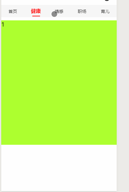
Final effect: