Floating introduction
At first, the purpose of floating is to arrange text around pictures, just like the mixed arrangement of pictures and texts on newspapers. But} Web developers quickly realized that anything can float, not just images, so the use of floating expanded. Floating has been used to realize the layout of the whole website page, which makes the information columns arranged horizontally (the default setting is to arrange them vertically in the order in which they appear in the source code). At present, there are newer and better page layout technologies, so the use of floating for page layout should be regarded as the traditional layout method.
float attribute
In css, element floating can be realized through the float attribute. The float attribute defines the direction in which the element floats. It has two values: float:left , float:right, and the default value is none
- Setting the horizontal float of these two value elements means that the element can only move left and right, not up and down.
- Floating makes the element separate from the document flow and move in the specified direction. It will stop when it meets the parent boundary or adjacent floating elements
- The element after the floating element will surround it, and the previous element will not be affected
characteristic
-
Do not distinguish between line, block and intra line block elements. Use floating to directly change elements to block level
-
Width and height, margin and padding are supported, but margin: auto is not supported
-
No gap problem (no baseline alignment at block level)
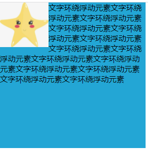
DEMO
<!DOCTYPE html>
<html>
    <head>
        <meta charset="utf-8">
        <title></title>
        <style type="text/css">
            *{
                margin: 0;
                padding: 0;
            }
            .container{
                width: 300px;
                height: 300px;
                background-color: #23A6D5;
            }
            img{
                width: 100px;
                /* Set picture floating left */
                float: left;
            }
        </style>
    </head>
    <body>
        <div class="container">
            <img src="./image/start.jpg">
            <p>Text surrounds floating element text surrounds floating element text surrounds floating element text surrounds floating element text surrounds floating element text surrounds floating element text surrounds floating element text surrounds floating element text surrounds floating element text surrounds floating element text surrounds floating element text surrounds floating element text surrounds floating element text surrounds floating element text surrounds floating element text surrounds floating element</p>
        </div>
    </body>
</html>
Operation effect:

Impact of floating
Through the above simple cases, we can't intuitively find the impact of floating. Here, we just need to remove the container size of the above demo and let the content open the box to find the problem!
.container{
    /* width: 300px;
    height: 300px; */
    background-color: #23A6D5;
}

As shown above, it can be seen that the parent element is highly collapsed and the picture is no longer in the container. This effect will seriously affect the web page layout in web page development
In addition, if the width of the parent element is not enough, the floating element will fall due to the floating of the child element, and the element will be stuck
What are the methods to clear floating?
Clear attribute needs to be used to clear floating. It has three values: left, right and both. The left value determines the left floating, the right value clears the right floating, and the both value clears all floating
Here, another demo is used to demonstrate several methods of clearing floating:
<!DOCTYPE html>
<html>
    <head>
        <meta charset="utf-8">
        <title></title>
        <style type="text/css">
            *{
                margin: 0;
                padding: 0;
            }
            .container{
                padding: 5px;
                background-color: #23A6D5;
            }
            p{
                width: 50px;
                height: 50px;
                background-color: red;
                margin: 5px;
            }
        </style>
    </head>
    <body>
        <div class="container">
            <p>1</p>
            <p>2</p>
            <p>3</p>
        </div>
    </body>
</html>

After setting the floating effect on the p element:
p{
    width: 50px;
    height: 50px;
    background-color: red;
    margin: 5px;
    float: left;
}

There are several ways to solve the problems caused by the above floating:
1) Parent div defines height
.container{
    width: 200px;
    height: 100px;
    padding: 5px;
    background-color: #23A6D5;
}
2) add an empty div tag after the last floating element and add the style {clear:both
<div class="container">
    <p>1</p>
    <p>2</p>
    <p>3</p>
    <div style="clear: both;"></div>
</div>
3) The parent label containing the floating element is added with a style of # overflow # as # hidden # or # auto
.container{
    padding: 5px;
    background-color: #23A6D5;
    overflow: hidden;
}
4) Parent div} zoom:1(IE)
.container{
    padding: 5px;
    background-color: #23A6D5;
    overflow: hidden;
}
5) Clear floating with # after pseudo element (recommended)
.clearfix::after {
    content: "";
    display: block;
    height: 0;
    clear: both;
}
.clearfix {
    zoom: 1;
}
- clearfix is the class name of the parent container
- content: "" is a blank character placed at the end of the parent container
- height: 0 is to make the blank character not displayed
- display: block # clear: both are independent blocks that ensure that the white space character is non floating
- Use "zoom:1" to support IE6
Clear the advantages and disadvantages of floating?
- Parent fixed height: only suitable for layout with fixed height
- End empty div method: if there are many floating layouts on the page, a lot of empty div will be added
- Parent BFC pattern method: when using overflow:hidden, the browser will automatically check the height of the floating area. It cannot be used with position, because the exceeding size will be hidden
- Pseudo class defined by parent div: the browser supports well and is not prone to strange problems (recommended)