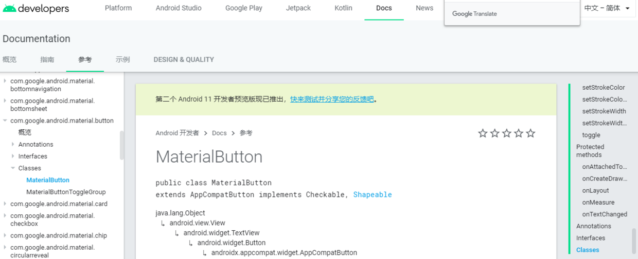
MaterialButton
The official website occupies the building. The following is a summary of personal use
MaterialButton official document
- The first must be the guide package
implementation 'com.google.android.material:material:1.2.0-alpha06'
- After the package is introduced, you will find that you can write the MaterialButton control in the layout
<com.google.android.material.button.MaterialButton
        android:layout_width="@dimen/dp_60"
        android:layout_height="wrap_content"
        android:layout_gravity="right|top"
        android:layout_marginTop="@dimen/dp_16"
        android:layout_marginRight="@dimen/dp_16"
        android:gravity="center"
        android:text="@string/preview_ok"
        app:backgroundTint="@color/colorBlue"
        android:textColor="@color/colorWhite"
        app:cornerRadius="@dimen/dp_5"/>
Rounding and shading, as well as width and height, did not work

I'm the MaterialButton before applying the theme
Rounding and shading, as well as width and height, work

I am the MaterialButton after applying the theme
- Several pits appear at this time
- You will find that the width and height property you set is not applied to the MaterialButton control, and even the color you use for its backgroundTint is wrong. Why?
- This is because the system itself sets the default properties for the MaterialButton control, so your operation will not take effect
- Then we need to override these properties and let the MaterialButton control be controlled by us
- In res → values → styles Add the following attributes to the XML
    <style name="materialButton" parent="Widget.MaterialComponents.Button">
        <item name="android:paddingLeft">8dp</item>
        <item name="android:paddingRight">8dp</item>
        <item name="android:paddingTop">4dp</item>
        <item name="android:paddingBottom">4dp</item>
        <item name="android:inset">0dp</item>
        <item name="android:insetLeft">0dp</item>
        <item name="android:insetRight">0dp</item>
        <item name="android:insetBottom">0dp</item>
        <item name="android:insetTop">0dp</item>
        <item name="android:minWidth">0dp</item>
        <item name="android:minHeight">0dp</item>
        <item name="android:elevation">0dp</item>
</style>- This time, it still didn't work
- Why on earth.
- 😄 Last step
- In res → values → styles The parent of AppTheme in XML should be changed to theme MaterialComponents. Light. NoActionBar
- At this time, your MaterialButton is completely subject to you
- Matters needing attention:
- If the last step is not done, the following error reports will be generated
 Caused by: android.view.InflateException: Binary XML file line #42: Binary XML file line #42: Error inflating class com.google.android.material.button.MaterialButton
Caused by: android.view.InflateException: Binary XML file line #42: Error inflating class com.google.android.material.button.MaterialButton- Look at the Internet, it is said to use implementation 'com google. android. Material: Material: 1.0.0-beta01 'the dependency of this version is OK, But it should be noted that if you consider using TabLayout, there is no TabLayoutMediator in this version.
Oh, yes, finally, the theme is theme MaterialComponents. Light. In noactionbar, your checkbox and other controls need to be handled like the MaterialButton, otherwise they will be colored gray by the system by default like the MaterialButton control
I am the CheckBox before the application theme, normal white

I'm the CheckBox before applying the theme
I am the CheckBox after applying the theme, which is colored gray by the system

I'm the CheckBox after applying the theme
- Here are all the points that need attention. The MaterialButton can be used, but pay attention to these details!