The goal of user controls is to provide a design surface for supplementary control templates, providing a quick way to define controls at the expense of losing future flexibility.This is a problem if you like the functionality of user controls but need to modify them to visualize them.For example, imagine that you want to use the same color picker, but you want to use different "skins" to better integrate it into existing application windows.Styles can be used to change some aspects of a user control, but some parts of the control are locked internally and hard-coded into tags.For example, you cannot move the preview rectangle to the left of the slider bar.
The solution is to create a no-look control -- one that inherits from the control base class but does not design a surface.Instead, the control places its markup in the default template, replacing the default template without affecting the control's logic.
1. Modify the code of the color picker
It is not difficult to change the color picker to a control without appearance.The first step is easy -- you just need to change the class declaration, as shown below:
public class ColorPicker:System.Windows.Controls.Control
    {

    }
In this example, the ColorPicker class inherits from the Control class.Inheriting from the FrameworkElement class is inappropriate because the color picker allows interaction with the user, and other advanced classes do not accurately describe the behavior of the color picker.For example, the color picker does not allow other content to be nested internally, so inheriting from the ContentControl class is also inappropriate.
The code in the ColorPicker class is the same as that used for user controls (except that the InitializeComponent() method call in the constructor must be removed).Dependency properties and routing events can be defined in the same way.The only difference is that you need to notify WPF that a new style will be provided for the control class.This style will provide a new control template (if you do not perform this step, you will continue to use the template defined in the base class).
To notify WPF that a new style is being provided, the OverrideMetadata() method needs to be called in the static constructor of the Bullet Female Process Control class.This method needs to be called on the DefaultStyleKeyProperty property, which defines the dependency property of the default style for a custom control.The code needed is as follows:
DefaultStyleKeyProperty.OverrideMetadata(typeof(ColorPicker), new FrameworkPropertyMetadata(typeof(ColorPicker)));
If you want to use templates for other control classes, you can provide different types, but almost always create specific styles for each custom control.
2. Modify the marking of the color picker
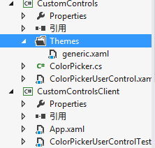
After adding a call to the OverrideMetadata() method, you only need to insert the correct style.Styles need to be placed in a resource dictionary named generic.xaml, which must be placed in the Themes subfolder of the project folder.This way, the style is recognized as the default style for the custom control.The following are the steps to add a generic.xaml file:
(1) Right-click the class library item in Solution Explorer and select the Add|New Folder menu item.
(2) Name the new folder Themes.
(3) Right-click the Themes folder and select the Add|New Item menu item.
(4) Select the resource dictionary in the Add New Item dialog box, enter the name generic.xaml, and click the Add button.
The following image shows the generic.xaml file in the Themes folder.
Custom control libraries usually contain several controls.To keep their styles independent for editing, generic.xaml files typically use the resource dictionary merge function.The following tags show the generic.xaml file, which extracts resources from the ColorPicker.xaml resource dictionary, which is located in the Themes folder of the CustomControls control library:
<ResourceDictionary xmlns="http://schemas.microsoft.com/winfx/2006/xaml/presentation"
                    xmlns:x="http://schemas.microsoft.com/winfx/2006/xaml">
    <ResourceDictionary.MergedDictionaries>
        <ResourceDictionary Source="/CustomControls;component/Themes/ColorPicker.xaml">
        </ResourceDictionary>
    </ResourceDictionary.MergedDictionaries>
</ResourceDictionary>
Custom control styles must use the TargetType attribute to automatically associate themselves with the color picker.Here is the basic structure of the markup in the ColorPicker.xaml file:
<ResourceDictionary xmlns="http://schemas.microsoft.com/winfx/2006/xaml/presentation"
                    xmlns:x="http://schemas.microsoft.com/winfx/2006/xaml"
                    xmlns:local="clr-namespace:CustomControls">
    <Style TargetType="{x:Type local:ColorPicker}">
        ...
    </Style>
</ResourceDictionary>
Styles can be used to set any property in a control class, whether inherited from the base class or new.Here, however, the most useful task of a style is to apply a new target that defines the default visual appearance of the control.
Common markers, such as those used by the color picker, can be easily converted into control targets.However, the following points should be noted:
- ElementName property cannot be used when creating binding expressions linked to parent control class properties.Instead, you need to use the RelativeSource property to indicate that you want to bind to the parent control.If one-way bindings are sufficient, lightweight TemplateBinding tag expressions can usually be used instead of full-featured data bindings.
- Cannot associate event handlers in control templates.Instead, you need to provide elements with recognizable names and code their associated handlers in the control constructor.
- Do not name elements in a control template unless you want to associate an event handler or interact with it through code.When naming the element you want to use, use the form "PART_Element Name".
Following the above points, you can create the following templates for the color picker:
<Style TargetType="{x:Type local:ColorPicker}">
        <Setter Property="Template">
            <Setter.Value>
                <ControlTemplate TargetType="{x:Type local:ColorPicker}">
                    <Grid>
                        <Grid.RowDefinitions>
                            <RowDefinition Height="Auto"/>
                            <RowDefinition Height="Auto"/>
                            <RowDefinition Height="Auto"/>
                        </Grid.RowDefinitions>
                        <Grid.ColumnDefinitions>
                            <ColumnDefinition></ColumnDefinition>
                            <ColumnDefinition Width="Auto"/>
                        </Grid.ColumnDefinitions>
                        <Slider Minimum="0" Maximum="255"
                                Margin="{TemplateBinding Padding}"
                                Value="{Binding Path=Red,
                             RelativeSource={RelativeSource TemplatedParent}}"/>
                        <Slider Grid.Row="1" Minimum="0" Maximum="255"
                                Margin="{TemplateBinding Padding}"
                                Value="{Binding Path=Green,
                             RelativeSource={RelativeSource TemplatedParent}}"/>
                        <Slider Grid.Row="2" Minimum="0" Maximum="255"
                                Margin="{TemplateBinding Padding}"
                                Value="{Binding Path=Blue,
                             RelativeSource={RelativeSource TemplatedParent}}"/>
                        <Rectangle Grid.Column="1" Grid.RowSpan="3"
                                   Margin="{TemplateBinding Padding}" Width="50"
                                   Stroke="Black" StrokeThickness="1">
                            <Rectangle.Fill>
                                <SolidColorBrush
                                    Color="{Binding Path=Color,RelativeSource={RelativeSource TemplatedParent}}"></SolidColorBrush>
                            </Rectangle.Fill>
                        </Rectangle>
                    </Grid>
                </ControlTemplate>
            </Setter.Value>
        </Setter>
    </Style>
As you can see above, this example has mentioned some binding expressions with the TemplateBinding extension.Other binding expressions still use the Binding extension, but set RelativeSource to the parent element (custom control) pointing to the template.Although TemplateBinding does the same thing as setting the RelativeSource property to TemplatedParent Value Binding - extracting data from properties of custom controls - it is always appropriate to use lighter TemplateBindings.TemplateBinding will not work if you need to bind bidirectionally (as with sliders) or to properties of classes that inherit from Freezable, such as the SolidColorBrush class.
3. Simplified Control Template
With the above design, the color picker control template fills in all the required content and can be used in the same way as the color picker is used.However, templates can still be simplified by removing some details.
All controls that wish to provide custom templates now use a large number of binding expressions that must be added to ensure that the control continues to work.It's not difficult, but it's cumbersome.Another option is to configure all binding expressions in the initialization code of the control itself.This way, the template does not need to specify these details.
1. Add Part Name
In order for this system to work, the code needs to be able to find the elements it needs.WPF controls are named the elements they need.Therefore, the name of the element becomes part of the public interface of the custom control and requires an appropriate descriptive name.By convention, these names begin with PART_followed by the element name.The first letter of an element's name is capitalized, just like a mathematical name.PART_RedSlider is the appropriate choice for the desired element name, whereas names such as PART_sldRed, PART_redSlider, and RedSlider are not.
For example, the tag below demonstrates how to prepare for setting bindings through code by deleting the binding expression of the Value Math for the three sliders and adding the PART_name for the three sliders.
<Slider Name="PART_RedSlider" Minimum="0" Maximum="255"
                                Margin="{TemplateBinding Padding}"
                               />
<Slider Name="PART_GreemSlider" Grid.Row="1" Minimum="0" Maximum="255"
                                Margin="{TemplateBinding Padding}"
                                />
<Slider Name="PART_BlueSlider" Grid.Row="2" Minimum="0" Maximum="255"
                                Margin="{TemplateBinding Padding}"
                                />
Note that Margin math still uses binding expressions to add internal margins, but this is an optional detail that can be easily removed from custom templates (you can choose to hard-code internal margins or use different layouts).
To ensure greater flexibility, this is not to give the Rectangle element a name, but to give its internal SolidColorBrush a name.This allows any shape or element to be used for the color preview function based on the template.
<Rectangle Grid.Column="1" Grid.RowSpan="3"
                                   Margin="{TemplateBinding Padding}" Width="50"
                                   Stroke="Black" StrokeThickness="1">
                            <Rectangle.Fill>
                                <SolidColorBrush
                                    x:Name="PART_PreviewBrush"></SolidColorBrush>
                            </Rectangle.Fill>
</Rectangle>
2. Operation Template Parts
After initializing the control, you can connect binding expressions, but there is a better way.WPF has a dedicated OnApplyTemplate() method that should be overridden if you need to find elements in the template and associate event handlers or add data binding expressions.In this method, you can find the desired element through the GetTemplateChild() method.
The recommended pattern will not work if the element you want to work with is not found.Code can also be added to retrieve the element, checking for the correct type if it exists, and throwing an exception if the type is incorrect.
The following code demonstrates the use of the OnApplyTemplate() method:
public override void OnApplyTemplate()
        {
            base.OnApplyTemplate();

            RangeBase slider = GetTemplateChild("PART_RedSlider") as RangeBase;
            if (slider != null)
            {
                Binding binding = new Binding("Red");
                binding.Source = this;
                binding.Mode = BindingMode.TwoWay;
                slider.SetBinding(RangeBase.ValueProperty, binding);
            }
            slider = GetTemplateChild("PART_GreenSlider") as RangeBase;
            if (slider != null)
            {
                Binding binding = new Binding("Green");
                binding.Source = this;
                binding.Mode = BindingMode.TwoWay;
                slider.SetBinding(RangeBase.ValueProperty, binding);
            }
            slider = GetTemplateChild("PART_BlueSlider") as RangeBase;
            if (slider != null)
            {
                Binding binding = new Binding("Blue");
                binding.Source = this;
                binding.Mode = BindingMode.TwoWay;
                slider.SetBinding(RangeBase.ValueProperty, binding);
            }

            SolidColorBrush brush = GetTemplateChild("PART_PreviewBrush") as SolidColorBrush;
            if (brush != null)
            {
                Binding binding = new Binding("Color");
                binding.Source = brush;
                binding.Mode = BindingMode.OneWayToSource;
                this.SetBinding(ColorPicker.ColorProperty, binding);
            }
        }
Notice that the code above uses the System.Windows.Controls.Primitives.RangeBase class (from which the Slider class inherits) instead of the Slider class.Because the RangeBase class provides the minimum required functionality -- in this case, the medium Value property.By maximizing the universality of the code, control users have greater freedom.For example, you can now provide custom templates that use different controls derived from the RangeBase class instead of color sliders.
The code to bind the SolidColorBrush is slightly different because SolidColorBrush reputation includes the SetBinding() method, which is defined in the FrameworkElement class.One easy workaround is to create a binding expression for the ColorPicker.Color property, using a one-way binding that points to the source.This will automatically update the brush when the color of the color picker changes.
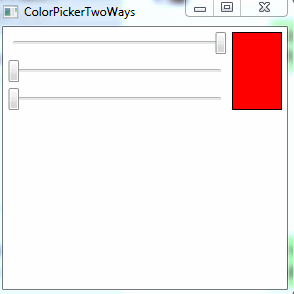
To see the benefits of this design change, you need to create a control that uses a color picker and provide a new control template.
3. Record template parts
For the example above, there is a final improvement.Good design guidelines recommend adding TemplatePart attributes to control declarations to record which part names are used in the control template and what types of controls are used for each part.Technically, this step is not required, but the document can help other users who use custom classes.
The following TemplatePart features should be added to the ColorPicker control class:
[TemplatePart(Name = "PART_RedSlider", Type = typeof(RangeBase))]
[TemplatePart(Name = "PART_BlueSlider", Type = typeof(RangeBase))]
[TemplatePart(Name = "PART_GreenSlider", Type = typeof(RangeBase))]
[TemplatePart(Name = "PART_PreviewBrush", Type = typeof(SolidColorBrush))]
public class ColorPicker:System.Windows.Controls.Control
{
}
This sample source code: CustomControlsV2.0.zip