Article catalogue
preface
Form definition of form.1
The form is mainly responsible for the data collection function in the web page. A form has three basic components:
- Form label: This contains the URL of CGI program used to process form data and the method of submitting data to the server.
- Form field: contains text box, password box, hidden field, multi line text box, check box, radio box, drop-down selection box, file upload box, etc.
- Form button: including submit button, reset button and general button; It is used to transfer the data to the CGI script on the server or cancel the input. You can also use the form button to control the processing of other defined processing scripts.
2. Properties of form
attribute | type | Default value | Required | explain | Minimum version |
|---|---|---|---|---|---|
report-submit | boolean | false | no | Is the formId used to send the template message | 1.0.0 |
report-submit-timeout | number | 0 | no | Wait a period of time (in milliseconds) to confirm whether the formId takes effect. If this parameter is not specified, there is a small probability that formId is invalid (such as network failure). Specify this parameter to check whether the formId is valid, and take the time of this parameter as the timeout of this detection. If it fails, the formId starting with requestFormId:fail will be returned | 2.6.2 |
bindsubmit | eventhandle | no | Carry the data in the form to trigger the submit event, event detail = {value : {‘name’: ‘value’} , formId: ‘’} | 1.0.0 | |
bindreset | eventhandle | no | Reset event will be triggered when the form is reset | 1.0.0 |
1, Form form
1. Basic use of form
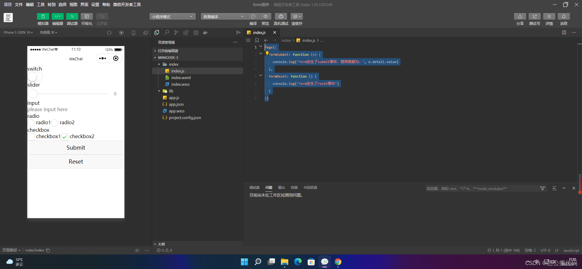
<form bindsubmit="formSubmit" bindreset="formReset">
  <view class="section section_gap">
    <view class="section__title">switch</view>
    <switch name="switch"/>
  </view>
  <view class="section section_gap">
    <view class="section__title">slider</view>
    <slider name="slider" show-value ></slider>
  </view>

  <view class="section">
    <view class="section__title">input</view>
    <input name="input" placeholder="please input here" />
  </view>
  <view class="section section_gap">
    <view class="section__title">radio</view>
    <radio-group name="radio-group">
      <label><radio value="radio1"/>radio1</label>
      <label><radio value="radio2"/>radio2</label>
    </radio-group>
  </view>
  <view class="section section_gap">
    <view class="section__title">checkbox</view>
    <checkbox-group name="checkbox">
      <label><checkbox value="checkbox1"/>checkbox1</label>
      <label><checkbox value="checkbox2"/>checkbox2</label>
    </checkbox-group>
  </view>
  <view class="btn-area">
    <button formType="submit">Submit</button>
    <button formType="reset">Reset</button>
  </view>
</form>
Page({
formSubmit: function (e) {
console.log('form It happened submit Event, carrying data:', e.detail.value)
},
formReset: function () {
console.log('form It happened reset event')
}
})
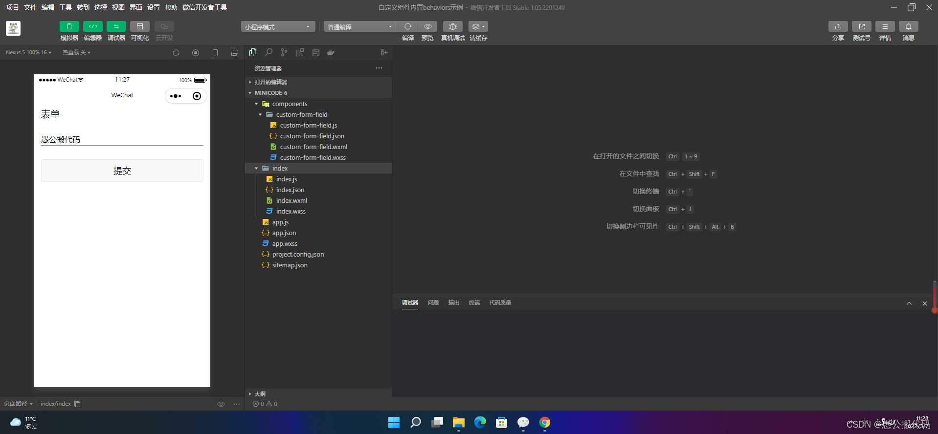
2. Use built-in behaviors
For form components, the following built-in behaviors can be recognized automatically:
- wx://form-field
- wx://form-field-group
- wx://form-field-button
2.1 wx://form-field
Attribute name | type | describe | Minimum version |
|---|---|---|---|
name | String | Field name in the form | 1.6.7 |
value | arbitrarily | Field values in the form | 1.6.7 |
1. Component definition
Component({
  behaviors: ['wx://form-field'],
  data: {
    value: ''
  },
  methods: {
    onChange: function (e) {
      this.setData({
        value: e.detail.value,
      })
    }
  }
})
<input placeholder="Please enter your name" value="{{value}}" bindinput="onChange" ></input>input {
margin: 60rpx 30rpx;
border-bottom: 1px solid grey;
padding-bottom: 2px;
}2. Form usage
{
  "usingComponents": {
    "custom-form-field": "../components/custom-form-field/custom-form-field"
  }
}
<form bindsubmit="formSubmit"> <text>form </text> <custom-form-field name="custom-name"></custom-form-field> <button form-type="submit">Submit</button> </form>
text {
  font-size: 40rpx;
  margin: 30rpx;
}
button {
  margin: 30rpx;
}
const app = getApp()
Page({
formSubmit: function(e) {
console.info('Data carried by form submission', e.detail.value)
},
})
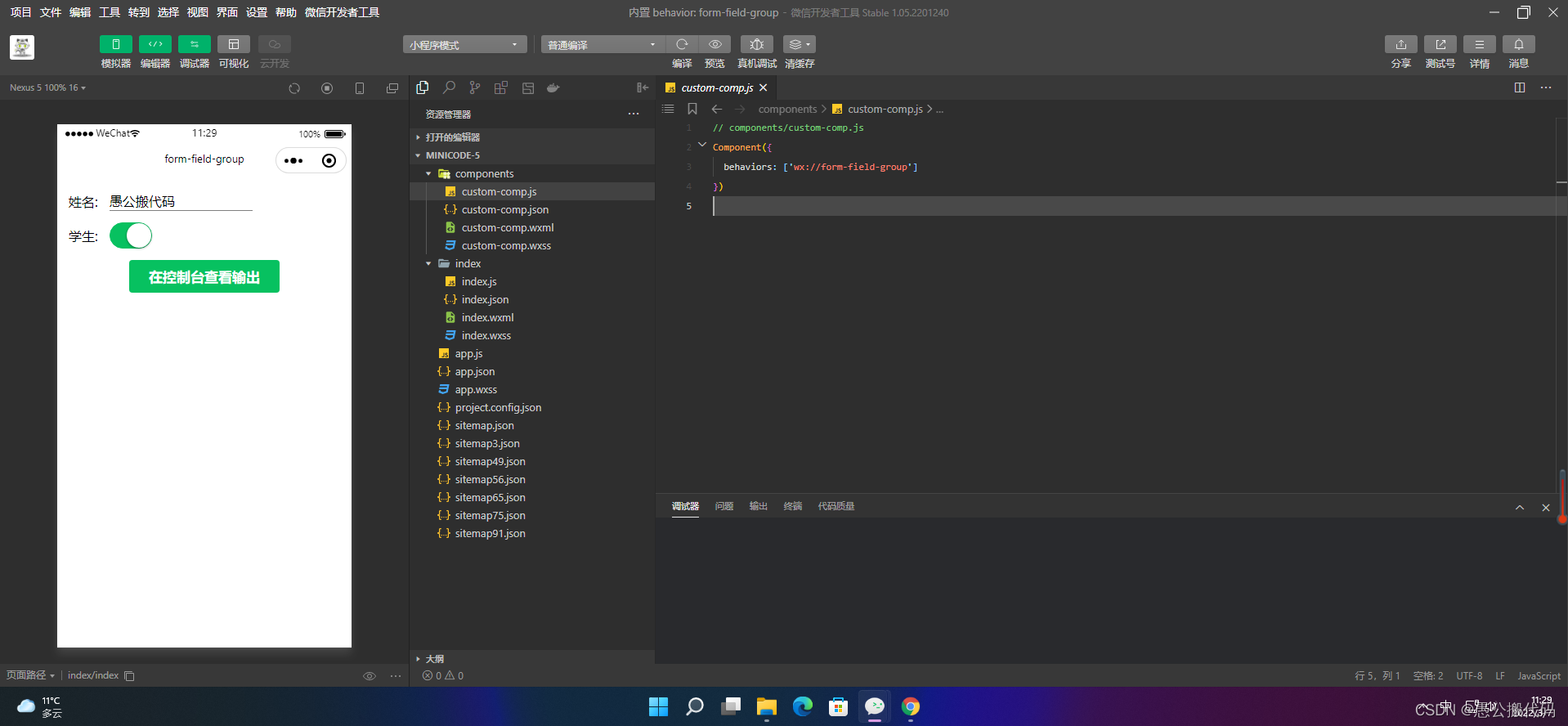
2.2 wx://form-field-group
1. Component definition
// components/custom-comp.js
Component({
  behaviors: ['wx://form-field-group']
})
<view> <text>full name: </text> <input name="name" /> </view> <view> <text>student:</text> <switch name="student" /> </view>
view {
  display: flex;
  flex-direction: row;
  align-items: center;
  margin: 30rpx;
}
text {
  margin-right: 30rpx;
}
input {
  padding-bottom: 1px;
  border-bottom: 1px solid gray;
}
2. Form usage
{
  "usingComponents": {
    "custom-comp": "../components/custom-comp"
  }
}
<form bindsubmit="formSubmit"> <custom-comp></custom-comp> <button type="primary" form-type="submit">View output in console</button> </form>
.intro {
  margin: 30px;
  text-align: center;
}
const app = getApp()
Page({
data: {
},
formSubmit: function(e) {
console.info('Data carried by form submission', e.detail.value)
},
onLoad: function () {
},
})
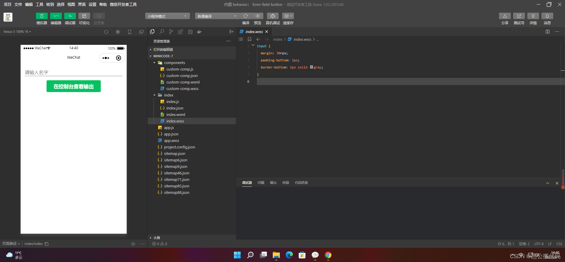
2.3 wx://form-field-button
1. Component definition
Component({
  behaviors: ['wx://form-field-button']
})
<button type="primary" form-type="submit">View output in console</button>
2. Form usage
{
  "usingComponents": {
    "custom-comp": "../components/custom-comp"
  }
}
<form bindsubmit="submit"> <input name="name" placeholder="Please enter your name"></input> <custom-comp></custom-comp> </form>
input {
  margin: 30rpx;
  padding-bottom: 1px;
  border-bottom: 1px solid gray;
}
const app = getApp()
Page({
data: {
},
submit: function (e) {
console.log("Data carried in the form:", e.detail.value)
},
onLoad: function () {
},
})