Recently, the class often needs interpolation and fitting. I think I need to summarize the tools used. I mainly use three ways to realize them.
matlab
1. matlab toolbox is preferred
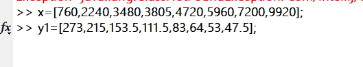
Give the prepared data to the variables in advance (I don't remember what it should be called here, but put down my data here)
x = [760,2240,3480,3805,4720,5960,7200,9920]
y1 = [273,215,153.5,111.5,83,64,53,47.5]
Enter after
cftool
After that, you will enter the toolbox interface. The meaning of fitting parameters and what fitting to choose are not introduced here. You can choose freely
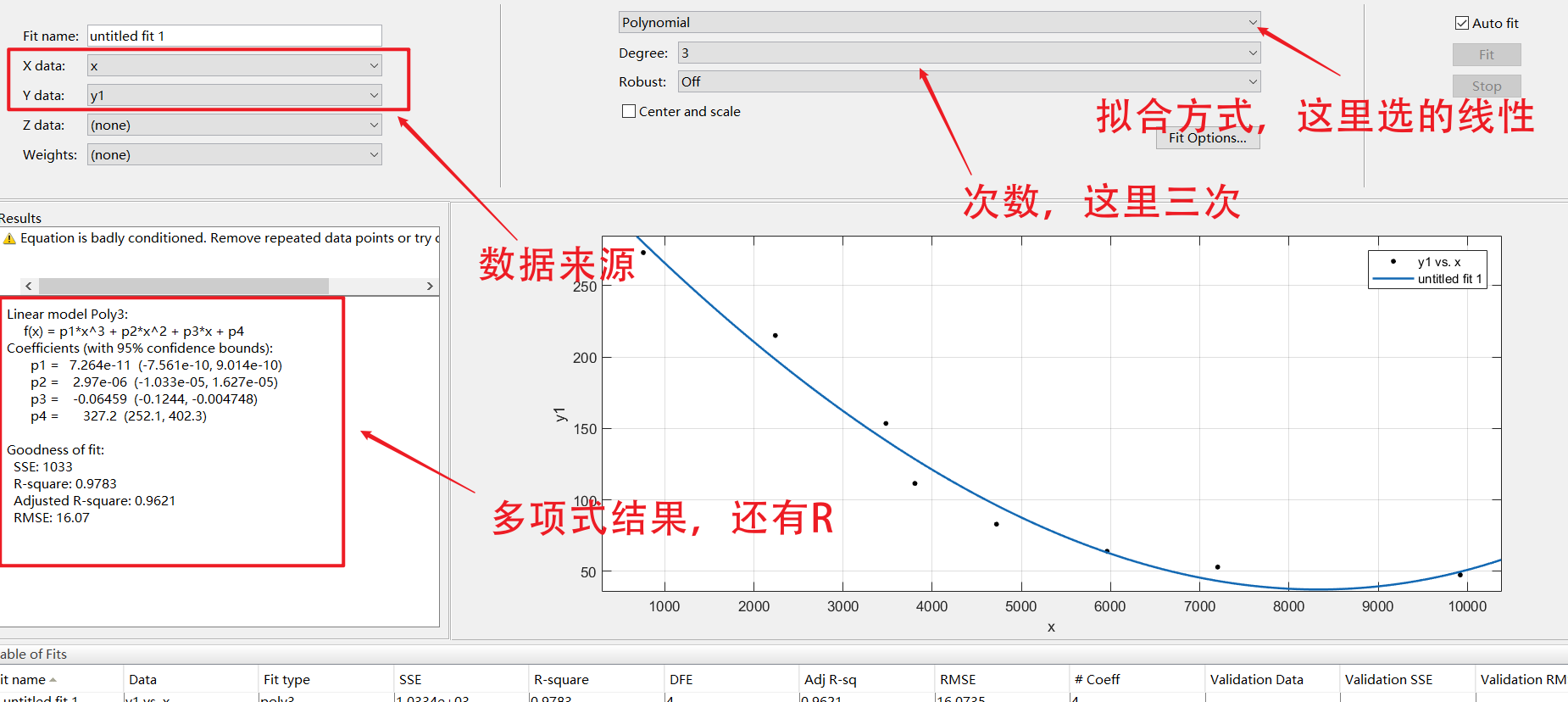
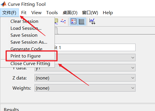
Select as follows to enter the normal drawing page
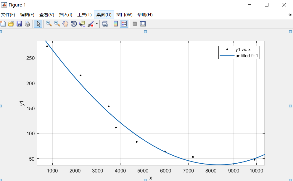
You can look at the graphics like an ordinary drawing
2. Using the fitting function ployfit
polyfit function is a function used for curve fitting in matlab. Its mathematical basis is the least square curve fitting principle. Curve fitting: when the data set on the discrete point is known, that is, the function value on the point set is known, an analytical function (its graph is a curve) is constructed to make it as close to the given value as possible on the original discrete point.
The example I use here is as follows:
x=[760,2240,3480,3805,4720,5960,7200,9920];
y1=[273,215,153.5,111.5,83,64,53,47.5];
y2=[215,211.5,172.5,125,98,80,69,64.5];
y3=[153.5,172.5,182.5,154.5,113.5,87.5,71.5,64];
y4=[111.5,125,154.5,171.5,149,113.5,93,83];

P1 = polyfit(x,y1,3); % Get a polynomial, followed by the degree of the polynomial
P2 = polyfit(x,y2,3); % Get polynomial
P3 = polyfit(x,y3,3); % Get polynomial
P4 = polyfit(x,y4,3); % Get polynomial
%mapping
xi = 0:100:10000;
yy1 = polyval(P1,xi);
yy2 = polyval(P2,xi);
yy3 = polyval(P3,xi);
yy4 = polyval(P4,xi);

subplot(2,2,1)
plot(xi,yy1,x,y1,'r*');
subplot(2,2,2)
plot(xi,yy2,x,y2,'r*');
subplot(2,2,3)
plot(xi,yy3,x,y3,'r*');
subplot(2,2,4)
plot(xi,yy4,x,y4,'r*');

hold on
The image results are as follows
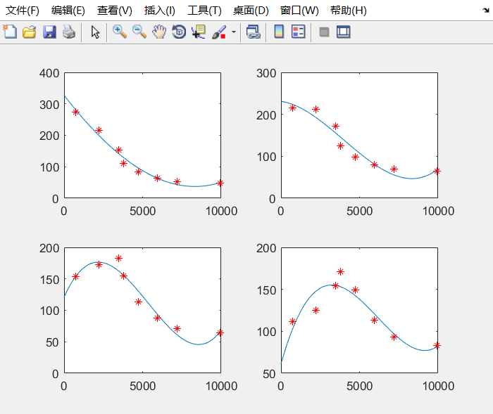
It can be seen that the fitting effect is also good.
excle
First, prepare the required data
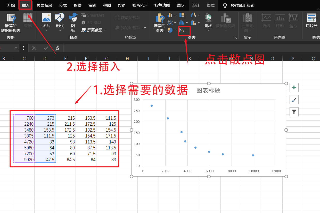
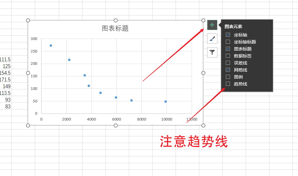 Select more from the trend line to enter the rich settings page
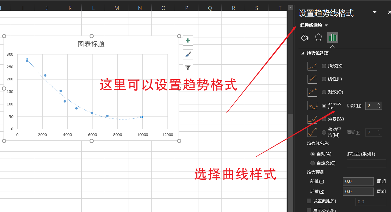 The formula and R square can be shown at the bottom. R square is related to the correlation coefficient. There is no derivation here. Basically, you only need to know that the closer the value is to 1, the better the fitting effect is.
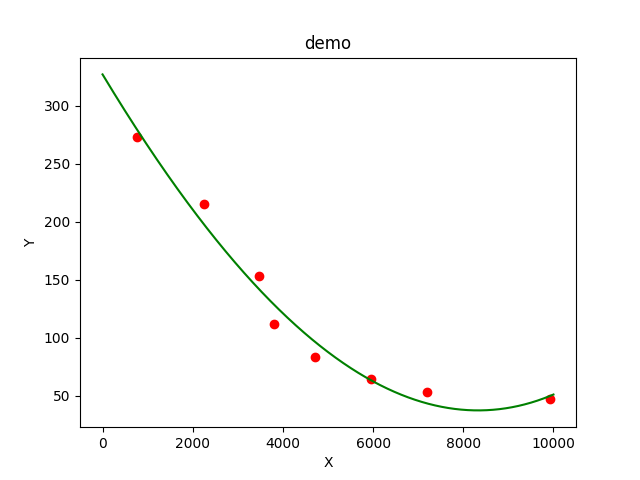
python
python is also a good fitting tool. The fitting function is very similar to matlab
import numpy as np
import matplotlib.pyplot as plt

x = [760,2240,3480,3805,4720,5960,7200,9920]
y = [273,215,153.5,111.5,83,64,53,47.5]

plt.scatter(x,y,color="red")
plt.title("demo")
plt.xlabel("X")
plt.ylabel("Y")

linear_model=np.polyfit(x,y,3) # Cubic fitting
linear_model_fn=np.poly1d(linear_model)  # Get the fitting function

x_s=np.arange(0,10000) #Generation point
plt.plot(x_s,linear_model_fn(x_s),color="green") #Draw fitting curve

plt.show()
The fitting results are as follows. Here we can directly move the mouse to see the coordinates, which is more convenient than matlab.
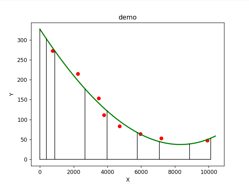
Add horizontal and vertical curves to view the required data
import numpy as np
import matplotlib.pyplot as plt

x = [760,2240,3480,3805,4720,5960,7200,9920]
y = [273,215,153.5,111.5,83,64,53,47.5]

plt.scatter(x,y,color="red")
plt.title("demo")
plt.xlabel("X")
plt.ylabel("Y")

linear_model=np.polyfit(x,y,3) # Cubic fitting
linear_model_fn=np.poly1d(linear_model)  # Get the fitting function

x_s=np.arange(0,10500,100) #Generation point
plt.plot(x_s,linear_model_fn(x_s),color="green",linewidth=2) #Draw fitting curve

x1 = [375,875,2675,3975,5775,7075,8875,10125]
y1 = linear_model_fn(x1)
for x in x1:
    plt.plot([x,x],[0,linear_model_fn(x)],color="black",linewidth=1)
plt.plot([0,x1[-1]],[0,0],color="black",linewidth=1)
plt.plot([0,0],[0,linear_model_fn(0)],color="black",linewidth=1)

plt.show()
Just traverse the required points one by one
This is basically enough for my class