Common Python packages
- Matplotlib
- Seaborn
- Pandas
- Bokeh
- Plotly
- Vispy
- Vega
- gaga-lite
Matplotlib visualization
Matplotlib installation
pip install matplotlib-i http://pypi.douban.com/simple/ --trusted-host pypi.douban.com
If you fail, try this:
Update pip first and install matplotlib
python -m pip install -U pip setuptools -i http://pypi.douban.com/simple/ --trusted-host pypi.douban.com
python -m pip install matplotlib -i http://pypi.douban.com/simple/ --trusted-host pypi.douban.com
Matplotlib includes two templates
- Drawing API: pyplot, usually used for visualization
- Integration Library: pylab, which is the integration Library of Matplotlib, SciPy and NumPy
Two ways of Matplotlib drawing
- inline, static drawing
- notebook, interactive
Plot plot. Plot() on 2D coordinates
plt.show() shows the results
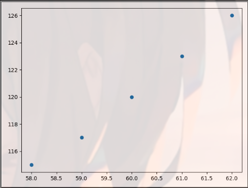
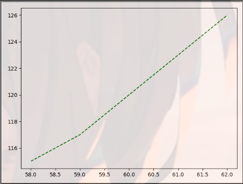
import matplotlib.pyplot as plt
import pandas as pd

dt = {'height': pd.Series([58, 59, 60, 61, 62], index=[0, 1, 2, 3, 4]),
      'weight': pd.Series([115, 117, 120, 123, 126], index=[0, 1, 2, 3, 4])}
women = pd.DataFrame(dt)
print(women)
'''
   height  weight
0      58     115
1      59     117
2      60     120
3      61     123
4      62     126
'''
plt.plot(women["height"],women["weight"])
plt.show()

Implement the method of displaying multiple lines, plt.plot(x,y1,x,y2,x,y3 )
import matplotlib.pyplot as plt
import numpy as np

t = np.arange(0.0, 4.0, 0.1)
print(t)
plt.plot(t, t, t, t + 2, t, t ** 2, t, t + 8)
plt.show()
Change graph properties
- Type of set point
Add the value of the third argument in plt.plot(), such as' o '
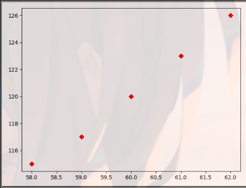
import matplotlib.pyplot as plt
import pandas as pd

dt = {'height': pd.Series([58, 59, 60, 61, 62], index=[0, 1, 2, 3, 4]),
      'weight': pd.Series([115, 117, 120, 123, 126], index=[0, 1, 2, 3, 4])}
women = pd.DataFrame(dt)
print(women)
'''
   height  weight
0      58     115
1      59     117
2      60     120
3      61     123
4      62     126
'''
plt.plot(women["height"],women["weight"],'o')
plt.show()
plt.plot(women["height"],women["weight"],'D')
plt.show()

- Set the color and shape of the line
Change the third argument of plt.plot()
import matplotlib.pyplot as plt
import pandas as pd

dt = {'height': pd.Series([58, 59, 60, 61, 62], index=[0, 1, 2, 3, 4]),
      'weight': pd.Series([115, 117, 120, 123, 126], index=[0, 1, 2, 3, 4])}
women = pd.DataFrame(dt)
print(women)
'''
   height  weight
0      58     115
1      59     117
2      60     120
3      61     123
4      62     126
'''
plt.plot(women["height"],women["weight"],'g--')
plt.show()
plt.plot(women["height"],women["weight"],'rD')
plt.show()
Please refer to these two articles for specific usage
https://blog.csdn.net/cjcrxzz/article/details/79627483
https://blog.csdn.net/sinat_36219858/article/details/79800460?utm_source=distribute.pc_relevant.none-task
- Display Chinese characters
Before plot
Common fonts of Chinese characters: SimHei, Kaiti, Lisu, Fangsong, YouYuan
plt.rcParams['font.family'] = 'SimHei'
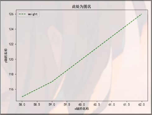
- Set the drawing name and x/y axis name
plt.title(), plt.xlabel(), plt.ylabel() are the title, x coordinate name and y coordinate name of the graph respectively
import matplotlib.pyplot as plt
import pandas as pd

dt = {'height': pd.Series([58, 59, 60, 61, 62], index=[0, 1, 2, 3, 4]),
      'weight': pd.Series([115, 117, 120, 123, 126], index=[0, 1, 2, 3, 4])}
women = pd.DataFrame(dt)
print(women)
'''
   height  weight
0      58     115
1      59     117
2      60     120
3      61     123
4      62     126
'''
plt.rcParams['font.family'] = 'SimHei'
plt.plot(women["height"], women["weight"], 'g--')
plt.title("Picture name here")
plt.xlabel("x Axis name")
plt.ylabel("y Axis name")
plt.show()

- Location of legend
First, add the label parameter to plt.plot(), and then use PLT. Legend (LOC =) LOC as the location, which can be set as "upper left". It shows the legend, that is, the content of lebel
import matplotlib.pyplot as plt
import pandas as pd

dt = {'height': pd.Series([58, 59, 60, 61, 62], index=[0, 1, 2, 3, 4]),
      'weight': pd.Series([115, 117, 120, 123, 126], index=[0, 1, 2, 3, 4])}
women = pd.DataFrame(dt)
print(women)
'''
   height  weight
0      58     115
1      59     117
2      60     120
3      61     123
4      62     126
'''
plt.rcParams['font.family'] = 'SimHei'
plt.plot(women["height"], women["weight"], 'g--', label='weight')
plt.title("Picture name here")
plt.xlabel("x Axis name")
plt.ylabel("y Axis name")

plt.legend(loc="upper left")
plt.show()
Change the type of graph
plt.scatter() scatter
import matplotlib.pyplot as plt
import pandas as pd

dt = {'height': pd.Series([58, 59, 60, 61, 62], index=[0, 1, 2, 3, 4]),
      'weight': pd.Series([115, 117, 120, 123, 126], index=[0, 1, 2, 3, 4])}
women = pd.DataFrame(dt)
print(women)
'''
   height  weight
0      58     115
1      59     117
2      60     120
3      61     123
4      62     126
'''
plt.scatter(women["height"], women["weight"])
plt.show()

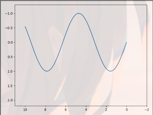
Change the value range of the coordinate axis of the graph
Define abscissa: plt.xlim()
Define ordinate: plt.ylim()
At the same time, define the horizontal and vertical coordinates: plt.axis()
The function of np.linspace (0,10100) is to return an equidistant sequence with 100 elements and the value range of each element is [0100]
import matplotlib.pyplot as plt
import numpy as np

x = np.linspace(0, 10, 100)
plt.plot(x, np.sin(x))
plt.xlim(11, -2)  # The value range of x axis is [11, - 2]
plt.ylim(2.2, -1.3)  # The value range of y axis is [2.2, - 1.3]
plt.show()
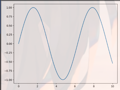
plt.axis(a1,a2,b1,b2): a1 and a2 are the value range of x-axis, b1 and b2 are the value range of y-axis
import matplotlib.pyplot as plt
import numpy as np

x = np.linspace(0, 10, 100)
plt.plot(x, np.sin(x))
plt.axis([-1, 21, -1.6, 1.6])
plt.show()

plt.axis("equal") x-axis and y-axis have the same scale units
import matplotlib.pyplot as plt
import numpy as np

x = np.linspace(0, 10, 100)
plt.plot(x, np.sin(x))
plt.axis("equal")
plt.show()

Remove the margin
plt.axis("tight")
import matplotlib.pyplot as plt
import numpy as np

x = np.linspace(0, 10, 100)
plt.plot(x, np.sin(x))
plt.axis("tight")
plt.show()
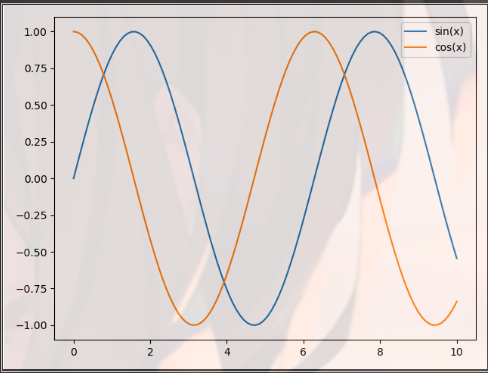
Draw two figures on the same coordinate
Define multiple plt.plot()
import matplotlib.pyplot as plt
import numpy as np

x = np.linspace(0, 10, 100)
plt.plot(x, np.sin(x),label="sin(x)")
plt.plot(x, np.cos(x),label="cos(x)")
plt.axis("tight")
plt.legend()
plt.show()
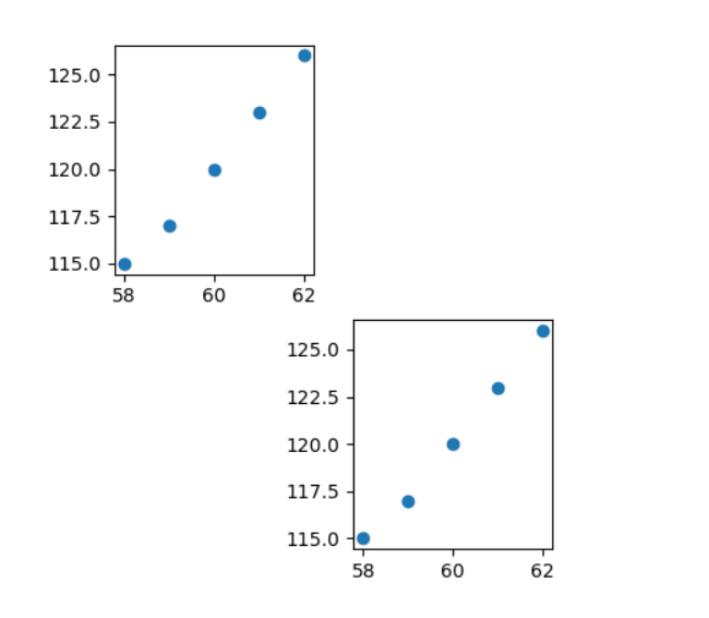
Multi graph display
Plot. Subplot (x, y, z) represents the Z window of x*y window as shown in the following figure
import matplotlib.pyplot as plt
import pandas as pd

dt = {'height': pd.Series([58, 59, 60, 61, 62], index=[0, 1, 2, 3, 4]),
      'weight': pd.Series([115, 117, 120, 123, 126], index=[0, 1, 2, 3, 4])}
women = pd.DataFrame(dt)
print(women)
'''
   height  weight
0      58     115
1      59     117
2      60     120
3      61     123
4      62     126
'''
plt.subplot(2, 3, 5)  # The 5th window of 2 * 3 windows
plt.scatter(women["height"], women["weight"])
plt.subplot(2, 3, 1)  # The first window of 2 * 3 windows
plt.scatter(women["height"], women["weight"])
plt.show()

Preservation of Graphs
Replace plt.show() with plt.savefig("picture name. Picture format")
Save in current working directory
import matplotlib.pyplot as plt
import pandas as pd

dt = {'height': pd.Series([58, 59, 60, 61, 62], index=[0, 1, 2, 3, 4]),
      'weight': pd.Series([115, 117, 120, 123, 126], index=[0, 1, 2, 3, 4])}
women = pd.DataFrame(dt)
print(women)
'''
   height  weight
0      58     115
1      59     117
2      60     120
3      61     123
4      62     126
'''
plt.subplot(2, 3, 5)  # The 5th window of 2 * 3 windows
plt.scatter(women["height"], women["weight"])
plt.subplot(2, 3, 1)  # The first window of 2 * 3 windows
plt.scatter(women["height"], women["weight"])
plt.savefig("sagefig.png")

Drawing method of scatter diagram
sklearn module Download
pip install sklearn -i http://pypi.douban.com/simple/ --trusted-host pypi.douban.com
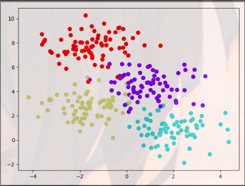
Make ﹐ blobs: generate random data set conforming to normal distribution
Parameters:
- n_samples: number of samples, i.e. number of lines
- N? Features: number of features per sample, i.e. number of columns
- centers: number of categories
- Random state: how to generate random numbers
- Cluster? STD: variance of each category
Return value:
- 10: Test set, type is array, shape is [n'samples, n'features]
- y: The label of each member is also an array with the shape of [n ﹣ samples]
Parameters for plt.scatter()
- X[:,0] and X[:,1] are x coordinate and y coordinate respectively
- c is color.
- s is the size of the point
- cmap is the color band, which is the supplement of c
from sklearn.datasets.samples_generator import make_blobs
import matplotlib.pyplot as plt

X, y = make_blobs(n_samples=300, centers=4, random_state=0, cluster_std=1.0)
plt.scatter(X[:, 0], X[:, 1], c=y, s=50, cmap="rainbow")
plt.show()
Pandas visualization
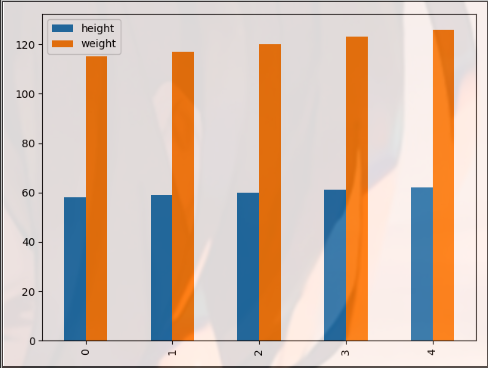
The drawing function of Pandas makes the data visualization of DataFrame class easier
The plot(kind =) parameter of Pandas determines the categories of Graphs
import matplotlib.pyplot as plt
import pandas as pd

dt = {'height': pd.Series([58, 59, 60, 61, 62], index=[0, 1, 2, 3, 4]),
      'weight': pd.Series([115, 117, 120, 123, 126], index=[0, 1, 2, 3, 4])}
women = pd.DataFrame(dt)
print(women)
'''
   height  weight
0      58     115
1      59     117
2      60     120
3      61     123
4      62     126
'''
women.plot(kind="bar")
plt.show()
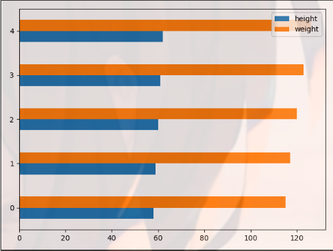
barh represents a horizontal bar graph
import matplotlib.pyplot as plt
import pandas as pd

dt = {'height': pd.Series([58, 59, 60, 61, 62], index=[0, 1, 2, 3, 4]),
      'weight': pd.Series([115, 117, 120, 123, 126], index=[0, 1, 2, 3, 4])}
women = pd.DataFrame(dt)
print(women)
'''
   height  weight
0      58     115
1      59     117
2      60     120
3      61     123
4      62     126
'''
women.plot(kind="barh")
plt.show()
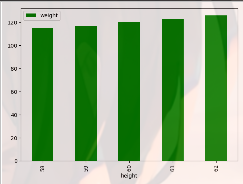
import matplotlib.pyplot as plt
import pandas as pd

dt = {'height': pd.Series([58, 59, 60, 61, 62], index=[0, 1, 2, 3, 4]),
      'weight': pd.Series([115, 117, 120, 123, 126], index=[0, 1, 2, 3, 4])}
women = pd.DataFrame(dt)
print(women)
'''
   height  weight
0      58     115
1      59     117
2      60     120
3      61     123
4      62     126
'''
women.plot(kind="bar", x="height", y="weight", color='g')
plt.show()
kde is expressed as kernel density estimation curve
import matplotlib.pyplot as plt
import pandas as pd

dt = {'height': pd.Series([58, 59, 60, 61, 62], index=[0, 1, 2, 3, 4]),
      'weight': pd.Series([115, 117, 120, 123, 126], index=[0, 1, 2, 3, 4])}
women = pd.DataFrame(dt)
print(women)
'''
   height  weight
0      58     115
1      59     117
2      60     120
3      61     123
4      62     126
'''
women.plot(kind="kde")
plt.show()

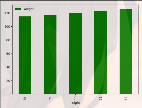
plt.legend(loc = "best") optimizes the location of the legend
import matplotlib.pyplot as plt
import pandas as pd

dt = {'height': pd.Series([58, 59, 60, 61, 62], index=[0, 1, 2, 3, 4]),
      'weight': pd.Series([115, 117, 120, 123, 126], index=[0, 1, 2, 3, 4])}
women = pd.DataFrame(dt)
print(women)
'''
   height  weight
0      58     115
1      59     117
2      60     120
3      61     123
4      62     126
'''
women.plot(kind="bar", x="height", y="weight", color='g')
plt.legend(loc="best")
plt.show()
Seaborn visualization
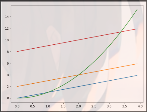
Cumsum is a function in Matlab, which is usually used to calculate the accumulated value of each row of an array. The syntax is: B = cumsum(A,dim), or B = cumsum(A)
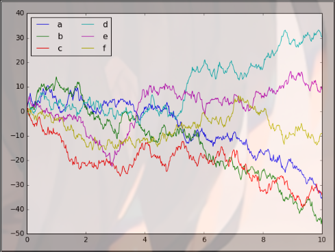
The function of plt.legend() is to set legend parameters
- Legend content: abcdef
- Number of legend columns: ncol = 2
- Display location of legend: loc = "upper left"
import matplotlib.pyplot as plt
import numpy as np

plt.style.use("classic")
Rng = np.random.RandomState(0)
X = np.linspace(0, 10, 500) # Generate 500 numbers between 0 and 10
y = np.cumsum(Rng.randn(500, 6), 0)
plt.plot(X, y)
plt.legend("abcdef", ncol=2, loc="upper left")
plt.show()
Seaborn Download
pip install seaborn -i http://pypi.douban.com/simple/ --trusted-host pypi.douban.com
Seaborn can make the figure more beautiful
import matplotlib.pyplot as plt
import seaborn as sns
import numpy as np

plt.style.use("classic")
Rng = np.random.RandomState(0)
X = np.linspace(0, 10, 500)
y = np.cumsum(Rng.randn(500, 6), 0)
sns.set()
plt.plot(X, y)
plt.legend("abcdef", ncol=2, loc="upper left")
plt.show()

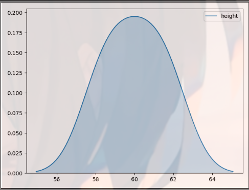
Kernel density estimate (KDE)
import matplotlib.pyplot as plt
import seaborn as sns
import pandas as pd

dt = {'height': pd.Series([58, 59, 60, 61, 62], index=[0, 1, 2, 3, 4]),
      'weight': pd.Series([115, 117, 120, 123, 126], index=[0, 1, 2, 3, 4])}
women = pd.DataFrame(dt)
print(women)
'''
   height  weight
0      58     115
1      59     117
2      60     120
3      61     123
4      62     126
'''
sns.kdeplot(women.height,shade=True)
plt.show()
The function is histogram + kdeplot
import matplotlib.pyplot as plt
import seaborn as sns
import pandas as pd

dt = {'height': pd.Series([58, 59, 60, 61, 62], index=[0, 1, 2, 3, 4]),
      'weight': pd.Series([115, 117, 120, 123, 126], index=[0, 1, 2, 3, 4])}
women = pd.DataFrame(dt)
print(women)
'''
   height  weight
0      58     115
1      59     117
2      60     120
3      61     123
4      62     126
'''
sns.distplot(women.height)
plt.show()

sns.pairplot(): scatter matrix
import matplotlib.pyplot as plt
import seaborn as sns
import pandas as pd

dt = {'height': pd.Series([58, 59, 60, 61, 62], index=[0, 1, 2, 3, 4]),
      'weight': pd.Series([115, 117, 120, 123, 126], index=[0, 1, 2, 3, 4])}
women = pd.DataFrame(dt)
print(women)
'''
   height  weight
0      58     115
1      59     117
2      60     120
3      61     123
4      62     126
'''
sns.pairplot(women)
plt.show()

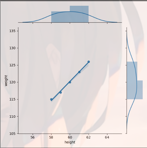
sns.jointplot() joint distribution
import matplotlib.pyplot as plt
import seaborn as sns
import pandas as pd

dt = {'height': pd.Series([58, 59, 60, 61, 62], index=[0, 1, 2, 3, 4]),
      'weight': pd.Series([115, 117, 120, 123, 126], index=[0, 1, 2, 3, 4])}
women = pd.DataFrame(dt)
print(women)
'''
   height  weight
0      58     115
1      59     117
2      60     120
3      61     123
4      62     126
'''
sns.jointplot(women.height, women.weight, kind="reg")
plt.show()
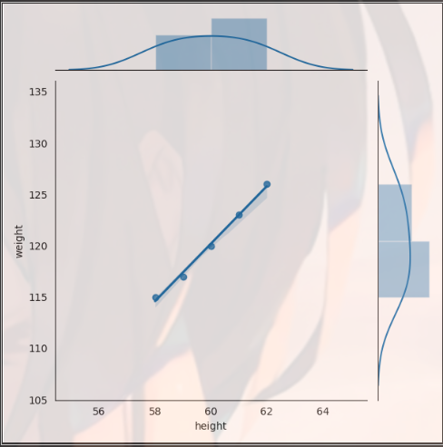
You can also change parameters by using with. Note that you need to add:, and pay attention to indent
import matplotlib.pyplot as plt
import seaborn as sns
import pandas as pd

dt = {'height': pd.Series([58, 59, 60, 61, 62], index=[0, 1, 2, 3, 4]),
      'weight': pd.Series([115, 117, 120, 123, 126], index=[0, 1, 2, 3, 4])}
women = pd.DataFrame(dt)
print(women)
'''
   height  weight
0      58     115
1      59     117
2      60     120
3      61     123
4      62     126
'''
with sns.axes_style("white"):
    sns.jointplot(women.height, women.weight, kind="reg")
plt.show()
plt.hist() is the histogram
Seaborn can also be placed in a for loop to draw multiple variables together
import matplotlib.pyplot as plt
import seaborn as sns
import pandas as pd

dt = {'height': pd.Series([58, 59, 60, 61, 62], index=[0, 1, 2, 3, 4]),
      'weight': pd.Series([115, 117, 120, 123, 126], index=[0, 1, 2, 3, 4])}
women = pd.DataFrame(dt)
print(women)
'''
   height  weight
0      58     115
1      59     117
2      60     120
3      61     123
4      62     126
'''
for x in ["height", "weight"]:
    plt.hist(women[x], normed=True, alpha=0.5)
plt.show()

More Seaborn operations references
https://www.jianshu.com/p/844f66d00ac1
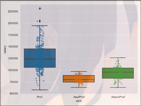
Data visualization practice
- Data preparation
 import os
print(os.getcwd())#E:\py_workspace\test2
Read into the memory object salaries with read_csv() in Panda
import pandas as pd

salaries = pd.read_csv("salaries.csv", index_col=0)
# Index col = 0 causes the read data file to have an index column and the index column is in column 0
View data
import pandas as pd

salaries = pd.read_csv("salaries.csv", index_col=0)
# Index col = 0 causes the read data file to have an index column and the index column is in column 0
print(salaries.head())
'''
       rank discipline  yrs.since.phd  yrs.service   sex  salary
1      Prof          B             19           18  Male  139750
2      Prof          B             20           16  Male  173200
3  AsstProf          B              4            3  Male   79750
4      Prof          B             45           39  Male  115000
5      Prof          B             40           41  Male  141500
'''
- Import Python package
import seaborn as sns
import matplotlib.pyplot as plt
- Visual drawing
SNS. Set ﹐ style ('darkgrid ') sets the drawing style or theme of Seaborn as darkgrid (gray + grid)
sns.stripplot() is used to draw a scatter diagram
Parameters:
- Data: data source
- x: Set X-axis
- y: Set Y axis
- Jitter: jitter or not
- alpha: transparency
sns.boxplot() is used to draw box line
Parameters: - Data: data source
- x: Set X-axis
- y: Set Y axis
import pandas as pd
import seaborn as sns
import matplotlib.pyplot as plt

salaries = pd.read_csv("salaries.csv", index_col=0)
# Index col = 0 causes the read data file to have an index column and the index column is in column 0
print(salaries.head())
'''
       rank discipline  yrs.since.phd  yrs.service   sex  salary
1      Prof          B             19           18  Male  139750
2      Prof          B             20           16  Male  173200
3  AsstProf          B              4            3  Male   79750
4      Prof          B             45           39  Male  115000
5      Prof          B             40           41  Male  141500
'''
sns.set_style('darkgrid')
sns.stripplot(data=salaries, x='rank', y='salary', jitter=True, alpha=0.5)
sns.boxplot(data=salaries, x='rank', y='salary')
plt.show()