Objectives of this section
- Master the use of flex flow, which is a collection of flex direction and flex wrap.
- Master the layout writing skills from top to bottom.
Content summary
This chapter introduces the container attribute flex flow, which is a collection of flex direction and flex wrap. The related attributes have been explained earlier. Let's make an application here.
The reading time is about 10 ~ 15 minutes.
Flex flow foundation
The flex flow attribute flex flow is a combination of flex direction and flex wrap. The syntax format is as follows:
.container {
	flex-flow: flex-direction flex-wrap;
}
Of which:
The default value is: row nowrap,It means that the spindle direction is horizontal to the right without line breaking.
The two properties here have been explained in the previous two chapters, so I won't repeat them. Here is an example commonly used in practice.
Flex flow application
In example 1, the following top, left, right and bottom layout is realized, which requires automatic adaptation when the screen width changes:
We can see that this is a mobile page. If you follow the previous method of using div+css and float, the left and right should be fixed in size and adaptive, there is no way.
Let's try flex here. It's very simple. The steps are divided into 7 steps. Steps 4 ~ 6 are flex related settings.
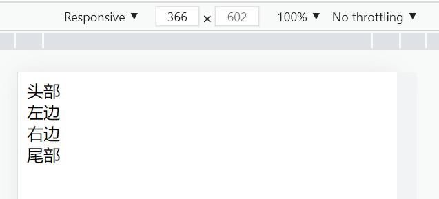
1) Write html code:
<div class="container">
	<div class="header">head</div>
	<div class="left">left</div>
	<div class="right">right</div>
	<div class="footer">tail</div>
</div>
The html code is very simple. It is a container containing four div. Now the page displays four divs:
2) Set margin and padding of * to 0:
* {
	margin: 0;
	padding: 0;
}
This is to remove the default margin and inner margin of all elements for accurate calculation and setting.
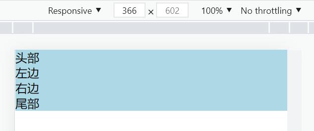
3) Set the background color of div:
.header,
.left,
.right,
.footer {
	background-color: lightblue;
}
The operation effect is as follows:
Some steps are laid down above, and the following are the key steps of flex layout.
4) Set the container to flex flexible layout. According to the page layout size, the width of header and footer is 100%:
.container {
	display: flex;
}

.header,
.footer {
	flex-basis: 100%;
}
The operation effect is as follows:
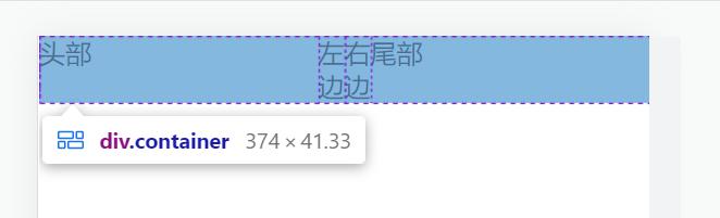
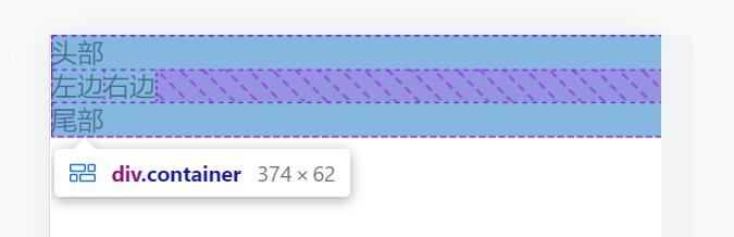
However, this has no effect. We know that if the total width of the project exceeds the container, the project will compress itself. It would be good if we could wrap lines by ourselves.
5) To set line wrap for items in a container:
.container {
	display: flex;
	/* Sets the line wrap for items in the container */
	flex-flow: wrap;
}
You can directly use flex wrap and flex flow.
Operation effect:
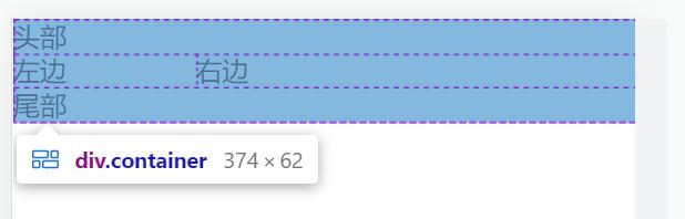
According to the expected display, let's deal with left and right.
6) Set the width of left and right, and use flex growth to occupy the remaining space.
.left {
	flex-grow: 1;
}
.right {
	flex-grow: 3;
}
Operation effect:
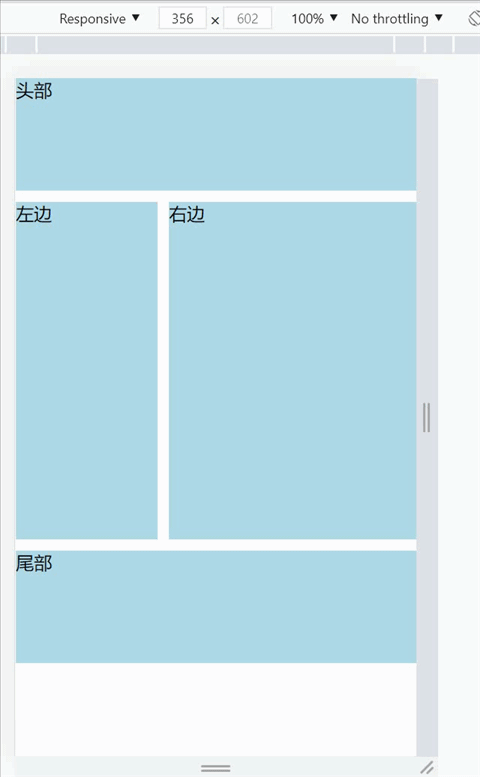
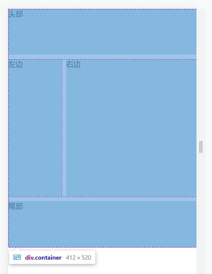
At this point, the key code of flex layout is finished. Let's set the height and spacing of the items later.
7) Set the height and spacing of items:
.header,
.footer {
	height: 6.25rem;
}

.header {
	margin-bottom: 0.625rem;
}

.left {
	height: 18.75rem;
}

.right {
	height: 18.75rem;
	margin-left: 0.625rem;
}

.footer {
	margin-top: 0.625rem;
}
Operation effect:
Finally, there is a complete code. All flex related codes are marked:
<!DOCTYPE html>
<html>
	<head>
		<meta name="viewport"
			content="width=device-width,initial-scale=1,minimum-scale=1,maximum-scale=1,user-scalable=no" />
		<meta charset="utf-8">
		<title>Upper, left, right and lower elastic layout</title>
	</head>
	<body>
		<style type="text/css">
			* {
				margin: 0;
				padding: 0;
			}

			.header,
			.left,
			.right,
			.footer {
				background-color: lightblue;
			}

			.container {
				/* Set container to flex layout */
				display: flex;
				/* Sets the line wrap for items in the container */
				flex-flow: wrap;
			}

			.header,
			.footer {
				/* Set the header and footer width to 100% */
				flex-basis: 100%;
				height: 6.25rem;
			}

			.header {
				margin-bottom: 0.625rem;
			}

			.left {
				/* Sets the magnification factor for left */
				flex-grow: 1;
				height: 18.75rem;
			}

			.right {
				/* Sets the magnification factor for right */
				flex-grow: 3;
				height: 18.75rem;
				margin-left: 0.625rem;
			}

			.footer {
				margin-top: 0.625rem;
			}
		</style>
		<div class="container">
			<div class="header">head</div>
			<div class="left">left</div>
			<div class="right">right</div>
			<div class="footer">tail</div>
		</div>
	</body>
</html>
Summary of this section
- Flex flow is a combination of flex direction and flex wrap.
- Through the combination of width and newline attributes, different layouts can be cleverly realized.