Concept: what is Flex?
FlexiableBox is an elastic box, which is used for elastic layout and can cooperate with rem to deal with the problem of size adaptation
Why Flex layout?
1. It is used to provide maximum flexibility for box model. Any container can be specified as a Flex layout (using the display property)
display:flex;
2. It is more in line with the characteristics of responsive design
Although we can use position, float and other attributes to meet all our needs in front-end layout, the amount of code is large and not flexible enough
Get to know Flex
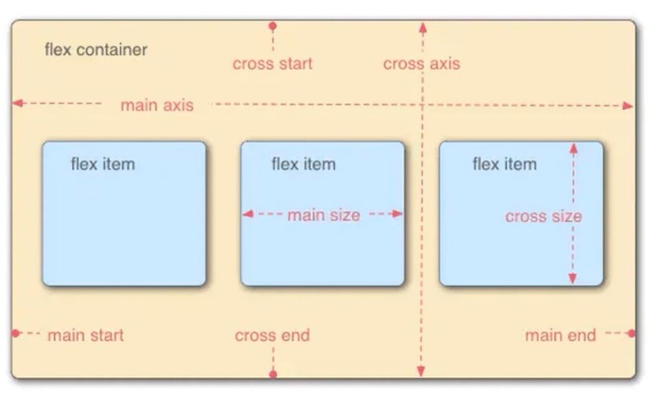
Each elastic container has two axes: the main axis and the cross axis. The two axes form a 90 degree relationship (the two axes of the elastic container are very important, and all attributes act on the axis). The above figure is a very classic diagram of Flex. In fact, it is easy to understand if it is thought of as the X axis and Y axis in our mathematics school. For example, the horizontal direction is the main axis, and the vertical direction is the cross axis (cross axis).
For example, if the sub elements in the box are arranged horizontally, the x-axis is called the main axis and the y-axis is called the cross axis. On the contrary, if the sub elements in the box are arranged vertically, the y-axis is called the main axis and the x-axis is called the cross axis, that is, the main axis and the cross axis are divided based on the arrangement direction of the sub elements.
In addition, there are four vertices, such as main start, main end, cross start and cross end, and an intersection.
The space occupied by the child element in the main axis is main size and the space occupied by the cross axis is cross size (which cannot be simply understood as the width and height of the child element)
Flex properties
1. Flex direction function: the arrangement order of child elements in the parent element box
| Attribute value | effect |
| row | Default. Displayed in left to right order |
| row-reverse | Same as row, but in reverse order |
| column | Display vertically, in order from top to bottom |
| column-reverse | Same as column, but in reverse order |
<html>
<head>
<title>Flex Example</title>
<style>
#div0{
width:500px;
background-color: red;
display: flex;
flex-direction: row;
}
#div0 div{
width: 100px;
height: 100px;
background-color: yellow;
}
</style>
</head>
<body>
<div id="div0">
<div>1</div>
<div>2</div>
<div>3</div>
<div>4</div>
</div>
</body>
</html>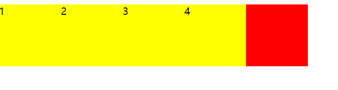 If it is flex direction: row reverse; it will be arranged in reverse; if it is column, it will be arranged vertically. There is no one-to-one mapping here.
2. Flex wrap function: whether the child element wraps in the parent element box (column)
| Attribute value | effect |
| nowrap | Default. No line break or column break, if exceeded, direct overflow |
| wrap | Line break or column break. If there is more than one line, another line or column will be displayed |
| wrap-reverse | Same as wrap, but in reverse order |
<html>
    <head>
        <title>Flex Example</title>
        <style>
            #div0{
                width:380px;/*Change the width of the parent element to 380*/
                background-color: red;
                display: flex;
                flex-direction: row;
                flex-wrap: wrap-reverse;/*Set to wrap in reverse order*/
            }
            #div0 div{
                width: 100px;
                height: 100px;
                background-color: yellow;
            }
        </style>
    </head>
    <body>
        <div id="div0">
            <div>1</div>
            <div>2</div>
            <div>3</div>
            <div>4</div>
        </div>
    </body>
</html>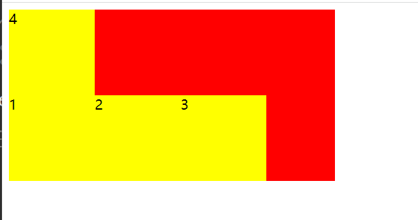
It should be noted here that if the remaining space does not meet the requirements, the remaining child elements will wrap. If line wrapping is not set, that is, only:
display: flex;
flex-direction: row;
It will automatically adjust the size of the child element so that it is just within the range. Of course, the size of the child element should be set.
3. Function of flex flow: short form of flex direction and flex wrap attributes
Syntax: Flex flow: < flex dorection > | < flex wrap >
For example: Flex flow: row wrap reverse;
4. Justify content function: used to set the spacing method when there is residual space
| Attribute value | effect |
| flex-start | Default. From left to right, next to the beginning of the line |
| flex-end | From right to left, next to the end of the line |
| center | Center display |
| space-between | Evenly distributed on the row, leaving no space on both sides |
| space-around | Evenly distributed on the line, with half the space on both sides |
<html>
    <head>
        <title>Flex Example</title>
        <style>
            #div0{
                width:380px;/*Change the width of the parent element to 380*/
                background-color: red;
                display: flex;
                flex-direction: row;
                flex-flow: row wrap;
                justify-content: space-between;
            }
            #div0 div{
                width: 100px;
                height: 100px;
                background-color: yellow;
            }
        </style>
    </head>
    <body>
        <div id="div0">
            <div>1</div>
            <div>2</div>
            <div>3</div>
            <div>4</div>
        </div>
    </body>
</html>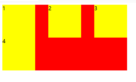
If it is in the parent element: justify content: space around;
If we want to set the spacing between the top and bottom, we can add: margin top: 10px;
In other words, we can still use the previous css style in flex
5. Align items function: set the default alignment of each flex element on the cross axis
Understanding: if the x axis is the main axis, the y axis is the cross axis. If the y axis is the main axis, the x axis is the cross axis. If the y axis is the cross axis, the alignment method is "top, middle and bottom". If the x axis is the cross axis, the alignment method is "left, middle and right".
| Attribute value | effect |
| flex-start | At the beginning of the container |
| flex-end | At the end of the container |
| center | Located in the center of the container |
| space-between | There is space between child elements |
| space-around | Blank at both ends |
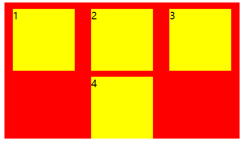
The main axis is X-axis and the cross axis is y-axis (as shown in Figure 1)
<style>
#div0{
width:400px;/*Change the width of the parent element to 380*/
height: 400px;
background-color: red;
display: flex;
justify-content: space-around;
align-items: center;
}
#div0 div{
width: 100px;
height: 100px;
background-color: yellow;
}
</style>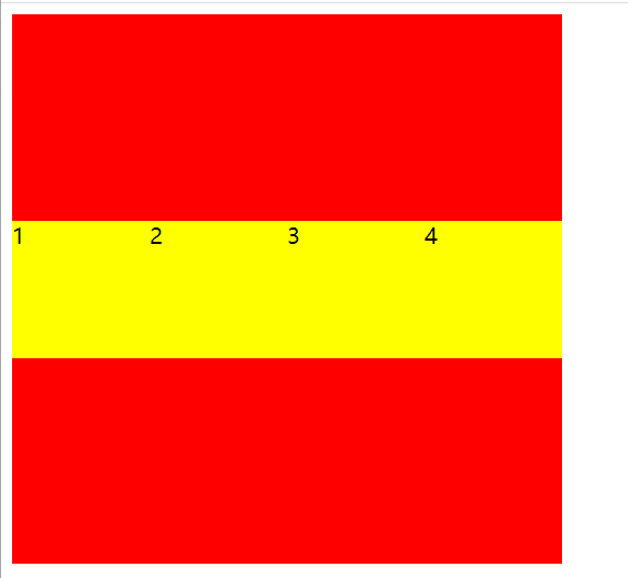 Figure 1
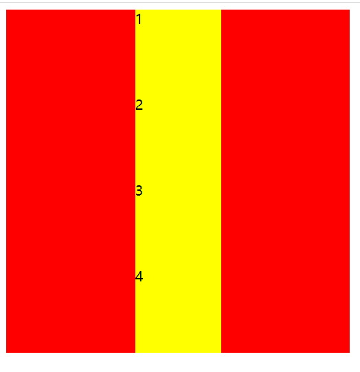 Figure 2
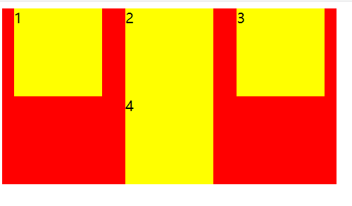
If the spindle is changed to y-axis, flex direction: column; as shown in Figure 2
If the width line of the parent element cannot drop all child elements, then:
        <style>
            #div0{
                width:380px;/*Change the width of the parent element to 380*/
                height: 400px;
                background-color: red;
                display: flex;
                flex-flow: row wrap;
                justify-content: space-around;
                align-items: center;
            }
            #div0 div{
                width: 100px;
                height: 100px;
                background-color: yellow;
            }
        </style>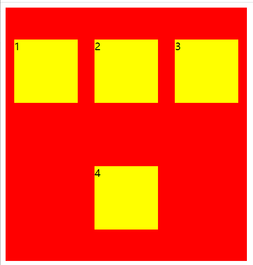
Note: as you may have learned before, align items can only handle single lines, not multiple lines. This is a problem of understanding. Align items can only handle single lines, which means that each line of all sub elements is treated as an independent individual
6. Align content function: set the default alignment of each flex element on the cross axis
Note: align content and align items have many similarities, which are used to control the alignment on the cross axis, but the difference is that align content treats the contents of multiple lines as a whole
<style>
#div0{
width:380px;/*Change the width of the parent element to 380*/
height: 400px;
background-color: red;
display: flex;
flex-flow: row wrap;
justify-content: space-around;
align-content: center;
}
#div0 div{
width: 100px;
height: 100px;
background-color: yellow;
}
</style>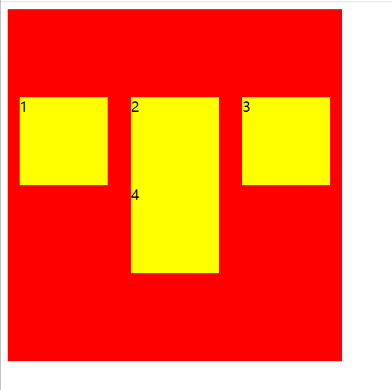 You can clearly see the difference from align items
In other words, if we want to process each line of multiple lines separately, use align items. If we want to treat multiple lines as a whole, use align content
7. Other attributes (set in child elements)
| attribute | effect |
| flex-basis | Set the base value of elastic box expansion (that is, the width of child elements) |
| flex-grow | Set the expansion ratio of the elastic box |
| flex-shrink | Sets the reduction ratio of the elastic box |
| flex | Abbreviations for the above three attributes |
<html>
    <head>
        <title>flex</title>
        <style>
            #div0{
                width:400px;
                height: 500px;
                background-color: red;
                display: flex;
            }
            #div0 div{
                width: 200px;/*After setting the reference value, the originally set width is invalid*/
                height: 200px;
                background-color: yellow;
                flex-basis: 50px;/*You can also set the percentage here, such as 30%. Note that this is 30% of the parent element*/
            }
        </style>
    </head>
    <body>
        <div id="div0">
            <div>1</div>
            <div>2</div>
        </div>
    </body>
</html>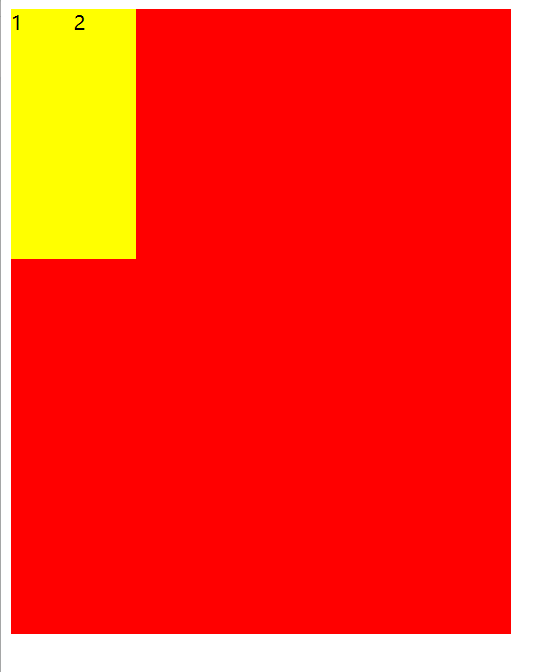
Flex growth is mainly used when the child element is not enough to fill the width of the parent element (when there is space left)
For example: Flex growth: 1; indicates that if expansion is required, a value greater than 1 indicates that expansion is allowed, and indicates the number of copies
For example, the first sub element flex growth: 1, and the second sub element flex growth: 3. It means that there are four parts in total, one for the first and three for the second.
<html>
    <head>
        <title>flex</title>
        <style>
            #div0{
                width:400px;/*Change the width of the parent element to 400*/
                height: 500px;
                background-color: red;
                display: flex;
            }
            #div0 div{
                width: 200px;
                height: 200px;
                background-color: yellow;
            }
            #div0 div:nth-child(1){
                flex-basis: 50px;
                flex-grow: 1;
            }
            #div0 div:nth-child(2){
                flex-basis: 100px;
                flex-grow: 1;
            }
        </style>
    </head>
    <body>
        <div id="div0">
            <div>1</div>
            <div>2</div>
        </div>
    </body>
</html>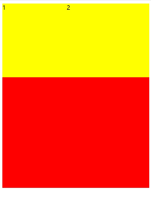
Flex shrink: it is used to set the reduction ratio. It is similar to flex grow when the child element is wide and the width of the parent element cannot be displayed
For example: Flex shrink: 0; 0 means that zoom out is not allowed, and it will exceed
flex-shrink: 1;flex-shrink: 3;
Flex: Flex grow , flex shrink , flex basis; (note the order)
Special writing:
8. Sub element attribute align self
Function: similar to align items, but it only deals with the alignment of child elements themselves