A learning blog post from the matplotlib library.matplotlib is very important for data visualization, it fully encapsulates all the API s of MatLab, and it works best with Python's syntax in a python environment.
I. Installation of Library and configuration of environment
Under windows: py-3-m PIP install Matplotlib
Under linux: python3-m PIP install Matplotlib
Recommended for use with Jupyter.In jupyter notebook, use%matplotlib inline to get to the interactive page (similar to the figure below)
2. Setting up the Chinese environment
First introduce the package:
import numpy as np #Need to use later
import matplotlib as mpl #Setting environment variables
import matplotlib.pyplot as plt #Special for Drawing
from mpl_toolkits.mplot3d import Axes3D #Draw 3D Graphics
In order for pictures to be compatible with Chinese descriptions, names, etc., you need to:
mpl.rcParams['font.sans-serif'] = ['FangSong']
mpl.rcParams['axes.unicode_minus']=False
3. A Glance at the Panorama
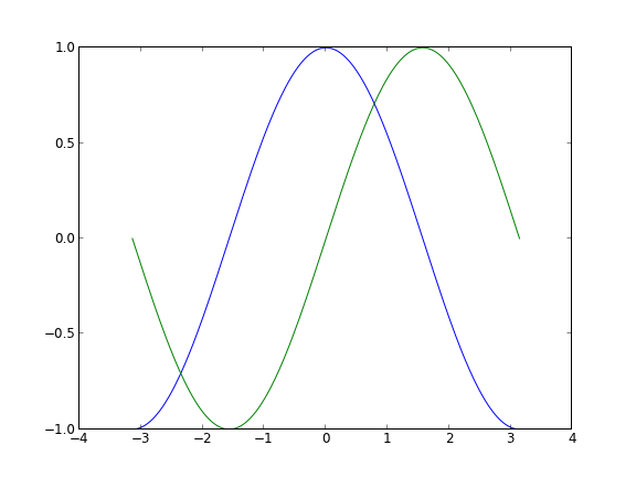
First, let's draw a sine and cosine graph.
plt.figure('sin/cos', dpi=70)
# Create a new subgraph of 1 * 1, in which the next drawing is the first (and only) block.
plt.subplot(1,1,1)
X = np.linspace(-np.pi, np.pi, 256,endpoint=True)
C,S = np.cos(X), np.sin(X)
# Draw a cosine curve using a blue, continuous, 1 (pixel) wide line
plt.plot(X, C, color="blue", linewidth=1.0, linestyle="-")
# Draw a sinusoidal curve using green, continuous, 1 (pixel) wide lines
plt.plot(X, S, color="green", linewidth=1.0, linestyle="-")
# Set the upper and lower limits of the horizontal axis
plt.xlim(-4.0,4.0)
# Set Horizontal Axis Marker
plt.xticks(np.linspace(-4,4,9,endpoint=True))
# Set the upper and lower limits of the vertical axis
plt.ylim(-1.0,1.0)
# Set Vertical Axis Mark
plt.yticks(np.linspace(-1,1,5,endpoint=True))
# Save pictures at resolution 72
# savefig("exercice_2.png",dpi=72)
# On-screen display
plt.show()
- plt.figure(name,dpi):name is the name of the image, DPI is the resolution
-
plt.plot(x,y,color,linewidth,linestyle,label): used to draw point and line graphs.The color is the line color, the linewidth is the width, and the linestyle can be set to--, which becomes a dashed line.
label parameters are related to legends - plt.xlim(min,max)/plt.ylim(min,max): Set the range of the x/y axis.
-
Plt.xtricks (list)/plt.ytricks (list): Sets the value displayed on the x/y axis.
If you want to set a token label (we can think of 3.1423.142 as PI pi, but it's not accurate enough after all.When we set the tags, we can set the tags of the tags at the same time.Note that LaTeX is used here.You can pass in two corresponding lists. -
plt.legend(loc=random default): Add a legend from label in the plt.plot() parameter. If you want label to follow a formula, you need to add $before and after the string.That is, label='$sin(x)$'
The loc parameter defines the icon position, which can be a similar direction to upper left/right. - plt.xlabel(labelname)/ylabel(labelname): Add the name of the x/y axis and display it.
- plt.scatter(xlist,ylist): Label the special points in the graph as needed.
- plt.title(): Give the picture a name
-
Move Axis: (Previous pictures still don't look good) There are actually four spines in each picture (top, bottom, left and right). In order to place the spines in the middle of the picture, we must set two of them (top and right) to be colorless, and then adjust the remaining two to the right position - 0 points in the data space.
ax = plt.gca()
ax.spines['right'].set_color('none')
ax.spines['top'].set_color('red')
ax.xaxis.set_ticks_position('bottom')
ax.spines['bottom'].set_position(('data',0))
ax.yaxis.set_ticks_position('left')
ax.spines['left'].set_position(('data',0))
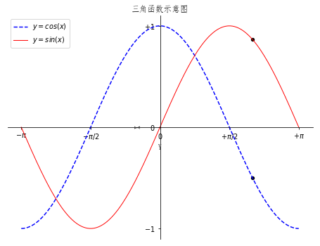
The improved code is as follows:
plt.figure(figsize=(8,6), dpi=70)

# Create a new subgraph of 1 * 1, in which the next drawing is the first (and only) block.
plt.subplot(1,1,1)

X = np.linspace(-np.pi, np.pi, 256,endpoint=True)
C,S = np.cos(X), np.sin(X)

plt.plot(X, C, color="blue", linewidth=1.5, linestyle="--",label="$y=cos(x)$")
plt.plot(X, S, color="red", linewidth=1.0, linestyle="-",label='$y=sin(x)$')

plt.xlabel('Y')
plt.ylabel('X')

plt.xlim(X.min()*1.1,X.max()*1.1)
plt.xticks([-np.pi, -np.pi/2, 0, np.pi/2, np.pi],\
       [r'$-\pi$', r'$-\pi/2$', r'$0$', r'$+\pi/2$', r'$+\pi$'])
plt.ylim(C.min()*1.1,C.max()*1.1)
plt.yticks([-1, 0, +1],\
       [r'$-1$', r'$0$', r'$+1$'])

ax = plt.gca()
ax.spines['right'].set_color('none')
ax.spines['top'].set_color('none')
ax.xaxis.set_ticks_position('bottom')
ax.spines['bottom'].set_position(('data',0))
ax.yaxis.set_ticks_position('left')
ax.spines['left'].set_position(('data',0))
# Save pictures at resolution 72
# savefig("exercice_2.png",dpi=72)

t = 2*np.pi/3
plt.scatter([t,],[np.cos(t),], 20, color ='black')
plt.scatter([t,],[np.sin(t),], 20, color ='black')

plt.legend(loc="upper left")
plt.title('Trigonometric function diagram')
# On-screen display
plt.show()
Now let's see what the processed graph looks like:
Welcome to further exchanges on this blog:
Blog Park address: http://www.cnblogs.com/AsuraDong/
CSDN address: http://blog.csdn.net/asuradong
You can also communicate by letter: xiaochiyijiu@163.com
Welcome to your personal microblog: http://weibo.com/AsuraDong
Welcome to upload, but please specify the source:)
4. Keep improving
plt.figure('sin/cos', dpi=70)

# Create a new subgraph of 1 * 1, in which the next drawing is the first (and only) block.
#plt.subplot(112)

X = np.linspace(-np.pi, np.pi, 256,endpoint=True)
C,S = np.cos(X), np.sin(X)

plt.plot(X, C, color="blue", linewidth=1.5, linestyle="--",label="$y=cos(x)$")
plt.plot(X, S, color="red", linewidth=1.0, linestyle="-",label='$y=sin(x)$')

plt.xlabel('Y')
plt.ylabel('X')

plt.xlim(X.min()*1.1,X.max()*1.1)
plt.xticks([-np.pi, -np.pi/2, 0, np.pi/2, np.pi],\
       [r'$-\pi$', r'$-\pi/2$', r'$0$', r'$+\pi/2$', r'$+\pi$'])
plt.ylim(C.min()*1.1,C.max()*1.1)
plt.yticks([-1, 0, +1],\
       [r'$-1$', r'$0$', r'$+1$'])

ax = plt.gca()
ax.spines['right'].set_color('none')
ax.spines['top'].set_color('none')
ax.xaxis.set_ticks_position('bottom')
ax.spines['bottom'].set_position(('data',0))
ax.yaxis.set_ticks_position('left')
ax.spines['left'].set_position(('data',0))
# Save pictures at resolution 72
# savefig("exercice_2.png",dpi=72)

t = 2*np.pi/3
plt.scatter([t,],[np.cos(t),], 20, color ='black')
plt.scatter([t,],[np.sin(t),], 20, color ='black')

plt.annotate(r'$\sin(\frac{2\pi}{3})=\frac{\sqrt{3}}{2}$',\
         xy=(t, np.sin(t)), xycoords='data',\
         xytext=(+10, +30), textcoords='offset points', fontsize=16,\
         arrowprops=dict(arrowstyle="->", connectionstyle="arc3,rad=.2"))

plt.annotate(r'$\cos(\frac{2\pi}{3})=-\frac{1}{2}$',\
         xy=(t, np.cos(t)), xycoords='data',\
         xytext=(-90, -50), textcoords='offset points', fontsize=16,\
         arrowprops=dict(arrowstyle="->", connectionstyle="arc3,rad=.2"))

plt.plot([t,t],[0,np.cos(t)], color ='blue', linewidth=2.5, linestyle="--")
plt.plot([t,t],[0,np.sin(t)], color ='red', linewidth=2.5, linestyle="--")

plt.legend(loc="upper left")
plt.title('Trigonometric function diagram')
# On-screen display
plt.show()
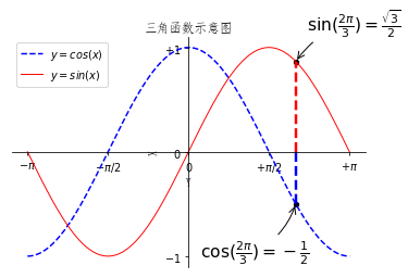
We added a label point and made a vertical line to the x-axis to make it clearer.
5. Storage of diagrams
For such a beautiful picture, save it locally by plt.savefig (photo name + suffix name).
6. Subgraphs
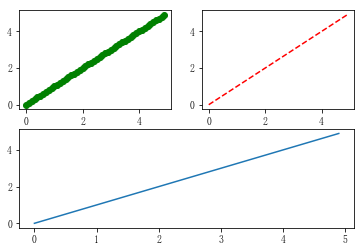
plt.subplot(x,y,n): Divide the picture into x*y blocks, this is the nth one.(see example)
Example 1:
x = np.arange(0, 5, 0.1)
y = np.arange(0, 5, 0.1)

#plt.figure(1)
plt.subplot(221)
plt.plot(x, y, 'go')

plt.subplot(222)
plt.plot(x, y, 'r--')

plt.subplot(212)
plt.plot(x, y,)

plt.show()
Example 2:
x = np.arange(0, 5, 0.1)
y = np.arange(0, 5, 0.1)

#plt.figure(1)
plt.subplot(221)
plt.plot(x, y, 'go')

plt.subplot(222)
plt.plot(x, y, 'r--')

plt.subplot(224)
plt.plot(x, y,)

plt.show()
