It is used for the accumulation of daily learning. If there are deficiencies, please give more advice.
1, Learn about the Matplotlib Library
1 what is Matplotlib
Matplotlib can be seen as a combination of three abbreviations:
·matrix (mat rix)
·Plot plot
·lib (Library) library
Matplotlib is a Python two-dimensional chart library.
2 role of Matplotlib
Visualizing the data makes the data more replaceable
3 use Matplotlib to make a simple drawing
3.1matplotlib.pyplot module
matplotlib.pyplot module contains a series of drawing functions similar to matlab.
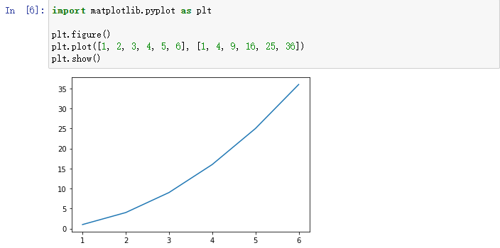
import matplotlib.pyplot as plt
3.2 drawing
import matplotlib.pyplot as plt

plt.figure() #Create canvas
plt.plot([1, 2, 3, 4, 5, 6], [1, 4, 9, 16, 25, 36]) #Draw image
plt.show()	#Display image
4. Three layer structure of Matplotlib
4.1 container layer
- Canvas of drawing board layer (located at the bottom layer, which is inaccessible to ordinary users)
It is located in the lowest system layer and acts as a sketchpad. - Canvas layer Figure (above canvas layer)
It is the first application layer of user operation and acts as the canvas.
plt.figure()
- Drawing area / coordinate system Axes (above Figure layer)
The second layer of the application layer.
plt.subplots()
- interrelation
- A figure can contain multiple axes, and an axis can only belong to one figure.
- One axis can contain multiple axes.
4.2 auxiliary display layer
The auxiliary display layer is the content in the Axes (drawing area) other than the image drawn according to the data, mainly including the appearance of Axes (facecolor), border lines (spines), coordinate axis (axis), coordinate axis name (axis label), coordinate axis scale (tick), coordinate axis scale label (tick label), grid line (grid), legend (legend), title (title), etc.
4.3 image layer
The image layer refers to the image drawn according to the data through functions such as plot, scatter, bar, histogram and pie in Axes.
2, Line chart
1. Drawing and display of line chart
- To draw a line chart
- Create canvas
- Draw image
- Display image
The details are consistent with the above code for making a simple drawing:
import matplotlib.pyplot as plt

plt.figure() #Create canvas
plt.plot([1, 2, 3, 4, 5, 6], [1, 4, 9, 16, 25, 36]) #Draw image
plt.show()	#Display image
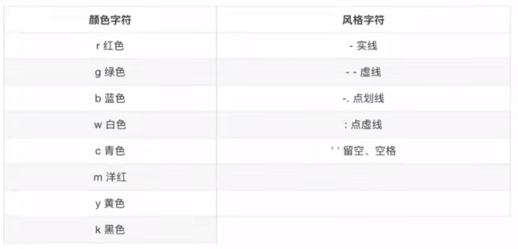
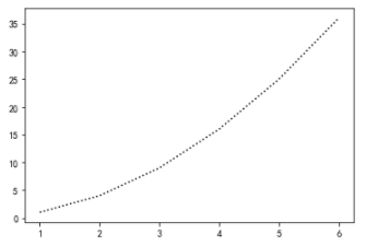
1.1 setting the style of graphics
plt.plot(x,y,color='k',linestyle=':')
#Color sets the line color
#linestyle sets the line style
Modify the above code:
import matplotlib.pyplot as plt

x=[1,2,3,4,5,6]
y=[1,4,9,16,25,36]

plt.figure() #Create canvas

plt.plot(x,y,color='k',linestyle=':') #Draw image

plt.show() #Display image
result:
2 set canvas properties
plt.figure(figsize=(),dpi=)
#figsize: Specifies the length and width of the graph
#dpi: sharpness of image
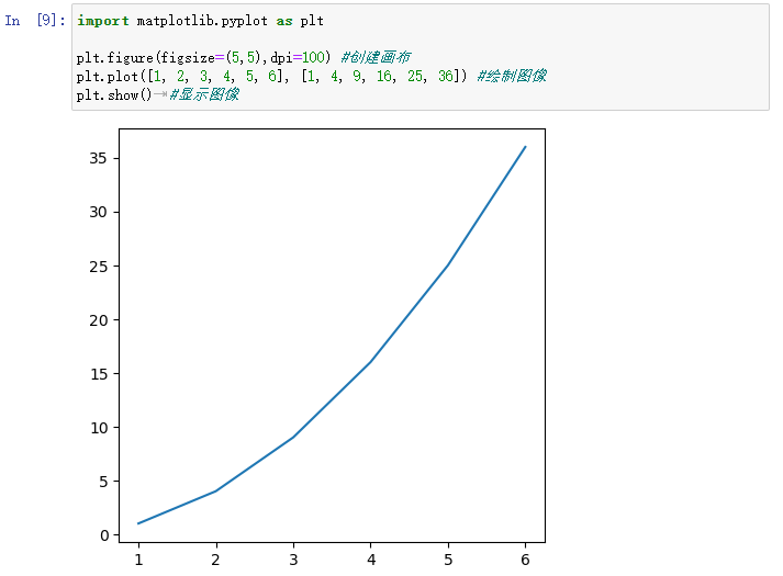
2.1 code example
import matplotlib.pyplot as plt

plt.figure(figsize=(5,5),dpi=100) #Create canvas
plt.plot([1, 2, 3, 4, 5, 6], [1, 4, 9, 16, 25, 36]) #Draw image
plt.show()	#Display image
3. Image saving
import matplotlib.pyplot as plt

plt.figure(figsize=(5,5),dpi=100) #Create canvas
plt.plot([1, 2, 3, 4, 5, 6], [1, 4, 9, 16, 25, 36]) #Draw image

plt.savefig("1.png") #Save on relative path

plt.show() #Display image
Note: PLT Savefig (path) cannot be written in PLT After show(). (plt.show() will release the resource of fixture. At this time, the image saved is an empty image)
4 set the auxiliary display layer
4.1 custom x, y scale
#Custom x-axis
plt.xticks(x,tick labels) #Tick labels can be replaced by x
#Custom y-axis
plt.yticks(y,tick labels) #Tick labels can be replaced y correspondingly
- Code example:
import matplotlib.pyplot as plt

x=[1,2,3,4,5]
y=[1,4,9,16,25]

plt.figure(figsize=(5,5),dpi=100)
plt.plot(x,y)

plt.xticks(x,["one","two","three","four","five"])

plt.show()
result:
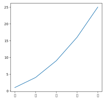
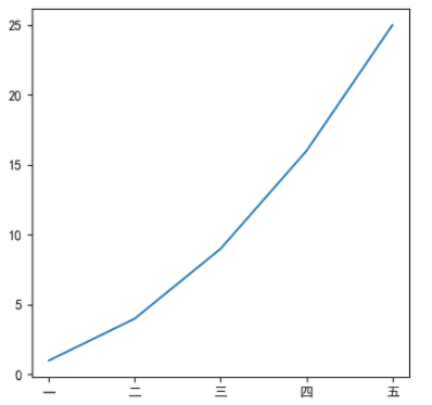
Note: the default font does not support Chinese and will become the white box in the above figure.
import matplotlib.pyplot as plt

x=[1,2,3,4,5]
y=[1,4,9,16,25]

plt.rcParams['font.sans-serif'] = ['SimHei'] #Solve the problem of Chinese display

plt.figure(figsize=(5,5),dpi=100)
plt.plot(x,y)
plt.xticks(x,["one","two","three","four","five"])

plt.show()
result:
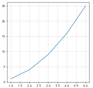
4.2 add grid display
plt.grid(True,linestyle,alpha)
#linestyle refers to the line style
#alpha refers to transparency
- Code example:
import matplotlib.pyplot as plt

x=[1,2,3,4,5]
y=[1,4,9,16,25]

plt.figure(figsize=(5,5),dpi=100)
plt.plot(x,y)

plt.grid(True,linestyle="--",alpha=0.8)	#Add grid display

plt.show()
result:
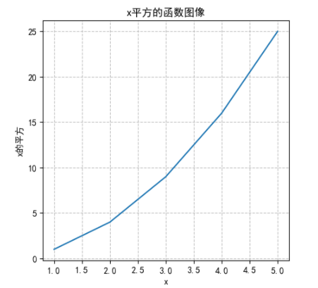
4.3 add description information
plt.xlabel(str)
plt.ylabel(str)
plt.title(str)
- Code example:
import matplotlib.pyplot as plt

x=[1,2,3,4,5]
y=[1,4,9,16,25]

plt.figure(figsize=(5,5),dpi=100)
plt.plot(x,y)

plt.xlabel("x")
plt.ylabel("x Square of")
plt.title("x Square function image")
plt.grid(True,linestyle="--",alpha=0.8)

plt.show()
result:
5 set image layer
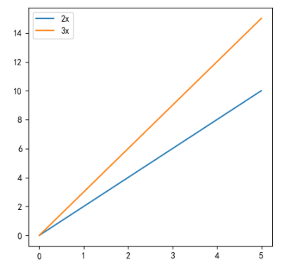
5.1 add another polyline
Use PLT again Plot () can add another curve.
Among them, you can set the label of the corresponding curve in plot():
plt.plot(x,y_2x,label='2x')
And add the following image layer code to show it:
plt.legend()
- Code example:
import matplotlib.pyplot as plt

x=[0,1,2,3,4,5]
y_2x=[2*i for i in range(6)]
y_3x=[3*i for i in range(6)]

#Create canvas
plt.figure(figsize=(5,5),dpi=100)
#Draw image
plt.plot(x,y_2x,label='2x')
plt.plot(x,y_3x,label='3x') #Add another polyline

plt.legend()

plt.show() #Display image
result:
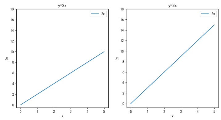
6 multi coordinate system display line chart
figure, axes = plt.subplots(nrows=1, ncols=2)
#nrows: row
#ncols: columns
Note: This is object-oriented programming. Pay attention to the different codes.
- Code example:
import matplotlib.pyplot as plt

x=[0,1,2,3,4,5]
y_2x=[2*i for i in range(6)]
y_3x=[3*i for i in range(6)]

#Create canvas
#plt.figure(figsize=(5,5),dpi=100)
figure, axes = plt.subplots(nrows=1, ncols=2,figsize=(10,5),dpi=100)

#Draw image
#plt.plot(x,y_2x,label='2x')
axes[0].plot(x,y_2x,label='2x')
#plt.plot(x,y_3x,label='3x')
axes[1].plot(x,y_3x,label='3x')

#Show Legend
#plt.legend()
axes[0].legend()
axes[1].legend()

#Modify scale
axes[0].set_xticks(x[::1])
axes[0].set_yticks(range(0,20)[::2])
axes[1].set_xticks(x[::1])
axes[1].set_yticks(range(0,20)[::2])

#Add description information
axes[0].set_xlabel("x")
axes[0].set_ylabel("2x")
axes[0].set_title("y=2x")

axes[1].set_xlabel("x")
axes[1].set_ylabel("3x")
axes[1].set_title("y=3x")

#Display image
plt.show()
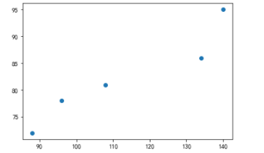
3, Scatter diagram
Analyze the relationship / law between different variables
plt.scatter(x,y)
3.1 drawing of scatter diagram
import matplotlib.pyplot as plt

#data
math_score=[140,96,134,108,88]
physics_score=[95,78,86,81,72]

#Create canvas
plt.figure()

#Scatter plot
plt.scatter(math_score,physics_score)

#Display image
plt.show()
result:
4, Histogram
Count the quantity and size of different categories and compare the differences between the data
plt.bar(x,width,...)
#x is data
#Width is the column width
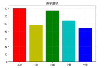
A single column chart 1.4
- Code example:
import matplotlib.pyplot as plt

#data
students=["Xiao Ming","Xiao Hong","Xiao Gang","Xiao Zhi","Xiaohua"]
math_score=[140,96,134,108,88]

#Create canvas
plt.figure()

#Draw image
plt.bar(range(0,5),math_score,color=['r','y','g','c','b']) #Use different colors to draw the histogram

#Modify scale
plt.xticks(range(0,5),students)

#Add title
plt.title("Mathematics achievement")

#Add grid display
plt.grid(linestyle=":",alpha=0.5)

#Display image
plt.show()
result:
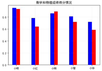
4.2 multiple histograms for one category
- Code example:
import matplotlib.pyplot as plt

#data
students=["Xiao Ming","Xiao Hong","Xiao Gang","Xiao Zhi","Xiaohua"]
math_score=[i/150 for i in [140,96,134,108,88]]
physics_score=[i/100 for i in [95,78,86,81,72]]

#Create canvas
plt.figure()

#Draw image
plt.bar(range(0,5),math_score,color='r',width=0.2)
plt.bar([i-0.2 for i in range(0,5)],physics_score,color='b',width=0.2)#Note that the scale should be adjusted, otherwise it will overlap

#Modify scale
plt.xticks([i-0.1 for i in range(0,5)],students)

#Add title
plt.title("Math and physics scores")

#Add grid display
plt.grid(linestyle=":",alpha=0.5)

#Display image
plt.show()
result:
5, Histogram
Indicates the data distribution
plt.hist(x,bins,density,...)
#x is data
#bins is the number of groups
#density is whether to display frequency (not displayed by default)
5.1 difference between histogram and histogram
| histogram | Histogram |
|---|---|
| Display the distribution of data | Compare the size of the data |
| The x-axis shows the number range | The x-axis shows classified data |
| There is no space between columns | There are gaps between columns |
| The column width makes sense |
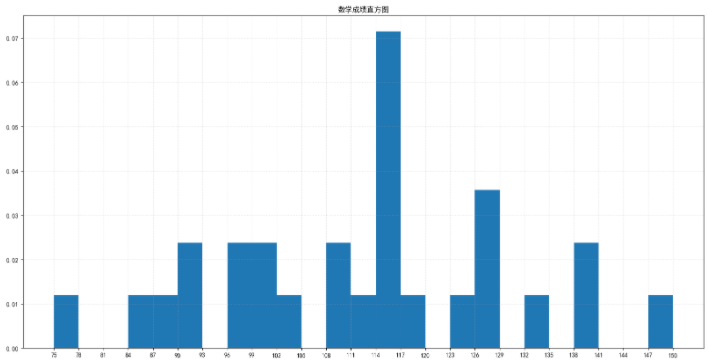
5.2 histogram drawing
import matplotlib.pyplot as plt

#data
math_score=[140,96,134,108,138,128,128,117,126,116,100,114,115,116,112,116,101,102,89,96,85,108,92,75,116,92,124,150]

#Create canvas
plt.figure(figsize=(20,10),dpi=100)

#Draw image
d=3
group_num = (max(math_score)-min(math_score))//d # group number = (max min) / / group distance
plt.hist(math_score,bins=group_num,density=True)

#Modify scale
plt.xticks(range(min(math_score),max(math_score)+d,d))

#Add title
plt.title("Mathematical score histogram")

#Add grid display
plt.grid(linestyle=":",alpha=0.5)

#Display image
plt.show()
result:
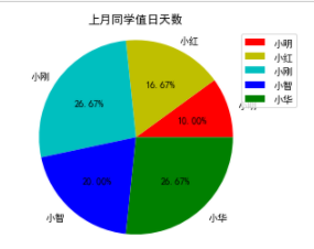
6, Pie chart
Proportion of different data (too many categories, not recommended)
plt.pie(x,labels,autopct,colors,...)
#x: Quantity
#labels: name of each part
#autopct: proportion display
#colors: color of each part
6.1 pie chart drawing
import matplotlib.pyplot as plt

#data
students=["Xiao Ming","Xiao Hong","Xiao Gang","Xiao Zhi","Xiaohua"]
duty_days=[3,5,8,6,8]

#Create canvas
plt.figure()

#Draw image
plt.pie(duty_days,labels=students,autopct="%1.2f%%",colors=['r','y','c','b','g'])
plt.axis('equal')#Ensure that the length and width of the pie chart are consistent

#Show Legend
plt.legend()

#Modify scale
plt.xticks()

#Add title
plt.title("Number of days on duty last month")

#Add grid display
plt.grid(linestyle=":",alpha=0.5)

#Display image
plt.show()
result: