Source
css common attribute settings
background


Text


Alignment
display attribute

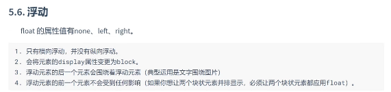
Float
Code 1
<!DOCTYPE html>
<html>
<head>
<meta charset="utf-8" />
<title>Common properties</title>
<style type="text/css"">
#div1 {
/*width: 5eepx;*/
height: 622px;
/*background color */
background-color: #EEE8AA;
/*Background picture */
background-image: ur1(img/ bd.png);
/*Repeat*/
background-repeat : no-repeat;
}
#div2 {
*Font color*/
color: #a83BFF;
/*Alignment left center right*/
text-align: left;
/*Text modification*/
text-decoration: line-through overline uncerline ;
/*text-indent*/
text-indent : 2em;
}
a {
/*Remove text effect (remove underline of hyperlinks)*/
text-decoration: none;
}
#p1 {
/*Alignment Left - Center right -- justify*/
text-align:justify;
}
h2 {
/*display Attribute none hide element block show element*/
display : none;
}
/*float*/
#d1 {
width: 100px;
height: 100px;
background-color: red;
/*float*/
float:left;
}
#d2 {
width : 100px;
height: 100px;
background-color: black;
/*float*/
float:left;
}
</style>
</head>
<body>
<!--
background
Back color
Whether the background picture is repeated
-->
<!--
<div id="div1">
Hello
</div>
-->
<hr>
<!-- text -->
<div id="div2">
Hello world
</div>
<!-- Remove text decoration -->
<a href="">Baidu</a>
<hr>
<p id="p1">
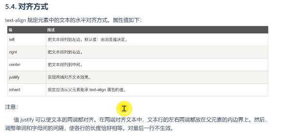
value justify You can align both ends of the text. In aligned text, the left and right ends of the text line are placed on the parent line
On the inner boundary of the element. Then value justify You can align both ends of the text. Align at both ends
In, the left and right ends of the text line are placed on the inner boundary of the parent element. then,value justify You can make two of the text
Both ends are aligned. In aligned text, the left and right ends of the text line are placed on the inner boundary of the parent element. then,value
justify You can align both ends of the text. In aligned text, the left and right ends of the text line are placed
On the inner boundary of the parent element. Then, the value justify You can align both ends of the text. Align text at both ends
In, the left and right ends of the text line are placed on the inner boundary of the parent element. then,value justify Can make the text
Align both ends. In aligned text, the left and right ends of the text line are placed on the inner boundary of the parent element. then
</p>
<hr>
<!-- display -->
<h2>hello world</h2>
<!-- float -->
<div id="d1"></div>
<div id="d2"></div>
</body>
</html>
Code result

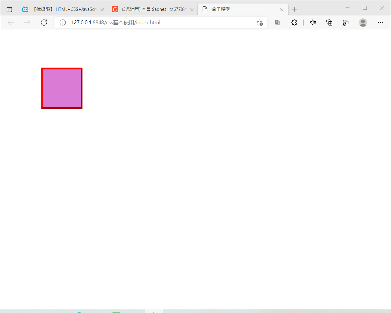
Box model
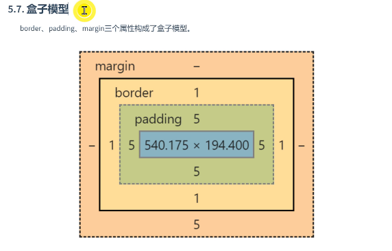
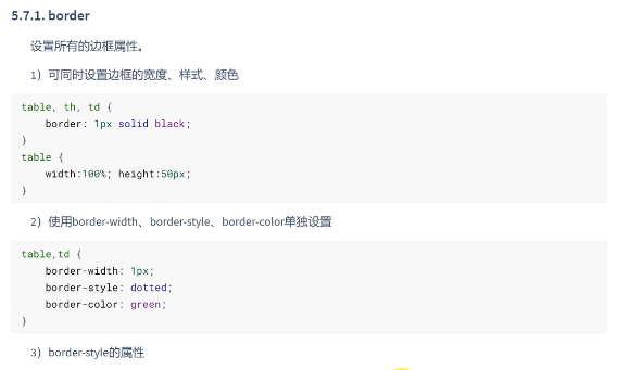
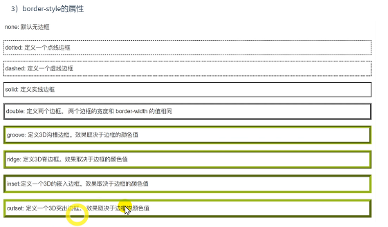
border
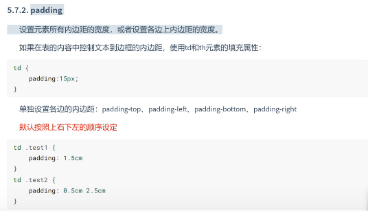
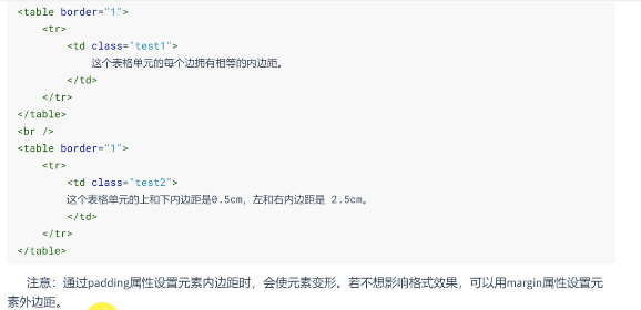
padding
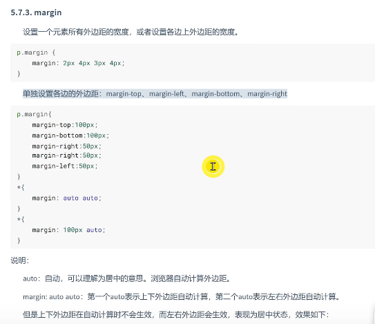
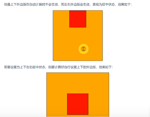
margin
Code 2
<!DOCTYPE html>
<html>
<head>
<meta charset="utf-8" />
<title>Box model</title>
<style type="text/css">
#d1 {
width: 100px;
height: 100px;
background-color: #DA7BD6;
/*Set border*/
border:red 5px outset;
/*Set inner margin*/
/*padding: 15px;*/
/*padding-left: 2epx;*/
padding: 10px 2epx;
margin-top:100px;
margin-left:100px;
}
</style>
</head>
<body>
<!--
Box model
padding:padding
border frame
margin Margin
border frame
Set the color, style and width of the border
border:Color style width
example: border : red soild 1px
Set the width, color and style of the border separately
/* border-width
border-style
border-colo
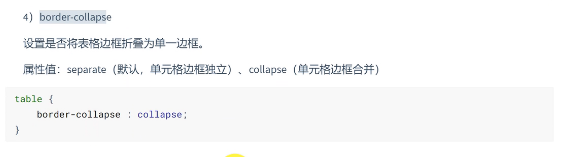
border-collapse
Sets whether the table border is collapsed into a single border
Attribute value: separate (the default cell border is independent)
collapse (Cell border (merge)*/r
/* padding padding
Set the width of all inner margins of the element, or set the width of the inner margins on each edge.
margin Margin
Set the width of all the outer margins of the element, or set the width of the outer margins on each edge.
Set the inner margin of each side separately: padding top, padding left, padding bottom and padding right are set in the order of top, right, bottom and left by default
Set 1 Value: the upper right, lower left are consistent
Set 2 values: consistent up and down, consistent left and right
Set three values: top right bottom, left and right consistent */
-->
<div id="d1"></div>
</body>
</html>
Code result
CSS navigation bar
navigation bar
Proficiency in using the navigation bar is very important for any website.
With CSS, you can turn it into a nice navigation bar instead of a boring HTML menu.
Navigation bar = link list
As the basis of standard HTML, a navigation bar is necessary
. In our example, we will build a standard HTML list navigation bar.
The navigation bar is basically a list of links, so it makes sense to use the < UL > and < li > elements:
example
<ul>
< li > < a href = "#home" > Home Page</a></li>
< li > < a href = "#news" > News < / a ></li>
< li > < a href = "#contact" > contact</a></li>
< li > < a href = "#about" > about</a></li>
</ul>
Now let's remove margins and padding from the list:
example
ul {
list-style-type:
none; margin: 0;
padding: 0;
}
Example analysis:
- List style type: None - removes the small flag before the list. A navigation bar does not require a list tag
- Remove the browser's default settings and set margins and padding to 0
The code in the above example is the standard code used for vertical and horizontal navigation bars.
Vertical navigation bar
In the above code, we only need the style of < a > element to establish a vertical navigation bar:
example
a {
display:block;
width:60px;
}
Example description:
- display:block - displays the links of the block elements, turning the whole into a clickable link area (not just text), which allows us to specify the width
- width:60px - the maximum width of a block element by default. We want to specify a width of 60 pixels
Note: be sure to specify the width of the < a > element in the vertical navigation bar. If the width is omitted, IE6 may have unexpected effects.
Vertical navigation bar instance
Create a simple instance of the vertical navigation bar. When the mouse moves to the option, modify the background color:
example
ul {
list-style-type: none;
margin: 0;
padding: 0;
width: 200px;
background-color: #f1f1f1;
}
li a { display: block;
color: #000;
padding: 8px 16px;
text-decoration: none; }
/*
Move the mouse over the option to modify the background color
*/
li a:hover {
background-color: #555;
color: white;
}
Activate / current navigation bar instance
After clicking the option, we can add the "active" class to determine which option is selected:
example
li a.active { background-color: #4CAF50; color: white; }
Create links and add borders
You can add a text align: Center style on < li > or < a > to center the link.
You can add the "border" attribute on the "border < UL > to make the navigation bar have a border. If you want to add a border on each option, you can add a border bottom on each < li > element:
example
ul { border: 1px solid #555; } li { text-align: center; border-bottom: 1px solid #555; } li:last-child { border-bottom: none; }
Fixed navigation bar with full screen height
Next, we create a fixed navigation bar with full screen height on the left and scrollable content on the right.
example
UL {list style type: none; margin: 0; padding: 0; width: 25%; background color: #f1f1f1; height: 100%; / * full screen height * / position: fixed; overflow: auto; / * scrolling is allowed if there are many navigation bar options * /}
Note: this instance can be used on mobile standby.
Horizontal navigation bar
There are two ways to create a horizontal navigation bar. List items that use inline or float.
Both methods are good, but if you want to link to the same size, you must use the floating method.
Inline list item
One way to create a horizontal navigation bar is to specify elements. The above code is standard inline:
example
li { display:inline;
Instance resolution:
- display:inline; - By default, < li > elements are block elements. Here, we delete each list item before and after the line feed to display a line.
Floating list item
In the above example, links have different widths.
For all links with the same width, float the < li > element and specify it as the width of the < a > element:
example
li { float:left; } a { display:block; width:60px; }
Instance resolution:
- float:left - slides that use floating block elements are adjacent to each other
- display:block - displays the links of the block elements, turning the whole into a clickable link area (not just text), which allows us to specify the width
- width:60px - the maximum width of a block element by default. We want to specify a width of 60 pixels
Horizontal navigation bar instance
Create a horizontal navigation bar and change the background color after moving the mouse to the option.
example
ul { list-style-type: none; margin: 0; padding: 0; overflow: hidden; background-color: #333; } li { float: left; } li a { display: block; color: white; text-align: center; padding: 14px 16px; text-decoration: none; } /* Move the mouse over the option to modify the background color * / Li a: hover {background color: #111;}
Activate / current navigation bar instance
After clicking the option, we can add the "active" class to determine which option is selected:
example
.active { background-color: #4CAF50; }
Align link right
Set the rightmost option of the navigation bar to right alignment (float:right;):
example
< UL > < li > < a href = "#home" > Home < / a > < / Li > < li > < a href = "#news" > News < / a > < / Li > < li > < a href = "#contact" > contact < / a > < / Li > < Li style = "float: right" > < a class = "active" href = "#about" > about < / a > < / Li > < / UL >
Add split line
<li>Add a split line with the {border right} style:
example
/*Except for the last option (last child), all other options add split lines * / Li {border right: 1px solid #bbb;} li:last-child { border-right: none;
Fixed navigation bar
You can set the navigation bar of the page to be fixed at the head or bottom:
Fixed to the head
ul { position: fixed; top: 0; width: 100%; }
Fixed at the bottom
ul { position: fixed; bottom: 0; width: 100%; }
Note: this instance can be used on mobile devices.
Gray horizontal navigation bar
Gray horizontal navigation bar
ul { border: 1px solid #e7e7e7; background-color: #f3f3f3; } li a { color: #666; }